 Another killer card from Edmund Bagwell.
Comics
 All four giclee prints I did with Henry Flint are now available in Orbital comics, 8 Great Newport Street, WC2H 7JA just off Charing Cross Rd. in London. They also have copies of the comic book / flexi disc / CD edition of ‘The Search Engine’ and Henry’s ‘Broadcast’ book along with a fine selection of comics, books, vintage toys and a small gallery space which is always interesting. Highly recommended.
It looks like there will be a fifth print soon too by way of a revitalised Scraffer.com, a smaller A3 size of ‘Planets’, an illustration that appeared on the ‘One Man’s Weird Is Another Man’s World’ EP. Talking of which, the 4 x 12″ repress package (the three EPs plus the Amorphous Androgynous remix 12″) is at the printers but it might be held over until Record Store Day in April now, I’m not sure. More info when I have it.
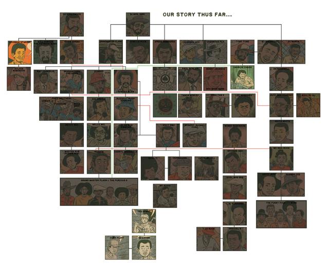
 This is so well done, the unfolding history of Hip Hop, drawn by Ed Piskor in the style of old 70’s underground comics by Crumb or Pekar. Starting in 1975 and continuing on into the 80’s Ed has been putting chapters on Boing Boing and they will be collected next year in print form. Love the yellowed paper, faded ink and retro vibe of it all, I wonder if he’ll change style as he moves along to mirror the historical changes in art?
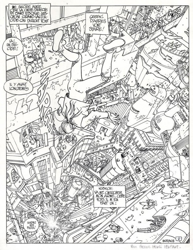
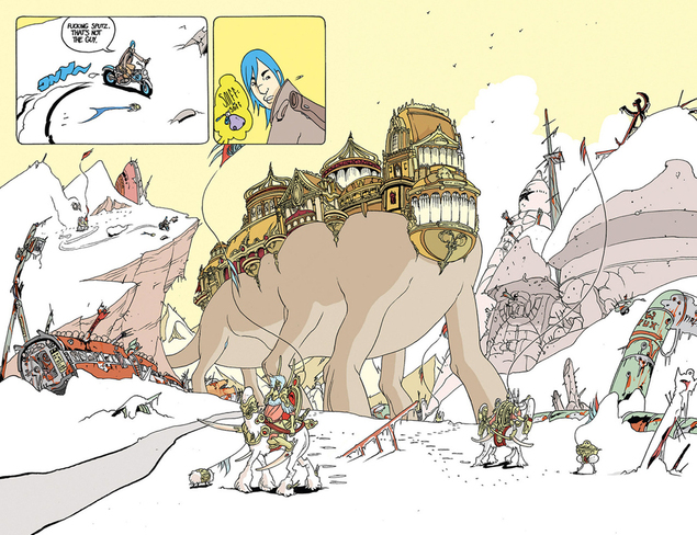
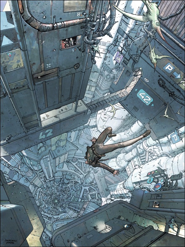 I found this amazing image on a tumblr the other day, as usual the person who had posted it hadn’t bothered to credit it. Anyone know who it’s by? It reminds me of (and is probably an homage to) this image by Moebius. It has ‘Jodorowsky – something’ in the bottom corner so I’m wondering if it’s actually a later version of this scene by Moebius for a graphic novel cover or something?
*UPDATE – and it’s David Rees for the win, in record time he responds: “A little light Googling suggests it’s from the ‘Final Incal’, by Alejandro Jodorowsky and José Omar Ladrönn“. Notice the similarity to the Zaucer of Zilk page I posted earlier (which, incidentally David helped me acquire)? I wonder if this was McCarthy’s homage to Moebius too?

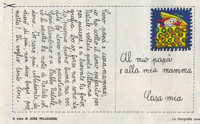
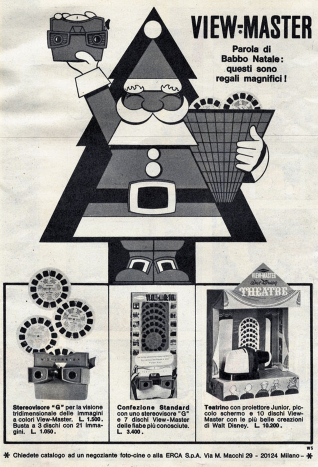
 It’s on the horizon, no denying it any more, best accept it and hope you get something you actually want. Here’s the last of the scans from the European magazines Steve Cook and I found back in May, all Xmas-themed for you. As usual there’s an unhealthy obsession with guns and what looks like a cut out card to send to Santa.
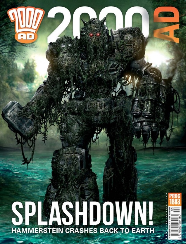
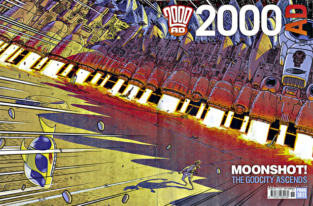 This is next week’s 2000ad with amazing wraparound cover by D’israeli (I subscribe so get it 4 days early). Not content with celebrating 35 years worth of publishing, the Dredd3D film and Prog 1800 in 2012, the comic has gone into uncharted territory in what is proving to be a golden year for them.
2000ad is an anthology title with four or five different strips running each week featuring characters in – usually – unrelated worlds. Without warning a month ago events in three of the strips suddenly began to intertwine and form a much bigger story which has grown to epic proportions since. Centered around Judge Dredd and the fallout from the equally epic ‘Day of Chaos’ story earlier this year, they’ve managed to outdo themselves AGAIN with this slice of storytelling.
Comics have crossed over before and plenty of universes and characters have fought with and against each other over the decades but the beauty of 2000ad is that they’re all contained in one place. To have several all suddenly tie together without even a single mention is genius. In any other comic this would have been trailed and trumpeted for months preceding its arrival in the hope of attracting press and attention for the title. Rather than underestimating their reader’s intelligence 2000ad has chosen to sneak this upon us with no warning and this is why they’re still the galaxy’s greatest.
Also this week, the other two strips not part of the tri-story arc have now concluded, leaving next week’s climax to play out across the whole issue! I’m looking forward to seeing how they intertwine the three strips and different artist’s styles – will they be separate stories or one huge strip with contrasting panels on each page? Whatever they do it will be the end of an incredible year for the title which concludes with their annual 100 page 2013 issue in 2 weeks before taking a break for Xmas. There’s never been a better time to be reading this, either physically or digitally.
UPDATE: There’s a fascinating post over on Pete Wells‘ 2000ad Covers Uncovered site about the making of this stunning cover.
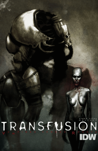
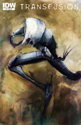
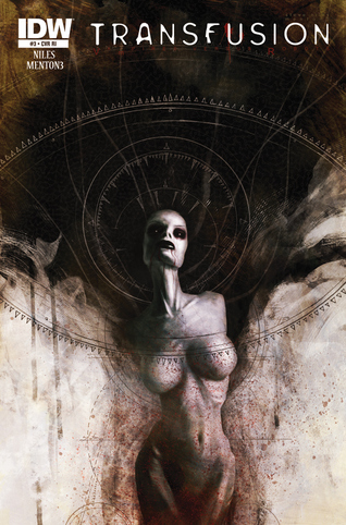
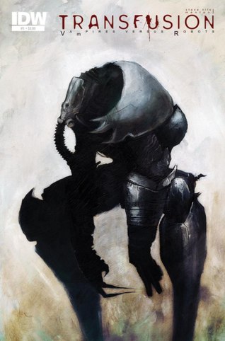 This looks promising, we’ve had vampires vs werewolves, vampires vs zombies, vampires vs vampires, now… vampires versus robots.
Actually it seems that the tagline here is a bit misleading and the robots are actually vampires (not sure how that works).
Nevertheless, the art – by Menton3 – is gorgeous, reminding me of Ashley Wood‘s work back when he was in his comic prime or the old Kent Williams/Jon J Muth Wolverine book.
Forget Transformers, this is Transfusion – a 3 issue series, written by Steve Niles. that just debuted from IDW, I’ve not read it yet but it looks pretty bleak as it’s set in the future where the remnants of the human race are hunted by robots who need blood to survive.
There’s a short preview from issue 1 over on CBR.
 .
.
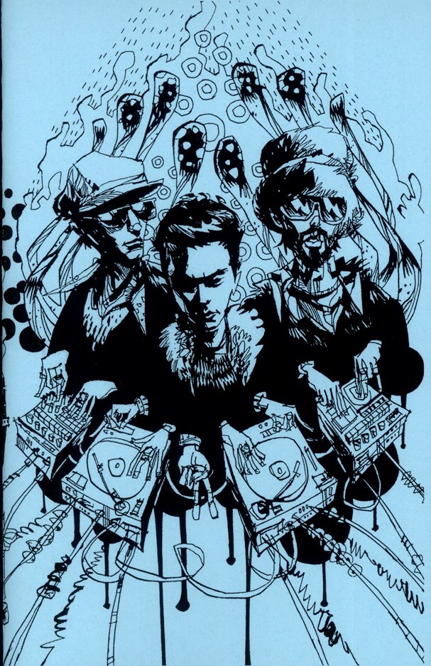
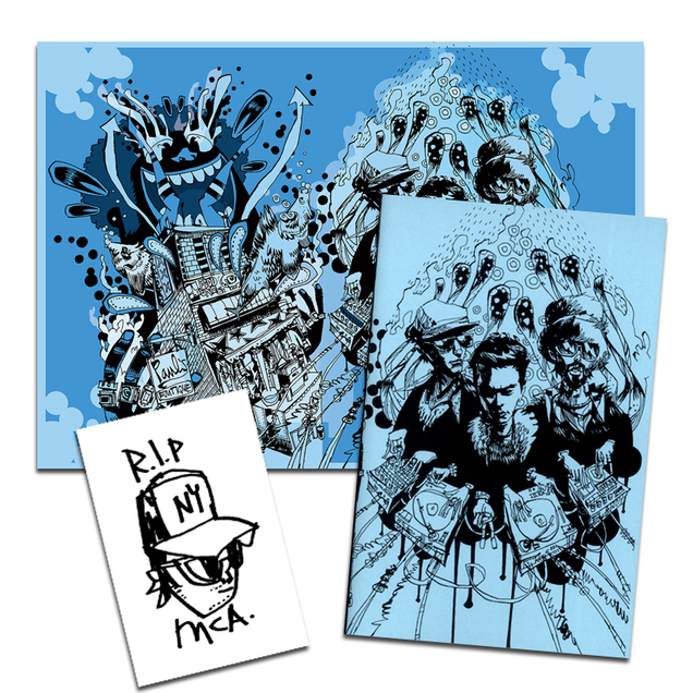
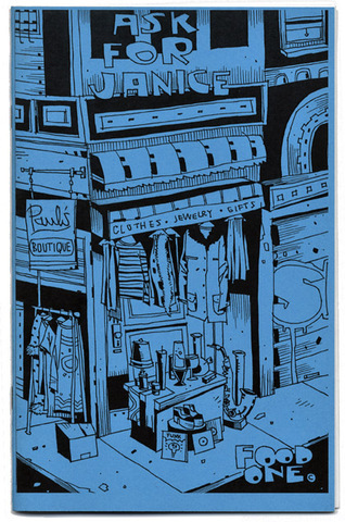
A new remix edition of Jim Mahfood’s classic, out of print 2007 mini-comic all about the ‘Paul’s Boutique’ album has just been released (see cover of the original version, left). For serious music heads and comic book fans alike, the man who did the illustration for our ‘Caught In The Middle Of A 3 Way Mix’ has updated his ode to the Beastie’s classic LP.
Each track is dissected with lyrics, samples and making-of facts alongside illustrations referencing the subject matter. It’s a beautiful tribute to the album, which Jim has said he listens to at least once every week, and made him the first choice for an image when we were compiling our mix.
The new version features a brand new wrap-around cover, new inside front and inside back cover art, 32 pages, black ink printed on light yellow paper. Signed and numbered by Jim. Also available, the new ‘Paul’s Boutique’ Limited Edition Giclee Print and the ASK FOR JANICE Funk Pack. Dig it! Available here…
Only 3 more weeks until Hellboy In Hell arrives in stores, written AND drawn by the great Mike Mignola for the first time in years. If you’re new to this and fancy jumping on then now’s the time to do it and this handy resumé of Hellboy’s history popped up on the web a few weeks back.
Not that it’s any substitute for reading the actual stories (about 11 collected graphic novels now I think plus a handful of spin offs and B.P.R.D. which is a whole other story). Also this board had been created on Pinterest: The Gothic Genius of Mike Mignola if you need a fix of his artwork anytime. 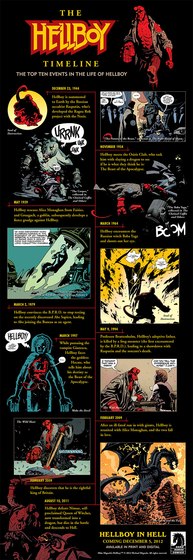
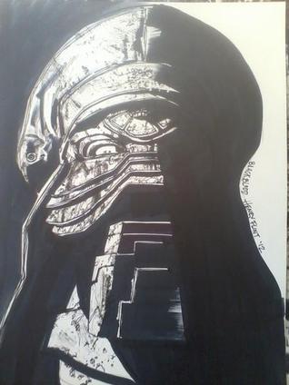
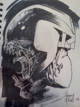 “just a sketch” says Henry Flint, better than some people’s finished pieces. From his twitter feed.
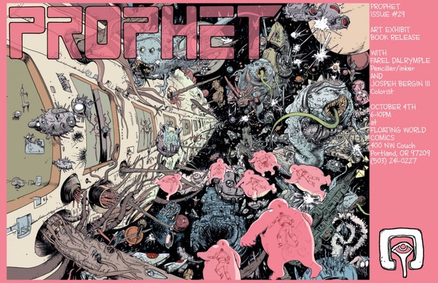 If off-the-hook sci-fi is your thing then you could do worse than read Brandon Graham‘s Prophet, now up to issue 30 although it’s a reboot of an old title so the new book actually started at issue 21. With a revolving roster of artists and short back up strips in each issue it has more ideas in one page than some comics have in a whole issue. Graham has also just launched another title that he draws AND writes – Multiple Warheads – which is similarly bizarre and comes off the back of his huge King City collection.
Nice way to start the day 
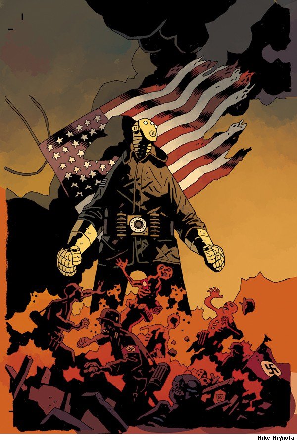 There’s been a lot of press recently about both the impending B.P.R.D. issue 100 and Mike Mignola‘s return to Hellboy as artist with ‘Hellboy in Hell‘. Several articles have revealed forthcoming B.P.R.D. stories, the most interesting of which looks like ‘Sledgehammer’, a wartime agent not revealed before. Here are Mignola’s covers for the 2-parter that debuts next year – via the Comics Alliance site, more interior art over there too. Looks a bit like the Iron Man of this particular universe and I predict this is going to push all the right buttons with fans when it arrives.
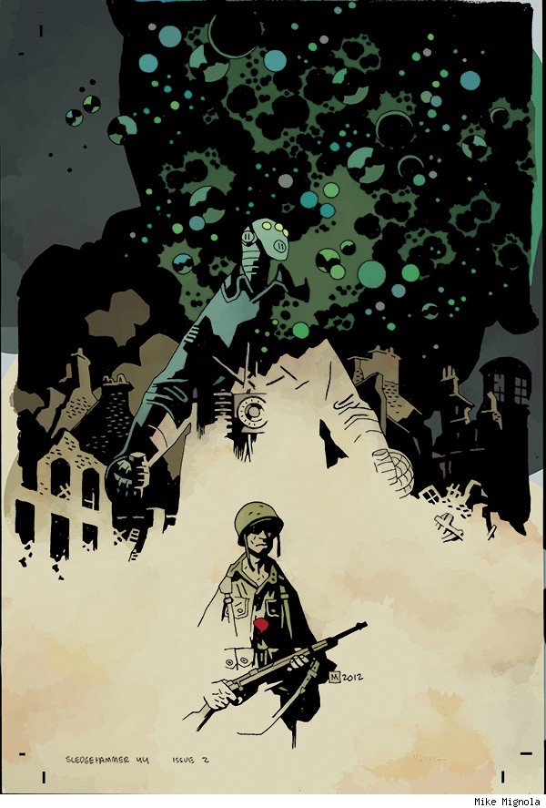
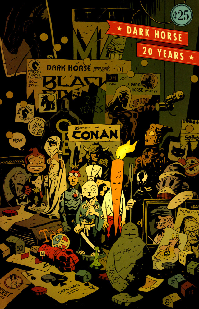
Also Brian Bendis posted this old Dark Horse anniversary cover by Mignola a few days back on his twitter, lovely stuff.

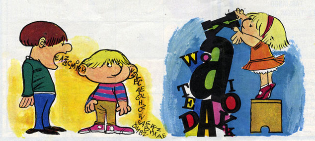

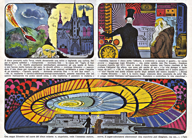
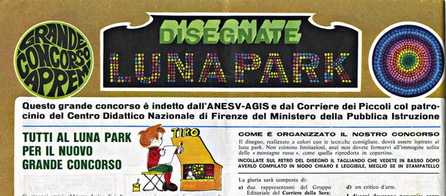
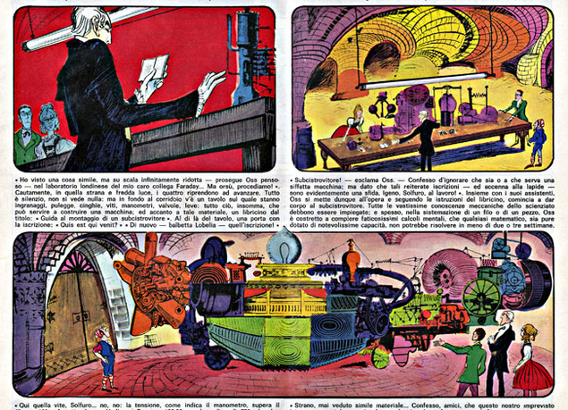

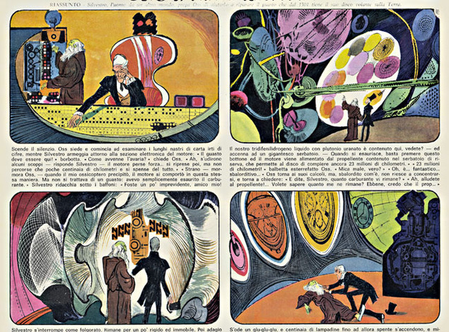
 Furthermore to the post I made back in June about a little magazine haul Steve Cook and I made – here’s some more. Check the Kirby-ish collage on some of the illustrations, the psychedelic lettering and the gorgeous colours.
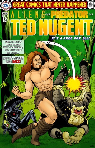
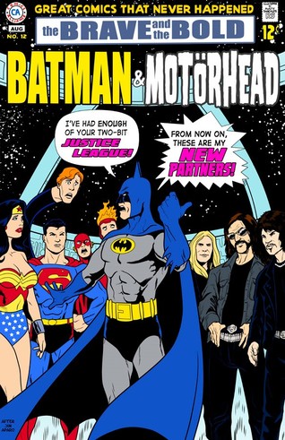
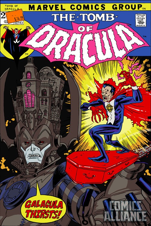
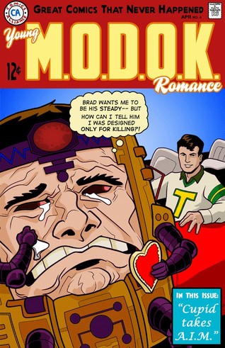
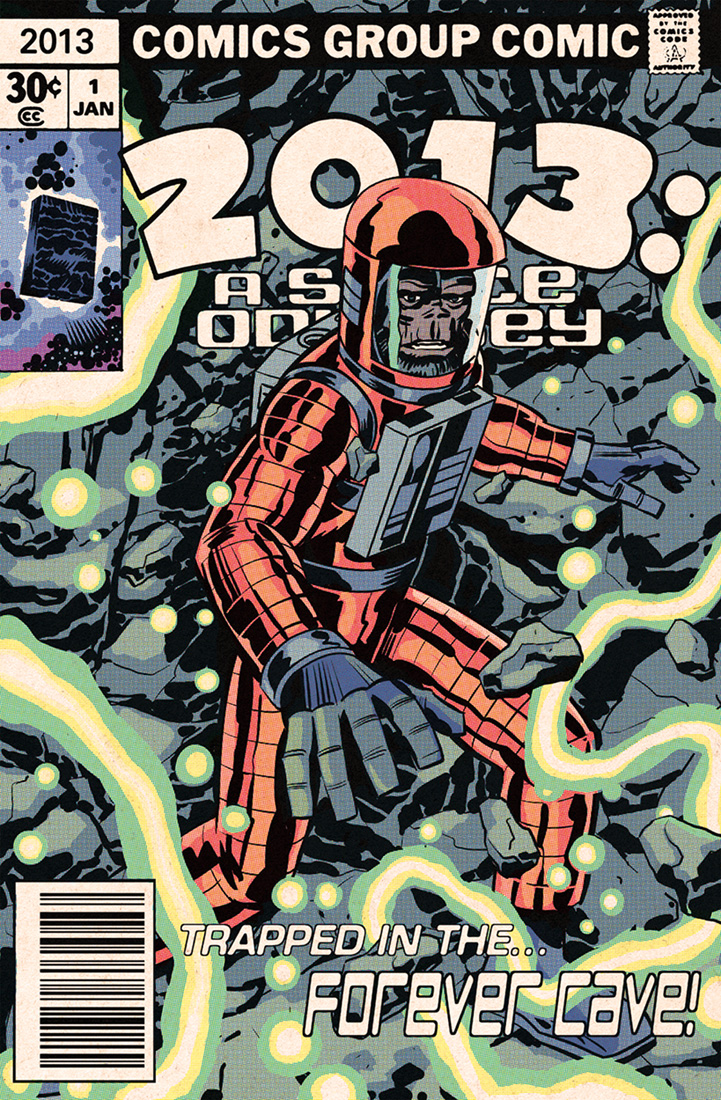
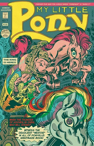 Self-explanatory title for a series of covers to comics that never were on Comics Alliance. The Kirby-does-My-Little-Pony did the rounds a while back and there many more but these are my pick of the bunch.


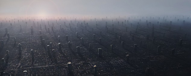


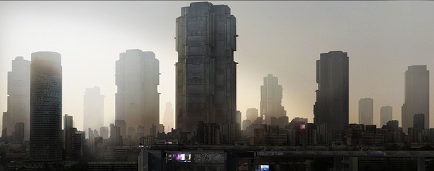
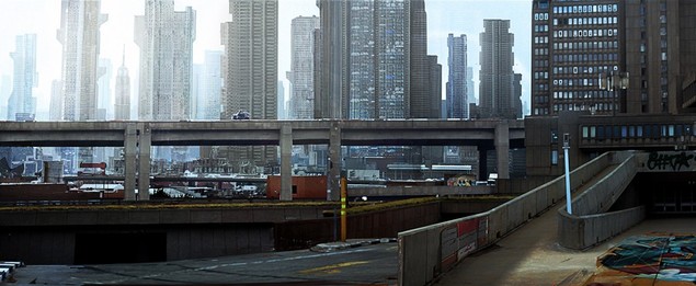
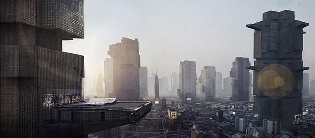
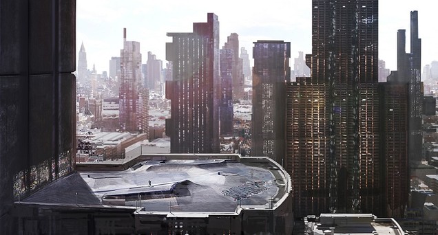
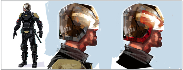
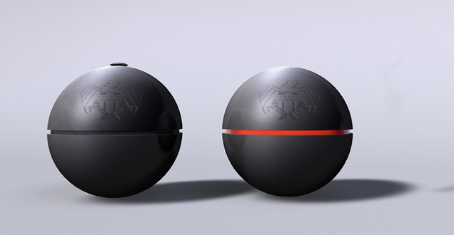
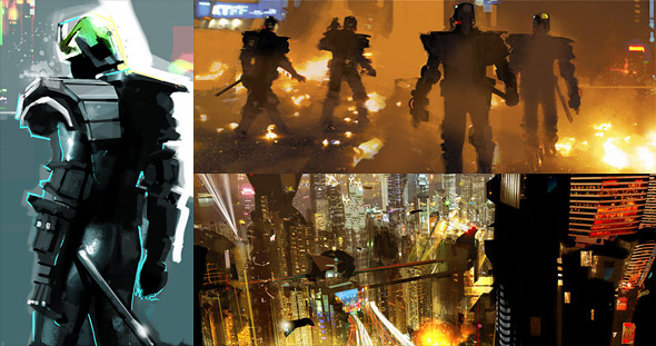
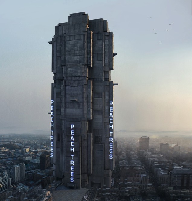 More Dredd concept art and Mega City scenes from the film. Some of these are by Jock , some by Neil Miller VFX (check his site for tons more) and some by Daren Horley. It’s a shame the film didn’t have as glorious an opening weekend as in the UK. Reading comments on some websites it seems that the Stallone film did more damage than we thought with a lot of Americans thinking that this was a remake of the 1995 film rather than a new take on a 35 year old character. Depressing.
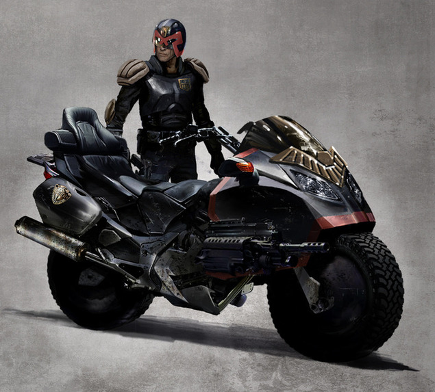

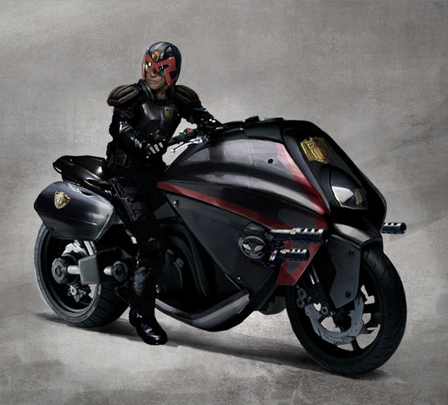

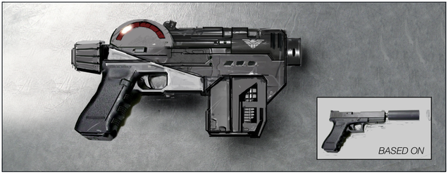
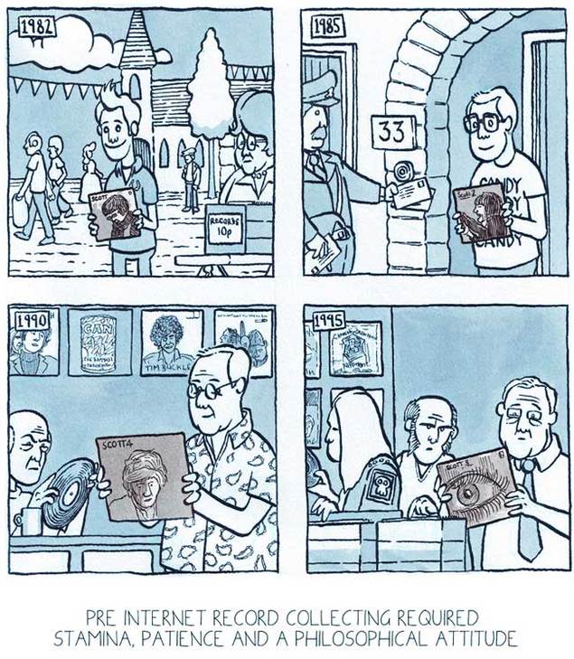
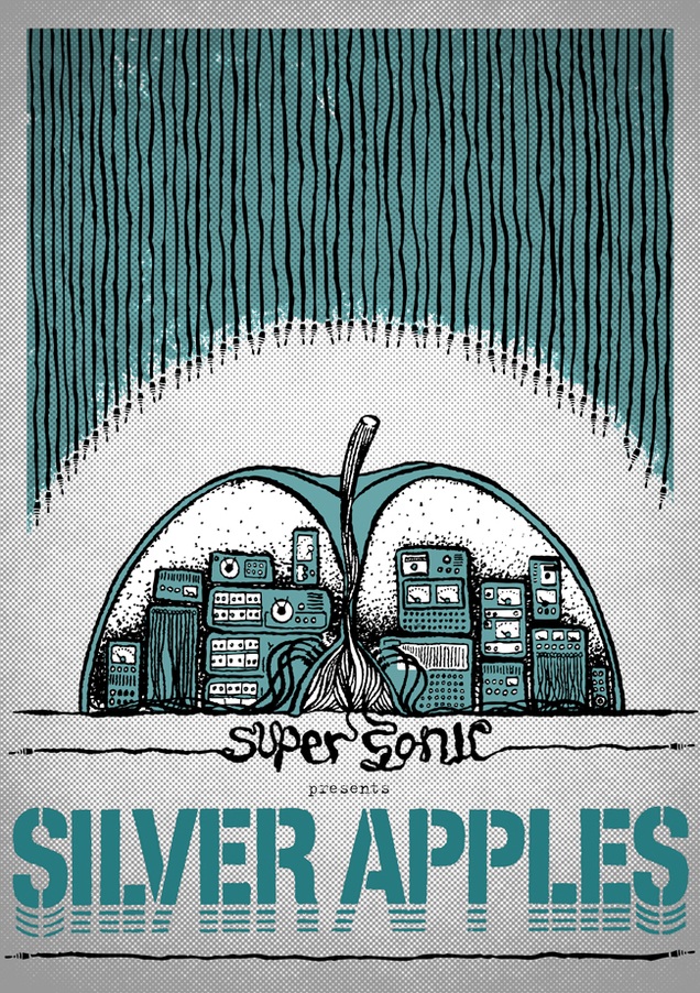
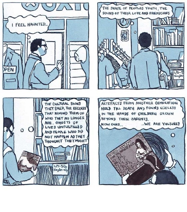
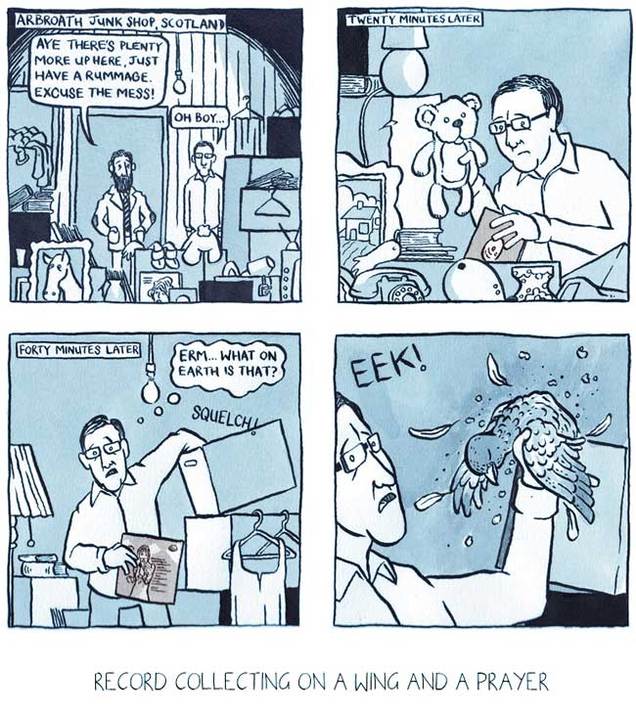 I love these short comics about record collecting by illustrator Mat Pringle, especially the Scott Walker one, easy to forget pre-internet era collecting. He also does a fine line in prints, gig posters (see the Silver Apples one below) and the odd Threadless shirt design too.
Talented guy, see more at his site.
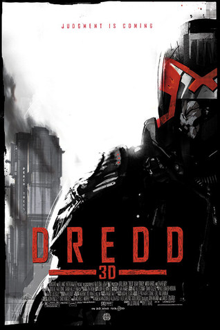 Being that Dredd3D just came out in the US after the UK premiere 2 weeks ago (special poster for Mondo by Jock, left) there have been numerous articles on which stories new readers should read up on should they want more from the character’s 35 year history. I thought it would be interesting to re-read one of the classics to see how well it held up today and see what others may be encountering for the first time.
‘The Cursed Earth’ is the first Judge Dredd ‘epic’, ie: a long form story recounting a significant event in the Dredd mythology. It ran from Prog 61 to 85 in 2000ad, way back in 1978 and coincidentally the premiere episode was also the first issue of the comic I ever bought as a child so I have fond memories of it.
Reading back through the collected edition was an enlightening experience though, all the art was present and correct, forever burned into my brain as I’d looked at it a thousand times as a child. The big shock though was the dialogue from writer Pat Mills, the man who started 2000ad and went on to write so many great strips for the comic but wasn’t Dredd’s main creator (that accolade falls to John Wagner and Carlos Ezquerra). Baring in mind that this was the late 70’s and 2000ad was slowly reinventing what British boys comics could be, it’s interesting to see how the character has developed with age and return to a time when storytelling was a lot more simplified.
I’ve picked out a few choice panels which made me smile but probably wouldn’t appear in today’s version of Dredd. Only two artists drew the saga* – Brian Bolland, all clean lines and perfect anatomy, and Mike McMahon – a scratchy, rough style with the classic big booted look to his characters. Each are fan favourites and both helped define the Dredd uniform as we know it today. *(Dave ‘Watchmen’ Gibbons actually inked a couple of Bolland episodes too for the record).
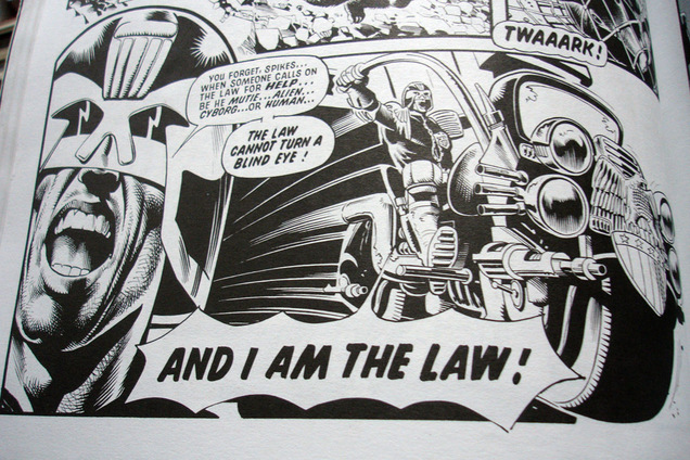
The panel above is hilarious and unfortunately there are a lot more like it that turn up throughout the epic. I wouldn’t be surprised if Sylvester Stallone read this and took it as gospel for his performance in the 1995 version of the film. Of course, back in 1978 this was gung-ho Dredd and my 8 year old self probably thought it was great.
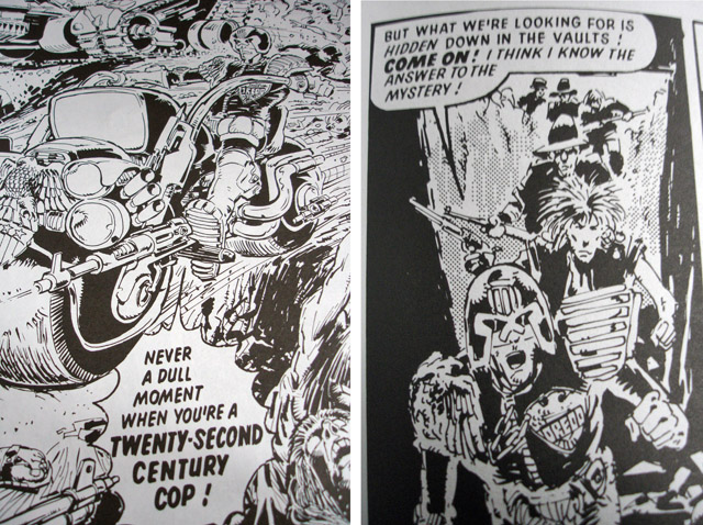 The image on the left above is from the opening splash page of the first episode, check that dialogue – wow – another spiky speech balloon too which usually meant the character was shouting. To the right of it, Dredd goes all Scooby Doo trying to solve the mystery of a vampire terrorizing a village. It turns out to be a trio of medical robots who need fresh blood for the body of the cryogenically frozen last president of the United States.
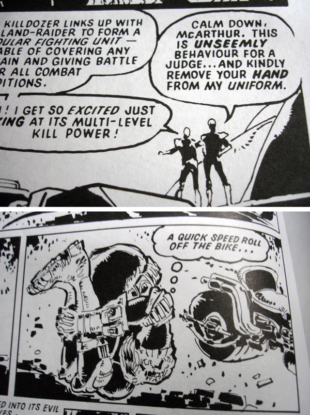 Some campy comedy in these two panels, Dredd wouldn’t be so polite in the top one these days and the little ‘speed roll’ thought bubble made me laugh. More often than not this kind of thing would be said out loud preceded by a, “only one chance!, got to…”.
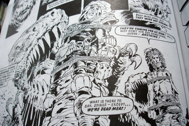 Above is one of the cliffhanger end panels that they were so fond of back in the day and still have their place in today’s comics too. I love the fact that he’s about to be eaten by a Tyrannosaurus and he still has the time for a bad gag to round things off.
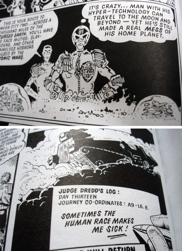 Conscious Dredd: you can see Pat Mills’ own concerns with the environment and man’s cruelty to others shining through here in Dredd’s own thoughts, something of a rarity in comics back then.
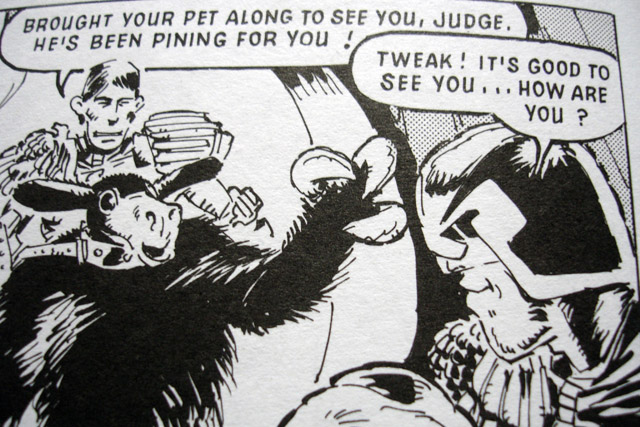 Dredd in smile shock! Yes, he does crack the occasional smile but it’s as rare as hens teeth these days.
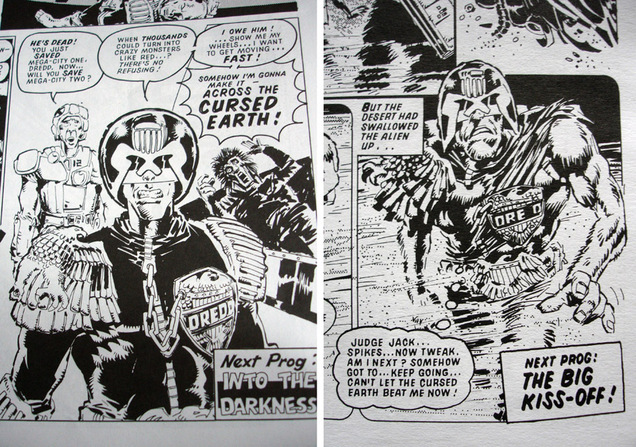 Two more final panels, the left one from the end of the first episode and the right from the penultimate part. Note the change in the character’s uniform and progression in drawing style by McMahon in just the space of 20 odd episodes. The rounded helmet has been straightened out and the chin is bigger – both artists really nailed their own takes on him during this run and helped iron out a lot of the creases in the original designs.
For a very enlightening insight into the creation of the character and the comic landscape at the time head over to Pat Mills‘ new blog as he goes into detail on the genesis of Dredd’s creation.
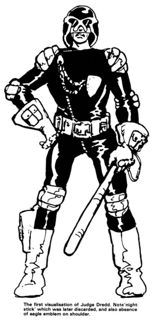
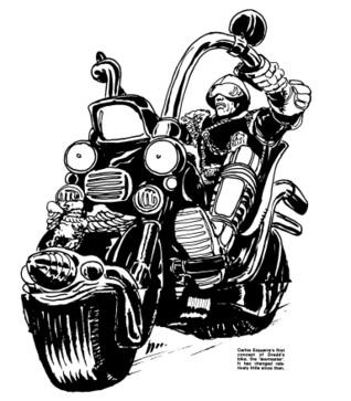
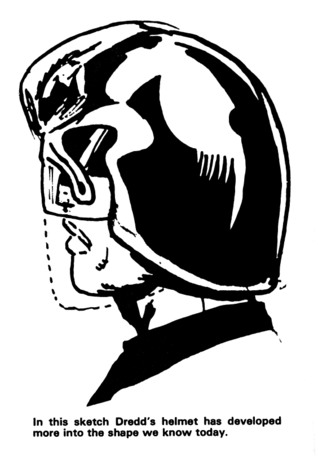
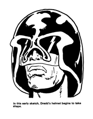
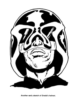
 These images recently came up in an old 1994 2000ad monthly my friend David Vallade got from his local library. Carlos Ezquerra‘s original designs for Dredd, his lawmaster bike and law giver gun.
The style of the 70’s is present in the chopper-esque bike proportions and flared gloves. Note the diagonal zip on Dredd’s uniform and lack of eagle shoulder pad.
“Dredd’s breast chain and badge actual predated punk fashion and with the black clad uniform, screened by a black helmet and his knee-length boots, he was the most exciting British comic book character that radiated menace” – Steve MacManus‘ ‘The Judge Dredd Story’ 1994.
