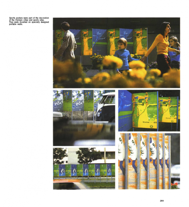
Transistor Tube Map Radio

.

.
.

Is it a circuit board? Is it a map of the London Underground? Is it a radio? It’s all of the above apparently.

I don’t usually go for things like this – one household object adapted to form another, like those vinyl record bowls – but the Tube map is a design classic and I have a thing for circuit boards.

Designed and built by Design Museum artist-in-residence Yuri Suzuki, these images come via the DesignBoom website. More info and a short film over there.

Posted in Art, Design. | No Comments |

Reso – ‘Check 1,2’ single

Love Reso‘s stuff, always interesting to see where he’s going with things. Great cover on this one, slightly reminiscent of the Tame Impala one I posted below with the pink/red sticker and abstract image.

The track, ‘Check 1,2’, is a killer slice of 100bpm break beat thunder which reminds be of some of those old Prodigy B-sides that were better than the A-sides. Remixes come from Starkey, DJ Kentaro, Emperor and Danny Scrilla and it’s out on Civil Music on 12″ and DL with an album forthcoming.

Posted in Design, Music. | No Comments |

Sculpture – print & spin zoetropes and ‘Slime Code’ 12″


Sculpture recently posted these zoetrope designs on their site, if you print them and spin at the right speed you can get some amazing animated effects. The complexity of these blows my mind, there’s so much doing on I could look at them revolving forever it seems. The Digitalis label are releasing edits of ‘Slime Code’ (a tape-only release in an edition of only 7 copies (!) from earlier this year) and you can listen to excerpts here. I’m hoping that at least one of these designs will be on the vinyl release in November.

They also have a new Tumblr too.

Posted in Art, Design, Film. | 2 Comments |

Drumsound & Bassline Smith cover

Love this cover and I was talking to the photographer who shot it the other week because he was explaining that it’s all real, not CGI as some people might think. They’ve been lugging it about all over the place photographing it in different locations but I’ll be damned if I can remember who it was I was talking to? Frazer Waller maybe?

Posted in Design, Photography. | 2 Comments |

Limited edition Herbaliser LPs stencilled by Snub23

Incredible stencil work done by Snub23 for the ultra limited edition (and sadly sold out) deluxe LP bundle for The Herbaliser‘s new album, ‘There Were Seven’. You can however buy the regular vinyl (but not for long as that’s a limited run too), designed by yours truly, from the Herb’s online shop, (click the red ‘store’ button top right for a pop up). Each one comes with two printed heavy card inners inside a screen printed PVC sleeve with a downlode code too.


Inkymole does Playboy

My good friend Sarah Coleman, aka Inkymole, who recently put on an exhibition of mine and Henry Flint‘s work, has done the cover for the new US edition of Playboy!

No, she hasn’t given up the pen to strip off and become a bunnygirl but that’s her hand drawn type all over the cover. The mag has recently gained a new art director who is keen to get back to the days of old when it had some genuinely original designs fronting it.

For more info, and a look at past designs sourced from the ever-handy Secret Oranges blog, go to Sarah’s Inkymole site.

Posted in Design, Magazines. | No Comments |

Judge Dredd original concept art by Ezquerra

These images recently came up in an old 1994 2000ad monthly my friend David Vallade got from his local library. Carlos Ezquerra‘s original designs for Dredd, his lawmaster bike and law giver gun.

The style of the 70’s is present in the chopper-esque bike proportions and flared gloves. Note the diagonal zip on Dredd’s uniform and lack of eagle shoulder pad.

“Dredd’s breast chain and badge actual predated punk fashion and with the black clad uniform, screened by a black helmet and his knee-length boots, he was the most exciting British comic book character that radiated menace”Steve MacManus‘The Judge Dredd Story’ 1994.

Posted in Art, Comics, Design. | No Comments |

Munich Olympics ’72 brochure excerpts

To the news that George Obsbourne just got booed by a stadium of 80,000 at the Paralympics medal giving ceremony, I bring you more beautiful design from the games’ past.
The gorgeous look for the Olympic Games held in Munich in 1972 was designed by Otl Aicher and his team. This is widely credited as a superb reaction to such a wide-ranging brief with everything working together in harmony to create a perfect look and feel.

Posted in Design, Event. | No Comments | Tags: , ,

Record bag designs from around the world

Wah Wah 1&2 – Barcelona’s best* new and used store for weird, psychedelic, electronic and everything else besides (*well it was the last time I was there).

I’m always on the lookout for interesting designs of all kinds and on my travels over the years I’ve kept a small collection of the more interesting record store bags I’ve found.

Rotate This – One from the many, many fine stores in Toronto, I love this, simple one colour on a brown paper bag.
Hi Fi – A Chicago staple, clean and simple (and they remembered the address)
Hot Wax – An oldie from Tokyo, the shop is down in a basement, the store that’s there now might not be called Hot Wax any more though.

Borderline Records – From Brighton, UK – the edge to edge illustration is pretty nice.

Fantastica – Great 60’s inspired design on silver plastic (you can’t really see that in the scan) This was a little shop in a back street on the first floor in Shibuya, Tokyo. It had the greatest collection of weird and wonderful records I found in that city in the 90’s. They even had an original copy of Afrika Bambaataa’s Death Mix 12″ but after picking out a ton of stuff with less than half an hour left before we had to go to the airport I discovered they didn’t take credit cards!

Aquarius – Nice Blue Note-esque design for San Francisco’s premier store for the weird and wonderful

Vinyl Planet – Another of the 50+ record shops rumoured to be open in Shibuya alone. This design is screen printed white onto a transparent bag (note Edan record inside).

Echo – Return of the Bag – They know what i’m talking about, unfortunately this design is let down by the fact that they didn’t put the shop address on it so I don’t know where to go back to get more records.

Posted in Design, Records. | No Comments |

Record bag designs from around the world

Wah Wah 1&2 – Barcelona’s best* new and used store for weird, psychedelic, electronic and everything else besides (*well it was the last time I was there).

I’m always on the lookout for interesting designs of all kinds and on my travels over the years I’ve kept a small collection of the more interesting record store bags I’ve found.

Rotate This – One from the many, many fine stores in Toronto, I love this, simple one colour on a brown paper bag.
Hi Fi – A Chicago staple, clean and simple (and they remembered the address)
Hot Wax – An oldie from Tokyo, the shop is down in a basement, the store that’s there now might not be called Hot Wax any more though.

Borderline Records – From Brighton, UK – the edge to edge illustration is pretty nice.

Fantastica – Great 60’s inspired design on silver plastic (you can’t really see that in the scan) This was a little shop in a back street on the first floor in Shibuya, Tokyo. It had the greatest collection of weird and wonderful records I found in that city in the 90’s. They even had an original copy of Afrika Bambaataa’s Death Mix 12″ but after picking out a ton of stuff with less than half an hour left before we had to go to the airport I discovered they didn’t take credit cards!

Aquarius – Nice Blue Note-esque design for San Francisco’s premier store for the weird and wonderful

Vinyl Planet – Another of the 50+ record shops rumoured to be open in Shibuya alone. This design is screen printed white onto a transparent bag (note Edan record inside).

Echo – Return of the Bag – They know what i’m talking about, unfortunately this design is let down by the fact that they didn’t put the shop address on it so I don’t know where to go back to get more records.

Posted in Design, Records. | 10 Comments |

Mexico ’68 Olympic brochure excerpts

Seeing as we are still in the grip of ‘Olympic fever’ I thought I’d post some excerpts from the brochures that accompanied the ’68 games in Mexico. There were at least 2 volumes and they included everything from historical background, art and architecture of the region, design styles and transport layouts.

The design team responsible for the look of the games was headed up by Lance Wyman alongside Eduardo Terrazas for urban design Beatrice Trueblood for Olympic publications, Manuel Villazon for the student design team and Peter Murdoch for special projects. I also have some from the Munich games which are widely considered the pinnacle of Olympic design.

Well Mexico.

Posted in Design, Event. | No Comments |

Lego love

Lego is a very big deal in our house with my boys making new things all the time and new figures or sets high on the birthday and Xmas list. I found this Enter The Dragon pastiche on the web and photographed the Star Wars poster on the tube back in March.

Posted in Design, Toys. | 2 Comments |