Loki title graphics and design

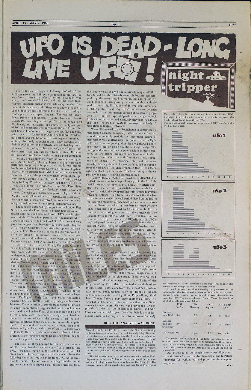
Marvel‘s new TV series, Loki, started this week on Disney+ and the title animation and design is fantastic, playing on ever-changing fonts, presumably to highlight the different facets and sides to the main character’s personality. Marvel have had some superior title work going on with both Wandavision and Falcon & The Winter Soldier recently, the former having individual, time-specific intro themes created for each episode. With Loki, this has stepped up a gear.

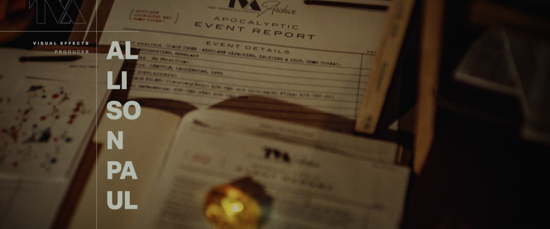
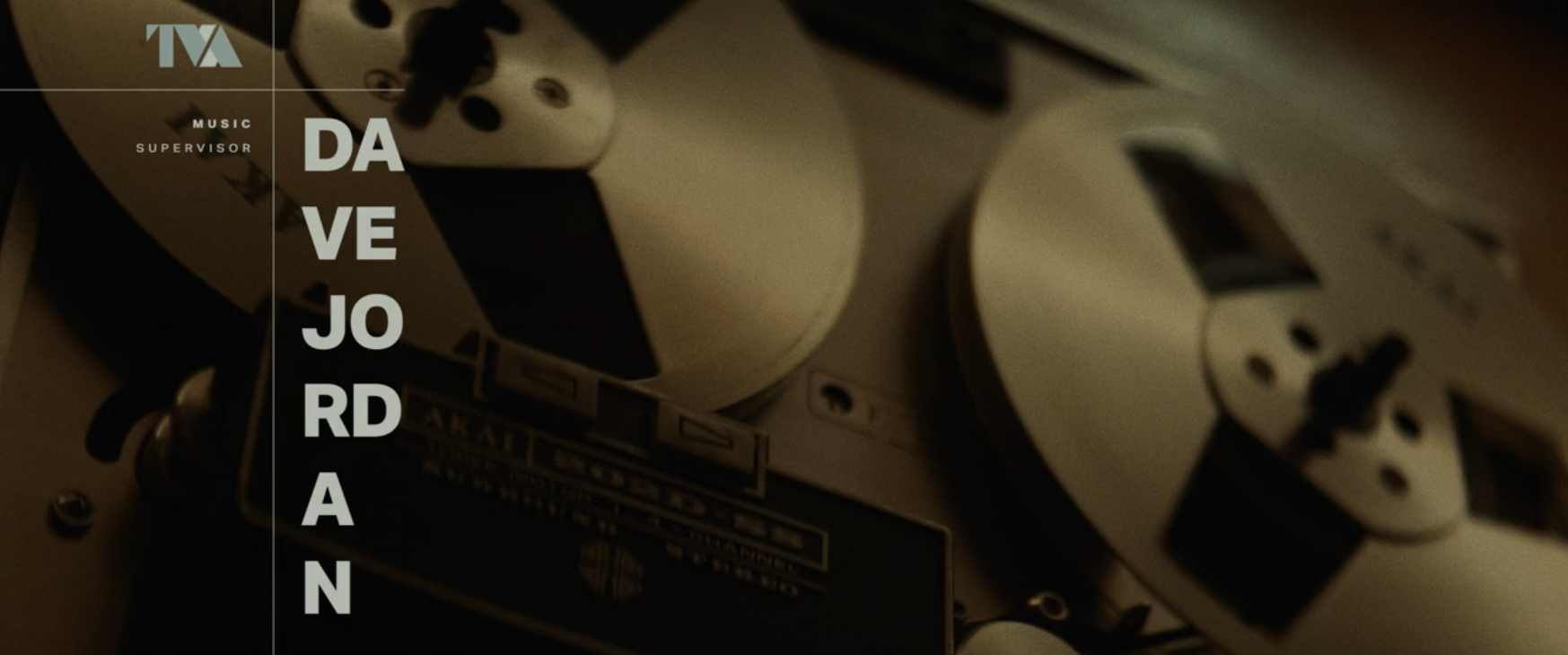
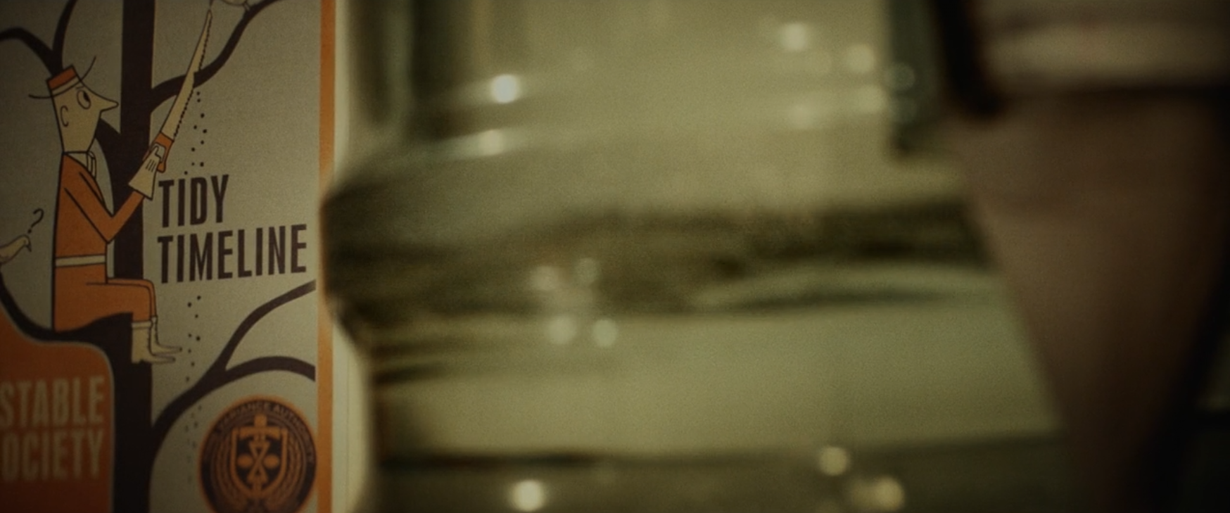
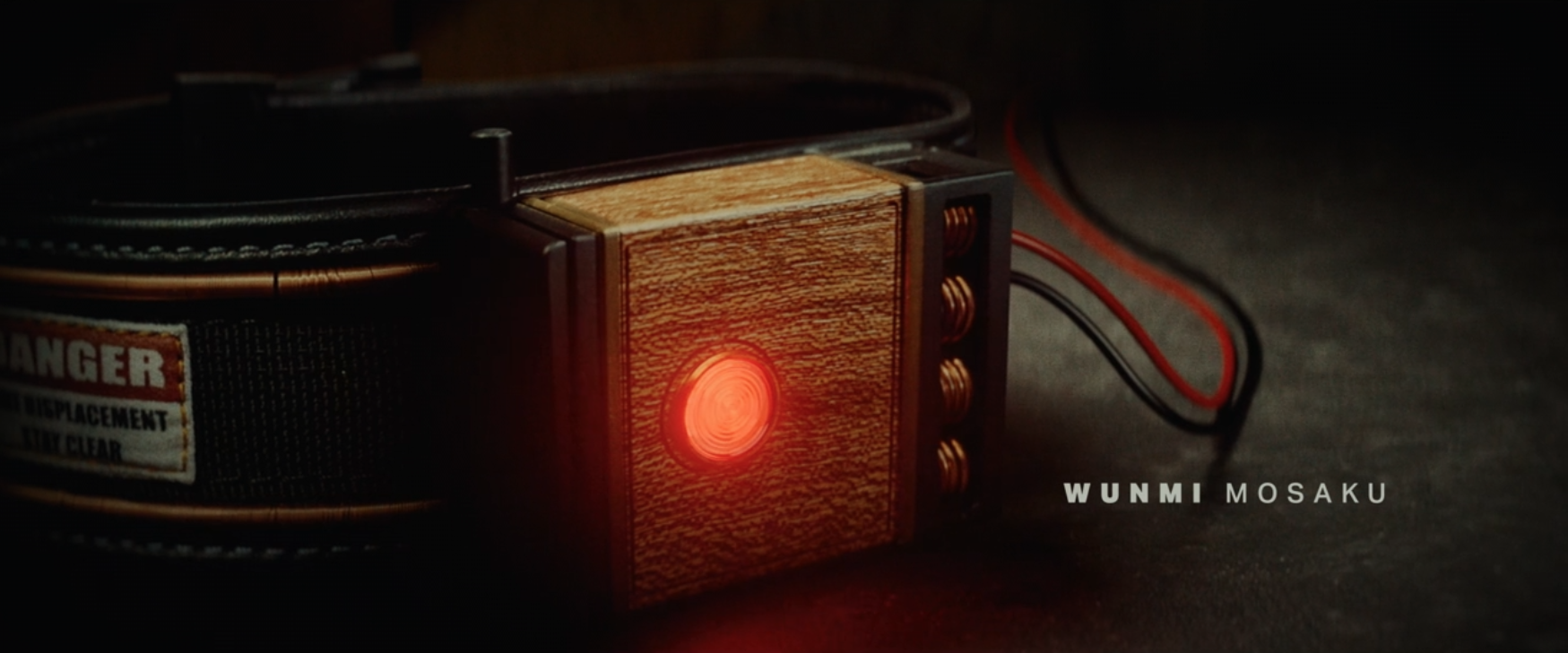
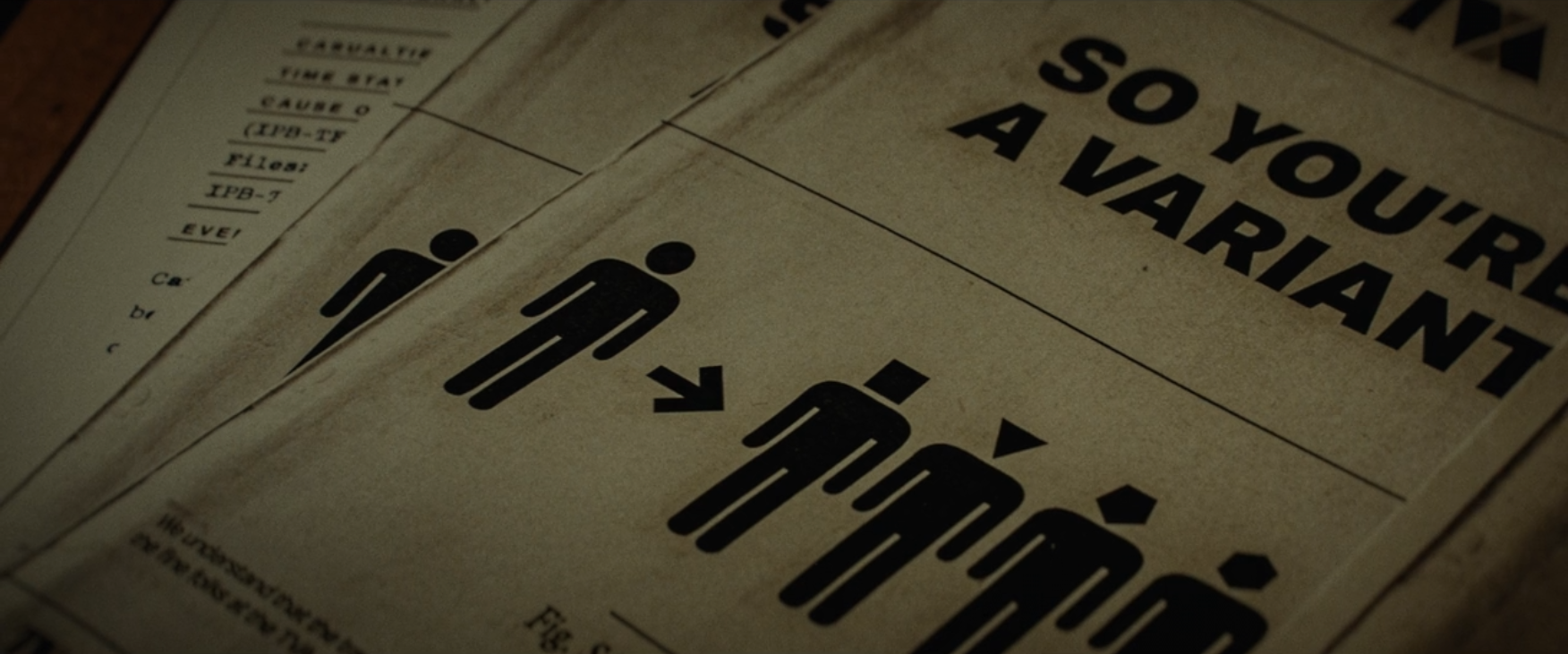
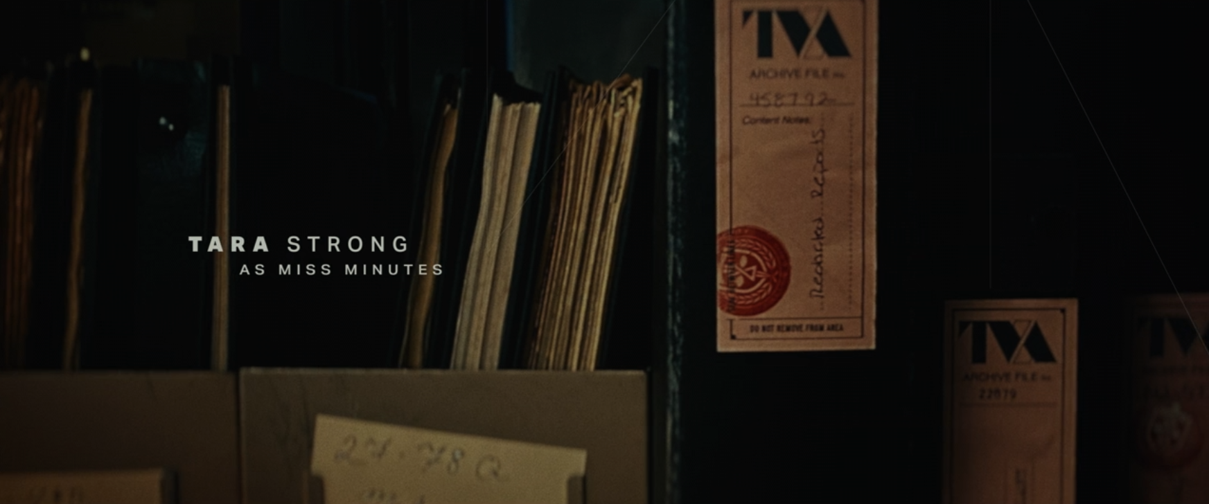
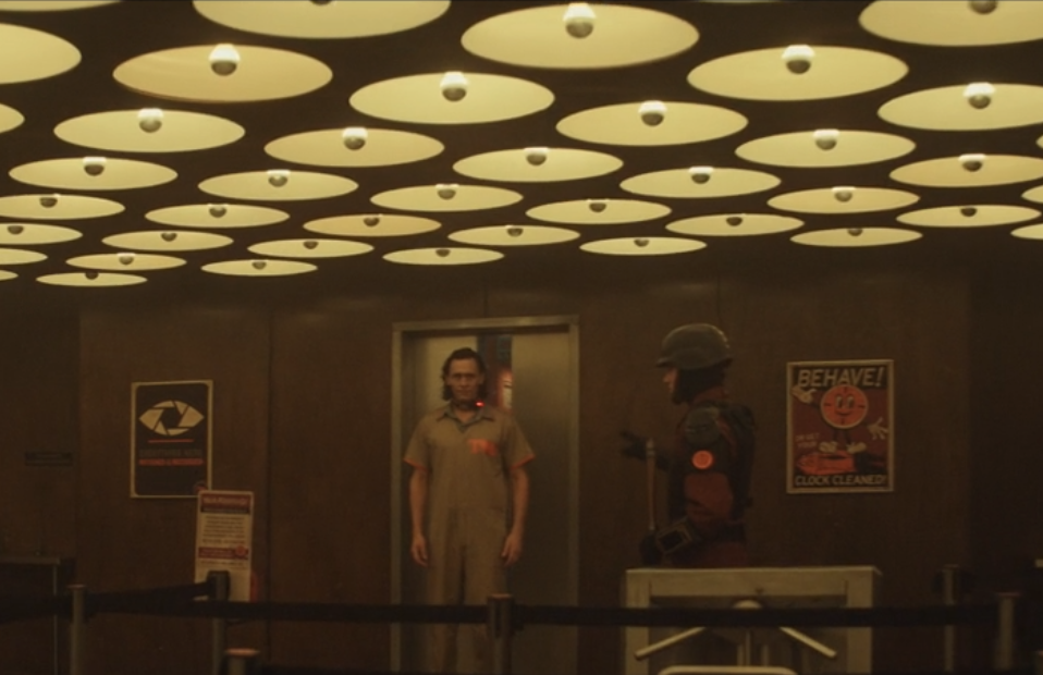
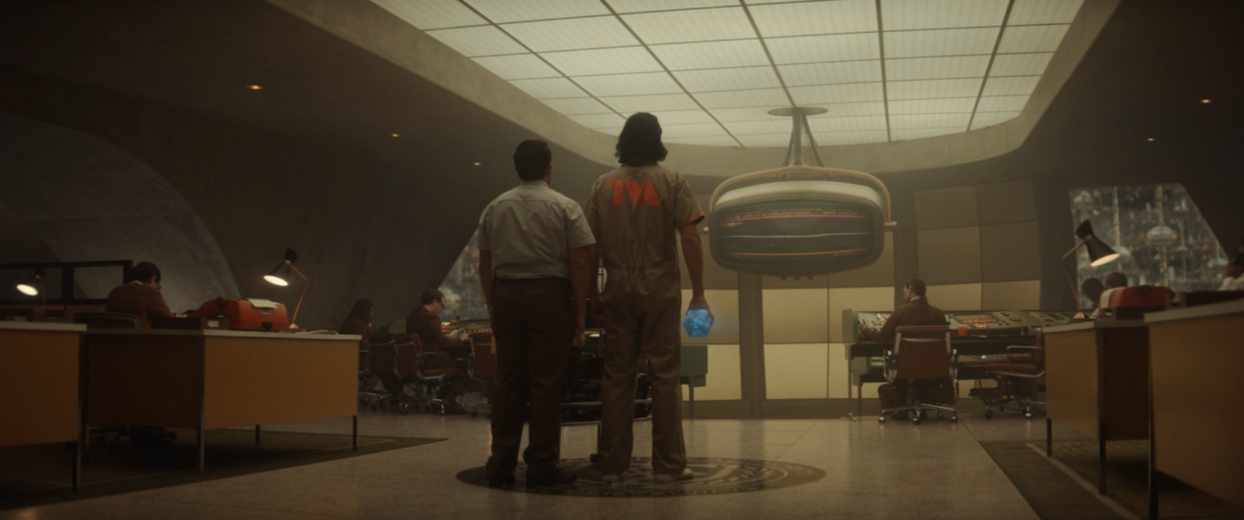
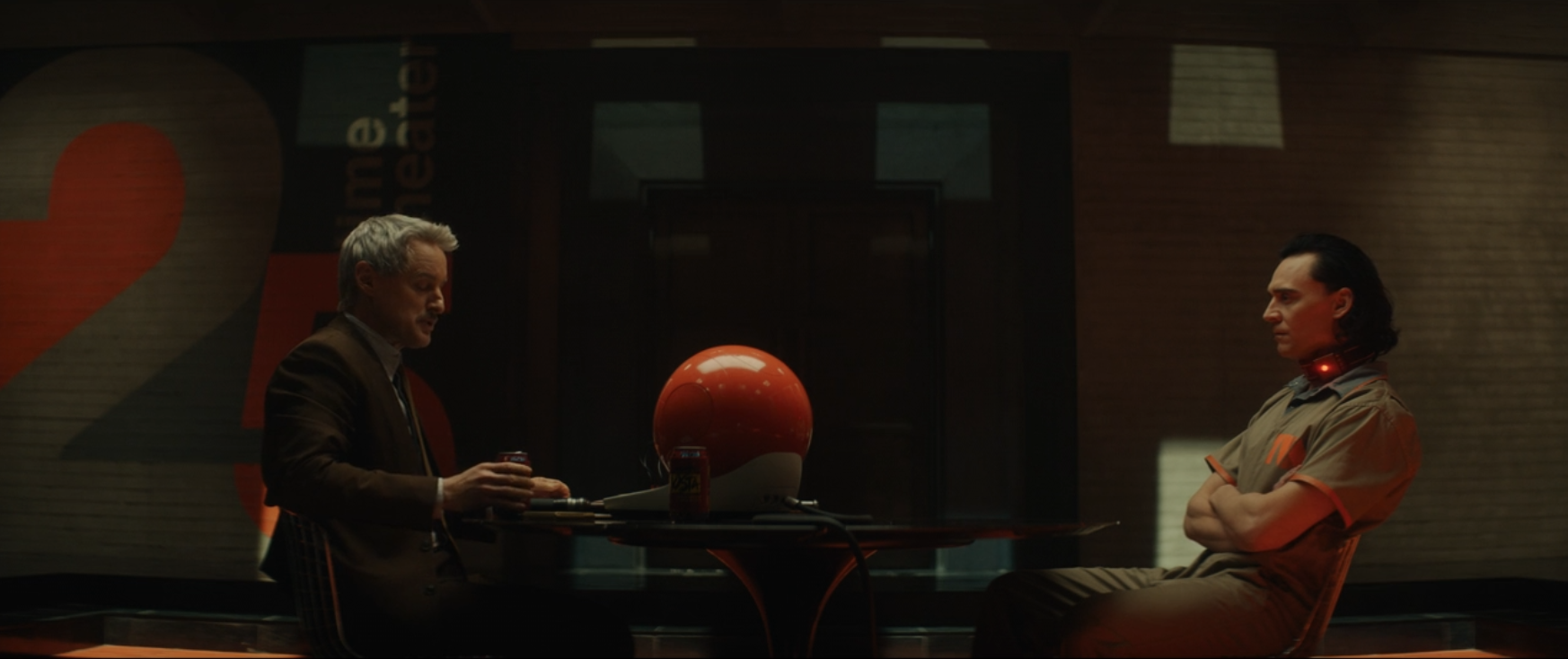
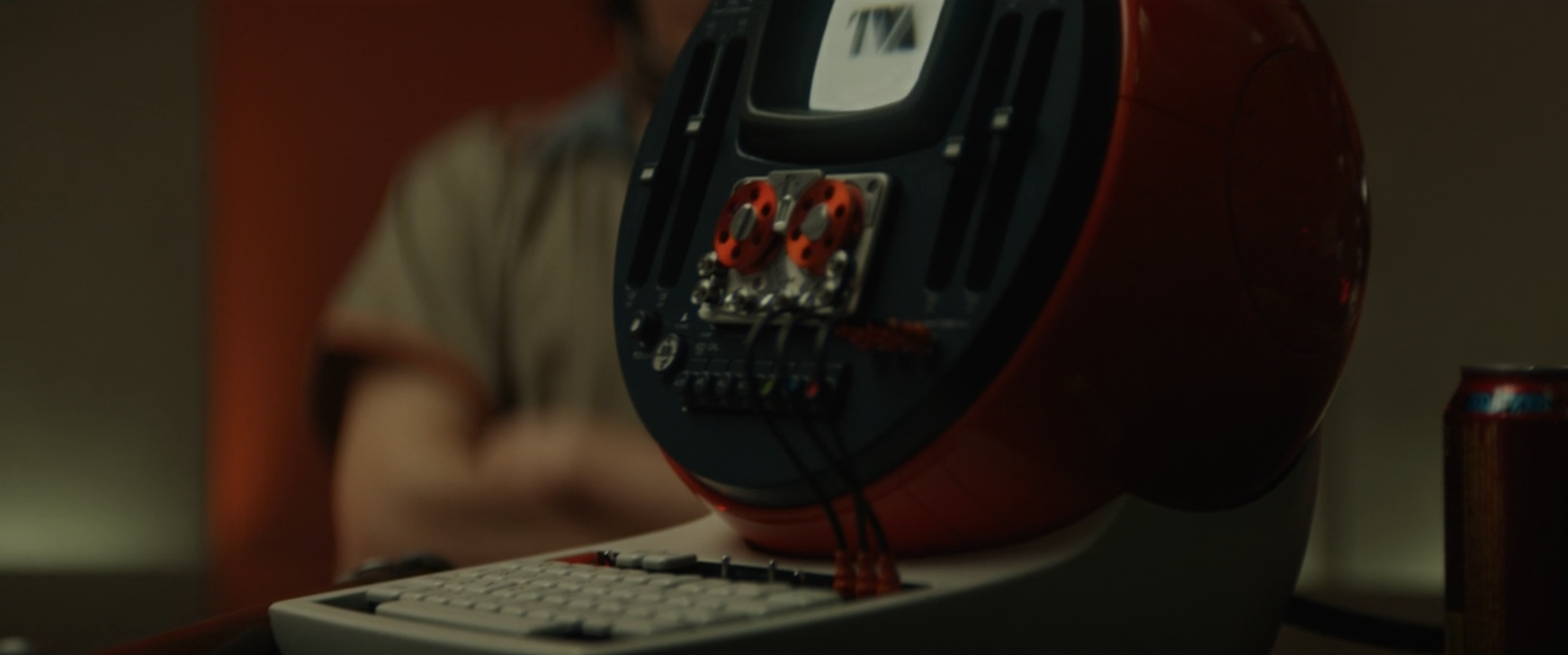
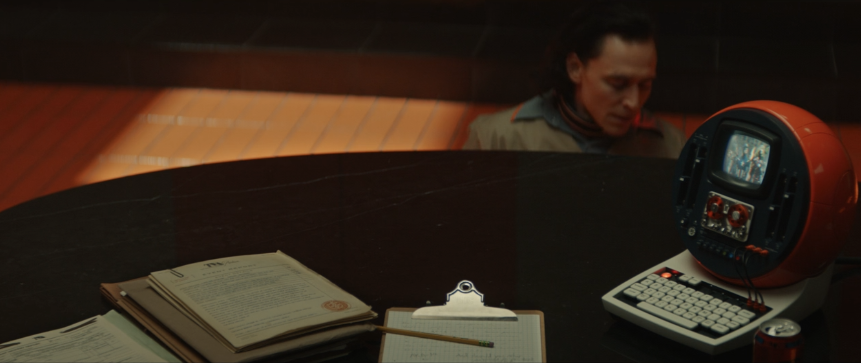
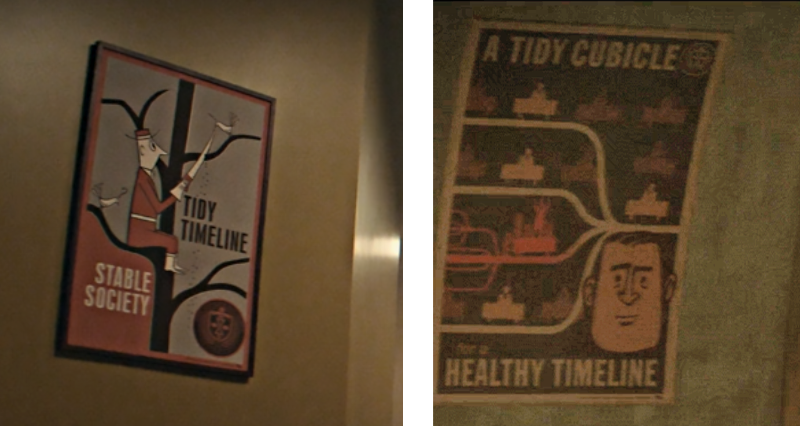
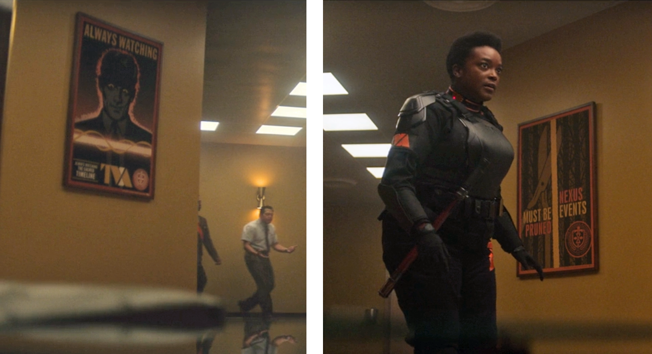
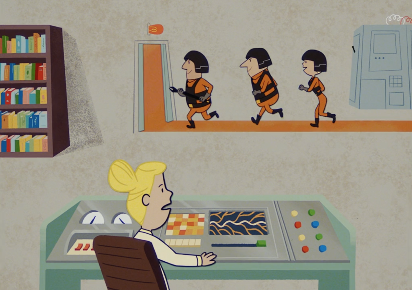
*slight spoiler alert!!* In the debut episode that appears to be a set up for a time travel chase caper where Loki may be both the good and bad guy, most of the ‘action’ is spent inside the TVA, a processing centre / court for those who disrupt The Sacred Timeline. The whole design of the Time Variance Authority has shades of Terry Gilliam‘s ‘Brazil’, with retro-modern tech, yellow tungsten lighting and 50’s styled public info posters adorning the walls.

TVA room TVA room 3 TVA room2TVA lift TVA console TVA console 2
TVA poster 1TVA poster 3+4TVA Miss Minutes

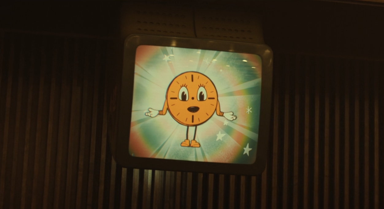
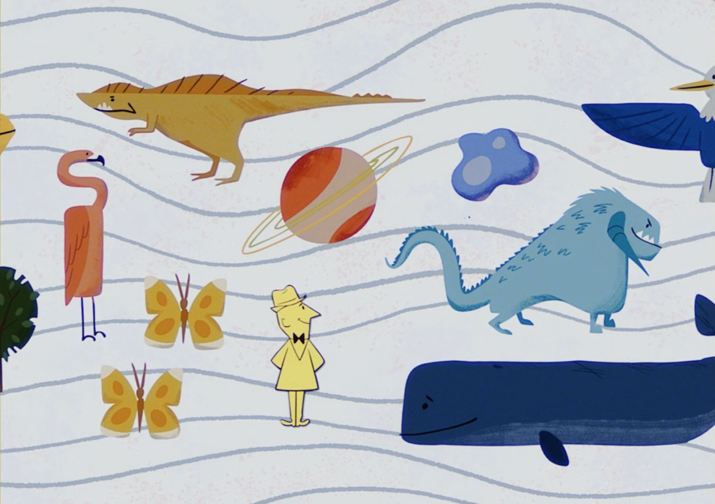
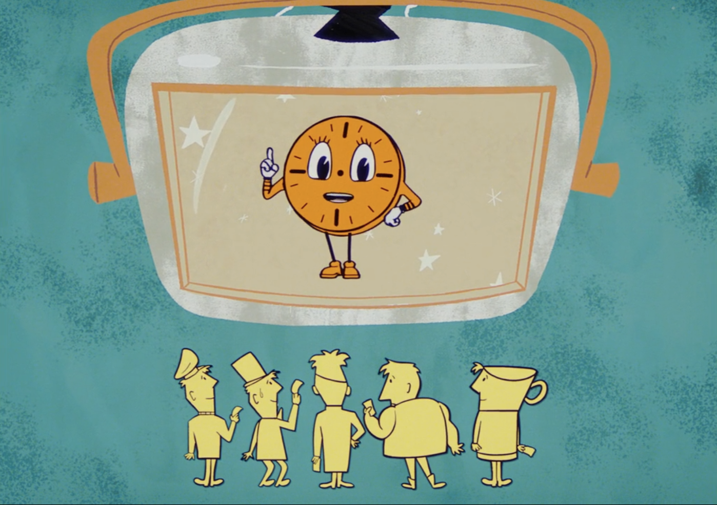
One of the highlights is a short animation, voiced by TVA mascot Miss Minutes, explaining what the agency does – for the audience’s benefit as much as Loki’s. It’s beautifully realised in what starts out as an 80’s Ulysses 31 homage before slipping into a 50s style similar to Charley Harper or some of the Halas and Batchelor cartoons like ‘Automania 2000’.

TVA film1 TVA film2 TVA film3 TVA film4 TVA film5 TVA film6 TVA film7 TVA film8
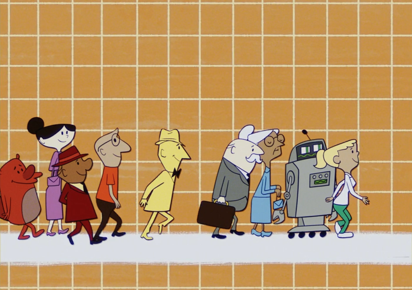
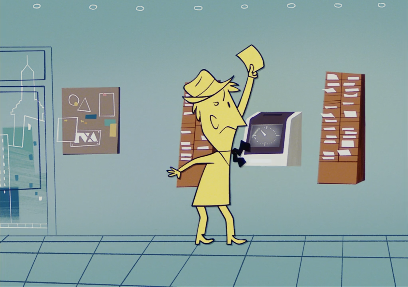
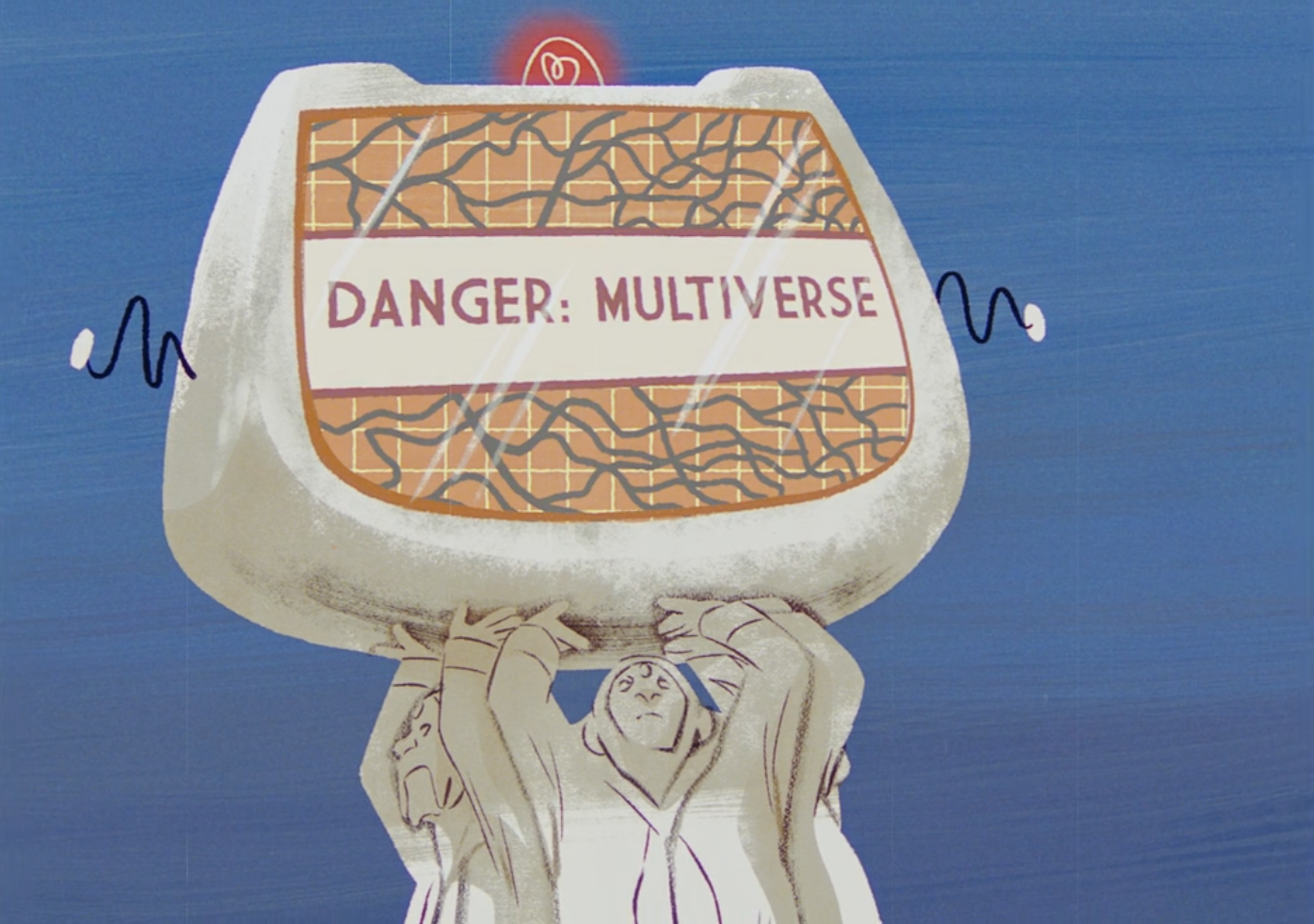
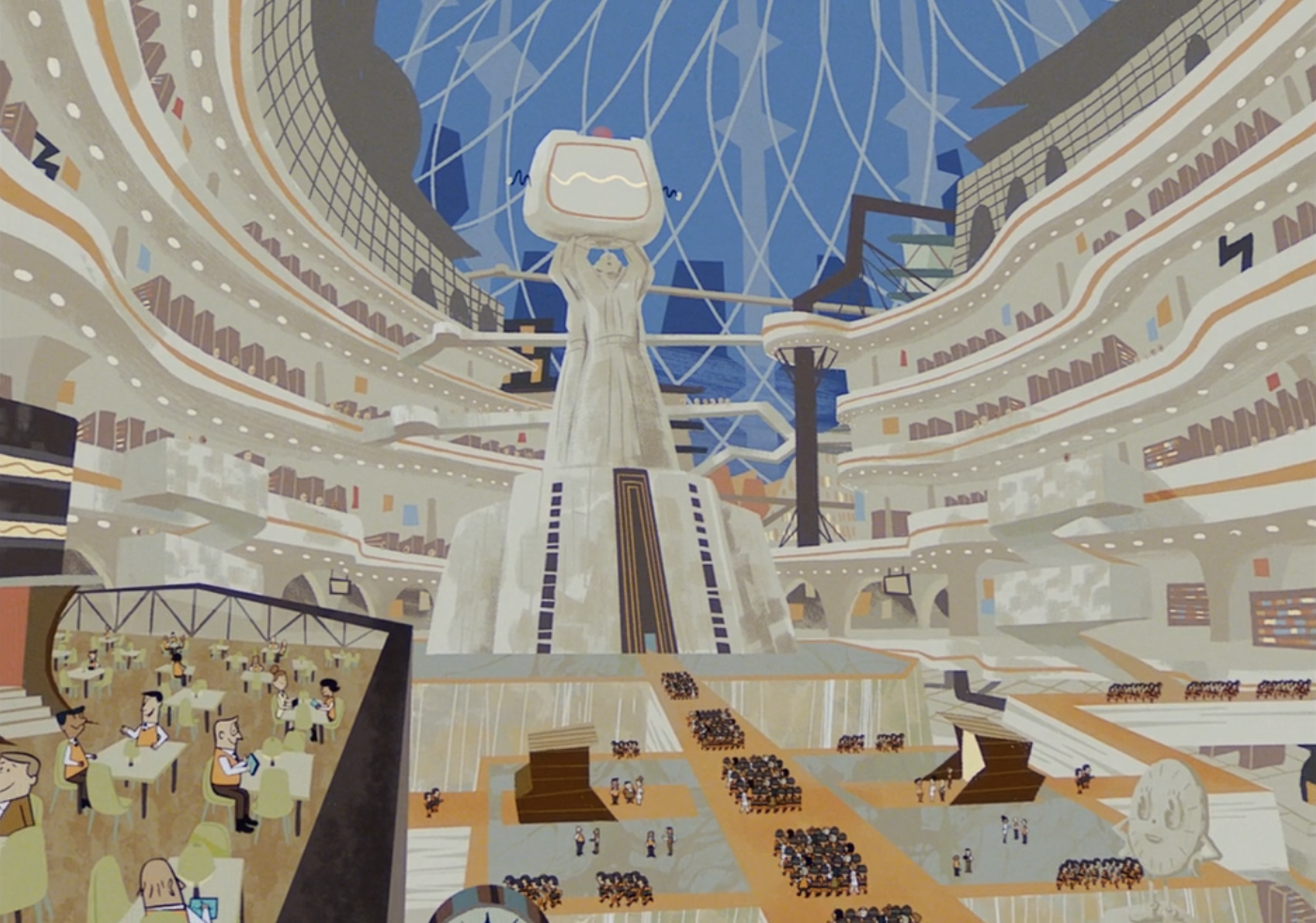
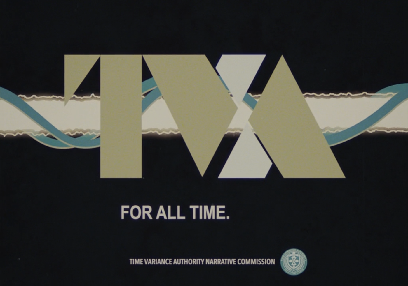
The TVA identity is nearer a 60’s/70’s airline / IBM look with employees wearing enamel badges, belt buckles and uniforms bearing the insignia as well as using headed notepaper and retro tech. Just like the work they do, design timelines seem to converge from different eras at the Authority.

TVA badge TVA scanner
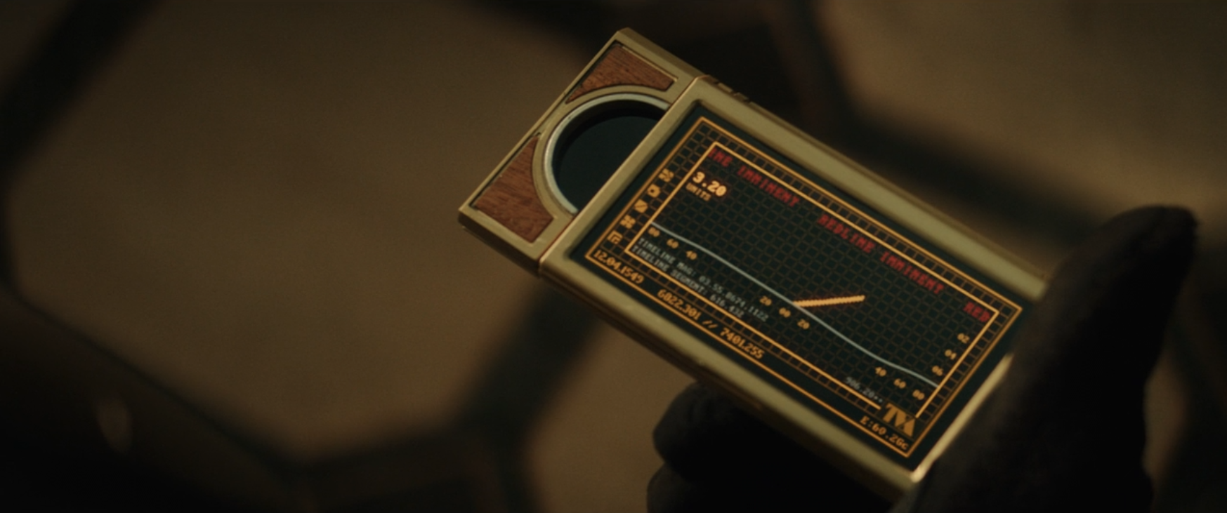
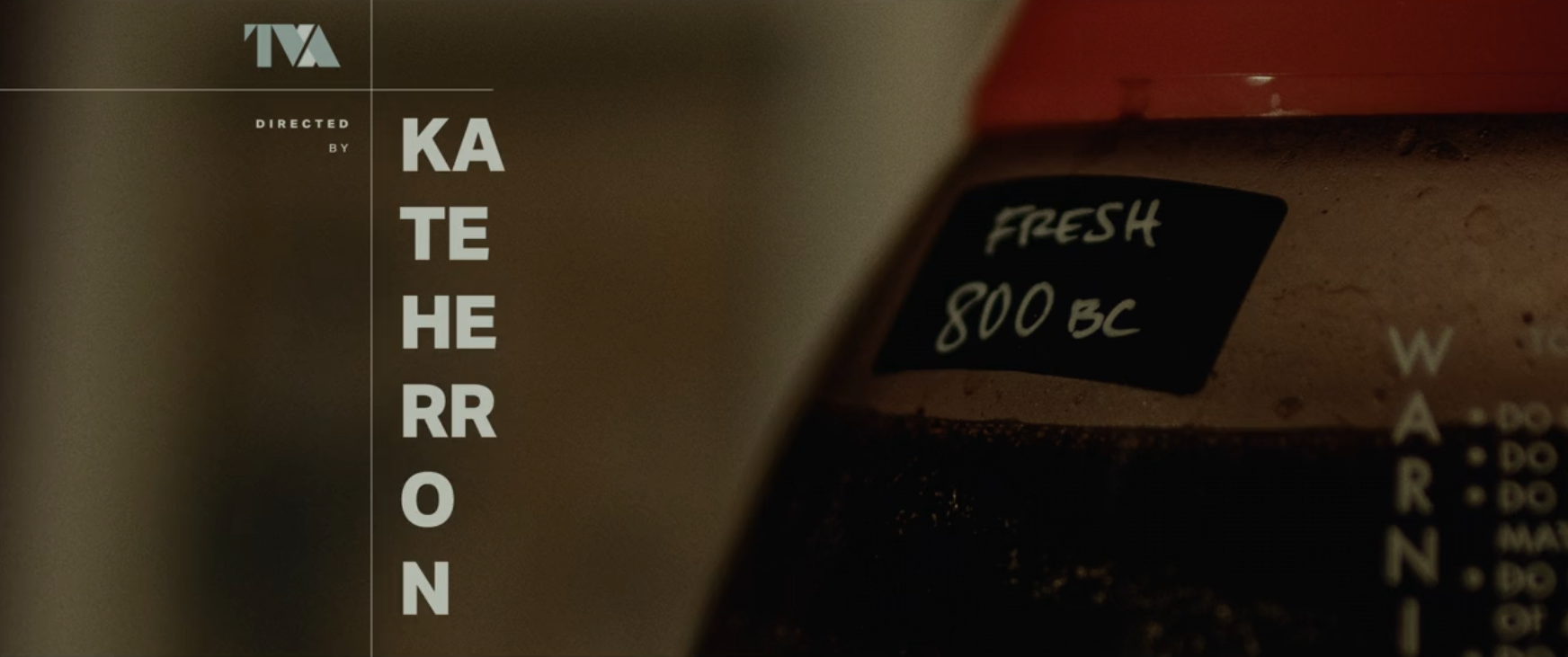
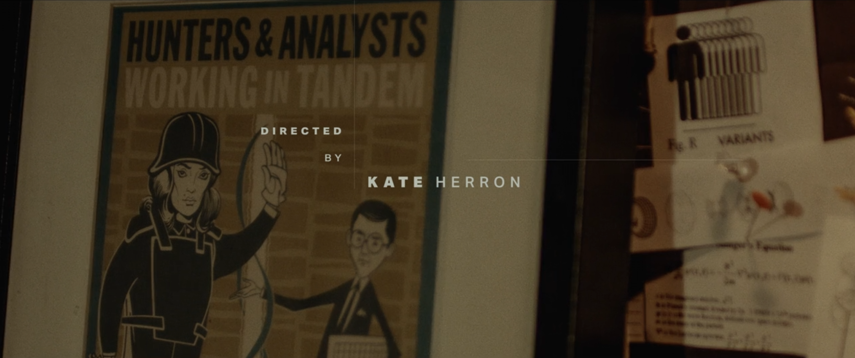
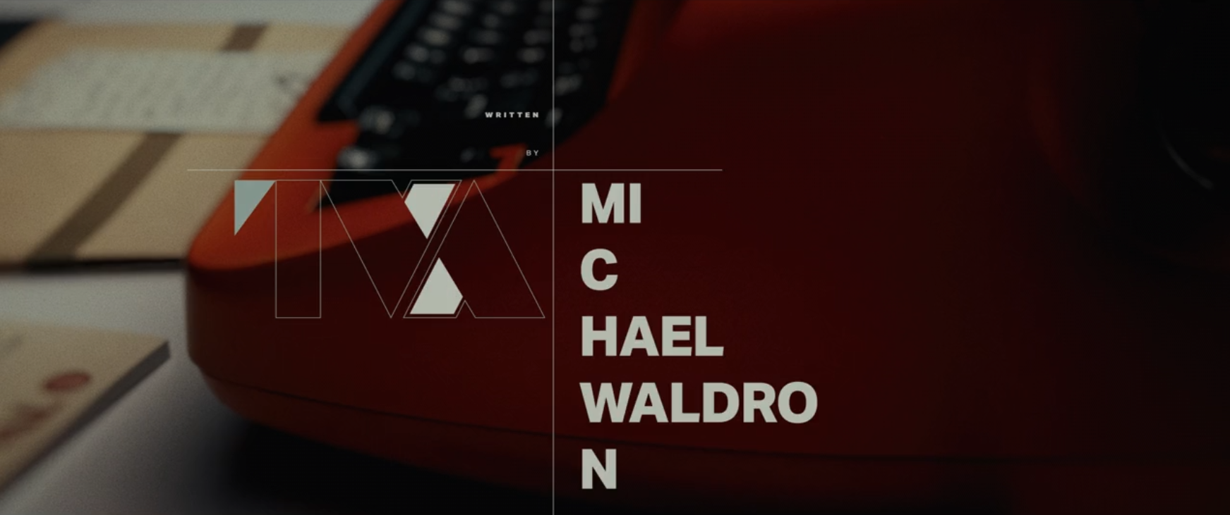
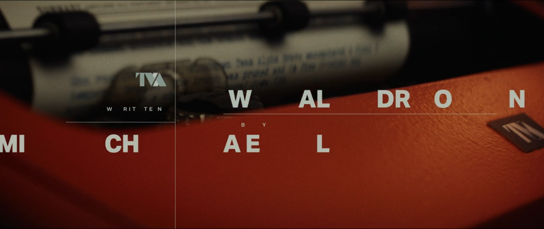
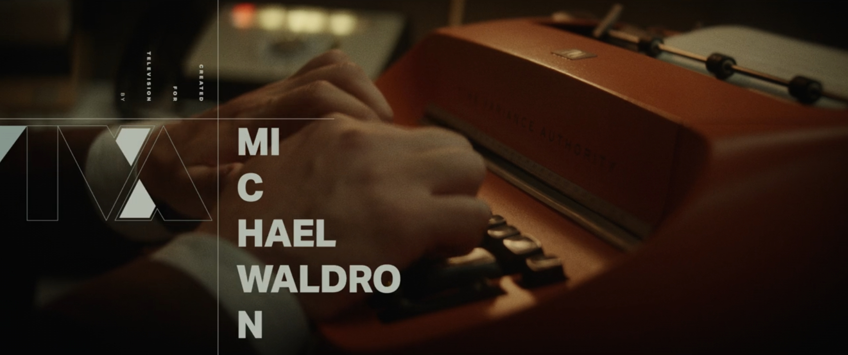
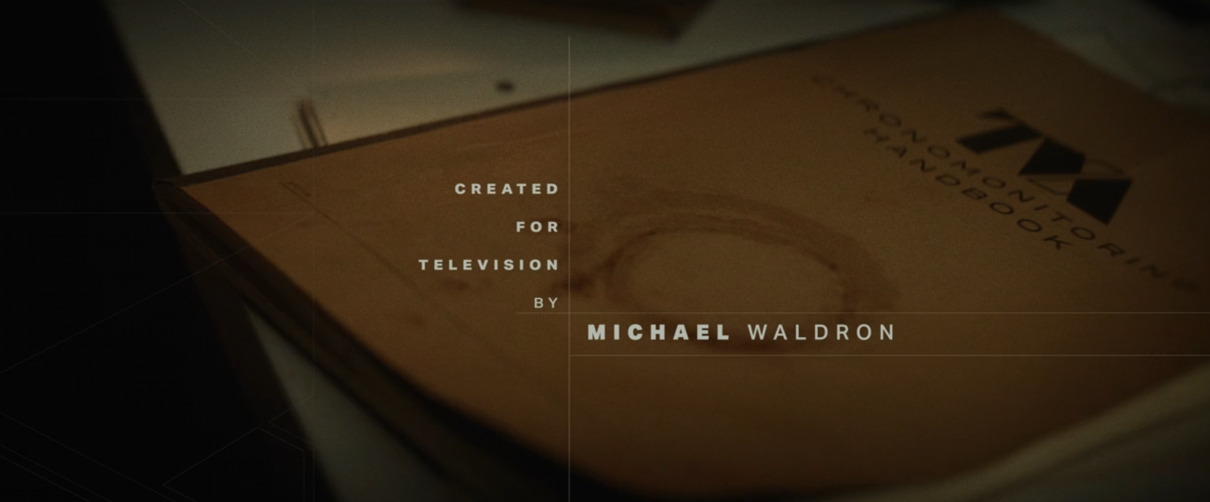
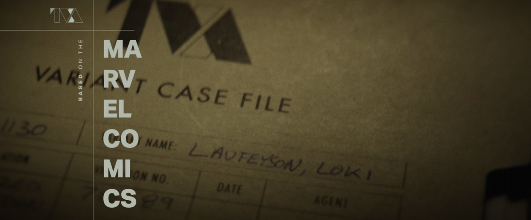
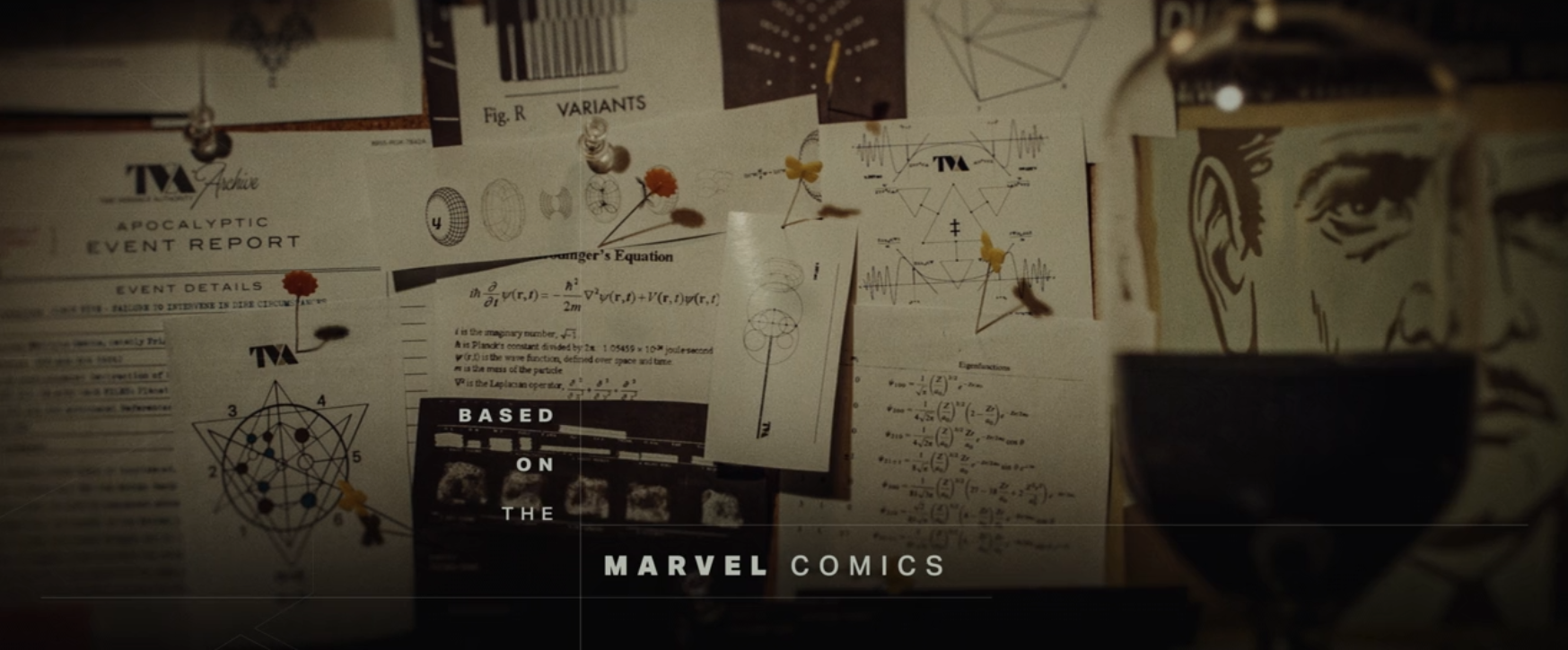
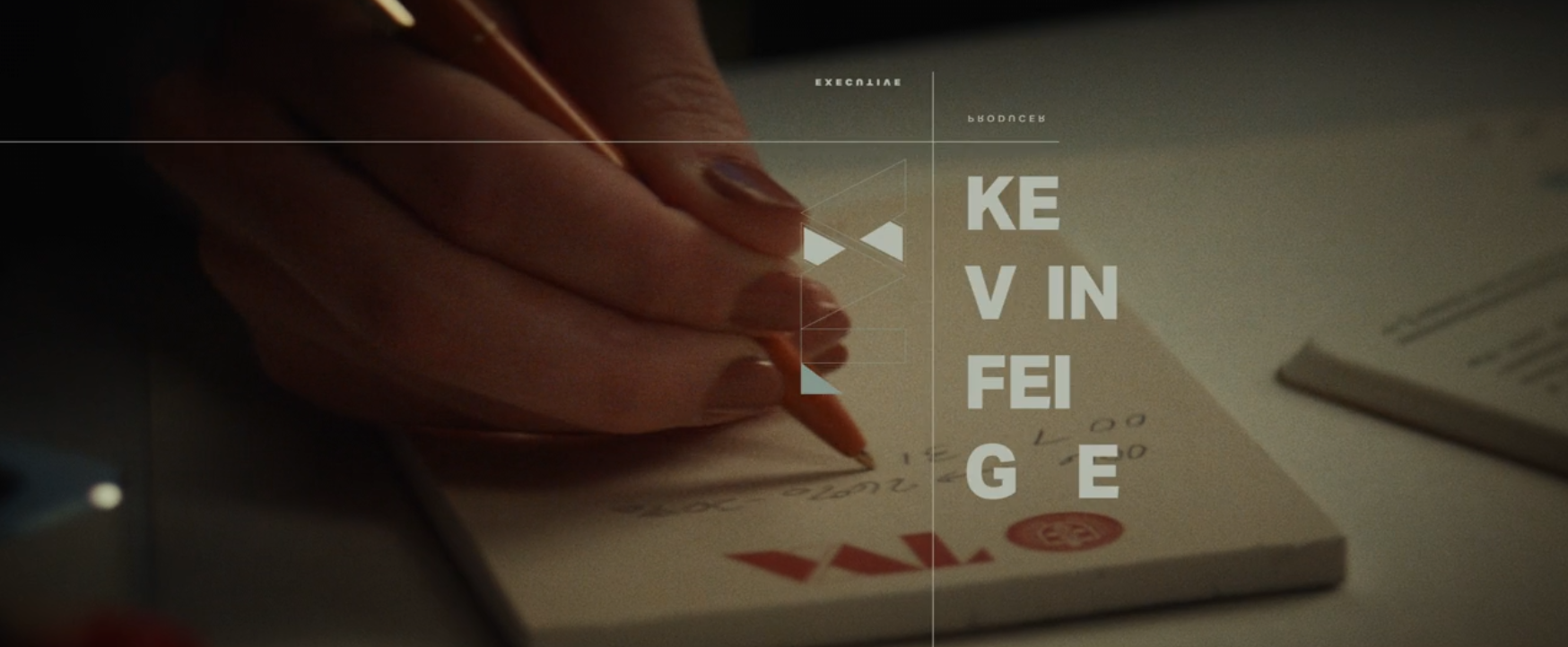
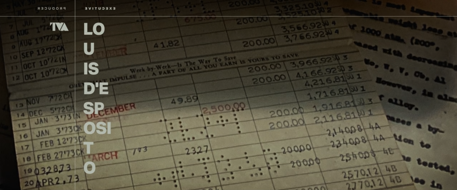
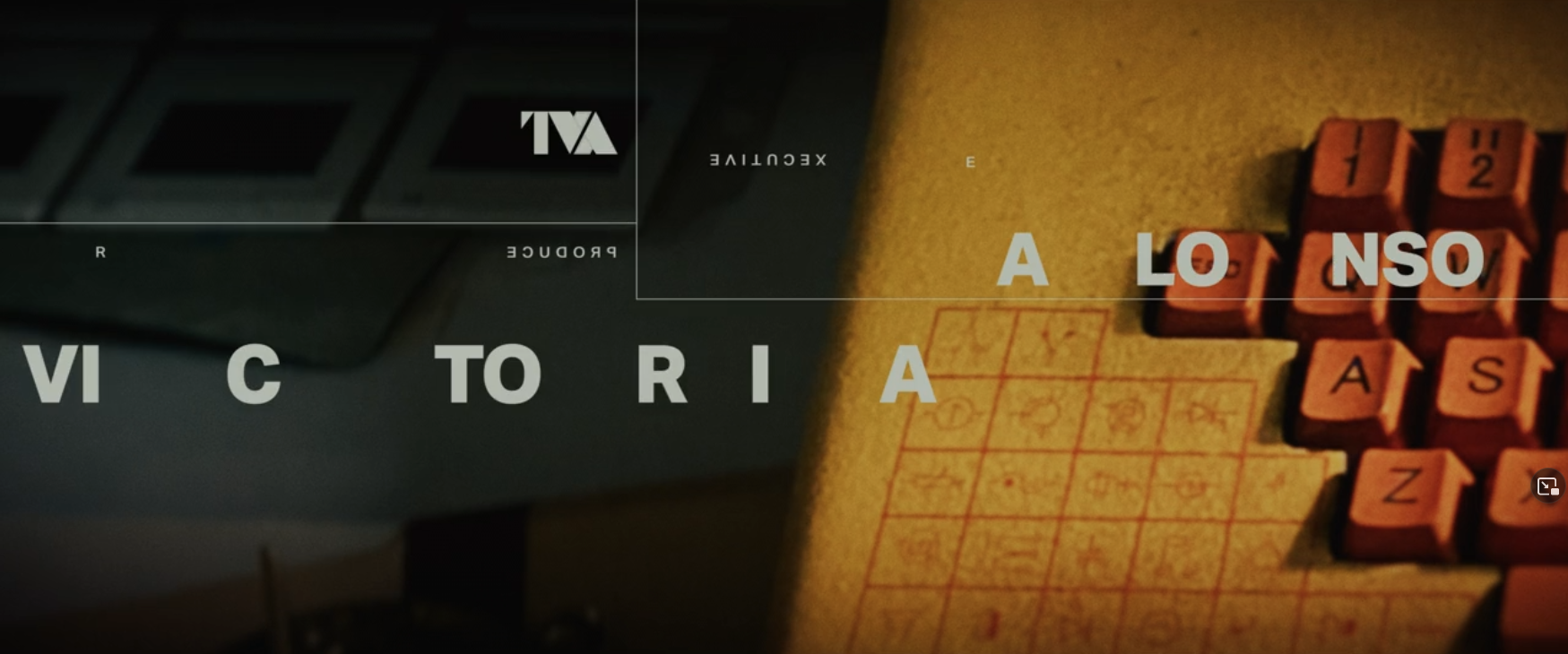
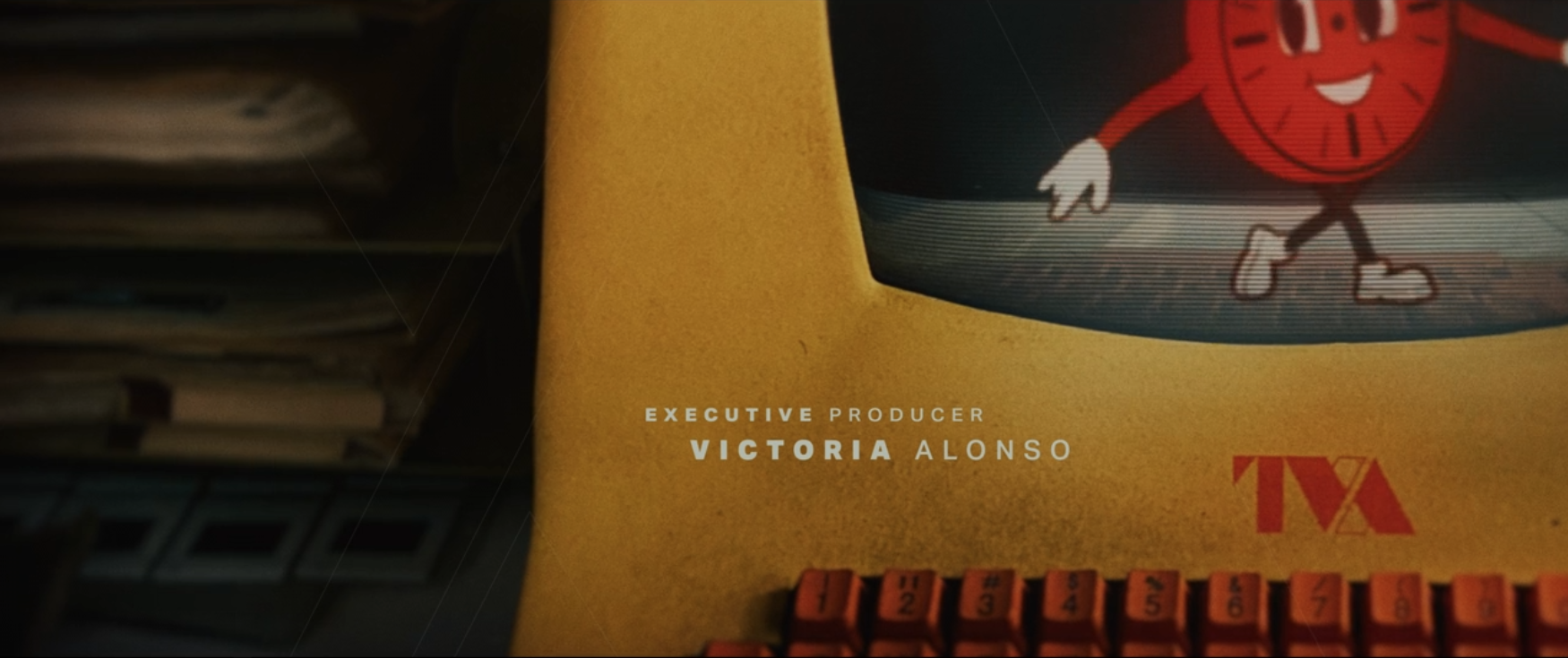
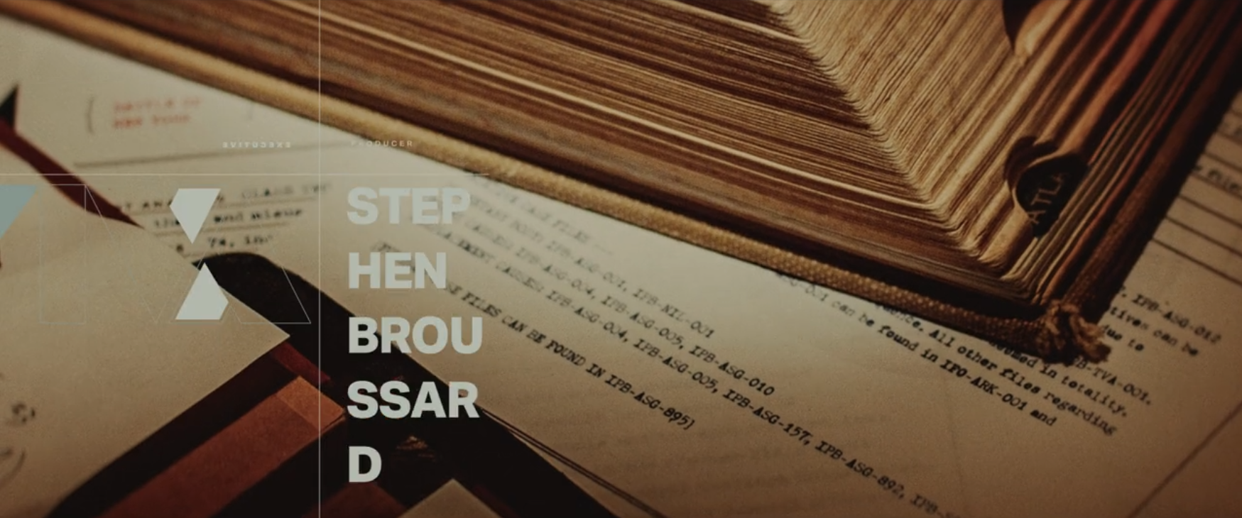
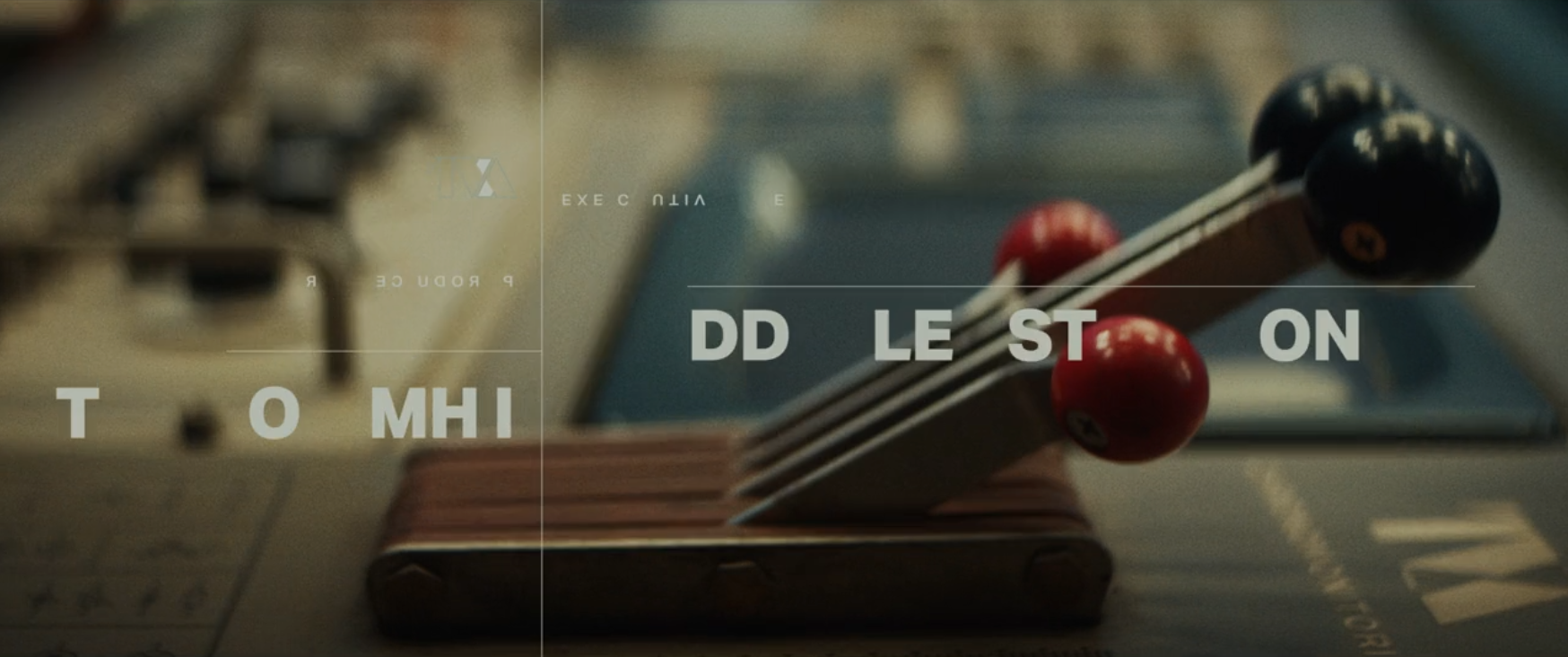
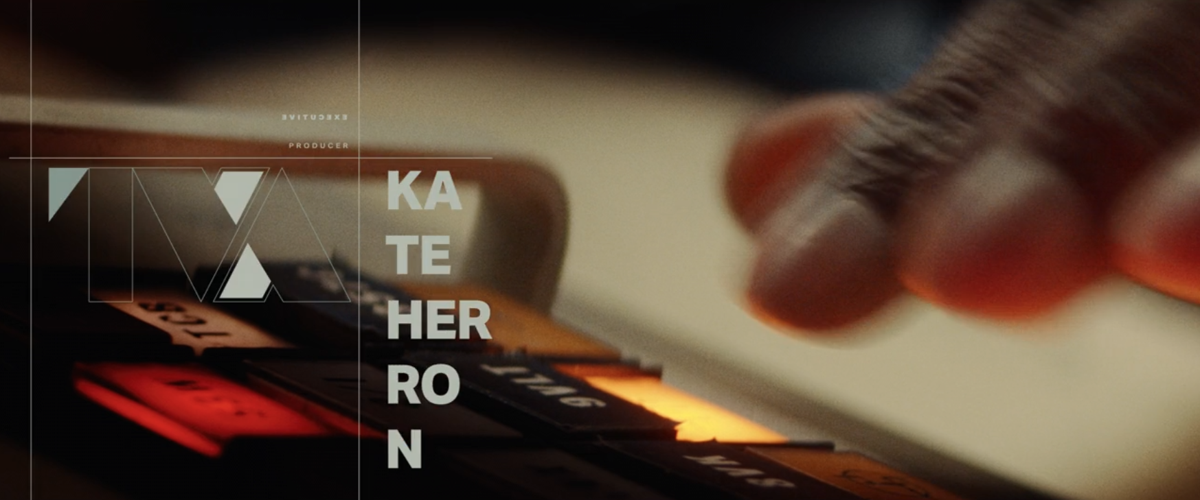
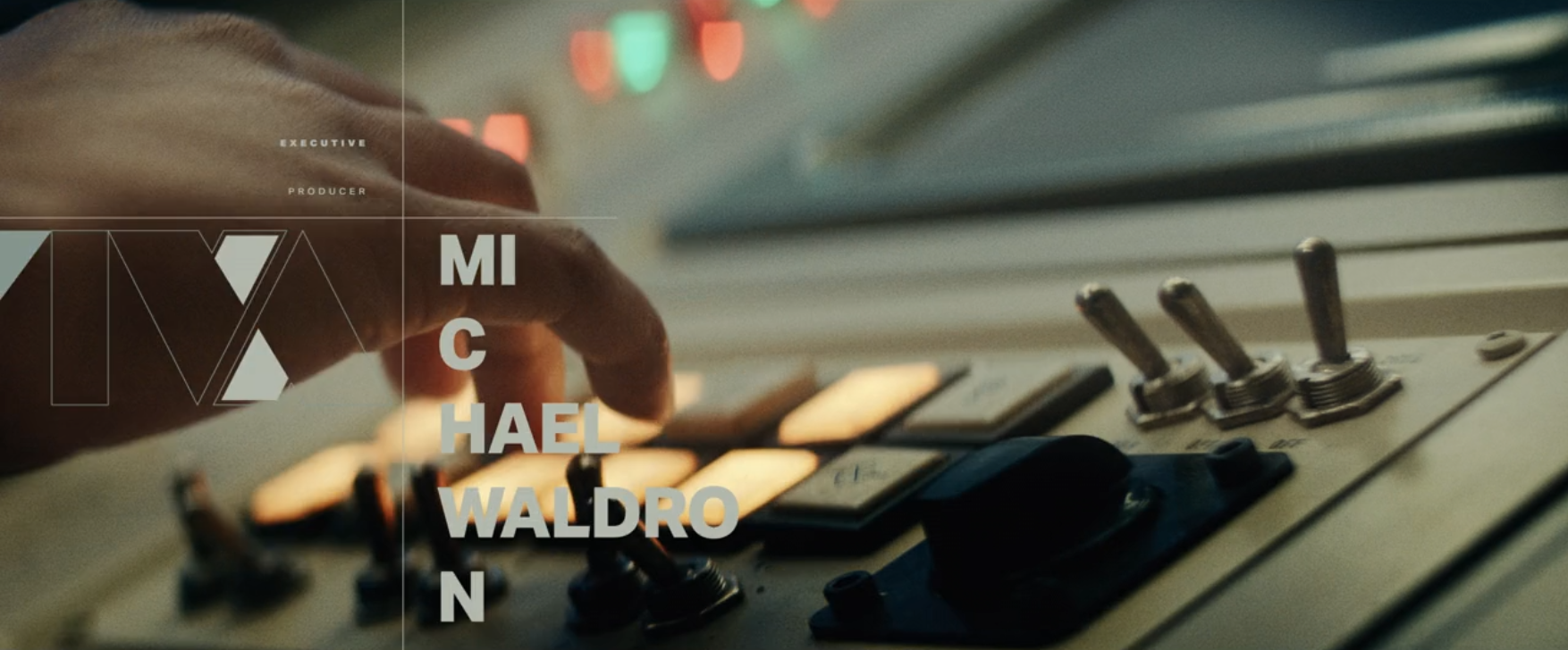
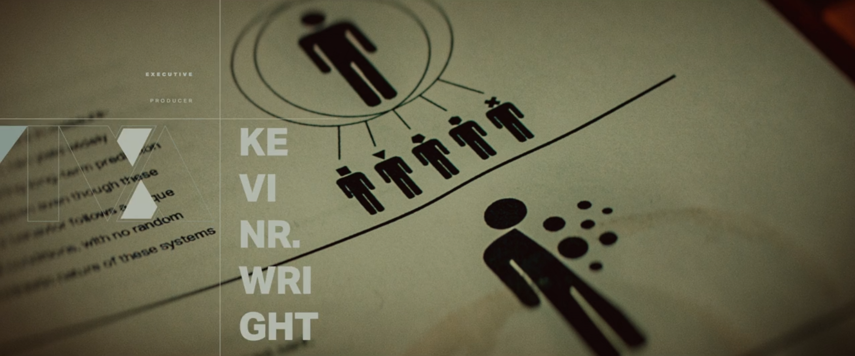
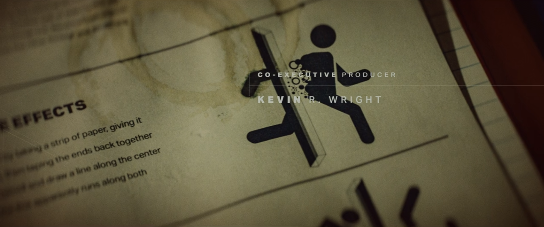
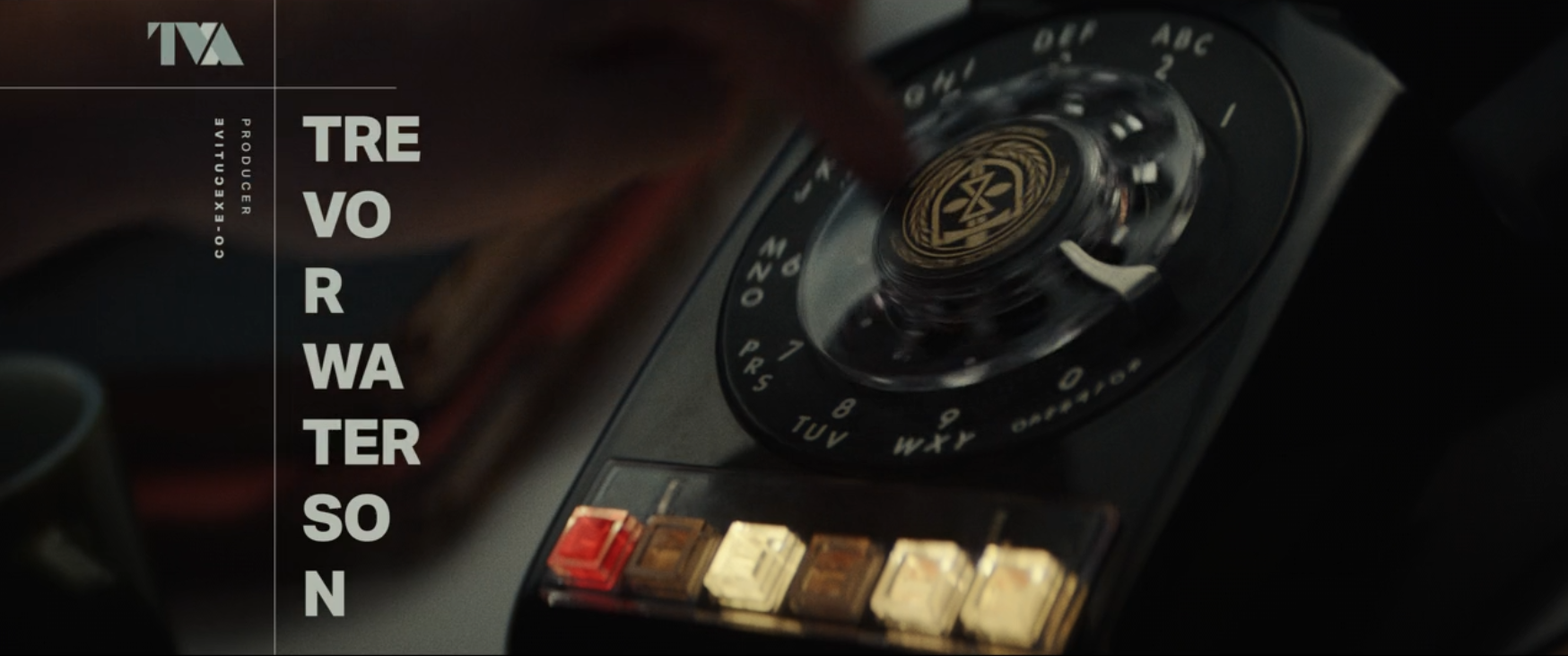
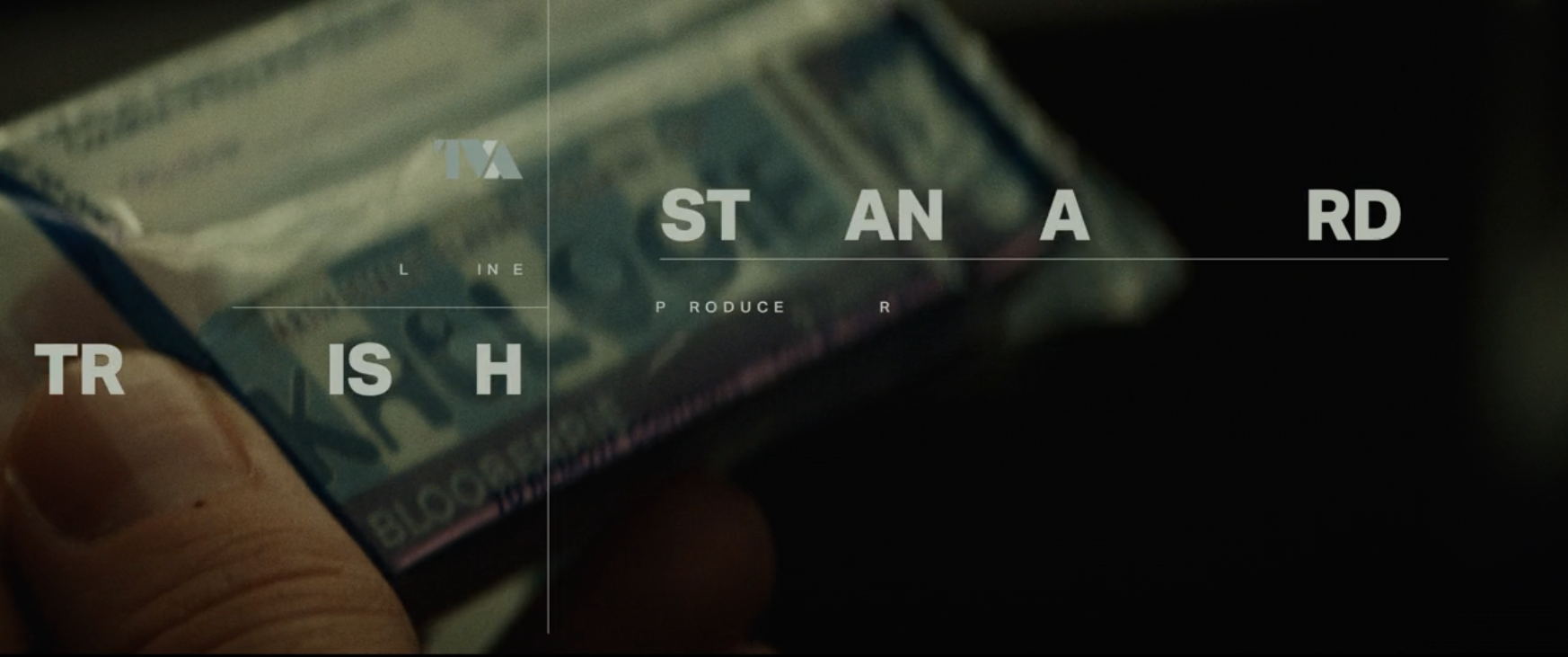
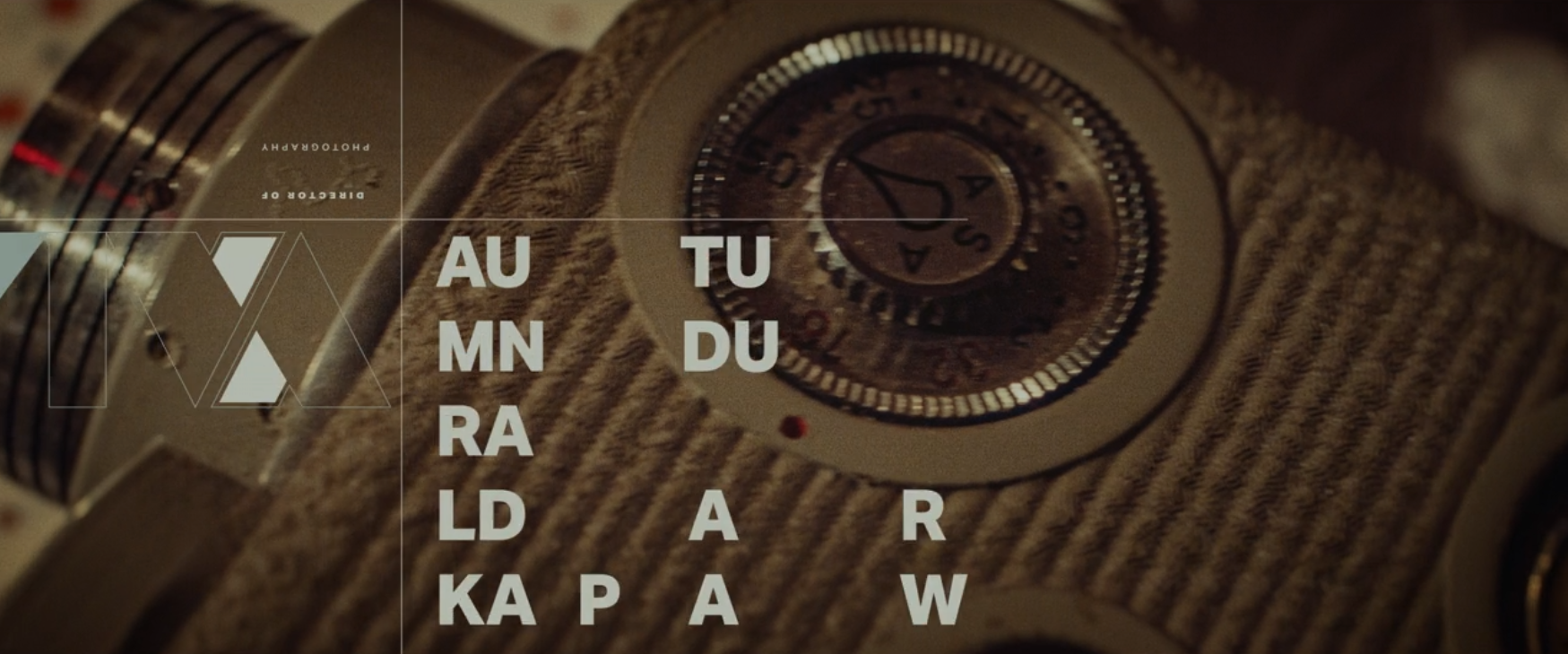
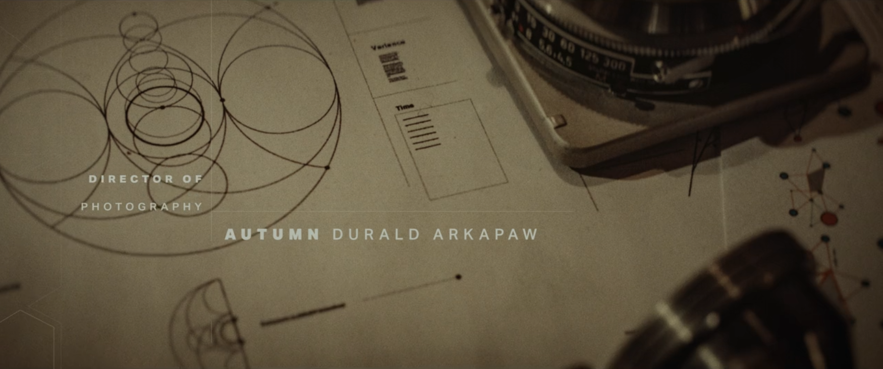
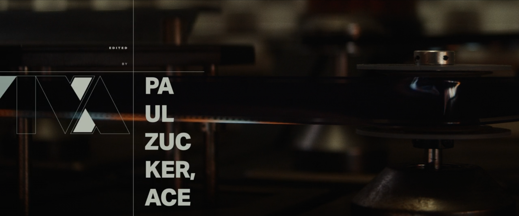
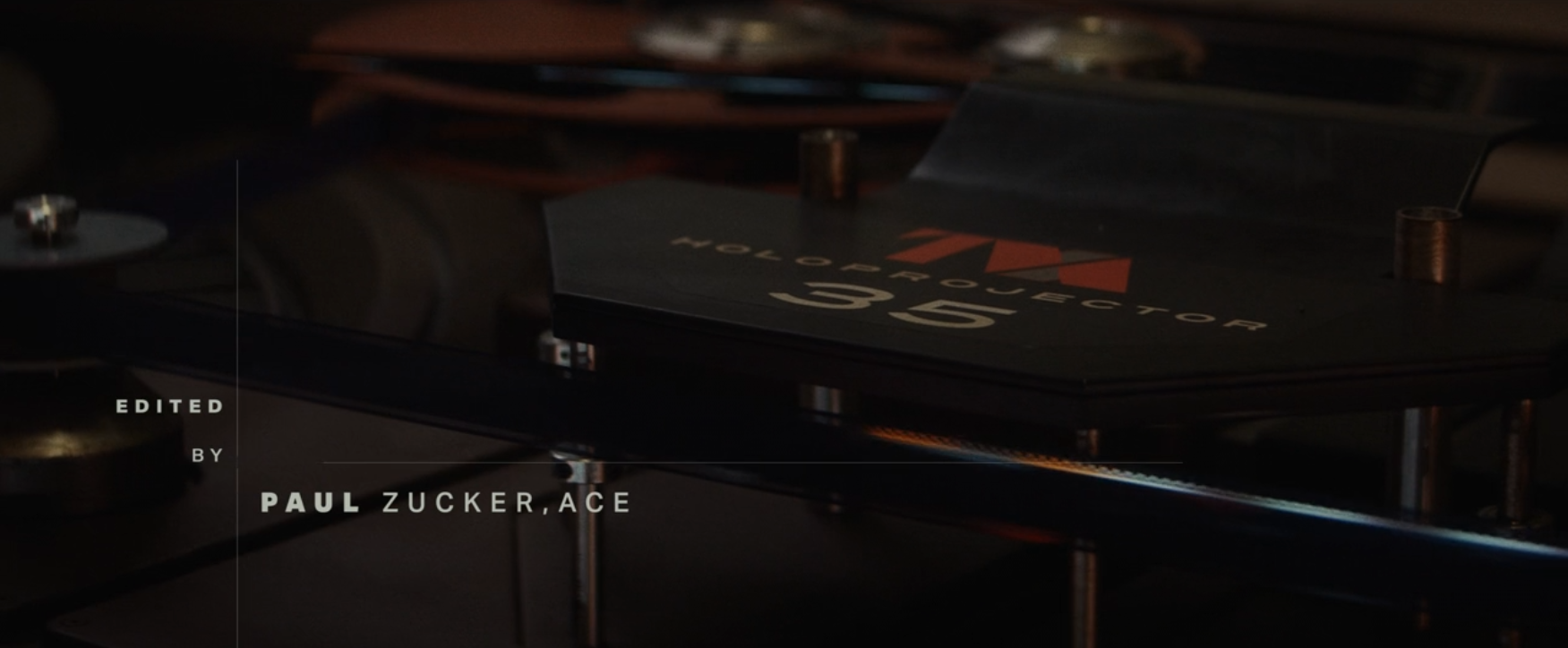
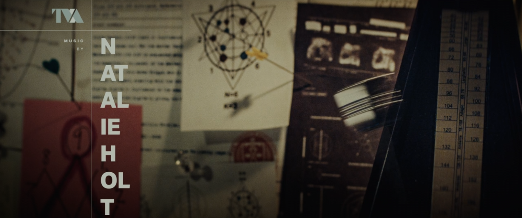
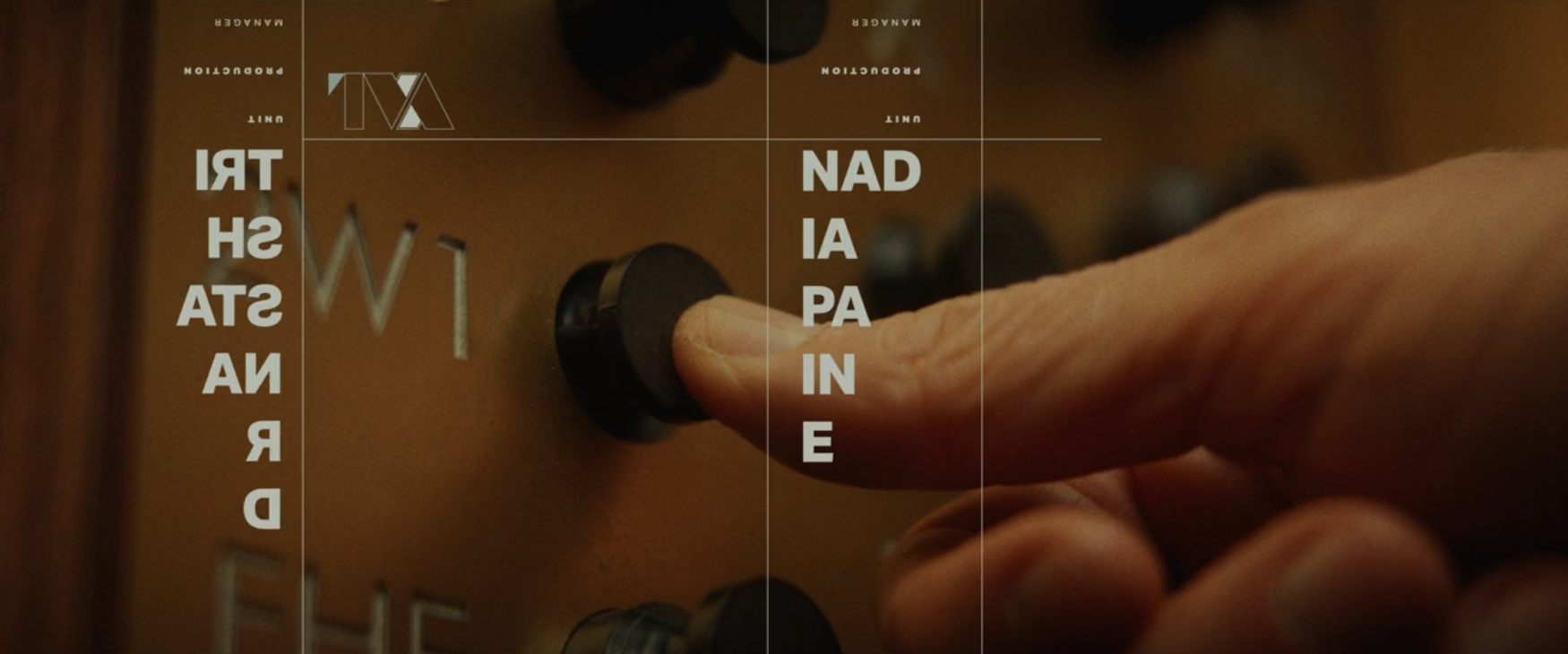
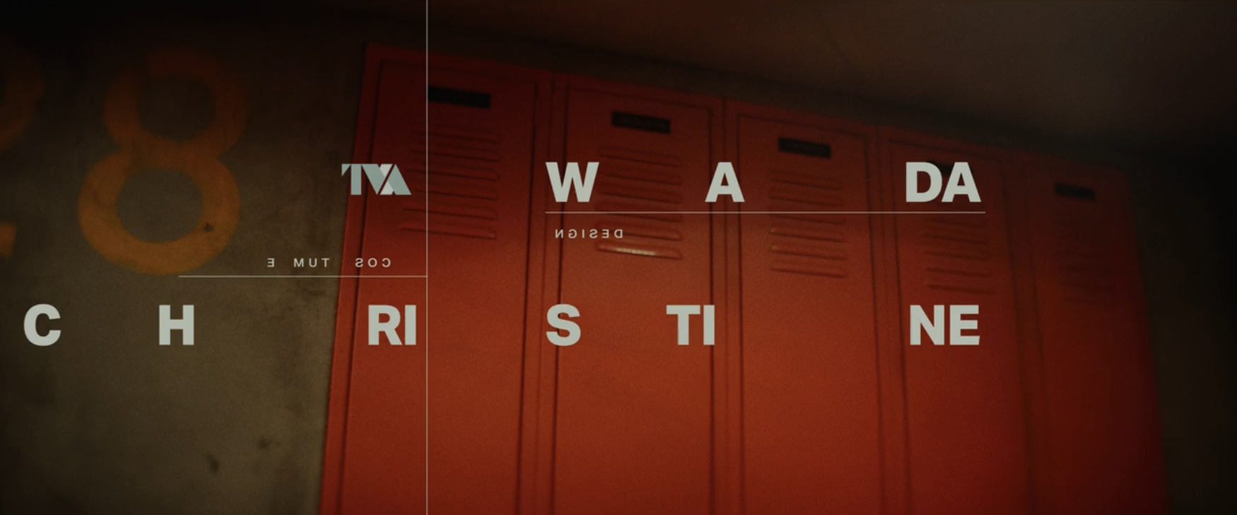
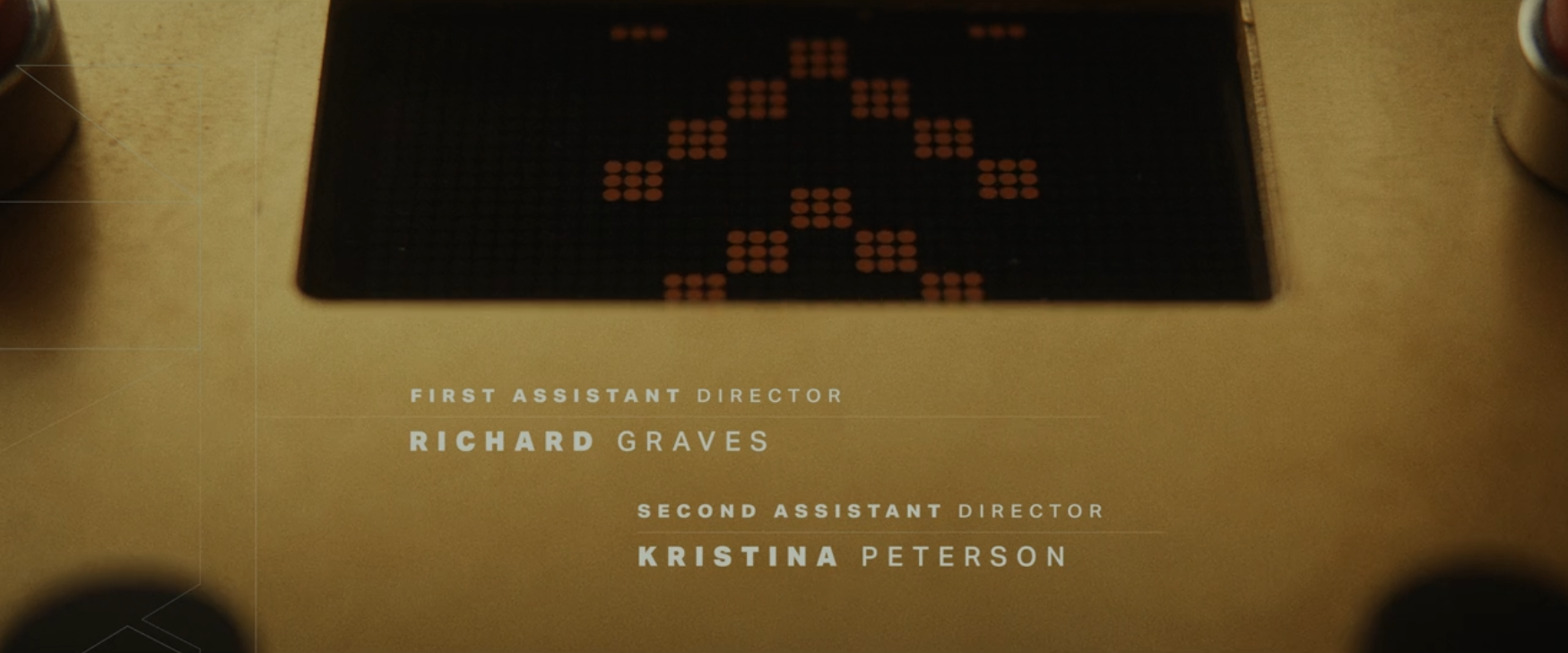
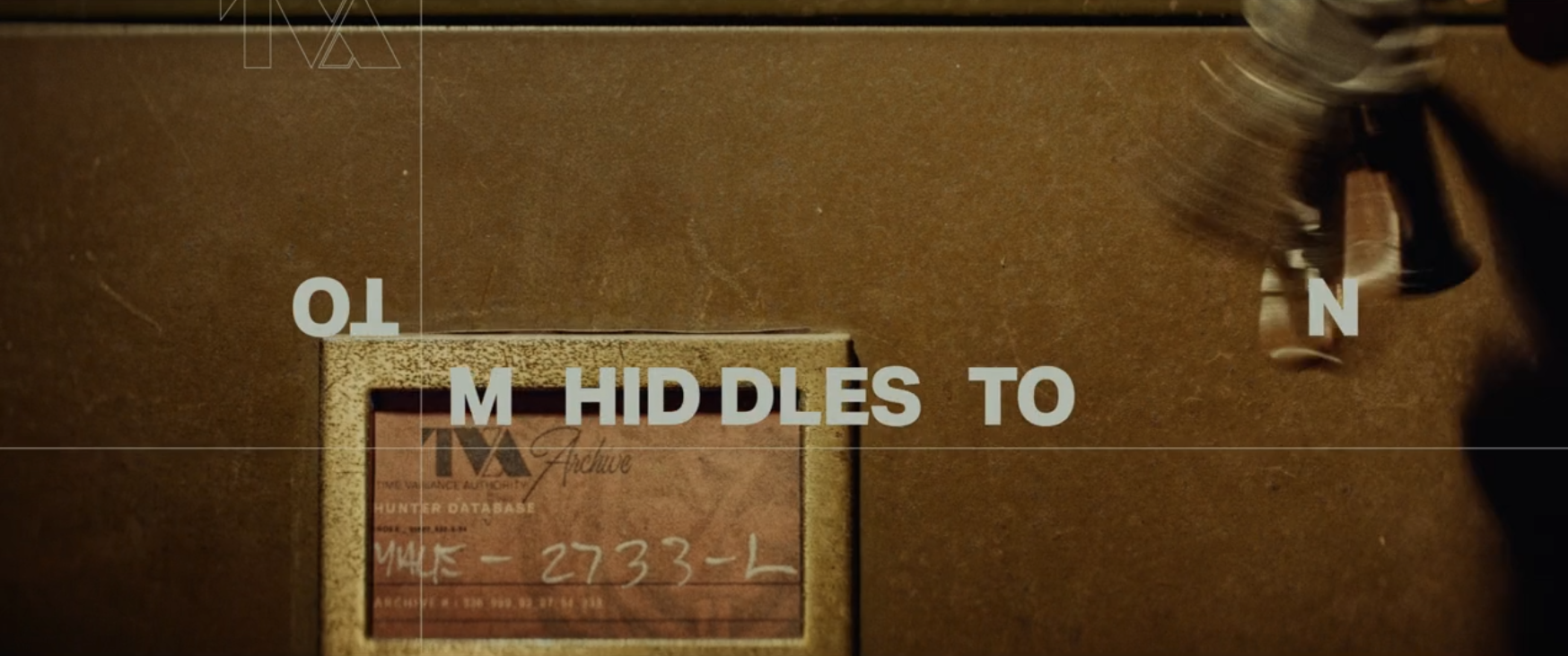
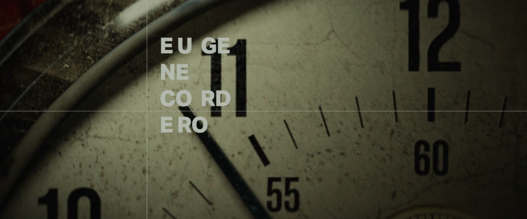
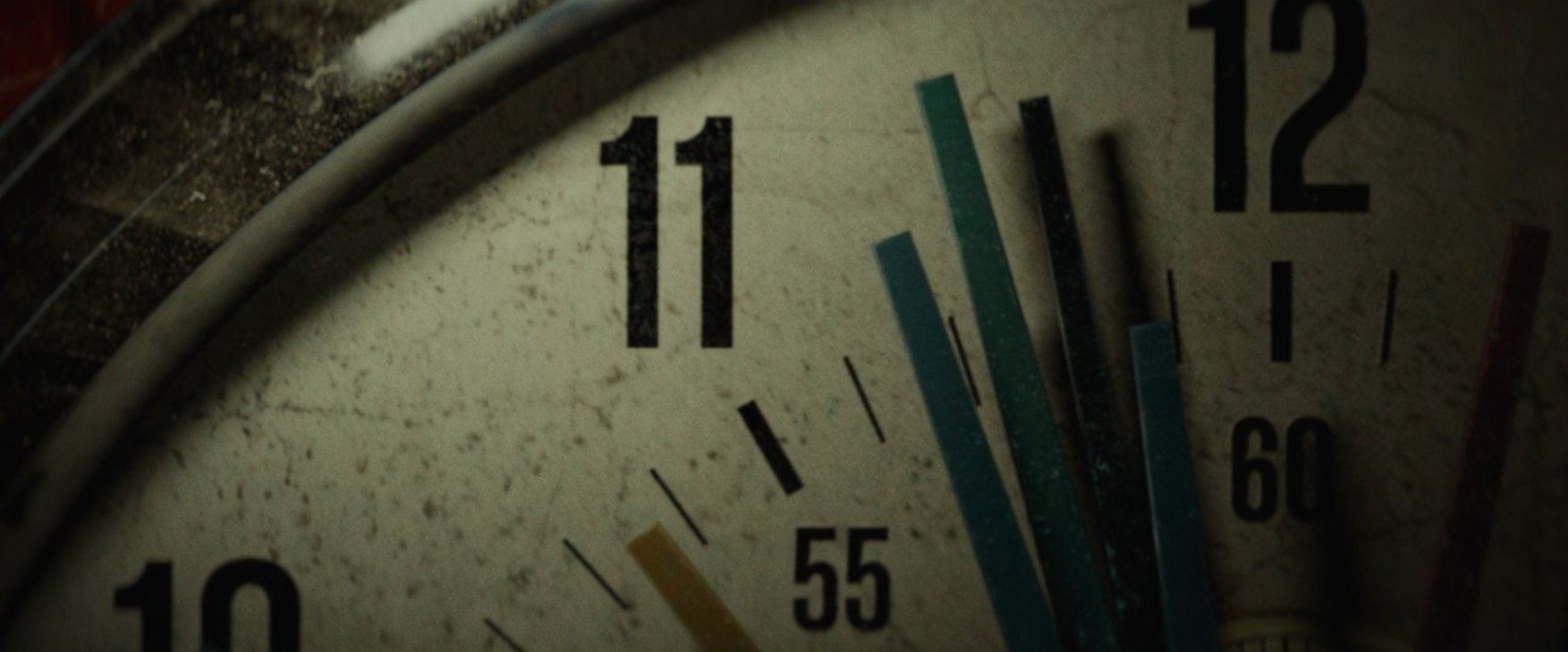
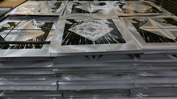
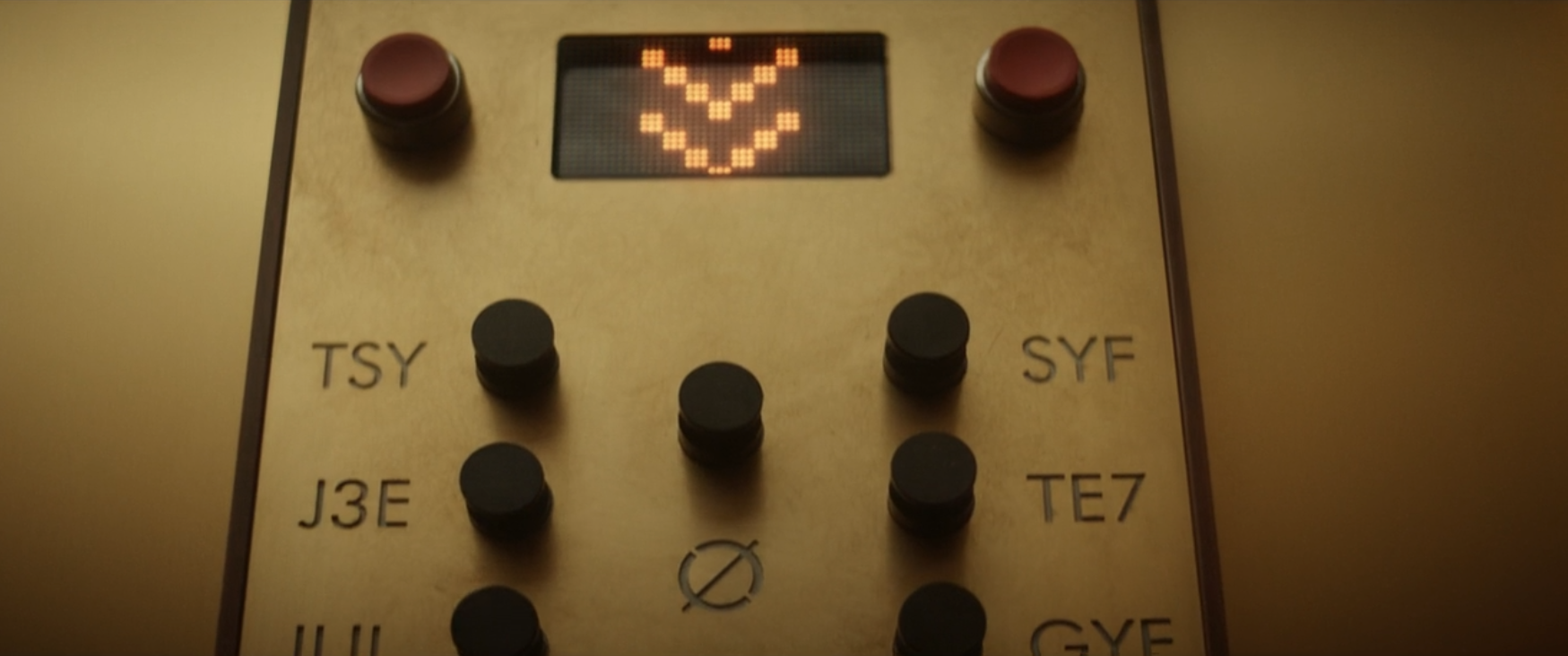
But the icing on the cake is the end credits, beautiful short focus close ups of many of the production details yet with contemporary typography details that you’ll miss if you blink. Everything is saturated but sepia-tinged for that nicotine-stained, low lighting look. Forgive me such a graphic-heavy post but this is all so tastefully done, so many great details like the clock with multiple hands.

Screen Shot 2021-06-11 at 12.11.30 Screen Shot 2021-06-11 at 12.11.49 Screen Shot 2021-06-11 at 12.12.04 Screen Shot 2021-06-11 at 12.12.17 Screen Shot 2021-06-11 at 12.12.47 Screen Shot 2021-06-11 at 12.14.20 Screen Shot 2021-06-11 at 12.14.40 Screen Shot 2021-06-11 at 12.15.44 Screen Shot 2021-06-11 at 12.18.37 Screen Shot 2021-06-11 at 12.18.56 Screen Shot 2021-06-11 at 12.19.44 Screen Shot 2021-06-11 at 12.20.07 Screen Shot 2021-06-11 at 12.20.23 Screen Shot 2021-06-11 at 12.20.47 Screen Shot 2021-06-11 at 12.21.42 Screen Shot 2021-06-11 at 12.22.20 Screen Shot 2021-06-11 at 12.22.40 Screen Shot 2021-06-11 at 12.22.51 Screen Shot 2021-06-11 at 12.23.06 Screen Shot 2021-06-11 at 12.23.47 Screen Shot 2021-06-11 at 12.24.07 Screen Shot 2021-06-11 at 12.24.19 Screen Shot 2021-06-11 at 12.25.00 Screen Shot 2021-06-11 at 12.25.12 Screen Shot 2021-06-11 at 12.25.30 Screen Shot 2021-06-11 at 12.25.55 Screen Shot 2021-06-11 at 12.26.30 Screen Shot 2021-06-11 at 12.27.06 Screen Shot 2021-06-11 at 12.27.44 Screen Shot 2021-06-11 at 12.28.14 Screen Shot 2021-06-11 at 12.29.33 Screen Shot 2021-06-11 at 12.29.52 Screen Shot 2021-06-11 at 12.30.14 Screen Shot 2021-06-11 at 12.30.30 Screen Shot 2021-06-11 at 12.30.50 Screen Shot 2021-06-11 at 12.31.13 Screen Shot 2021-06-11 at 12.31.46

Posted in Comics, Design, Film. | 1 Comment | Tags: , ,

Openmindesign Instagram

IMG_1015
Thanks to Coldcut sharing my Openmindesign account on Instagram yesterday we just went over the 1000 followers mark, thanks guys. I’ve been saving this entry for just such a milestone.IMG_1009

I remember well, setting up the huge flight case that would become the toy box on the cover of this album in Matt Black’s Spacelab studio at Ninja Tune HQ in Clink St one sunny spring morning. Matt and Jon More had pulled out various items that they felt were part of the Coldcut story for inclusion and Hex’s Rob Pepperell had created a game box with graphics of the duo and added a copy of his book, ‘The Post-Human Condition’ too. I’d made a set of assembly instructions with the album title on it the night before as we’d decided on no obvious typography on the front cover.

IMG_1010Suzi Green was in charge of photography and we arranged the box a number of different ways as well as shooting the underside for the back of the sleeve. You can see all sorts of items in and around the box; badges, CDs of samples, previous records, a portable turntable, a flyer for Stealth, tapes of studio sessions, a toy Ninja and the Journeys By DJ mix tape. Hex – including a pre-Hexstatic Robin Brunson – computer generated the ‘toys’ of Matt and Jon and perfectly photoshopped them into the cover image afterwards.

IMG_1011IMG_1012
I used old children’s play blocks for the lettering on the labels and a 3D box typeface for the Let Us Play titles, also finding an image for each track. There really wasn’t an inch of space that wasn’t used on this, a crazy amount of information. I’d do it differently these days of course but I think it was what was needed given the smorgasbord of contents inside.

IMG_1013

There was so much info to go into this album, it was never going to be a minimal design. Suzi had taken various shots around the Ahead Of Our Time studio which featured around the edges of the inside sleeves and gatefold, then there was a freaky ‘chakra’ inner sleeve, lyrics, loads of collaborator credits and info. Then there was the CD with bonus enhanced disc of games and digital toys, the cassette, the video and multiple press ads, posters and more, it went on and on, one of the biggest album campaigns of the label’s history up until that point and quite rightly.

Then there was the remix album ‘Let Us Replay’ in early 1999… read and see more at www.instagram.com/openmindesign and give us a follow as there are daily postsIMG_1014

UFO Club adverts from International Times magazine

IT_1966-12-12_B-IT-Volume-1_Iss-5_012

Recently researching light shows in London around the mid 60s I was perusing the International Times archive online and noticed that the UFO Club had various ‘flyers’ present in each issue around its tenure at the Blarney Club and The Roundhouse during ’66-’67. It’s no surprise as UFO initially gave money to IT and you’ll notice the first event was called Night Tripper / UFO as they couldn’t decide on a name.
There was no format, some had to be decoded and the 27th October ’67 issue featured a piece stating that UFO is Dead! Reading between the lines you can detect some general annoyance that some promised cash flow had been cut off. The final image here maybe or may not be connected but it was on the same page as the club obituary and features lights in the sky.

IT_1967-01-16_B-IT-Volume-1_Iss-6_016
IT_1967-02-13_B-IT-Volume-1_Iss-8_016 IT_1967-02-27_B-IT-Volume-1_Iss-9_016
IT_1967-04-28_B-IT-Volume-1_Iss-12_012 IT_1967-05-19_B-IT-Volume-1_Iss-13_014 IT_1967-06-02_B-IT-Volume-1_Iss-14_015IT_1967-06-16_B-IT-Volume-1_Iss-15_012IT_1967-06-30_B-IT-Volume-1_Iss-16_016IT_1967-08-31_B-IT-Volume-1_Iss-18_020IT_1967-10-05_B-IT-Volume-1_Iss-19_020IT_1967-10-27_B-IT-Volume-1_Iss-20_013
There was a posthumous analysis of what killed UFO in IT nearly a year after it closed, comparing the audience’s locations as the popularity grew.

IT_1968-04-19_B-IT-Volume-1_Iss-29_003 UFO is Dead

Steven Rutter – Close Your Eyes And Breathe

Steve Rutter 12 front + shadowIt’s a busy day for releases I’ve been involved with today, Blood by The Real Tuesday Weld is officially released today with artwork by myself, the Celestial Mechanic I co-wrote with Saron Hughes album went up for pre-order this morning (see other post) and now Steven Rutter‘s (B12) solo release on De:tuned is available to pre-order.
It’s a really excellent 3 track EP and I designed the release with a die cut cover that reveals the inner sleeve and inside printed cover – available in black and ‘safari’ vinyl versions.

Steve Rutter 12 front + shadow + inner safariSR v5 mock up 3 Safari SR v5 mock up 1SR v5 mock up 2SR v5 mock up 3 Steven Rutter 12 back
Listen and pre-order now (full links are on the Soundcloud page) – out Friday, 25 June 2021.

Celestial Mechanic – Citizen Void vinyl pre-order

CM packshot full
Online today is the vinyl version of the Celestial Mechanic album, ‘Citizen Void’, that I co-wrote with Saron Hughes last year. The album is a soundtrack of sorts to Rian Hughes‘ book, ‘XX – a novel, graphic’ after he tasked us with created the actual music for a fictitious album review featured in the book.

The release which is immaculately designed by Rian, is a lavish package featuring an LP and 7″ on yellow vinyl with inner sleeves, 12″x12″ print and original album press release. The cover is finished with silver ink and features a slightly reworked version of the sleeve that appears in Rian’s book. Part of the book focusses on an alien signal from space that is detected on Earth and is used at one point to make an album, a QR code inside takes the reader to a Bandcamp page with the music on it. For more info see my original post about the book.

Upon release we were contacted by Alex Egan of Utter who was excited to put it out on vinyl to compliment other multi media entries on his label. We had a problem in that ‘side 1’ of the album on the digital release was 30 minutes long and an LP can generally only cram 24 mins tops onto one side before the sound deteriorates. After unsatisfactory edits and deleted track line ups the solution was to snip the final two tracks and place them onto a bonus 7″ – more artwork for Rian! The whole package is a perfect visual companion to the book and differs slightly from the original digital version in that side 2’s side-long epic, ‘The Signal’ is the remixed version from the follow up digital EP.

UPDATE: It’s come to my attention that the pre-order from Bandcamp now adds tax onto the record and shipping total for the LP – seemingly as a result of Brexsh*t continuing to shaft us in all sorts of ways we never could have foreseen in the name of ‘taking back control’. If you pre-order via the Phonica link you should be able to get around this. It’s limited to 300 copies so be quick if you want one – release is early July.

Ninja Tune x AIAIAI Headphones

ReleaseProduct-228764-134141

I saw these announced today and just had to share – Ninja Tune have teamed up with AIAIAI to produce a version of their modular TMA-2 headphones. Not only are these great headphones, I’ve used them myself at home for listening, but the difference with these is that some of the parts are made from recycled Ninja vinyl records! They’re not cheap but they are great quality, completely modular so you can change parts or replace one if it wears or breaks. More info and pre-order here BLEEP

ReleaseProduct-228764-134136ReleaseFormat-715867-134523ReleaseFormat-715867-134515 ReleaseProduct-228764-134142

Posted in Design, Ninja Tune. | No Comments | Tags: ,

The Real Tuesday Weld ‘Blood’ and ‘Tape Dust Memories’ albums

Blood front cover red vThis has been a long time coming but… ‘There will be Blood!’. More specifically The Real Tuesday Weld‘s ‘Blood’, the first in a trilogy of albums under the umbrella of ‘Swan Songs’, the final bow of Stephen Coates‘ 20 year+ recording career under this name. ‘Blood’ is the first, to be followed by ‘Dreams’ and ‘Bone’ over the next 18 months and each will be supplemented by cassette versions with completely different tracks in sympathetic packaging to each main title.Blood back cover poster DLBlood red contents

The whole design concept was started over a year ago, pre-lockdown, but stalled like everything for months mid year until we picked it back up in the summer, reworked the concepts and mapped out the whole set. With the benefit of hindsight it was worth the rest and the design is better for it as we went through various stages and ideas, coming back to it with fresh eyes. There’s a small books-worth of unused elements and ideas that never made it for this series, a huge folder of work that was slowly honed into shape over months as the artwork formed.
Blood red contents back Blood splatter contents Blood splatter v light TRTW

The ‘Blood’ vinyl comes in red or red & black splatter vinyl versions, has an inner sleeve with a short story (a feature of all the albums), die-cut back and inner covers and download card. Depending on how you insert the record / inner sleeve or poster you can have different back covers.

Blood back poster Blood back Stephen Blood back Blood

If you pre-order direct from the Real Tuesday Weld Bandcamp page you get an exclusive target print and beermat with the 10 track album plus there you can also find a bundle with the 11 track cassette companion, ‘Tape Dust Memories’ which is housed in a blood bag with medical-style lyric sheet and download card. This is a completely different album of extra tracks from the same sessions and possibly not available anywhere else. I’m extremely pleased with how these have both turned out and we’re forging ahead with the follow up, ‘Dreams’ for the end of 2021.
TDM blood bag TDM Blood bag 2TDM tape ATDM contentsTDM contents 2

For those wanting a CD version, there may be something at the end of the trilogy that collects them all, we’ll see…

Blood red v stamp

King Gizzard Fuzz Club Bootleg series

KGLW Asheville
Like many others last year King Gizzard raided their tape archives and pumped out live sets via their Bandcamp page to fill the void of cancelled gigs. Of course these were digital only releases and they later offered the recordings to anyone who wanted to press them up on the condition that they sent them a portion of the stock to sell. Fuzz Club have stepped up and taken eight shows plus a demos set and a teenage pre-Gizzard collection and made some of the best looking releases I’ve seen in a while. Grab these quick if you want them, they’re selling out fast, some independent shops have them on pre-order like Norman Records, and Resident Music. King Gizzard have form on this, giving away their ‘Polygondwanaland’ album to everyone to do their own versions in 2017, there are nearly 300 versions on Discogs as I write.
KGLW Auckland KGLW Brussels KGLW London KGLW Paris KGLW Rats Live KGLW TeensKGLW Demos 1 KingGizzardDemo_24

Under The Covers 001: Sleevenote interview

Openmind selectionI did a very enjoyable interview with Tom Vek from Sleevenote about design for music past and present with an emphasis on my work for Ninja Tune and how things have changed in the digital age. It’s the first in what will be a series of interviews with designers and features an example of how the Sleevenote site is digitising LP artwork for the streaming generation to preserve the art of the sleeve in the age of the thumbnail.

Read the interview here and have a look at Sleevenote too, you can browse cover art and play tracks by clicking the interactive sleeves which are linked to Spotify and Apple Music, work on desktop or mobile.

Sleevenote page

Mini CDs #7: XTC – Oranges & Lemons

XTC front
This beautifully unique object is possibly the first example of a full album presented across three mini CDs, housed in a fragile cigarette-sized box. Sporting a Yellow Submarine-esque flip up cover, the discs are stacked as you see them below in tiered slots but the box is easy to crush or tear – as you can see here. I always found it odd that they did this album after two Dukes of the Stratosphear LPs but maybe they had dipped their toes in the psychedelic waters enough to put it out as XTC by this time.XTC inside
XTC 3 CDs 2 XTC back

Posted in Design, Mini CDs. | No Comments | Tags:

Mini CDs #6: The The – Gravitate To Me

Gravitate frontThe post-Mind Bomb’ single, again released on multiple formats including 7″, cassette, two 12″s and another 12″ box set with photos, postcard and stencil, it also came as a 3″ CD in downscaled fold out card sleeve with pocket for the disc. It’s horribly fragile, isn’t easy to keep in good shape 30 years on and hasn’t any exclusive material. I’m not sure whether the German stamp on the inner cover is the previous owner’s or a shop address.

Gravitate openGravitate insideGravitate back

Buro Destruct 4 book kickstarter

Buro-Destruct-4-00_GIF
Those lovely guys from Buro Destruct in Bern, Switzerland have just launched a kickstarter for their 4th collection of design work (see excerpts above and below). I first became aware of them in the mid 90’s when we started touring Europe and when we played at the Reitschule in Bern the flyers and posters plastered over the walls were of a higher standard than normal. This was in large due to Buro Destruct who provided a lot of the work and it didn’t take longer for their work to feature in magazines and books of the time as well as their own publications collecting the work.
They’re now onto the 4th volume, featuring 12 years of work (volume 3 was back in 2009) including unused work, intermediate steps and experiments along the way. The softcover book will be 256 pages long and you can support the kickstarter here although only 5 of the early bird discounted price copies are left as I write this.

Buro-Destruct-4-08 Buro-Destruct-4-10 Buro-Destruct-4-11 Buro-Destruct-4-12 Buro-Destruct-4-13

Mini CDs #5: The The – The Beaten Generation

The The Beaten cover
The The‘s eagerly-awaited single, preceding their ‘Mind Bomb’ album and including the first fixed line up of a band Matt Johnson had assembled to tour with, including a certain Johnny Marr. Released on multiple formats including 7″, two 12″s and a 12″ box set with postcards and badge, it also came as a 3″ CD that downscaled the box set with fold out insert. It’s a cute little item but doesn’t have any material not on other formats and is hard to find in good shape.

The The Beaten inside 2 The The Beaten insideThe The Beaten back

The New Obsolescents LP cover process 2 – Cover assembly

TNO Printed stack

For the first part of this process and a little back story, see Part 1

TNO selection

Once Jonas Ranson at paperHAUS had screen printed each panel during the summer of 2020 it was down to me to assemble them. Each sheet was 18″ x 18″, sadly not large enough to fold round into a full LP sleeve, so each panel had to be trimmed to a 12” x 12” size and painstakingly glued to each already printed sleeve – 300 of them.

TNO cutting

I’d specified that the designs be printed dead centre of each pattern to take advantage of the symmetrical nature of the cover graphic so there were lots of offcuts (which will be used somehow on future projects).

TNO offcuts

This was all done sometime during the Autumn of 2020 in my studio while we waited for the vinyl to come back from the pressing plant. The original plan had been for Colin at Castles in Space and I to then rent a bigger space for a day and glue the foil panels to each sleeve but I quickly realised that this just wasn’t going to be possible in such a short time. The next lockdown put a stop to any thoughts of that anyway.

Eventually the vinyl turned up and Colin arrived one evening with 17 boxes of covers in the back of his car and, in a socially distanced handover, I hauled them up to my studio.

TNO plain

Just after the Xmas period, during the 3rd lockdown, I began the extremely long task of gluing a panel to each sleeve, padding every cover out with a card square then laying them between newsprint sheets to avoid anything sticking while drying. The glue would start to curl the card within about a minute as it dried and started to contract so it was imperative to press them flat under weights.

TNO sticking beginsTNO sticking 2

I could average two boxes of 17 a day in two shifts by the end; one box first thing in the morning then leave to dry. Once stuck they were inspected for marks, sleeved in PVC outers and then boxed. Clean the area, do another box before bed and leave to dry in a stack overnight. By the end I could do one box in under 50 minutes, below is the last box on the 8th or 9th day.

TNO Last boxTNO Boxes done

As a nod to the site of the original performance recordings at the Museum of London, with moon rock bean bags and a space travel theme, we decided on a silver and black hybrid moon surface effect for the vinyl. The whole process of making the sleeves probably took longer than the whole album but I couldn’t be happier with the results, I doubt it’ll see a repress in this state as I’m told the foil stocks are virtually gone now but it was worth it.

TNO Hyperspace
Hyperspace

TNO Spiral
Spiral

TNO Starburst
Starburst

TNO Cross
Cross

TNO Curls
Swirls

TNO Back

The New Obsolescents LP cover process 1 – Screenprinting

L1340496
Seeing as The New Obsolescents album is up for pre order today I thought I’d break down how we made the cover as it was quite an involved job using obsolete materials and analogue processes without the aid of automation. Part of the concept behind the group name is referencing the use of largely obsolete practices and equipment and I thought I’d carry this on with the artwork. This post is about the printing and there’s another about the assembly here.
L1340497
I met Jonas Ranson a couple of years back when I got him to print a poster for the De:tuned 10th anniversary exclusive via Bleep (I think they even have some left). It was a complex 6 colour job and I was impressed with how diligently he worked to get it as good as possible using tests to determine the best results and revising screens with me after we both agree the first tests didn’t look right. So the sleeves for The New Obsolescents LP cover required a similar touch as this was printing onto delicate foil covered card that marked if you ran a fingernail across it.

L1340425
To rewind slightly, since discovering the Philips 21st Century Prospective series of French musique concrete LPs on tour in Europe the 90s I’d been fantasizing about one day making a record with a Héliophore patterned silver foil cover. The patterns etched in the covers are achieved by minute differences in the angles of the foil coating which then reflect the light and appear to animate when moved. These legendary and increasingly expensive LPs contain critical works from an international array of leading artists in the tape and electro acoustic field, spearheaded by Pierre Henry who also released many of his own works on the label.

L1340504
Tracking down the company who made the original Philips covers in France led to a dead end many years ago as they had long ceased to exist so I gave up hope. Unknown to me a British company had managed to replicate the process under the name Dufex in the UK. Sadly they’d also wound up business in 2019 but via a chance encounter on a separate project I managed to find the final stocks of card from the business at a lighting company so I filed that away for future use.

L1340505
Once The New Obsolescents’ album was in the bag we started to think about artwork and I knew that this collision of tape loops and turntablism was the perfect record to sleeve in foil as a homage to the Philips series. Those familiar with the originals would immediately make the visual connection and it would set the tone for the sounds contained inside as the group name would be unfamiliar to most. When we sent the album out to record labels it included a mock up of the cover art with foil and that was part of the package we wanted to produce. Colin Morrison at Castles in Space was fully on board with the sleeve idea from the beginning and it’s a testament to his belief in the project that he was prepared to trust me with the whole process despite the considerable extra costs.

L1340514
Ordering 300 sheets in five different designs, I gave them to Jonas at paperHAUS who carefully but expertly screen printed each panel with the cover design, making sure not to scratch the extremely delicate foil. I specified that the designs be printed dead centre to take advantage of the symmetrical nature of the cover graphic and asked Jonas to document the process as I wasn’t allowed in the studio due to lockdown restrictions at the time. Many thanks to Jonas, these are his beautiful photos of the job and you can contact him and see his work at www.jonasranson.com/paperhouse


L1340521 L1340432

L1340431L1340519 L1340508 L1340509 L1340528L1340527
All photos © Jonas Ranson 2020

Mini CDs #4: Yazz & The Plastic Population – The Only Way Is Up

Coldcut Only Way is front
This US CD single is unfortunately missing part of its cover, it was part of a long box as can be seen in the bottom photo. The extended UK mix and the Bam Bam remix feature from both of the UK 12″s but the most interesting thing about this release is the Acid Dub mix by Justin Strauss and Murray Elias which was exclusive to the US releases and not featured on any European editions. It all starts getting interesting around the 3.50 mark

Coldcut Only Way is back Coldcut Only Way is disc TOWIU long back

Posted in Design, Mini CDs, Music. | 1 Comment | Tags: ,

Zodiac posters by Funky Features, 1967

FF Sagittarius
(images and text adapted from the pbagalleries website)
A complete set of original 12 Zodiac Astrology Star Sign Posters, commissioned by Jack Leahy (“Funky Jack”), of San Francisco’s Funky Features, in 1967. Funky Features was originally a home recording studio in an Edwardian house that quickly became a popular recording location for Big Brother and the Holding Company, Cold Blood, Steve Miller, and others. Leahy also went on to do artwork for a number of motion pictures, airbrushing the Starship Enterprise for the first Star Trek film. Each poster is by a different artist, uniquely capturing the heyday of San Francisco’s counterculture. Artists include Dick Moore, Tommy Dixon, Lee and Shirley Goddard, Robert McClay, Fred Adams, Primo Angel, Jim Blashfield, and others. Complete sets of all 12 posters are extremely rare, especially in this condition.

Funky Features logoFF credit Robert McClayFF Gemini FF TaurusFF LeoFF LibraFF Pisces FF VirgoFF Scorpio

FF Aquarius FF Aries FF Cancer FF Capricorn

The Mercier Press record label design

Challenge of Change

Hipped in part to this label last year by collector Andrew Divine, I have been collecting images of the Irish imprint’s output from all the sources I could find on the web. Mercier Press, the famous Irish book publisher founded after WW2, also released many religious spoken word records from the 60s onwards under its own name and under their Mercier Catholic Record Club banner. In the 1960s and 70s the Mercier paperback books had a distinctive cover style which usually consisted of an illustration, in both pen & ink and brush & ink, and always in two colours.

The Dutch designer Cor Klaasen who had studied in Germany and Switzerland before coming to Ireland was Mercier’s main cover designer as well as the artist John Skelton (1925-2009) – Skelton worked as an art director and book illustrator before concentrating full-time on painting in 1975. The record labels mirrored this beautiful sense of design and graphic identity of the books with clean cut illustrations and vertically or horizontally split covers delineating each side of the album. There are even more on this Flickr page

Facing Up 2 Vocation is 2 Is Community necessary Single Mindedness Understanding our vocation Lightening Out Burden Hazards 2 God Loves Us Adaptation & Renewal

Community Worship blue Community Worship red Death & Resurrection Folk songs 1 Folk songs 2 Light of the World Message from the manger Mary, her role Our Christmas Religion Today
Euchrist 2 copy Seeking New Forms The Church Authority & Obedience yellow The Church blue The Church Christ among us orange The Church Kingdom of God greenNot My Will The Midnight Court The West WindWhat Is a religious Why The Old Testament Theology Issues Today green Theology Issues Today pink Theology Issues Today purple Theology Issues Today yellow True Prayer orange True Prayer pink

Posted in Design, Music, Records. | No Comments | Tags:

Mini CDs #3: Coldcut – Stop That Crazy Thing

CC Stop That front

An early example of packaging that attempted to forma the 3″ CD into a 5″ size, sadly destined to fail but a beautiful attempt nevertheless. The mini gatefold sleeve housed the CD and then one flap was supposed to be inserted into the slit just below the COLDCUT logo and this would secure the cover to the plastic border. A nice idea but in practice the weak cardboard sleeve would weaken and tear at the corners, weighed down by the rest of the cover.

CC Stop That back

The plastic would bend at the corners too and it must have been a pain to assemble. This release has the exclusive ‘vocal dub mix’ of the title track and lovely design by Mark Porter using the illustration by Michael Bartalos who later also made the original Ninja Tune logo in a similar style. It was also released as a mini CD in Germany but in a mini CD case with inlay and the same tracklist as the 12″.

CC Stop That inside 2 CC Stop That inside 3C Stop That inside 4

Posted in Design, Mini CDs, Music. | 1 Comment | Tags:

Announcing: The Superceded Sounds of… The New Obsolescents

Presented for your delectation, a brand new deep space travelogue from the collective minds of DJ Food and Howlround. A new collaborative group release that I’m part of…

The Superceded Sounds of… The New Obsolescents

Format: 12” Coloured Vinyl LP in Screen Printed Foil Board Sleeve. Hand Assembled by DJ Food

Cat No: CiS069

Released: 26th February, 2021 – Pre-order Feb 12th (I’ll post the link when it’s live)

Genre: Electronic / Turntables / Tape Music / Psychedelic / Ambient / Experimental

This album began life four years ago when the trio of Strictly Kev, Robin The Fog and Chris Weaver were tasked by Jonny Trunk with providing an all-night immersive soundtrack for the mammoth ‘Museum Of Last Parties’ extravaganza in the Museum of London’s Torch Room. Setting up their vintage reel to reel tape machines, turntables and various FX units in the very shadow of the torch that became the icon of the 2012 Olympics, the trio set about creating a soundtrack worthy of champions.

Strange new worlds conjured from obsolete media, a vision of the future constructed live using nothing but vintage analogue technology and a sense of adventure.

With a constant stream of revellers stopping by to lounge on moon-shaped cushions and enjoy this interstellar soundtrack being woven right before their ears, the trio amassed almost four hours of improvised oddities that night. It wasn’t until the spring of 2020 when they suddenly each found themselves at home with all plans cancelled and a LOT of spare time that the tapes were resurrected and the album started to take shape.

The album is presented in an extraordinary sleeve, hand assembled by Strictly Kev, who explains, “Since discovering the Philips 21st Century Prospective series of French musique concrete LPs on tour in European the 90s I’ve been fantasising about one day making a record with a Héliophore patterned silver foil cover. The patterns etched in the covers are achieved by minute differences in the angles of the foil coating which then reflects the light and appears to animate when moved. These legendary and increasingly expensive LPs contained critical works from an international array of leading artists in the tape and electro acoustic field, spearheaded by Pierre Henry who also released many of his own works on the label.

Tracking down the company who made the original Philips covers in France led to a dead end as they had long ceased to exist so I gave up hope. Unknown to me a British company had managed to replicate the process under the name Dufex in the UK. Sadly they’d also wound up business in 2019 but via a chance encounter on a separate project I managed to find the final stocks of card from the business at a lighting company.

Once The New Obsolescents’ album was in the bag we started to think about artwork and I knew that this collision of tape loops and turntablism was the perfect record to sleeve in foil as a homage to the Philips series. Those familiar with the originals would immediately make the visual connection and it would set the tone for the sounds contained inside as the group name would be unfamiliar to most.

Colin at Castles in Space was fully on board with the sleeve idea from the beginning and it’s a testament to his belief in the project that he was prepared to trust me with the whole process despite the considerable extra costs. Procuring 300 sheets in five different designs, I gave them to Jonas Ranson at paperHAUS who carefully but expertly screen printed each panel with the cover design. Each sheet was then cut to a 12”x12” size and painstakingly glued to each sleeve, pressed while drying and sleeved in PVC outers, making sure not to scratch the foil which is extremely delicate.

As a nod to the site of the original performance recordings at the Museum of London, with moon rock bean bags and a space travel theme, we decided on a silver and black hybrid moon surface effect for the vinyl. The whole process of making the sleeves probably took longer than the whole album but I couldn’t be happier with the results, it was worth it.”

Kev has tagged the five variants of the foil board sleeves as “Spiral’, “Starburst’, “Cross’, “Swirls’ and “Hyperspace”!

This extraordinary and unique album is available to pre-order directly from Castles in Space from 12th February for a full release on 26th February.