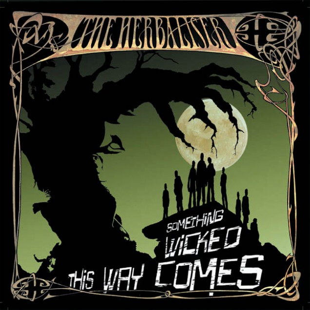
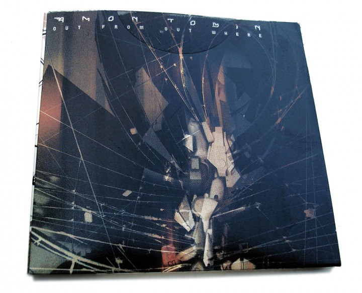
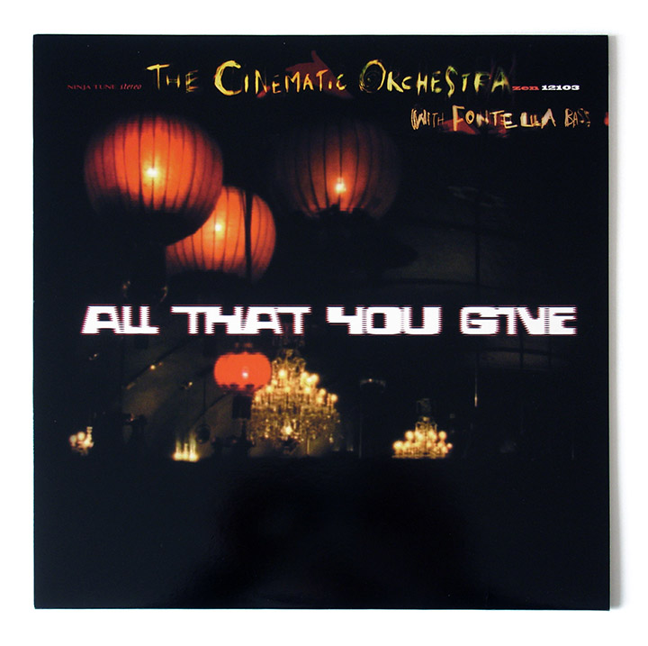
Gray Market Goods ‘The Shape of the Future’

  • RELEASED: 2003
  • FORMAT: 12″
  • LABEL: THRILL JOCKEY
  • CAT No.: THRILL 12.27
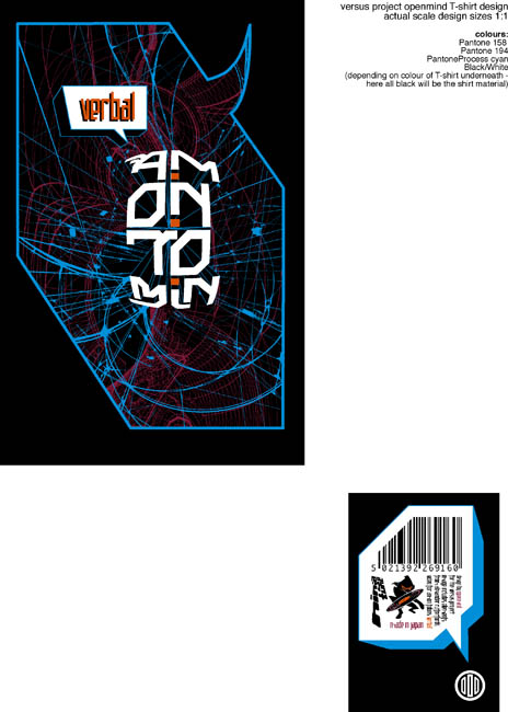
  • DESIGN: Openmind (after Vaughn Bodé)
  • ILLUSTRATION: Strictly Kev
  • EXTRA ZEN: Thrill Jockey page

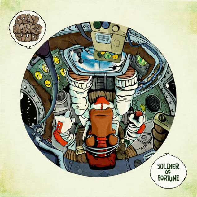
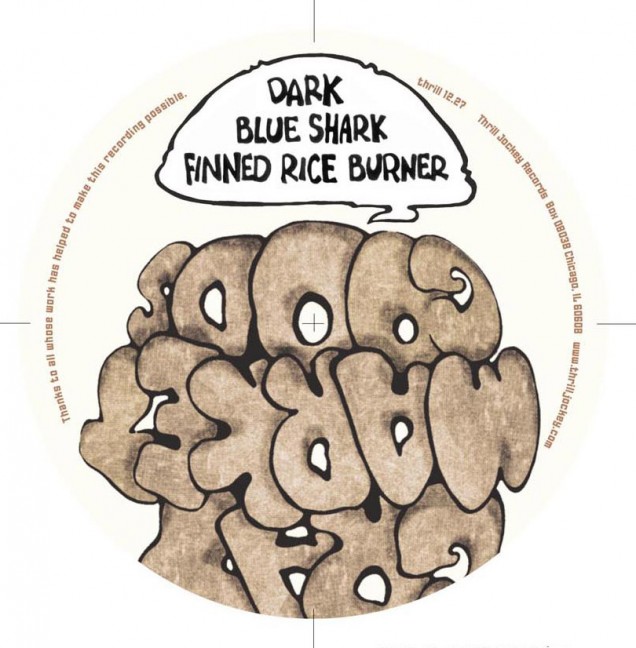
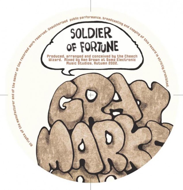
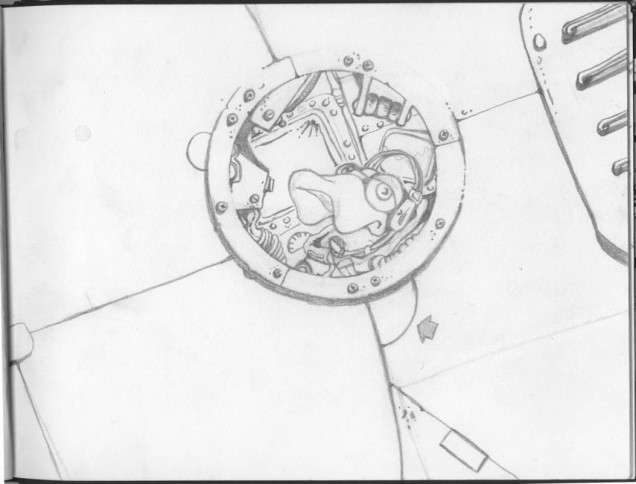
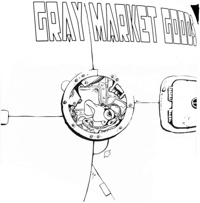
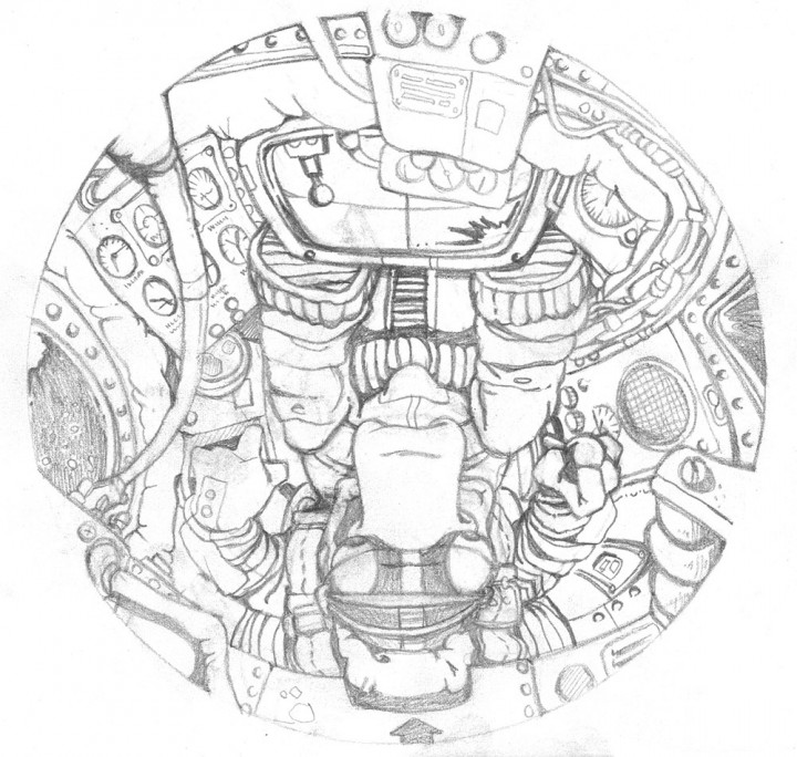
Bundy K Brown – whom I had collaborated with on ‘Full Bleed’ from Kaleidoscope – did a one-off 12″ for Thrill Jockey under this alias and asked if I would design the cover in exchange for some mixing work. He and I are big Vaughn Bodé fans and he wanted something that paid homage to the great artist so I worked up these original images based on his characters and style. I decided space was the theme and had a lizard in the cockpit of some kind of random vessel looking forlornly out of the porthole as he drifted in space.

All lettering was scanned and pieced together from Vaughn’s own writing and the logo adopted his bubble style letters within a speech bubble. When it came to colouring the images I meticulously scanned tons of sections of his paintings to get exact matches for colours and that unique texture his paintings have. These were then mapped into the outlined images, layer by layer until I had something that could genuinely pass for an undiscovered Bodé. Vaughn’s son, Mark, got wind of this and actually paid me a compliment on the rendition, saying that it was one of the better homages he had seen.

T-Love ‘Long Way Back’

  • RELEASED: 2003
  • FORMAT: 2xLP / CD
  • LABEL: ASTRALWERKS
  • CAT No.: ASW12818
  • DESIGN: Openmind
  • PHOTOGRAPHY: Harriet Fuller / unknown
  • EXTRA ZEN: T-Love Facebook

This has a long and protracted origin. T (Taura) came over to live in London for a couple of years around 2000 and ended up sharing the flat with Ollie Teeba from The Herbaliser after I moved out, hence my involvement (and his) in her debut album. Originally there were going to be two records: ‘Long Way Back’ and ‘Long Way Up’ and I designed logos for both of them. ‘Up’ never appeared because plans changed which was a shame because that logo worked really nicely but I was never 100% happy with the ‘Back’ version.

The record was originally slated to maybe come out on Ninja which is why T has a rogue 12″ on the label in her discography but she went with Astralwerks via Virgin in the end. No matter as I was on board and had done some roughs already using a wealth of material T had provided from old photo albums, family letters, report cards, ads and even 3D objects like tins, books and a washboard. This was every designer’s dream and she wanted a kind of photo album look to it although it was her older family who featured prominently rather than her. Lots of the photos were gorgeous faded sepia shots, some creased and decaying in books that had seen plenty of handling over the years too.

I started off by …

Read more…

Funki Porcini ‘Fast Asleep’

  • RELEASED: July 2002
  • FORMAT: LP / CD + DVD
  • LABEL: NINJA TUNE
  • CAT No.: ZEN57/ ZENCD57 / ZENDV57
  • DESIGN: Openmind
  • PHOTOGRAPHY: Martin LeSanto-Smith
  • SPOTTERS DELIGHT: The poster features behind the decks in the film ‘Shaun of the Dead’ and the same poster from that set used to hang behind the counter at Rat Records in Camberwell, only a short walk from where I live.
  • EXTRA ZEN: ninjatune page / BUY

James Braddell (aka Funki Porcini) is always fun to work with as his ideas are usually pretty leftfield. For this album he originally gave me an image of a shooting star over a tranquil night scene in the country, a sleeping cat curled in a ball and a line of Italian, the meaning of which, I still don’t know. I took the shooting star image and made a few versions for covers but nothing really stuck, the image was just too weak to work on it’s own. I also made a graphic of a ‘swarm’ of ‘zzzzzzzzz’s to denote being asleep which later wound up on the back cover and the curled up cat was perfect for the CD disc and record label. When we first discussed ideas for the cover James had mentioned that he would really like to have a girl asleep in a room of analogue kit somewhere but we immediately discounted this as it would take way too much money to set up and shoot.

After my initial efforts hadn’t amounted to anything I …

Read more…

The Herbaliser ‘Something Wicked This Way Comes’

  • RELEASED: Mar 2002
  • FORMAT: 2xLP / CD
  • LABEL: NINJA TUNE
  • CAT No.: ZEN64 / ZENCD64
  • DESIGN: Openmind / Ollie Teeba
  • EXTRA ZEN: ninjatune page / BUY

A form of Art Nouveau was order of the day here mixed with a soundtrack cover graphic of a tree forming a spindly hand inset with various intertwined bodies. I did tons of work on this but was never happy with it, I hadn’t drawn for years, maybe just a quick thumbnail sketch to lay something out, and I wish I had made the tree better. It works much better on the single version as the arm of the Ninja logo where is has more context and you’re not focusing on the details so much.

The back of the LP is more successful than the front as well with the Herbaliser logo transposed into an Art Nouveau carving and there are some nice instances with the type on the labels of the vinyl. Also check the woman’s face in the dead space in the crook of the elbow… Also included here are works in progress, alternate designs, colours and logos plus merchandise variations  on slip mats and shirts

The Herbaliser ‘Good Girl Gone Bad’ / ‘Something Wicked’

  • RELEASED: Feb 2002 / May 2002
  • FORMAT: 12″ / CDS
  • LABEL: NINJA TUNE
  • CAT No.: ZEN12110 / ZENCD110 / ZEN12110US / ZEN12111 / ZENCDS111
  • DESIGN: Openmind / Ollie Teeba
  • PHOTOGRAPHY: n/a
  • SPOTTERS DELIGHT: The US releases had different A and B sides respectively
  • EXTRA ZEN: ninjatune page / BUY / ninjatune page / BUY

Good Girl Gone Bad

Love the simplicity of this and the halo / devil tail angle works well even though it’s obvious.

Something Wicked This Way Comes

A form of Art Nouveau was order of the day here and it works much better on the single version as the arm of the Ninja logo where the tree has more context and you’re not focusing on the details so much. In some ways I wish this had been the album cover but the largeness of the Ninja might have confused people.

Amon Tobin ‘Remixes & Collaborations’

  • RELEASED: 28 Apr 2003 / 07 Jul 2003
  • FORMAT: 12″ / 12″ / CDS
  • LABEL: NINJA TUNE
  • CAT No.: ZEN12130 / ZEN12138 / ZENCDS138
  • DESIGN: Openmind / Openmind & Doug Bowden
  • SPOTTERS DELIGHT: Different covers for both Euro and US versions on both EPs, different again for the CD release. Collaborations EP comes with a gatefold sleeve that the Remixes 12″ fits inside.
  • EXTRA ZEN: RemixesCollaborations

This came out of the ‘Out From Out Where’ album – the Remixes being the ‘Verbal’ single – and it was always my intention to echo the musical process with the graphics when it came to the artwork. For ‘Remixes’ I took all the same elements I had used for ‘OFOW’ and remixed them into something new, adding various new components as I went. The crouching figure is made up of exactly the same elements as the object on the cover of ‘OFOW’ and – as with the previous album – I did multiple variations of the image for various different formats.

For ‘Collaborations’ – guess what? – yep, I collaborated, with designer Doug Bowden this time, a guy who had shown me his portfolio a few years hence after being recommended by a friend. I immediately liked him and, although his work didn’t have that ‘something’ I could hook into, I could see he had all the right elements in there but needed a break and some experience. At the time I needed some help with the graphic side of Ninja …

Read more…

Amon Tobin ‘Out From Out Where’

  • RELEASED: 14 Oct 2002
  • FORMAT: 2xLP / CD
  • LABEL: NINJA TUNE
  • CAT No.: ZEN70 / ZENCD70
  • DESIGN: Openmind
  • SPOTTERS DELIGHT: Different covers for Euro and US releases
  • EXTRA ZEN: ninjatune page / BUY

My whole ‘thing’ with Amon is for a mechanic/organic mix of imagery as I find his music highly technical but naturally flowing and melodic. With all his artwork I’ve been exploring these themes and in this series of sleeves I scanned parts of un-built Gundam robot models. I reassembled them in Photoshop to make forms and creatures that have a quality that I would associate with his previous sleeves. Each part, once assembled into a form, was then shaded via airbrush and various layers of colour tones, lighting and textures applied until I had something I wanted.

I’ve been a fan of Gundam for years and always loved the forms and angles of the models, this time I wanted to build my own object and Amon’s work was the perfect platform for that. This is by no means the end of my work involving these shapes but for the next Amon record I moved onto something else. He’s one of the few artists who leave me to do what I want, he trusts me to make something on my own but he knows what he likes and what he doesn’t so I make a lot of material that gets discarded. For the LP I did around 15 different variations of the cover image, some made the LP …

Read more…

Amon Tobin ‘Verbal’

  • RELEASED: 30 Sept 2002
  • FORMAT: 12″ / CDS
  • LABEL: NINJA TUNE
  • CAT No.: ZEN12118 / ZENCDS118
  • DESIGN: Openmind & Alex Rutterford
  • SPOTTERS DELIGHT: Different covers for Euro and US releases
  • EXTRA ZEN: ninjatune page / BUY

For this single I made 3 completely different overall designs before Amon gave approval. The first was a distorted version of a famous rapper who was sampled in the song, the second was an abstract image with tramlines that I had photographed in Switzerland but neither of these were up to scratch. I was nearly at the end of my tether when showing him the 3rd ‘Gundam’ version but he loved it and it’s one of my favourite pieces of work.

I used some of this unpublished work (the 2nd version) for an exhibition called Versus I took part in at Parco in Tokyo where one image was made into a huge banner and part of the design was made into an exclusive Amon T-shirt.

DJ Vadim ‘USSR: The Art of Listening’ / ‘Instrumentals’

Again with this album cover Vadim wanted graffiti on the cover but didn’t want to have a conventional piece and I suggested hooking up with french writer Darco for a collaboration. I had admired his work for a while and they had already met once before so it was on after we met at a Ninja gig on the Batofar boat one September. Before anything was committed to paper there was already a plan in plan to release four 12″ singles and a 7″ of material from the album so I had a large canvas to map out in terms of space for designs to occupy.

There where several stages to the making of this project and it was fairly labour intensive for all involved: Stage 1: Darco comes up with designs for a full scale piece to be painted in Paris that will be photographed and filmed on time lapse photography and video.

Stage 2: I come up with a graphic look for the album, this includes a new logo for Vadim, a motif featuring the outline of Russia and a camouflage pattern made out of shapes from Darco’s graffiti. This camo was made into eight different colour combinations, one for each single, the album, the 7″ …

Read more…

DJ Vadim ‘USSR: The Art of Listening’ singles

  • RELEASED: July 2002 / Aug 2002 / Apr 2003 / Nov 2003
  • FORMAT: 7″ / 12″ / CDS
  • LABEL: NINJA TUNE
  • CAT No.: ZEN7114 / ZEN12113 / ZENCDS113 / ZEN12108 / ZENCDS108 / ZEN12129 / ZEN12107
  • DESIGN: Openmind / Darco
  • PHOTOGRAPHY: Le Truc – FTP
  • SPOTTERS DELIGHT:  Euro and US versions have slightly different cover designs
  • EXTRA ZEN: Up To Jah / Combustible / It’s On / Edie Brikell / Til Sun’s In Your Eyes

With these singles Vadim wanted graffiti on the cover but didn’t want to have a conventional piece and I suggested hooking up with french writer Darco for a collaboration. Before anything was committed to paper there was already a plan in plan to release 4 12″ singles and a 7″ of material from the album so I had a large canvas to map out in terms of space for designs to occupy.

There where several stages to the making of this project and it was fairly labour intensive for all involved: Stage 1: Darco comes up with designs for a full scale piece to be painted in Paris that will be photographed and filmed on time lapse photography and video.

Stage 2: I come up with a graphic look for the album, this includes a new logo for Vadim, a motif featuring the outline of Russia and a camouflage pattern made out of shapes from Darco’s graffiti. This camo was made into eight different colour combinations, one for each …

Read more…

Cinematic Orchestra ‘Every Day’ / ‘All That You Give’

first issue LP with tip on sleeve detail
Straight No Chaser advert
A2 promo poster
logo variation ideas
unused cover design for 'Every Day'
unused cover design for 'Horizons'
unused back cover design for 'Horizons'
unused cover design for 'Horizons'
unused label designs for 'Horizons'
unused cover design for 'Man With The Movie Camera'
unused cover design for 'Burnout'
unused early cover layouts
  • RELEASED: May 2002
  • FORMAT: 2xLP / CD
  • LABEL: NINJA TUNE
  • CAT No.: ZEN59 / ZEN59X / ZENCD59
  • DESIGN: Openmind
  • PHOTOGRAPHY: Carl Fox
  • SPOTTERS DELIGHT: Limited heavyweight LP cover with large sticker artwork
  • EXTRA ZEN: ninjatune page / BUY

I was never happy with how this came out although the heavy vinyl sleeve version looks great. Something just doesn’t gel with the elements, same with the single ‘All You Can Give’ which is a shame because they are great records. I was working with, first, visuals given to me from the video – shot in a ballroom down in Blackheath. Secondly, more still photos shot by Carl Fox in the same location which were of obvious higher quality that the video stills.

As before with any Cinematic project I made loads of idea mock ups for sleeves and logos and some of these are interesting in hindsight for the way they try to illustrate the title. Talking of titles; it changed several times over the course of the design so I had to go back and redo stuff. It started as ‘Horizons’ then changed to ‘Burnout’, was briefly ‘Man With A Movie Camera’ and finally: ‘Every Day’.

Neotropic ‘Sunflower Girl’

  • RELEASED: Aug 2001
  • FORMAT: 7″
  • LABEL: NTONE
  • CAT No.: NTONE45
  • DESIGN: Openmind
  • PHOTOGRAPHY: Riz Maslen
  • EXTRA ZEN: ninjatune page / BUY

A sad one as this is the last release on Ntone, Ninja’s electronic / ambient / whatever sub-label, before it was folded into Ninja (not including Neotropic either). Riz had some lovely pictures of sunflowers, I think taken on a Lomo, and they were perfect for the cover. For some reason, at the printing stage, the cover picture got substituted for one of the label images hence the odd cover choice.

I never saw a proof and it was a one-off pressing so there was never a chance to correct it. Until now that is… here is the cover as it was supposed to look, close cropped sunflower and ornate type – lovely – another one for the ‘it should have looked like this’ pile.