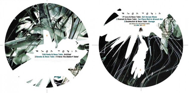
- RELEASED: 28 Apr 2003 / 07 Jul 2003
- FORMAT: 12″ / 12″ / CDS
- LABEL: NINJA TUNE
- CAT No.: ZEN12130 / ZEN12138 / ZENCDS138
- DESIGN: Openmind / Openmind & Doug Bowden
- SPOTTERS DELIGHT: Different covers for both Euro and US versions on both EPs, different again for the CD release. Collaborations EP comes with a gatefold sleeve that the Remixes 12″ fits inside.
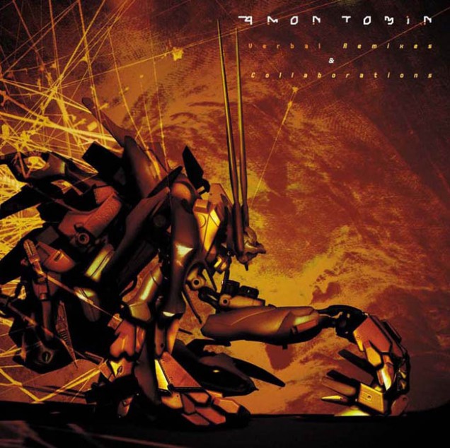
- EXTRA ZEN: Remixes / Collaborations
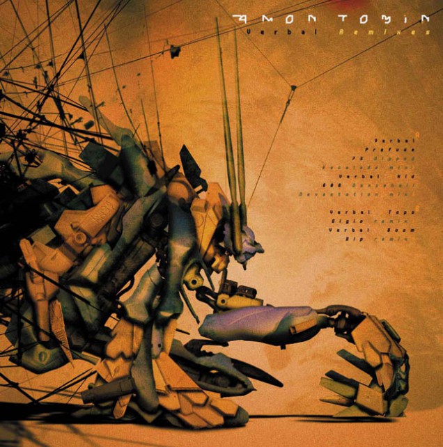
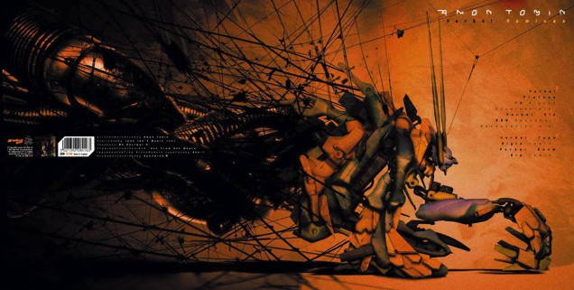
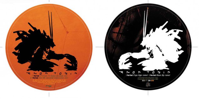
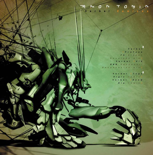
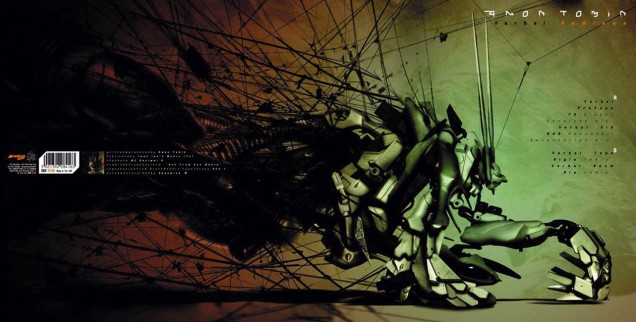
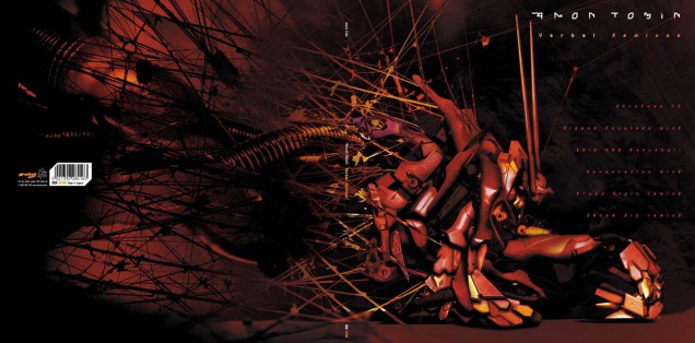
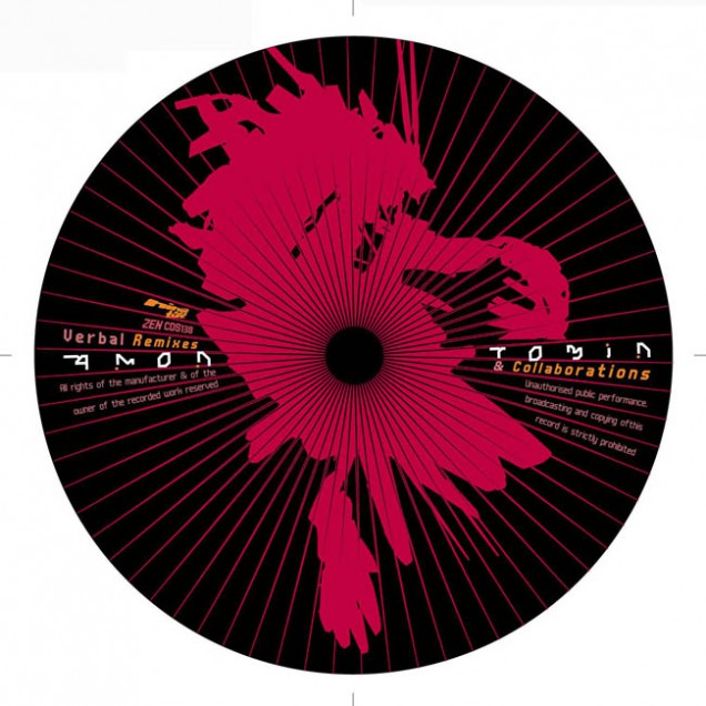
This came out of the ‘Out From Out Where’ album – the Remixes being the ‘Verbal’ single – and it was always my intention to echo the musical process with the graphics when it came to the artwork. For ‘Remixes’ I took all the same elements I had used for ‘OFOW’ and remixed them into something new, adding various new components as I went. The crouching figure is made up of exactly the same elements as the object on the cover of ‘OFOW’ and – as with the previous album – I did multiple variations of the image for various different formats.
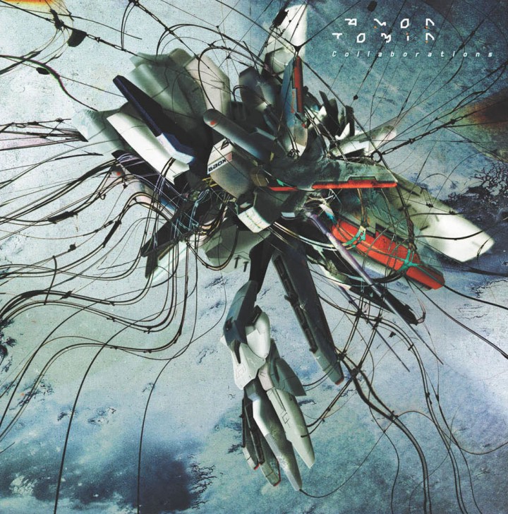
For ‘Collaborations’ – guess what? – yep, I collaborated, with designer Doug Bowden this time, a guy who had shown me his portfolio a few years hence after being recommended by a friend. I immediately liked him and, although his work didn’t have that ‘something’ I could hook into, I could see he had all the right elements in there but needed a break and some experience. At the time I needed some help with the graphic side of Ninja as there was so much work and he has since done work for them as well as Big Dada, Son and many others. Check his work out at www.pandayoghurt.co.uk/
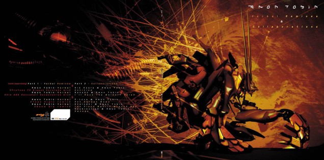
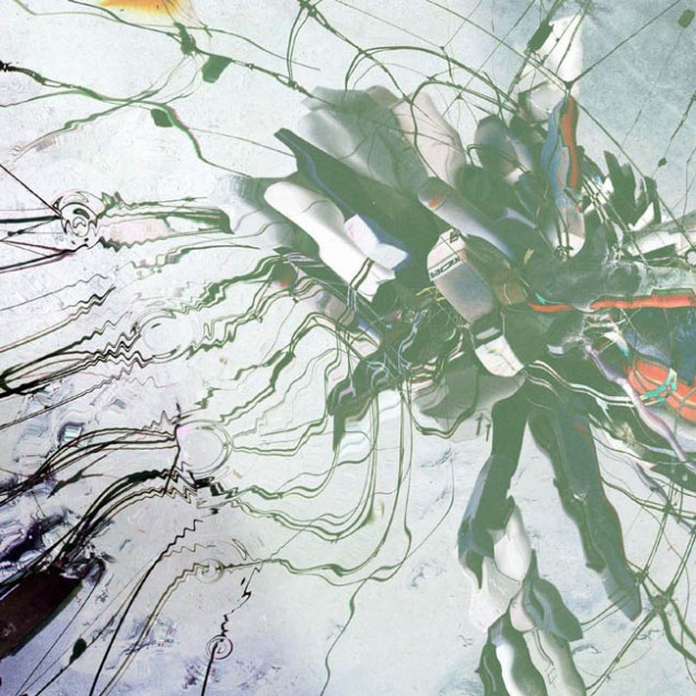
Anyway – being a control freak – I led the brief but got him to start it, the idea being that he construct a ‘being’ using the methods I usually employ and then hand it over to me to put into a setting. He did something, not a world away from my ‘OFOW’ cover, which you can see the original of on his cover for Amon’s ‘library’ CD seen here…
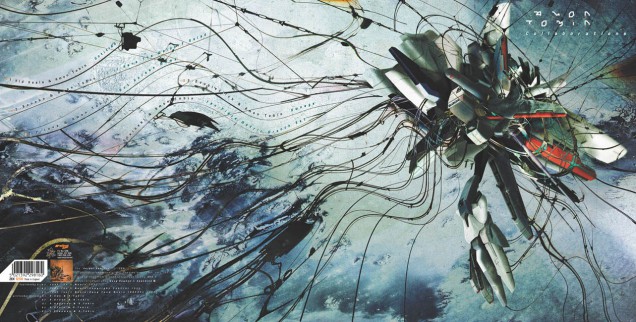
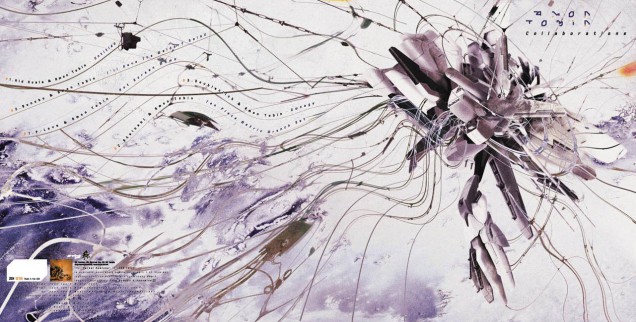
I took this, flipped it (literally), added and subtracted a few bits and set it in a kind of underwater environment, taking the tramlines I’d previously used but making them more like tentacles. At one point I wanted the image to look as though the being was above and the viewer was underwater, looking up as the tentacles pieced the surface and caused ripples, distorting the above image. I tried a load of different Photoshop techniques but just couldn’t get it to look convincing but here is one that nearly worked.
Again, multiple versions were made that were spread across the European and US editions and, with these two releases, I began to deconstruct the Amon Tobin logo a little more each time so that it became more of a graphic symbol but would still be recognisable and readable by fans instantly. I had made sure that the ‘Verbal’ vinyl version was printed in a small inner sleeve sized cover at the time of release which may have puzzled some people but all was revealed when ‘Collaborations’ came out. The disc came in a sleeve the same size as ‘Verbal’ but housed in a gatefold cover that had a side for the ‘Remixes’ disc to be stored thus completing a two part set. This set, along with ‘OFOW’, is some of my favourite artwork I have ever had the pleasure of making. A few years later someone pointed out how much like William Blake’s ‘Newton’ the cover looked and asked if it had inspired it. It hadn’t but I have to admit that it’s definitely similar and I do know the piece so maybe it was a subconscious thing.