- RELEASED: July 2002 / Aug 2002 / Apr 2003 / Nov 2003
- FORMAT: 7″ / 12″ / CDS
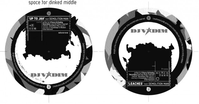
- LABEL: NINJA TUNE
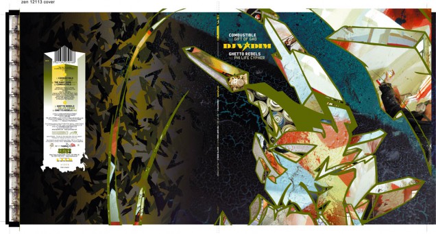
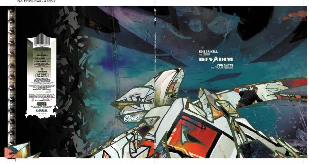
- CAT No.: ZEN7114 / ZEN12113 / ZENCDS113 / ZEN12108 / ZENCDS108 / ZEN12129 / ZEN12107
- DESIGN: Openmind / Darco
- PHOTOGRAPHY: Le Truc – FTP
- SPOTTERS DELIGHT: Euro and US versions have slightly different cover designs
- EXTRA ZEN: Up To Jah / Combustible / It’s On / Edie Brikell / Til Sun’s In Your Eyes
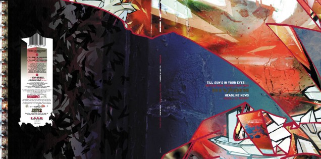
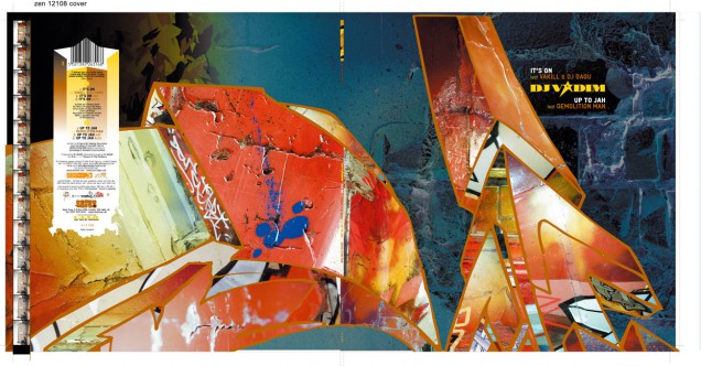
With these singles Vadim wanted graffiti on the cover but didn’t want to have a conventional piece and I suggested hooking up with french writer Darco for a collaboration. Before anything was committed to paper there was already a plan in plan to release 4 12″ singles and a 7″ of material from the album so I had a large canvas to map out in terms of space for designs to occupy.
There where several stages to the making of this project and it was fairly labour intensive for all involved:
Stage 1: Darco comes up with designs for a full scale piece to be painted in Paris that will be photographed and filmed on time lapse photography and video.
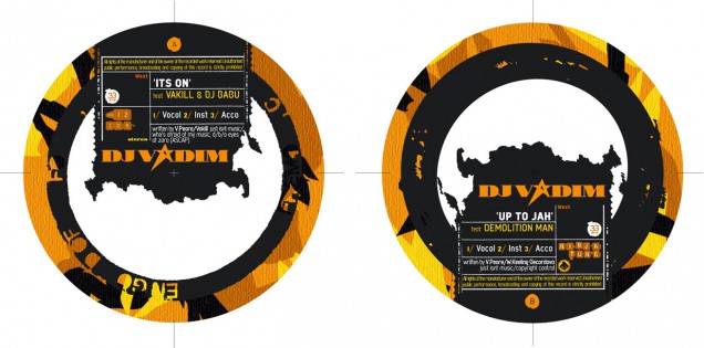
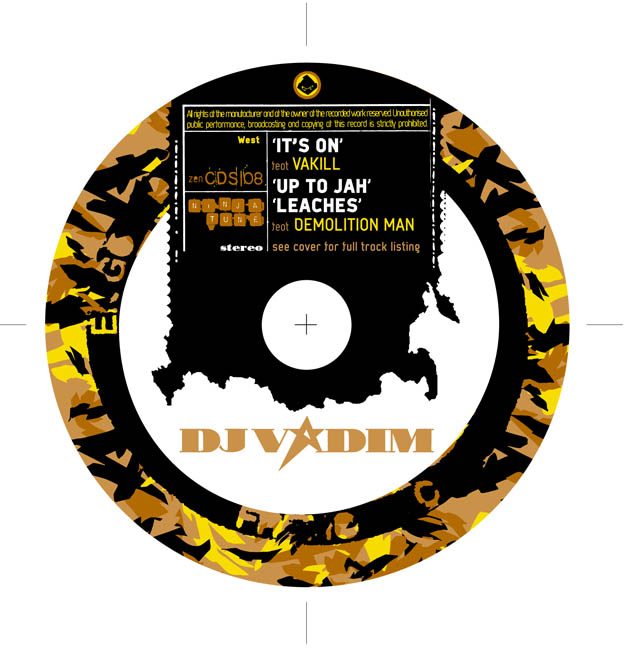
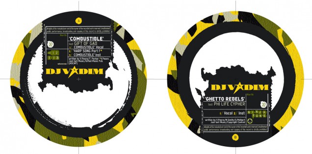
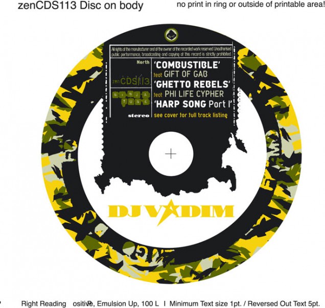
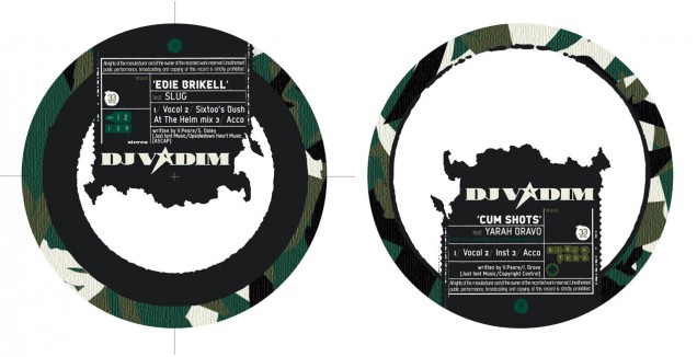
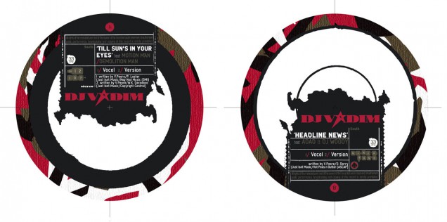
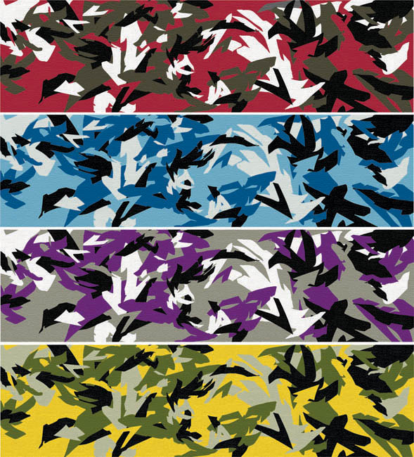
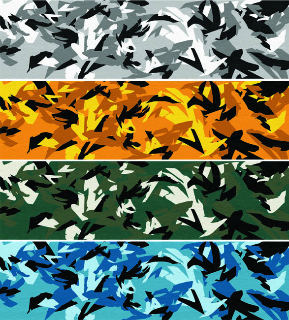
Stage 2: I come up with a graphic look for the album, this includes a new logo for Vadim, a motif featuring the outline of Russia and a camouflage pattern made out of shapes from Darco’s graffiti. This camo was made into eight different colour combinations, one for each single, the album, the 7″ and the instrumental album that would inevitably follow.
Stage 3: I take the 100+ photos shot at the site of Darco’s painting in Paris and imbed them into another Darco piece which will be split into nine panels for the artwork. Two panels each for the back and front of each 12″ single and the middle panel for the back cover of the LP. Each 12″ sleeve is colour coded with both camo and images that feature a corresponding colour prominently so as to sit well together. The idea being that if you collect all the singles and the LP you can make a giant nine panel version of the LP front cover in a similar way that the five Futura 2000 paintings on the back of the early Celluloid sleeves join up.
Stage 4: It all came together beautifully in the end with a variation on the overall look created for the US/N. American market as well. Ninja nearly didn’t release the fourth 12″ thus making the set incomplete but, after some badgering were persuaded to finish the series.