- RELEASED: 21 Feb 2007
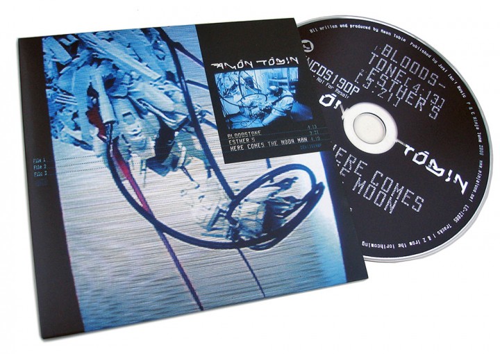
- FORMAT: 2xLP + DVD / CD+DVD / Ltd CD+DVD / DL
- LABEL: NINJA TUNE
- CAT No.: ZEN121 / ZENCD121 / ZENCD121X / ZENDL121
- DESIGN: Openmind
- PHOTOGRAPHY: Nicholas Casonova, Julie Elie, Marianne Allard
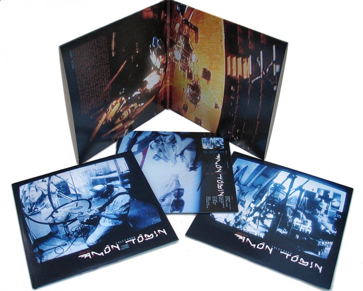
- SPOTTERS DELIGHT: Additional DVD attached to the inside of the vinyl gatefold, limited gatefold digipak CD/DVD, pdf booklet with iTunes download, individual track images with download from Bleep.com
- EXTRA ZEN: ninjatune page / BUY
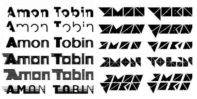
During my long association with Amon I have always tried to progress the themes and graphics in the artwork with each release. ‘Foley Room’ was no exception and started with a subtle revamp of his logo, something that started life as a typeface made by graffiti artist She One and has since morphed this way and that into what it is today. After initially starting from scratch with an entirely new logo and getting nowhere I made the original spikier and sleeker, cutting sections diagonally to make it seem like it would cut you if touched.
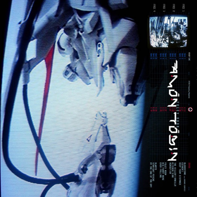
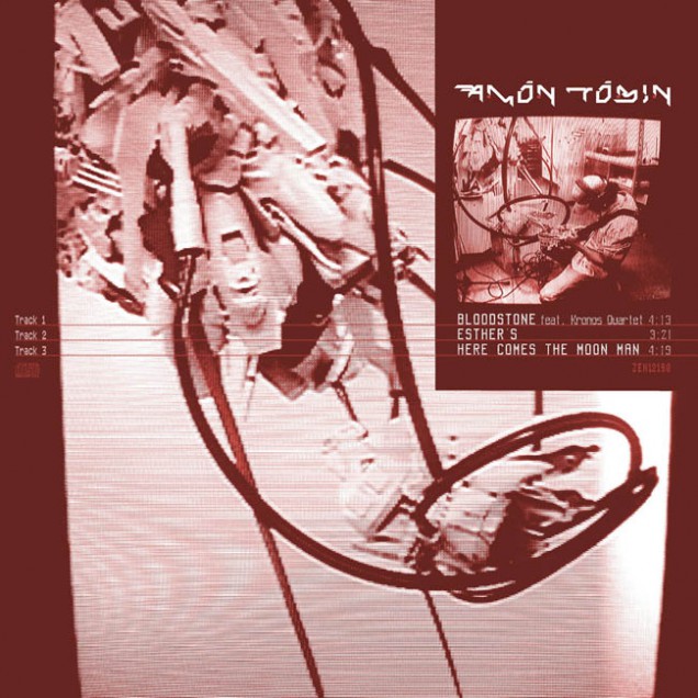
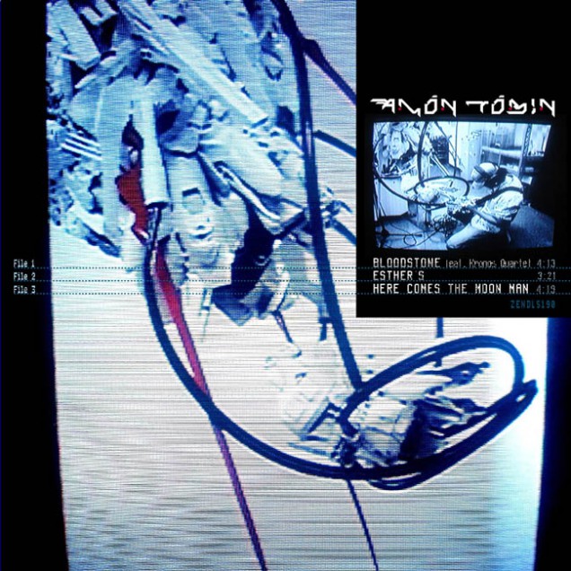
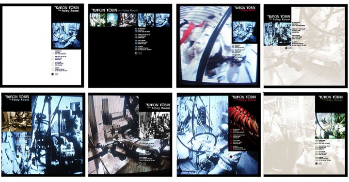
For this record Amon had made a series of field recordings of sounds that he then sampled and used as the bulk of the record structure. He’d also had the good sense to document these trips on both film and photo for a DVD to be included with the record. He wanted photography used in the artwork that would show everyday situations and tally with his field trips but he didn’t want it to be a literal document – he wanted a twist of some kind.
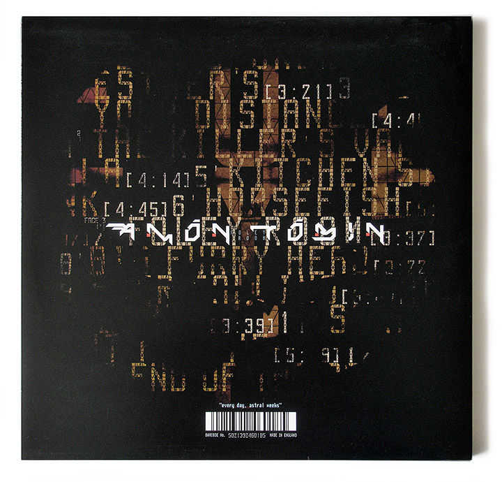
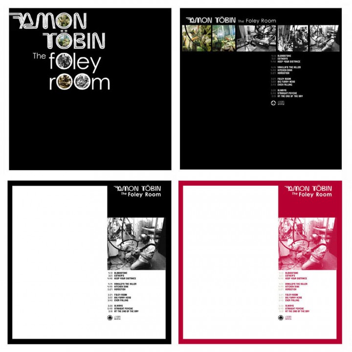
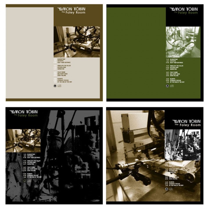
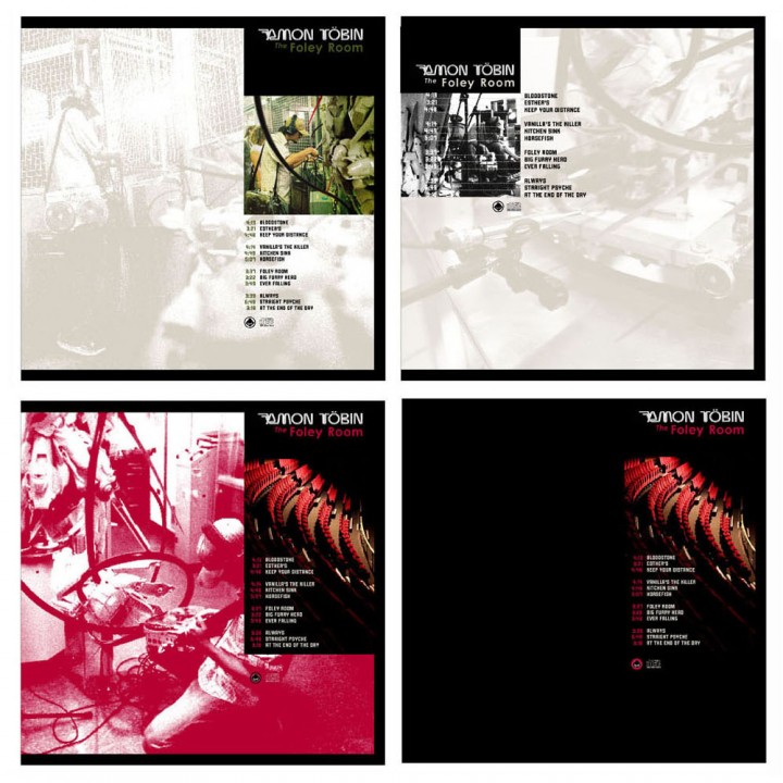
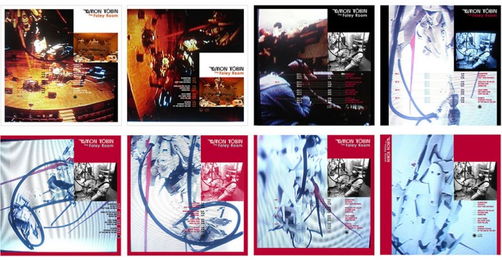
Next came designing the look of the record and I took inspiration from the Folkways and Nonesuch record labels that specialised in field recordings and unique events. The Folkways records often had a plain black card sleeve with a big wrap around sticker that would cover the front but only reach part way across the back. They usually used a minimal palette of 2 or 3 colours and a black and white image so I designed a mass of variations in different colour combinations in this style. Whilst not yielding anything definitive it gave the layout an initial structure and produced some interesting results which I then began to work on by substituting one image for another until I found the right combination.
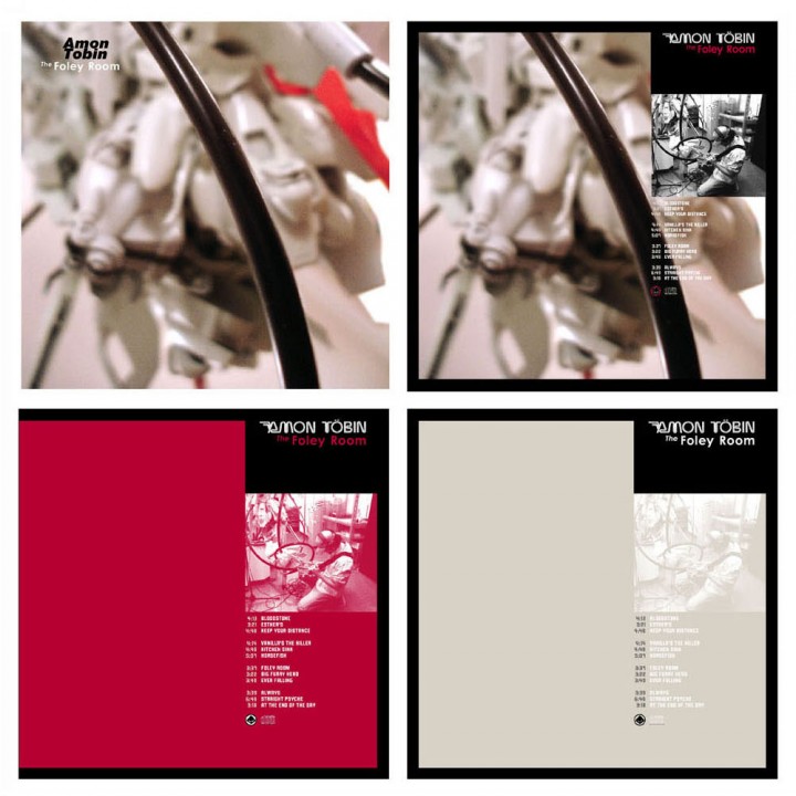
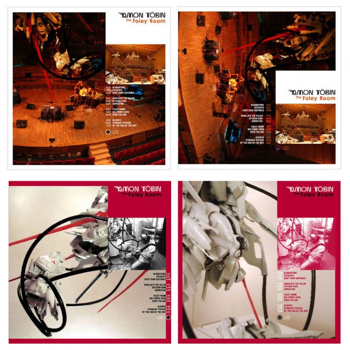
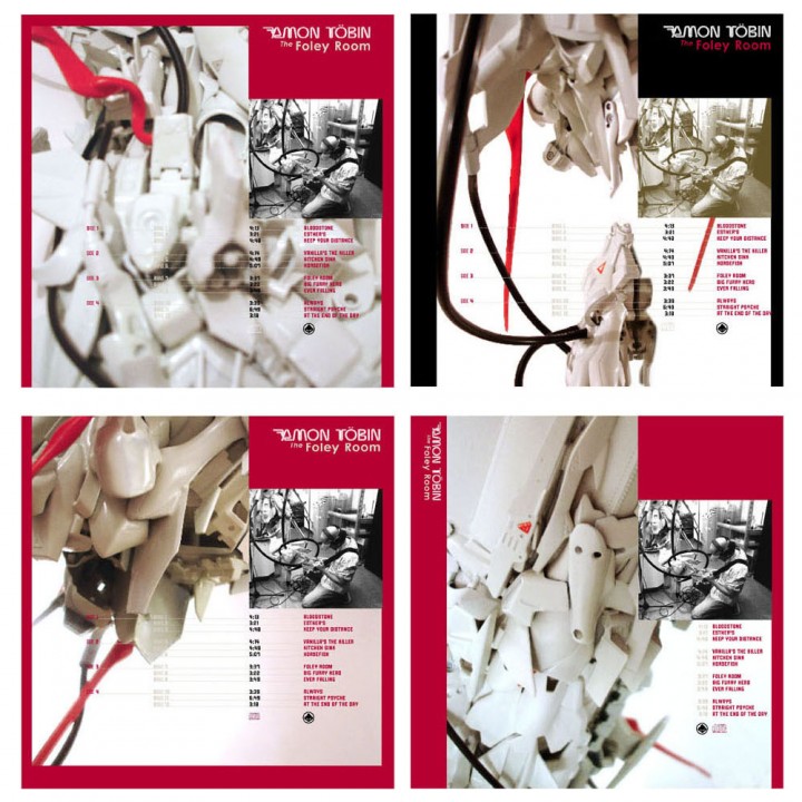
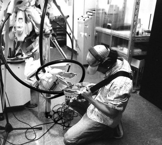
I had previously done the Tag The System train customisation and had figured that it would be ideal for an Amon record in one form or another as it used a similar process – albeit in a 3D context rather than a 2D one – to previous album artwork. With this in mind I made sure I photographed the model extensively after it was finished and showed some of these images to Amon who loved them as he had recorded train sounds for the album so saw a connection. After photo-shopping sections of the model images into his recording photos – so that it looked like Amon was recording robots, the twist he had wanted.
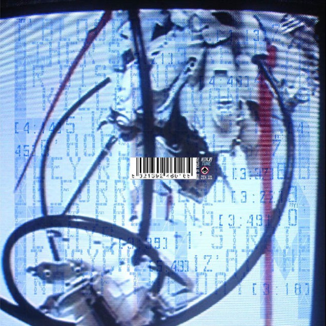
I experimented with shooting the images through the TV screen to add texture and grain. At the time I was having a rekindled love affair with Eno & Byrne’s ‘My Life In The Bush Of Ghosts’ album as it had been reissued and the TV feedback cover art had always been a favourite of mine. The results threw up all sorts of new angles; as well as distorting and blending the Photoshop results together they exaggerated the contrast, colour and lighting of each image and gave it that ‘documentary’ feel.
When you shoot a TV on a slow speed the camera can’t keep up with the constant flicker of the screen refreshing so, sometimes, you get a black band across part of the image. It was one of these photos which became the front cover because it was perfect for setting the cover text as I had decided to put the titles on the front rather than the back (for some reason). Of all the photos of the train that were used I took good care to make them as ambiguous as possible and few people who had seen the original model made the connection when they saw the artwork.
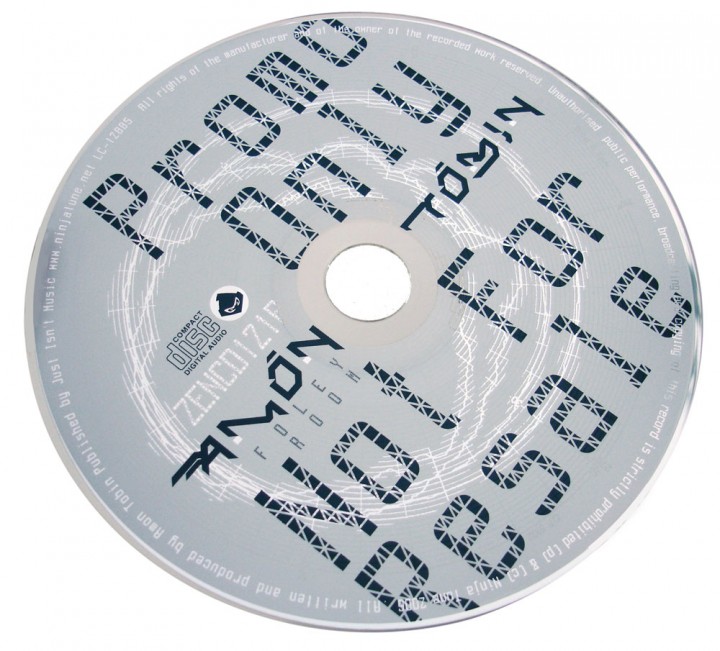
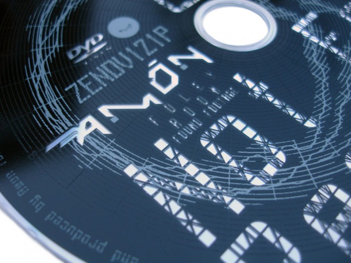
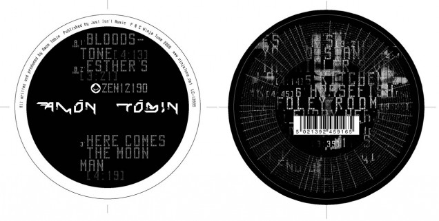
The TV gave them a nice blue hue which coloured some of the black and white images too. Next was which typeface to use as a basis for the record: I wanted something ‘technical’ without resorting to the obvious Data 70 or LCD-type fonts. I settled on the Airport/Luggage family which is based on airport timetables boards, all squares and triangles that make up each character like an LCD display but with many more options. This font is incredibly detailed so it looks great large but blends into a regular character at small sizes, hence the large and small instances used on the sleeve.
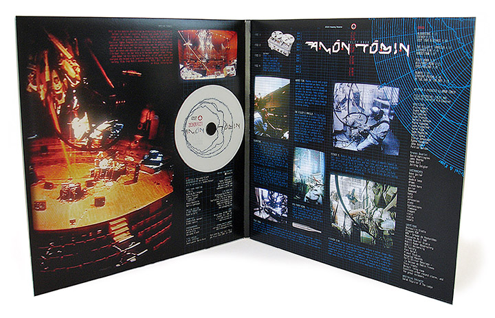
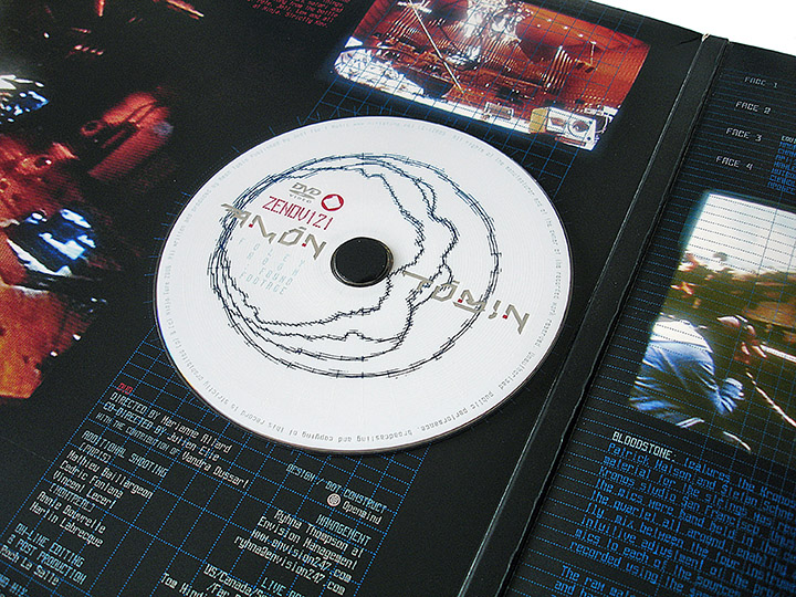
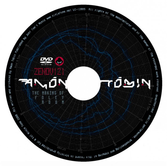
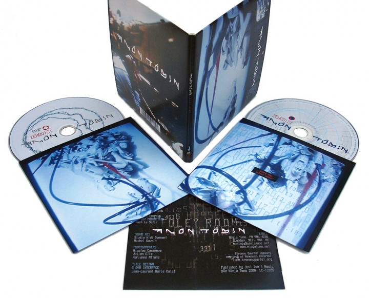
The next problem came with the DVD as Amon was adamant that it be included with the vinyl as well as the CD. The CD posed no problem, you just add a double tray or a second card sleeve but the disc needed to be fixed to the cover to keep it from getting scratched and I didn’t want it just thrown inside a sleeve to rattle around. The first idea was to have it attached via a plastic sleeve to the outside but this would cause problems when the records were stacked together as it could catch and rip and also make an indentation in the sleeve next to it meaning possible returned copies marked as ‘damaged’.
The second idea was to attach it to a 12 x 12 piece of card to be slotted into one side of the gatefold cover, again this would have potentially caused an indentation on the cover so a recessed version was mooted. This would have meant two thick pieces of card stuck together, one with a disc sized cut out so that the DVD could sit ‘inside’ the card and not cause damage – alas, too expensive.
The final solution was to do a gatefold with a very thick spine (1cm!) and sit the disc on a foam button inside the gatefold opening itself, near to the middle as there is a gap where the card doesn’t meet due to the thickness of the spine. The whole package would then be shrink wrapped to ensure that if a disc fell off it wouldn’t be able to escape – this was actually very cheap and simple to do and worked well. Frustratingly the whole package fell at the last hurdle though through a myriad of printing cock ups where approved artwork reverted back to old versions, images were resized or missing for no apparent reason and one bright spark at the pressing plant decided that the DVD should look the same as the CD and changed the ink on the background colour!