![]()
A few weeks ago I stumbled across this badge on eBay from a seller in the UK. The name piqued my interest as The Sunshine Makers was a documentary about Tim Scully and Nicholas Sand, two west coast chemists who manufactured Orange Sunshine LSD in the sixties, considerd the gold standard of acid production.
I wondered if this was connected in some way? Maybe something produced by and for those in the know who also made or distributed the drug? An innocuous signifier to those hip to it that confirmed the wearer as someone to be trusted maybe? The back of the badge bears the hallmark: W.O. Lewis Badge which must be Lewis Badges from Birmingham and puts the origin of manufacture as the UK. They had no info on it either as their records only go so far back.
![]()
I couldn’t find anything about ‘the league…’ on the web aside from the above documentary and a reference to a 1935 cartoon of the same name which is most likely a coincidence rather than anything else.
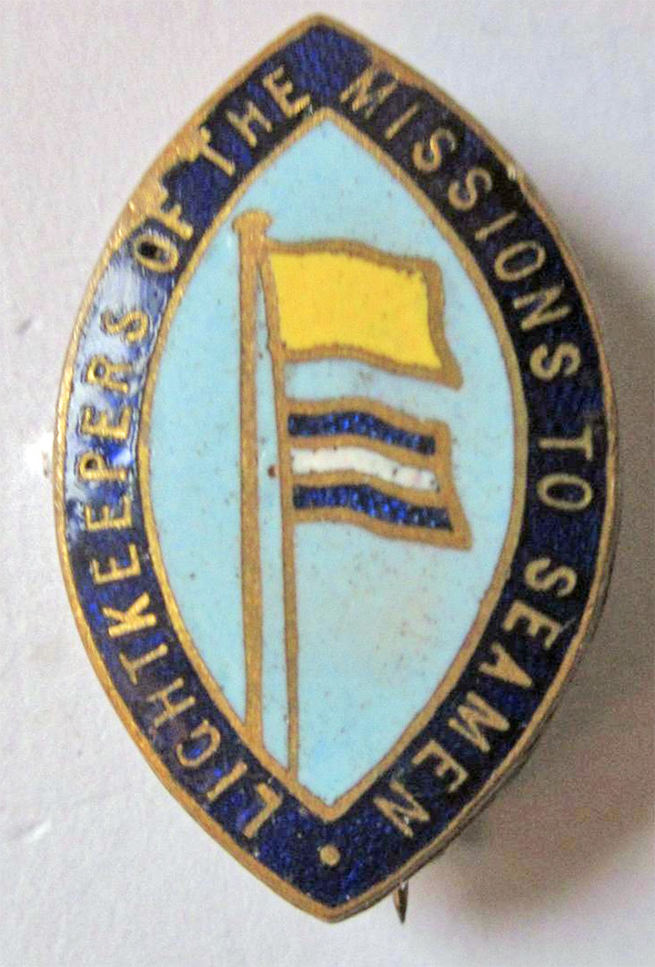
It niggled me that there was nothing out there, and there was no info in the original eBay listing either but I did find a mental health organisation called Shine who also used a light house in one of their logos. A google picture search returned a very similar looking badge under the name ‘LightKeepers of the Missions to Seamen’ which is appararently an organization that supports seafarers, including those who work on lighthouses and lightships.
I wondered if the lighthouse pictured was a clue so contacted the Association of Lighthouse Owners in the UK to enquire if they had any reference for it.
Their response came back:
“We’ve checked our catalogue and drawn a blank. If we had such a badge, we would have been sure to record the text. The badge depicts a generic rock lighthouse. If it was meant to represent any particular lighthouse or lighthouse service, one would expect more of a clue.
It might not be lighthouse-related at all. Christian churches and charities frequently appropriate the word lighthouse or lighthouse symbolism for their own missions.”
Now there’s a thought, anyone recognise or know the origins of this oddity? Please leave a comment if you do.