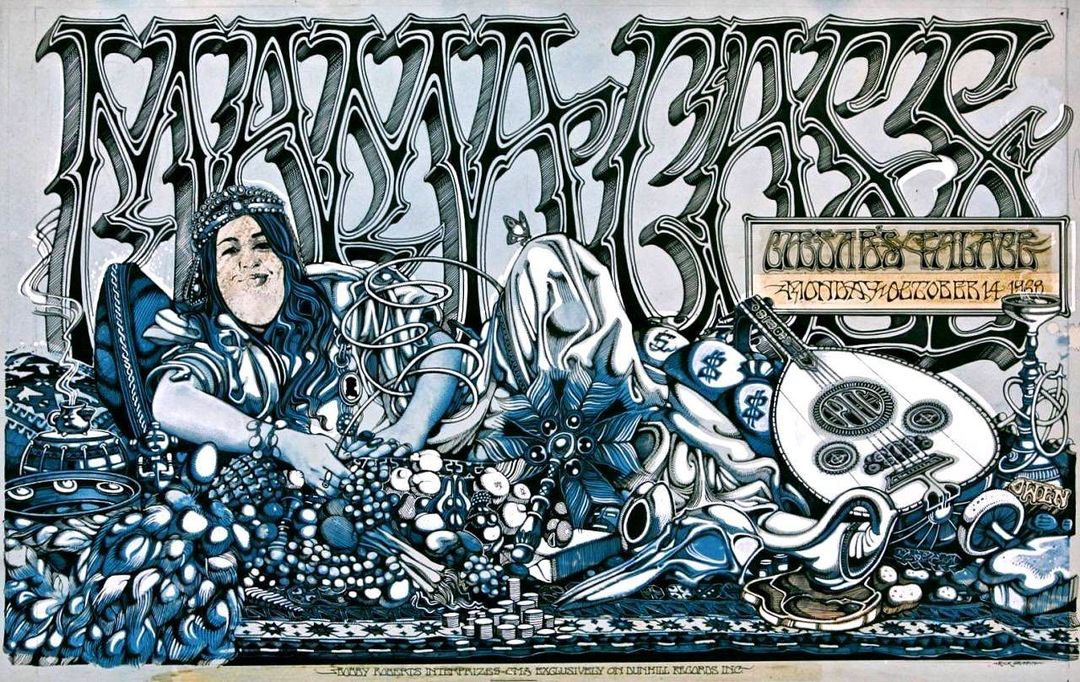
Amazing Rick Griffin billboard poster for a Mama Cass gig that I found online at the excellent Far Out Company website.
Bureau of Lost Culture
Objects or items related to the Bureau of Lost Culture ethos of exploring the forgotten corners of the counter culture.
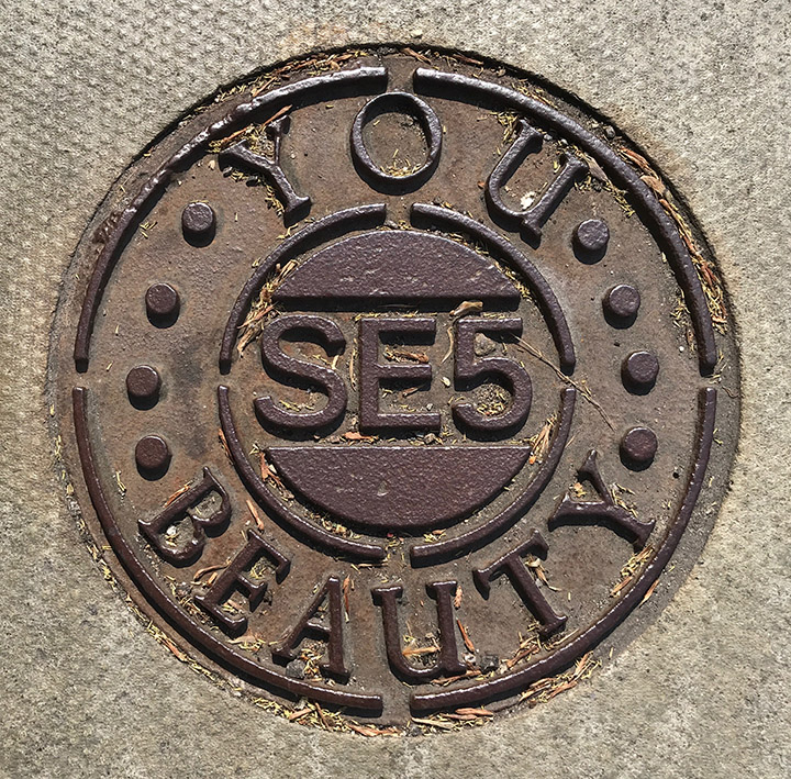
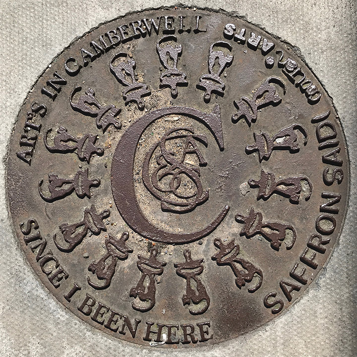
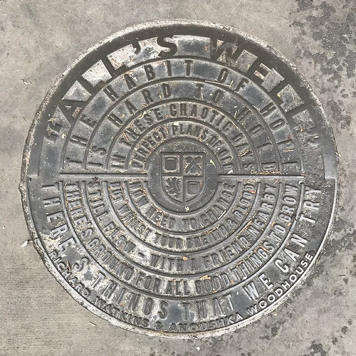
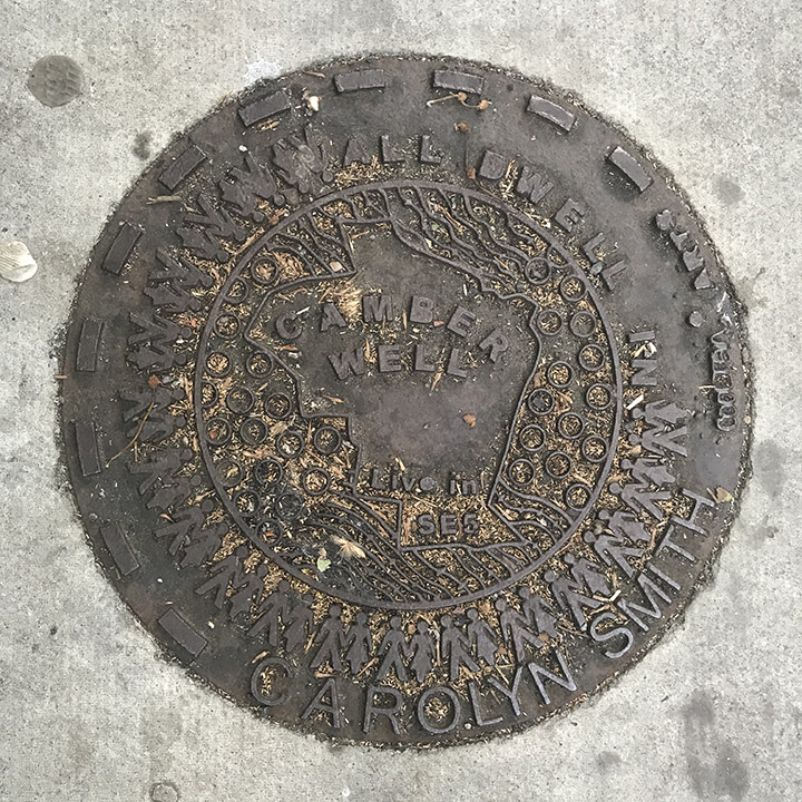
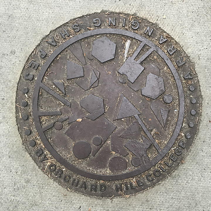
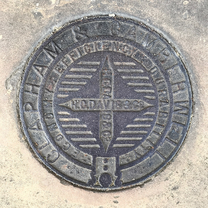
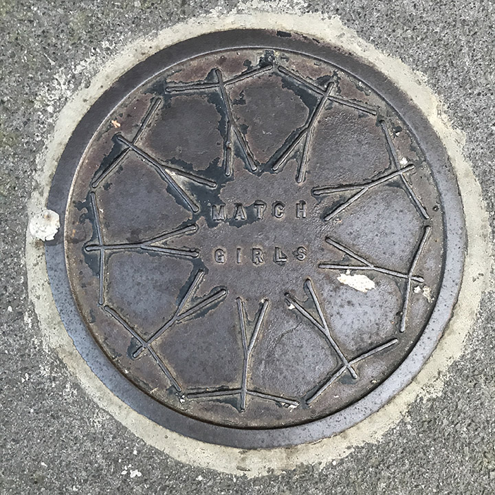
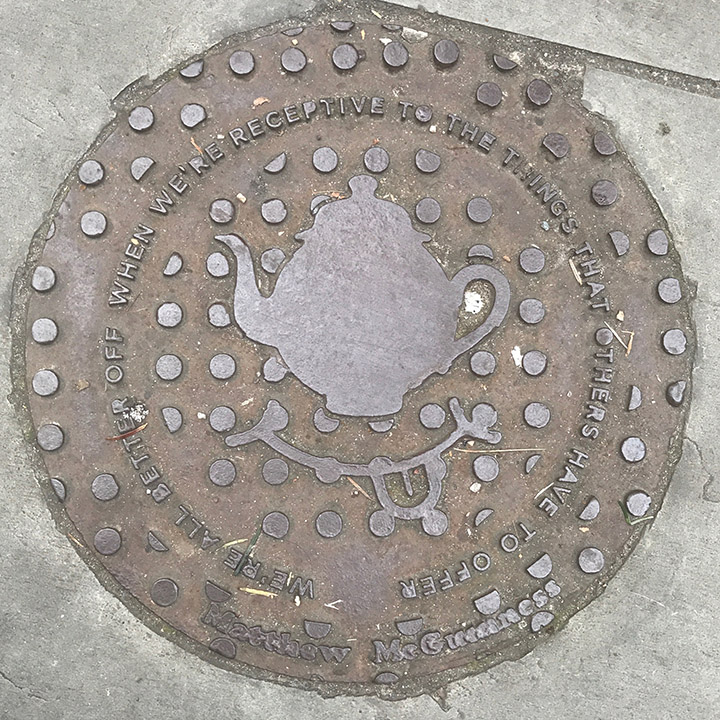
A set of 9 decorative ‘manhole covers’ found in Camberwell, these are all set into the pavements around the lower part of Denmark Hill, SE5*. I think only one of them is an actual coal hole, the rest seem to be area-specific art installations. If anyone has any info please leave a comment
*Actually I think the Match Girls one is from around Brick Lane
#streetart #lookdown #manholecovers #SE5 #camberwell
(images and text adapted from the pbagalleries website)
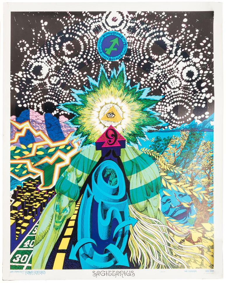
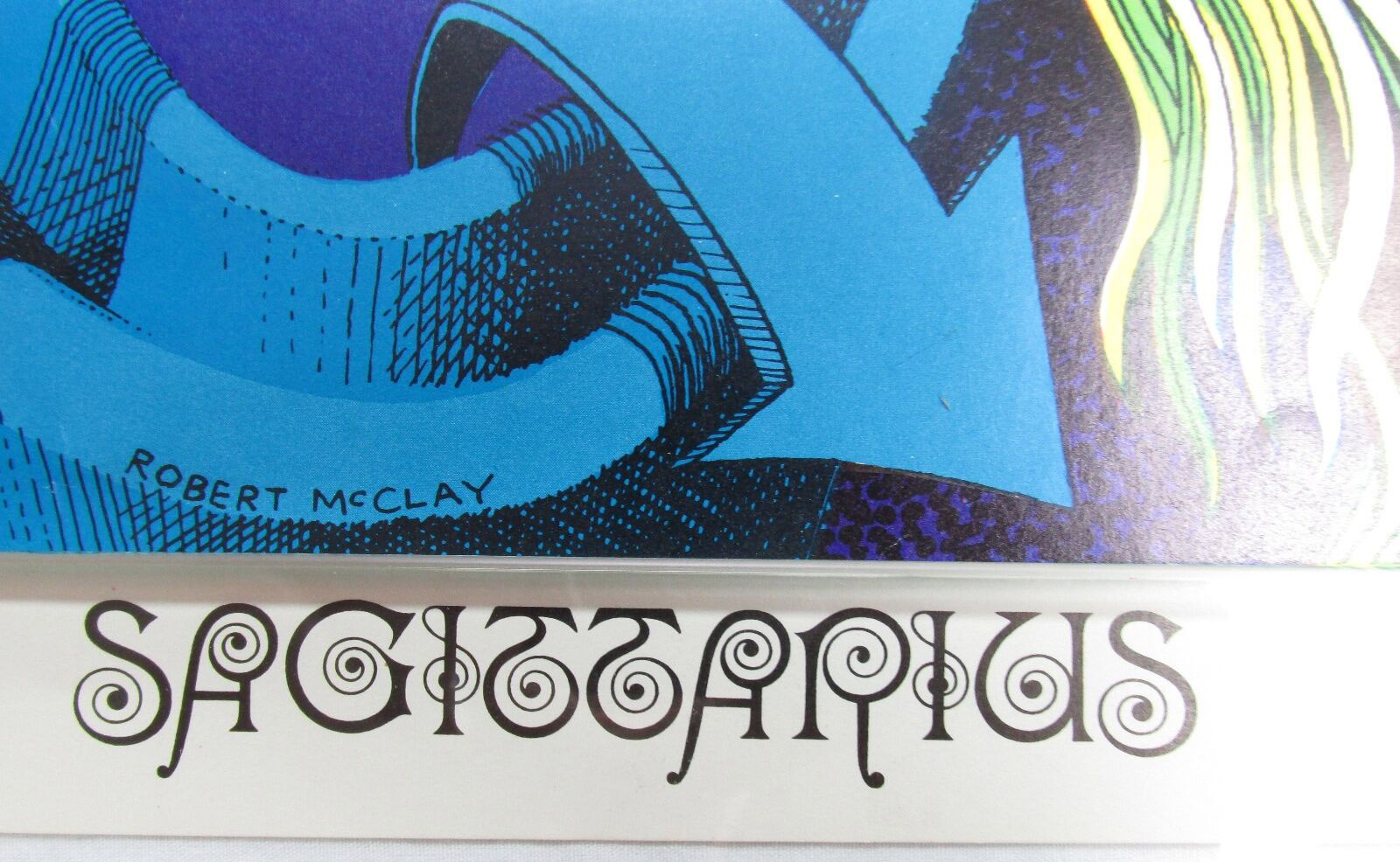
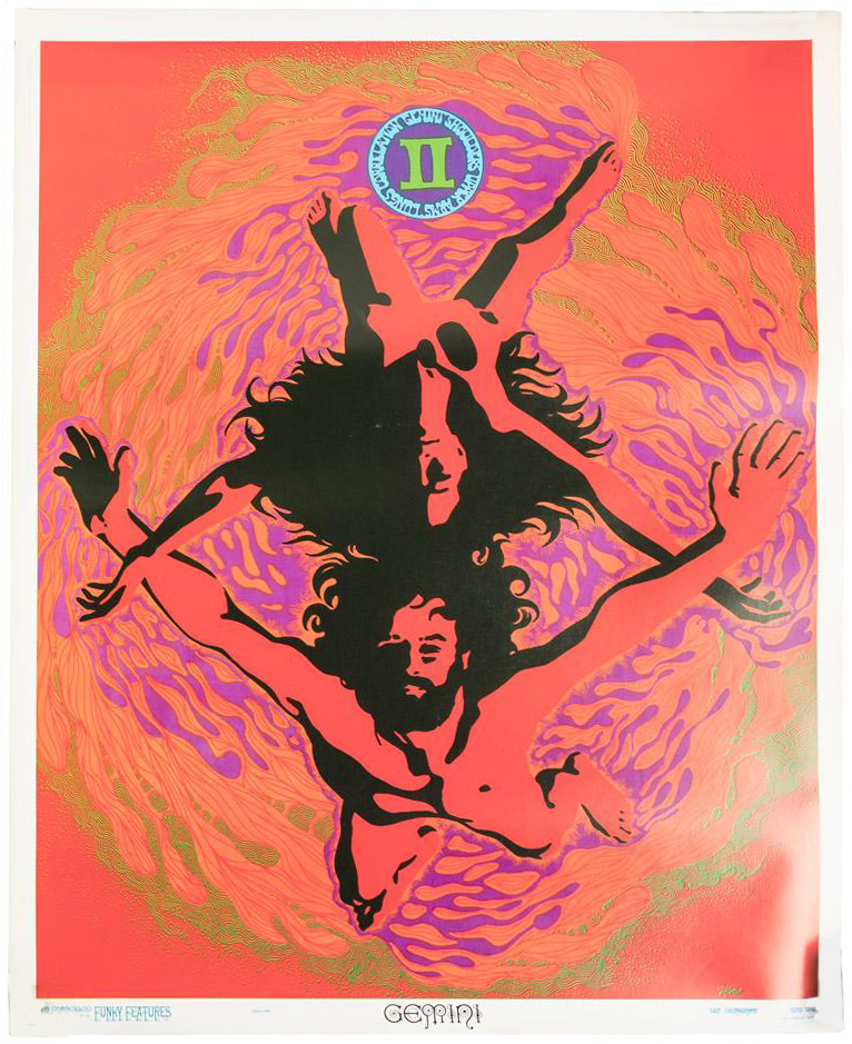
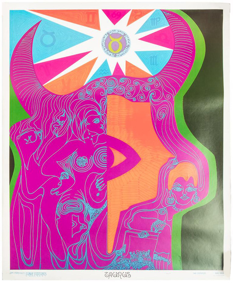
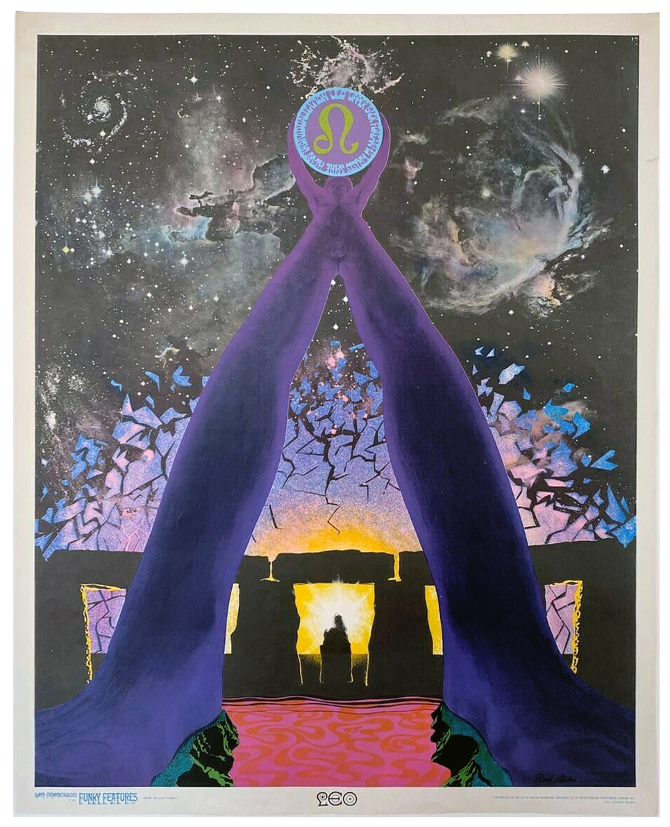
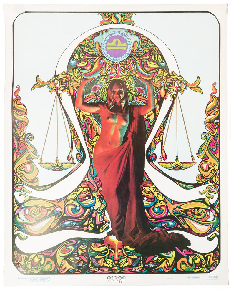
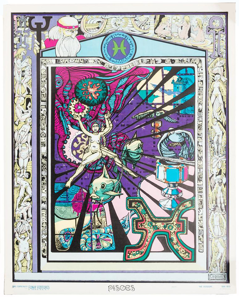
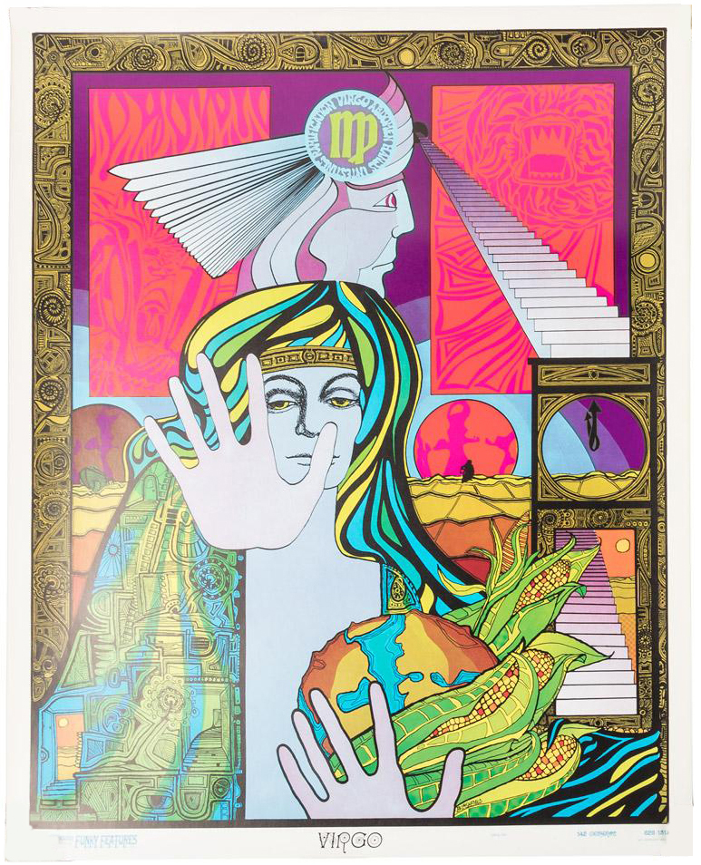
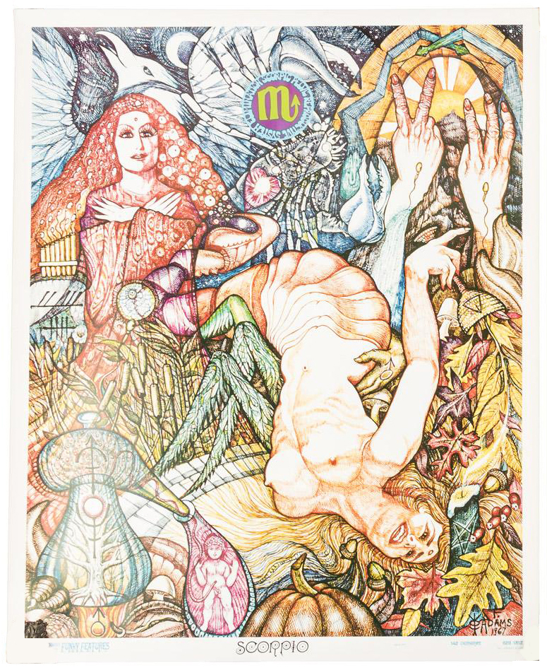
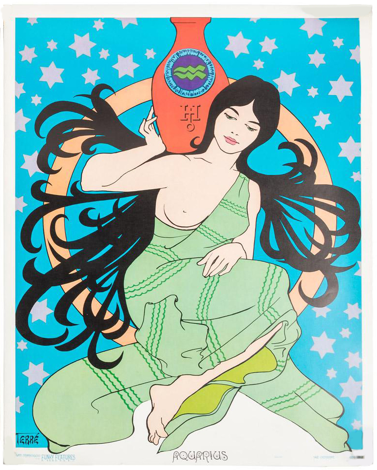
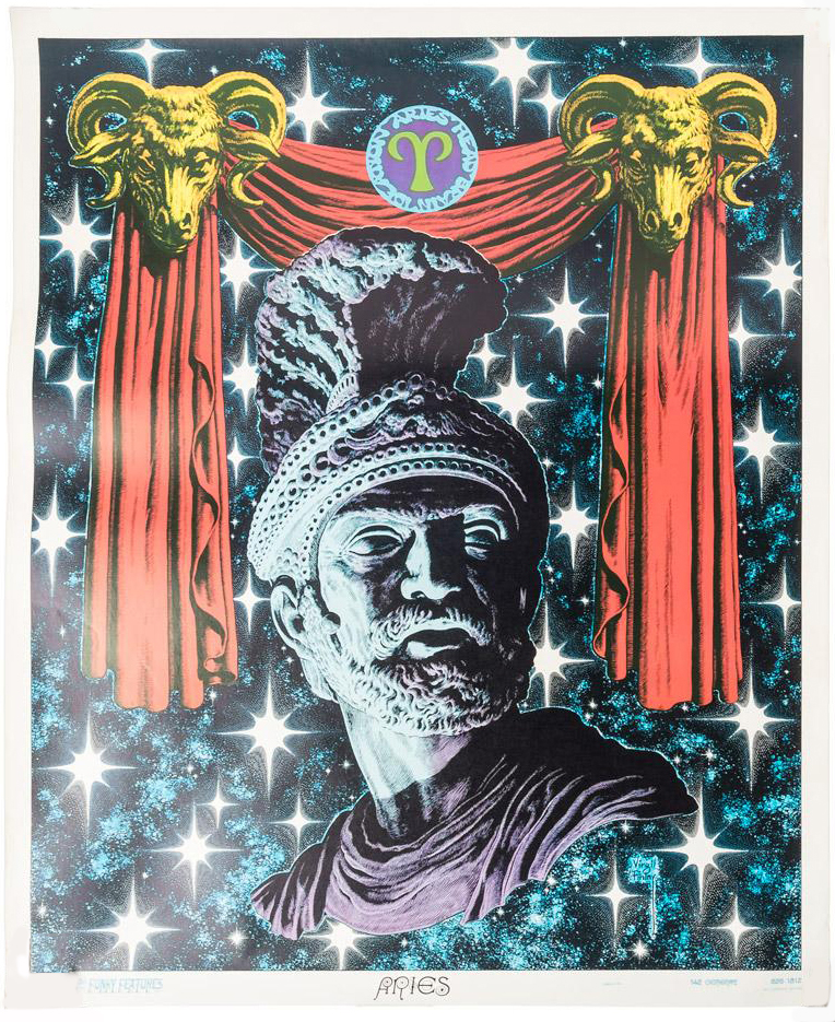
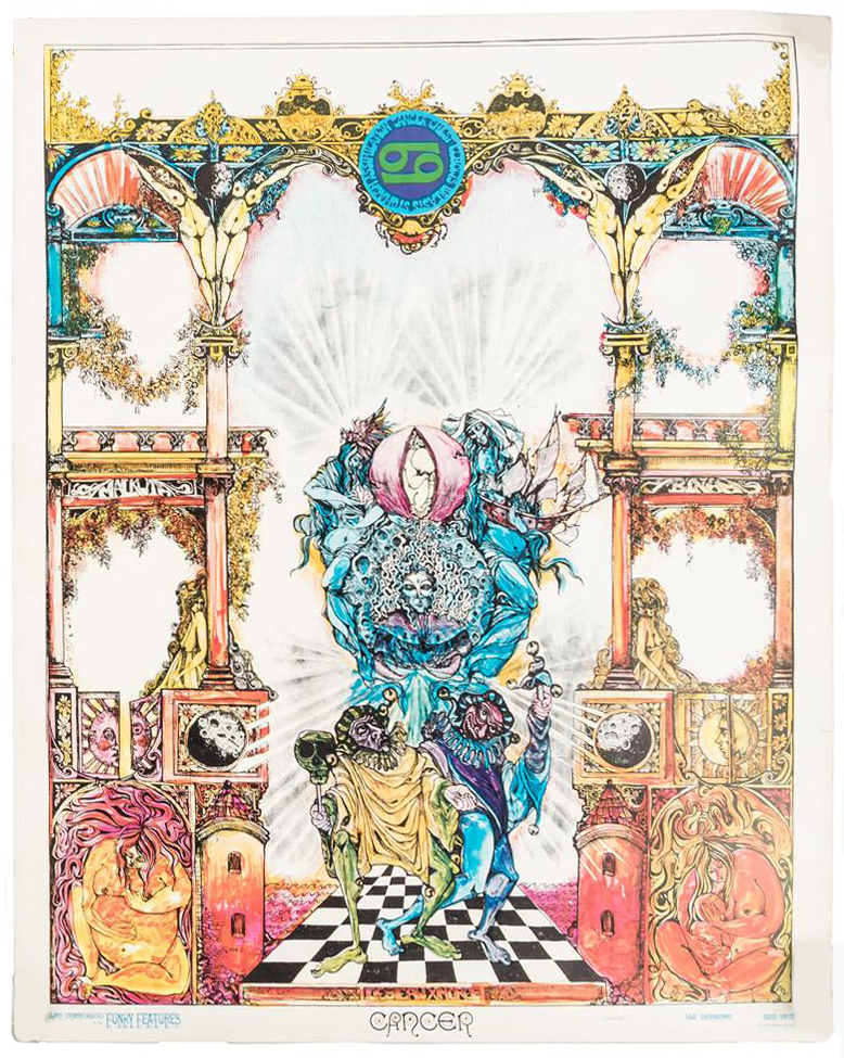
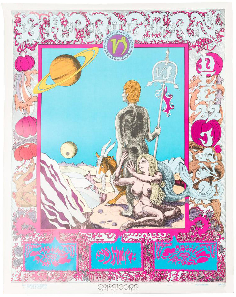
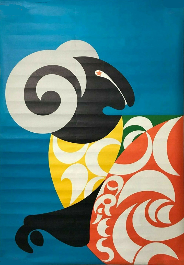
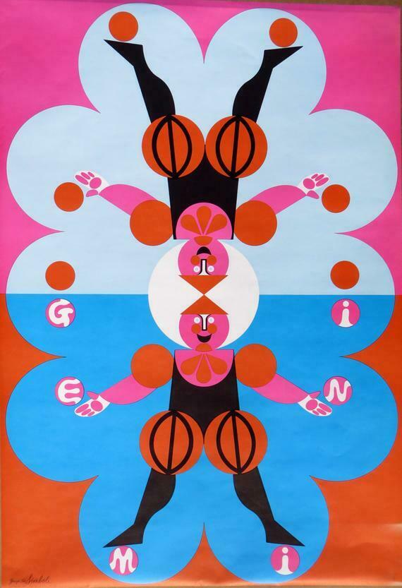
A complete set of original 12 Zodiac Astrology Star Sign Posters, commissioned by Jack Leahy (“Funky Jack”), of San Francisco’s Funky Features, in 1967. Funky Features was originally a home recording studio in an Edwardian house that quickly became a popular recording location for Big Brother and the Holding Company, Cold Blood, Steve Miller, and others. Leahy also went on to do artwork for a number of motion pictures, airbrushing the Starship Enterprise for the first Star Trek film. Each poster is by a different artist, uniquely capturing the heyday of San Francisco’s counterculture. Artists include Dick Moore, Tommy Dixon, Lee and Shirley Goddard, Robert McClay, Fred Adams, Primo Angel, Jim Blashfield, and others. Complete sets of all 12 posters are extremely rare, especially in this condition.
![]()
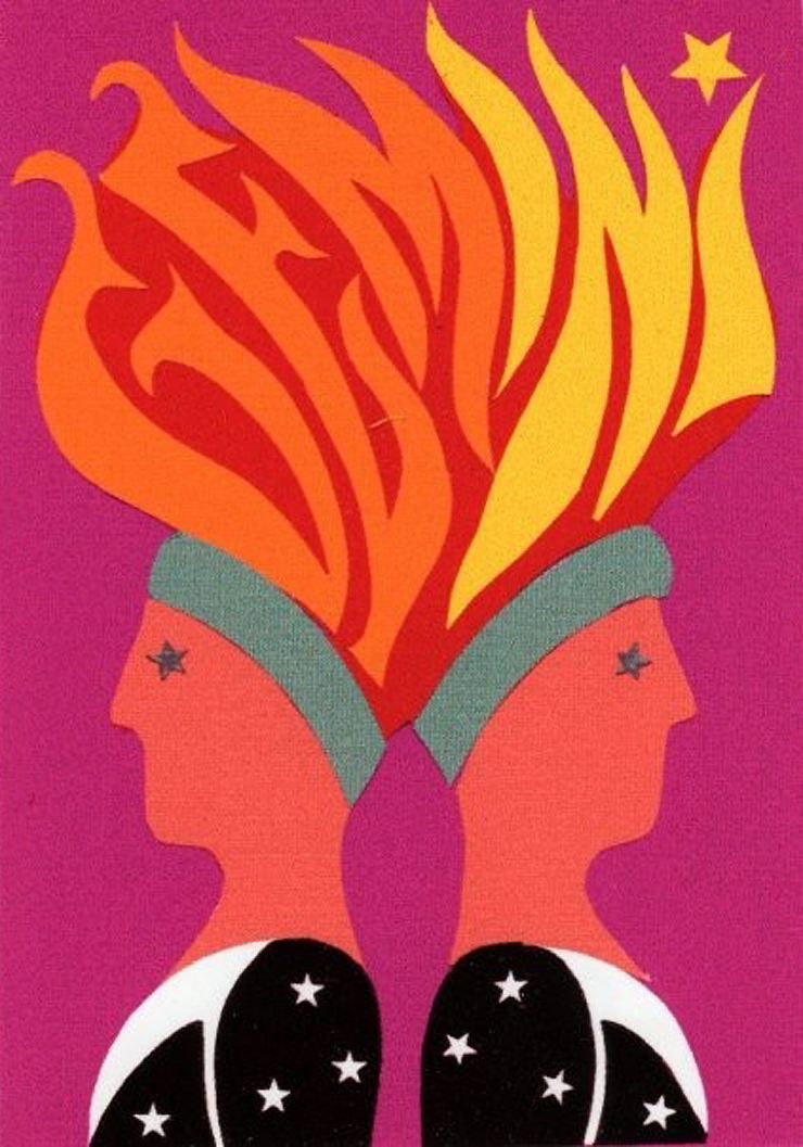
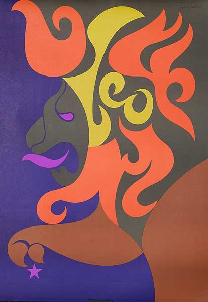
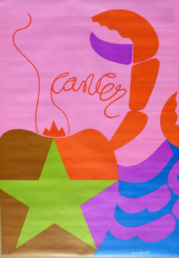
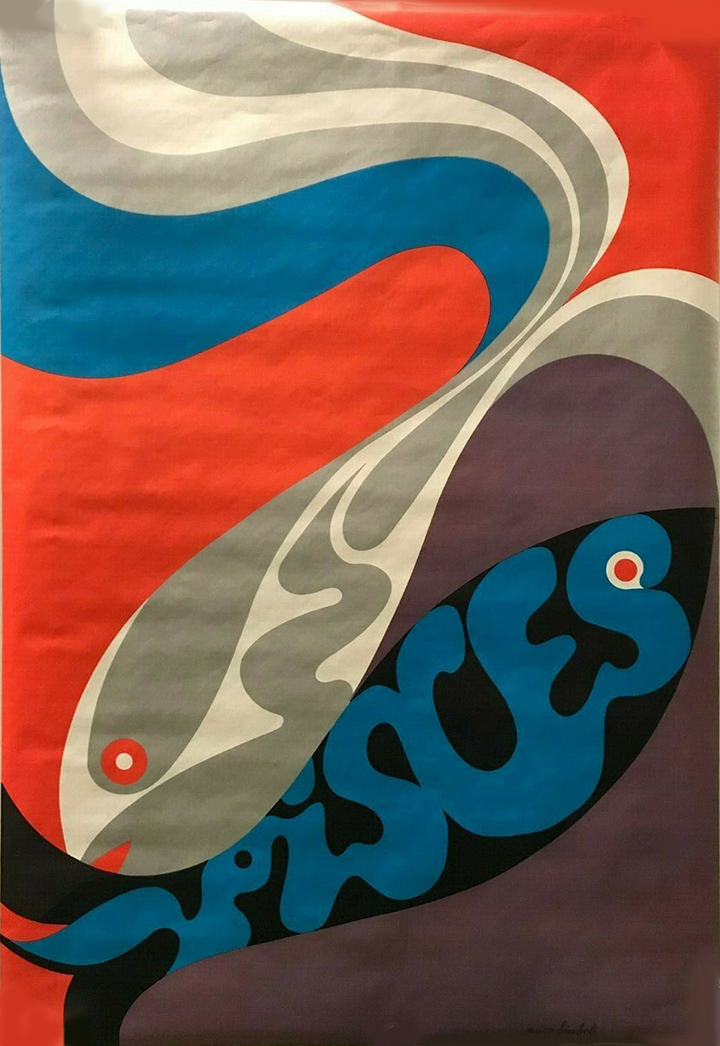
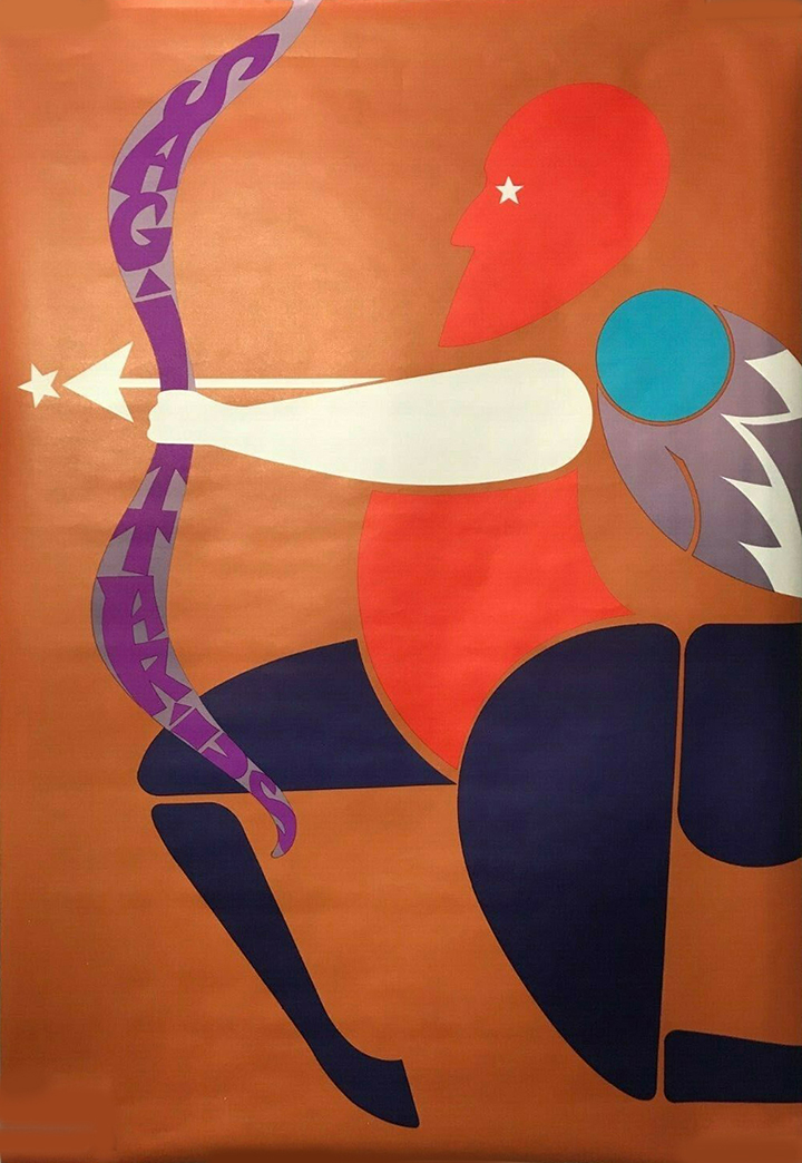
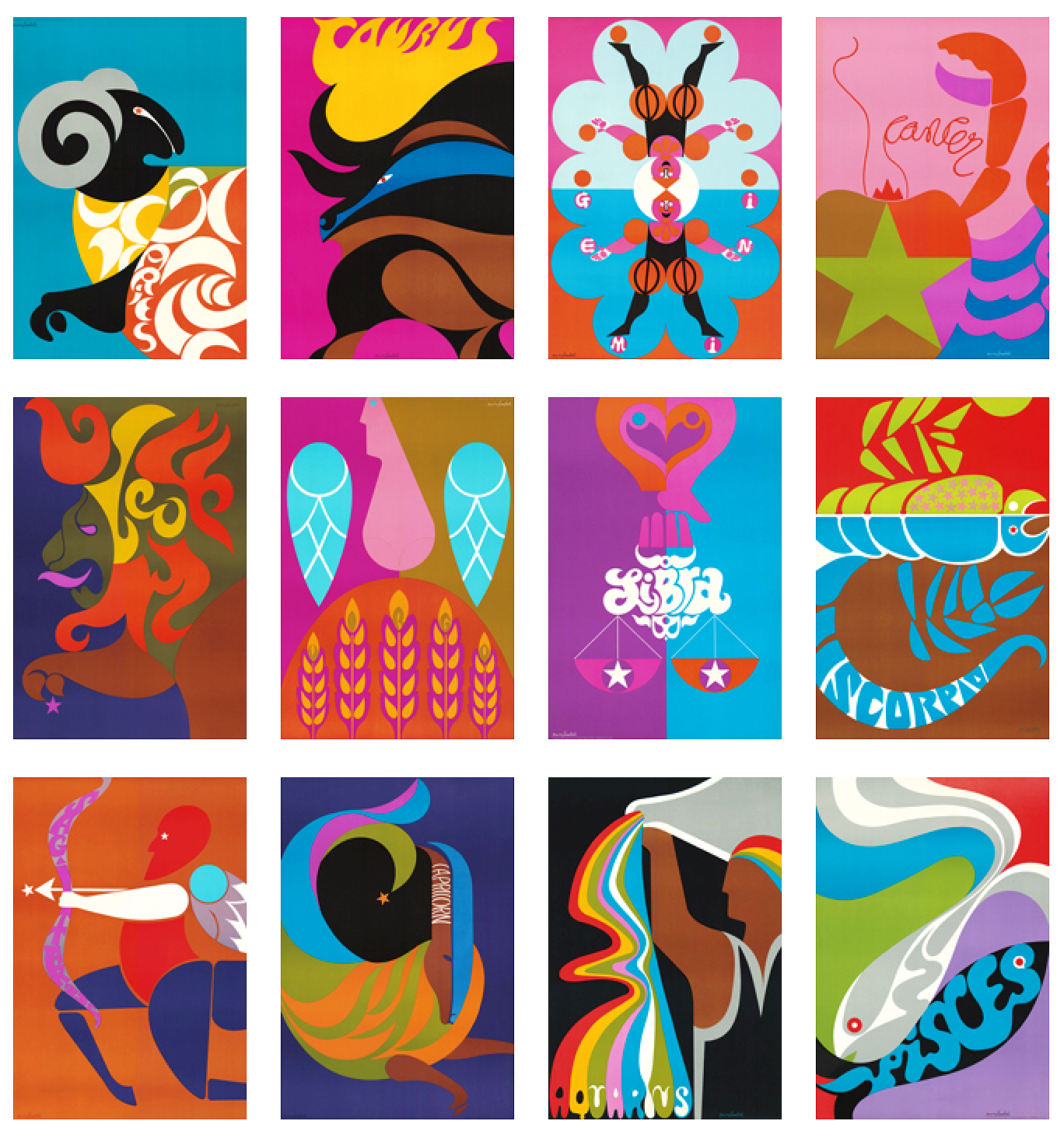 In my periodic searches for graphic material from the late 60s I came across several sellers on eBay offering these lovely zodiac posters for sale. I did some digging and found decent resolution copies of most of them and a bit of info about their origins. In 1969, Poster Prints commissioned Simboli Design – Gerry & Joe Simboli – to create a line of graphically strong and colourful zodiac posters, which were sold worldwide. There seems to have been two different designs for Gemini for some reason but finding an original of the fire-headed twins seems impossible, their website seems to suggest it’s a new design.
Paul Smith, the UK fashion designer, found the posters on a website and used them for a line of casual clothing for Neiman Marcus in 2004. Recently, the posters were also used on the set of the HBO series, Vinyl, produced by Martin Scorsese and Mick Jagger.
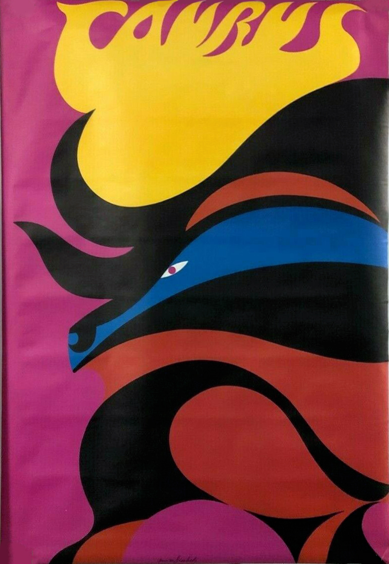
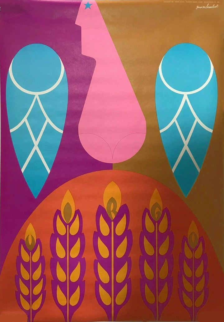
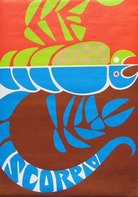
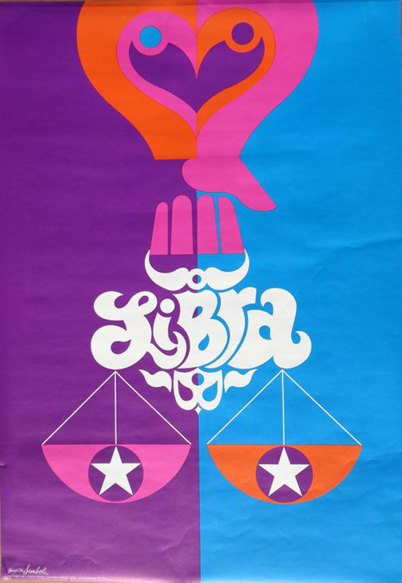
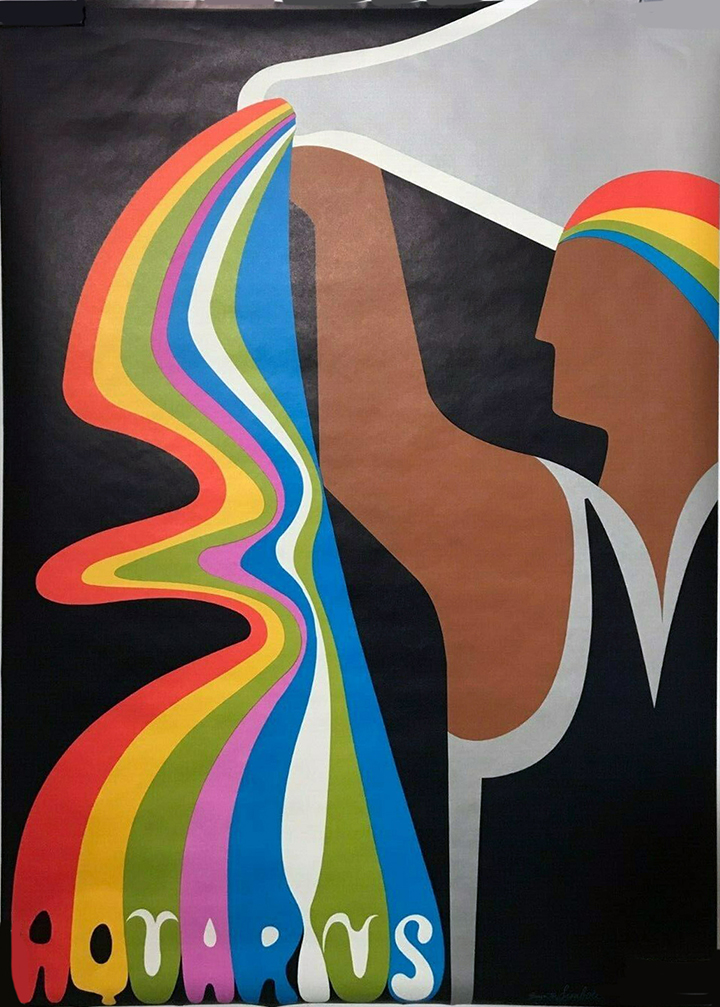
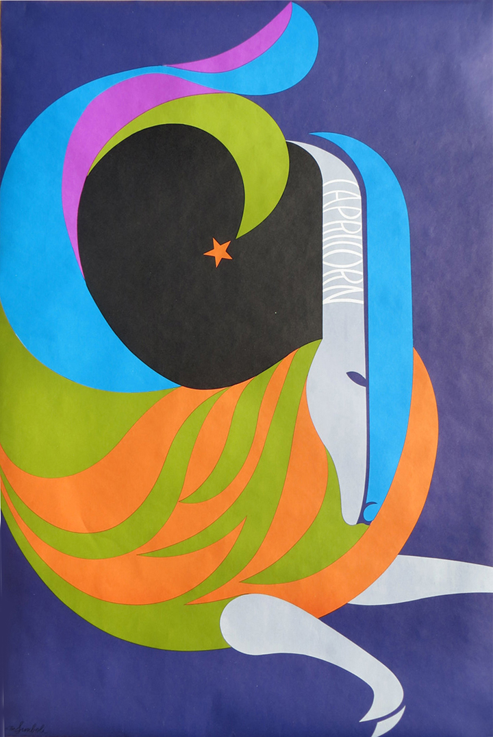
Simboli have a website and they sell some of the originals and Gicleé repros via Etsy, dimensions are 12″x18″ with additional 1″ border for matte. They also have other sets themed around Anti-War, Tea, Coffee, some great logo designs, toys and this lovely robot which was created at some point in the 70s.
There are several more zodiac set by different designers from this era out there that I’ll be posting as I find complete sets.
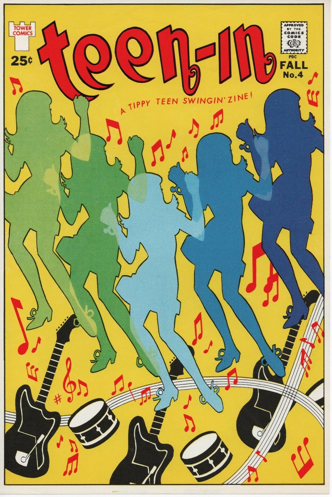
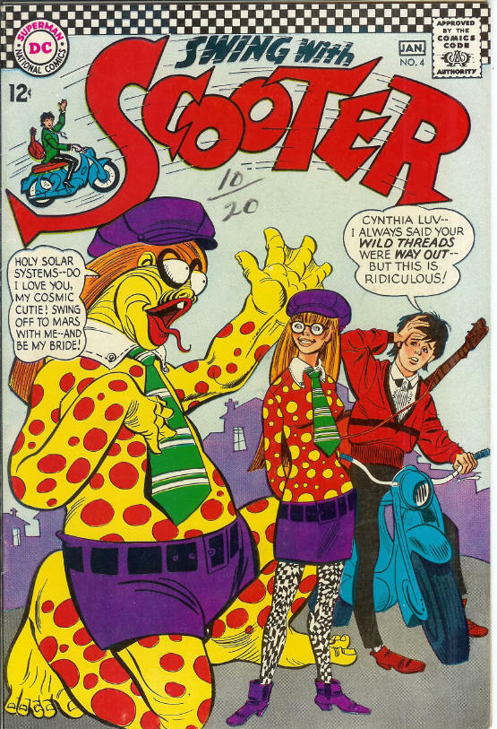
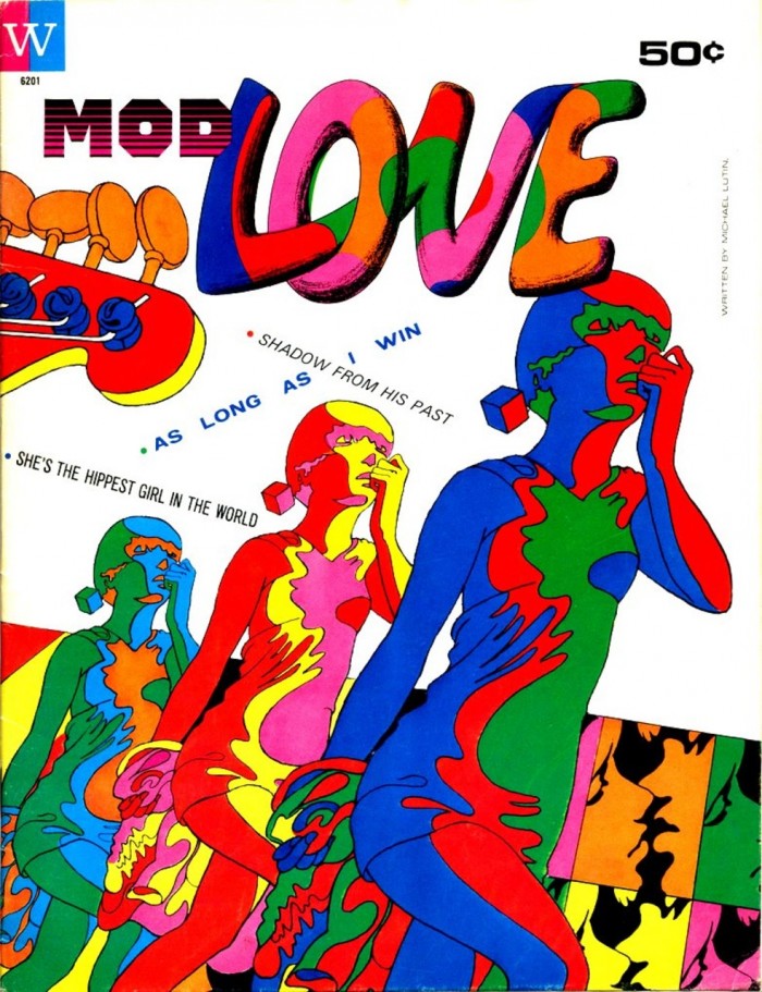
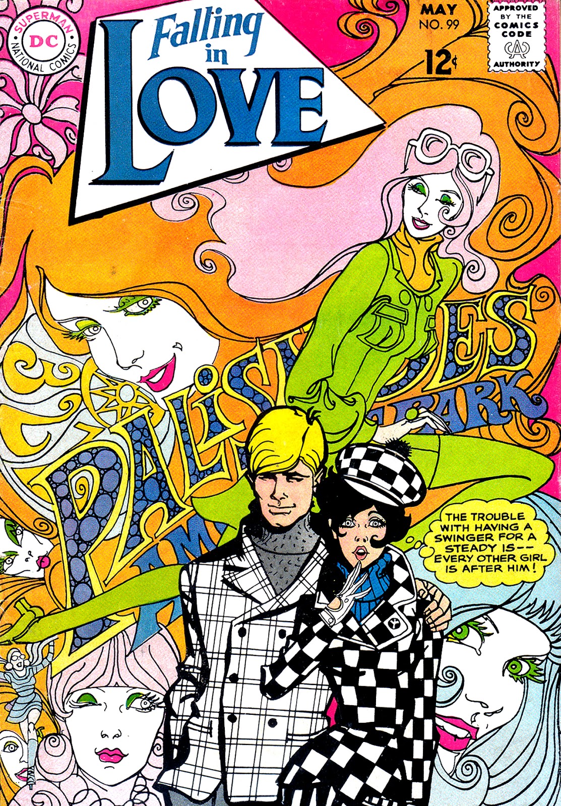
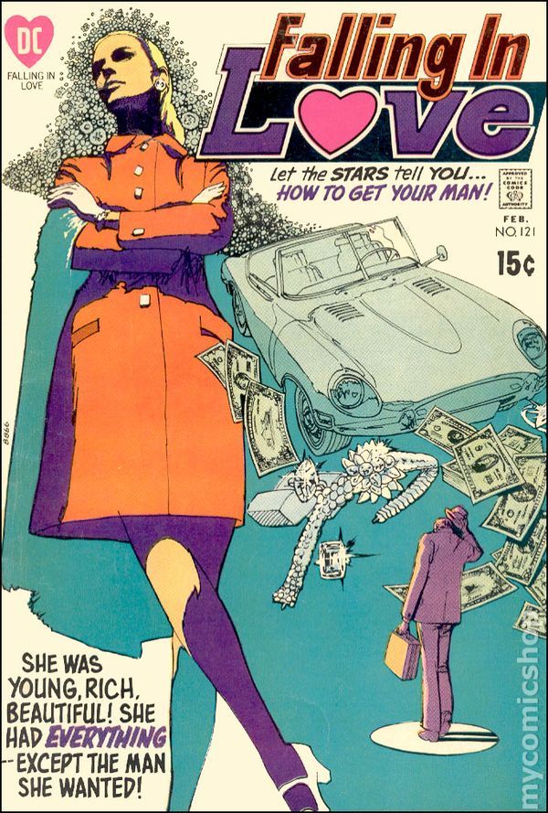
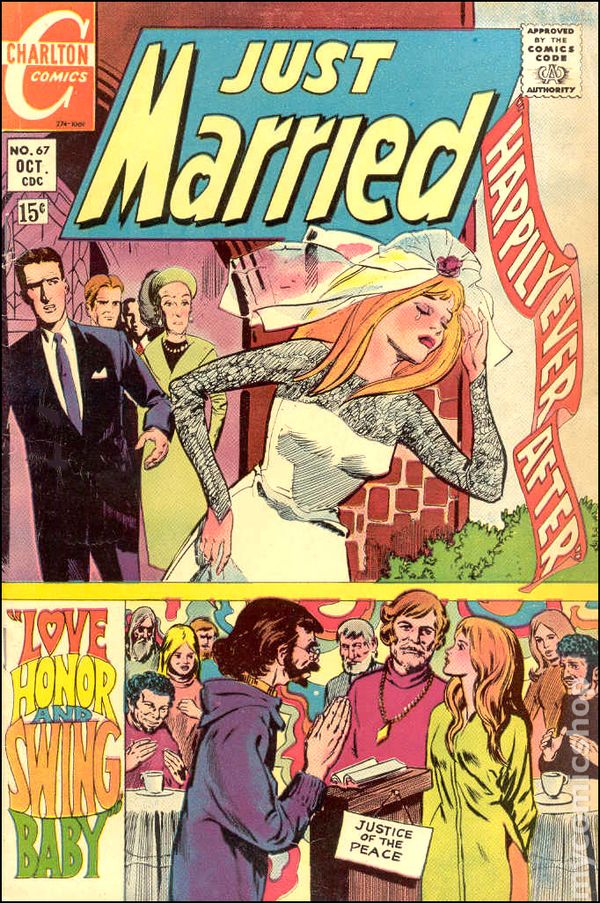
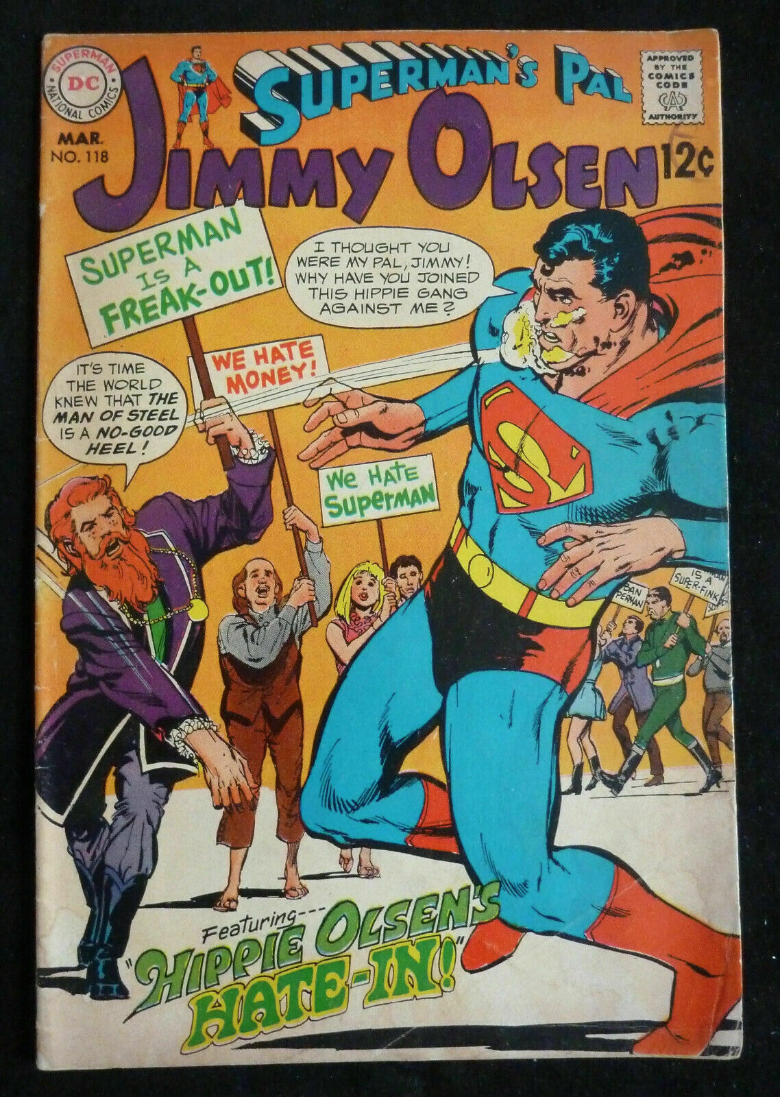
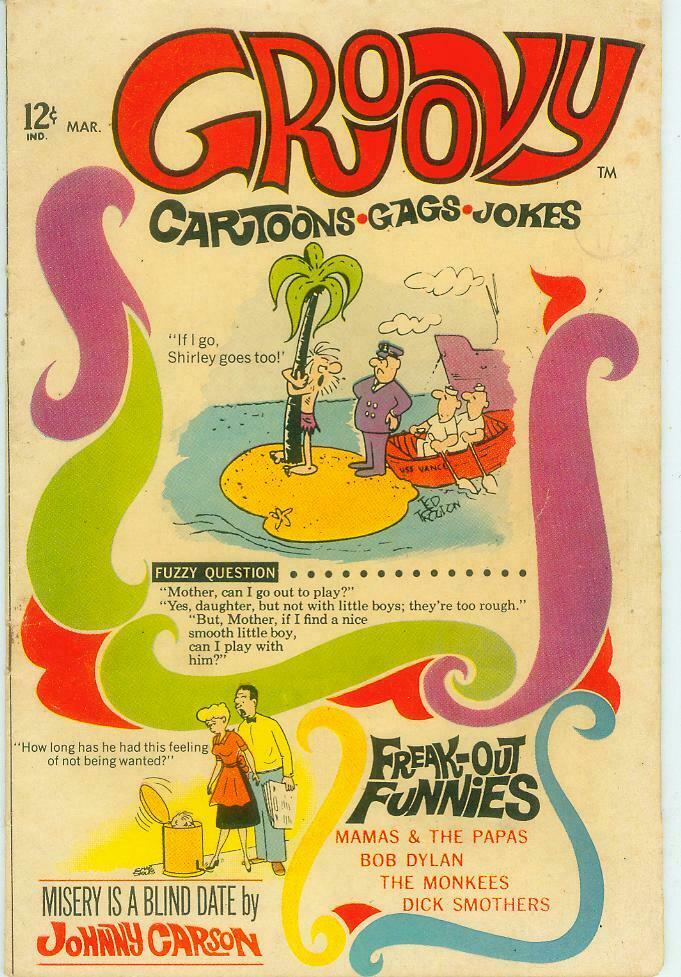
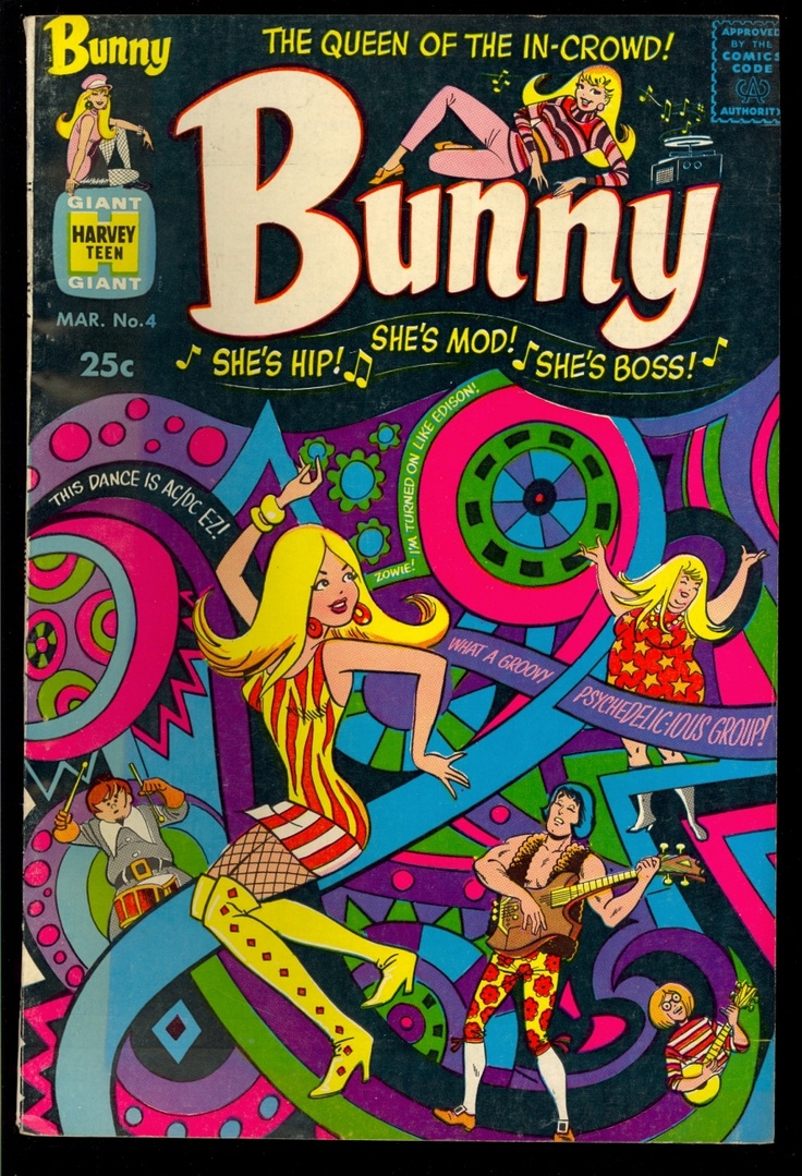 I always like seeing the psychedelic style of the late 60s adopted by items outside of the immediate area of music. It’s usually a watered down version but it’s always fun to see how some ‘straighter’ mediums co-opted to style of the day to be hip with the kids. Regular comics especially went through a phase of being ‘groovy’, ‘swinging’ or ‘hip’ and it was big with love and romance titles for girls. Here are some covers I’ve collected on my internet trawls, obviously omitting work from the underground sector whose artists helped build the style in the first place.
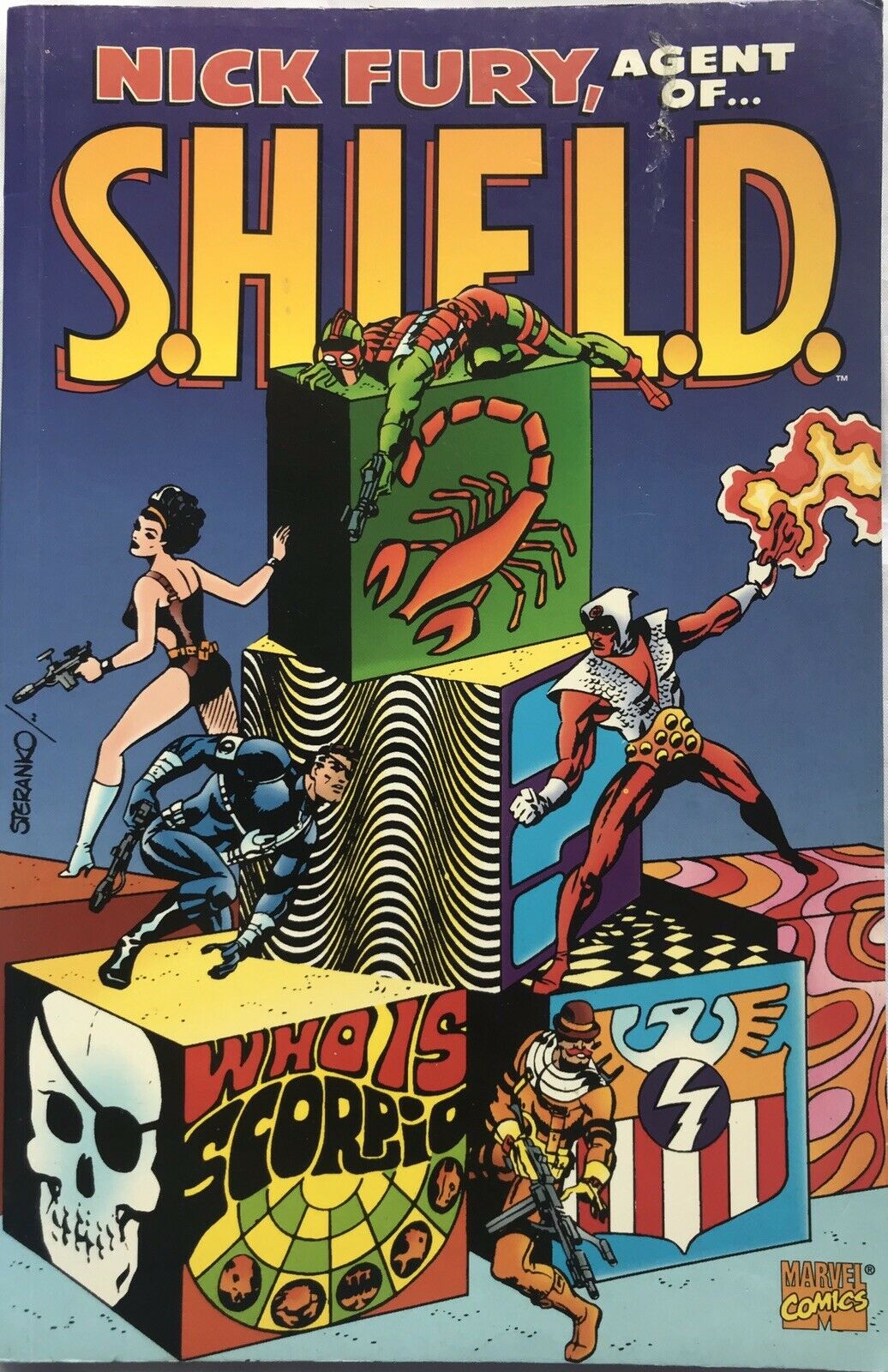
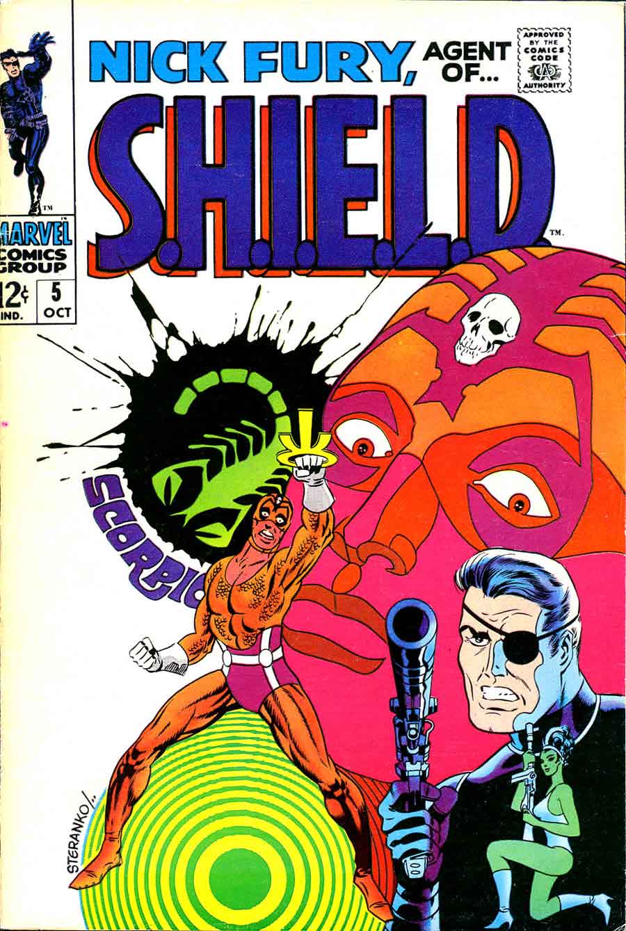
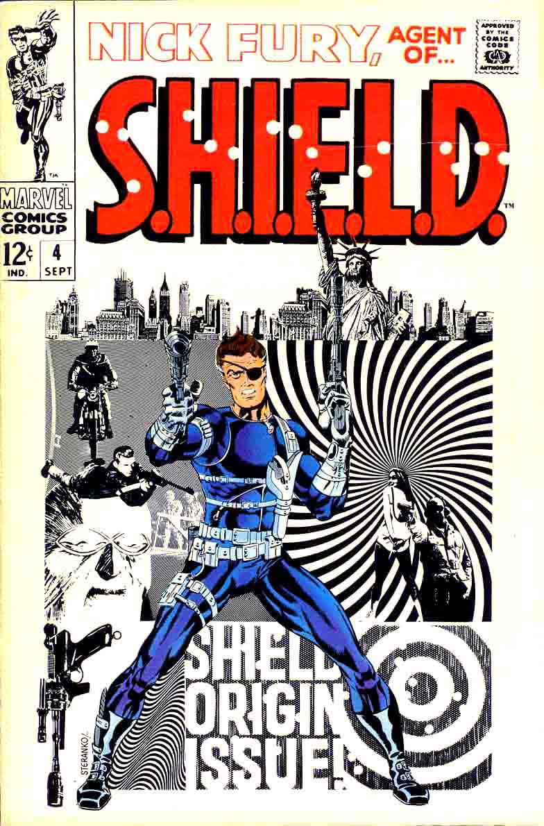
Early Nick Fury covers really went at it for a short period too
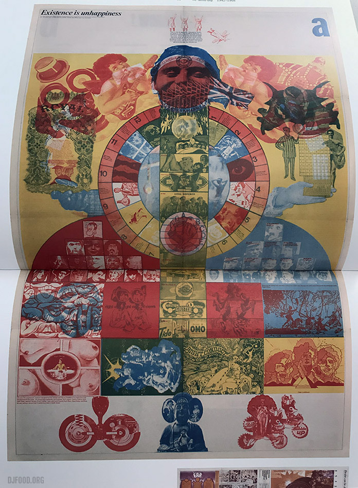
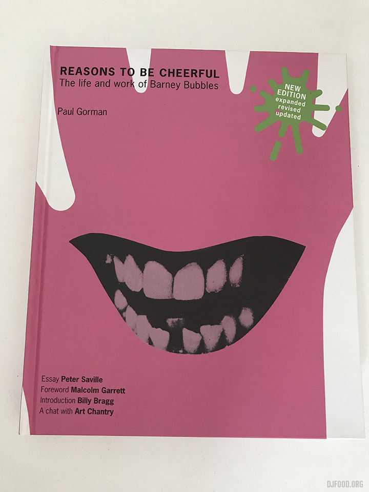 I’ve highlighted The Bureau of Lost Culture podcasts before and in the latest instalment Stephen Coates interviews writer and biographer Paul Gorman about the life of designer Barney Bubbles. Paul wrote the definitive (and only) book about Barney’s work, Reasons To Be Cheerful and recounts his fascinating but ultimately tragic story.
Paul has also recently set up a Barney Bubbles Estate Instagram account where he’s posting examples and rarities from his collection. Even if you’re not familiar with his name, you may well be familiar with his work.
There have recently been a slew of great interviews from The Bureau, focussing on Hawkwind, the history of Goth, Biba, groupies, The UFO club and more. The easiest way to listen to them is via their Soundcloud page
Today I discovered the director Pramod Pati after seeing the incredible film above. Psychedelic India cinema and a great electronic / musique concrete soundtrack to match.
Stephen Coates is a busy man, aside from his The Real Tuesday Weld recording project and his X-Ray Audio talks, exhibitions and book he also has his hand in radio with The Bureau of Lost Culture alongside co-conspirator Paul Heartfield. This takes the form of interviews with people who were present and took part in corners of the counterculture who may not have had their stories heard. First person accounts can differ from the accepted narratives and everyone will have personal experiences associated with events and times that have gone undocumented.
One such example is Nick Laird Clowes, musician and composer with The Dream Academy among other talents, who gives some quite extraordinary experiences in the first part of an interview with Stephen. Recounting going to the Isle of Wight festival at just 13, hanging out at Oz magazine and tales of the underground London scene through the eyes of a fresh-faced young teen, his tales seem to flow endlessly and will make some yearn for simpler times.
If you want more of the same then there are plenty of past shows archived on Soundcloud. Ranging from groupies to psychedelic visions, punk, flexi discs, mescaline and much more.
Update: Part 2!
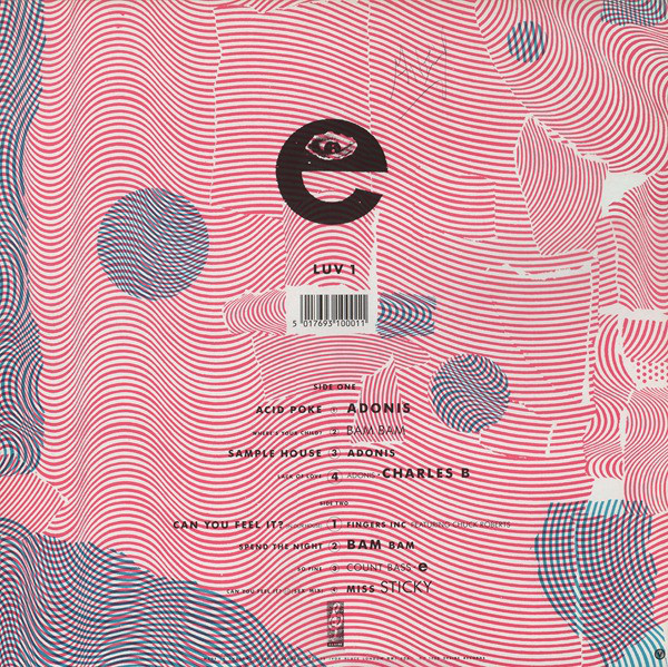
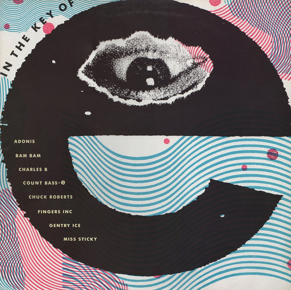
 A few weeks ago I posted a selection of sleeves from the acid house era of Desire records‘ releases which, for a brief moment, showcased some of the best house music to come out of Chicago. The uncredited designer, Andy Vella, was tasked with wrapping these releases in a distinctive house style and, curious about how they came about and who made them, I did some detective work and tracked him down. He is best known for his work with The Cure for the Fiction label (of which Desire was a subsidiary) and I fired him a few generic questions first, to give context and history:
Where, when and what did you study?
I studied at various places, which to be honest were less than effective, however, luckily I ended up at The Royal College of Art and my creative life started to fly.
What was your first notable design that the public would have seen?
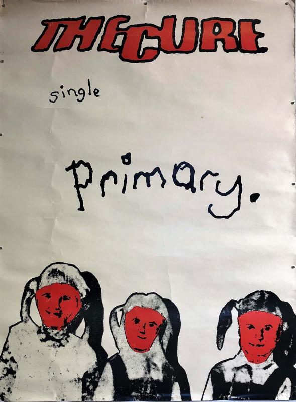
The first bit of work the public would have seen was the 60×40 fly poster for the cure’s ‘Primary’ single (it got to number 44 in the charts 1981), I do remember being 18 and walking down Oxford street thinking, ‘that looks familiar’, then realising I had worked on it.
How did you come to work with the Cure and Fiction Records?
Pure fluke really….and as luck has it I am still working with them.
(From the biography of Andy’s website: “It all began when Andy, then a teenage student in Worthing, had a chance encounter on a train with Porl Thompson, some-time guitarist in the Cure. The pair would go on to form the Parched Art design company, but not before Andy’s photographs had caught the eye of the Cure’s front man Robert Smith who asked him to design the covers of the album Faith and its single Primary.”
Looking you up on by name on Discogs, there’s a gap between 1981 and 1988 and this seems to be the golden period of your collaborative work with Porl Thompson for the Cure under the ‘Parched Art’ banner. Obviously it’s not a complete list of your work though as you aren’t credited for any Desire sleeves at all.
I went through a phase of not putting my name on lots as I thought it was uncool.
Whose decision was it to start releasing dance music on Desire, up until the mid 80s it had been sporadically releasing indie rock I think?
Chris Parry, he was also the manger of The Cure and supremo A&R maestro.
Where you into the music? Did you go clubbing in those days?
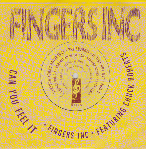
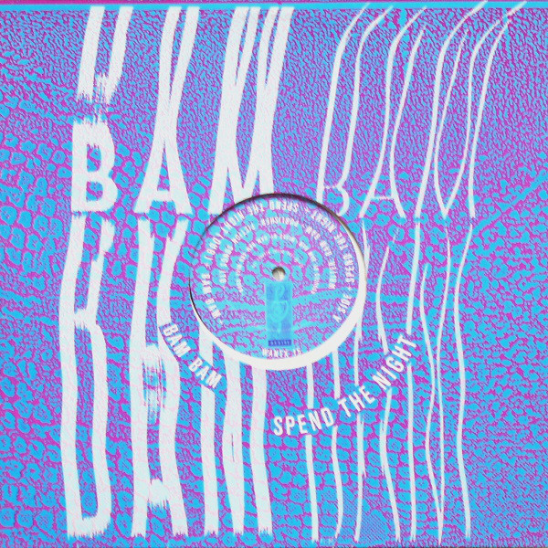
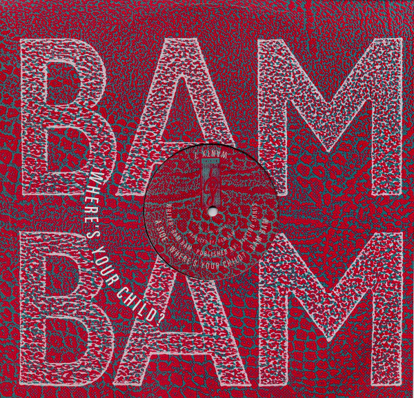
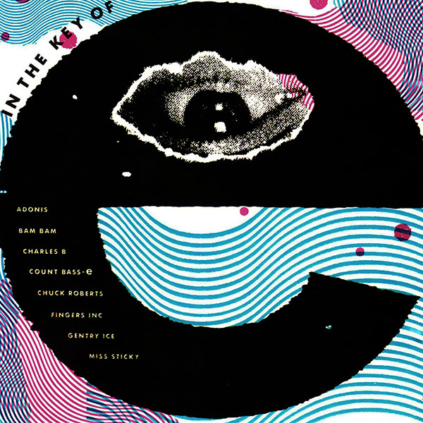
I loved it. I used to go and hang out with all the guys in Chicago Trax (Chicago of course), they were great and so accepting of me, Fingers Inc, CAN YOU FEEL IT…Yes, Ben Mays, Bam Bam, Destry, Lil Louis was always hanging about.
I remember Chris gave me £20 and an ecstasy tablet and said go to the Café de Paris and design me an album sleeve (In the Key of E) it was great, changed my whole world, shame as later that night ended up in Harry’s and DJ Fat Tony and his mates esp. some bloke who is now a famous author (I should name him) kept referring to me as a rent boy with total hatred in their eyes. Glad I had had the mitsibushi tab otherwise I probably would have thrown them out of the window, homophobic DJs and posse for you.
The world will come and eat you up boys.
You used photocopying extensively for those early sleeves, not just for distorting type but also for texture too, What influenced you?
Being experimental was always key in my design, trying things out.
You were working in largely uncharted territory with very little except the smiley logo and the early DJ International graphics from the US as any kind of look for the genre, were you left to interpret the music in your own way?
Always like a challenge, recently I designed a book for Glen Matlock about the Sex Pistols (Filthy Lucre tour) and like then, coming up with design/art that does not follow the cliche known style is what good design should be.
Were you working in isolation or did you have assistants? Were you aware of what other designers were doing in the field like Trevor Jackson at Champion and Gee Street or the Designers Republic at Warp?
At this time just working on me own and the artists in Chicago, they loved this stuff.
You had a thing for type wrapped around curves, I’m presuming this is was all pre-computer and hand-cut and pasted?
Sure was, its so easy now, every letter cut out and pasted down.
There seem to be several releases that re-use old sleeves folded inside out, was this a money-saving exercise?
It was me being really early into re-cycling, this was in 1989, the printers throw this stuff away, I hated the idea of this, so re-purposed it and used it inside, my fav is ‘In The Key Of E’ printed on the reversed board with the Desire house bag on the inside.
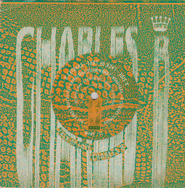
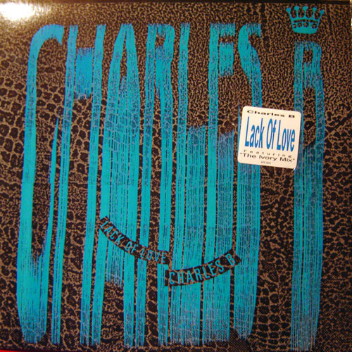
The Charles B ‘Lack of Love’ release has multiple different covers in different colours, was this to distinguish different versions or because of printing errors?
I can’t remember that, maybe I liked the idea of the sleeve forever changing, I did used to swap the printing plates about.
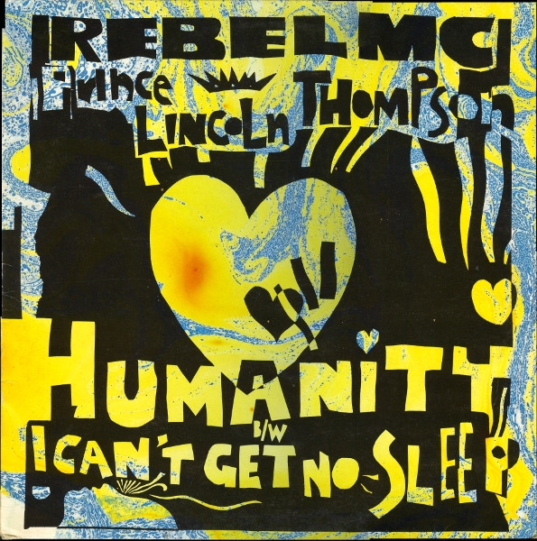
Double Trouble and Rebel MC (both together and separately) were most prominent on the label after ’88 and both hugely successful. The licensed US releases stopped, and your stretch lettering and snakeskin look with them. Why was this?
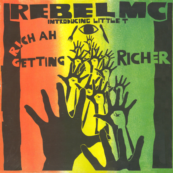
Not sure, guess it was because it was way more commercial. Later on I designed all the Rebel and his Tribal Bass label and created very nice roots-based paper cut-out graphics, based on African art.
Did you work for any other labels around this time (aside from Fiction) or do other work for dance music like flyers, posters and T-shirts we wouldn’t have seen?
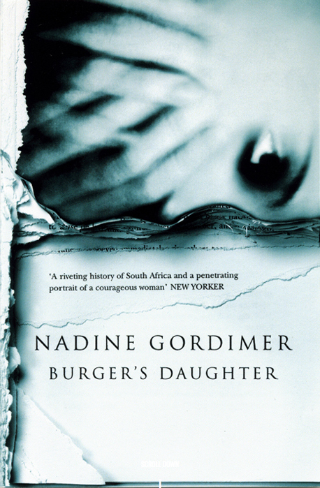
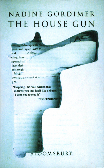
On the back of working with Rebel MC and creating the drum and bass rootsy style, Island records snapped me up and later I worked with many companies and designed all the paperback book covers for Bloomsbury publishing.
The rest of your work seems to have been more in the indie rock sector, was Desire a case of being in the right place at the right time?
Just love designing and creating.
Are you aware that some of those early releases are now considered classics of the genre and worth a lot of money?
That’s nice, eh?
Do you have any favourites from this time, both musically and design-wise?
All of them, I had a blast and still am. I guess ‘In The Key of E’, it’s a great compilation too. Roger Dean of Yes fame always loved ‘In The Key of E’ and asked me to send him a signed version of the cover, I was flattered beyond belief as he was the hero of every school kid when I was growing up, so nice!
Andy’s website is here with an extensive gallery of work, you can see him reference the eye from his ‘In The Key of E’ LP cover above at least twice.
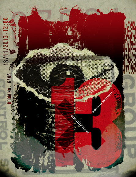
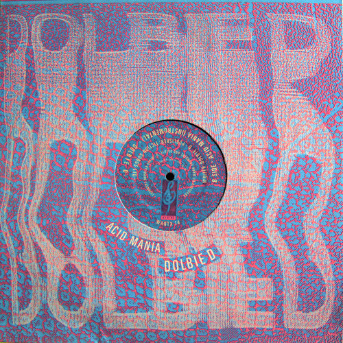
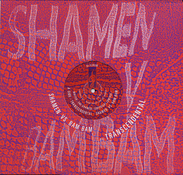
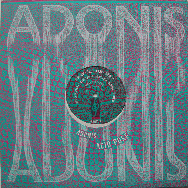
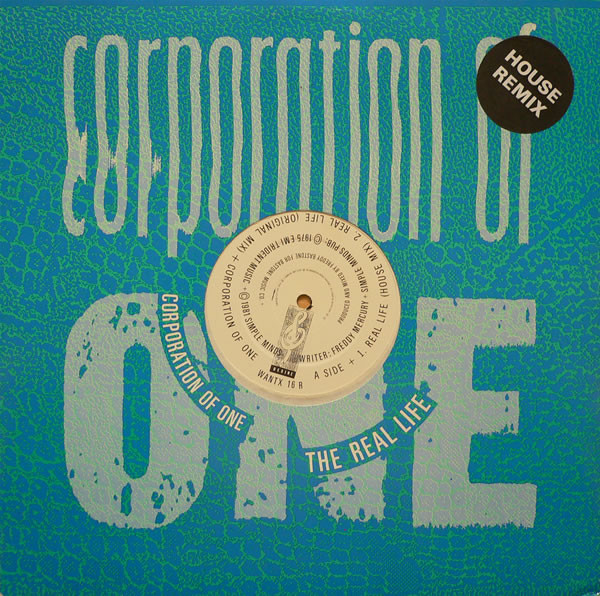
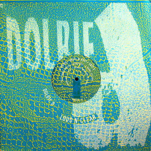
The Desire Records sleeves I mentioned Pete Isaac referencing on the new 45 Live release were a brief series at the end of the 80s when the label switched into the dance music genre, most specifically, acid house. Artists like Adonis, Bam Bam, Corporation of One, Fingers Inc.,Charles B and Dolbie D all got the snake skin and twisted Xerox type treatment. Desire was a subdivision of the indie Fiction label, most known for releasing The Cure. The design for these sleeves is uncredited but I believe them to be the work of Andy Vella, at least he did the ‘In The Key Of E’ LP cover and a lot of work for Fiction.
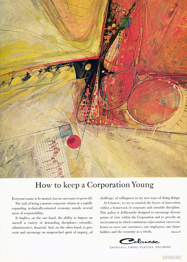
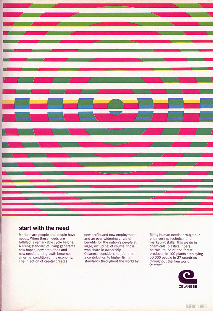
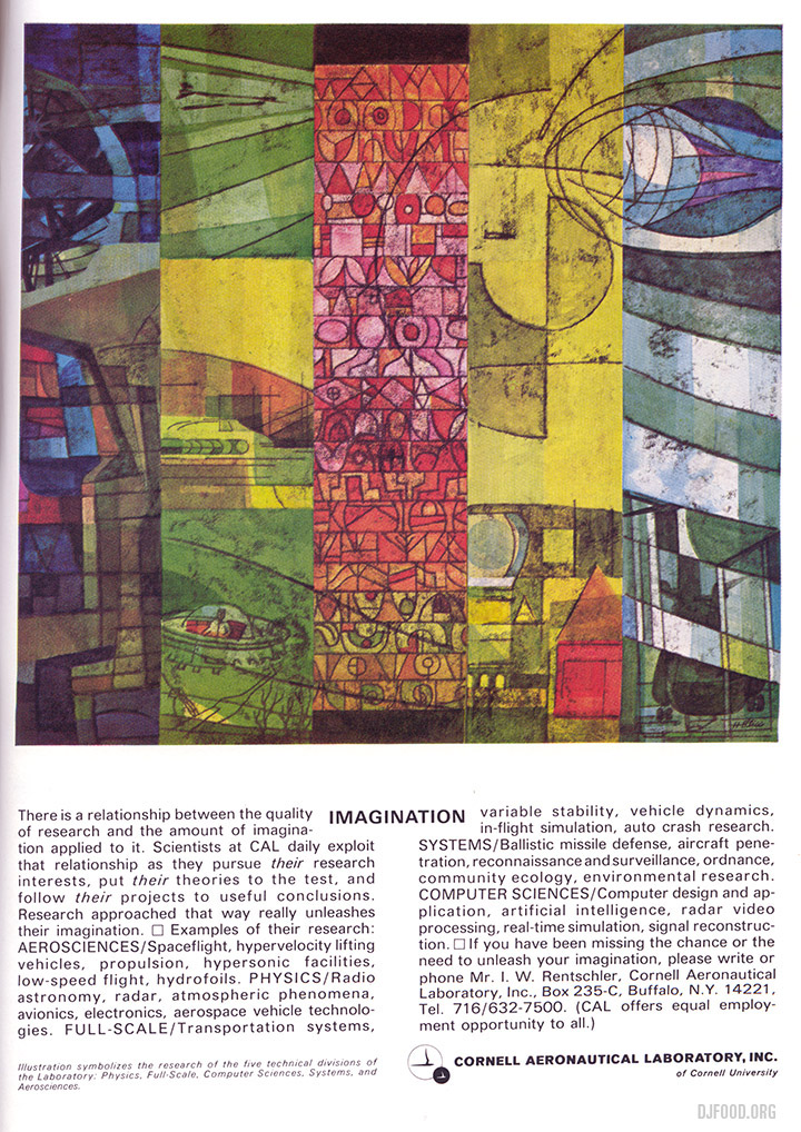
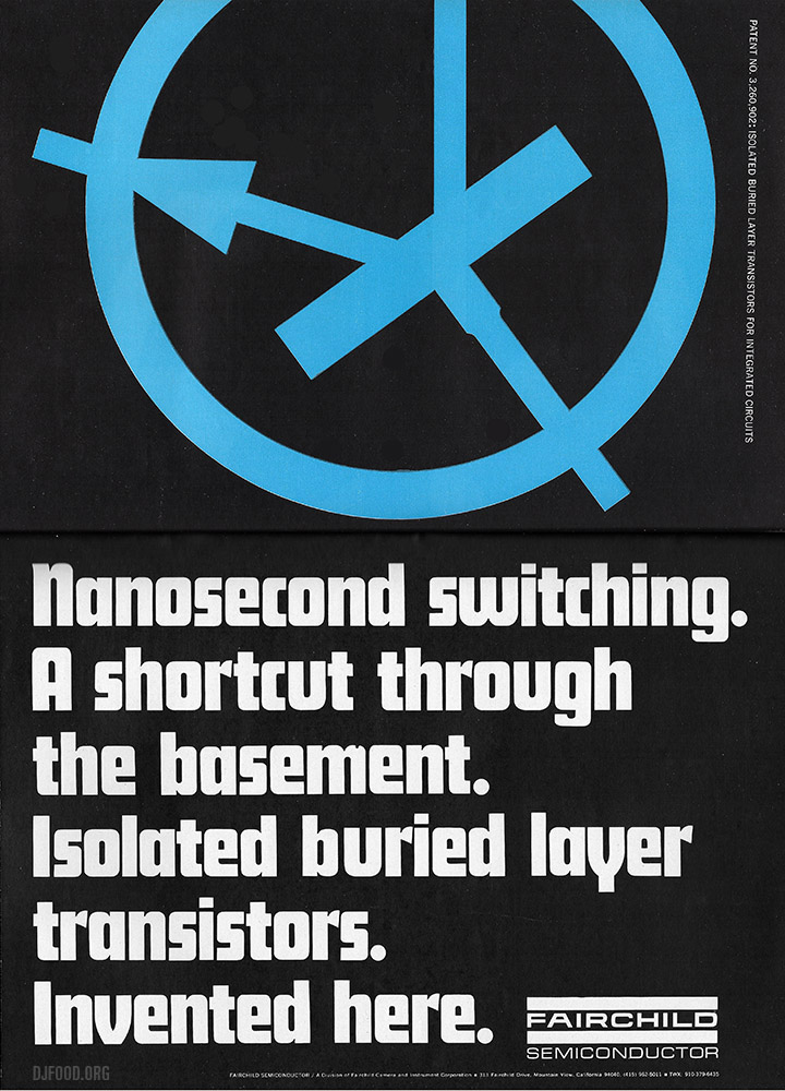
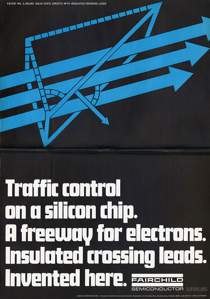
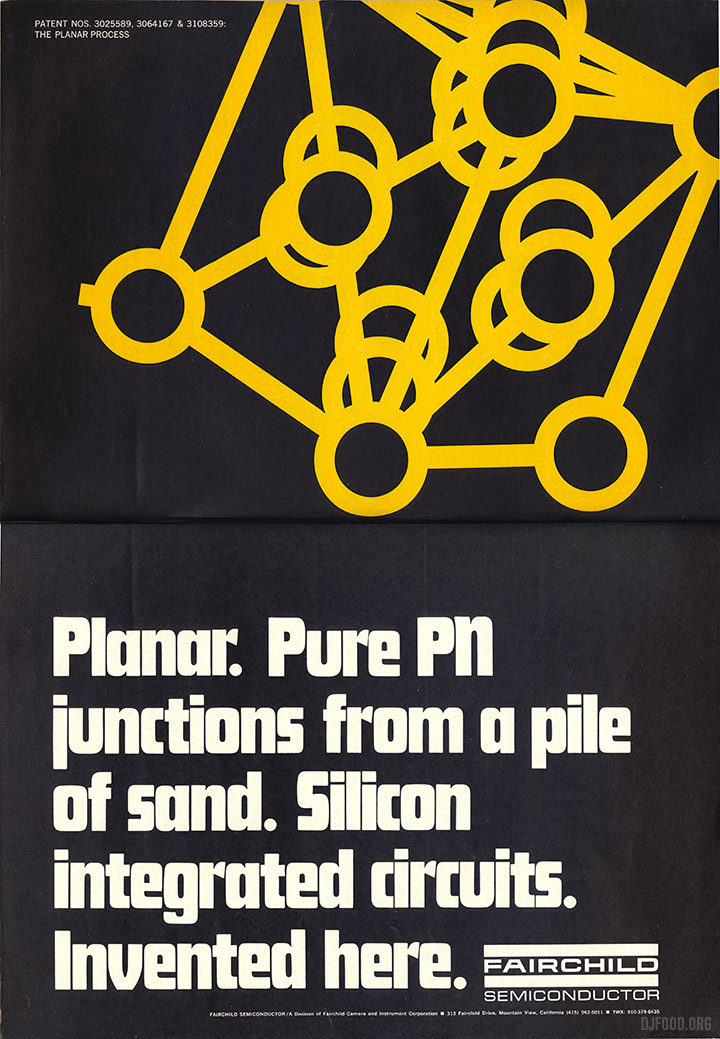
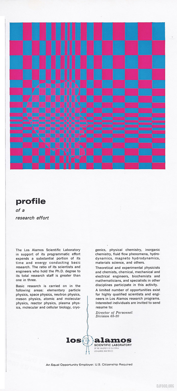
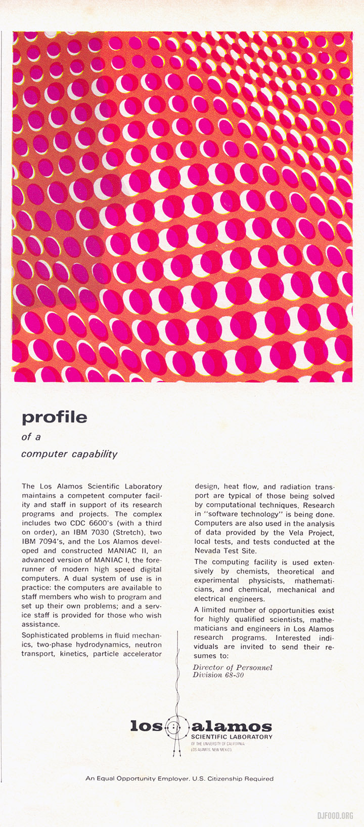
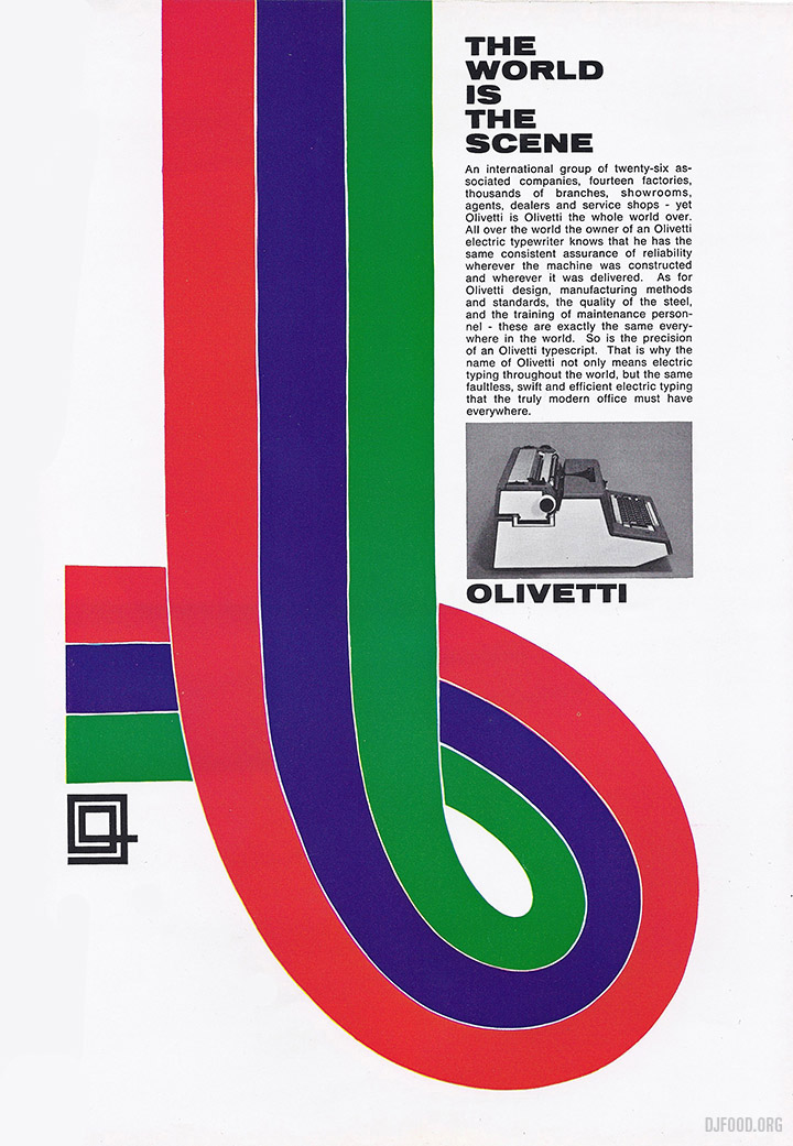
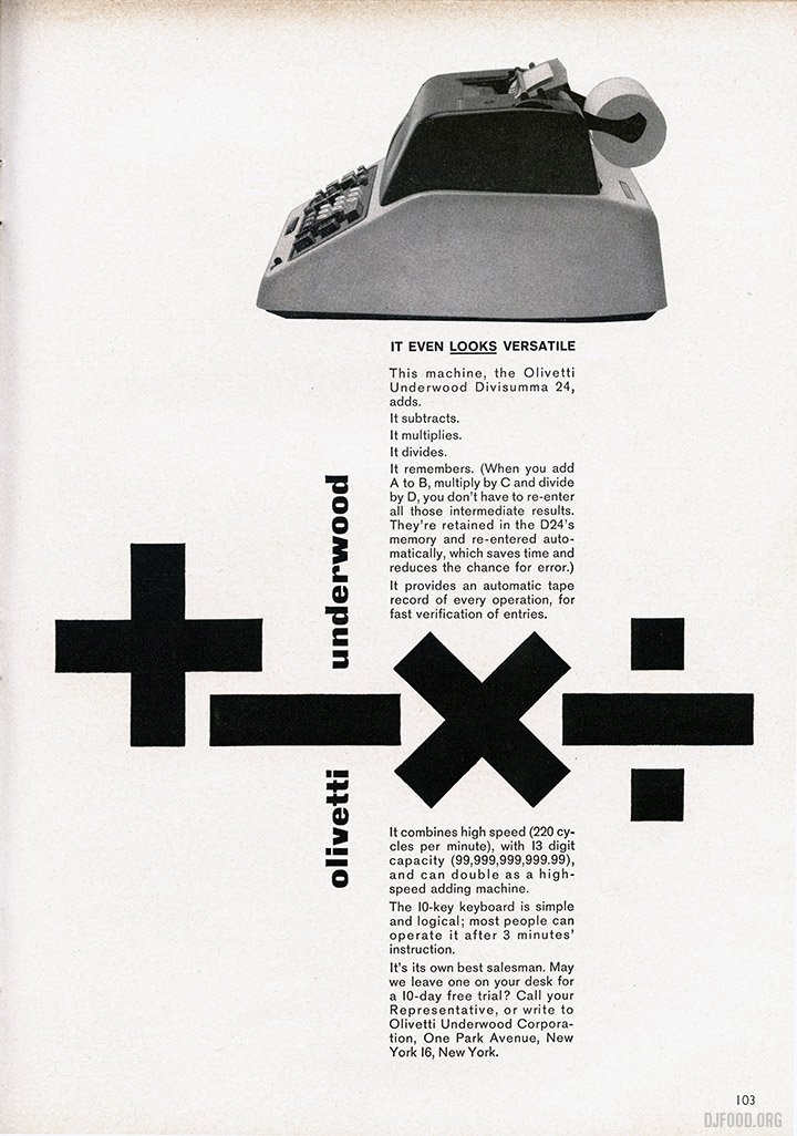
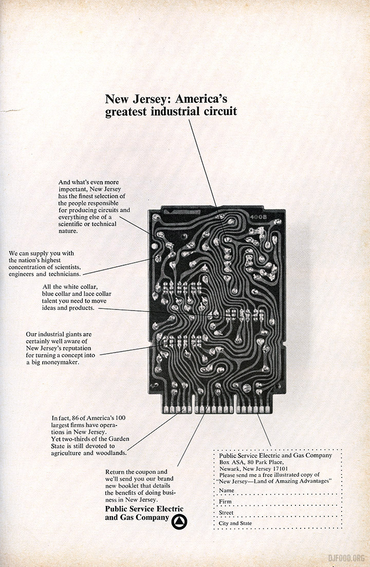
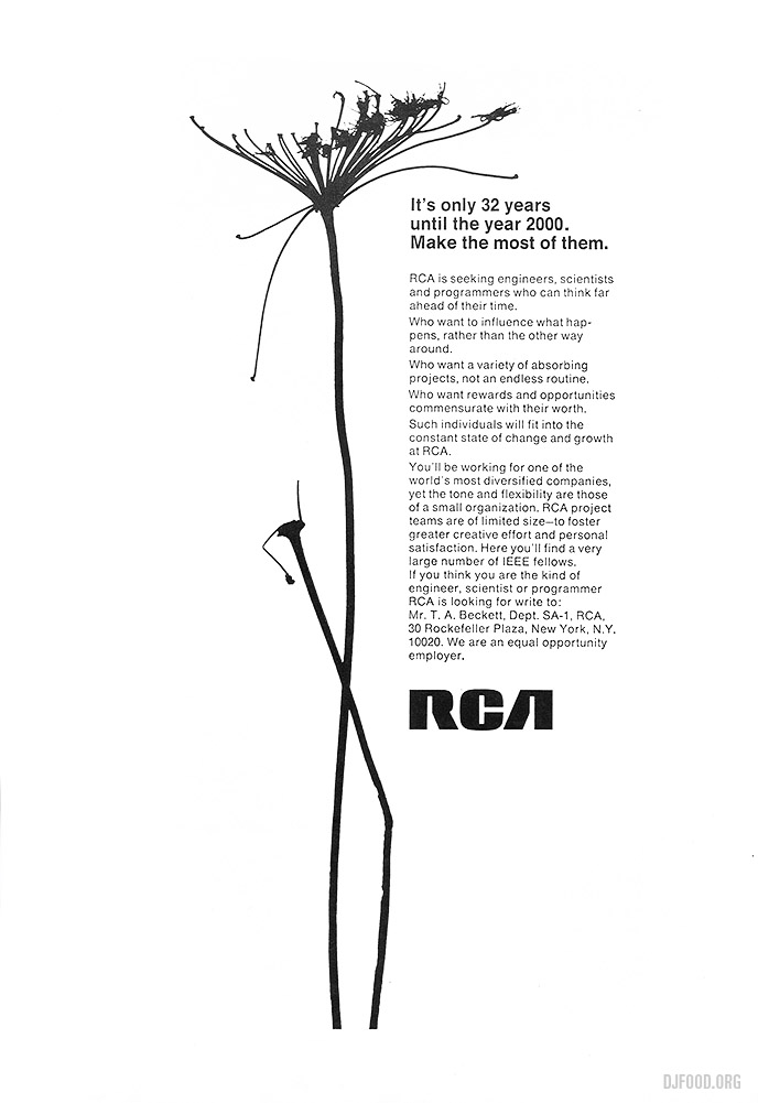
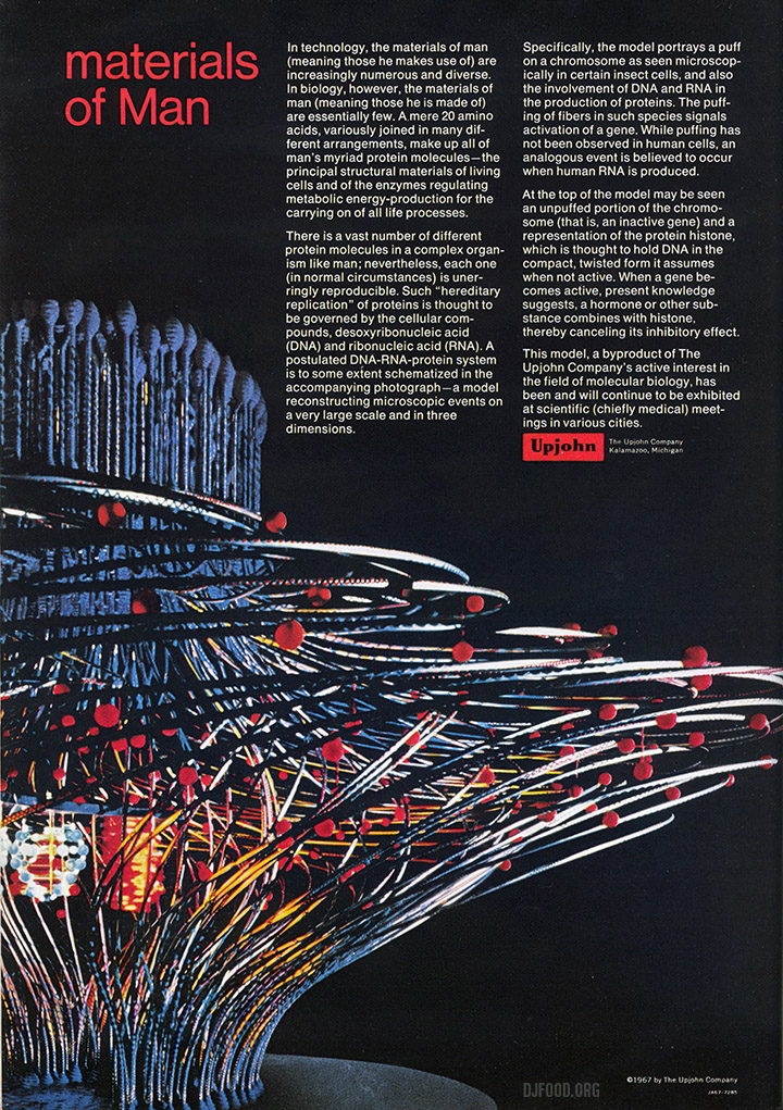
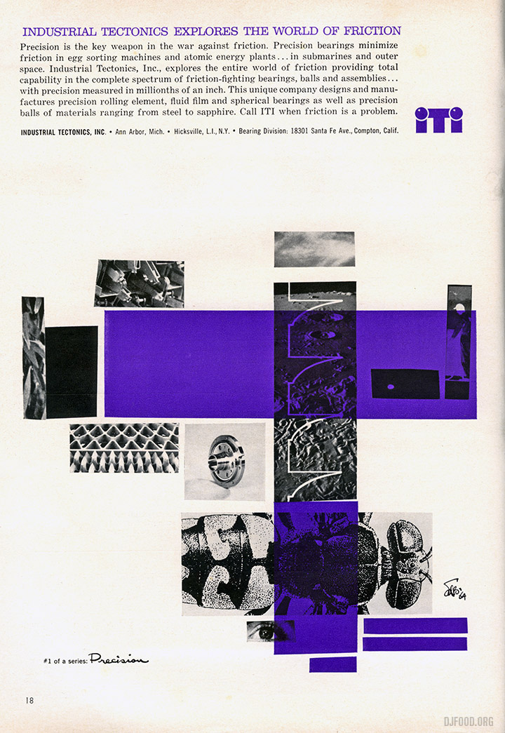 I was recently sorting out a small book collection for someone and ran across a stash of Scientific American magazines from the 60s. Some of the adverts are just beautiful examples of design, from typewriters to paper, electric and gas suppliers and general engineering companies. The standard is very high, considered and fun, attempting to make the banal interesting. Here are some of my favourite examples.
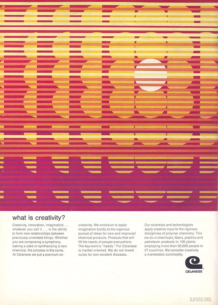
The three ads below for Fairchild Semiconductor are double pagers – look at that font!
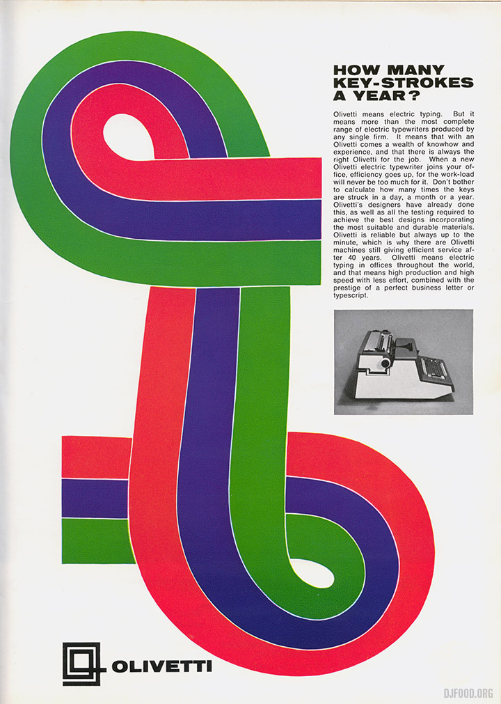
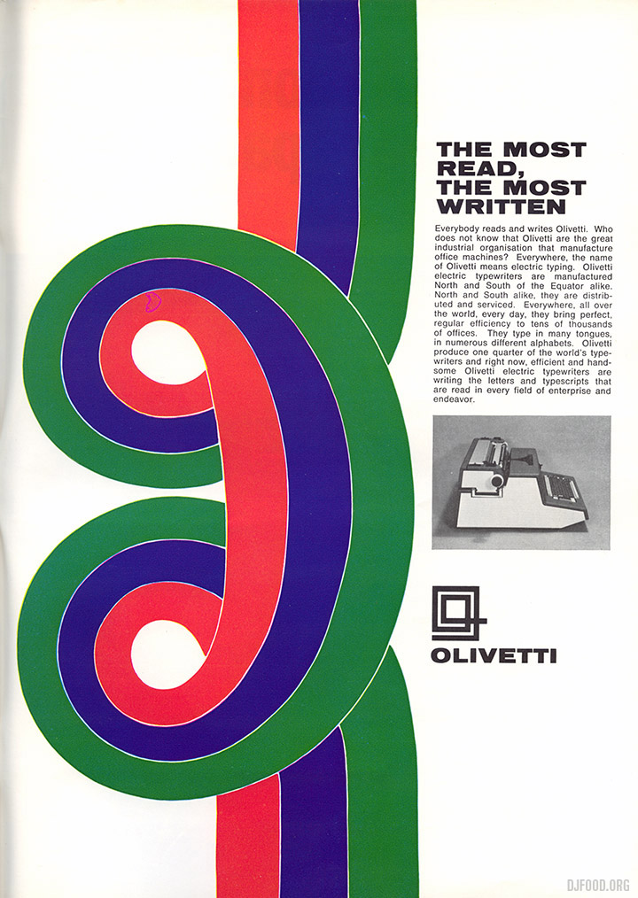
The Olivetti ones below are just stunning, there seems to have been so many of these ads throughout the years, enough to make a huge coffee table book easily. I’ve found them in Graphis annuals and architectural magazines before, there must be hundreds, all seemingly different.
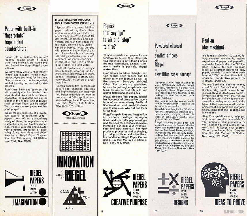
 I love the little illustrations at the bottom of these Riegel papers ads, they are small sidebar ads near the back of the magazine so I’ve lumped them together in one image.
No-brainer Kickstarter from Jonny Trunk which, judging by the pledges so far, might well be fully funded by the end of the day at this rate. Pledge your allegiance to space dust, curly wurlys and bubblegum here.
A couple of weeks ago I joined friend George Stewart-Lockhart at Soho Radio to chat about my clubbing experiences from the 80s to present. George has a new show at the second Soho Radio building just opened on Broadwick St. He has an old head on young shoulders and his show aims to interview people who have been around a bit, seen and done things and can honestly use the LCD Soundsystem adage, “I was there”.
We cover the mid to late 80’s hip hop and acid house era, the 90’s chill out clubs, Blue Note and Ninja Tune nights, the 00’s mash up scene and the Solid Steel residency which continued throughout the decade from London to Bristol. I also bought along a handful of records that resonated with me as being key milestones or reminders of these days but I have to stress, this is just my take on things, my memory is fairly good on dates but we’re going back over 30 years here in places.
Update: George’s show is now re-titled ‘Five On The Door’ and he’s been steadily adding more great shows – all handily compiled over on his site http://gslstudio.com/radio/
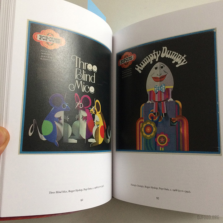
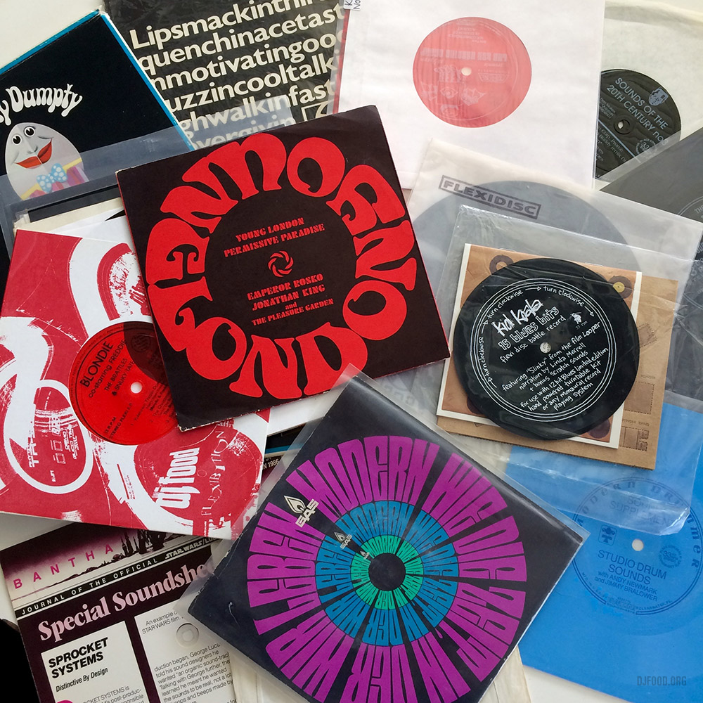 I was happy to be asked onto Jonny Trunk’s OST show on Resonance FM yesterday to feature various selections from my flexi disc collection. Listen back to our Flexible Finds and Wobbly Sounds from earlier, lots of stupidity and hilarity, inc.Star Wars, Biz Markie covering Elton John, Humpty Dumpty, Fenella Fielding, Ken Nordine, Blondie doing a Christmas version of Rapture and a silly competition.
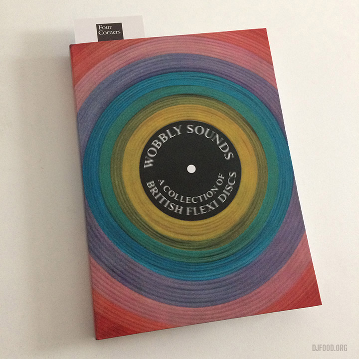
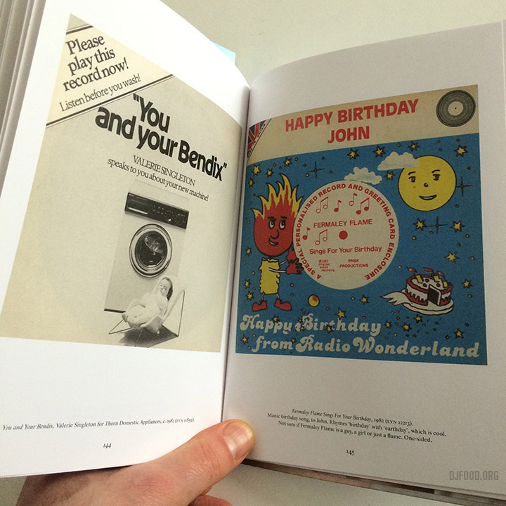
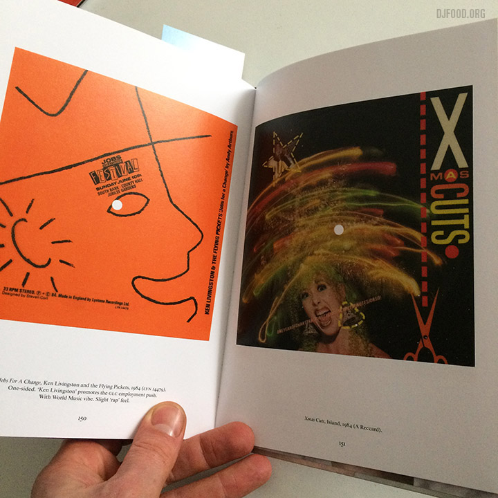
A quick round up of all things flexi disc-related that’s coming up over this month. The good news is that the Wobbly Sounds book by Jonny Trunk and published by Four Corners Books that I contributed to is back from the printers and looking great! It’s 160 pages and is only a tenner – pre-order here for an April 15th release date.
As a result there’s a plethora of promotion coming up: The Eye on Design blog has just published this article on the book.
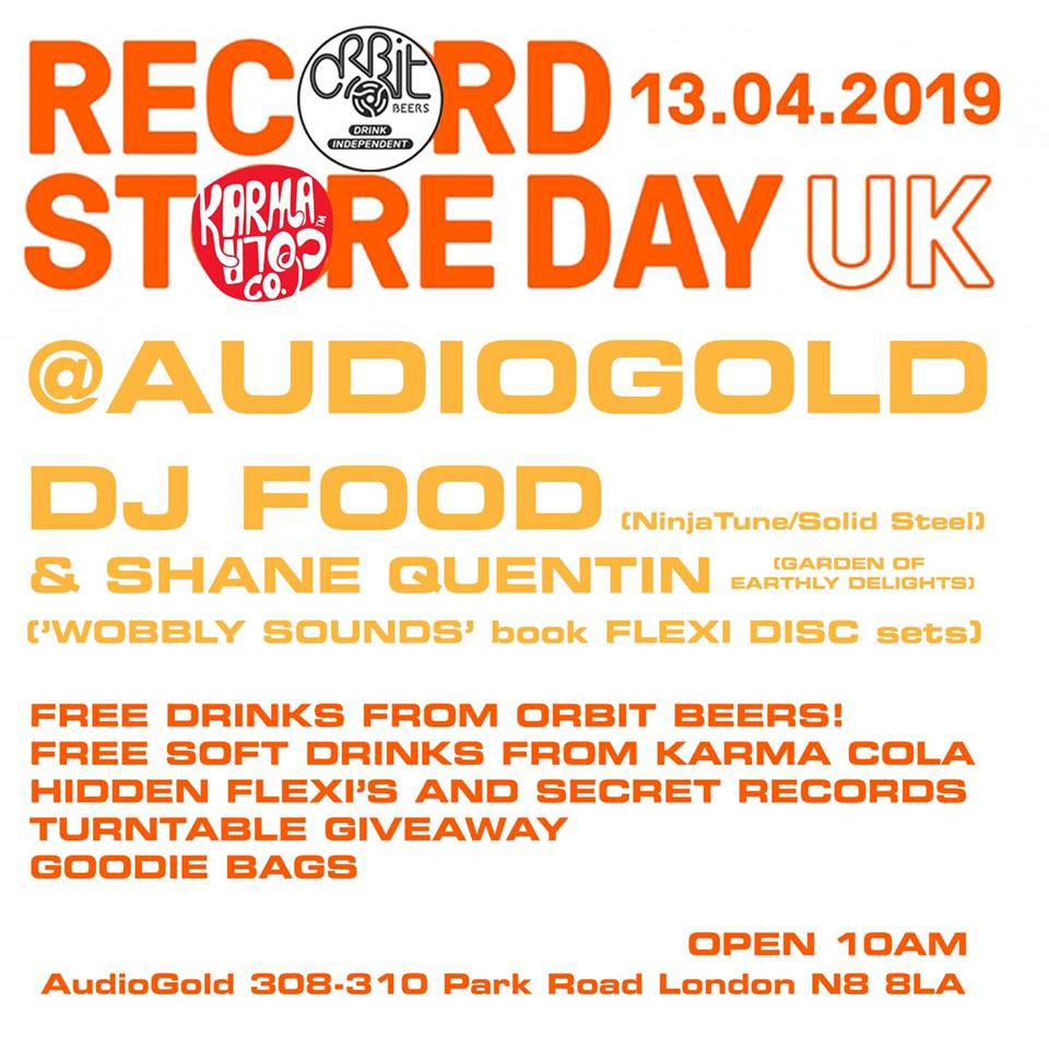 On April 13th (Record Store Day) I’ll be at Audio Gold in Crouch End, London with Shane Quentin from The Garden of Earthly Delights radio show, playing flexi disc sets with hidden discs in the racks and free beer as well – check the event page for more details.
April 16th sees the official book launch at Spiritland in Kings X, 6.30-8pm along with Jonny, Shane and Andrew Beedell Coram with an evening set by Jonny from real vinyl.
Later this month I should be joining Jonny on his OST show (4.30-6.30pm) on Resonance FM for a flexi special, playing selections from the book and more, hopefully with the usual competition hilarity.
I’m told print pieces in Record Collector and Shindig magazines are on the horizon too…
Other non-flexi related things happening: I have a guest mix coming up on The Allergies podcast mid April
I’ll be playing on Out Of The Wood radio at the Book & Record Bar this Sunday 7th with Pete Williams during the first West Norwood FEAST of 2019.
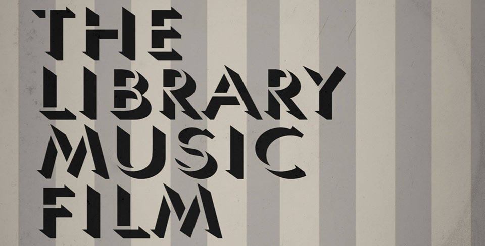
Also at the B&RB on Record Store Day (April 13th, remember?) I’ll be playing records with Ceri Preston after a showing of The Library Music Film and a Q&A from Shawn Lee. Starts at 7.30pm and goes to 1am.
Unfortunately the Kraftwerk AV gig I was to do at the Sheffield O2 Academy on the 27th April has been rescheduled for Nov 8th now but will be locking more in for May/June.
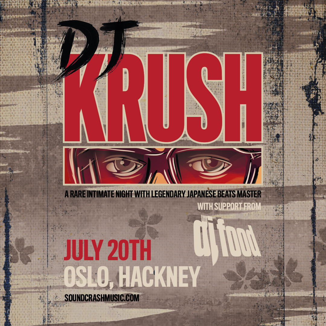
Also, I’ll be supporting DJ Krush on June 20th at Oslo in Hackney – tickets just went on sale yesterday.
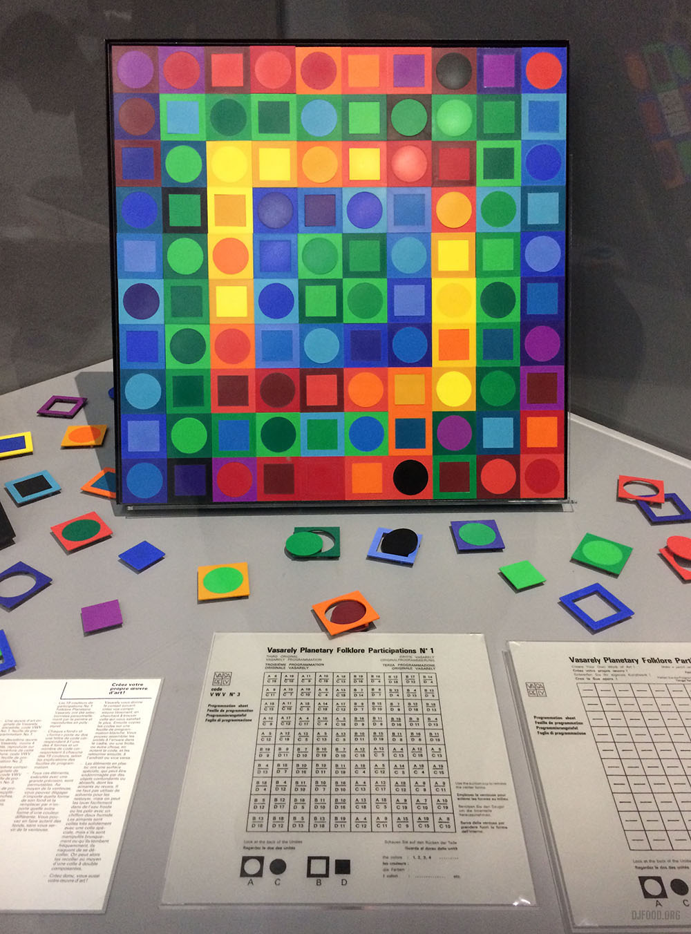
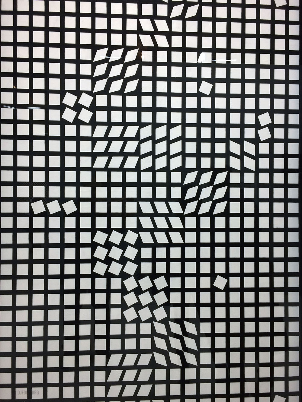
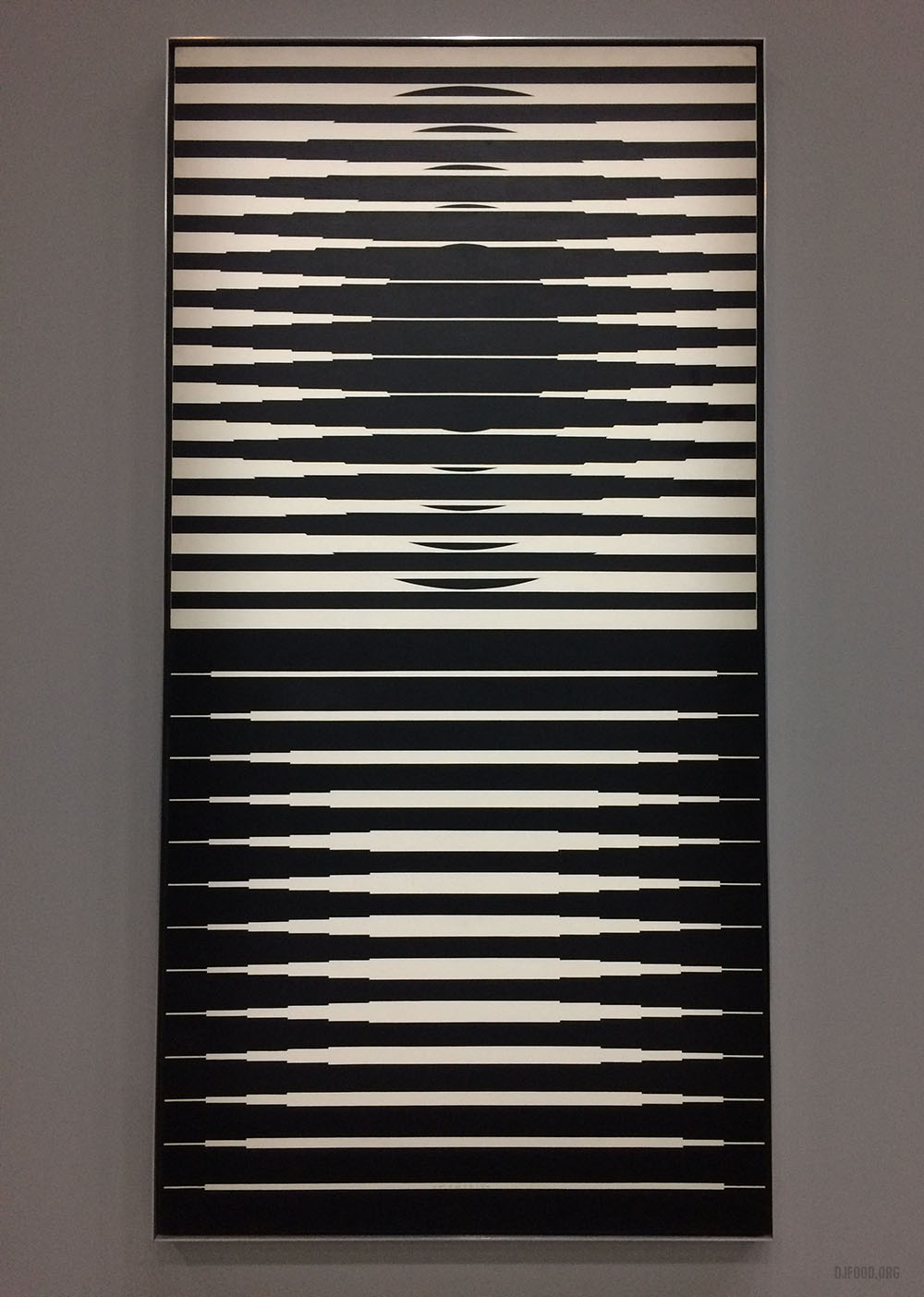
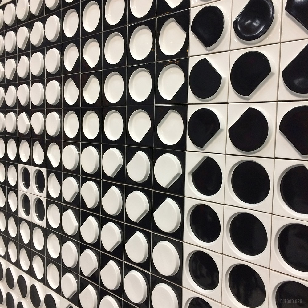
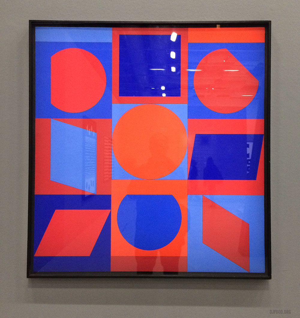
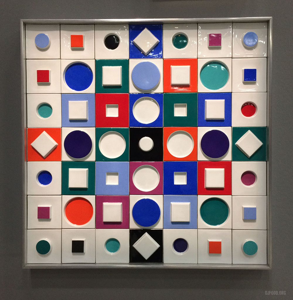
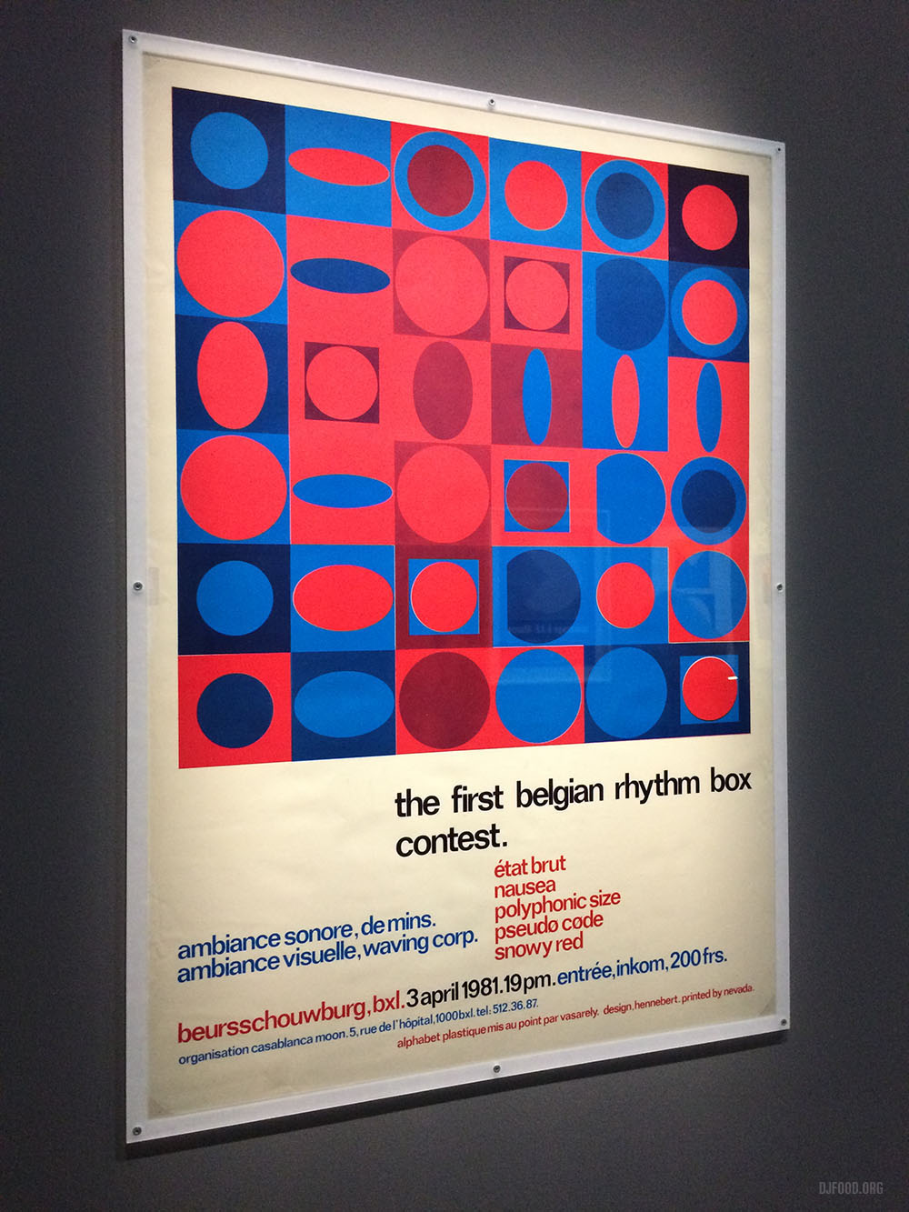
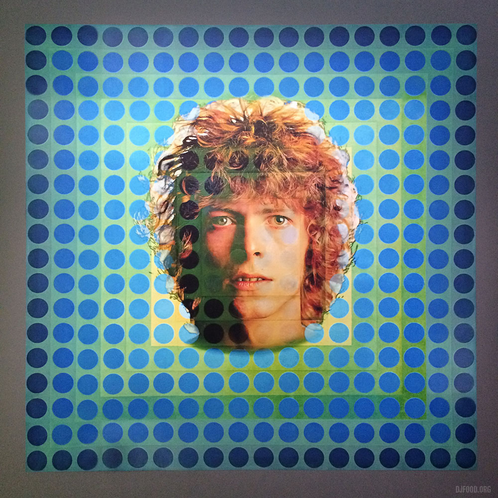
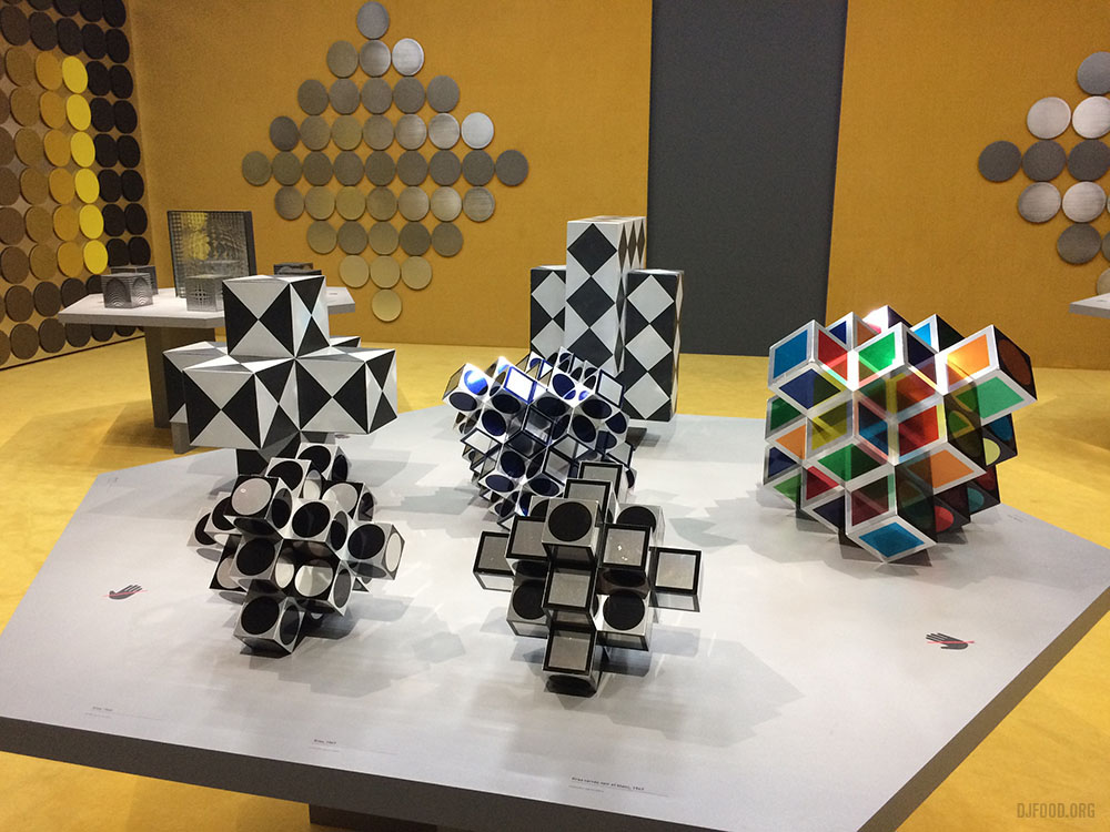
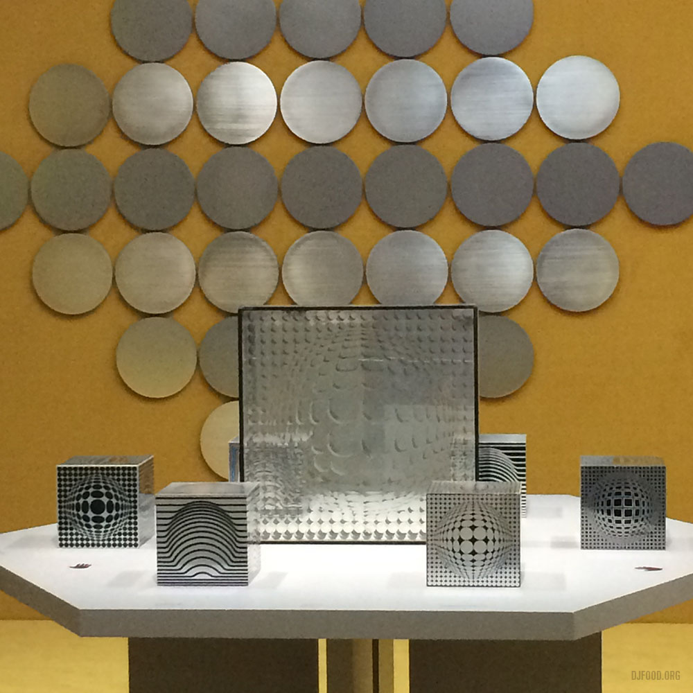
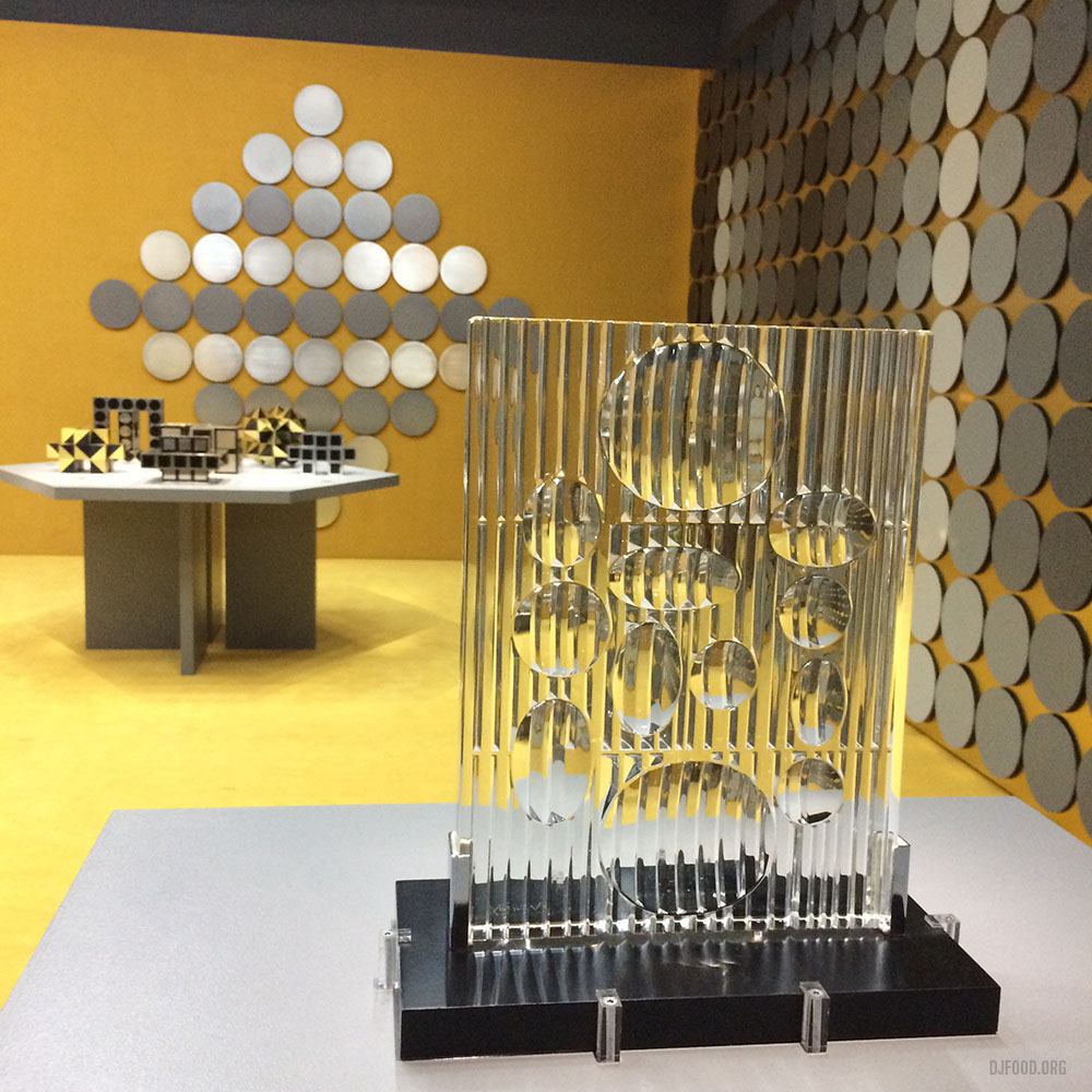
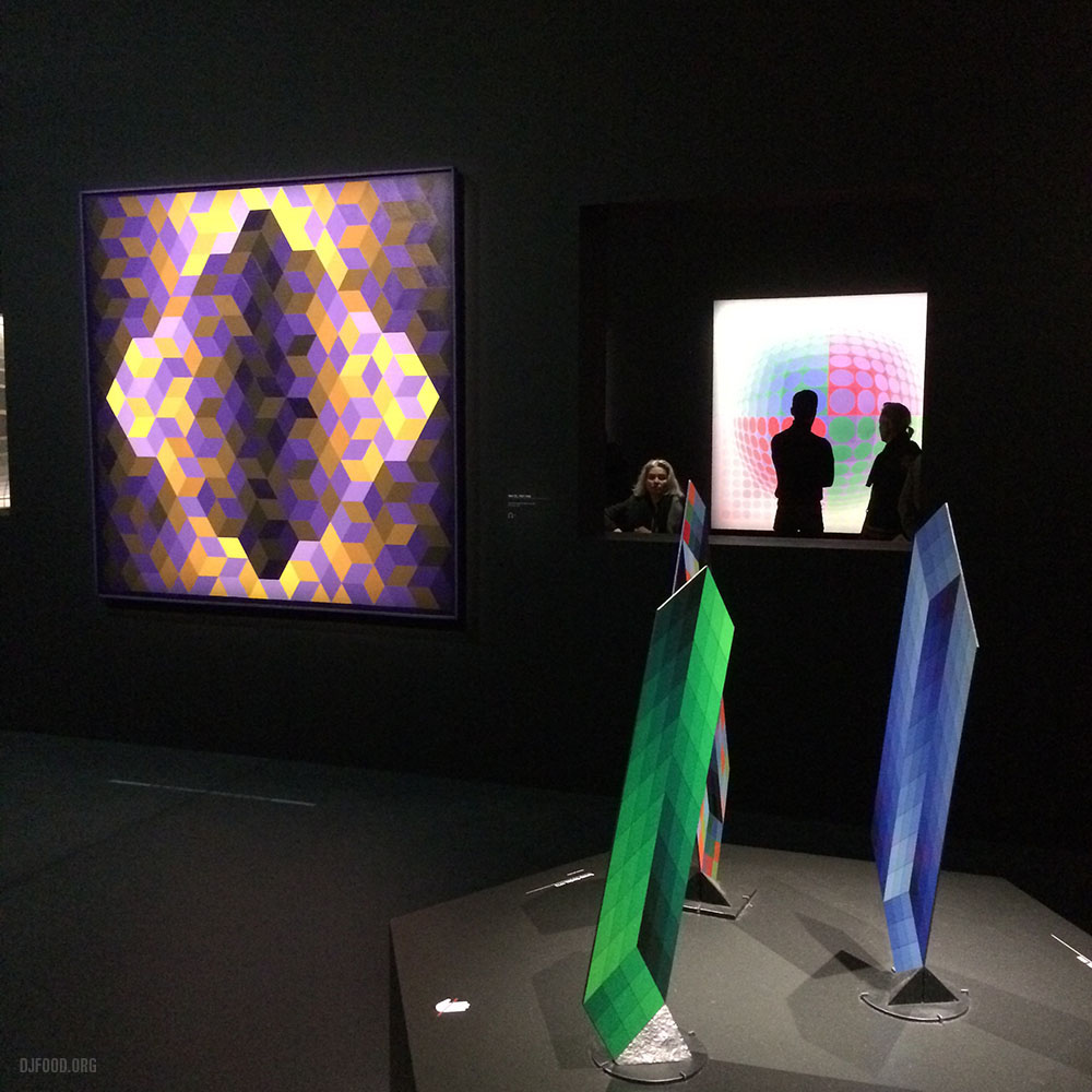
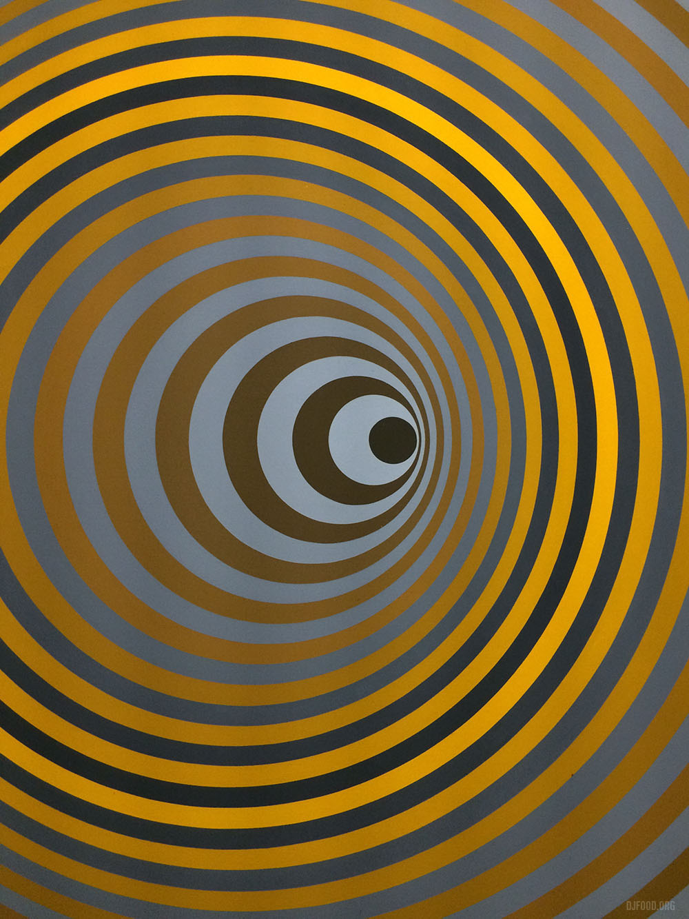
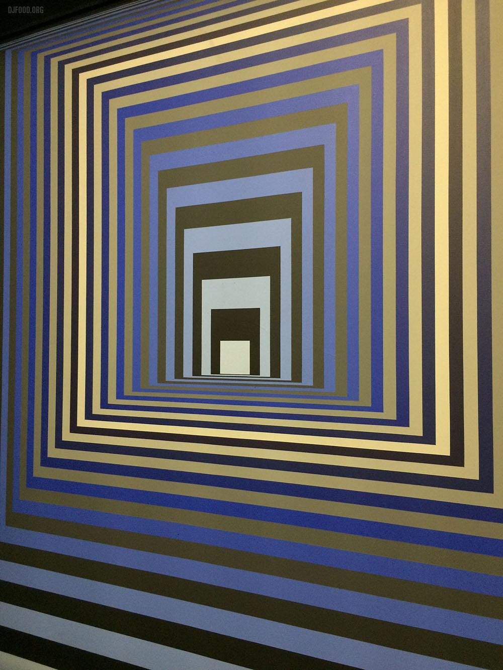
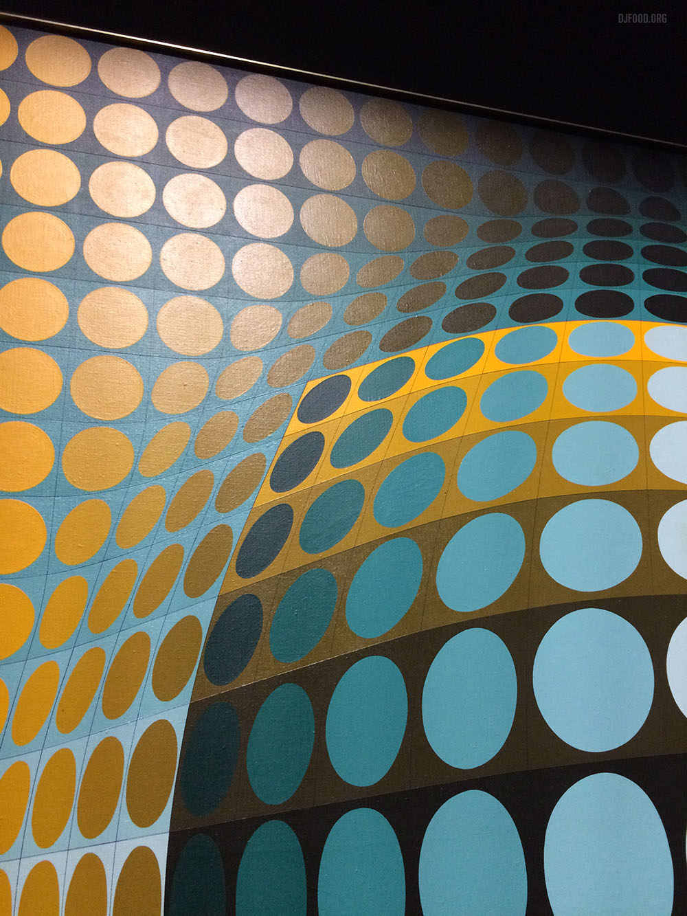
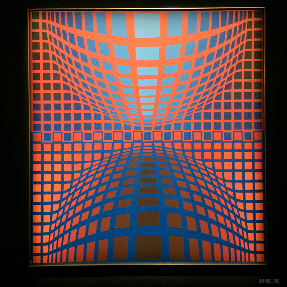
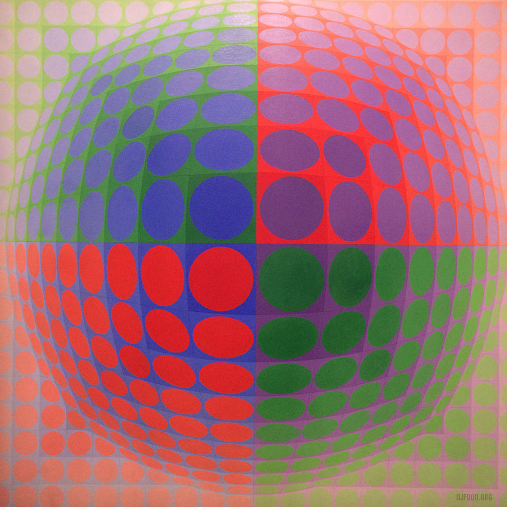
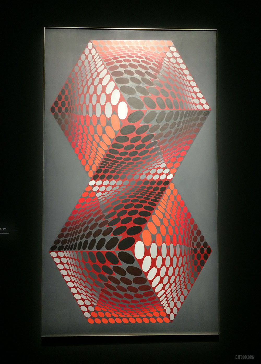
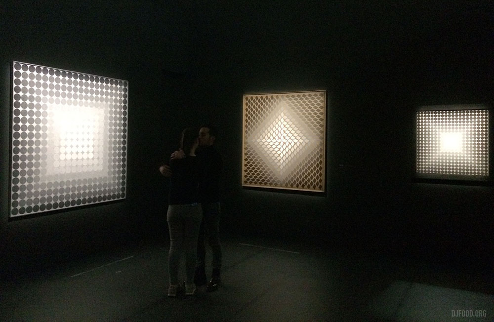
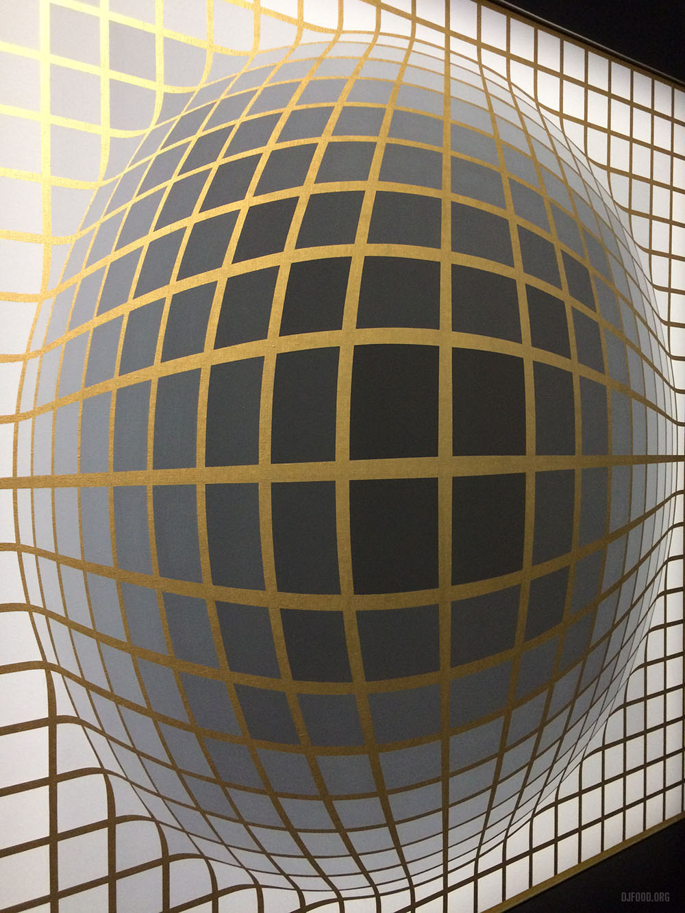
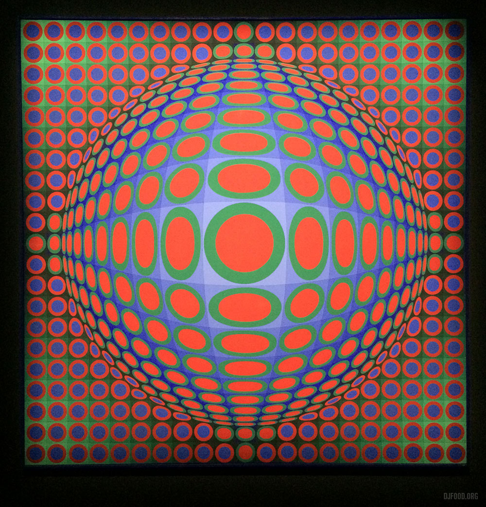
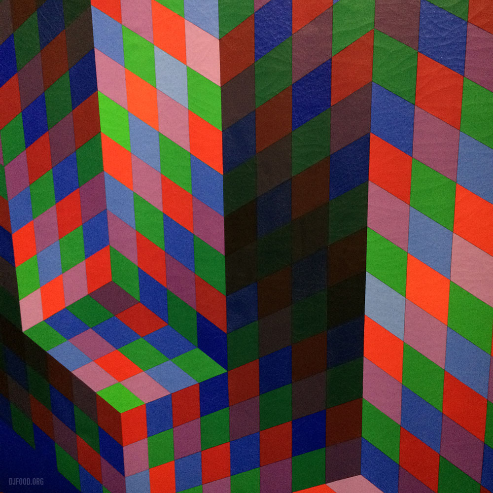
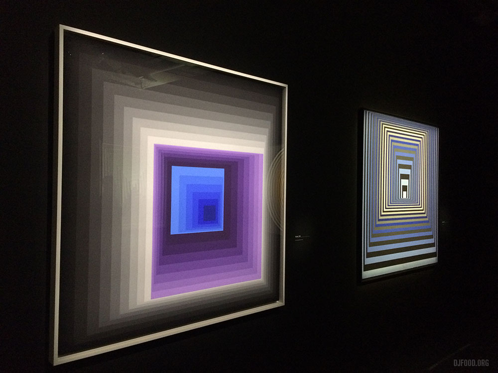
The highlight of my recent trip to Paris to play at the Ping Pong 20th anniversary party was a trip to the Pompidou Centre to bask in the first major Victor Vasarely retrospective. A comprehensive overview of his work was on display, from earliest experiments through to his breakthrough op art achievements. Whilst a lot of his large scale work wasn’t present there were some 300 pieces to admire including paintings, sculpture, ceramics, prints, logos, textiles and more. The final room was particularly good with very low light and excellent lighting that picked out the paintings in a glow that seemed to make them radiate and become even more three dimensional. The level of skill and draughtsmanship on display was incredible and I’d highly recommend a day trip over before it finishes in May, the book shop at the end is something else too, take lots of money and a strong bag is all I can say!
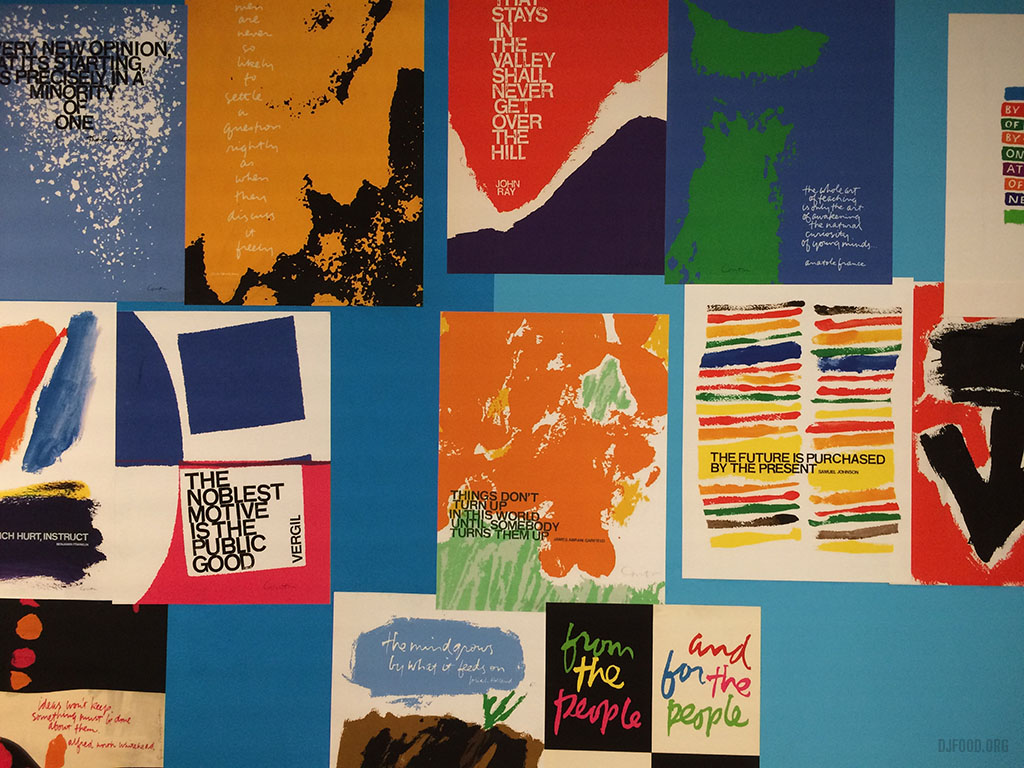
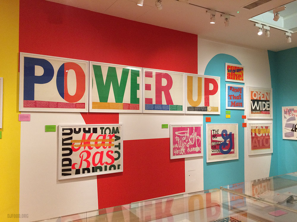
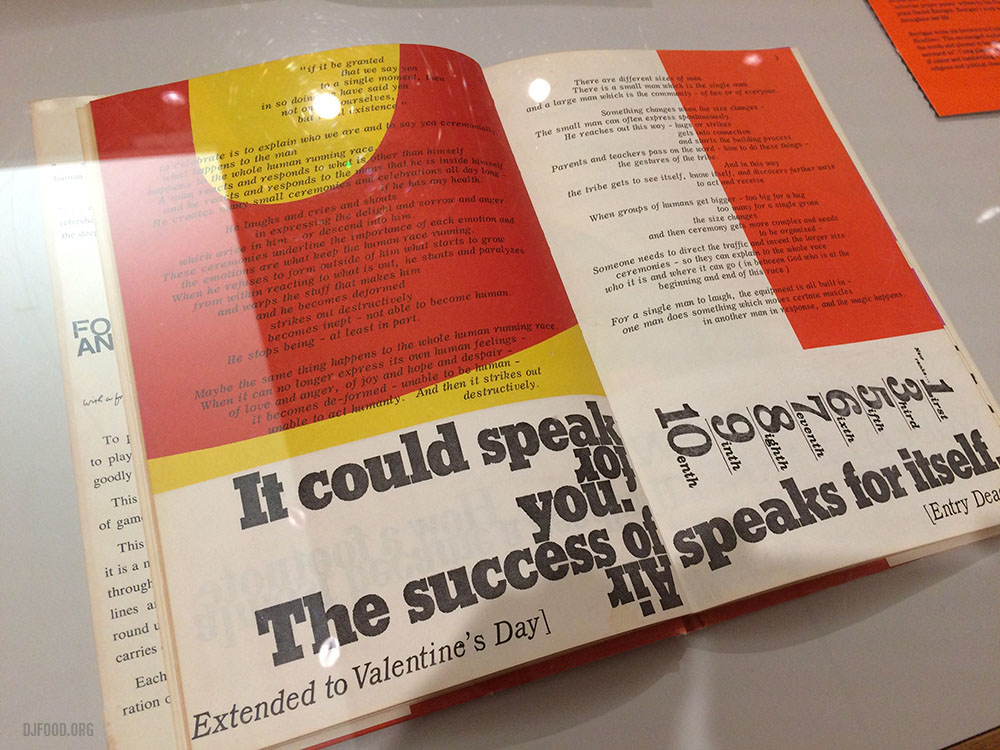
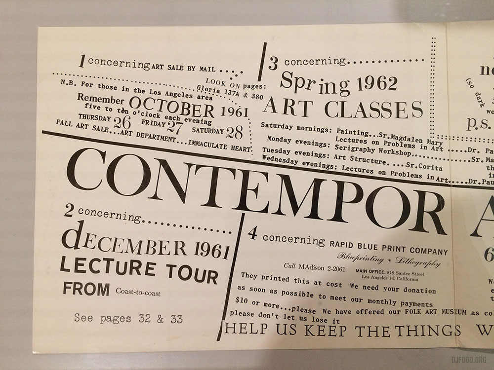
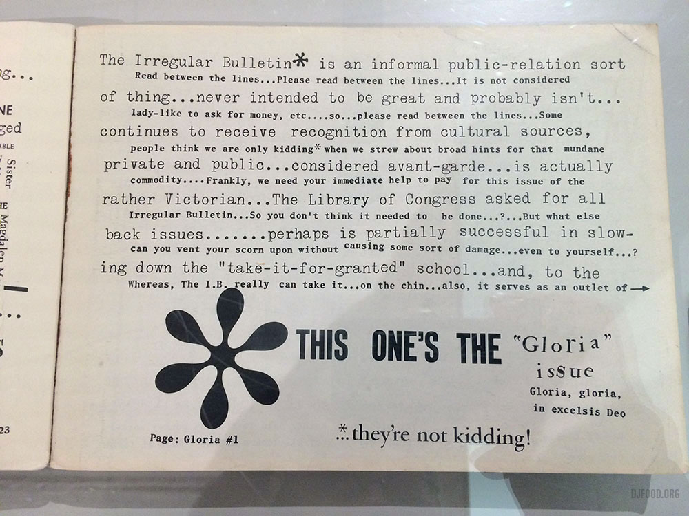
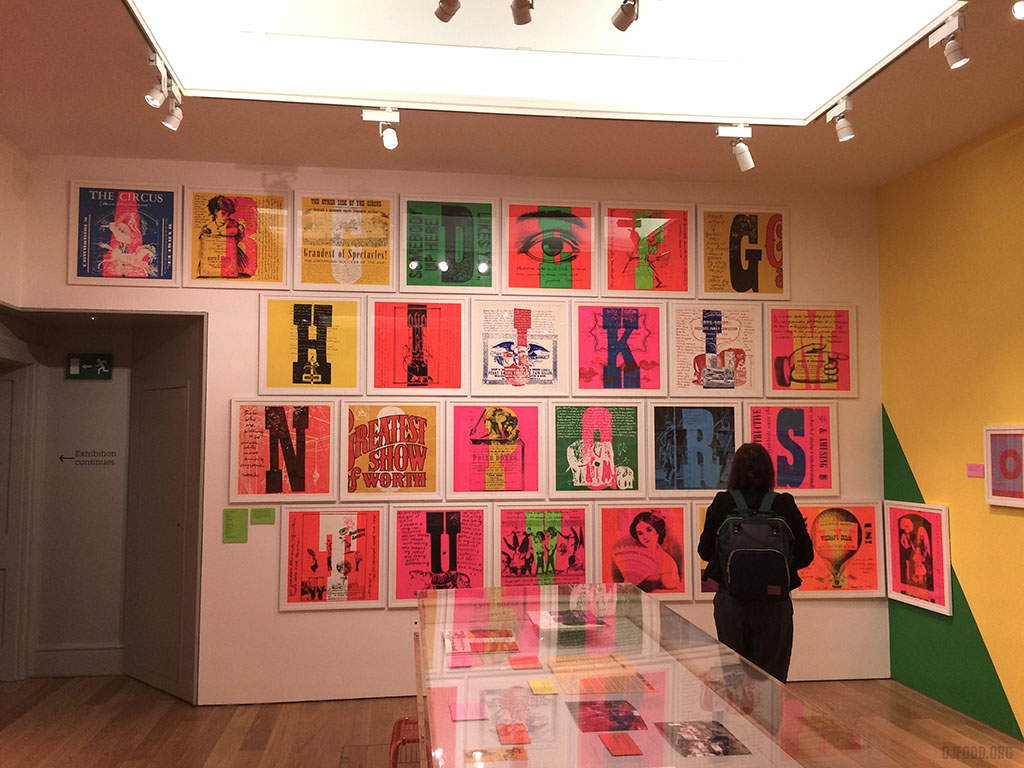 The new Sister Corita Kent exhibition has been on at the House of Illustration in Kings X now for a month, expanded from the version shown in Ditchling last year. It’s still small but packed with lots of beautiful prints, books, posters and ephemera that she created during her lifetime both in and outside of the church. I urge you to go and see these beautiful prints in the flesh and pick up a free copy of her ‘rules’ taken from an art department classroom.
I recently took part in a radio show hosted by Stephen Coates (aka The Real Tuesday Weld) and his co-conspirator in X-Ray Audio Project, Paul Heartfield for Soho Radio. The pair are doing a takeover for two weeks with a series of themed radio shows and a small exhibition in the front of the station. (photos by Hannah Brown)
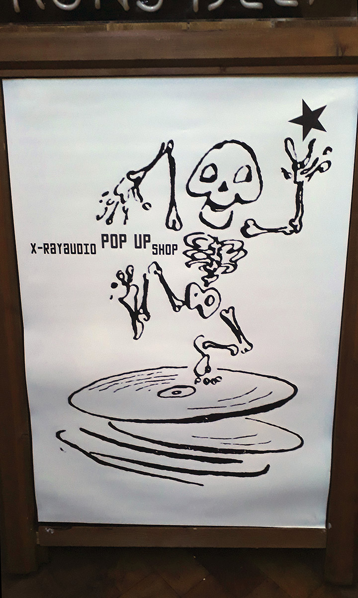
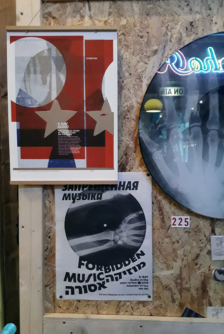
The show I took part in was about flexi discs and we were joined by Barry Cain, the original publisher of anarchic early 80s Flexipop magazine. Other episodes on X-Ray discs, self-made records, bootlegs and a live performance & x-ray cut are also archived on the soho radio site.
I mention the Flexibition during the program so here’s a handy link to all the entries if you’re wondering what it is and want to have a look & listen.
I was asked to take part in this short piece by the BBC Archive that focused on Peter Zinovieff‘s computer-made music and the role computers now play in everyday life. You can follow the archive on Twitter as they regularly post fascinating clips of unsung pioneers and oddities from yesteryear.
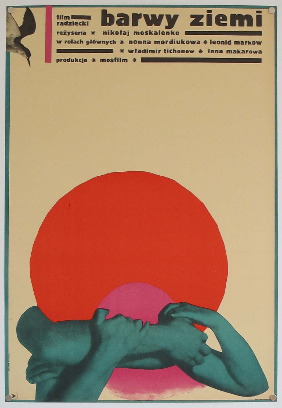
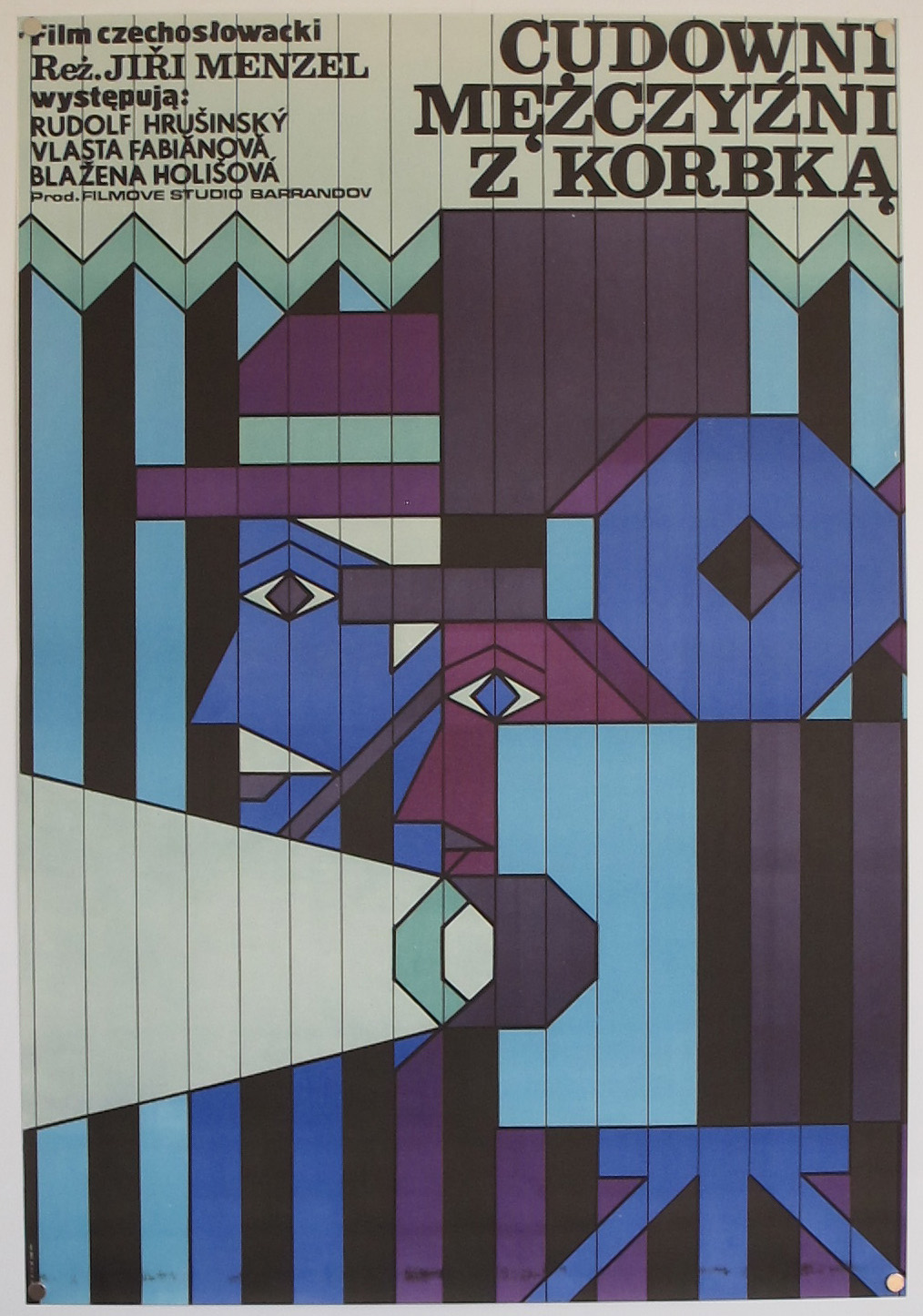
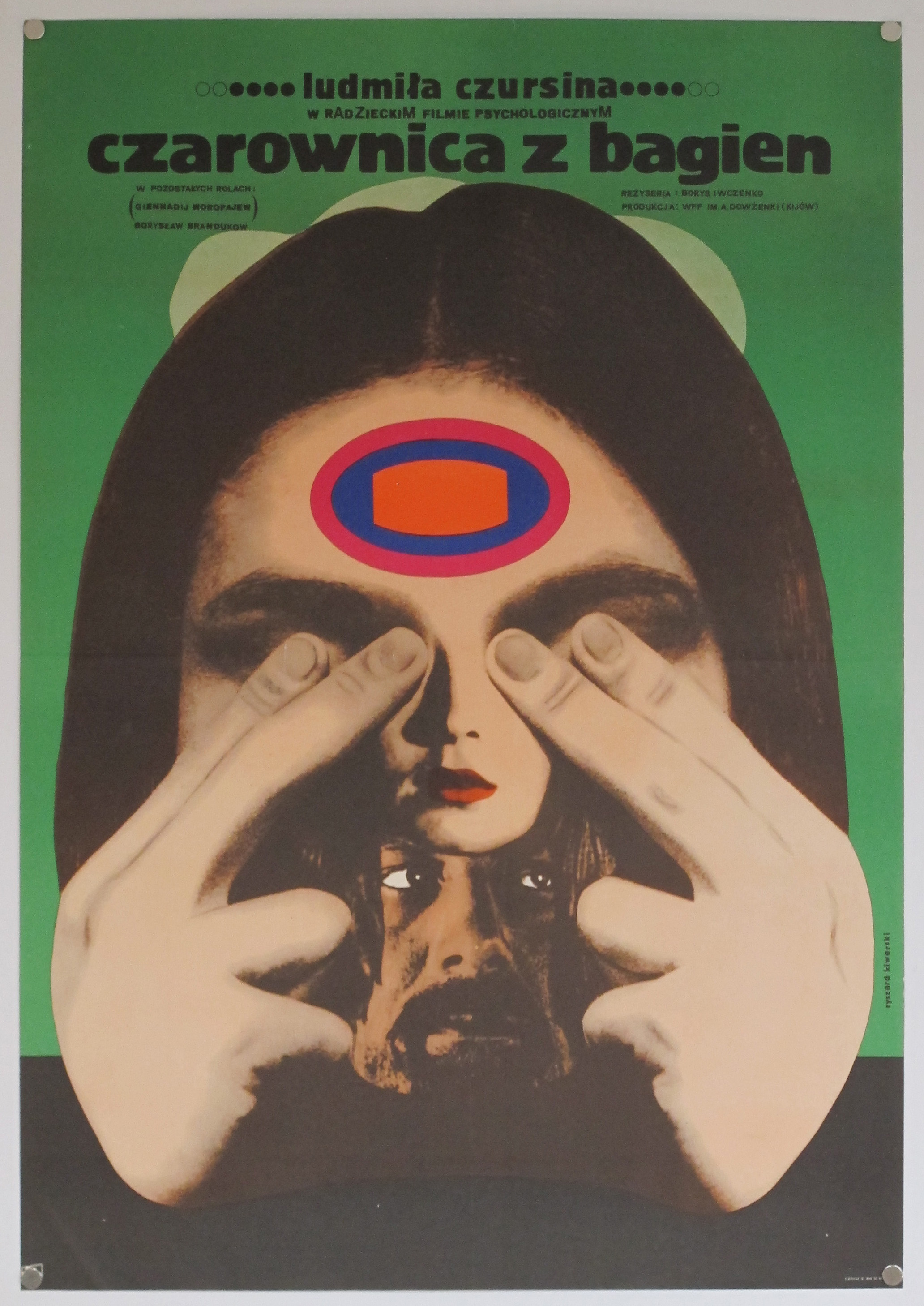
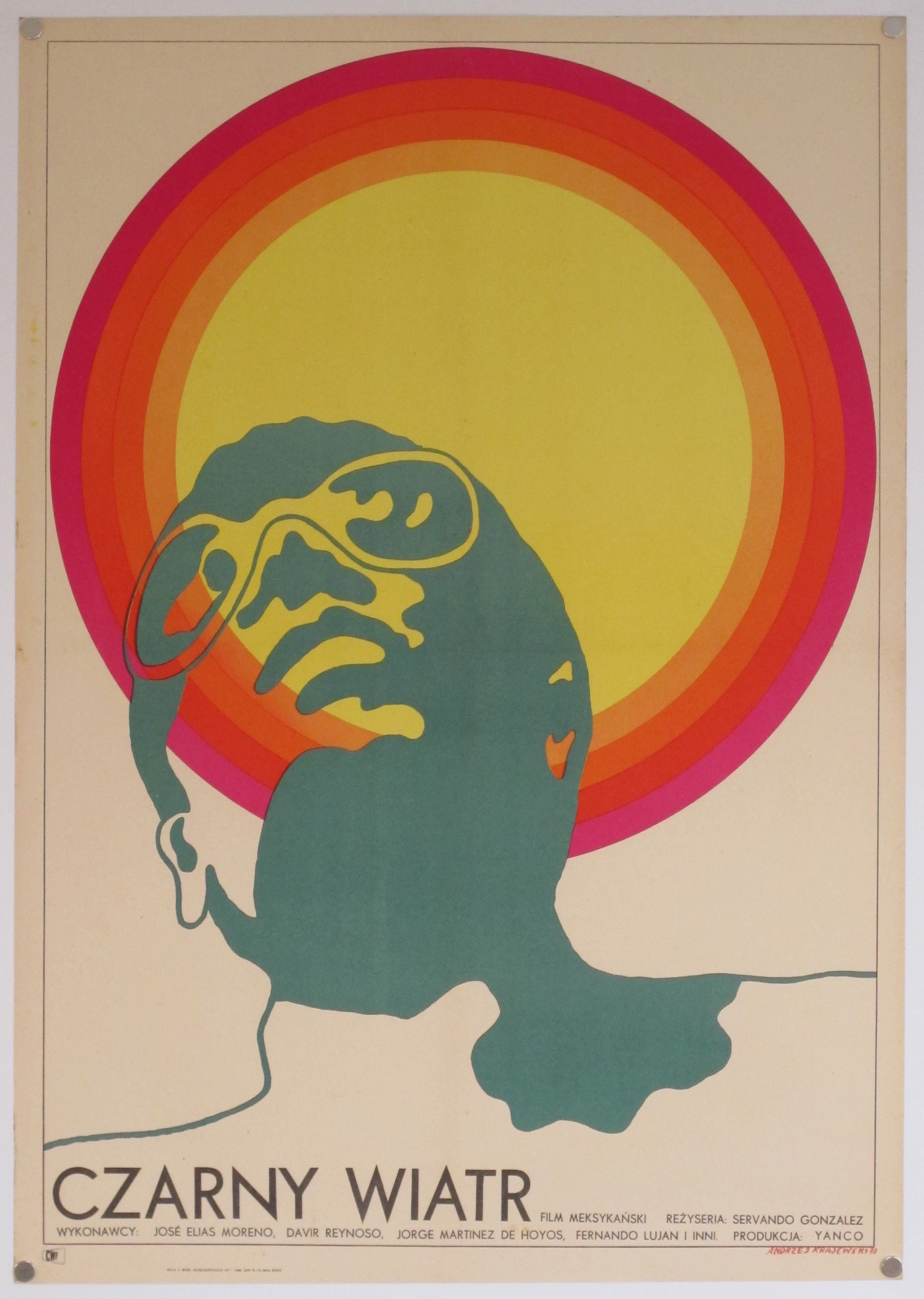
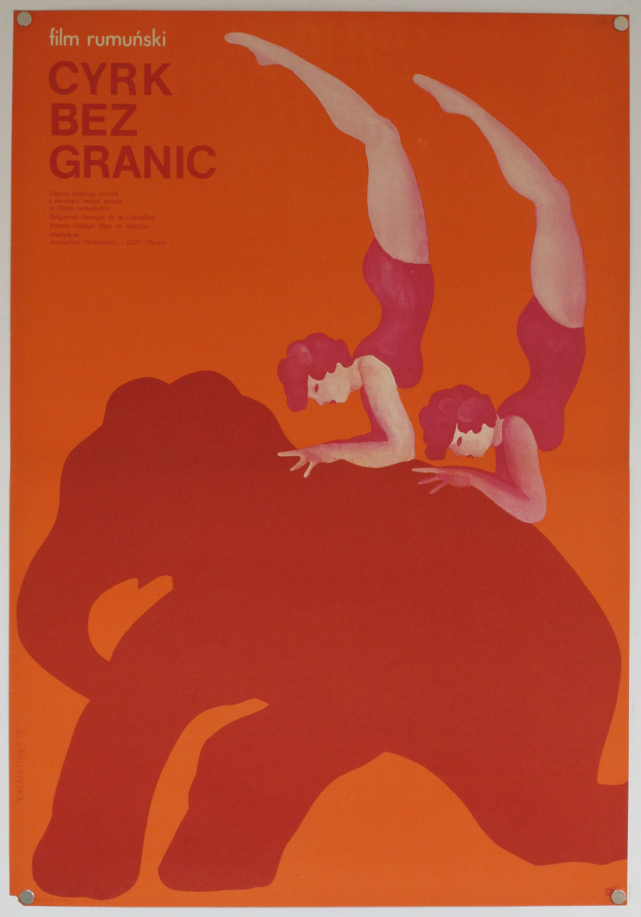
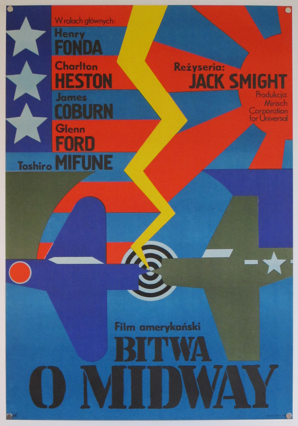
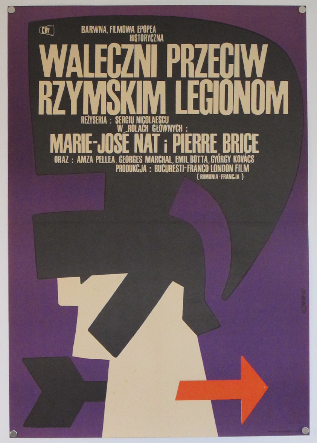
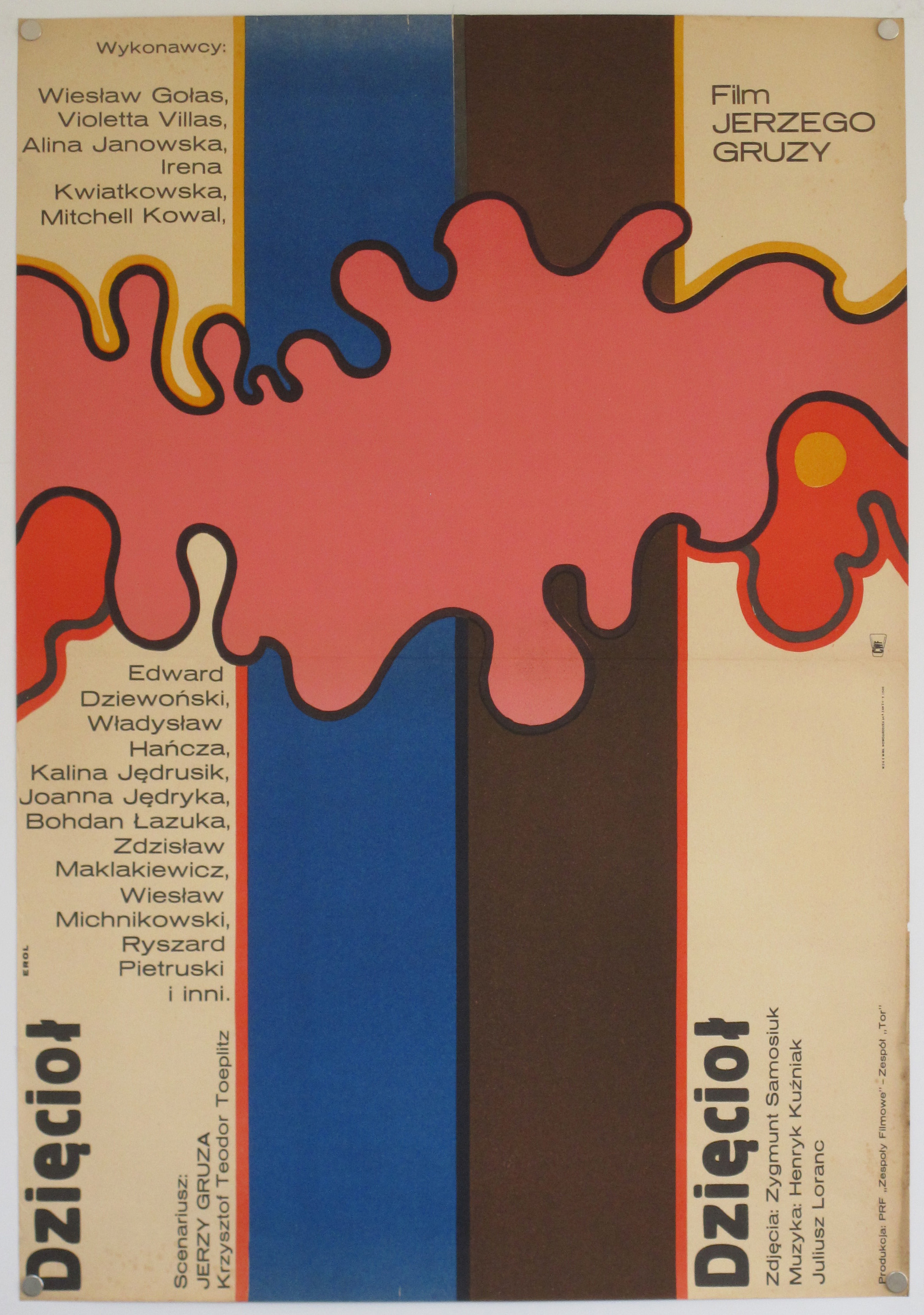
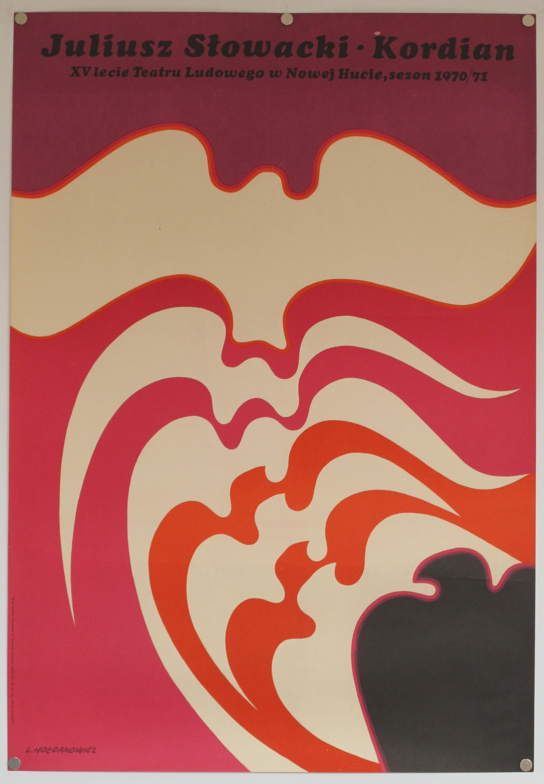
Eye Sea Posters have been around for a few years now, specializing in original, vintage posters from around the world with an emphasis on Polish designs of an alarming variety. Their website has been offline for a while but was recently updated and plenty of new stock has been added, some of which is featured here. Take a look around
From their own mouths: “From the 1950s theatre, circus and film posters became a new form of art on the streets of post-war Poland. Despite the controlling soviet regime, some artistic expression was tolerated and the film industry, largely controlled by the state, prospered. Established artists were commissioned to design film posters. The artists had to convey the essence of the film in their designs and were given artistic freedom to do so which led to some truly original posters that are sometimes surreal and often have a satirical sense of humor. Unlike most film posters, the use of photos of film stars or film stills wasn’t mandatory, and most of the time even the main actors’ names didn’t feature prominently in the designs. Free from commercial constraints, graphic designers used film posters to develop their artistic creativity.
The Polish School of Posters created a unique aesthetic that occupies a prominent place in the history of graphic design. The posters seems to have a style all of their own and we love their amazing and often bizarre artwork.
Eye Sea Posters specialize in Polish posters from the 60’s and 70’s by artists like Jerzy Flisak, Maciej Zbikowski and Maciej Hibner. Their collection is handpicked with an emphasis on design and the posters are rich in symbols, metaphors, unusual forms and colours.”
The company was started by James Dyer and is now continued by Chiara Amini and Iain Twitchett