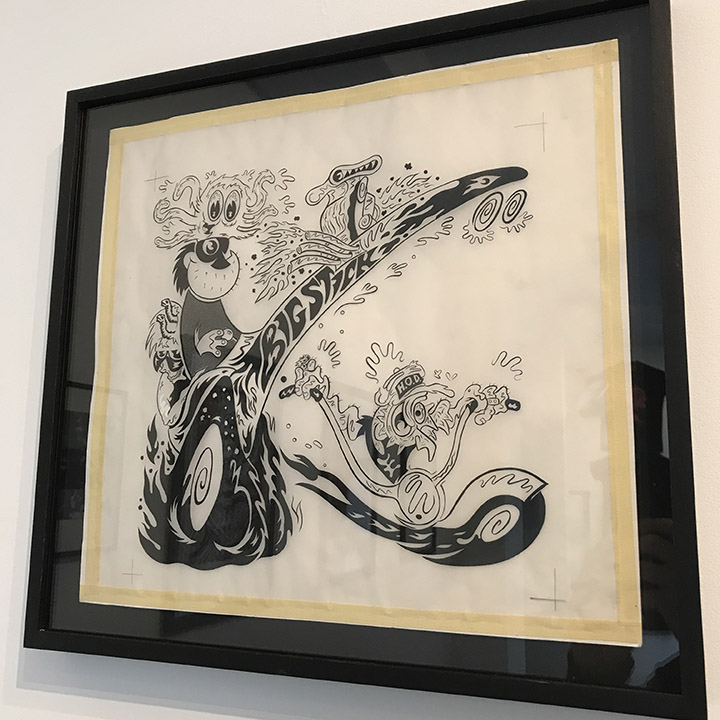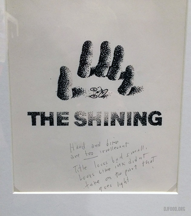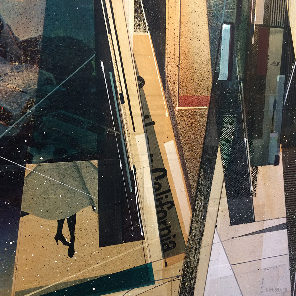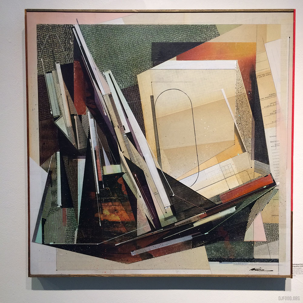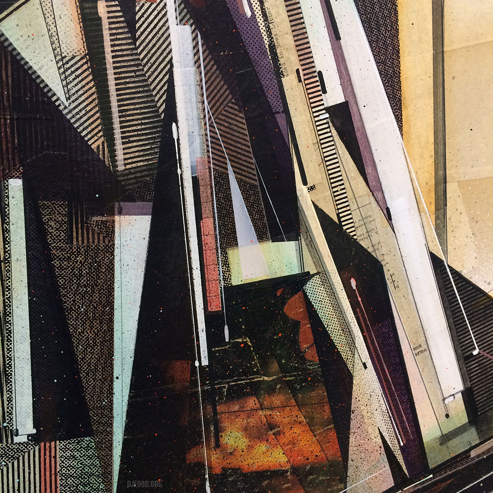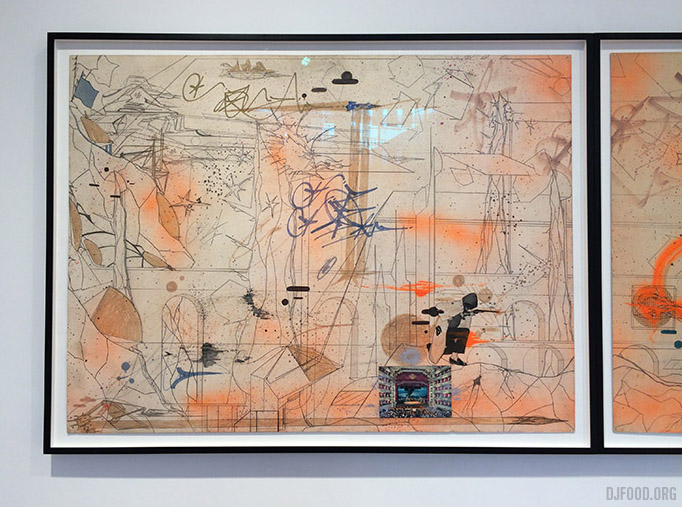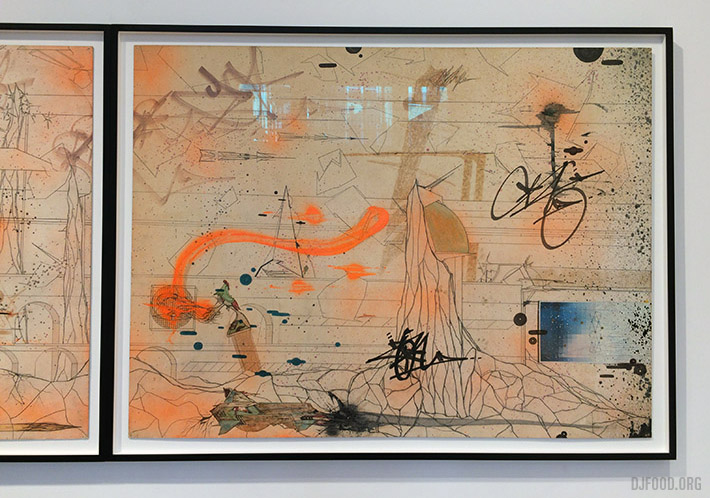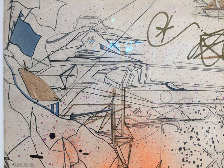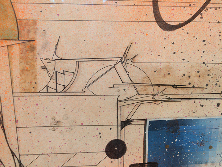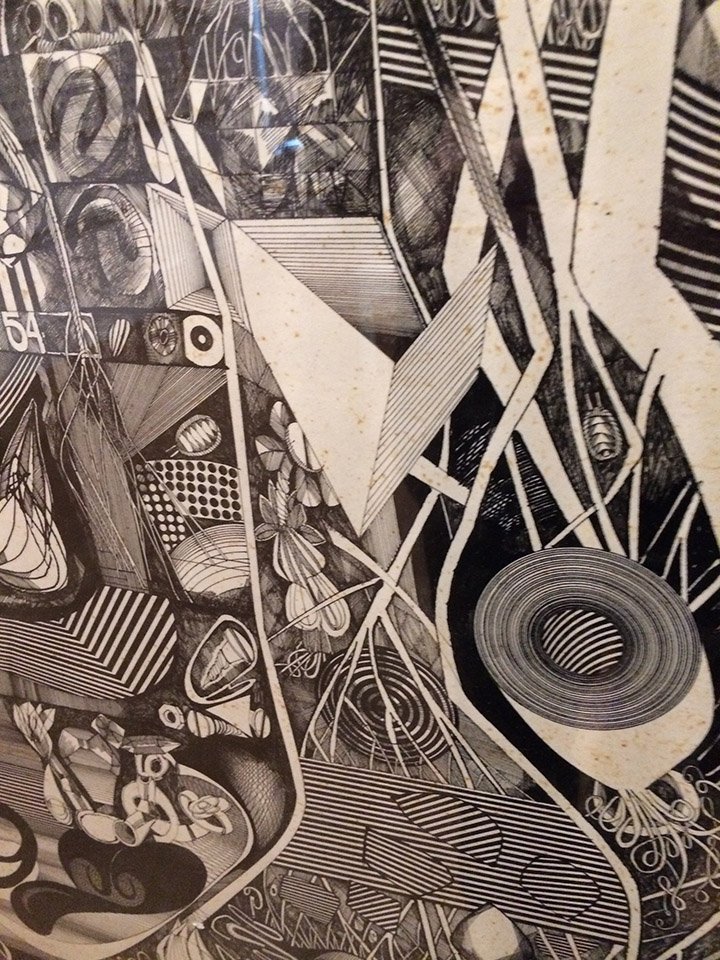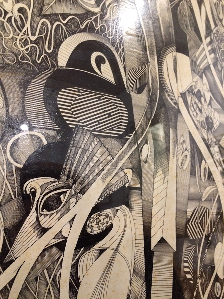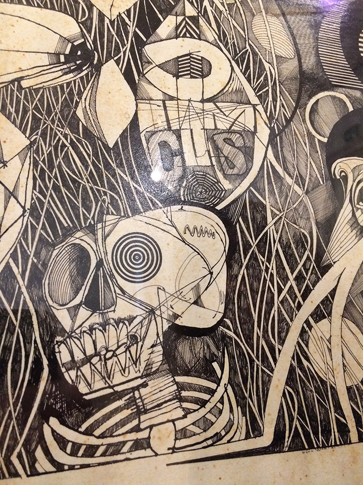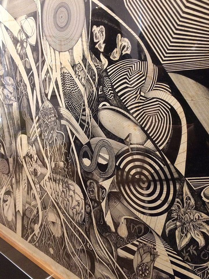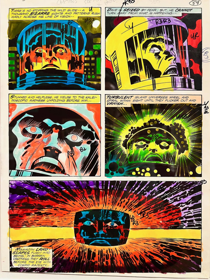
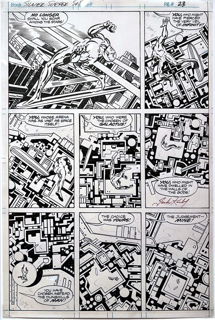
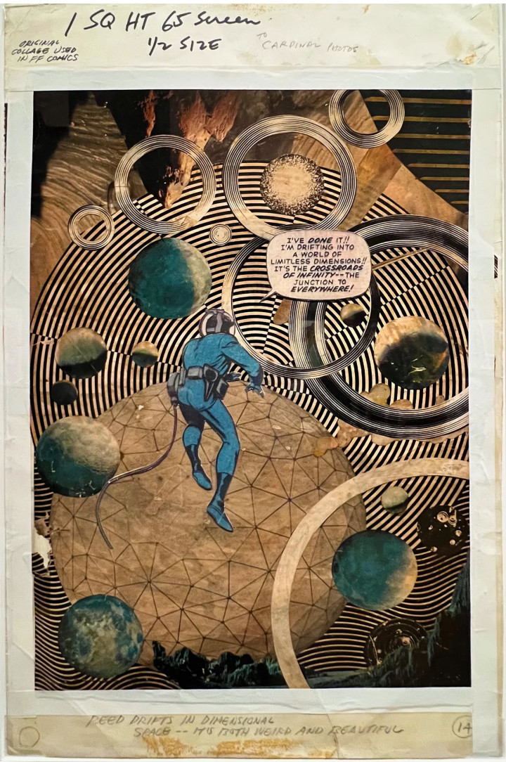
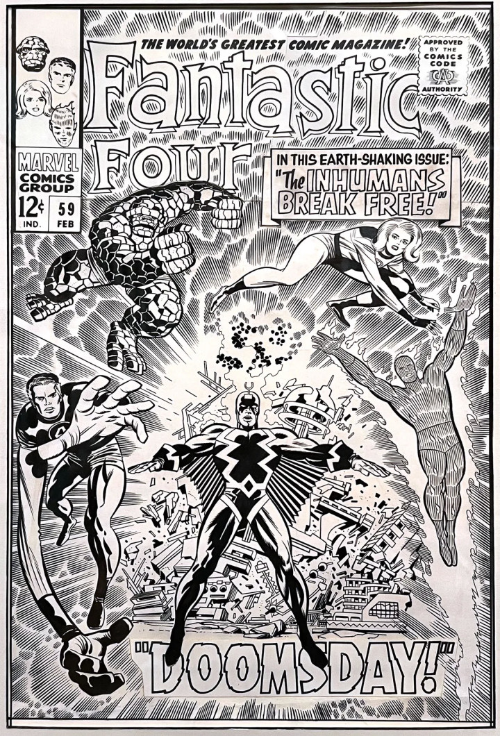
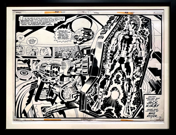
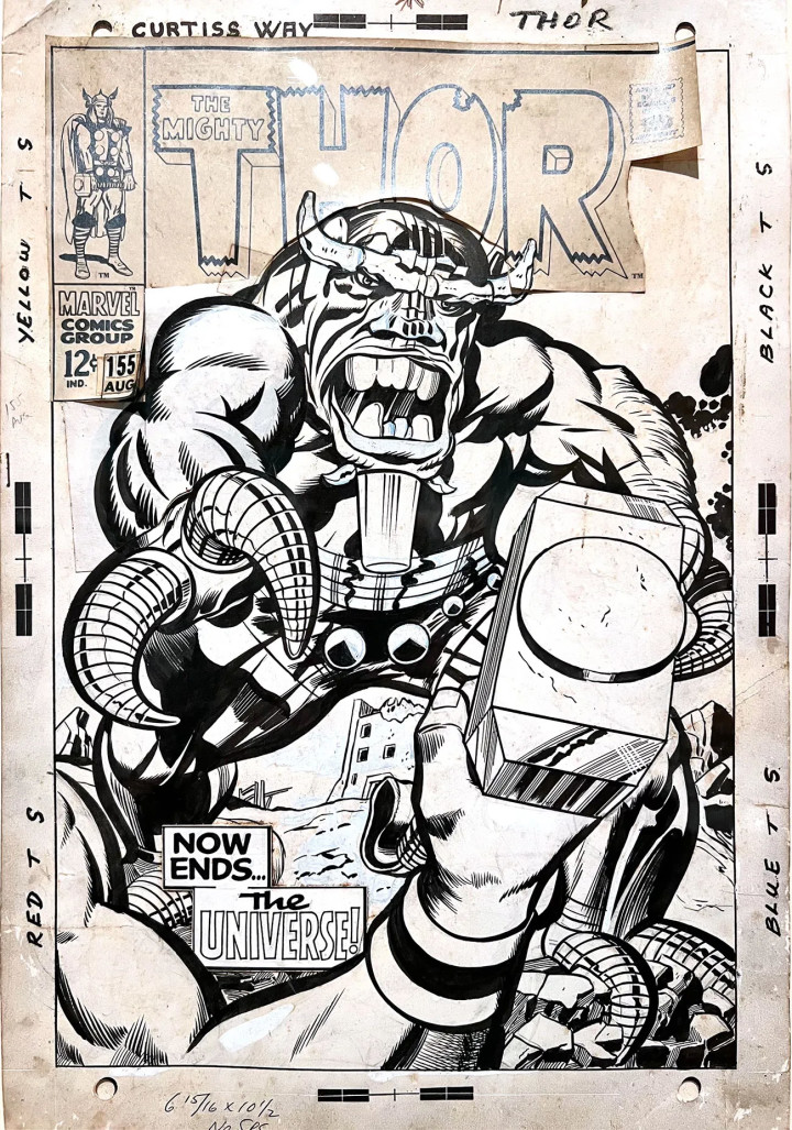
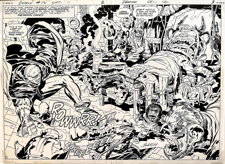
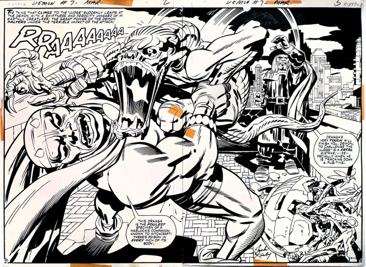
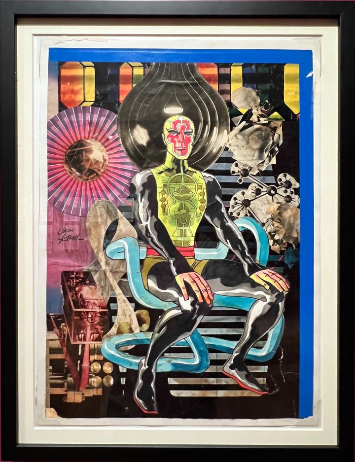
A Jack Kirby retrospective entitled Heroes & Humanity was been open since September at LA’s The Skirball Cultural Center and my good friend Steve Cook has been posting beautiful shots from it over three different entries on his Secret Oranges Substack.
Jack Kirby post 1. Jack Kirby post 2. Jack Kirby post 3
Being that he’s a skilled photographer, he’s managed to capture the original artwork perfectly in all its gritty, pasted up, whited-out, dog-eared glory. Below are just a selection that he graciously allowed me to repost but you should check out his original posts as well as his excellent Substack too. Even better, if you’re in the LA area you should get along to view the real thing before it closes at the end of March.

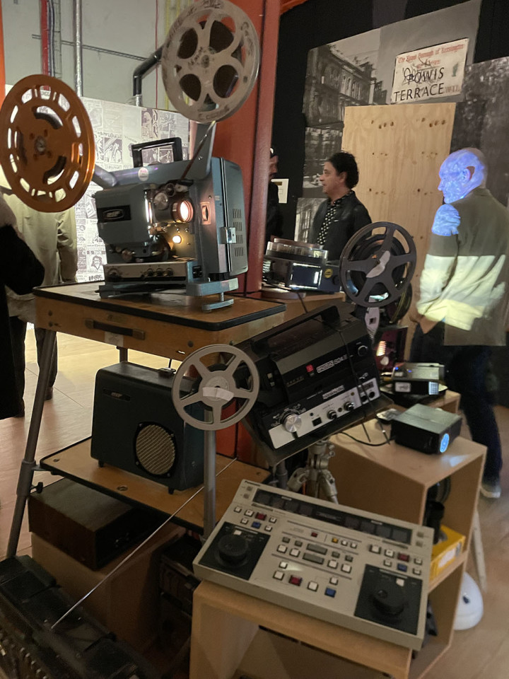
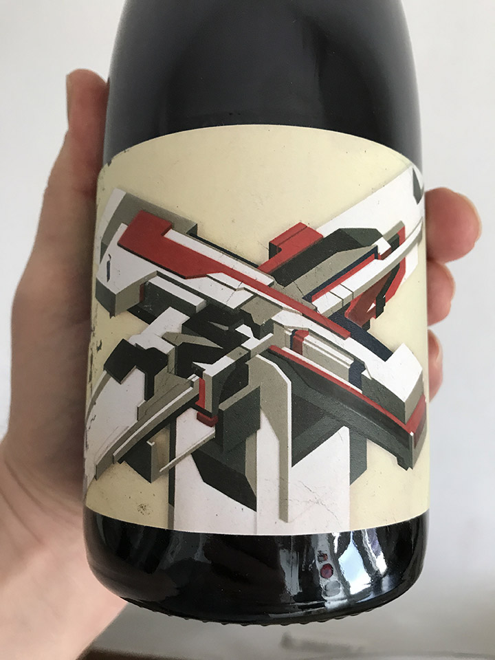
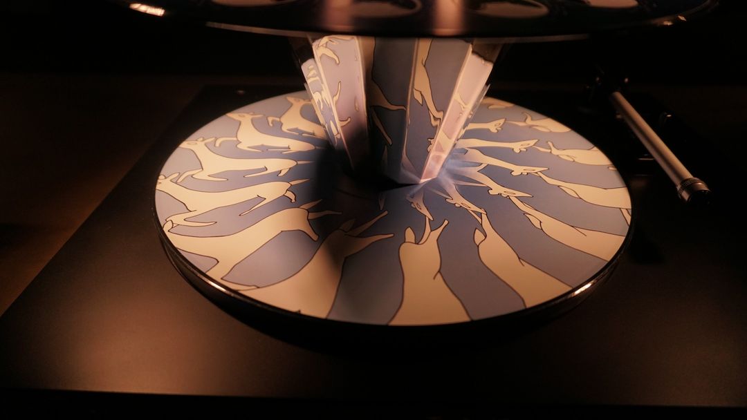
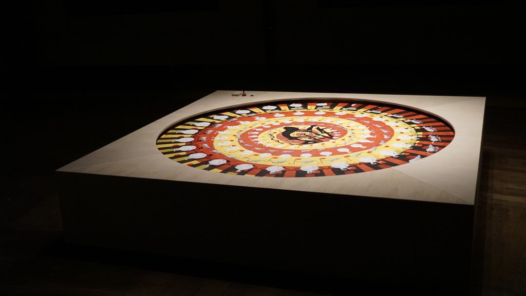
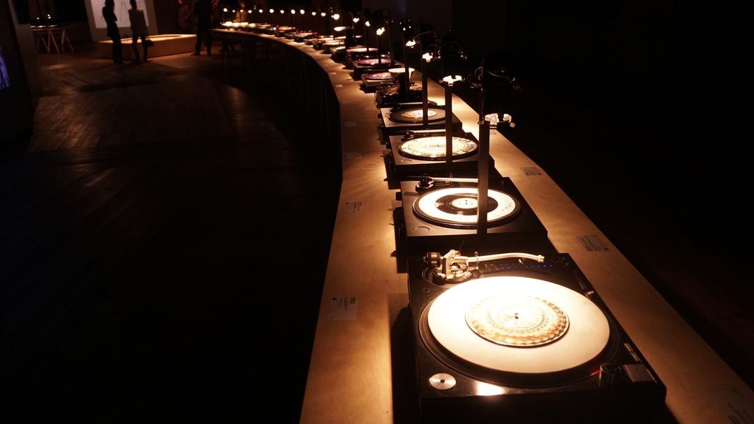
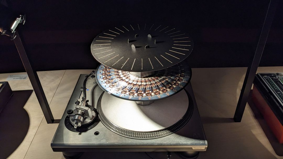
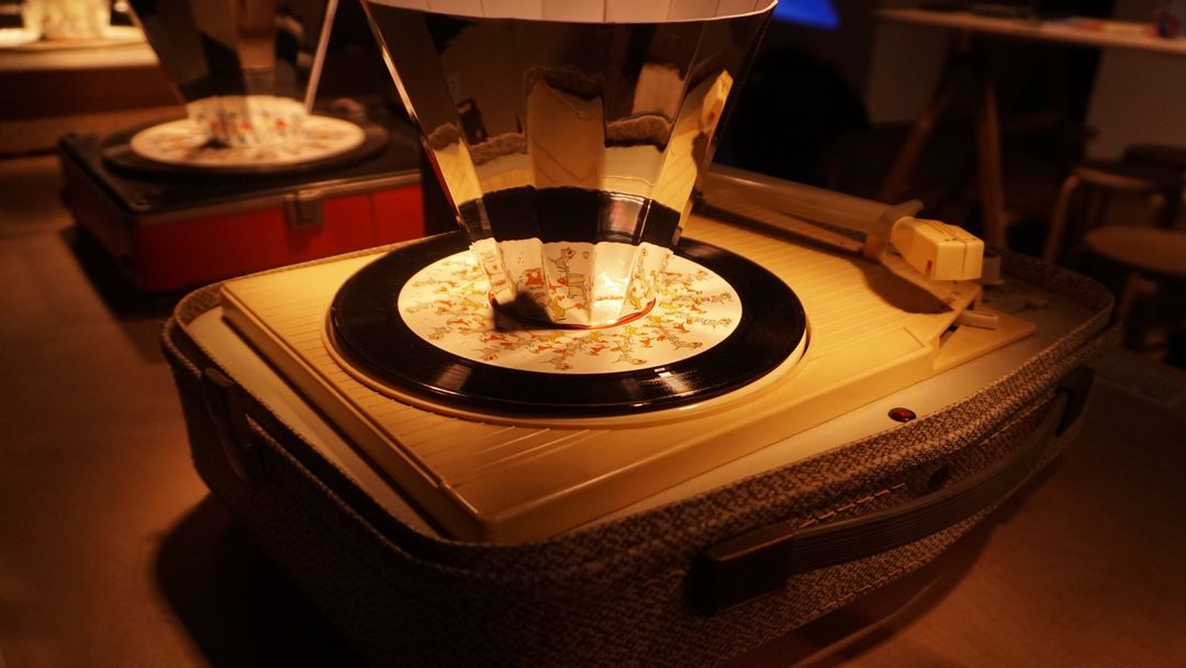
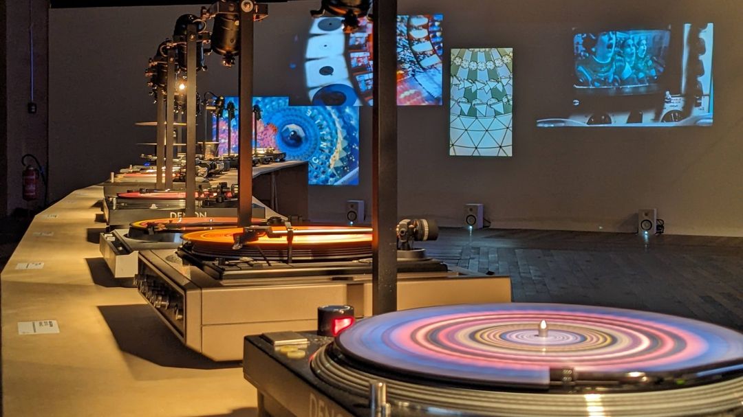
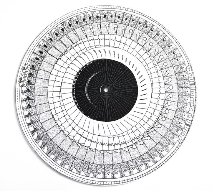
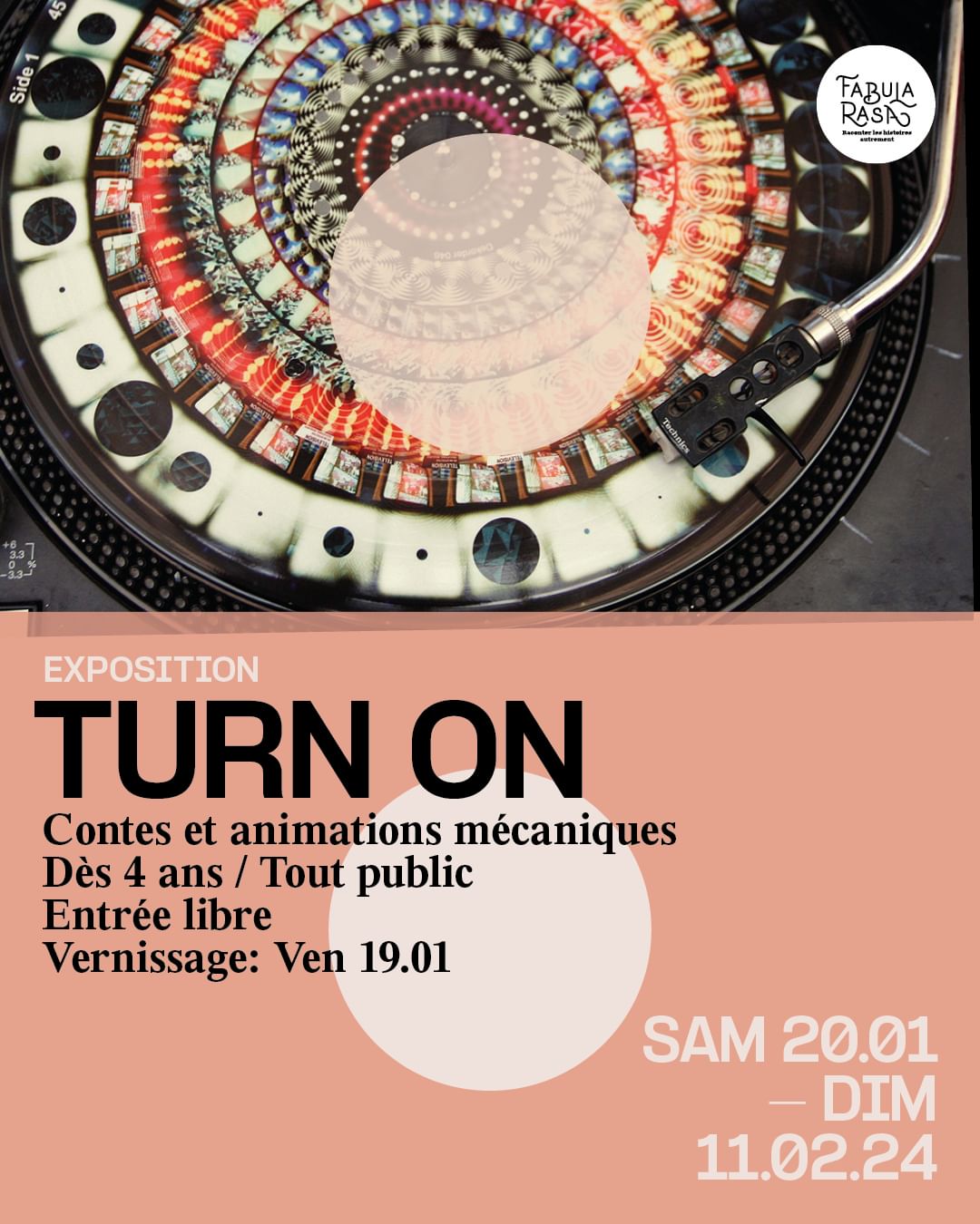 An exhibition of phenakistoscopes and zoetropes revolving around music and audio has just opened at the Rotundes venue in Luxembourg. I was thrilled to see my design and viewer for Bonobo‘s ‘Cirrus’ on Ninja Tune way back in 2013 using animations by Cyriak from his video for the song.
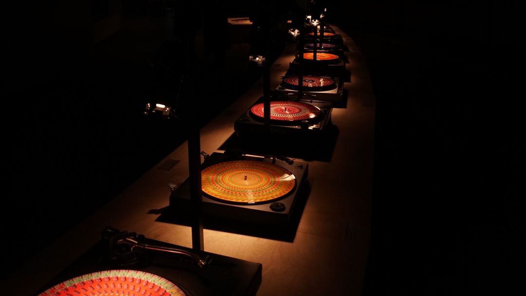
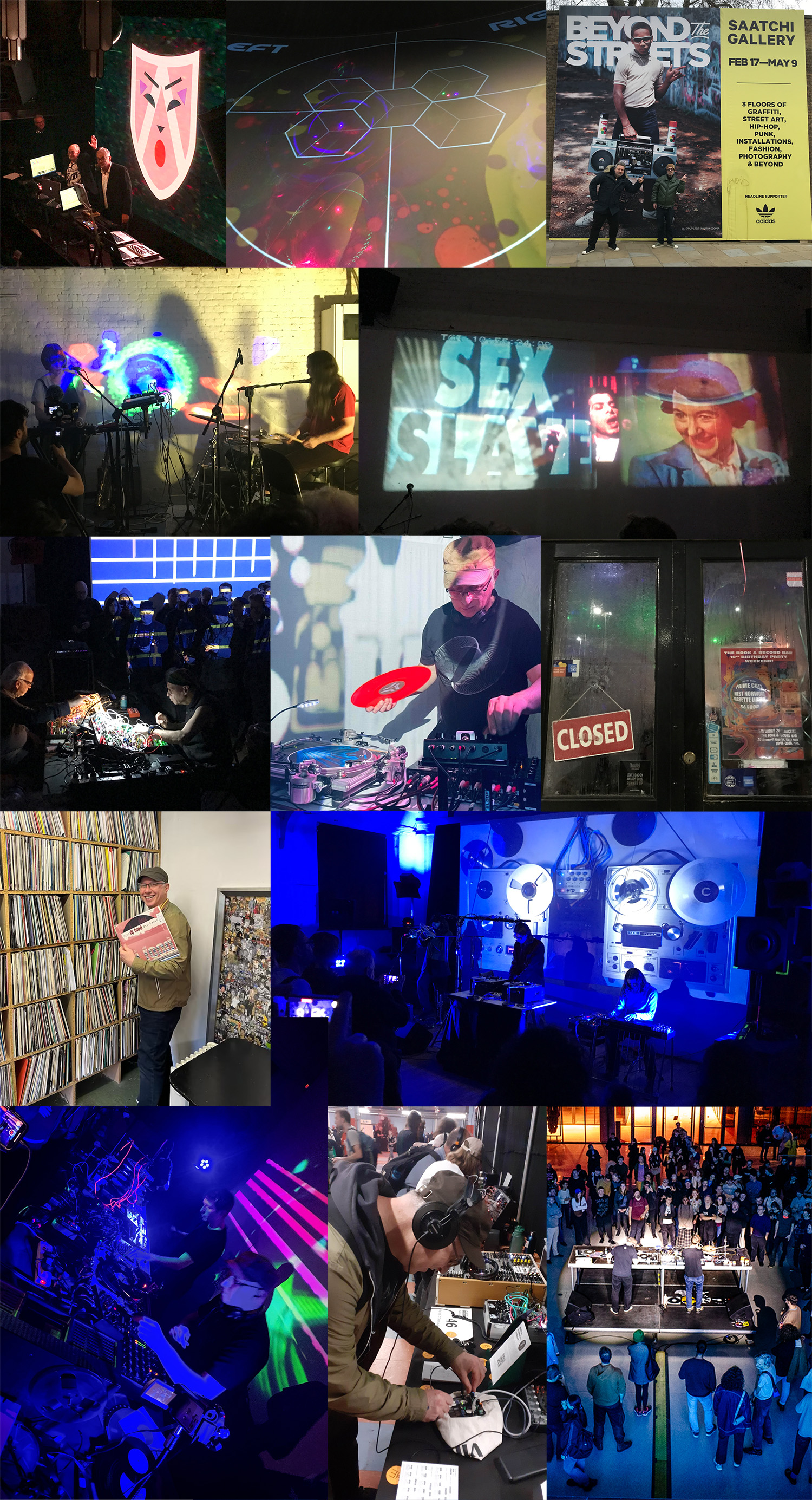
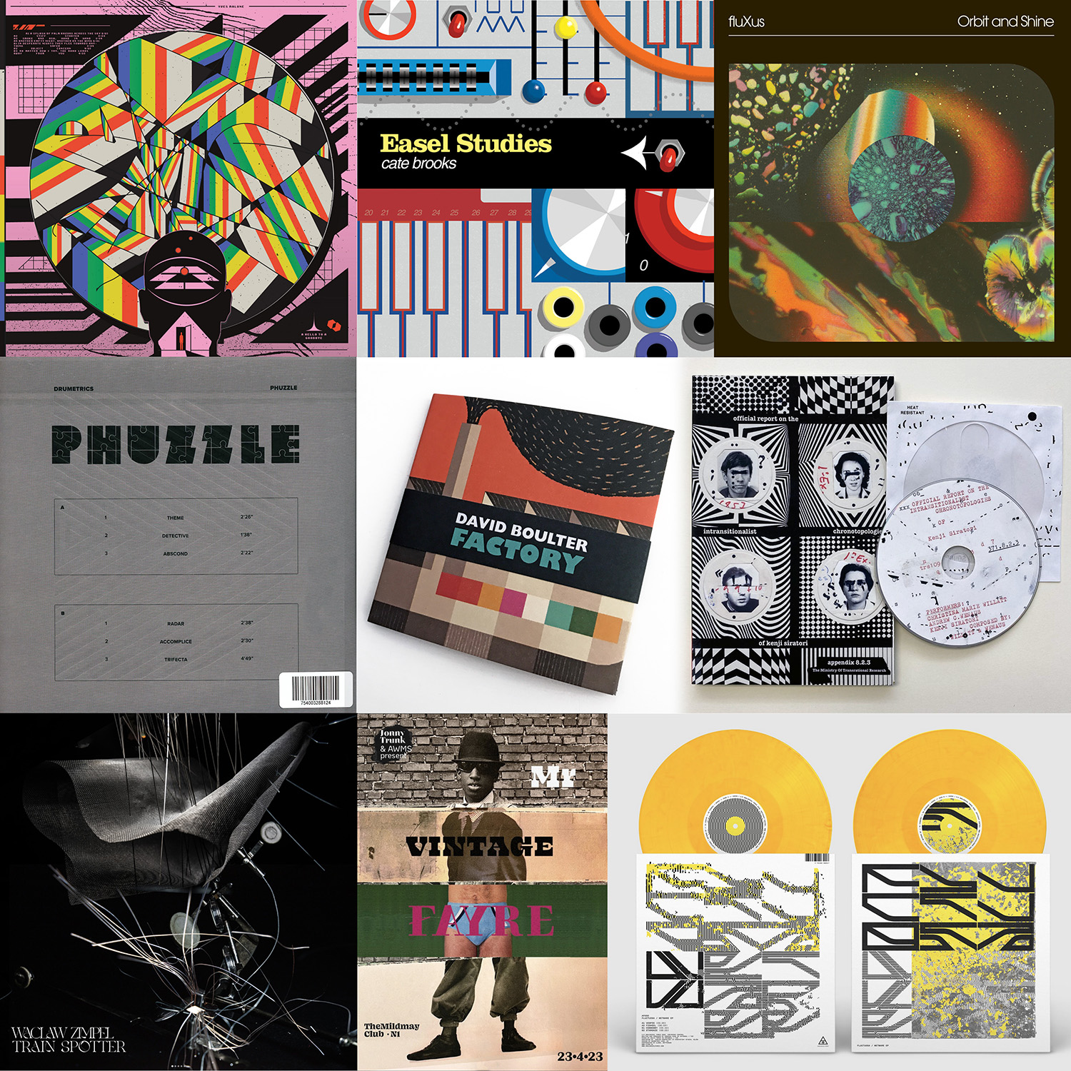
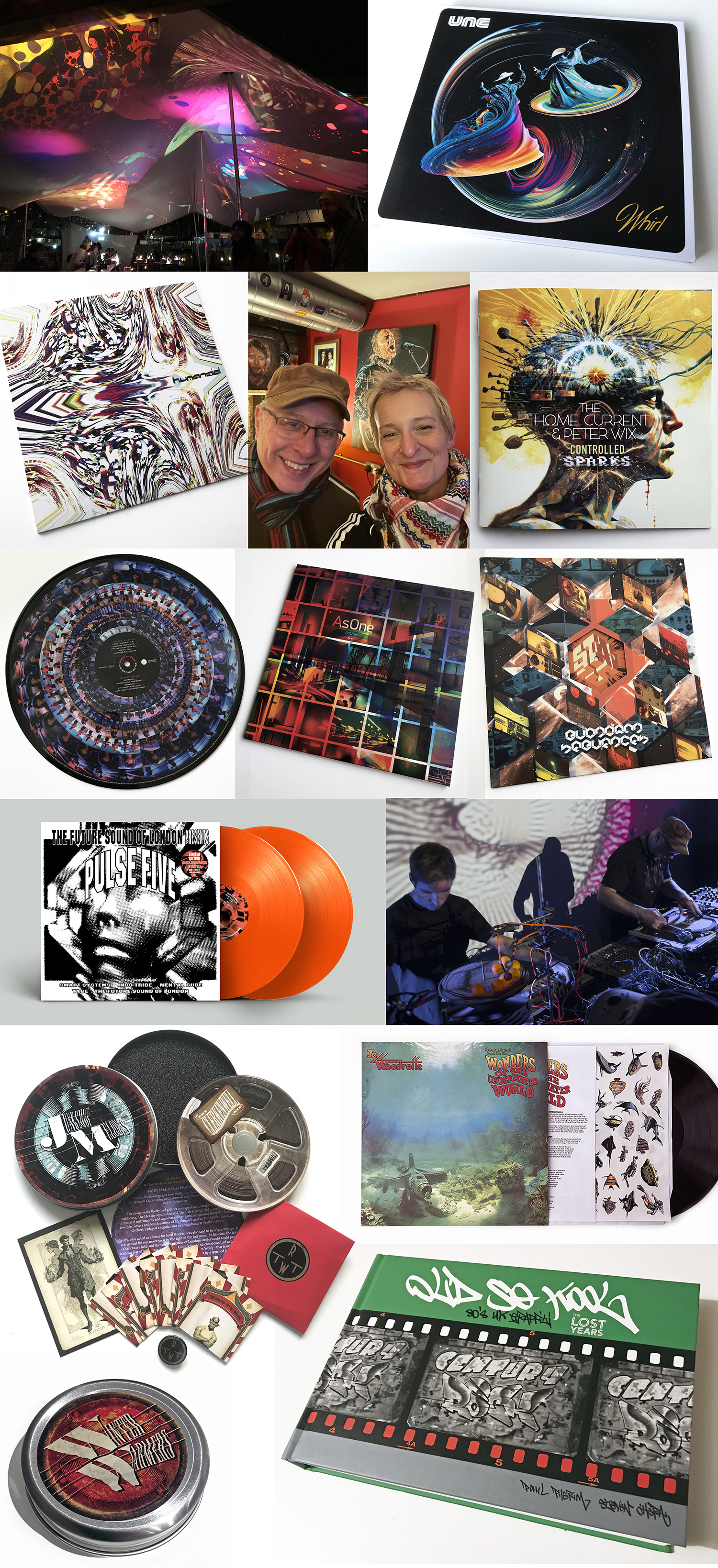
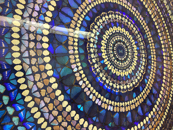
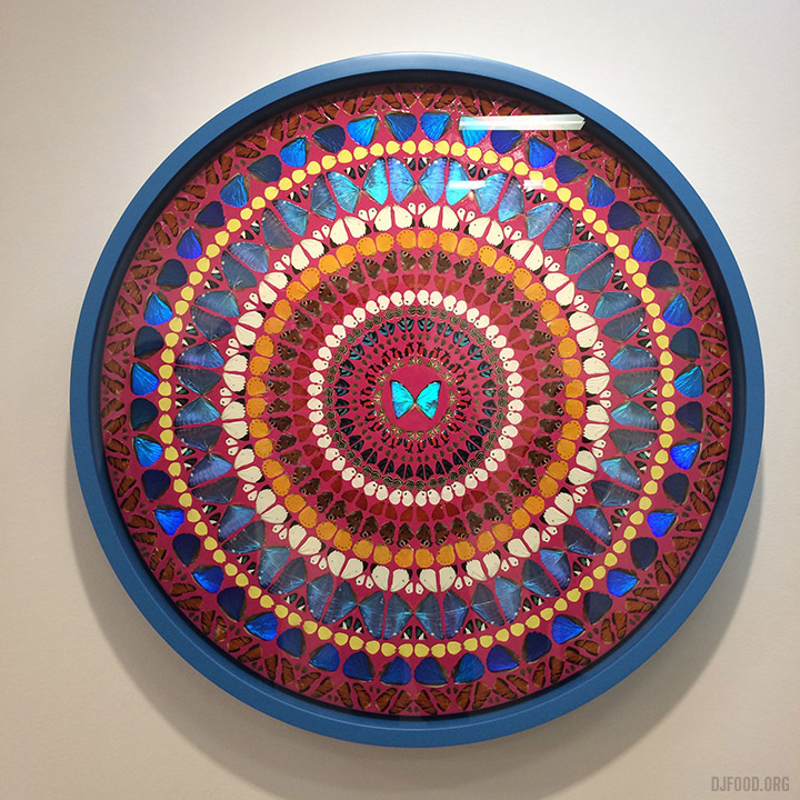
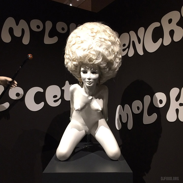
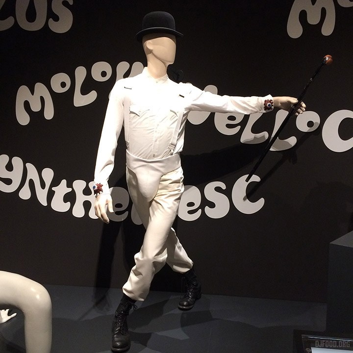
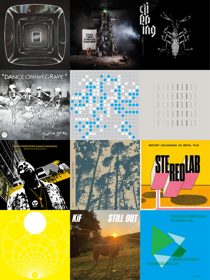
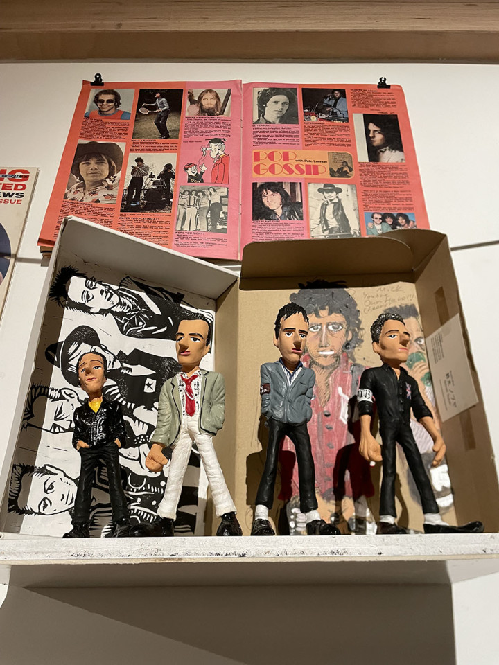
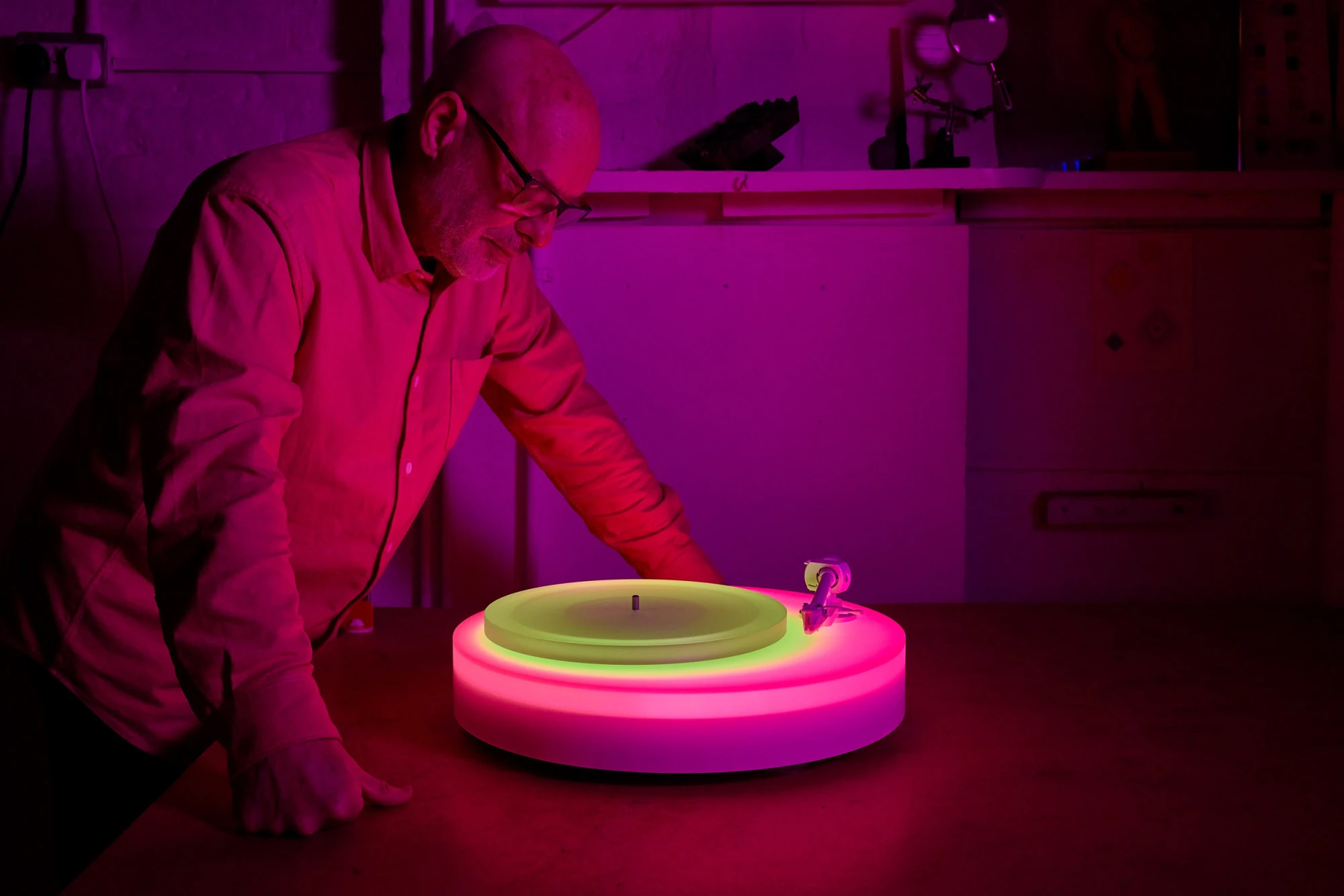
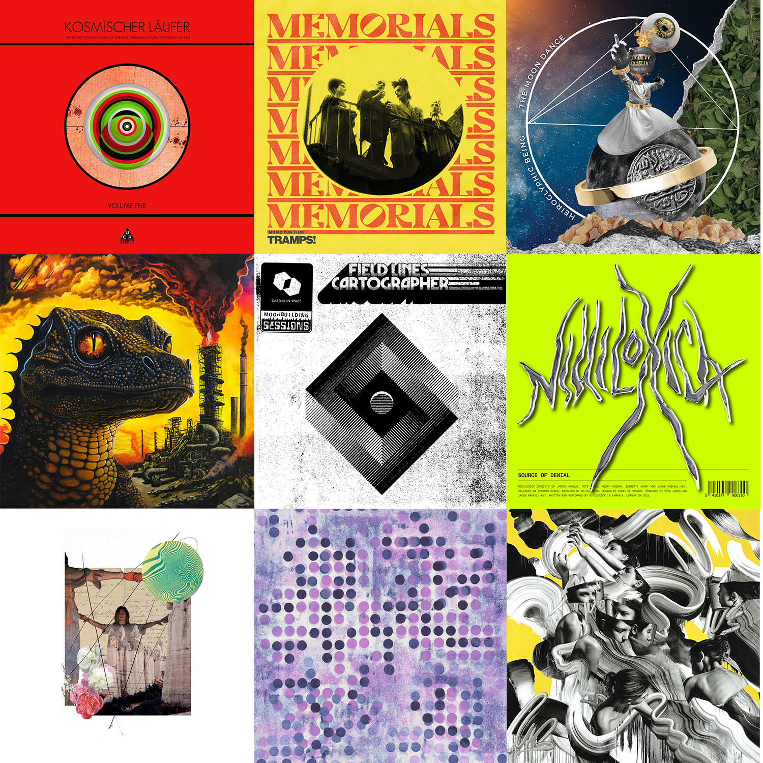 Music:
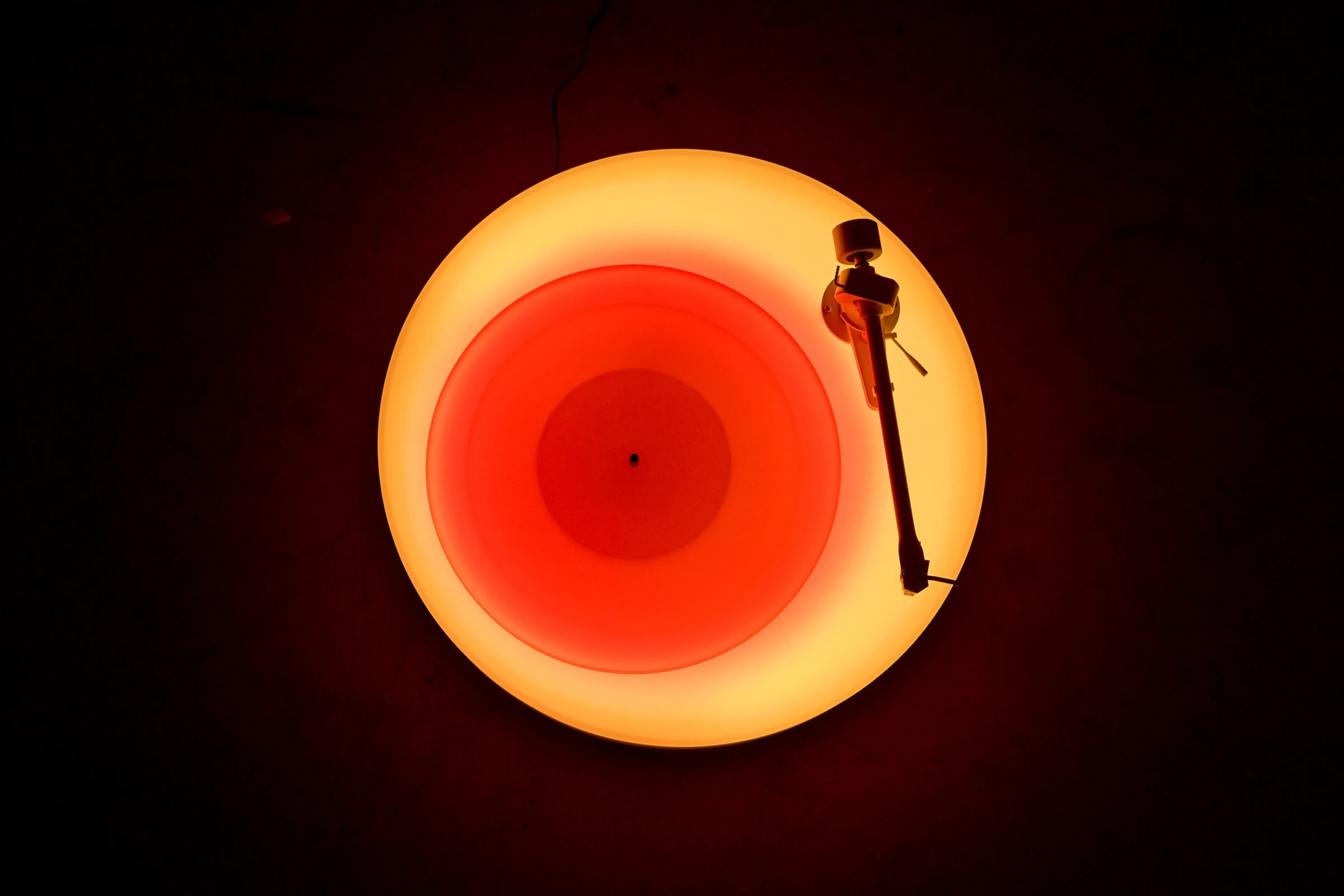