 It’s been an exciting week for Boards of Canada fans. News broke last Tuesday of a VHS tape sent out to selected people across the world containing a brief but garbled message, very much in the style of similar transmissions around the time of the band’s last album promo campaign for ‘Tomorrow’s Harvest’. The fact that the tapes were sent from the same address used by Warp and Bleep for their distribution rang alarm bells.
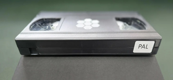
Fans immediately set about trying to decode the tape and decipher the muffled spoken word or identify the brief visible images which include a sign saying ‘I Love Jesus’, images of televangelists Jim and Tammy Faye Bakker and what appears to be a 3D rendeing of a hexagaon made up of smaller hexagaon, the same logo printed on the label of the VHS tapes. The audio seems to have been identified as coming from what may have been a radio advert for a magazine (Moody Monthly, that does exist) from the Moody Bible Institute AD, a religous organisation from Chicago, originating in 1886. Their website states; “Moody exists to proclaim the gospel and equip people to be biblically grounded, practically trained, and to engage the world through gospel-centered living. In short, we prepare people for their purpose and calling!”
The unconfirmed audio source also mentions hexagonal flexi discs several times but no trace of a flexi disc associated with the magazine has been located yet. What is odd is, as a collector of flexi discs (and odd formats in general) as well as religious records, I have NEVER seen a hexagonal flexi disc. I have a couple of hexagonal vinyl discs but not a flexi as you’d have to cut down a larger disc to achieve the shape and the largest flexi I have is a 10″. Is someone trolling us with this supposed interpretation of the muffled audio clip or have BoC inserted new audio into the ad to sow more seeds? Is a 7″ hexagonal flexi disc the next thing to look for? Possibly on Record Store Day this weekend? At the time of writing approx 30 VHS tapes had been identified, all seemingly the same in content but in both PAL and NTSC formats.
Friday night/Saturday morning saw pictures of four posters bearing distressed ‘children of the damned’ type images on them start appearing on streets in London, Barcelona and LA. Each poster had only the same hexagon symbol as the VHS tape in one corner, nothing else, seemingly confirming a connection at least. I spent part of Sunday afternoon in Soho, looking for posters with my partner and managed to snap these images, firstly sitting in plain sight on a hoarding on Oxford Street.

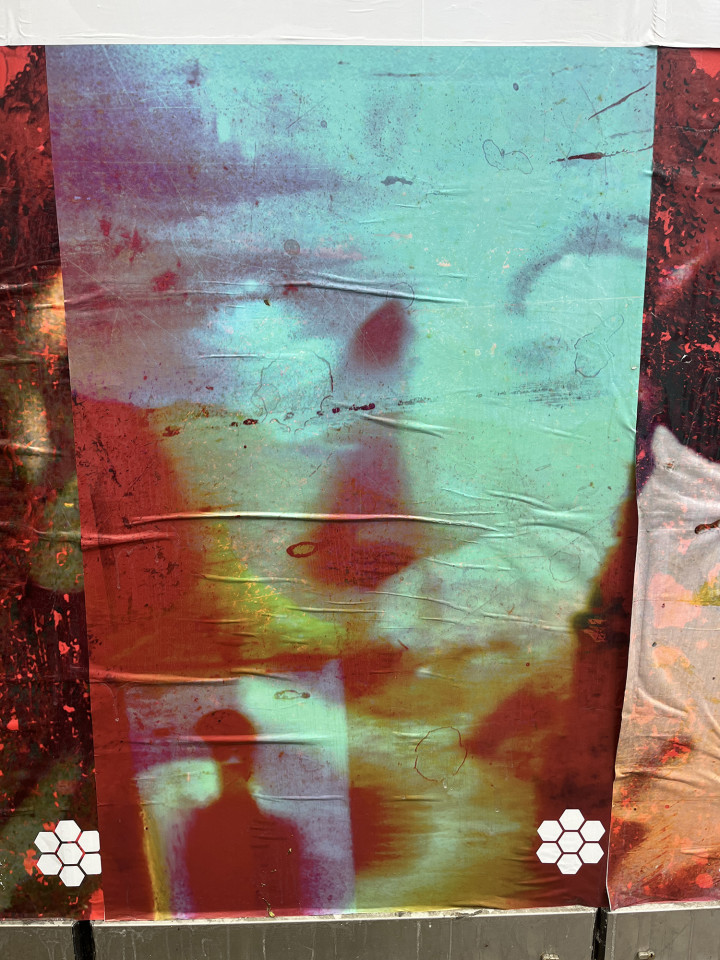


The posters below were some of the first to be found and posted online, nestling down St. Anne’s Court, a side alleyway off Wardour Street in Soho. To me, these could all plausibly be connected to a new release from Boards and I’m looking forward to what they do next…


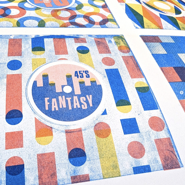
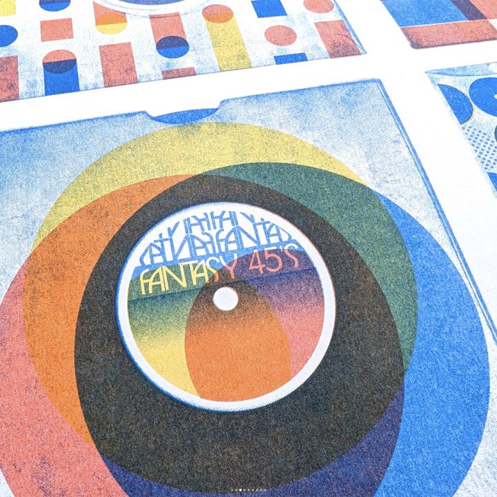
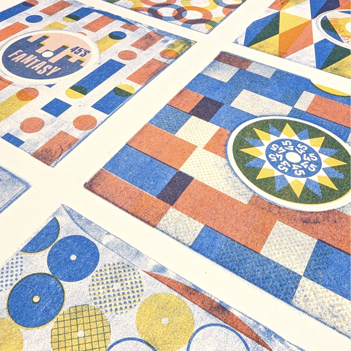
 Unless I’ve got a deadline I can tinker with things forever (hence no new DJ Food music in years) and this has been on the
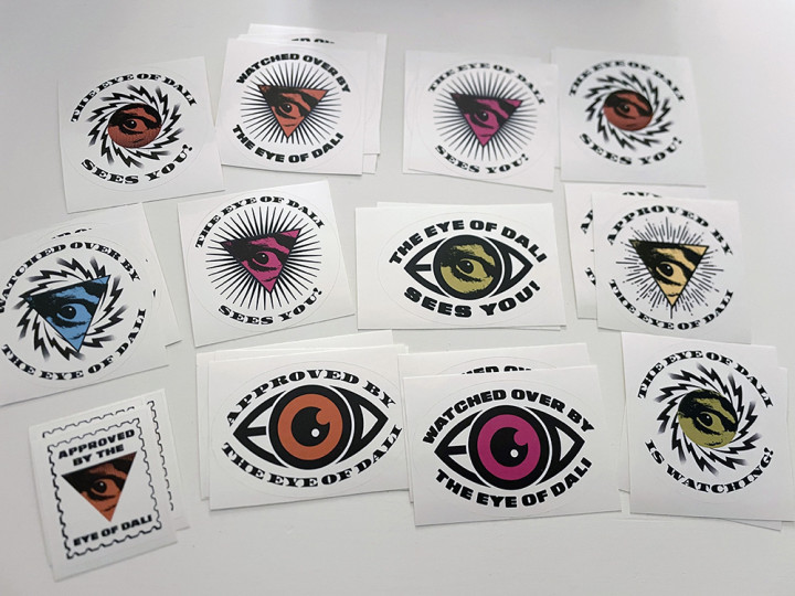


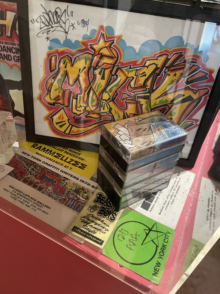
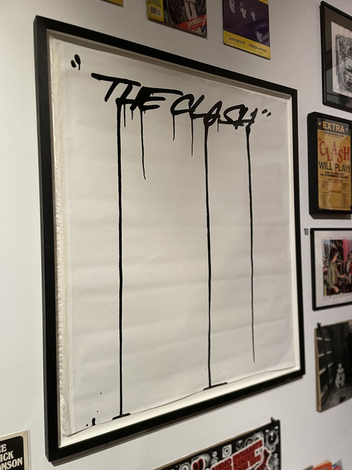
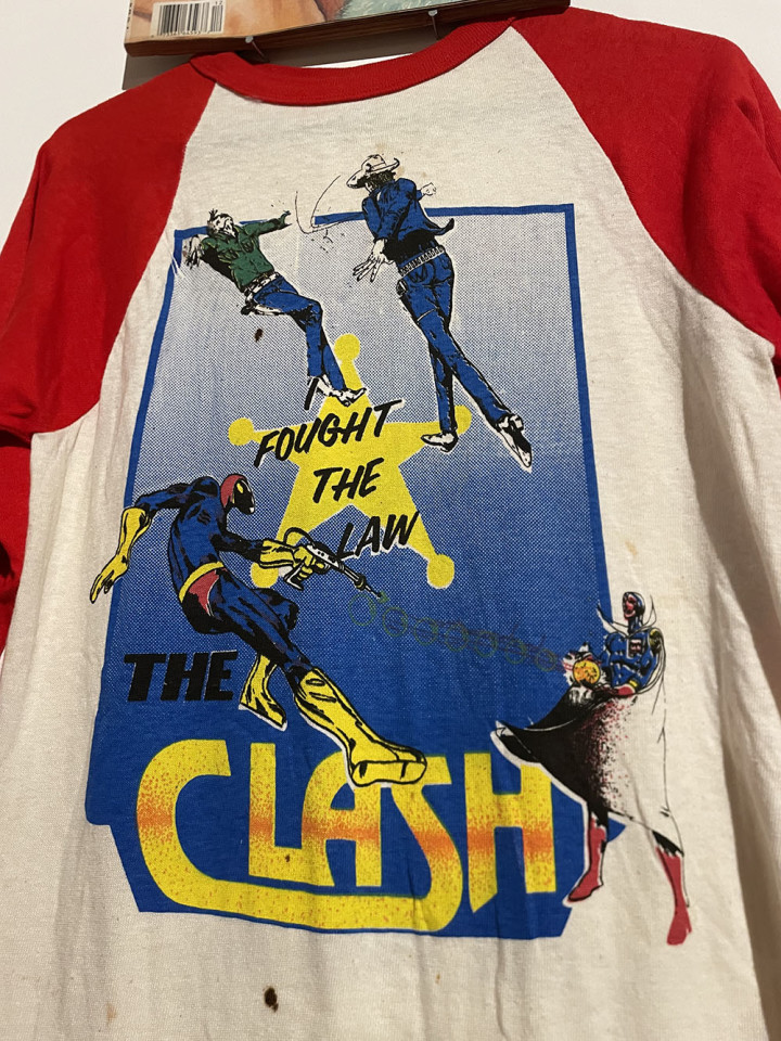
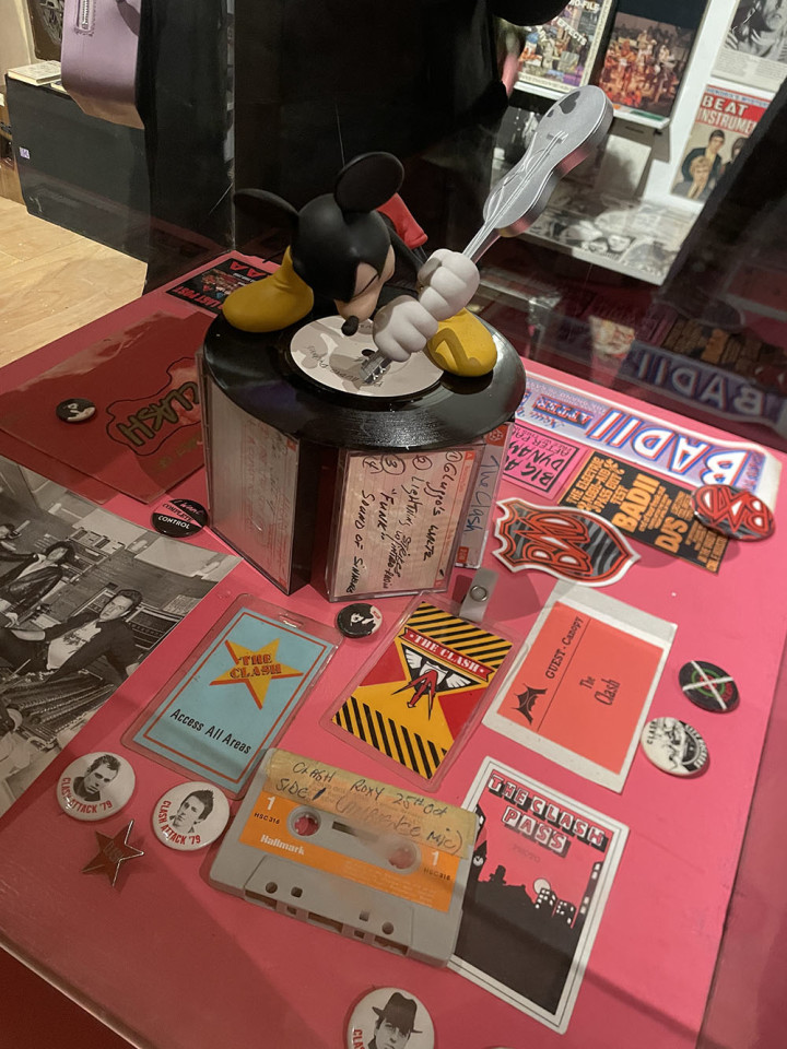
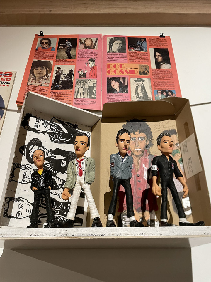
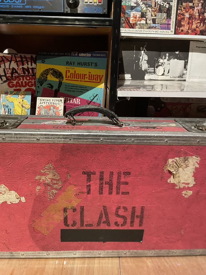
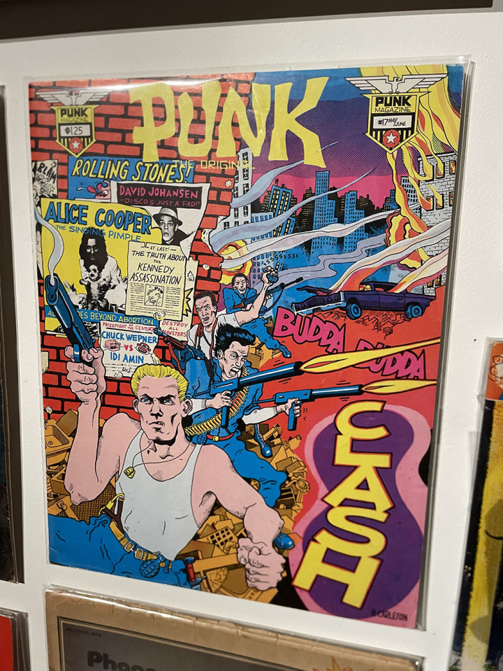
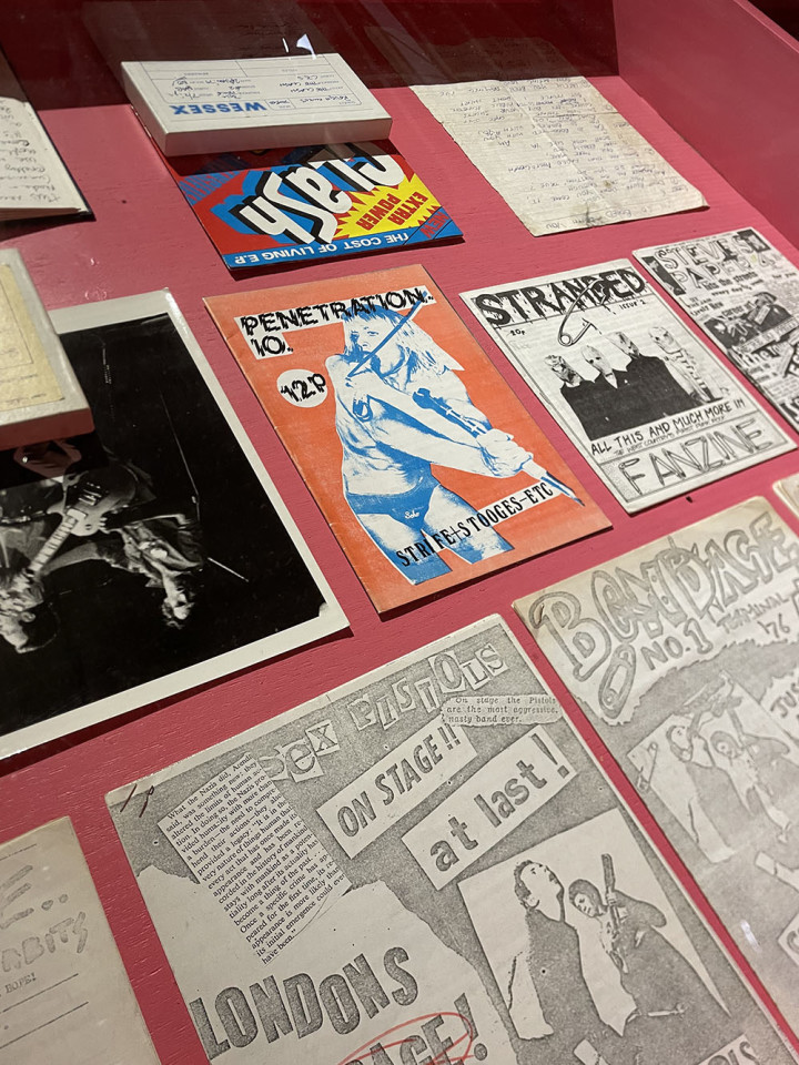
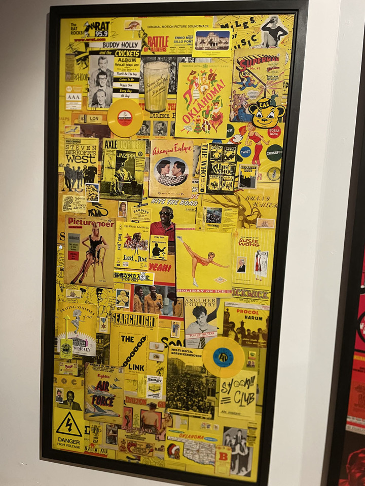
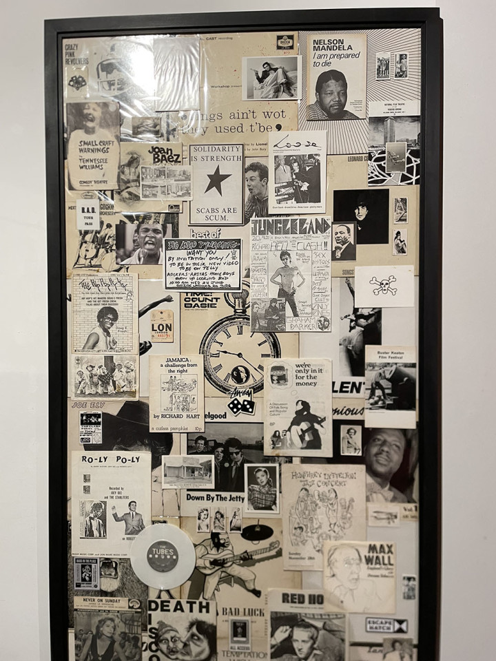
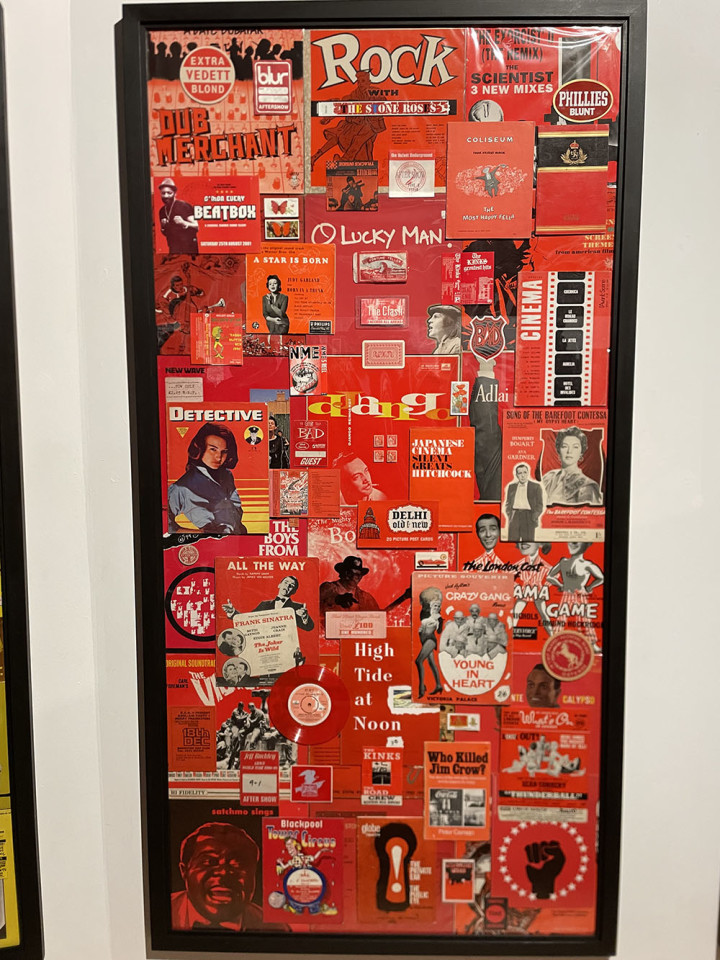
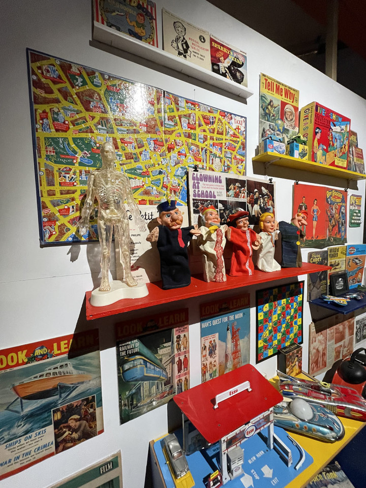
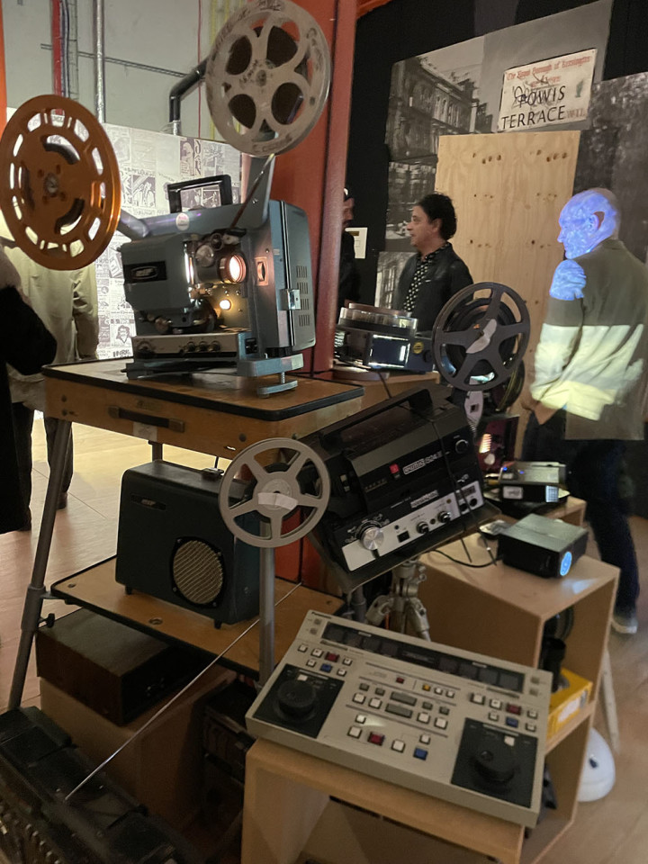
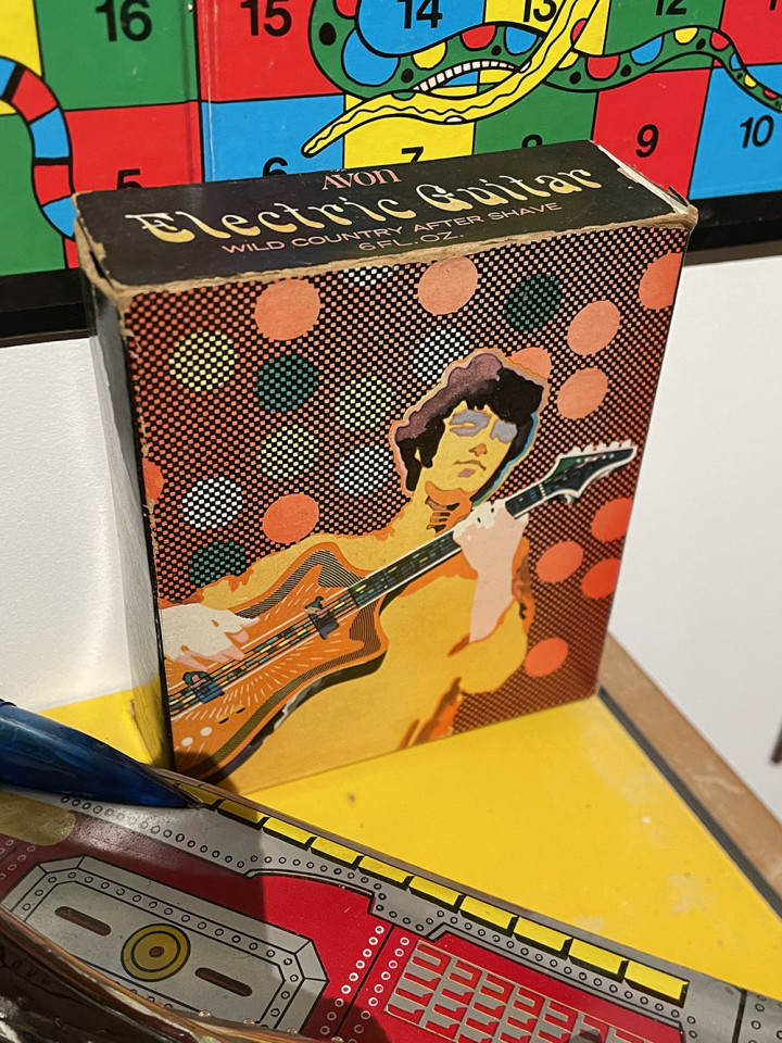
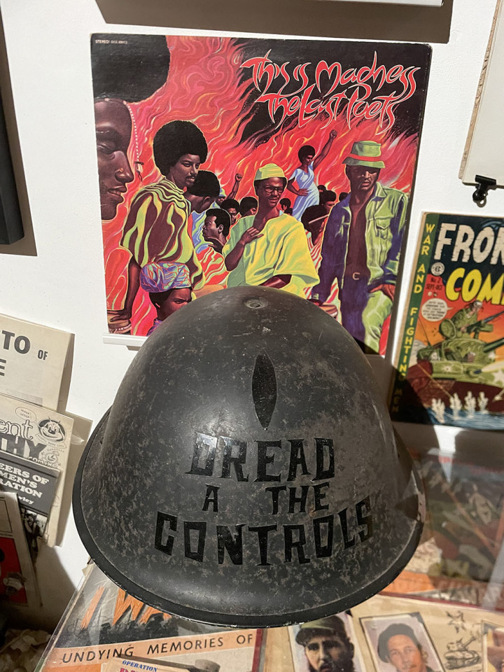
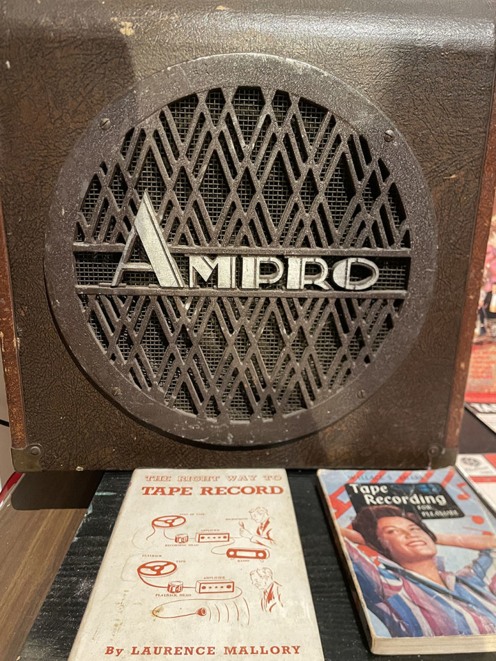
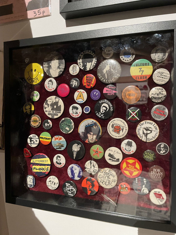
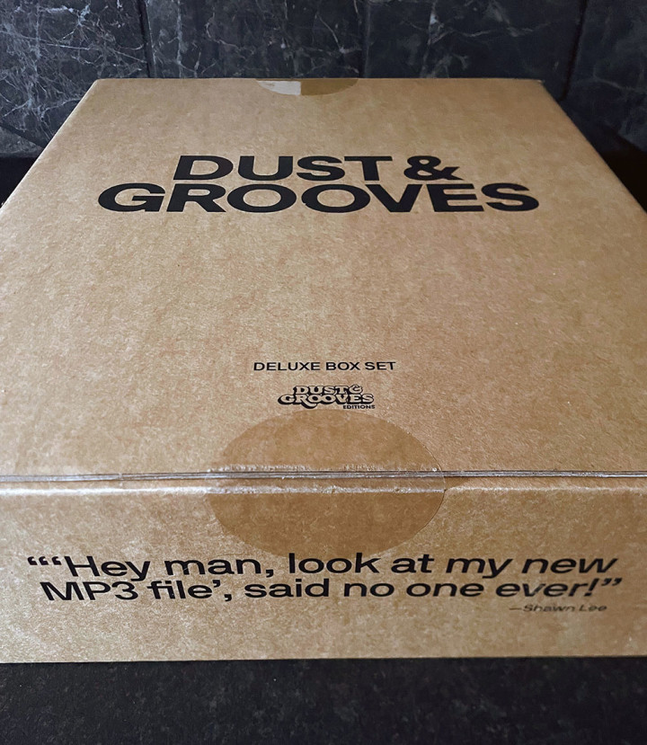
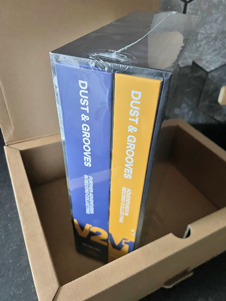
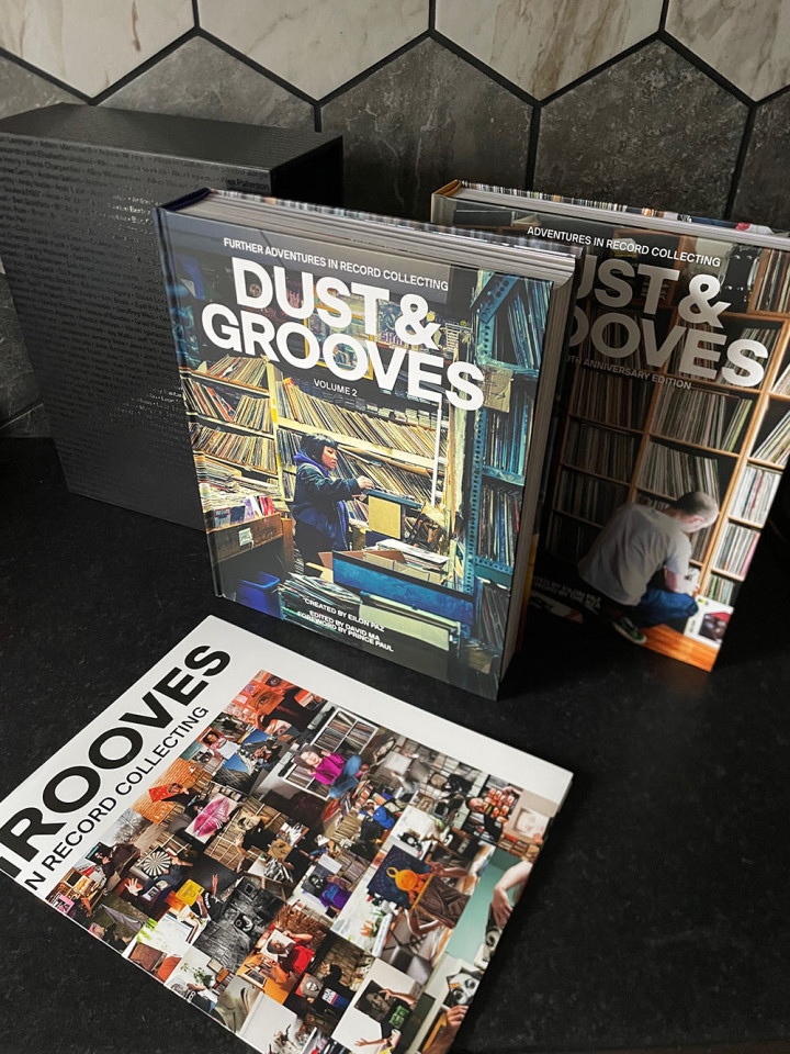
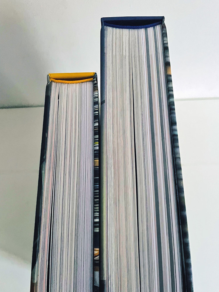
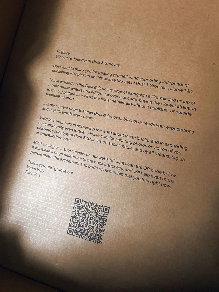
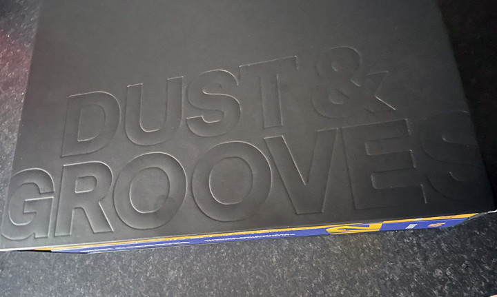
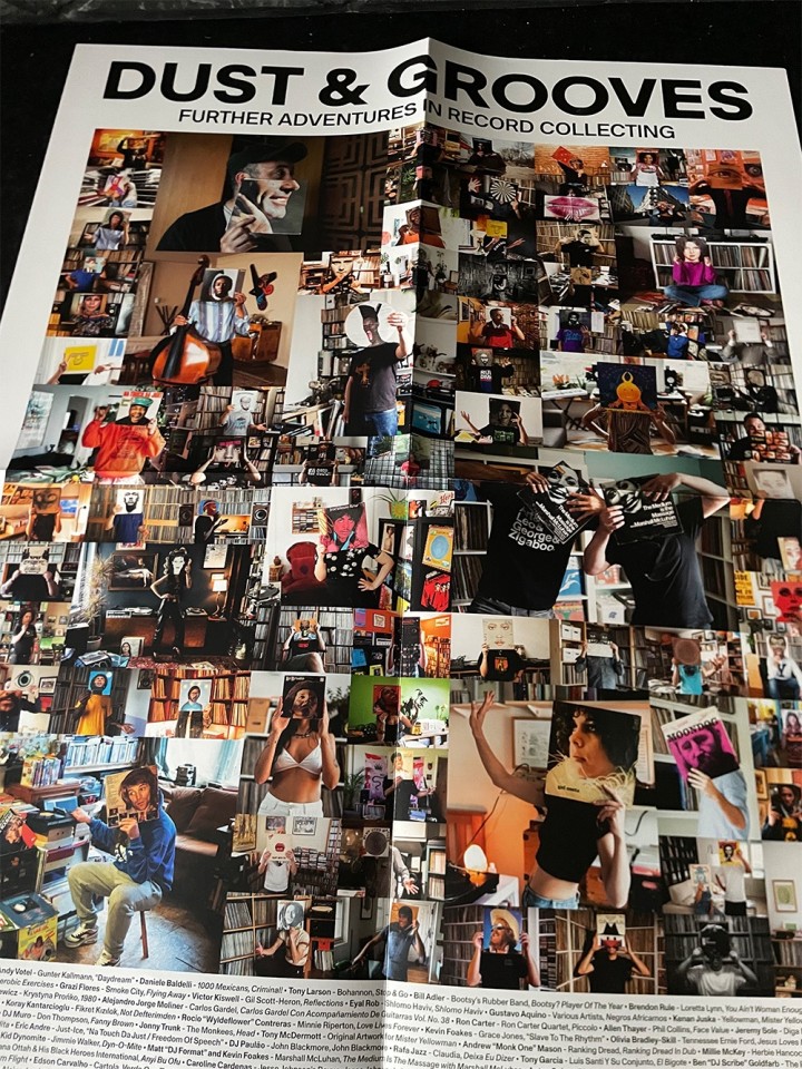
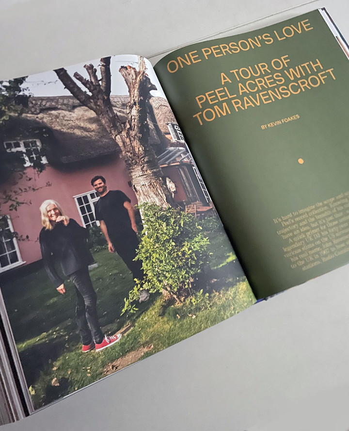
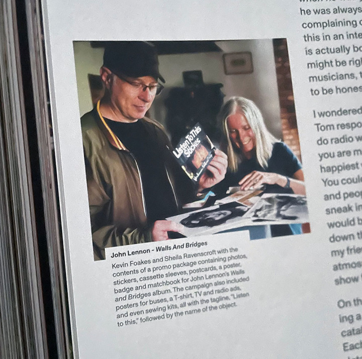
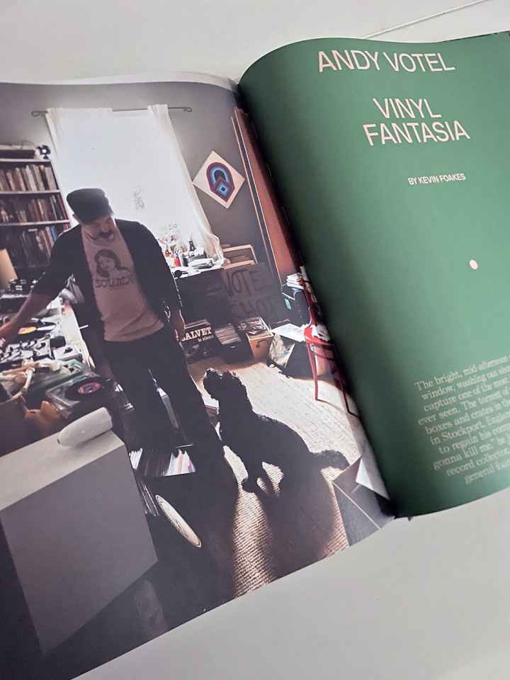
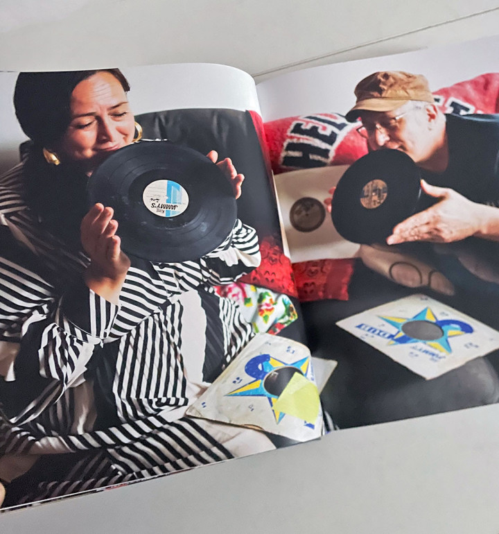
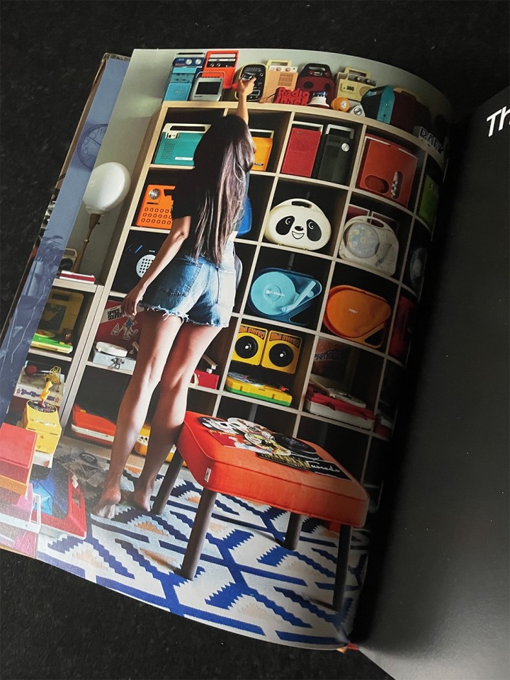
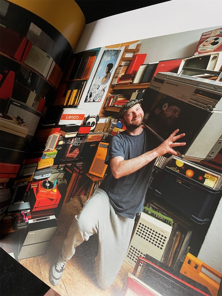
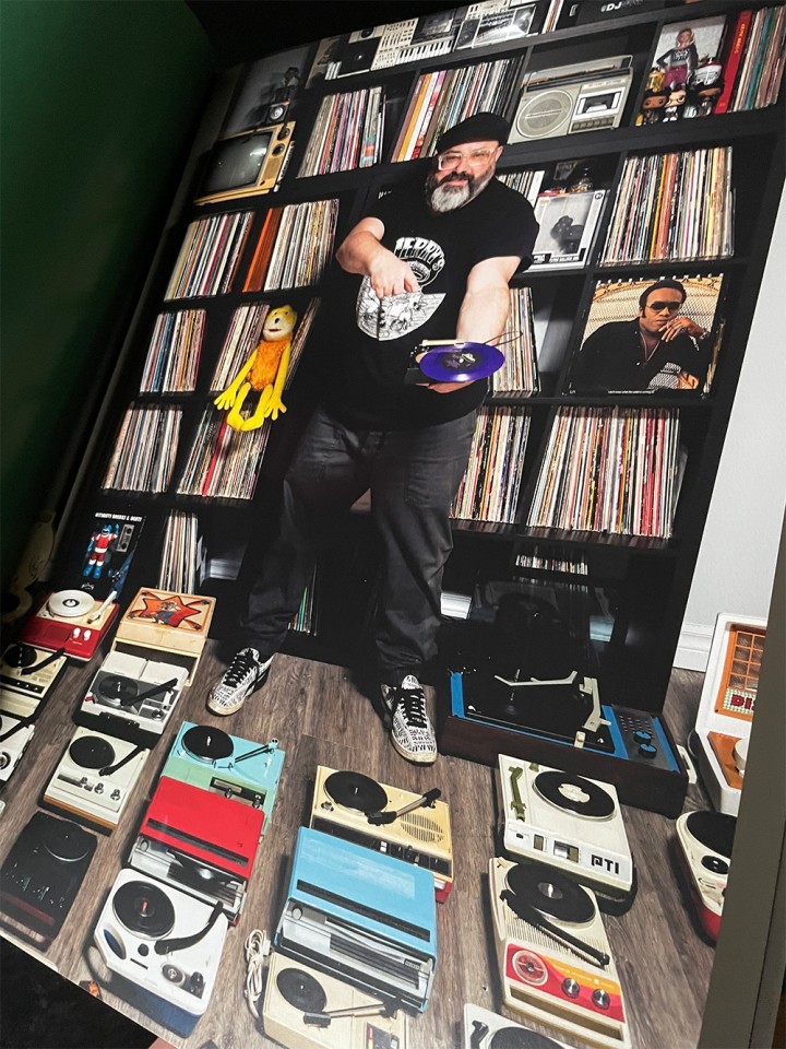
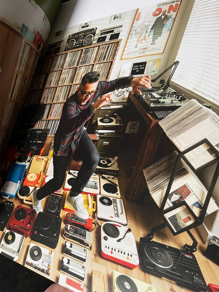
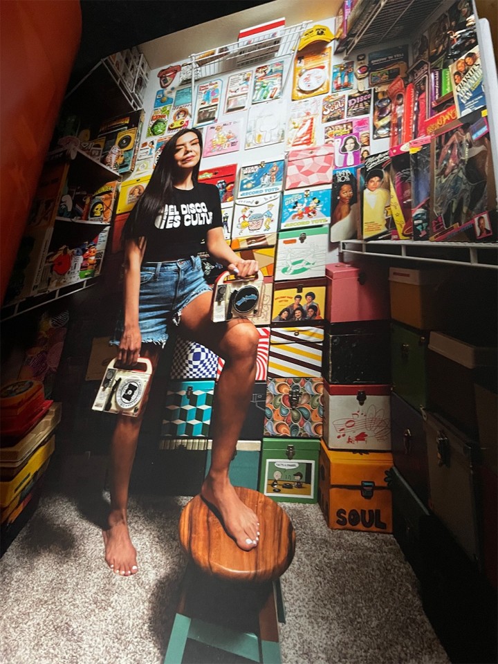
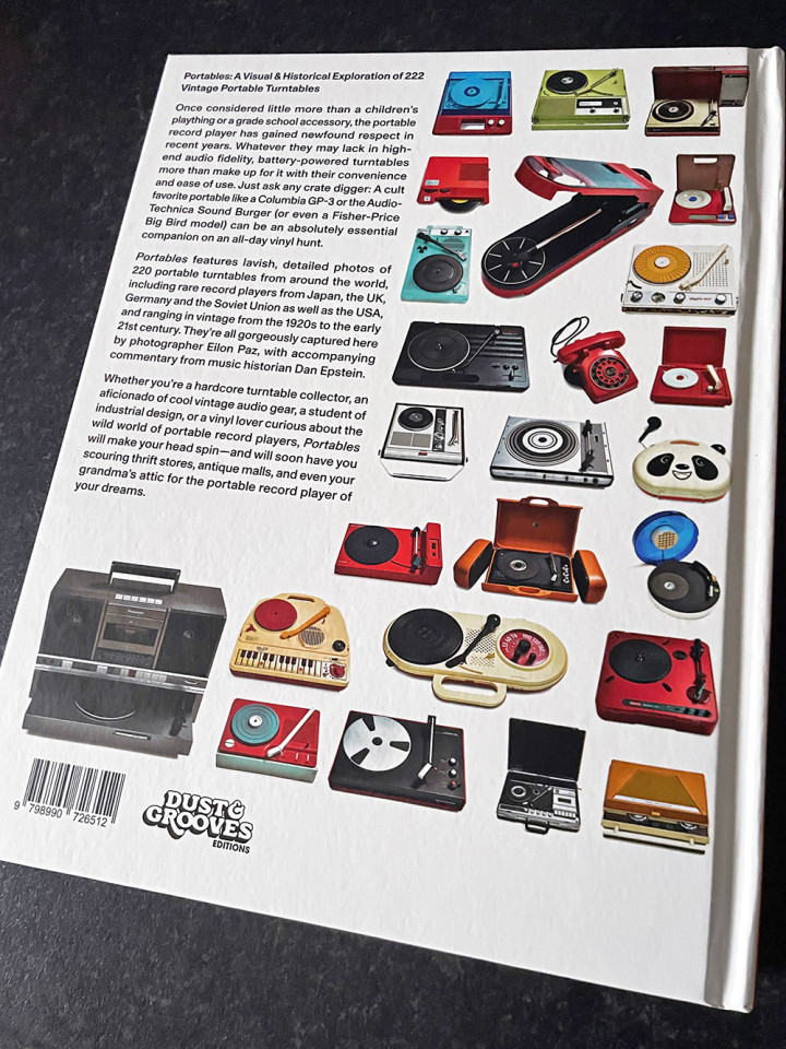
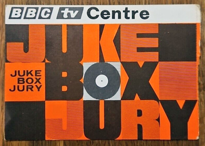
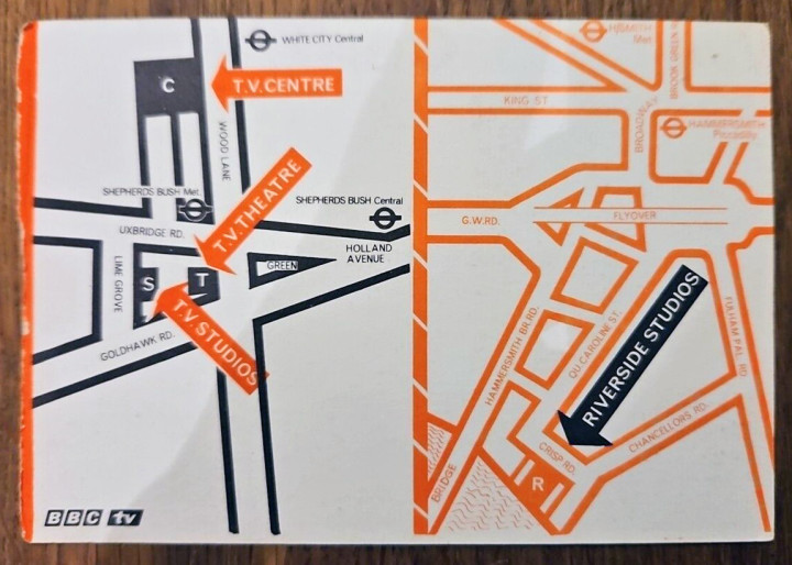
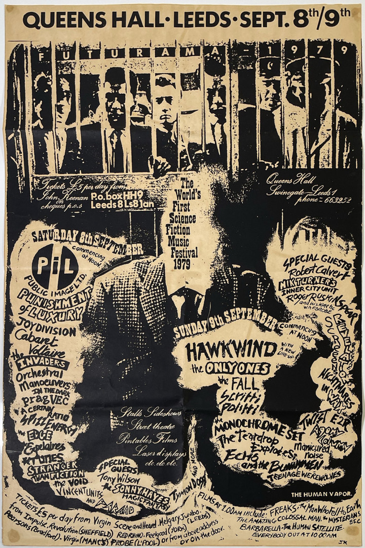
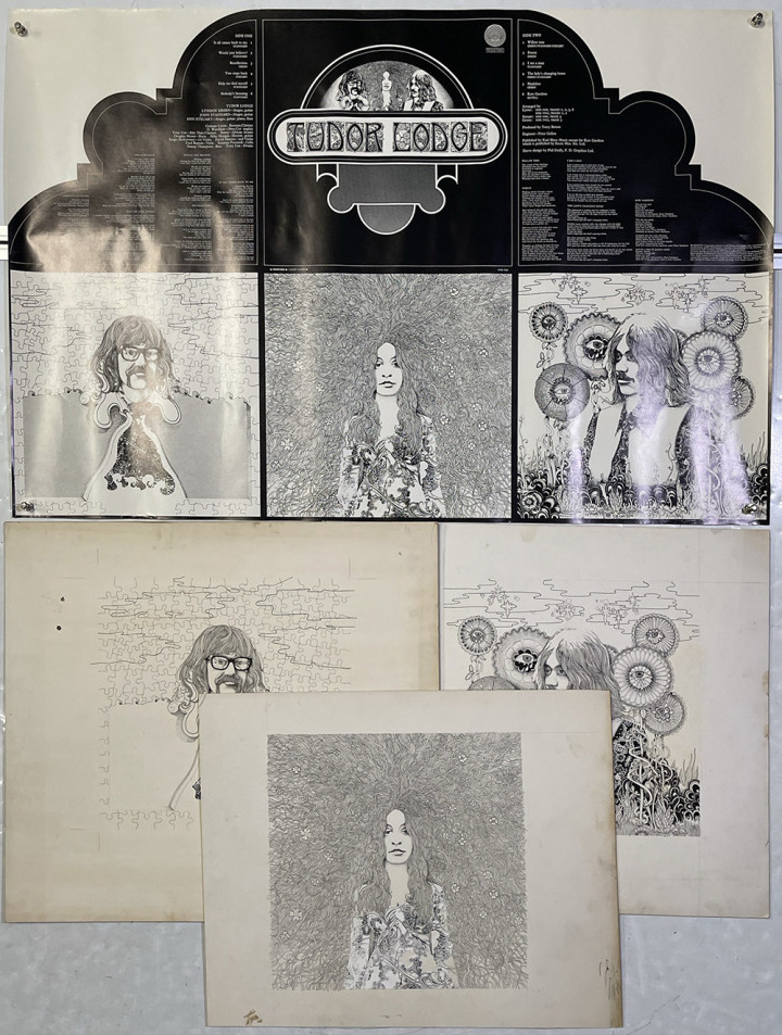
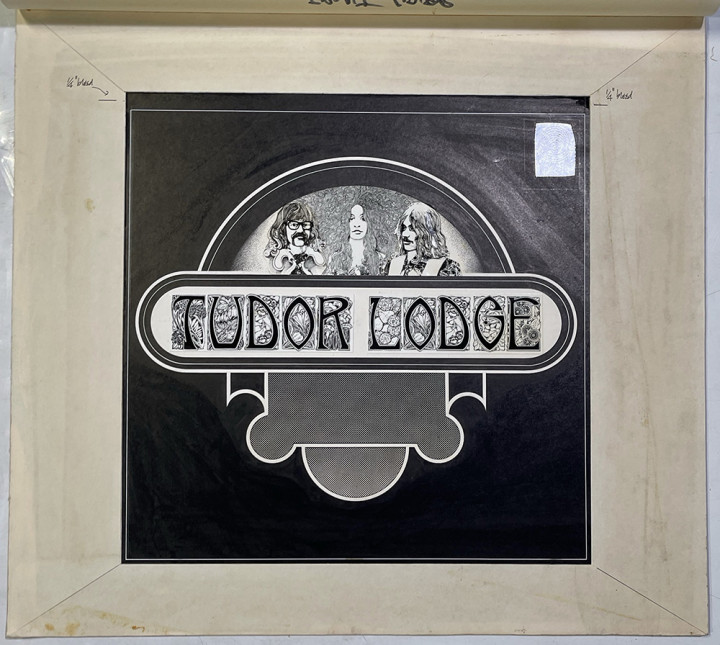
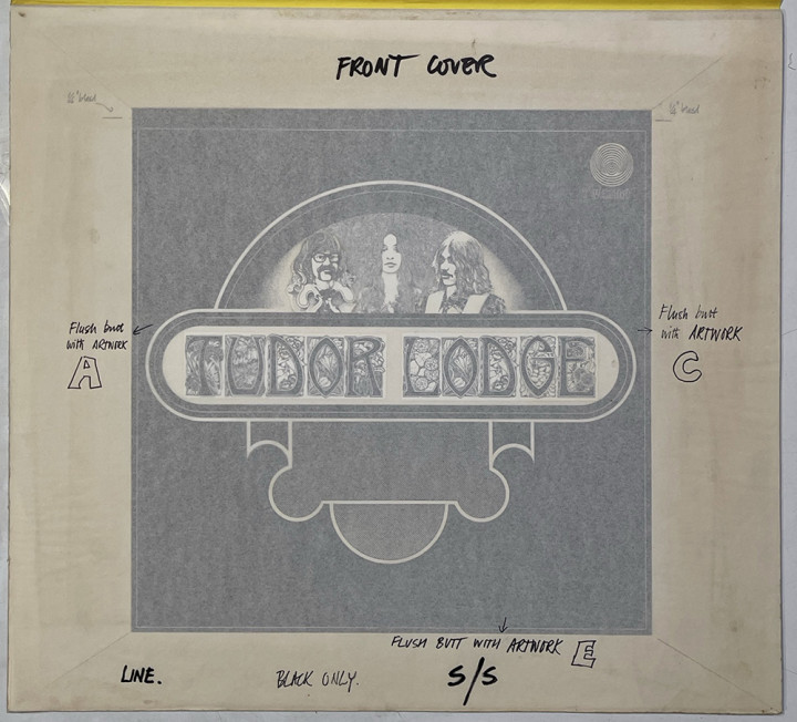
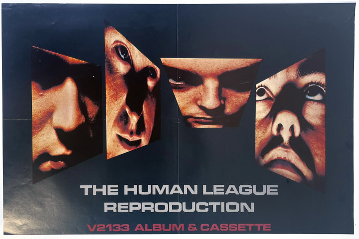
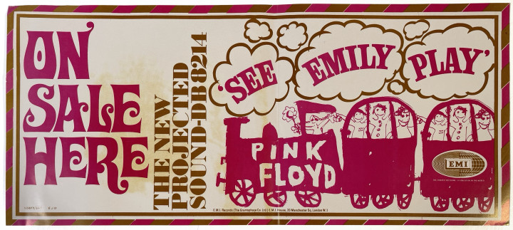
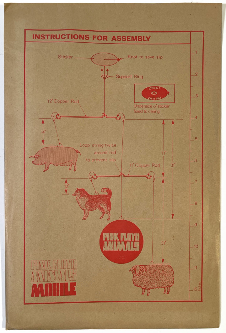
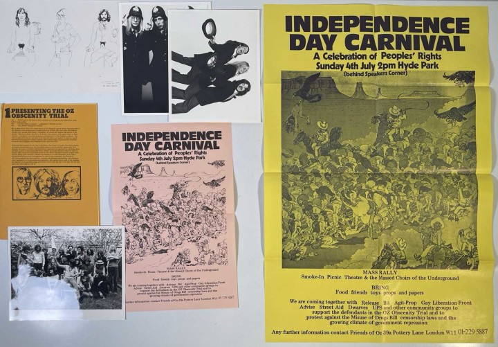
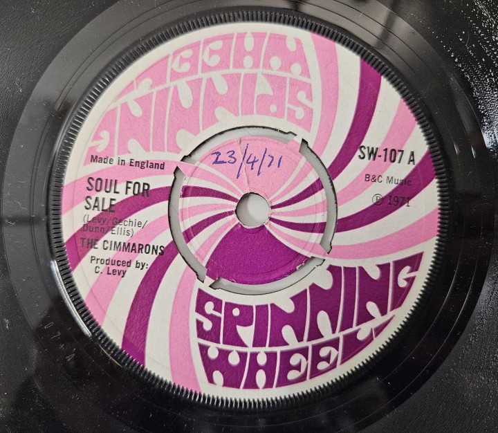
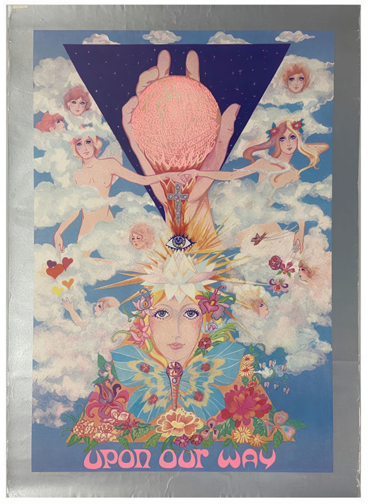
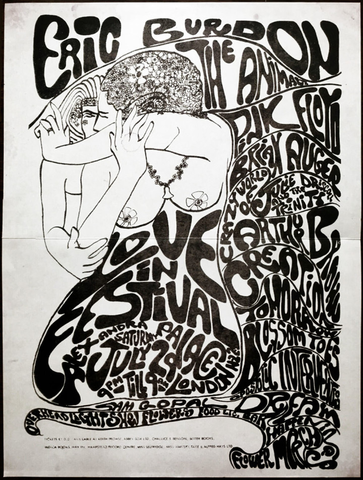
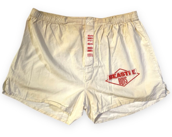 Omega Auctions have taken on the task of disposing of some of John Peel‘s incredible collection and I can’t think of anyone better. It’s odd seeing objects that I’ve actually held in my hands up for auction and fascinating to see some of the items that I’d not seen when I visited Peel Acres for the Dust & Grooves 2 book – I feel very lucky to have seen it before it was broken up. Here are just some of my favourties
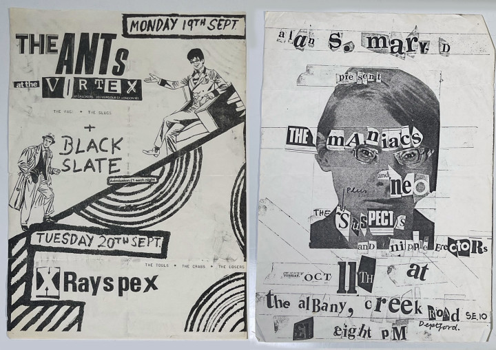


 It’s seemingly been a month of losses so far and sadly news of another reached me this week, less than two weeks after I’d