- RELEASED: 18 Jan 2005
- FORMAT: 2xLP + Poster cover/CD+slipcase / DVDA / DL
- LABEL: NINJA TUNE
- CAT No.: ZEN100 / ZENCD100 / ZENDVA100 / ZENDL100
- DESIGN: Openmind / Splinter Cell
- SPOTTERS DELIGHT: Ltd. foldout poster cover with screen printed PVC sleeve with vinyl, screen printed slipcase with CD, PAL & NTSC versions of DVDA
- EXTRA ZEN: ninjatune page / BUY
What a bugger this was to get off the ground. For those who don’t know, Splinter Cell is a computer game based on the novels of Tom Clancy and a highly successful one at that – this being the 3rd installment. Dealing with major companies in other areas is immensely time consuming, frustrating and tedious, neither side fully understands the others needs and both want their own way. When Amon recorded the soundtrack for this computer game Ninja decided to release it and suitable artwork was needed that appealed to both the computer game’s audience and Amon’s fans. Putting a straight image from the game on the cover was never a consideration but the record needed to use elements of the game graphics to tie the two together.
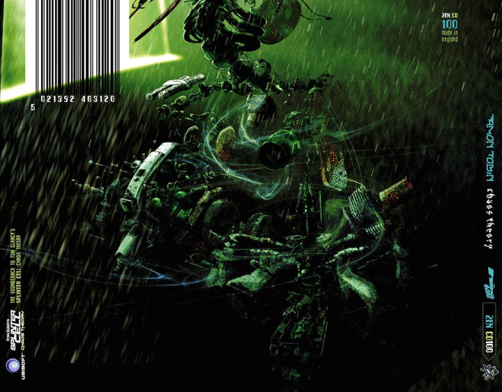
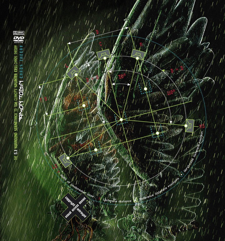
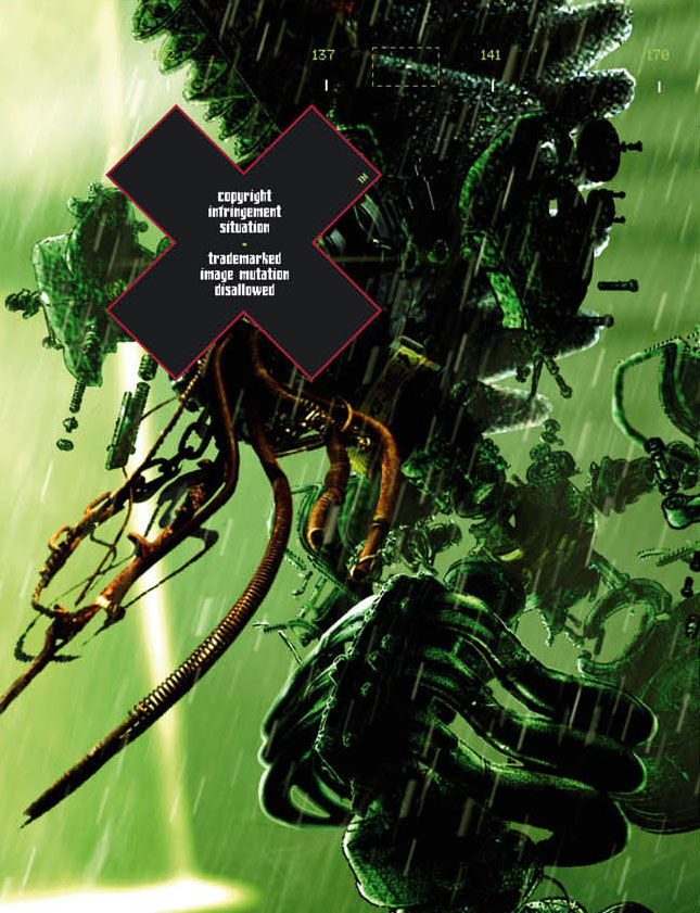
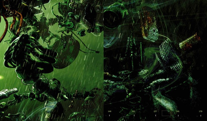
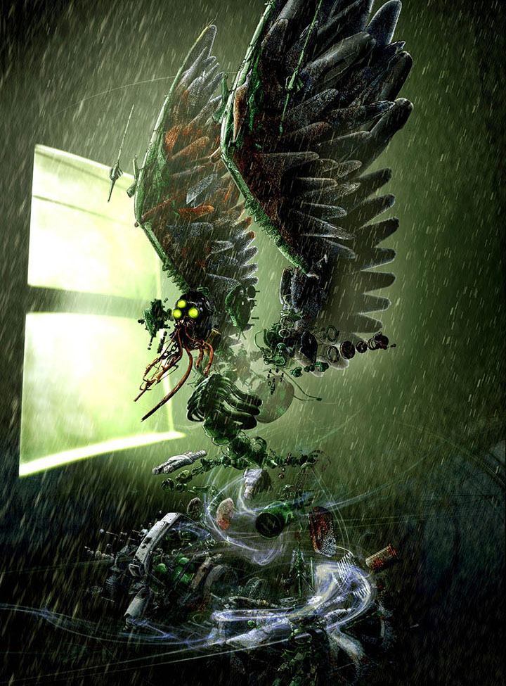
Splinter’s Cell’s premise is based on a soldier running around with night vision goggles on, shooting all manner of foes and most of it takes place in the rain and in the dark. I was sent a load of layered graphics and logos and – jumping on from the ‘Remixes and Collaborations’ artwork – I envisaged some sort of potential creature / foe that would be encountered if Splinter Cell collided with ‘Amon’s world’. At the time I was into cross-section diagrams and put together a being made from various instruction manual graphics I found of anything from washing machines to motorbikes. The legs and body came very quickly but I had trouble with the arms and the head looked a bit boring and I tried to think of ways to make them more exciting.
The arms had to be doing something but I didn’t want the thing holding a gun or weapon although without one it looked like it was dancing which just looked bad. I’d found an image of a big squid that I’d used for a part of the mouth and the contrast of animal/mechanical that I use as a template for Amon’s work set me thinking. Substituting the arms for wings worked way better and made the ‘thing’ look very odd – something vaguely birdlike but made from cross sections of airplane wings into the bargain. I added rain and a strong light source and then it all came together. Here was my main album graphic but what to do with it?
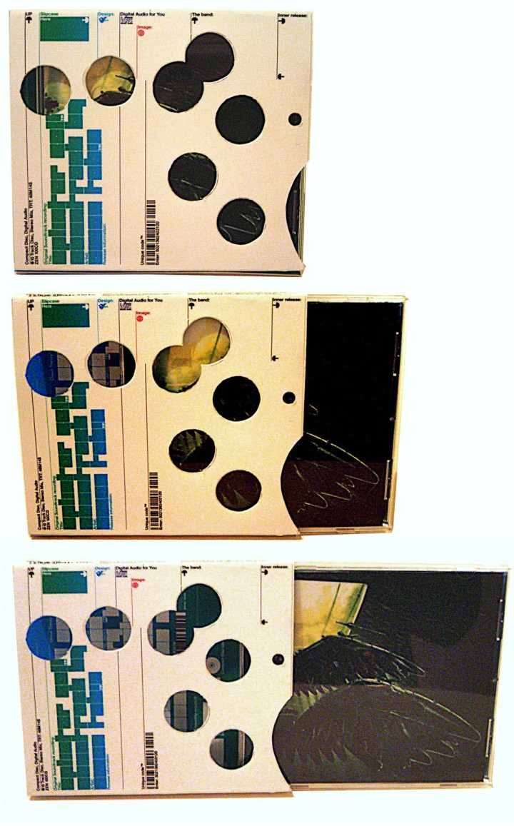
I’d recently met up with Michael C. Place of Build after admiring his work for a long time and wanted to collaborate with him so we hatched a plan that he would take my image and add his graphic touch to it with a die cut slipcase that would show through parts of my design underneath. The first design he came back with didn’t really fit colour-wise with the overall themes of the game graphics so he redesigned it to make it blend in a bit more but unfortunately Amon and Ninja didn’t like it. Here are images of the mock ups I made from his print outs of the proposed artwork and we agreed that this was a collaboration for another day and another artist.
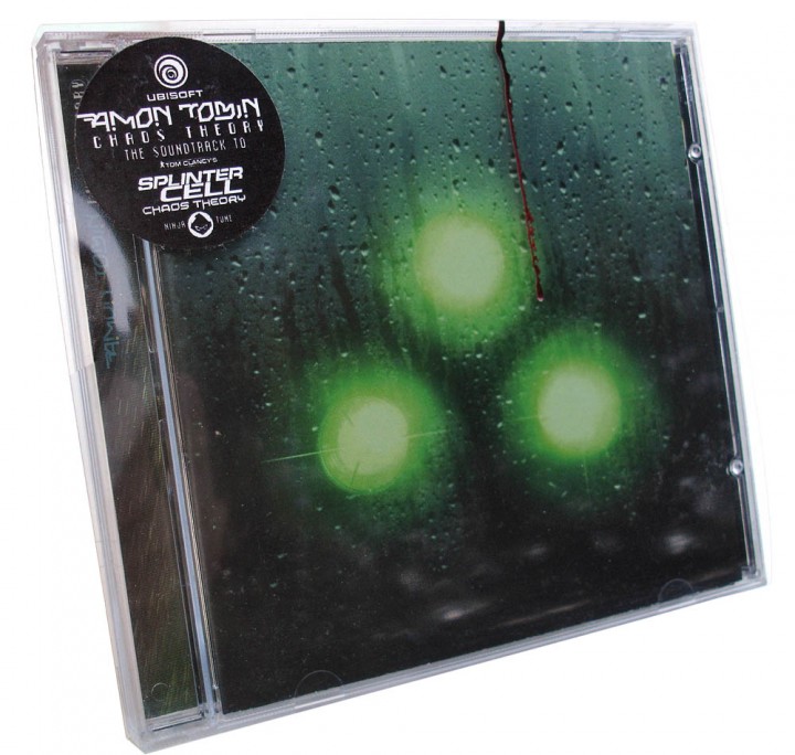
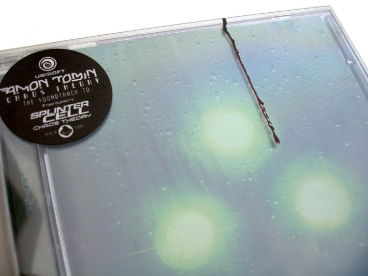
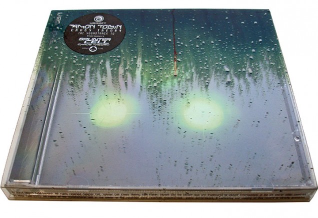
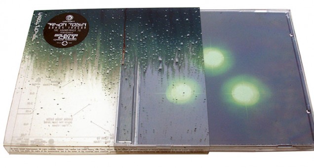
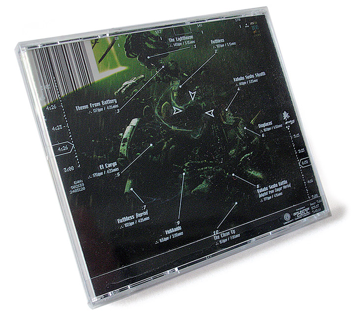
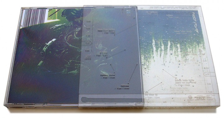
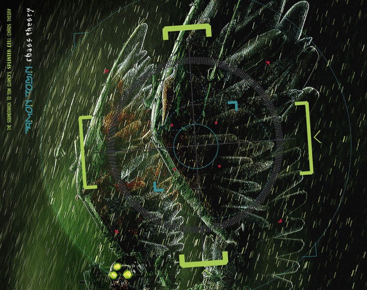
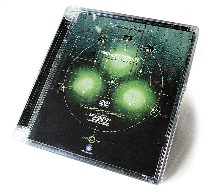
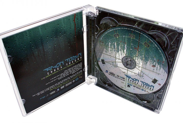
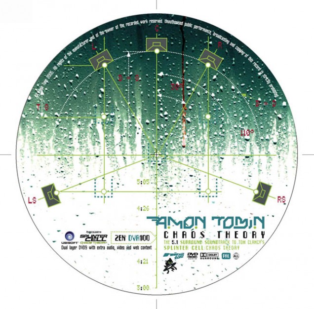
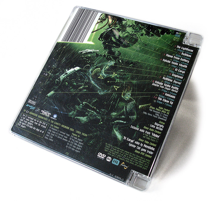
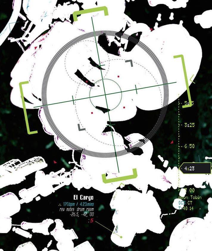
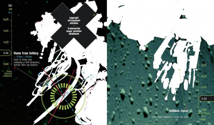
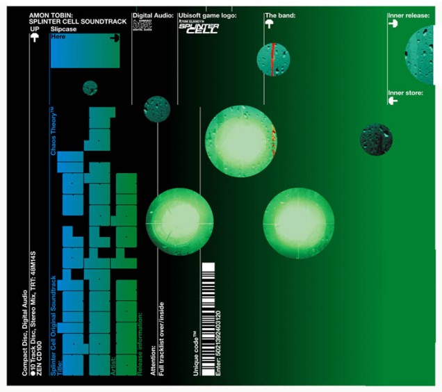
So, back to the drawing board and I had an idea centered around a transparent slipcase with printed raindrops and a gun night sight on it. The game has a wealth of these from the player’s viewpoint and a main graphic was the 3 green goggles looking through a window. As this is an ambiguous image and could have referred either to the creature I had created of the main game hero I decided to have this as the cover. Looking out from behind a transparent sleeve streaked with rain, which would be printed on, a single drop of blood running down as per the game image. When the buyer slid the sleeve / booklet out of the transparent sleeve it would reveal the creature behind the glass in a foldout poster and the accompanying graphics tied in with the game night site icons.
Getting the rain effect printed on a transparent sleeve was easier said than done and countless phone calls to the printer seemed to arrive at a solution but it was all guesswork. There had to be some kind of white base because otherwise any other colours wouldn’t show up and it would all blend into a mess against the black background underneath. I can’t remember exactly what I did but I do remember a distraught Jeff Waye – Ninja North America’s manager – who had gone to the pressing plant on December 27th to check the print – ringing me to tell me that it looked like the Grinch in a snow storm! It wasn’t quite that bad but it didn’t look great so the first batch went out like that and then it was changed. Luckily we hadn’t done the vinyl so we fixed it for that and everyone was happy. I’m pretty pleased with the final result but it’s all clouded by to-ing and fro-ing associated with the whole thing.