- RELEASED: May 2005
- FORMAT: 2xLP / 3xLP / CD / 2xCD
- LABEL: NINJA TUNE
- CAT No.: ZEN98 / ZEN98X / ZENCD98 / ZENCD98X
- DESIGN: Openmind / Ollie Teeba
- PHOTOGRAPHY: Jake Wherry / various
- EXTRA ZEN: ninjatune page / BUY
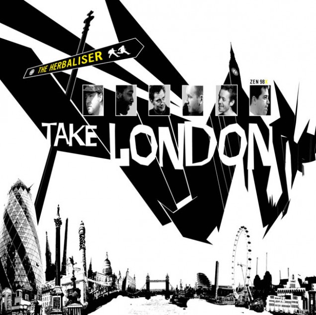
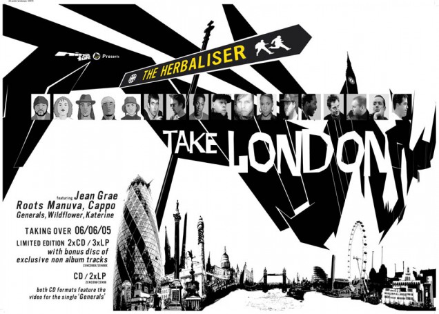
The idea for this sleeve took it’s original inspiration from a film poster for The Last Picture Show which showed a row of buildings at the bottom, titles near the top with actors faces in boxes and a large expanse of blank space between. Ollie is a big fan of film and the design of film posters and had come up with the title ‘Take London’ as a tribute of sorts to the East End gangster films now largely being aped by people like Guy Ritchie in ‘Lock, Stock…’ etc.
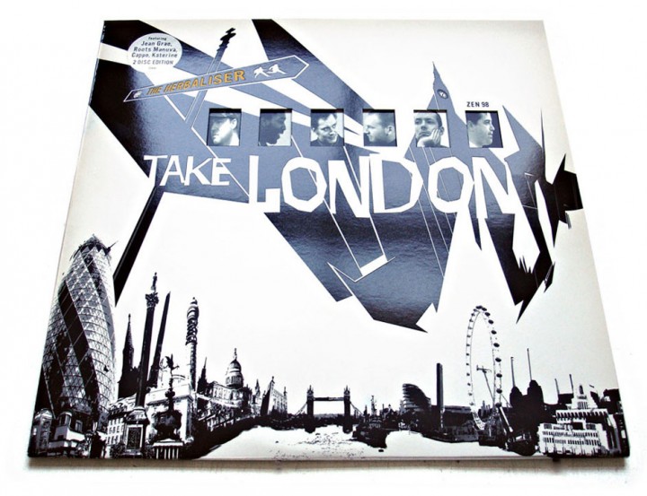
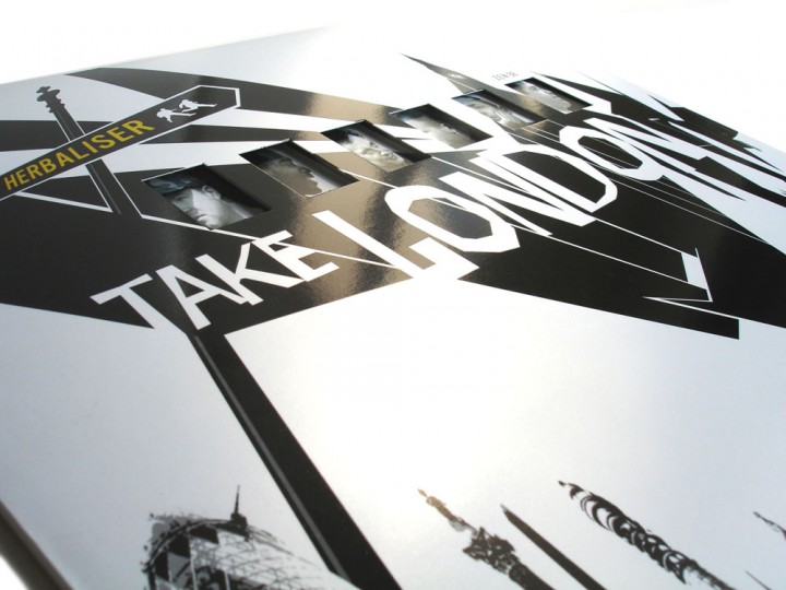
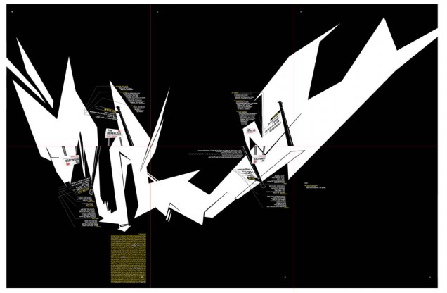
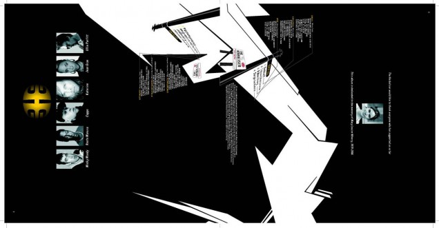
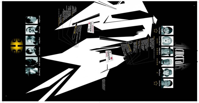
We made a geographically fictional London skyline with as many major landmark buildings as we could think of, being careful to put them on their respective sides of the river even though buildings like the gherkin are obviously nowhere near Nelson’s column. The faces of the band replaced the original actor boxes but we soon hit upon the idea of having windows die-cut in the sleeve to show through different faces because the band has many members and features even more guests. We knew the LP would at least be a double vinyl so that would give us a potential 4 sides of inner sleeve to play with in terms of different images to show through the windows. These were easily filled and thus, you can have 4 variations of the front sleeve depending on which side of the inner sleeves you insert.
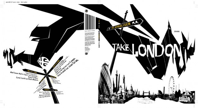
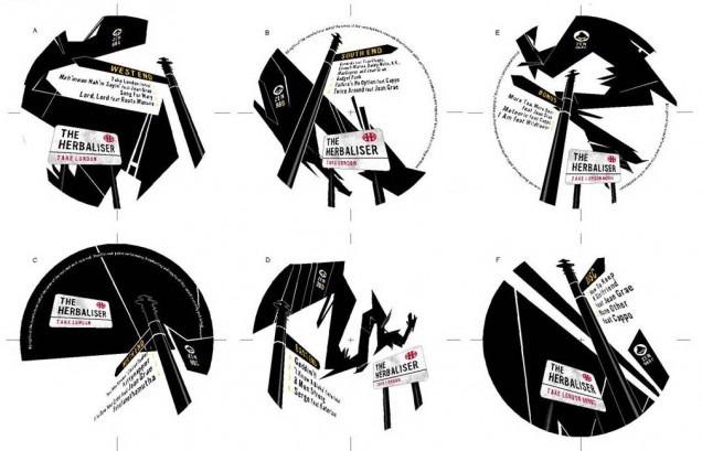
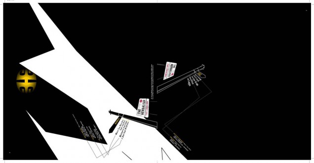
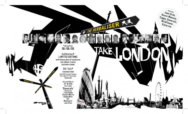
Our initial attempts at the layout failed miserably because they seemed to be pale imitations/parodies of 60’s film posters which have been done to death already and we wanted to get away from that to something that alluded to them but wasn’t confined by homage. I’d recently seen the Saul Bass retrospective at the Design Museum and was acutely aware that his style was affecting the design process as it was probably the very thing that inspired most of the posters we were taking as inspiration ourselves. I wanted to play up to the typographic side of the city and so made graphic versions of the London street signs saying ‘The Herbaliser – Take London’ using the typeface ‘vinyl’ (how apt) which is very close to the sign font. Also I made directional signs on posts for the logo and side divisions – we ended up with North End, East End, South End and West End instead of sides A, B, C and D.
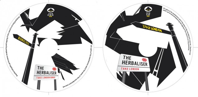
We’d been playing around with a gloved hand which was coming in from one side and was grasping Big Ben which was extending from the ‘n’ on the original ‘Take London’ lettering. It was a literal visual translation of the title and wasn’t really working but we wanted something to fill a portion of the ‘sky’ on the cover other than the title and band name. Ollie had just seen a graffiti documentary with very abstract title sequences featuring a whole host of arrows, cross sections of letters and other effects and we decided to feature something like this. The Thames river is obviously a major feature of the city of London so I made a ‘graffiti’ version of it in Freehand which was then stretched with exaggerated perspective to form the various shapes across the sleeve and the rest of the package.
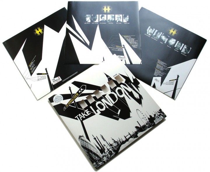
The 3 (on the limited triple vinyl edition) inner sleeves gave me loads of space to use these images and, if you lay them out together, they join up to form yet another image of the Thames graphic (both sides too, if you have 2 copies). Seen separately though the inner sleeves make their own kind of street landscape as the shapes form their own skyline with the addition of the street signs and signposts. The colour scheme was pure black and white up until this point with a splash of red (again the Saul Bass influence) which we decided to change because it immediately made the homage connection. We substituted it for yellow on a black background as it stood out bright and bold and gave the sleeve a different quality, almost bordering on industrial warning sign colour schemes.
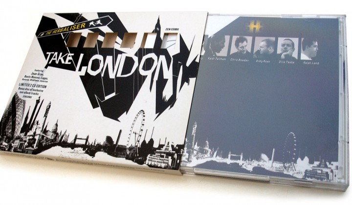
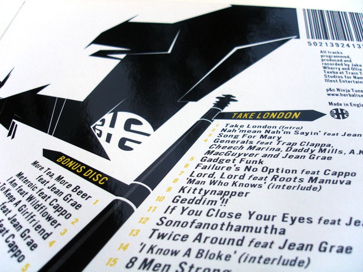
The London skyline and the ‘Thames’ graphic were, I felt, too separate so I anchored them together with a large signpost sporting the Herbaliser name emerging from the city. Big Ben was added back in and the icing on the cake is a gloss spot UV varnish across the back and front to emphasise the quality of the whole package. On body CD and LP designs feature scenes of the ‘Thames’ snaking across the sky as viewed from below whilst various signs point out track listings and band/title. The CD comes in a die-cut slipcase version of the LP sleeve and the booklet can be folded in 4 different ways to show through 4 selections of the artists, just like the vinyl.