- RELEASED: 19 April 2014
- FORMAT: 12″
- LABEL: SONY/ LEGACY
- CAT No.: ZEN12232
- DESIGN: Openmind / Cally @ Antar
- ILLUSTRATION: Andy Dog / Openmind
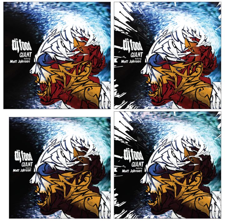
- SPOTTERS DELIGHT: Billed as a ‘GIANT2FACED12INCH’ the sleeve was supposed to open at the top but due to a cock up that none of us spotted it opened from the side.
- EXTRA ZEN: BUY
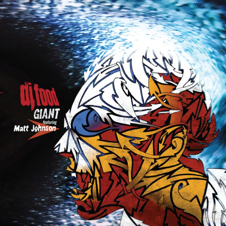
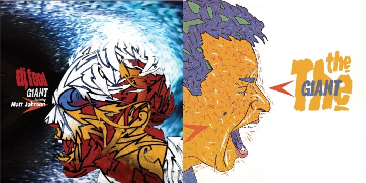
I was pretty excited when Matt Johnson got in touch to ask about the possibility of licensing my version of ‘GIANT’ for a The The vs DJ Food double A side 12″ on Record Store Day and then asked me to design one side of the sleeve as well. The brief was simple, the front was his brother, Andy ‘Dog’ Johnson‘s shouting face image from the cover of the American issue of the ‘Soul Mining’ LP and I was to do my interpretation for the reverse. OK, so a shouting face, fairly obviously Matt’s, to compliment Andy’s vision, how best to go about this? I didn’t want to ape his style as that would be pointless but there had to be some visual connection so I decided to use the same colour palette.
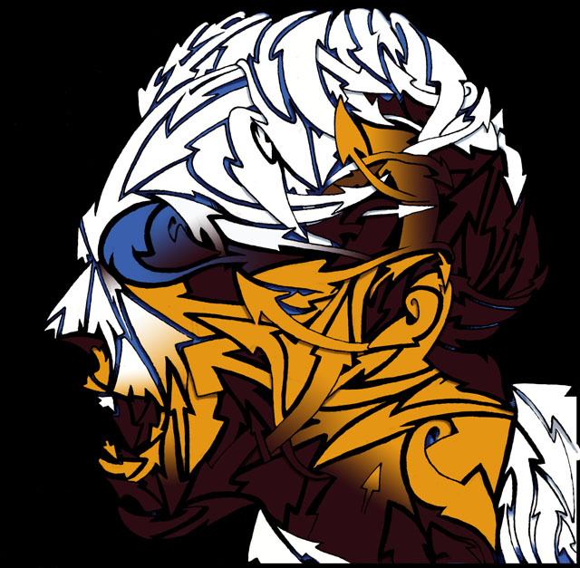
I’d remembered an image of Matt shouting/singing from the Infected video that was featured in the The The songbook as a still, taken straight from the TV by the looks of it and so scanned that as the basis of my version. The head was facing the opposite direction from Andy’s so this was a good start and I took the idea of the arrows he would add to some of his images and redrew the face, now made from a warren of intertwined arrows. This was supposed to represent the confusion in the character but also served to create a dynamic image with movement without copying the blizzard of detail that gives Andy’s art such a visual buzz.
After inking the pencil tracing I scanned it and cleaned up edges to get a clear B&W version before adding a limited colour palette that would mimic the lighting of the original photo. The background I’d decided would be black rather than white to counterbalance the other side and I added some distorted TV feedback I’d taken years before to reference the texture of the original photo. It was looking a little clean for my taste so a layer of grain was added across the face just to give it some ‘glue’ to pull the flat face together with the background and a tiny amount of spin blurring to the black outlines to blend it further.
I then experimented with adding a section of the Robosunburst from the background of the ‘Search Engine’ LP cover to reference that release but, while it added an extra level of dynamism to the image. I felt it was too busy although I did submit a couple of versions to Matt for a second opinion and my feeling was Matt’s too and he went with the simpler image. I also felt that my colour choice was a bit on the dark side so a re-balancing of the browns for redder tones evened things out and bought it a little closer to Andy’s colourful original.
All that remained then was to add the titles and I wanted my clean DJ Food logo to reflect Fiona Skinner‘s original choppy The The logo design. For this I imported the Food one into Illustrator and used the tracing tool too create a rougher outline as it can never trace exactly, especially at small sizes. This was then further roughed up on the edges in Photoshop and the words ‘featuring Matt Johnson’ and ‘GIANT’ were taken from the back of the ‘Soul Mining’ LP cover. Actually I think I had to cobble the ‘featuring’ together from several different words…
After this I wanted a copy of the arrow Andy had pointing toward the nose of the face to tie our designs together and form an anchor point to align the titles with.