
- RELEASED: Jan 1999
- FORMAT: 12″ / CDS
- LABEL: NTONE
- CAT No.: NTONE29 / NTONECDS29
- DESIGN: Openmind
- PHOTOGRAPHY: Openmind
- EXTRA ZEN: ninjatune page / BUY
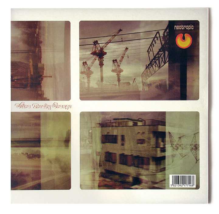
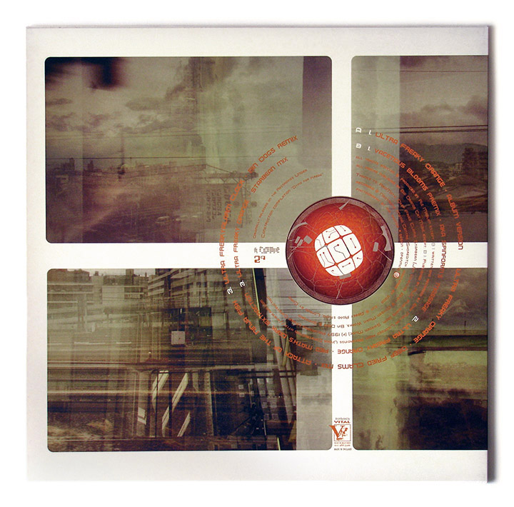
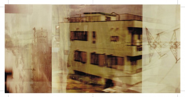
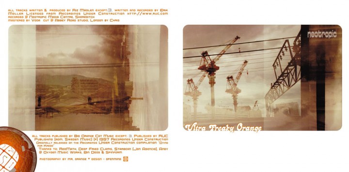
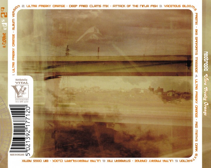
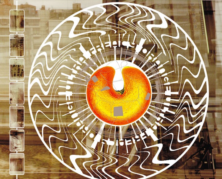
The photos on this were taken on the Bullet train between Tokyo and Osaka in Japan by randomly shooting a whole film out of the window, winding it back to the beginning and shooting it all again. After rotating the camera 90 degrees. Four times.
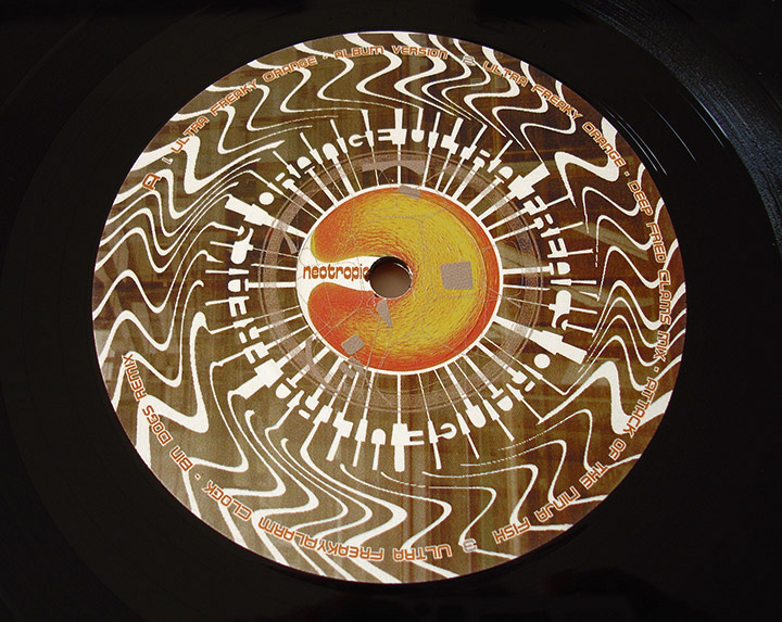
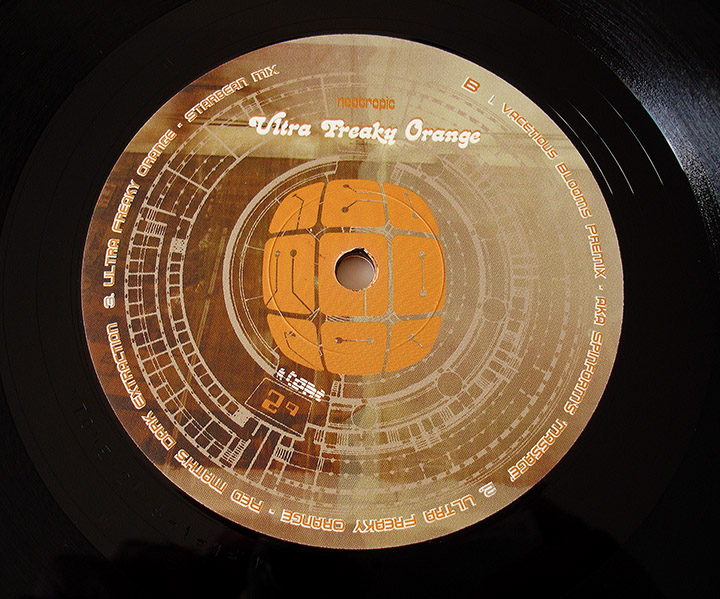
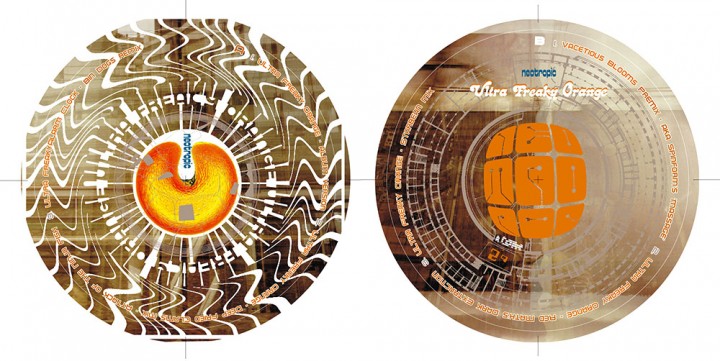
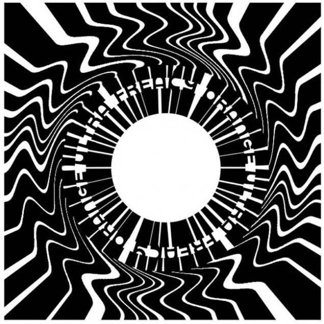
The Neotropic logo in the nine squares was inspired when I went to an Art Nouveau exhibition at the V&A and thought that some of the fonts used resembled circuit boards. I remember drawing a rough sketch for the logo in the cafe while it was still in my head and I always liked it although it works better in the square format than in a straight line.
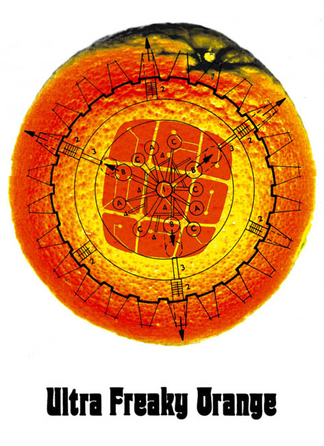
This EP was a mass of contradictions as far as the visuals were concerned as Riz had sampled the 60’s UFO theme – hence the title with the same initials – and wanted a psychedelic look to it. I played around with various things including a version of the underground UFO club logo and some swirly black and white Op-art-type graphics (visible under the CD single tray). I also had an orange in the original which was pretty obvious but looked nice and, coupled with the Japanese images and the circuit board logo, it all looked a bit odd.
Ultimately the images won as we both liked them and I still count this as one of my favourite sleeves.