- RELEASED: 20 Sept 2010
- FORMAT: Book / 6×7″ / 6xCDs / 2xPosters / Sticker sheet / Slipcase
- LABEL: NINJA TUNE
- CAT No.: ZENBOX160
- DESIGN: Openmind
- ADDITIONAL ILLUSTRATION: Nigel Peake
- SPOTTERS DELIGHT: Two double CDs were released independently from the box set in standard jewel cases. The ’20 Years of Beats & Pieces’ book contained in the set was a hardback version exclusive to the box.
- EXTRA ZEN: ninjatune page / BUY
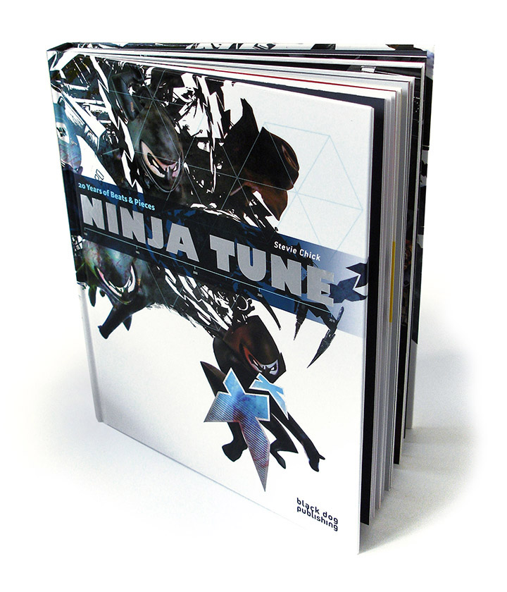
This set probably took six months to design but one element – the ‘Ninja Tune: 20 Years of Beats & Pieces’ book – was a year in the making with a full six months spent solidly on every visual aspect of it. Black Dog Publishing, renowned for their art, architecture, fashion and music books, were approached in the summer of 2009 with a view to publishing a book on the history of the label a year later. This was to be paperback only and was, originally, a standalone entity from the box set that eventually emerged. Stevie Chick was commissioned to write and me to design, including picture research, archive plundering, scanning and colour correction of over 1200 images, design and page layout.
Early in 2010 I met with label head Peter Quicke and A&R chief Simon Skevington to thrash out what exactly would be in the box and how exactly it would all come together. My original idea was to have several different formats included that would chart the progress of the label through the last two decades. A cassette to contain a mix, harking back to the good old days of pirate radio, a vinyl record – shaped, possibly double grooved as well, to showcase the possibilities of the format over CD and the download. CD was a must and DVD to show off the label’s audio-visual side, also a USB stick, shaped as a stand up NInja logo figure, to contain multi-media info and mp3s and bring us up to date format-wise.
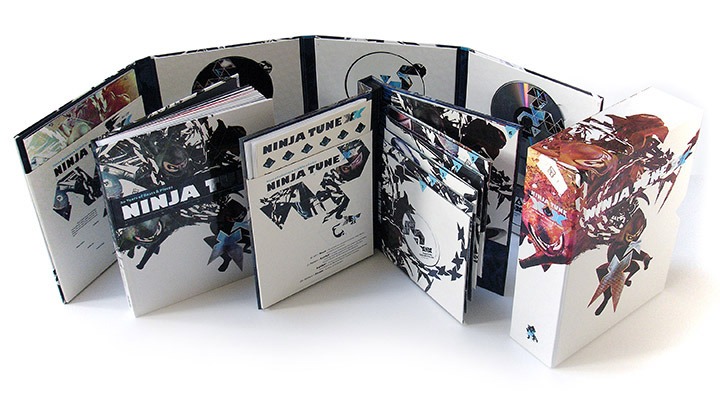
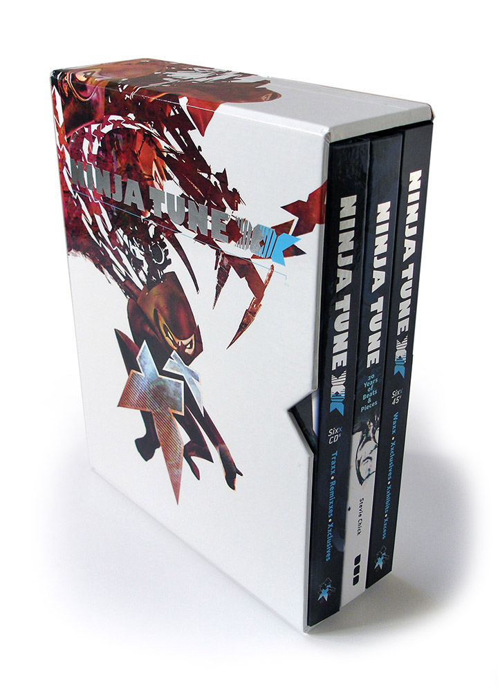
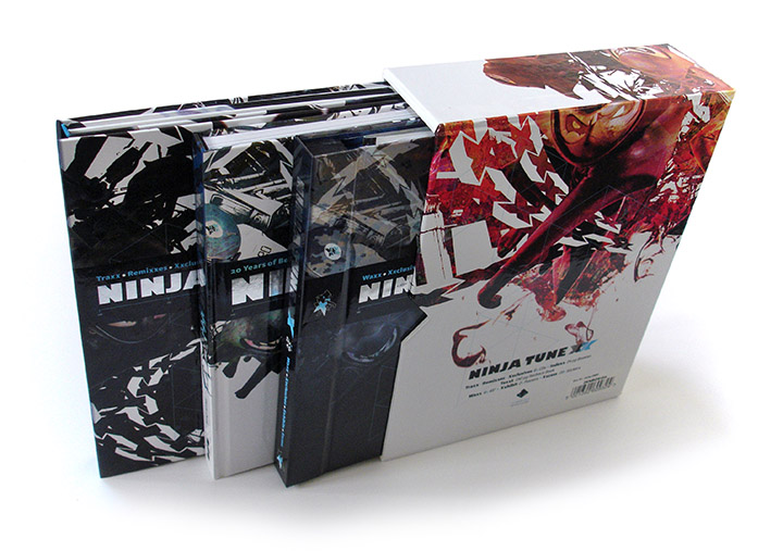
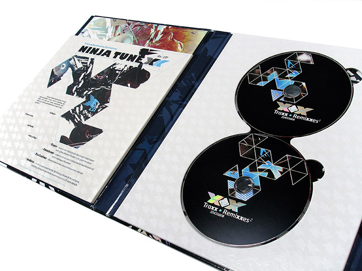
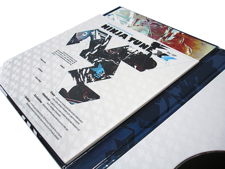
It soon became apparent that this would be woefully inadequate for the sheer volume of music that would need to be contained on the finished set (there are over 100 tracks floating about on all the different media). Eventually it was decided that six CDs and six 7″ singles would carry the music whilst the book – now well underway – would be included in hardback form, as well as two posters depicting a family tree and a visual discography and 20 stickers.
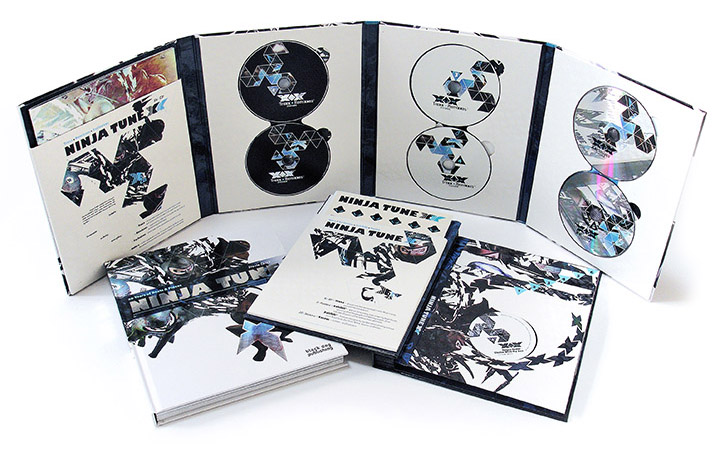
Peter was adamant that, firstly, everything would revolve around the book size and that the set be as ‘green’ packaging-wise, as possible, in as much as something like this can be green, ie: as little plastic as possible. In the end only the stubs holding the CDs were plastic which we went for because of our dislike for the foam buttons so beloved by many. Nice though they are, they are tricky, frustrating and with a set like this we absolutely didn’t want discs falling out when it was opened. We also wanted the set to be used and easy to access unlike some sets where you have to remove several layers to get to the contents beneath. We wanted each of the different components to be independently accessible without the hassle of taking the whole thing apart. Two more hardback books were decided on – one for CDs and one for 7″s – each with pockets for a large format booklet detailing the set’s contents and the posters and stickers respectively. This left the outer packing largely free of any text which would possibly be changed along the way anyway and cause problems or delays.
The main problem we had was that the music for the set was still being made and decided upon through the whole design process, hence the booklet detailing all the tracks which was one of the last things to go to print. The other was that Black Dog were unwilling to let us take the print files for the book and print it ourselves at the same factory as the rest of the set. This meant that we had several headaches trying to match the books as closely as possible as we didn’t have a finished sample of the Black Dog book before all the other elements had to be at the printers. This is fair enough, they make books, we make records but many fraught emails were exchanged trying to determine exact dimensions and finishes.
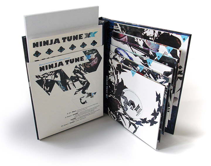
When it came to print finishes and how the set would look I was left entirely to my own devices and Peter, on this occasion, let me have free reign. Spot varnishes and foil blocking as well as printing inside the sleeves for the 7″s was OK’d but a major point in the packaging was how to house the 7″s. The CDs were fine, they fitted, two up, on three panels the same size as the book with a fourth added to house the booklet detailing all their contents. The original book for the 45s had them all bunched together on the same level, bound into the spine of their book. This was fine width-wise, even with the built up spine to hold them, but it left a large gap above or below them half as big again. At one point, when the USB key was still in the frame, this was where is was going to be housed but repeated problems getting a sculpt to our satisfaction and approaching manufacturing deadlines meant this was off the agenda.
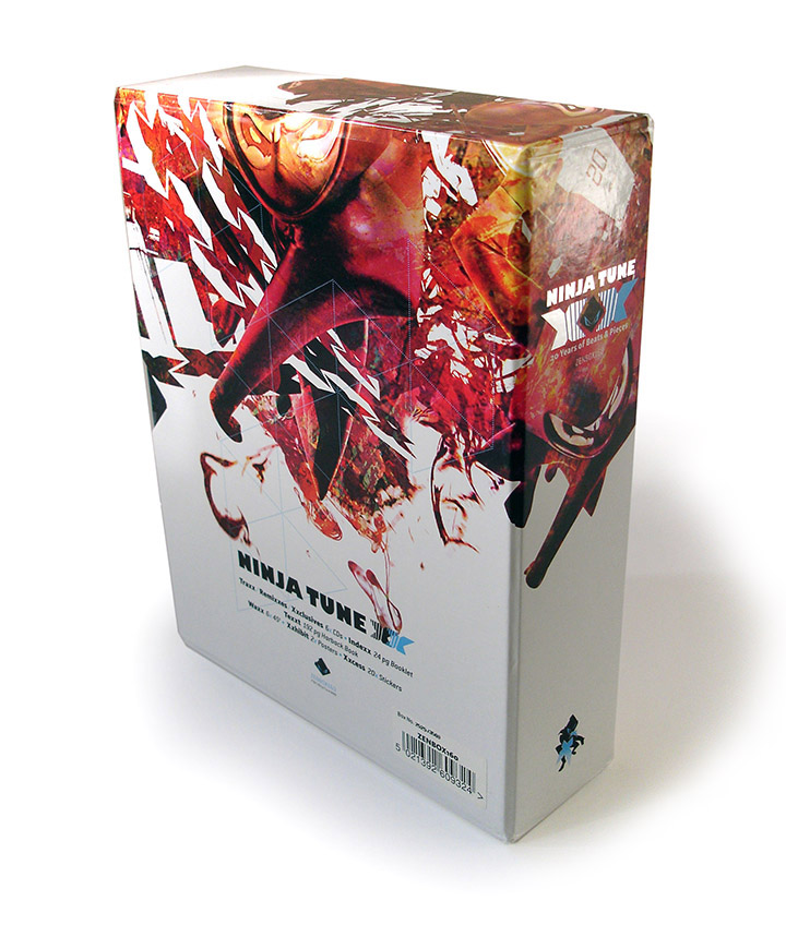
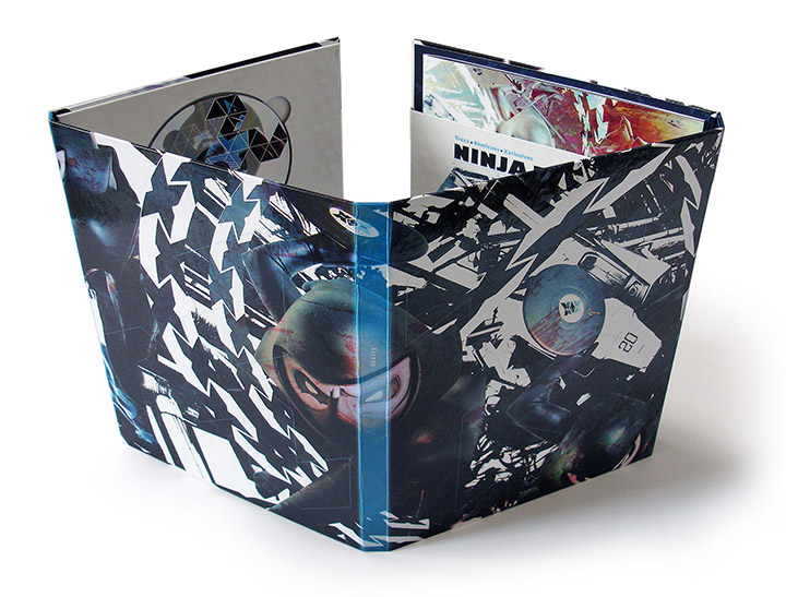
I had the idea to stagger the 7″ sleeves up the spine with the last one being attached to the inside of the book which solved this problem and created a unique way of packaging singles we’d not seen anywhere else. This in place we had the packaging, all held together by a slipcase which we reinforced as the contents now weighed 3.5 kilos! The main graphics for the whole set came from several sessions I had made for the book cover for Black Dog, a total of about 10 different cover designs, all of which were either deemed not quite right or rejected outright by them or Ninja (the only case of any external interference with the design). The real problem was how to portray 20 years of a label? I decided to take my Ninja logo, actually a 3D model of it, made over a decade ago and used for the tenth anniversary sleeve, and multiply it extensively into a swarm exploding from a single Ninja, adding multiple X’s and other paraphernalia. This was then worked into several different colour versions and spread across all the formats in different detail.
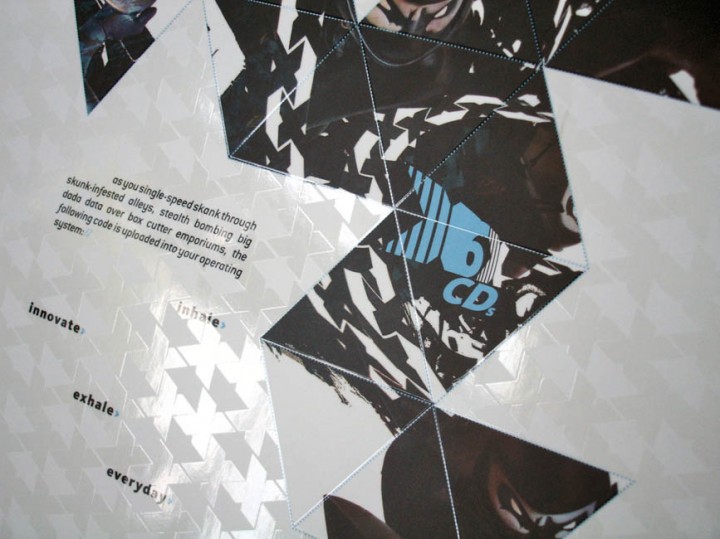
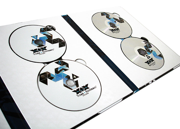
Another graphic device I used across everything was an Icosahedron laid flat, this is a twenty sided shape which makes a crude sphere when folded up. This was suggested by Jon More from Coldcut who, at the beginning of the whole process when ideas were being bandied about, sent an incredibly detailed email full of dozens of items containing 20 in everyday life, language or folklore. Twenty was also represented by the Roman numerals for it – XX, as I’d used X ten years earlier – and words containing an ‘x’ were used to describe the various components of the set. Exclusives, remixes, wax, exhibits – and the X’s doubled within the words to emphasize the twenty connection. A spot varnish of XXs in a diagonal pattern was also used across several surfaces with certain areas picked out and the main titles picked out in silver foil blocking. Other parts to look out for are the different set of Ninja eyes at the top of each 7″ sleeve edge which all stack on top of each other by the spine and little details like the Icosahedron picked out of the varnish behind the last 45 cover and the word ‘XXcess’ down the spine of the CD book.
It is excessive and I had a ball working on it although I couldn’t see the wood for the trees by the end. The visual discography poster alone was an exercise in graphic nerdism as I took it upon myself to show every release from the four main labels’ catalogues up until Summer 2010. The obvious would have been to do a grid of lots of tiny squares but I felt that would be too obvious and not that enticing to display (that’s what posters are for, right?). So, many hours were spent getting the exact position and file size to bend them in a perfect circle and that’s after all the hours just collecting every cover (the Ninja archive is not as complete as it should be). The family tree poster is the only part I didn’t do, that was down to my good friend Nigel Peake who had previously provided all the illustrations for the Coldcut album ‘Sound Mirrors’. His hyper-detailed family tree underwent many additions, revisions and corrections before it was ready and we printed it to look and feel like a blueprint on a rougher stock.
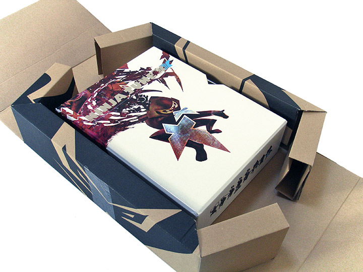
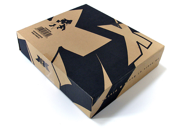
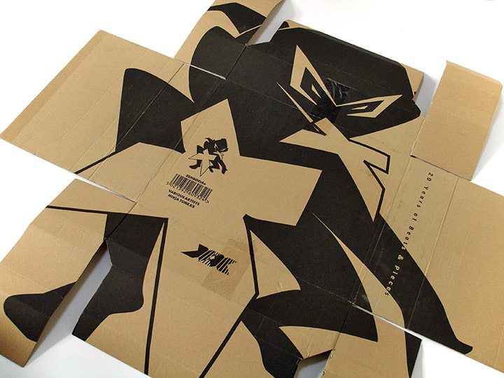
The final element of the package was the packing box the set would eventually arrive in, to which I also added graphics. After all that work we were careful to ensure that it would arrive as it was intended and not with a dinged corner or dented slipcase. The outer card contains a huge Ninja logo which, when folded up to enclose the set, makes abstract shapes around it, a nice treat for me as I didn’t know how it would exactly look until I received the finished set. The one thing I would possibly do differently would be to have a matt laminate finish on the outside of the books and slipcase. This was always intended but changed at the last moment because Black Dog insisted that it would mark easily and weren’t happy to have the book non-gloss. This meant that we had to have the rest gloss or it wouldn’t have matched, the upside being that the colours and especially blacks, were much more vivid. But really, I’m very happy with it as well as the myriad of spin-off releases that come alongside it (you get two exclusive 12″s when returning a unique code inside the box to the Ninja shop). It’s probably the largest single graphics job i’ve ever undertaken and to be given this, as well as be featured in the package, and for it to be about a label you love and have worked for for 15 years is a dream job I doubt I’ll ever undertake the likes of again.