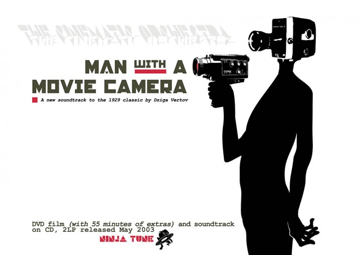
DJ Food ‘Jazz Brakes’ vol.2

Info

  • 1. Dark Aeco
    2. The Food Song
    3. Feelin' Guilty
    4. Cosmic Jam Part 1
    5. Count Zero
    6. Some Drum
    7. Gentlemen
    8. Mella
    9. Black Ice
    10. Red Driller
    11. Stealin' Stew
    12. Rude Food
    13. Circus Maximus
    14. Your Mother
    15. Sexy Bits

    CD / Digital adds:
    15. Last Coltrane To Skaville
    16. Blue Pants Ting
    17. Deadly Serious Bass Party
    18. Funky Emergency
    19. Cosmic Jam Reprise
    20. Answer Me
    21. Lo Message
    22. Drum Message

Info

RELEASED: Sept 1991
FORMAT: LP / CD
LABEL: NINJA TUNE
CAT NO.: ZEN3 / ZENCD2
PRODUCERS: Matt Black, Jonathan More
WANTS LISTS: CD version includes 8 extra tracks
EXTRA ZEN: ninjatune.net / BUY

Various Artists ‘Remember The Future’

Info

    • RELEASED: Oct 2007
    • FORMAT: CD
    • LABEL: n/a
    • CAT NO.: n/a
    • DESIGN: Openmind
    • SPOTTERS DELIGHT: 75 copies, each disc has a different image
    • EXTRA ZEN: Listen / Download

    Robots, mecha, androids, simulacra, I love them and, to commemorate the release on the first Transformers film in the summer of 2007 I put together a themed mix called ‘Remember the Future’ with the emphasis on the machine envisaged in the 50’s, 60′ and 70’s when space travel was still a new wonder of the world. The intro was Transformer-themed and I was doing a gig with Hexstatic a few months later for the release of their album ‘When Robots Go Bad’ so I decided to make up some artwork to go with it so that I could sell some at the gig. The outer cover was a folding version of the Autobot logo (I wanted to do a Decepticon but it didn’t lend it’s self as well to the task in hand). This held the disc inside, each one of which was printed with a different image of a robot cribbed from an online gallery of bots made from found objects.

    The process took ages and I wondered what on earth I had been thinking as I estimated that each one probably took around an hour to assemble. Each disc had to be burned then printed with a unique image. Then a sleeve had to be printed (on both sizes because the tracklist was inside) hand cut and folded around the disc which was put into a plastic sleeve and then the whole thing was dropped into a re-sealable freezer bag. I did 75 and called it a day.

Info

Amon Tobin ‘Foley Room’

Info

    • RELEASED: 21 Feb 2007
    • FORMAT: 2xLP + DVD / CD+DVD / Ltd CD+DVD / DL
    • LABEL: NINJA TUNE
    • CAT No.: ZEN121 / ZENCD121 / ZENCD121X / ZENDL121
    • DESIGN: Openmind
    • PHOTOGRAPHY: Nicholas Casonova, Julie Elie, Marianne Allard
    • SPOTTERS DELIGHT: Additional DVD attached to the inside of the vinyl gatefold, limited gatefold digipak CD/DVD, pdf booklet with iTunes download, individual track images with download from Bleep.com
    • EXTRA ZEN: ninjatune page / BUY

    During my long association with Amon I have always tried to progress the themes and graphics in the artwork with each release. ‘Foley Room’ was no exception and started with a subtle revamp of his logo, something that started life as a typeface made by graffiti artist She One and has since morphed this way and that into what it is today. After initially starting from scratch with an entirely new logo and getting nowhere I made the original spikier and sleeker, cutting sections diagonally to make it seem like it would cut you if  touched.

    For this record Amon had made a series of field recordings of sounds that he then sampled and used as the bulk of the record structure. He’d also had the good sense to document these trips on both film and photo for a DVD to be included with the record. He wanted photography used in the artwork that would show everyday situations and tally with his field trips but he didn’t want it to be a literal document – he wanted a twist of some kind.

    Next came designing the look of the record and I took inspiration from the Folkways and Nonesuch record labels that specialised in field recordings and unique events. The Folkways records often had a plain black card sleeve with a big wrap around sticker that would cover the front but only reach part way across the back. They usually used a minimal palette of 2 or 3 colours and a black and white image so I designed a mass of variations in different colour combinations in this style. Whilst not yielding anything definitive it gave the layout an initial structure and produced some interesting results which I then began to work on by substituting one image for another until I found the right combination.

    I had previously done the Tag The System train customisation and had figured that it would be ideal for an Amon record in one form or another as it used a similar process – albeit in a 3D context rather than a 2D one – to previous album artwork. With this in mind I made sure I photographed the model extensively after it was finished and showed some of these images to Amon who loved them as he had recorded train sounds for the album so saw a connection. After photo-shopping sections of the model images into his recording photos – so that it looked like Amon was recording robots, the twist he had wanted.

    I experimented with shooting the images through the TV screen to add texture and grain. At the time I was having a rekindled love affair with Eno & Byrne’s ‘My Life In The Bush Of Ghosts’ album as it had been reissued and the TV feedback cover art had always been a favourite of mine. The results threw up all sorts of new angles; as well as distorting and blending the Photoshop results together they exaggerated the contrast, colour and lighting of each image and gave it that ‘documentary’ feel.

    When you shoot a TV on a slow speed the camera can’t keep up with the constant flicker of the screen refreshing so, sometimes, you get a black band across part of the image. It was one of these photos which became the front cover because it was perfect for setting the cover text as I had decided to put the titles on the front rather than the back (for some reason). Of all the photos of the train that were used I took good care to make them as ambiguous as possible and few people who had seen the original model made the connection when they saw the artwork.

    The TV gave them a nice blue hue which coloured some of the black and white images too. Next was which typeface to use as a basis for the record: I wanted something ‘technical’ without resorting to the obvious Data 70 or LCD-type fonts. I settled on the Airport/Luggage family which is based on airport timetables boards, all squares and triangles that make up each character like an LCD display but with many more options. This font is incredibly detailed so it looks great large but blends into a regular character at small sizes, hence the large and small instances used on the sleeve.

    The next problem came with the DVD as Amon was adamant that it be included with the vinyl as well as the CD. The CD posed no problem, you just add a double tray or a second card sleeve but the disc needed to be fixed to the cover to keep it from getting scratched and I didn’t want it just thrown inside a sleeve to rattle around. The first idea was to have it attached via a plastic sleeve to the outside but this would cause problems when the records were stacked together as it could catch and rip and also make an indentation in the sleeve next to it meaning possible returned copies marked as ‘damaged’.

    The second idea was to attach it to a 12 x 12 piece of card to be slotted into one side of the gatefold cover, again this would have potentially caused an indentation on the cover so a recessed version was mooted. This would have meant two thick pieces of card stuck together, one with a disc sized cut out so that the DVD could sit ‘inside’ the card and not cause damage – alas, too expensive.

    The final solution was to do a gatefold with a very thick spine (1cm!) and sit the disc on a foam button inside the gatefold opening itself, near to the middle as there is a gap where the card doesn’t meet due to the thickness of the spine. The whole package would then be shrink wrapped to ensure that if a disc fell off it wouldn’t be able to escape – this was actually very cheap and simple to do and worked well. Frustratingly the whole package fell at the last hurdle though through a myriad of printing cock ups where approved artwork reverted back to old versions, images were resized or missing for no apparent reason and one bright spark at the pressing plant decided that the DVD should look the same as the CD and changed the ink on the background colour!

Info

Coldcut ‘Mr Nichols’

Info

    • RELEASED: Sept 2005
    • FORMAT: 12″ Promo
    • LABEL: NINJA TUNE
    • CAT No.: ZEN12172P
    • DESIGN: Openmind / Matt Black
    • PHOTOGRAPHY: n/a
    • EXTRA ZEN: ninjatune page / BUY

    Oh, this could have been so beautiful. At the beginning stages of promoting Coldcut’s ‘Sound Mirrors’ album it was decided to do a one-sided 12″ promo with an etching which was to be limited with the bulk of the copies being exported to Japan. It featured the track ‘Mr Nichols’ with Saul Williams, an excellent slow burner which wasn’t exactly chart single material but deserved a space to shine. My brief was to make it ‘a desirable object, something people would really notice and want to own’ – presumably to create a buzz about both the music and Coldcut’s return after years without a major release. Bear in mind this was the first instance of a new Coldcut product so I was starting with a completely clean slate, trying to give shape and direction to something that would turn into a giant behemoth of a project by the time the DVD was released after four singles and the album.

    I originally wanted to do clear vinyl with the lyrics reversed so that they could be read through the grooves but that wasn’t to be, I wanted a black rubber sleeve with embossed a Coldcut logo, no again. Eventually Matt hand wrote the lyrics into a fresh metal plate but I still have a test pressing of my version with the reversed lettering.

Info

Amon Tobin ‘Chaos Theory’ (Splinter Cell 3 soundtrack)

Info

    • RELEASED: 18 Jan 2005
    • FORMAT: 2xLP + Poster cover/CD+slipcase / DVDA / DL
    • LABEL: NINJA TUNE
    • CAT No.: ZEN100 / ZENCD100 / ZENDVA100 / ZENDL100
    • DESIGN: Openmind / Splinter Cell
    • SPOTTERS DELIGHT: Ltd. foldout poster cover with screen printed PVC sleeve with vinyl, screen printed slipcase with CD, PAL & NTSC versions of DVDA
    • EXTRA ZEN: ninjatune page / BUY

    What a bugger this was to get off the ground. For those who don’t know, Splinter Cell is a computer game based on the novels of Tom Clancy and a highly successful one at that – this being the 3rd installment. Dealing with major companies in other areas is immensely time consuming, frustrating and tedious, neither side fully understands the others needs and both want their own way. When Amon recorded the soundtrack for this computer game Ninja decided to release it and suitable artwork was needed that appealed to both the computer game’s audience and Amon’s fans. Putting a straight image from the game on the cover was never a consideration but the record needed to use elements of the game graphics to tie the two together.

    Splinter’s Cell’s premise is based on a soldier running around with night vision goggles on, shooting all manner of foes and most of it takes place in the rain and in the dark. I was sent a load of layered graphics and logos and – jumping on from the ‘Remixes and Collaborations’ artwork – I envisaged some sort of potential creature / foe that would be encountered if Splinter Cell collided with ‘Amon’s world’. At the time I was into cross-section diagrams and put together a being made from various instruction manual graphics I found of anything from washing machines to motorbikes. The legs and body came very quickly but I had trouble with the arms and the head looked a bit boring and I tried to think of ways to make them more exciting.

    The arms had to be doing something but I didn’t want the thing holding a gun or weapon although without one it looked like it was dancing which just looked bad. I’d found an image of a big squid that I’d used for a part of the mouth and the contrast of animal/mechanical that I use as a template for Amon’s work set me thinking. Substituting the arms for wings worked way better and made the ‘thing’ look very odd – something vaguely birdlike but made from cross sections of airplane wings into the bargain. I added rain and a strong light source and then it all came together. Here was my main album graphic but what to do with it?

    I’d recently met up with Michael C. Place of Build after admiring his work for a long time and wanted to collaborate with him so we hatched a plan that he would take my image and add his graphic touch to it with a die cut slipcase that would show through parts of my design underneath. The first design he came back with didn’t really fit colour-wise with the overall themes of the game graphics so he redesigned it to make it blend in a bit more but unfortunately Amon and Ninja didn’t like it. Here are images of the mock ups I made from his print outs of the proposed artwork and we agreed that this was a collaboration for another day and another artist.

    So, back to the drawing board and I had an idea centered around a transparent slipcase with printed raindrops and a gun night sight on it. The game has a wealth of these from the player’s viewpoint and a main graphic was the 3 green goggles looking through a window. As this is an ambiguous image and could have referred either to the creature I had created of the main game hero I decided to have this as the cover. Looking out from behind a transparent sleeve streaked with rain, which would be printed on, a single drop of blood running down as per the game image. When the buyer slid the sleeve / booklet out of the transparent sleeve it would reveal the creature behind the glass in a foldout poster and the accompanying graphics tied in with the game night site icons.

    Getting the rain effect printed on a transparent sleeve was easier said than done and countless phone calls to the printer seemed to arrive at a solution but it was all guesswork. There had to be some kind of white base because otherwise any other colours wouldn’t show up and it would all blend into a mess against the black background underneath. I can’t remember exactly what I did but I do remember a distraught Jeff Waye – Ninja North America’s manager – who had gone to the pressing plant on December 27th to check the print – ringing me to tell me that it looked like the Grinch in a snow storm! It wasn’t quite that bad but it didn’t look great so the first batch went out like that and then it was changed. Luckily we hadn’t done the vinyl so we fixed it for that and everyone was happy. I’m pretty pleased with the final result but it’s all clouded by to-ing and fro-ing associated with the whole thing.

Info

Various Artists ‘HEAD’ (DJ Food Re-score)

Info

    • RELEASED: 2004
    • FORMAT: DVD
    • LABEL: n/a
    • CAT No.: n/a
    • DESIGN: Openmind
    • PHOTOGRAPHY: Doug Smith, Osymyso, Alice Cersole, Mark Cantwell
    • SPOTTERS DELIGHT: Each DVD featured a different random flyer from the Dublin gig
    • EXTRA ZEN: Discogs page

    I made a very limited edition number of DVDs of a studio recording of my ‘Head’ rescore synched to the original film and printed up sleeves on reflective card to mimic the original album’s packaging. Each DVD had one of seven different flyers from the Dublin performance inserted into the package as the promoter had gone to town and made a set of cigarette card-style flyers depicting scenes from the film and had a load left over after the night.

    The graphics on the sleeve are largely taken from the original film promotional material but also include photos taken by people at some of the performances, more of which are included on a slide show as a DVD extra along with flyer art from the shows. A list of the ten performances with dates and locations is also inside as well as a teaser for the next DJ Food album… I especially like the DVD on body disc design for this as it is so simple but effective.

Info

Cinematic Orchestra ‘Man With A Movie Camera’

Info

    • RELEASED: May 2003
    • FORMAT: 2xLP / CD / Ltd DVD
    • LABEL: NINJA TUNE
    • CAT No.: ZEN78 / ZENCD78 / ZENDV78
    • DESIGN: Openmind
    • PHOTOGRAPHY: Carl Fox
    • SPOTTERS DELIGHT: Book edition DVD, heavyweight card LP repress in 2012
    • EXTRA ZEN: ninjatune page / BUY

    The original idea for this came about during the mass of artwork created for the ‘Every Day’ album a year earlier and a version of the ‘cameraman’ logo was even included on the band’s bass drum on that record’s cover. As MWAMC is essentially an expanded rework of ‘Every Day’ including the track that gave the album it’s title, it seemed apt to continue the theme. The actual ‘cameraman’ figure was drawn in about 20 seconds and then given a camera to hold and for a head from images sourced on the web. I remember why it was so quick because, after I had drawn it, I knew I had nailed something incredibly quickly that was visually instant in response to the title.

    For the MWAMC cover I reworked the hand down at his side as this was very basic on the ‘Every Day’ version and I knew it needed something a little more defined. The whole look was supposed to be evocative of eastern European film posters of a certain era, basic, flat graphics and minimal text. It could have been black and white but I added touches of red just to pick out certain things and also to allude to ‘Every Day’ as the main colour for that album artwork was red. Courier was used for the text because it was simple and also because it was a typeface regularly used at the time the film was made (even though it’s not a font i’m particularly fond of)

    I also has some excellent photos of the studio sessions taken by Carl Fox to work with that fleshed out the basic black and white feel beautifully. For the inside gatefold on the vinyl sleeve there was a shot of the empty studio through the control room window except it wasn’t originally empty. There was a person sitting at the piano and a girl half hidden behind the screen over on the left that were taken out via Photoshop to give it a solitary air. The DVD came out very nicely with it’s minimal hardback book-style cover and interior pages. Jason Swinscoe originally suggested that I revisit the ‘cameraman’ figure from the previous album as he had liked it and it was an obvious choice when we began the artwork. I’m really glad he did as it’s one of my favourite projects in terms of the elements conveying the mood of the music and adding an image to the project.

Info

Player ‘Angel of Theft’

Info

    • RELEASED: 2004
    • FORMAT: 1-sided etched red vinyl 12″
    • LABEL: n/a
    • CAT No.: BLOOD00 1
    • DESIGN: Openmind / Sixtoo (after Slayer & Def Jam)
    • EXTRA ZEN: Discogs page

    Another boot I had the pleasure of designing was a ‘makeover’ of Slayer’s ‘Angel of Death’ by a well known producer and his label manager who I may have done a few designs for in the past. Being a massive fan of both the ‘Reign In Blood’ and ‘South of Heaven’ albums I could really get my teeth into this and immediately set about retooling the Slayer logo into a Player one with turntable arms instead of swords. The Def Jam logo (Slayer’s original label) was bastardised too into a not too subtle signpost to the authors and it was decided that this would be pressed on blood red vinyl (of course) with an etching on the reverse.

    I went through various designs for the etching, some of which were not possible simply because the etching process at the time was unable to cope with the detail (story of my life). An original design of spiraling inverted crosses bit the dust for this reason as did the Player logo. Eventually an inverted Star of David was used which wasn’t ideal but did the job. Here are various different label designs and etchings that didn’t make it. Oh and the ‘Angel of Theft’ lettering was by Sixtoo.

Info

RolitoTune NinjaBoy

Info

    • RELEASED: 2004
    • FORMAT: Toy
    • LABEL: Rolito / Toy2R
    • CAT No.: N/A
    • DESIGN: Openmind & Rolito
    • PHOTOGRAPHY: Openmind
    • SPOTTERS DELIGHT: There are reportedly very rare sitting versions out there but I’ve never seen one.
    • EXTRA ZEN: Rolitoland

    An email from the mysterious ‘Rolito’ arrived one day in 2003 with an offer of being one of 6 designers to customise a new line of toys he was making. Each toy had a tiny body and a large, dome-shaped head inside of which was another, smaller, stash box. I was intrigued as I’ve been a fan of the vinyl toy ‘thing’ since Michael Lau came out with his Crazy Children around 2000 and the thought of having my own one was something that appealed greatly. The other thing that appealed was that Rolito had a crazy website based around a load of characters he had created that inhabited Rolitoland. There was little or no explanation about these creatures but the attention to detail and graphic ideas were more than enough to hook me in.

    The brief was open and I decided to adapt my Ninja logo around the toy using various different existing graphics and logos to make a ‘RolitoTune Ninjaboy’. The process for getting the graphics onto the toy were slightly limited so I wasn’t able to do some of the things I wanted to. I suggested we include a 3″ CD in the package with a selection of Ninja music to add to the promotional aspect of the toy so that people who didn’t know where it came from would be introduced to the label via the disc. One of the beauties of the Rolito packaging is that it dismantles without having to tear, cut or un-stick anything, this meant that the empty vacuum packing would ultimately become the ‘sleeve’ that would house the CD.

    There were only 450 made, Ninja got around 150 I think and sold the lot within a weekend over the net, some of which have since appeared on eBay for up to £99. I also contributed a short soundtrack to an animation on his website that showed the shipment getting stuck at the French customs – a scenario that actually happened. He later released a book with a set of unpainted figures (two small birds about to be devoured by a dog with a gigantic mouth that features in a lot of his graphics for Rolitoland). In this book he invited over a hundred artists from across the globe to contribute their impression of Rolito and his associated characters. I submitted a spaceman floating high above the earth with the domed head as helmet and the silhouette of the dog and birds in the visor.

Info

DJ Food posters

Info

  • Various posters I created around ‘The Search Engine’ album release. The ‘Solid Psyche’ one was remade from the artwork of the CD of the same name purely because I liked the design and thought it would make a good print.

Info

Image Duplicator ‘Before Lichtenstein’ exhibition

Info

    • RELEASED: 16 May 2013
    • FORMAT: one-off illustration / print / catalogue
    • LABEL: n/a
    • CAT No.: n/a
    • DESIGN: Openmind after Tony Abruzzo / Dave Gibbons
    • EXTRA ZEN: What is Image Duplicator?

    The Image Duplicator exhibition at the Orbital Comics gallery in London was set up by Rian Hughes to highlight the original artists that Lichtenstein copied, uncredited, for his most famous Pop Art works. For my entry I chose Tony Abruzzo‘s work that was copied for two other ‘Kiss’ pieces. I wanted to give a nod to Dave Gibbons – the original artist on Watchmen – for his speaking out on the subject of appropriating imagery whilst also referencing the similar outcry when Watchmen was remodeled as Before Watchmen the year before. Not quite the same thing I know but it makes for a tenuous link.

    Creating a fake cover for a comic called Before Lichtenstein was the first part, I then made this into a ‘real’ distressed comic that looked like it might have been the sort of thing Lichtenstein copied from. I chose to do one of the ‘Kiss’ images because of the visual link to Watchmen – the iconic silhouetted kissing imagery that crops up throughout.

Info

Ninja Tune ’20 Years of Beats & Pieces’ book

Info

    • RELEASED: 29 Nov 2010
    • FORMAT: Paperback / Hardback
    • PUBLISHER: Black Dog Publishing
    • CAT No.: ZEN160SB
    • WRITER: Stevie Chick
    • DESIGN: Openmind / Black Dog Publishing
    • SPOTTERS DELIGHT: The hardback version was only available as part of the Ninja Tune XX box set.
    • EXTRA ZEN: ninjatune.net / BUY

    ’20 Years of Beats & Pieces’ was actually started back in July 2009 and completed just under a year later with a solid six months spent on it and little else. Featuring over 1,200 images from personal collections of various artists as well as my own archive, I photographed, scanned and cleaned up hundreds upon hundreds of picture for this on my own.

    I sorted through boxes of Ninja Tune‘s press archives, found photographers to gain access to high quality images and even helped proof-read Stevie Chick’s copy as it came in. 192 pages, priced £19.95, if you see one, have a flick through and find out what the label got up to during their first two decades.

Info