-
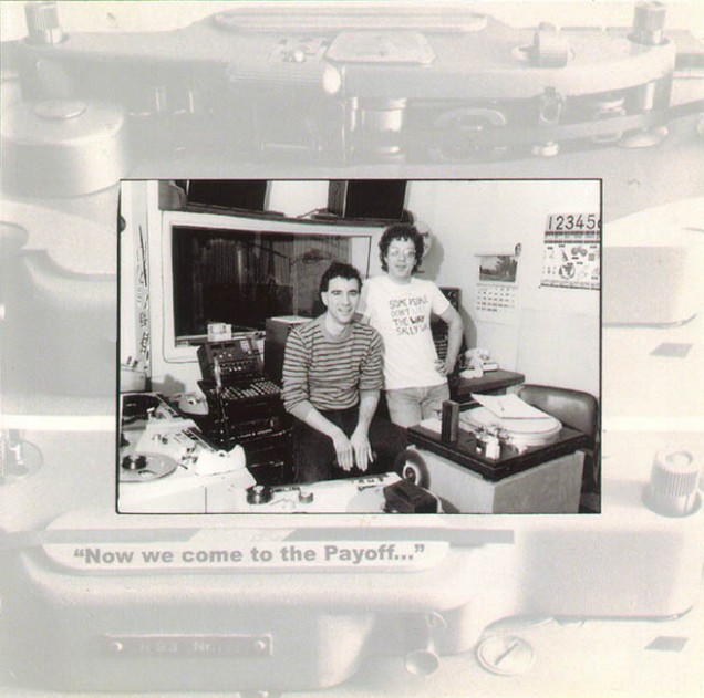
DK and I interviewed the dynamic duo in Double Dee's studio after a great sushi meal in what turned out to be the longest interview they'd ever done together. It was the first time we'd met Douglas and he was on top form (as was Steve) throughout the two hour recording.
After I'd gone through the material he dug out the original re-edit of Led Zeppelin's 'The Crunge' that he'd made for 'Lesson 3' so that we could use it in the piece. Likewise Steve provided adverts, audio flyers for old gigs and the original session material for the unfinished 'Lesson 4' from back in the eighties.
-
Two versions exist, a two hour internet broadcast one and another for the double CDs that has 17 more minutes of material. When Douglas heard the final show he emailed me within 20 minutes to say thanks as he was totally blown away.
Info
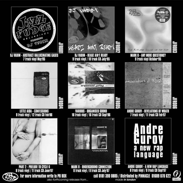
RELEASED: 2003
FORMAT: 2xCD
LABEL: n/a
CAT NO.: n/a
MIXER: Strictly Kev
GUESTS: DK
SPOTTERS DELIGHT: A handful of handmade CDR versions include extra material, radio ads and outtakes
EXTRA ZEN: