DJ Food ‘Simian’ Pts 1 & 2

Info

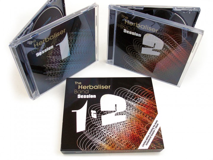
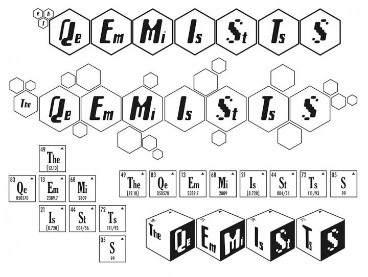
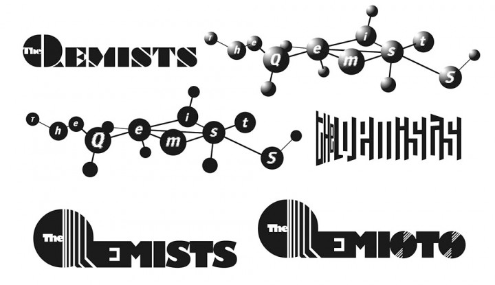
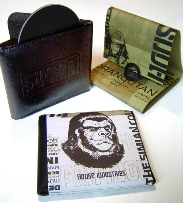
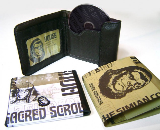
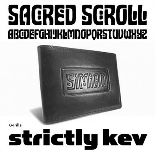
  • Part of the Simian typeface package from the House Industries type foundry. Two ape-‘themed’ tracks to accompany the font ‘Simian’ which referenced the shapes and typefaces in the Planet of the Apes films. These two short tracks came on a 3″ CD housed in a leather wallet, embossed with the Simian type logo. Probably the most expensive DJ Food tracks available

Info

RELEASED: 2001
FORMAT: 3"CD + wallet
LABEL: HOUSE INDUSTRIES
CAT NO.: N/A
PRODUCERS: Strictly Kev
SPOTTERS DELIGHT: Wallet came in various different wraparound paper covers
EXTRA ZEN: House Industries Simian page

Dynamic Syncopation / DSP – labels & logos (unused)

Info

    • RELEASED: Nov 2001
    • FORMAT: 12″
    • LABEL: NINJA TUNE
    • CAT No.: DSP001
    • DESIGN: Openmind
    • EXTRA ZEN: Discogs page

    I did a load of logos for Dynamic Syncopation – then trimming their name to DSP – both for the group and the sub-label DSP records. The single release was called ‘Trifeasaurus Rex’ so I made the title into the silhouette of a Tyrannosaurus but they weren’t into it.

Info

The Irresistible Force ‘Nepalese Bliss’ (unused)

Info

    • DESIGNED: Aug 1998
    • FORMAT: 12″ / CDS
    • LABEL: NINJA TUNE
    • CAT No.: ZEN1273 / ZENCDS73
    • DESIGN: Openmind
    • EXTRA ZEN: ninjatune page / BUY

    I was sharing a flat with my friend David Vallade (amongst others) and we both knew Mixmaster Morris as he used to live nearby and come and play at our Telepathic Fish parties. When Morris signed to Ninja he asked for David to design the cover as he had previously seen his artwork on various releases for MLO, Worm Interface and Reflective and had had him paint his bathroom from floor to ceiling with his illustrations.

    As I was doing 99% of the Ninja artwork at the time and rated Morris highly as a DJ I obviously wanted a crack at it too so we both did something. Mine was more graphic and mainly centered around a triple ‘M’ logo I’d already designed in a few different versions that Morris liked. Here’s what I had in mind although it only got so far because it became obvious that Morris wanted David to do it so I didn’t push on … David’s version with the serrated ‘roach filters’ card cover for the CD single is much more exciting.

Info

Jazz Fudge Recordings inner sleeve / logos

Info

    • DESIGNED: 1998 / 1996
    • FORMAT: LP
    • LABEL: JAZZ FUDGE
    • CAT No.: n/a
    • DESIGN: Openmind

    This sadly never got made but was intended to be printed and used as the paper inner on all future Jazz Fudge releases. It comes from the designs for the Isolationist LP in style and featured a discography up until that point plus other miscellaneous audiophile info.

    Also the ‘Russian JFR swirl’ logo: this was an attempt to create a logo like the Phillips 21st Century series records had that would be present on each release and indicate a kind of experimental nature and hark to the music concréte side of the label.

Info

Tusken Raiders ‘Bantha Trax’ (unused)

Info

    • RELEASED: 1995
    • FORMAT: 12″
    • LABEL: Clear
    • CAT No.: CLR407
    • DESIGN: Openmind / Tusken Raiders logo by Ben Drury
    • PHOTOGRAPHY: Openmind
    • EXTRA ZEN: Discogs page

    Back in the early 90’s I did a fanzine with my housemates (the beginnings of Openmind actually) called ‘MindFood’ which focused on ambient and electronic music. It only got to 4 issues but in that time we featured a cookery recipe from Richard D.James, features on Irdial and Scanner and an interview with Mike Paradinas aka Mu-ziq / Tusken Raiders / Jake Slazenger etc.

    I went to his house in Wimbledon (I think) shortly after he had released ‘Tango N Vectif’ and ‘Bluff Limbo’, did a short interview and took some pictures of his set up and general bedroom/studio. I cut these up and made a montage for the fanzine and reused the images for this cover that I knocked up on spec for Clear’s second release. I’d gotten the Tusken Raiders tag lettering from Hal, who did their general layout, and did an opposite to their first release – the Jedi Knights –  an all black cover with white lettering instead of the other way around. The ‘Bantha Trax’ lettering was supposed to look like tracks made in sand and I was pretty pleased with it overall but they had their own ideas.

    Also I did my own version of the Clear graffiti lettering logo, this was used when I laid out Gescom‘s ‘Machines Our Parents Used’ release for the label. Mike P released a second Tusken Raiders single on another label later on that was very black in general tone so maybe I was onto something.

Info

DJ Food ‘The Shape Of Things That Hum’ EP

Info

    • RELEASED: 30 Nov 2009
    • FORMAT: 12″ / DL / CD promo
    • LABEL: NINJA TUNE
    • CAT No.: ZEN12252 / ZENDNLS252 / ZENCDS252P
    • DESIGN: Openmind / Henry Flint
    • PHOTOGRAPHY: Alice Ceresole
    • SPOTTERS DELIGHT: 12″ A2 double sided poster cover + full colour inner sleeve. DL and CD promo contains three exclusive bonus remixes by Mr P (PC) unavailable on the vinyl.
    • EXTRA ZEN: ninjatune page / BUY

    Part 2 of the trilogy – a 5 track 12″ housed in a full colour inner sleeve, wrapped in an A2 double-sided poster cover, another of Henry Flint’s amazing illustrations – done specially for this release. He only provides the line work though and I colour each image in Photoshop using a combination of photos, transparency and colour balancing.

    It’s a painstaking process involving many layers, minute mouse work and multiple options and variations. I did several screen shots of the work in progress as I went this time (see animated gif in gallery) and I’d estimate it took roughly 2 weeks of intense work. It wasn’t helped by Photoshop bugs flattening the image for no reason after saving. I’d wake up the next morning to find a whole session had been lost and had to use Time Machine to go back a stage to un-flatten the thing. Another setback was ‘the orange juice incident‘ where one of my sons managed to knock a whole glass of juice over the laptop – effectively frying the logic board – after a weeks work on it in the evenings on holiday.

Info

King Cannibal ‘So… Embrace The Minimum’ / ‘Dirt’

Info

    • RELEASED: Oct 2009
    • FORMAT: CD / CD Promo
    • LABEL: NINJA TUNE
    • CAT NO.: ZENCD151 / ZENCD151P
    • DESIGN: Openmind
    • EXTRA ZEN: ninjatune page / BUY

    A straight crop of the center of the album cover, although no one had seen the full image at the time, see the ‘Let The Night Roar’ entry for a full explanation. I finally got the KC logo how I wanted it with this release too, lining up the diagonal lines on the ‘n’s with the blades to form a sharper look.

    Looking for typefaces for the album I’d found a fantastic Brazilian custom font designer called Marcio Hirosse on the web who I’d bought several typefaces from for the project, namely one called DESTROYER which seemed to be apt for Dylan’s music. This was a bit too much on its own so I combined it with another font to make it more readable.

Info

King Cannibal ‘Let The Night Roar’

Info

    • RELEASED: Oct 2009
    • FORMAT: CD / CD Promo
    • LABEL: NINJA TUNE
    • CAT NO.: ZENCD151 / ZENCD151P
    • DESIGN: Openmind
    • SPOTTERS DELIGHT: spot Dylan in the cover image
    • EXTRA ZEN: ninjatune page / BUY

    I definitely bit off more than I could chew with this cover (no pun intended). The initial image idea had been to create a mass of intertwined bodies, all covered in latex, gas masks, bondage gear and the like (made for some interesting ‘research’). Whilst putting all this together I came to the conclusion that this needed something more and sitting at the table casually talking with my wife about seemingly unrelated events, I got a vision and knew how I could make the image better. Two outer rings of machines and photos of the Earth from above would encircle the latex bodies like a darker, industrial take on Mati Klarwien’s painting ‘A Grain of Sand’.

    Now that this vision had manifest itself in my mind the only thing to do was go back to the drawing board and start adding to the artwork at hand. I often find this happening, something is adequate but a flash of inspiration can make it better or even brilliant and I am helpless to ignore it and go for the easy option. A week later and I’m sitting at the computer at 3am, literally falling asleep at the mouse, with a 1.4GB image file comprised of 180 layers and the machine is seriously struggling to do what I’m asking it. The picture ended up over 220 layers and nearer 1.5 GB – definitely a record for me and not something I’d like to push the computer to too often.

    Both Dylan and I were pretty gutted when Ninja said they weren’t going to do a last 12″ single from the album (not a physical one anyway) as we wouldn’t see the cover image any bigger than CD sized. All that effort and work, lost on a format little bigger than a coaster! I’ve taken the step to have them available as a series of desktops and a high quality jpeg of the cover, twice the size of an LP sleeve, at a resolution that you could make a poster from in the download section.

Info

King Cannibal ‘Virgo’ / ‘Murder Us’

Info

    • RELEASED: May 2009
    • FORMAT: 12″ / CD Promo
    • LABEL: NINJA TUNE
    • CAT NO.: ZEN12233 / ZENCD233P
    • DESIGN: Openmind
    • PHOTOGRAPHY: Openmind
    • EXTRA ZEN: ninjatune page / BUY

    This one had plenty of people guessing with various explanations of blood, entrails, worms, paint and the like. It was actually old fabric paint dropped in water which made it curl into worm-like shapes briefly before dissipating into a brown cloud. I got one decent shot of it at the start and all subsequent attempts didn’t capture the same effect. See the interview on the Keep Up! website for more details.

    I also did some experimenting with altering waveform images from an audio restoration program where it showed the sound more in terms of colour than spikes. Several versions of this concept were produced but we both agreed that the paint was stronger. I’ve included various different placements of the image with alternate type treatments along the way before I arrived at the final version.

Info

The Herbaliser ‘Session 1 & 2’

Info

    • RELEASED: Aug 2009
    • FORMAT: CD / Ltd 2xCD
    • LABEL: !K7
    • CAT No.: !K7245CD / !K7245CDLtd
    • DESIGN: Openmind / Ollie Teeba
    • PHOTOGRAPHY: Jake Wherry
    • EXTRA ZEN:!K7 page / BUY

    If you’re not familiar with the ‘Session 1’ album there is good reason as it was recorded nearly 10 years before this one and not released on Ninja Tune but on the Herbs’ own Dept H label which was distributed by the now defunct Beechwood Music. This was a live album of various cuts from their first three long players in the form they’d been playing as a full touring band and was fairly limited at the time, going on to command high prices. Now the band have recorded a follow up with material from the last three albums and !K7 have reissued the first volume in a special double CD pack as well as the regular, singular ‘Session 2’.

    Having done all their artwork since the first album with the exception of ‘Session 1’ and the last LP ‘Same As It Never Was’ (other work commitments) I was delighted to go back and fill a space in the catalogue. I completely redesigned the first volume and paired it with a new look for the second from an initial idea by Ollie Teeba – a simple but classic pair of sleeves focusing on large 1 and 2 numerals containing photos from various recording sessions. I ran with this and produced an array of designs in a kind of library music style with geometric number forms, some of which feature inside the booklets now as there were too many to use. Here are some more of the alternate designs as well as variations where I included the number 1 & 2 in the word Session although it was later taken out (!K7’s decision not mine).

Info

DJ Food ‘One Man’s Weird Is Another Man’s World’

Info

    • RELEASED: 6 July 2009
    • FORMAT: 12″ / DL / CD promo
    • LABEL: NINJA TUNE
    • CAT No.: ZEN12232 / ZENDNL232 / ZENCD232P
    • DESIGN: Openmind / Henry Flint
    • PHOTOGRAPHY: Alice Ceresole
    • SPOTTERS DELIGHT: 12″ A2 double sided poster cover. CD promo contains an exclusive bonus remix by Bundy K Brown different from the one available on the download version of the EP.
    • EXTRA ZEN: ninjatune page / BUY

    How to go about dressing you own record? A blank canvas but the thing that the public will associate the music with first. I did something I didn’t think I’d ever do, I let someone else have a big hand in it. I’ve been a fan of comic artist Henry Flint’s work for ages, accruing tens of pages of it over the years firstly from dealers and then from him personally. For me he embodies the perfect collision of old school 2000ad artist with contemporary comic illustrator, someone who can adapt and ape a number of styles with apparent ease and can draw robots, cities, spacecraft, humans and aliens with equal success. After purchasing some art from him he included a number of postcards of his personal work. They completely blew my mind and I asked if he was selling any of it as it was perfect for the artwork I had in mind on a forthcoming record.

    They weren’t for sale but he had some more and kindly sent me a CDR of over 30, all different but mostly insanely detailed, flights of fantasy. I’d been thinking of commissioning him to do something with very random guidelines but these were fully formed and he allowed me to do what I wanted with them. They were also in black and white and I knew I could put my stamp on them by colouring them which I set about doing, occasionally sending him versions for feedback. The question now was how to present them? Most were A3 sized and, because of the detail, really needed to be seen bigger so a poster sleeve idea was formulated and I went back and forth with the printer to find the best, and cheapest, way to do it all, complete with inner, outer and plastic sleeves.

    It was a 12″ and download only release but Ninja wanted a CD promo so I did a nice spot varnish effect on black with the disc on body and the cover includes a partially coloured version of the final poster image. As this was the first of three EPs I continued this theme as I had plenty more of Henry’s drawings to use before the series was done.

Info