DJ Food ‘Dub Lion’ (Remake)

Info

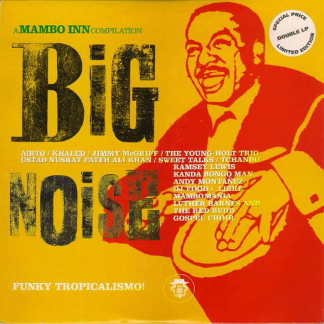
  • This originally appeared on the Mambo Inn compilation 'Big Noise' released in 1994 which was very hard to find for a while
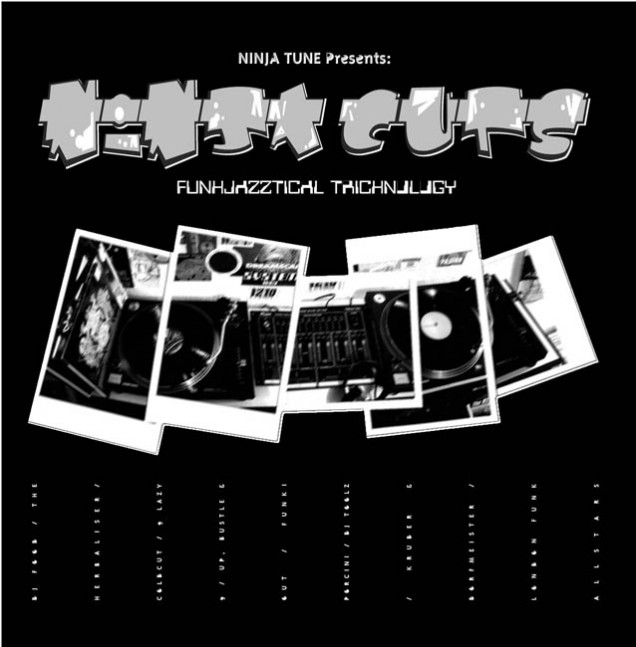
Info

RELEASED: March 1995
FORMAT: 2xLP / CD
LABEL: NINJA TUNE
CAT NO.: ZEN15 / ZENCD15
PRODUCERS: Matt Black, Jonathan More, PC
COMPILATION TITLE: Ninja Cuts: Funkjazztical Tricknology
EXTRA ZEN: ninjatune.net / BUY

Osymyso ‘Fruit From Fifty’ project

Info

    • RELEASED: September 2006
    • FORMAT: 12″
    • LABEL: NOODLES DISCOTHEQUE
    • CAT No.: NOODOON101 / NOODOON202
    • DESIGN: Openmind
    • ILLUSTRATION: Douglas Pledger
    • EXTRA ZEN: Batch 1 / Batch 2  / Osymyso Soundcloud

    I was doing a gig in Nottingham in late November 2004 with Osymyso and we got talking about albums, the internet and how to get people interested in what you were doing and keep them interested. I had taken part in Otis Fodder’s 365 Days project the year before, posting an mp3 a day for free and Mark decided that his next album would take on a similar form.

    Because he is constantly thinking about palindromes he had come up with the idea of doing 50 songs in 05 – roughly one a week – and then compiling them together to form an album at the end. When I suggested that he turn the ‘S’ in Osymyso to a ‘5’ the deal was sealed and we resolved to make it happen. He would handle the music and I would handle the design of it with his friend taking care of the website where the songs would be posted.

    Alas, despite good intentions, a track a week is pretty hard going unless you have a stockpile beforehand and he managed 14 (I think). These were later released on Si Begg’s Noodles Discotheque imprint as two EPs with Douglas Pledger illustrations. Somewhere I have the designs for the other three records, I’ll have to dig them out.

Info

Bonobo ‘Live Sessions’ EP

Info

    • RELEASED: Sept 2005
    • FORMAT: CD
    • LABEL: NINJA TUNE
    • CAT No.: ZENCDS170
    • DESIGN: Openmind
    • EXTRA ZEN: ninjatune page / BUY

    Simon Green (Bonobo) wanted an EP of new and live tracks to sell as merch on his US and Canadian tour so i was asked to come up with some simple but covetable as a tour exclusive. He had 6 tracks plus the previously released Four Tet remix of ‘Pick Up’ and my idea was to do a partially silvered CD with part of the artwork showing through and no booklet so that the disc became the cover graphic. For this you need a maximum of 35 minutes of music and ‘Pick Up’ was a nine minute epic which had to be edited down to fit on the allotted time.

    This was one of the easiest jobs I had done in a while as Simon loved the first design i showed him! The Bonobo logo starts on the underlying tray and is then printed across the CD disc, reappearing through the centre spindle hole and then off on to the disc again so you have to turn the disc at the correct angle so that the letters match up. The back cover imagery of the London Planetarium was taken from an old book on telescopes and the other blurred light photography was taken in Japan when I was messing about with a new digital camera.

Info

The Herbaliser ‘Take London’

Info

    • RELEASED: May 2005
    • FORMAT: 2xLP / 3xLP / CD / 2xCD
    • LABEL: NINJA TUNE
    • CAT No.: ZEN98 / ZEN98X / ZENCD98 / ZENCD98X
    • DESIGN: Openmind / Ollie Teeba
    • PHOTOGRAPHY: Jake Wherry / various
    • EXTRA ZEN: ninjatune page / BUY

    The idea for this sleeve took it’s original inspiration from a film poster for The Last Picture Show which showed a row of buildings at the bottom, titles near the top with actors faces in boxes and a large expanse of blank space between. Ollie is a big fan of film and the design of film posters and had come up with the title ‘Take London’ as a tribute of sorts to the East End gangster films now largely being aped by people like Guy Ritchie in ‘Lock, Stock…’ etc.

    We made a geographically fictional London skyline with as many major landmark buildings as we could think of, being careful to put them on their respective sides of the river even though buildings like the gherkin are obviously nowhere near Nelson’s column. The faces of the band replaced the original actor boxes but we soon hit upon the idea of having windows die-cut in the sleeve to show through different faces because the band has many members and features even more guests. We knew the LP would at least be a double vinyl so that would give us a potential 4 sides of inner sleeve to play with in terms of different images to show through the windows. These were easily filled and thus, you can have 4 variations of the front sleeve depending on which side of the inner sleeves you insert.

    Our initial attempts at the layout failed miserably because they seemed to be pale imitations/parodies of 60’s film posters which have been done to death already and we wanted to get away from that to something that alluded to them but wasn’t confined by homage. I’d recently seen the Saul Bass retrospective at the Design Museum and was acutely aware that his style was affecting the design process as it was probably the very thing that inspired most of the posters we were taking as inspiration ourselves. I wanted to play up to the typographic side of the city and so made graphic versions of the London street signs saying ‘The Herbaliser – Take London’ using the typeface ‘vinyl’ (how apt) which is very close to the sign font. Also I made directional signs on posts for the logo and side divisions – we ended up with North End, East End, South End and West End instead of sides A, B, C and D.

    We’d been playing around with a gloved hand which was coming in from one side and was grasping Big Ben which was extending from the ‘n’ on the original ‘Take London’ lettering. It was  a literal visual translation of the title and wasn’t really working but we wanted something to fill a portion of the ‘sky’ on the cover other than the title and band name. Ollie had just seen a graffiti documentary with very abstract title sequences featuring a whole host of arrows, cross sections of letters and other effects and we decided to feature something like this. The Thames river is obviously a major feature of the city of London so I made a ‘graffiti’ version of it in Freehand which was then stretched with exaggerated perspective to form the various shapes across the sleeve and the rest of the package.

    The 3 (on the limited triple vinyl edition) inner sleeves gave me loads of space to use these images and, if you lay them out together, they join up to form yet another image of the Thames graphic (both sides too, if you have 2 copies). Seen separately though the inner sleeves make their own kind of street landscape as the shapes form their own skyline with the addition of the street signs and signposts. The colour scheme was pure black and white up until this point with a splash of red (again the Saul Bass influence) which we decided to change because it immediately made the homage connection. We substituted it for yellow on a black background as it stood out bright and bold and gave the sleeve a different quality, almost bordering on industrial warning sign colour schemes.

    The London skyline and the ‘Thames’ graphic were, I felt, too separate so I anchored them together with a large signpost sporting the Herbaliser name emerging from the city. Big Ben was added back in and the icing on the cake is a gloss spot UV varnish across the back and front to emphasise the quality of the whole package. On body CD and LP designs feature scenes of the ‘Thames’ snaking across the sky as viewed from below whilst various signs point out track listings and band/title. The CD comes in a die-cut slipcase version of the LP sleeve and the booklet can be folded in 4 different ways to show through 4 selections of the artists, just like the vinyl.

Info

Cinematic Orchestra ‘Man With A Movie Camera’ single / remixes

Info

  • I had all I needed with the artwork for the album with this one and, as it was a version of the title, it was pretty obvious what was going on the cover. I flipped the white to black so it wouldn’t be too confusing with the album and single together and Ninja paid for a nice embossed logo on the 12″ sleeve.
    The remix single was a weird anomaly that turned up much later and had reused images to give the remixes some context. I’ve included some different versions along the design process too.

Info

Solid Steel presents ‘Pinball Number Count’ / ‘C Is For Cookie’

Info

    • RELEASED: Sept 2003
    • FORMAT: 12″
    • LABEL: NINJA TUNE
    • CAT No.: ZEN12143
    • DESIGN: Openmind / Sesame Street
    • PHOTOGRAPHY: Sesame Street
    • SPOTTERS DELIGHT: One detail that was omitted was the parody of the Ages 35+ on the top left corner which was felt to be inappropriate by the powers that be at Sesame St.
    • EXTRA ZEN: ninjatune page / BUY

    This came about after I licensed the track ‘Pinball Number Count’ for the first ‘Now, Listen’ mix CD although I can’t quite remember how we got to doing a 12″ with ‘C Is For Cookie’. The Pinball song had never been released commercially until this release and was a beat digger’s grail for years amongst many of my friends. The ‘C Is For Cookie’ 12″ was a highly sought promo fetching over £100 because it was the first appearance of Larry Levan on vinyl as he remixed the cut in a weird twist of fate.

    As I said before, ‘Pinball…’ was already licensed but didn’t appear on the aforementioned compilation because there were worries within Sesame St. about content on some of the rap tracks elsewhere in the mix. They thought that it was an unsuitable setting for their material, being a kids organisation – fair enough. In hindsight I’m glad this happened as the mix was released on Sept 22 2001, eleven days after the World Trade Center disaster, and one of the rap tracks in question was called ‘The Terrorist’, the less said the better.

    Anyway, two years later I found myself digging through the Sesame St. archives at their NY offices, compiling a mix CD of largely unreleased funk, electronic and spoken word arcana and these tracks were on the list for consideration. I think that this 12″ was an initial trail run for Ninja and Sesame to see how they could work together and test the water for the full release later on. They gave me access to full artwork specs with very detailed guidelines on how to present their image including hi res images, Pantone colour references and font options.

    I also got all the versions of the Pinball animation – eleven altogether –  and took screen shots of all the different settings to make panoramas of the number sequences. These I then took and wrapped round each other to form a kind of pinball machine from above. The centre label was cut out on the back cover only and showed through the ball rolling around the maze and i scoured old Letraset books for suitably 70’s neon-style typefaces.

    For the Cookie side I was spoilt for choice as they had provided me with loads of different shots of the monster. My main contributions here were to design a Cookie Monster & the Girls logo complete with crazy eyes for the ‘o’s on Cookie and a nice touch of teeth marks in the barcode box. Originally there was a plan to press it on Cookie Monster blue vinyl but it would have cost too much and it was anyone’s guess how it would have sold so the label erred on the side of caution.

Info

Gray Market Goods ‘The Shape of the Future’

Info

    • RELEASED: 2003
    • FORMAT: 12″
    • LABEL: THRILL JOCKEY
    • CAT No.: THRILL 12.27
    • DESIGN: Openmind (after Vaughn Bodé)
    • ILLUSTRATION: Strictly Kev
    • EXTRA ZEN: Thrill Jockey page

    Bundy K Brown – whom I had collaborated with on ‘Full Bleed’ from Kaleidoscope – did a one-off 12″ for Thrill Jockey under this alias and asked if I would design the cover in exchange for some mixing work. He and I are big Vaughn Bodé fans and he wanted something that paid homage to the great artist so I worked up these original images based on his characters and style. I decided space was the theme and had a lizard in the cockpit of some kind of random vessel looking forlornly out of the porthole as he drifted in space.

    All lettering was scanned and pieced together from Vaughn’s own writing and the logo adopted his bubble style letters within a speech bubble. When it came to colouring the images I meticulously scanned tons of sections of his paintings to get exact matches for colours and that unique texture his paintings have. These were then mapped into the outlined images, layer by layer until I had something that could genuinely pass for an undiscovered Bodé. Vaughn’s son, Mark, got wind of this and actually paid me a compliment on the rendition, saying that it was one of the better homages he had seen.

Info

T-Love ‘Long Way Back’

Info

    • RELEASED: 2003
    • FORMAT: 2xLP / CD
    • LABEL: ASTRALWERKS
    • CAT No.: ASW12818
    • DESIGN: Openmind
    • PHOTOGRAPHY: Harriet Fuller / unknown
    • EXTRA ZEN: T-Love Facebook

    This has a long and protracted origin. T (Taura) came over to live in London for a couple of years around 2000 and ended up sharing the flat with Ollie Teeba from The Herbaliser after I moved out, hence my involvement (and his) in her debut album. Originally there were going to be two records: ‘Long Way Back’ and ‘Long Way Up’ and I designed logos for both of them. ‘Up’ never appeared because plans changed which was a shame because that logo worked really nicely but I was never 100% happy with the ‘Back’ version.

    The record was originally slated to maybe come out on Ninja which is why T has a rogue 12″ on the label in her discography but she went with Astralwerks via Virgin in the end. No matter as I was on board and had done some roughs already using a wealth of material T had provided from old photo albums, family letters, report cards, ads and even 3D objects like tins, books and a washboard. This was every designer’s dream and she wanted a kind of photo album look to it although it was her older family who featured prominently rather than her. Lots of the photos were gorgeous faded sepia shots, some creased and decaying in books that had seen plenty of handling over the years too.

    I started off by assembling a montage haphazardly across her kitchen cabinets as though they had been there for years, piling up on top of each other, vying for space. I piled up the 3D objects in with the everyday kitchen utensils too and we had a homely scene that reeked of history and references to T’s past for ‘Long Way Back’. She was going to be on the cover too but as just another photo in the collage and I photo-shopped an image of her into an old photo frame, ageing it to make it blend in with all the others.

    Harriet Fuller shot the kitchen montage and we set up some pictures of T where she was in silhouette against a white wall, moving on a slow shutter speed so that we got plenty of movement and grain. These were going to be used in the first version of the cover over the top of the montage but mostly didn’t get used for one reason of the other. There was a lot to cram in as T wanted her lyrics in there and all the usual production credits so it was going to be a gatefold vinyl, digitally aged to fit in with the look of her ‘Return of the B-Girl’ EP.

    The album took a long time amidst re-recordings of vocals and problems with the record company and it was over a year from conception to completion, maybe more. I had plenty of other things on so it got done in fits and starts when new material came in and changed a number of times when Astralwerks said they weren’t going to go for a gatefold sleeve. I ended up putting all that info on an insert and I felt, somewhere down the line, I had lost the initial drive on the project and couldn’t see the wood for the trees. It still has some nice elements and the source material is graphic gold but I was never completely happy with it. An early mock up of the cover seems to have more life than the final thing and an unused version of the kitchen montage would have been a nicer cover in my opinion.

    Postscript: seems like ‘Long Way Up’ may see the light of day now on a new label using some of my elements and many unused tracks and mixes from the original sessions.

Info

Funki Porcini ‘Fast Asleep’

Info

    • RELEASED: July 2002
    • FORMAT: LP / CD + DVD
    • LABEL: NINJA TUNE
    • CAT No.: ZEN57/ ZENCD57 / ZENDV57
    • DESIGN: Openmind
    • PHOTOGRAPHY: Martin LeSanto-Smith
    • SPOTTERS DELIGHT: The poster features behind the decks in the film ‘Shaun of the Dead’ and the same poster from that set used to hang behind the counter at Rat Records in Camberwell, only a short walk from where I live.
    • EXTRA ZEN: ninjatune page / BUY

    James Braddell (aka Funki Porcini) is always fun to work with as his ideas are usually pretty leftfield. For this album he originally gave me an image of a shooting star over a tranquil night scene in the country, a sleeping cat curled in a ball and a line of Italian, the meaning of which, I still don’t know. I took the shooting star image and made a few versions for covers but nothing really stuck, the image was just too weak to work on it’s own. I also made a graphic of a ‘swarm’ of ‘zzzzzzzzz’s to denote being asleep which later wound up on the back cover and the curled up cat was perfect for the CD disc and record label. When we first discussed ideas for the cover James had mentioned that he would really like to have a girl asleep in a room of analogue kit somewhere but we immediately discounted this as it would take way too much money to set up and shoot.

    After my initial efforts hadn’t amounted to anything I was happy with (I’d yet to show James anything) I decided that maybe the analogue bedroom idea wasn’t so un-doable after all. I drew a room with a forced perspective, looking down from a top corner and the words ‘Funki Porcini’ and ‘Fast Asleep’ across two walls as I’d decided to include the title in the image and have an otherwise graphic-less cover. Then I found as many retro analogue synth galleries online as I possibly could and downloaded countless images of Russian amplifiers, synths, speakers and other oddities for inclusion.

    Fitting the various synth and hardware into the form of the letters was a long, laborious process and numerous pieces had to be cut, distorted and given fake shading so that they looked like three dimensional pieces. When the letters had been done I filled the remainder of the room with left over bits of kit and laid a carpet of a giant circuit board which, when made negative, looked more like an Indian rug. Other pieces of ‘furniture’ then had to be found such as a record player, lamp, clock and phone to make it look more like a real room. I also managed to find an image of a cat that fitted in perspective perfectly which was a link to the cat image James had given me earlier.

    But what about the girl? My photographer friend, Martin Le Santo-Smith, came to the rescue and suggested his flatmate Christina would be perfect for the role. I printed out a nearly finished empty room image which he took away and set up a shoot in his living room in the Loughborough Junction flat they shared. While he was there he also shot a newspaper lying on the floor (I can’t remember whose idea this was but he was definitely meant to shoot it) The idea behind this was that I would include the line of Italian James had given me as the headline and also the shooting star image but I added a few other things, one being a picture of James I had taken on tour one night when he was ‘tired and emotional’. I also personalised some of the headlines…

    When I presented it to James he liked it immediately and suggested that Ninja make meter square posters of the image with nothing else on them for promotion. It’s one of my favourite images that I’ve created, largely owing to the amount of the effort that I put into it – around 130 layers in Photoshop to achieve the finished article.

Info

The Herbaliser ‘Something Wicked This Way Comes’

Info

    • RELEASED: Mar 2002
    • FORMAT: 2xLP / CD
    • LABEL: NINJA TUNE
    • CAT No.: ZEN64 / ZENCD64
    • DESIGN: Openmind / Ollie Teeba
    • EXTRA ZEN: ninjatune page / BUY

    A form of Art Nouveau was order of the day here mixed with a soundtrack cover graphic of a tree forming a spindly hand inset with various intertwined bodies. I did tons of work on this but was never happy with it, I hadn’t drawn for years, maybe just a quick thumbnail sketch to lay something out, and I wish I had made the tree better. It works much better on the single version as the arm of the Ninja logo where is has more context and you’re not focusing on the details so much.

    The back of the LP is more successful than the front as well with the Herbaliser logo transposed into an Art Nouveau carving and there are some nice instances with the type on the labels of the vinyl. Also check the woman’s face in the dead space in the crook of the elbow… Also included here are works in progress, alternate designs, colours and logos plus merchandise variations  on slip mats and shirts

Info

The Herbaliser ‘Good Girl Gone Bad’ / ‘Something Wicked’

Info

    • RELEASED: Feb 2002 / May 2002
    • FORMAT: 12″ / CDS
    • LABEL: NINJA TUNE
    • CAT No.: ZEN12110 / ZENCD110 / ZEN12110US / ZEN12111 / ZENCDS111
    • DESIGN: Openmind / Ollie Teeba
    • PHOTOGRAPHY: n/a
    • SPOTTERS DELIGHT: The US releases had different A and B sides respectively
    • EXTRA ZEN: ninjatune page / BUY / ninjatune page / BUY

    Good Girl Gone Bad

    Love the simplicity of this and the halo / devil tail angle works well even though it’s obvious.

    Something Wicked This Way Comes

    A form of Art Nouveau was order of the day here and it works much better on the single version as the arm of the Ninja logo where the tree has more context and you’re not focusing on the details so much. In some ways I wish this had been the album cover but the largeness of the Ninja might have confused people.

Info