Spaceways ‘Japanese Flute’ (DJ Food Remix)

Info

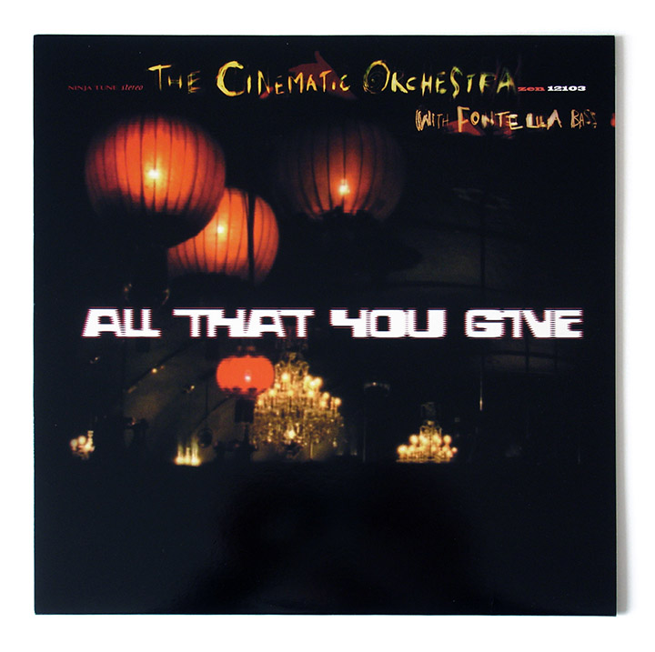
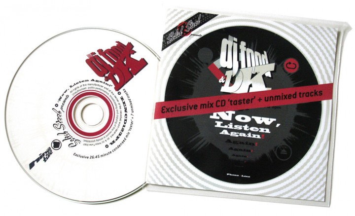
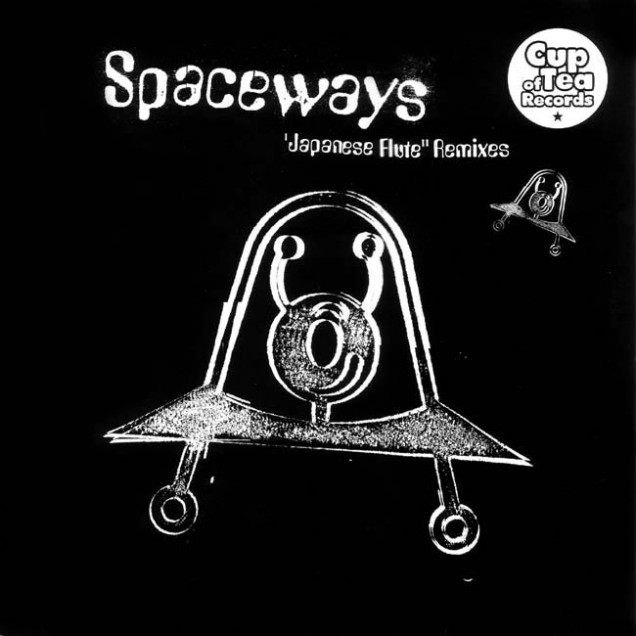
  • Great 12" on the now defunct Cup of Tea records. This also includes a Coldcut mix as well as versions by Fila Brazillia, Hidden Chipsters and label owner Pips' own Pop version.
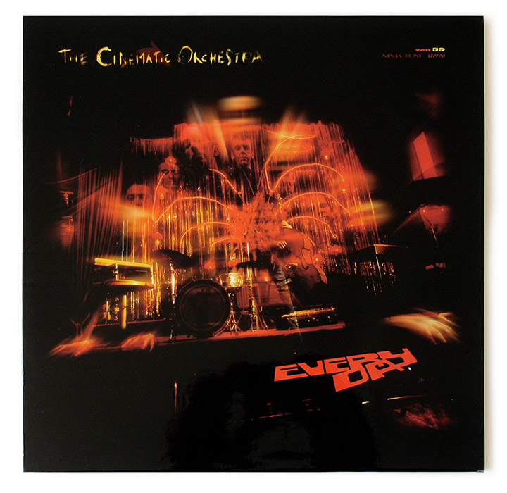
Info

RELEASED: 1995
FORMAT: 12"
LABEL: CUP OF TEA
CAT NO.: COT017
REMIXER: PC
TITLE: (DJ Food mix)
EXTRA ZEN: Discogs page

Amon Tobin ‘Out From Out Where’

Info

    • RELEASED: 14 Oct 2002
    • FORMAT: 2xLP / CD
    • LABEL: NINJA TUNE
    • CAT No.: ZEN70 / ZENCD70
    • DESIGN: Openmind
    • SPOTTERS DELIGHT: Different covers for Euro and US releases
    • EXTRA ZEN: ninjatune page / BUY

    My whole ‘thing’ with Amon is for a mechanic/organic mix of imagery as I find his music highly technical but naturally flowing and melodic. With all his artwork I’ve been exploring these themes and in this series of sleeves I scanned parts of un-built Gundam robot models. I reassembled them in Photoshop to make forms and creatures that have a quality that I would associate with his previous sleeves. Each part, once assembled into a form, was then shaded via airbrush and various layers of colour tones, lighting and textures applied until I had something I wanted.

    I’ve been a fan of Gundam for years and always loved the forms and angles of the models, this time I wanted to build my own object and Amon’s work was the perfect platform for that. This is by no means the end of my work involving these shapes but for the next Amon record I moved onto something else. He’s one of the few artists who leave me to do what I want, he trusts me to make something on my own but he knows what he likes and what he doesn’t so I make a lot of material that gets discarded. For the LP I did around 15 different variations of the cover image, some made the LP and inner sleeves and some went on to the US version and the first single (Verbal). Oh yeah, and the vinyl sleeve was actually printed totally in metallic inks where I got the printer to replace the CMYK process with the nearest equivalent metallic ink. It’s a very subtle effect and makes the image paler than usual but I wanted to try it anyway.

Info

Amon Tobin ‘Verbal’

Info

    • RELEASED: 30 Sept 2002
    • FORMAT: 12″ / CDS
    • LABEL: NINJA TUNE
    • CAT No.: ZEN12118 / ZENCDS118
    • DESIGN: Openmind & Alex Rutterford
    • SPOTTERS DELIGHT: Different covers for Euro and US releases
    • EXTRA ZEN: ninjatune page / BUY

    For this single I made 3 completely different overall designs before Amon gave approval. The first was a distorted version of a famous rapper who was sampled in the song, the second was an abstract image with tramlines that I had photographed in Switzerland but neither of these were up to scratch. I was nearly at the end of my tether when showing him the 3rd ‘Gundam’ version but he loved it and it’s one of my favourite pieces of work.

    I used some of this unpublished work (the 2nd version) for an exhibition called Versus I took part in at Parco in Tokyo where one image was made into a huge banner and part of the design was made into an exclusive Amon T-shirt.

Info

DJ Vadim ‘USSR: The Art of Listening’ / ‘Instrumentals’

Info

  • Again with this album cover Vadim wanted graffiti on the cover but didn’t want to have a conventional piece and I suggested hooking up with french writer Darco for a collaboration. I had admired his work for a while and they had already met once before so it was on after we met at a Ninja gig on the Batofar boat one September. Before anything was committed to paper there was already a plan in plan to release four 12″ singles and a 7″ of material from the album so I had a large canvas to map out in terms of space for designs to occupy.

    There where several stages to the making of this project and it was fairly labour intensive for all involved:
    Stage 1: Darco comes up with designs for a full scale piece to be painted in Paris that will be photographed and filmed on time lapse photography and video.

    Stage 2: I come up with a graphic look for the album, this includes a new logo for Vadim, a motif featuring the outline of Russia and a camouflage pattern made out of shapes from Darco’s graffiti. This camo was made into eight different colour combinations, one for each single, the album, the 7″ and the instrumental album that would inevitably follow.

    Stage 3: I take the 100+ photos shot at the site of Darco’s painting in Paris and imbed them into another Darco piece which will be split into nine panels for the artwork. Two panels each for the back and front of each 12″ single and the middle panel for the back cover of the LP with the LP front cover being the whole image in miniature. Each 12″ sleeve is colour coded with both camo and images that feature a corresponding colour prominently so as to sit well together. The idea being that if you collect all the singles and the LP you can make a giant nine panel version of the LP front cover in a similar way that the five Futura 2000 paintings on the back of the early Celluloid sleeves join up.

    Stage 4: Put this all together with a cohesive graphic look and inner sleeves or booklet showcasing Darco’s original sketch, the final painting and the time lapse images of it being created. It all came together beautifully in the end with a variation on the overall look created for the US/N. American market as well. Ninja nearly didn’t release the fourth 12″ thus making the set incomplete but, after some badgering were persuaded to finish the series.

    With such an expanse of material to draw from it was pretty easy to translate this into stickers, flyers, posters and T-Shirts and Darco did a fantastic full colour version of the LP cover image for a line he sold himself. Vadim had started his Russian Percussion tour group – with a logo designed by Remi / Rough who had taken over from me at Jazz Fudge – so this was included as well as Darco’s initial sketch graphic and the Russia motif across various items.

Info

DJ Vadim ‘USSR: The Art of Listening’ singles

Info

    • RELEASED: July 2002 / Aug 2002 / Apr 2003 / Nov 2003
    • FORMAT: 7″ / 12″ / CDS
    • LABEL: NINJA TUNE
    • CAT No.: ZEN7114 / ZEN12113 / ZENCDS113 / ZEN12108 / ZENCDS108 / ZEN12129 / ZEN12107
    • DESIGN: Openmind / Darco
    • PHOTOGRAPHY: Le Truc – FTP
    • SPOTTERS DELIGHT:  Euro and US versions have slightly different cover designs
    • EXTRA ZEN: Up To Jah / Combustible / It’s On / Edie Brikell / Til Sun’s In Your Eyes

    With these singles Vadim wanted graffiti on the cover but didn’t want to have a conventional piece and I suggested hooking up with french writer Darco for a collaboration. Before anything was committed to paper there was already a plan in plan to release 4 12″ singles and a 7″ of material from the album so I had a large canvas to map out in terms of space for designs to occupy.

    There where several stages to the making of this project and it was fairly labour intensive for all involved:
    Stage 1: Darco comes up with designs for a full scale piece to be painted in Paris that will be photographed and filmed on time lapse photography and video.

    Stage 2: I come up with a graphic look for the album, this includes a new logo for Vadim, a motif featuring the outline of Russia and a camouflage pattern made out of shapes from Darco’s graffiti. This camo was made into eight different colour combinations, one for each single, the album, the 7″ and the instrumental album that would inevitably follow.

    Stage 3: I take the 100+ photos shot at the site of Darco’s painting in Paris and imbed them into another Darco piece which will be split into nine panels for the artwork. Two panels each for the back and front of each 12″ single and the middle panel for the back cover of the LP. Each 12″ sleeve is colour coded with both camo and images that feature a corresponding colour prominently so as to sit well together. The idea being that if you collect all the singles and the LP you can make a giant nine panel version of the LP front cover in a similar way that the five Futura 2000 paintings on the back of the early Celluloid sleeves join up.

    Stage 4: It all came together beautifully in the end with a variation on the overall look created for the US/N. American market as well. Ninja nearly didn’t release the fourth 12″ thus making the set incomplete but, after some badgering were persuaded to finish the series.

Info

Cinematic Orchestra ‘Every Day’ / ‘All That You Give’

Info

    • RELEASED: May 2002
    • FORMAT: 2xLP / CD
    • LABEL: NINJA TUNE
    • CAT No.: ZEN59 / ZEN59X / ZENCD59
    • DESIGN: Openmind
    • PHOTOGRAPHY: Carl Fox
    • SPOTTERS DELIGHT: Limited heavyweight LP cover with large sticker artwork
    • EXTRA ZEN: ninjatune page / BUY

    I was never happy with how this came out although the heavy vinyl sleeve version looks great. Something just doesn’t gel with the elements, same with the single ‘All You Can Give’ which is a shame because they are great records. I was working with, first, visuals given to me from the video – shot in a ballroom down in Blackheath. Secondly, more still photos shot by Carl Fox in the same location which were of obvious higher quality that the video stills.

    As before with any Cinematic project I made loads of idea mock ups for sleeves and logos and some of these are interesting in hindsight for the way they try to illustrate the title. Talking of titles; it changed several times over the course of the design so I had to go back and redo stuff. It started as ‘Horizons’ then changed to ‘Burnout’, was briefly ‘Man With A Movie Camera’ and finally: ‘Every Day’.

Info

Neotropic ‘Sunflower Girl’

Info

    • RELEASED: Aug 2001
    • FORMAT: 7″
    • LABEL: NTONE
    • CAT No.: NTONE45
    • DESIGN: Openmind
    • PHOTOGRAPHY: Riz Maslen
    • EXTRA ZEN: ninjatune page / BUY

    A sad one as this is the last release on Ntone, Ninja’s electronic / ambient / whatever sub-label, before it was folded into Ninja (not including Neotropic either). Riz had some lovely pictures of sunflowers, I think taken on a Lomo, and they were perfect for the cover. For some reason, at the printing stage, the cover picture got substituted for one of the label images hence the odd cover choice.

    I never saw a proof and it was a one-off pressing so there was never a chance to correct it. Until now that is… here is the cover as it was supposed to look, close cropped sunflower and ornate type – lovely – another one for the ‘it should have looked like this’ pile.

Info

Double Dee & Steinski ‘The Lessons’ + ‘The Motorcade Sped On’

Info

    • RELEASED: 2001
    • FORMAT: 12″
    • LABEL: n/a
    • CAT No.: DDS01
    • DESIGN: Openmind
    • EXTRA ZEN: steinski.com

    During my association with Double Dee & Steinski over the years I was given the opportunity to design a label for a 12″ containing all three Lessons and ‘The Motorcade Sped On’. This was a big deal as these recordings were hugely influential on me and these guys were essentially heroes of mine. It was obviously going to be a bootleg so I decided to make it look like a bootleg in the style of the old disco master mixes from whence they came originally.

    This meant breaking out the Letraset and hand setting the titles in the best way i could which would still be far from as accurate as a computer and would look like it was unofficial. I set about doing this, leaving cracked letters as they were when rubbing them down to preserve the handmade look. I then scanned then in and deliberately made sure they weren’t quite straight when laid up for the printer. I was pretty pleased with the result and sent it off to the pressing plant which was abroad so I wouldn’t be able to see a proof of the final thing.

    A few months later I was sent a few copies for my archive and was amazed by what had been printed in place of my design. Someone at the artwork dept had gone to great lengths to find the exact font I had used in the Letraset and retyped and set the labels ‘properly’ in place of my ‘handmade’ design! I applaud whoever did this but they really missed the point and made all effort I put in redundant. See the original Letraset designs here next to the final version (when I actually find them!).

Info

Double Dee & Steinski ‘Now We Come To The Payoff’

Info

    • RELEASED: 2003
    • FORMAT: 2xCD
    • LABEL: n/a
    • CAT No.: n/a
    • DESIGN: Openmind
    • PHOTOGRAPHY: unknown
    • EXTRA ZEN: Discogs page

    When DK and I interviewed the guys I made sure to grab a couple of things and whilst I was as Stein’s studio I asked if he still had the competition entry for the Tommy Boy mix that they’d entered with Lesson 1. Amazingly he did and graciously did me a photocopy as well as giving me an old photo and a copy of the rare yellow label version of Lessons 1 & 2 that they had privately pressed up in the 80’s.

    This interview took up two discs and I used the yellow labels as graphics as well as a couple of the original Disconet labels that the mixes had first appeared on. Coupled with the classic studio shot of the duo from the 80’s this made a nice package.

Info

Herbie Hancock ‘The Solid Steel Interview’

Info

    • RELEASED: 2002
    • FORMAT: CD
    • LABEL: n/a
    • CAT No.: n/a
    • DESIGN: Openmind
    • SPOTTERS DELIGHT: Approx 10 copies with handmade covers
    • EXTRA ZEN: Discog page

    To say DK and I were excited about this meeting would be an understatement of galactic proportions only equaled by the size of Herbie’s afro in the seventies. From our first encounter with him via ‘Rockit’ (along with virtually every B-Boy-to-be outside of the States in the 80’s) to his jazz, electronic, funk and disco eras we would later discover, this was a very big deal.

    The cover of the CD was made up of slices from all of the records we discussed, each one showing part of a face from the original cover. A slice of Herbie from throughout his recording career – or the years we touched on in our interview – preferably including a face or eye from his record covers, one for each letter of his name. DK liked it so much he had me make up a poster for his studio, I think there are about ten handmade copies of this, mainly given out to friends but we sent one to Herbie too.

Info

David Axelrod ‘The Solid Steel Interview’

Info

    • RELEASED: 2001
    • FORMAT: CD
    • LABEL: n/a
    • CAT No.: n/a
    • DESIGN: Openmind
    • PHOTOGRAPHY: DK
    • SPOTTERS DELIGHT: Also featured on the 20 years of Solid Steel DVD
    • EXTRA ZEN: Discogs page

    This was DK’s gig the whole way although he was accompanied by his musical partner from Arc, Dean Smith, during the meeting as they are both rabid fans of ‘The Axe’. DK’s resulting mix was a labour of love taking in obscure productions along with the better known ones and a plethora of hip hop records that had sampled Axelrod over the years. At one point, when discussing a Miriam Makeba album, Axelrod cut him dead saying, “How the hell did you know that I made that record?”

    Bear in mind this was 2002 and people were still largely unaware of Axelrod’s wider production credits, DK had a spare copy of said album and, as David didn’t own one, dropped it off at his hotel later that night. When it came time to make some CDs, he photographed some of his collection relating to the interview against his old stereogram and we had some suitably retro artwork.

Info

DJ Food & DK ‘Now, Listen Again!’

Info

    • RELEASED: Apr 2007
    • FORMAT: CD / CD promo / edited CD promo / 7″ / Ltd 2×7″ promo / Serato Whitelabel.net DL
    • LABEL: NINJA TUNE
    • CAT No.: ZENCD123 / ZENCD123P / ZEN7123P / ZEN7123PR
    • DESIGN: Openmind
    • PHOTOGRAPHY: Gem Pope
    • SPOTTERS DELIGHT: Hidden track at the start of the finished CD, you have to press play and hold down reverse to get to it. The original promo CDs had a different track at one point which was removed at the 11th hour due to licensing issues. The 3 track download version was the first official release on Serato’s Whitelabel.net promo site.
    • EXTRA ZEN: ninjatune.net page / BUY / Serato Whitelabel.net page

    It was time to rejig the look of the Solid Steel mix CD series, I wanted to keep the slipcase idea but make the overall look of the covers less busy and more slick looking. I decided to make a more generic slipcase that could be used for all the mixes to come, with only changes made to the colour, track listing and barcode. Also a die cut window in the cover would show through the main graphic of the booklet inlay through the inserted jewel case inside. Add to this some spot varnish to keep the ‘soundwave rings’ graphic that had been present since the beginning but was beginning to get a bit much graphically and you have a package that looks a little bit more special than a straight jewel case CD.

    We had made the whole mix on Serato Scratch Live software and wanted to include some graphic elements that alluded to that in the design without making it seem like it was an advert for the brand. Their ‘virtual turntable’ was the basis for the main cover graphic as was the red, black and grey colour scheme. A balance of old / new / analogue/ digital was the idea as well and this was shown by close up photos of 78 rpm discs as background texture, not because we used them but because you can see the grooves much more easily on these discs and they have their own visual quality. Photos of DK and I were also needed but we didn’t want the usual ‘two guys in the studio’ or ‘standing in from of a wall’ type shots so we shot images of us alternately against collections of blank record sleeves which were then added to in Photoshop with sleeves of tracks we had used in the mix as well as sections of our faces.

    A kind of timeline runs through some of the booklet against a waveform graphic extracted from the mix so as to break up the endless text and credits that we wanted to cram in. Another waveform, that is actually the image of the hidden track that appears on the disc, was also used but ‘looped’ on itself to form a kind of ‘starburst’ image which was used in various other places on the cover. This was also a throwback to the first ‘Now, Listen’ artwork which was based on stereo demonstration record graphics and, coupled with the larger ‘NOW’ of the title, alluded to those kind of records.

    My favourite of the Solid Steel series and a bit of a version excursion with regular CD, promo CD, edited radio mix, unmixed radio selections, 7″ plus double promo 7″ and Serato control record.

Info