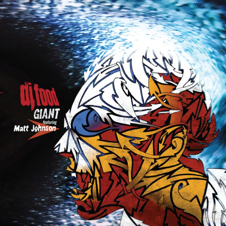
-
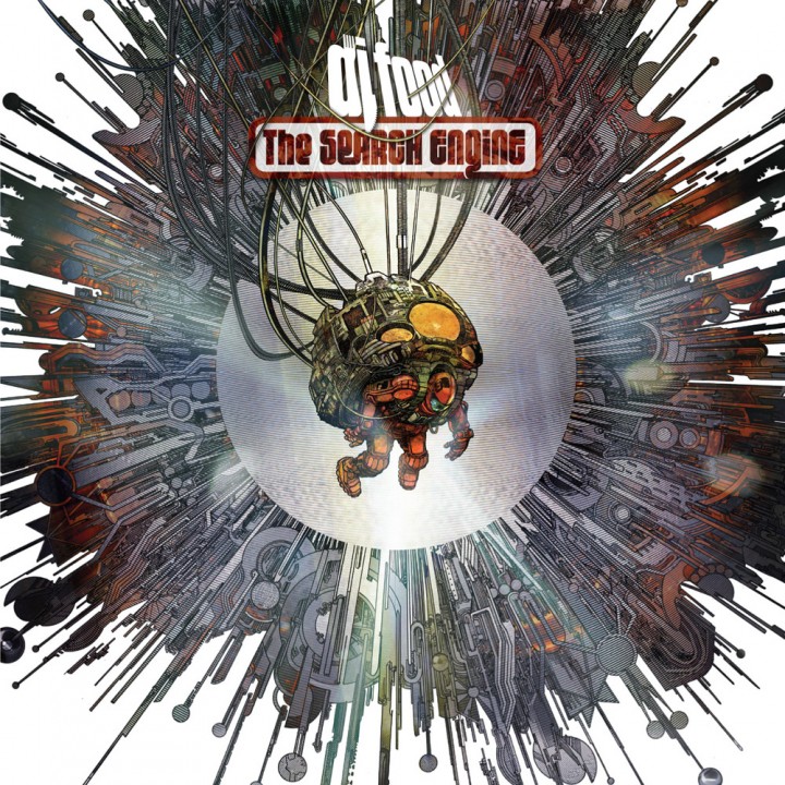
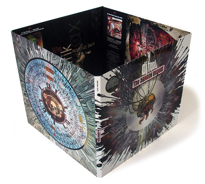
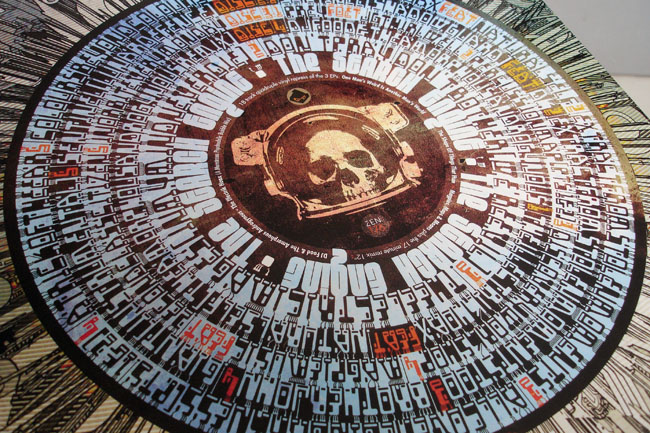
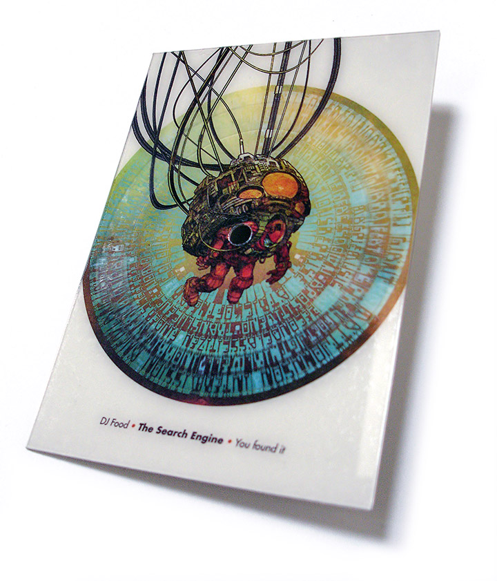
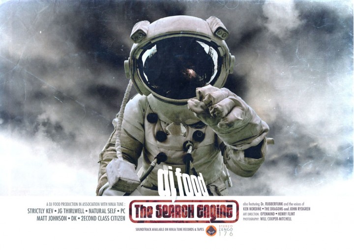
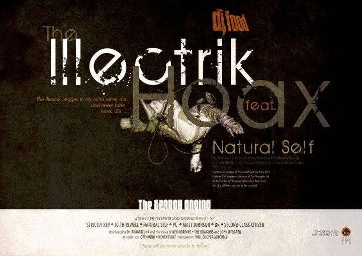
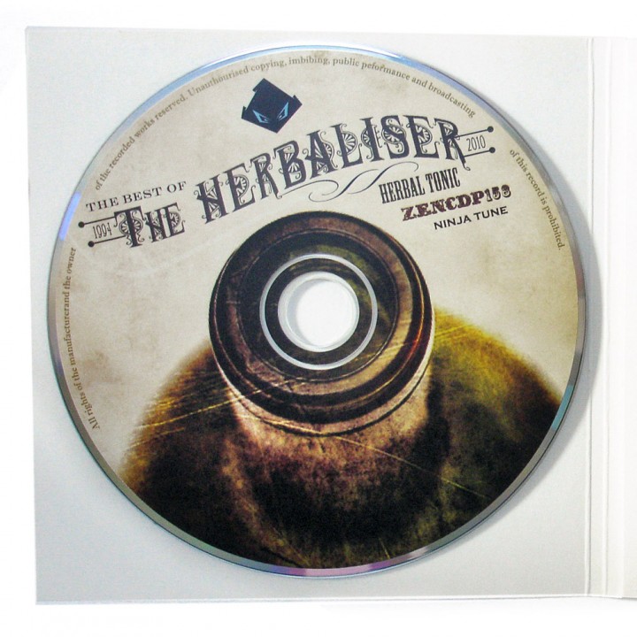
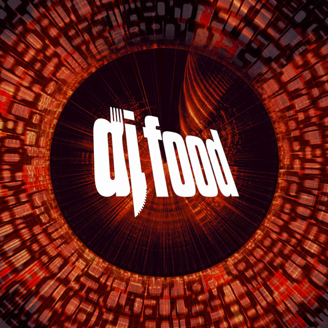
Jon Tye‘s Lo Editions series of online licensing albums gets another entry with a DJ Food sampler. This is music for TV and film, fully licensed and ready to use if you’re signed up to Universal Music’s production music service. The tracks span from early ‘Jazz Brakes’ LPs up to ‘The Search Engine’ but all songs have any vocals removed as well as names changed from the originals.
Some are exclusive edits, instrumentals, reworkings and even unreleased in some cases. You can listen online and play spot the original but there won’t be a physical release because this stuff is mainly in the digital domain these days
Info
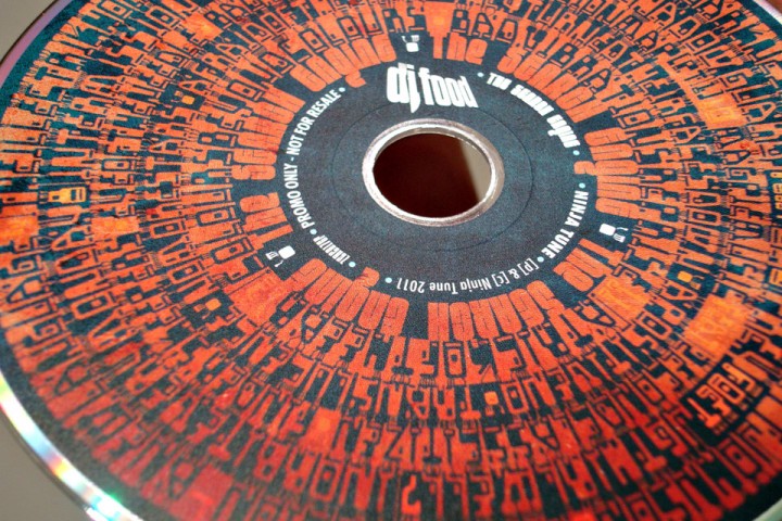
RELEASED: Oct 2013
FORMAT: DL
LABEL: Lo Editions
CAT NO.: LO-CD47
PRODUCERS: Matt Black, Jon More, PC, Strictly Kev, DK
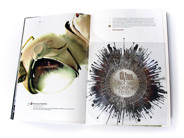
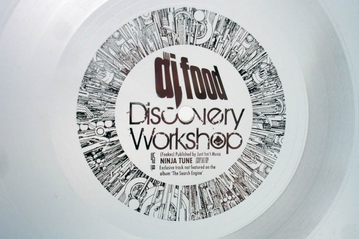
SPOTTERS DELIGHT: Contains exclusive edits, versions or unreleased DJ Food tracks retitled for licensing purposes
EXTRA ZEN: Lo Editions / LISTEN