Marvel‘s new TV series, Loki, started this week on Disney+ and the title animation and design is fantastic, playing on ever-changing fonts, presumably to highlight the different facets and sides to the main character’s personality. Marvel have had some superior title work going on with both Wandavision and Falcon & The Winter Soldier recently, the former having individual, time-specific intro themes created for each episode. With Loki, this has stepped up a gear.
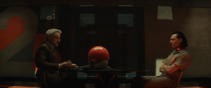
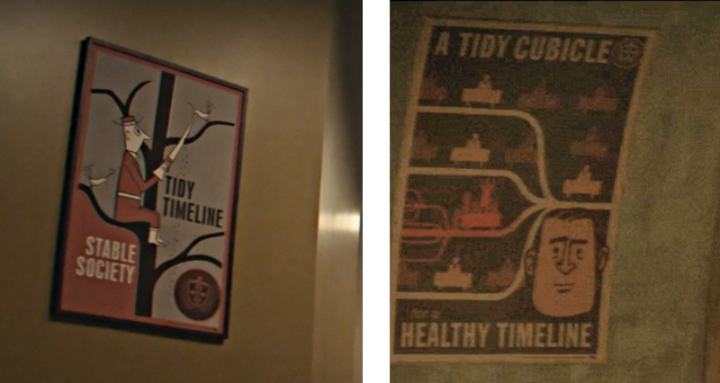
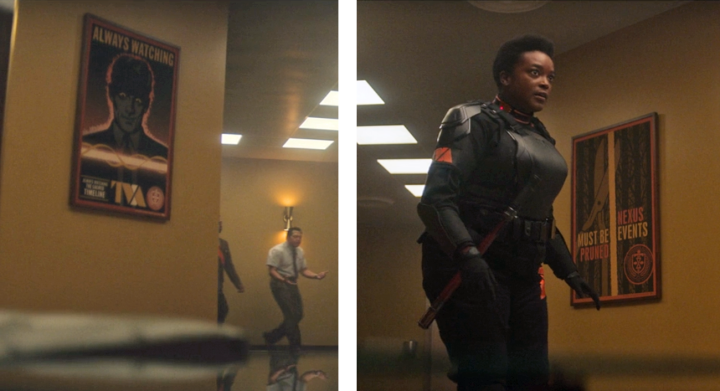
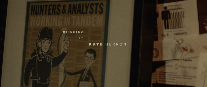
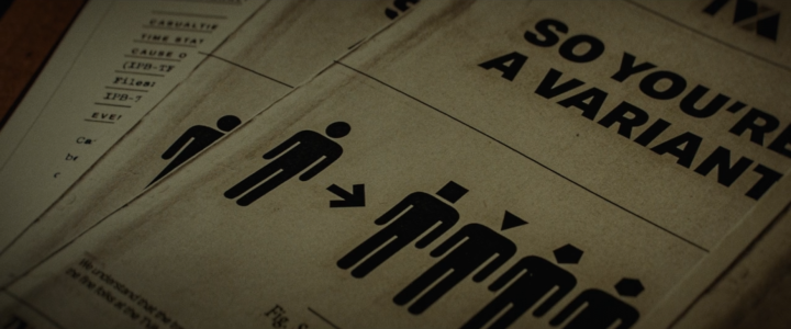
*slight spoiler alert!!* In the debut episode that appears to be a set up for a time travel chase caper where Loki may be both the good and bad guy, most of the ‘action’ is spent inside the TVA, a processing centre / court for those who disrupt The Sacred Timeline. The whole design of the Time Variance Authority has shades of Terry Gilliam‘s ‘Brazil’, with retro-modern tech, yellow tungsten lighting and 50’s styled public info posters adorning the walls.
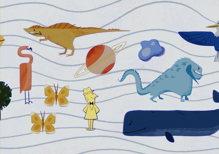
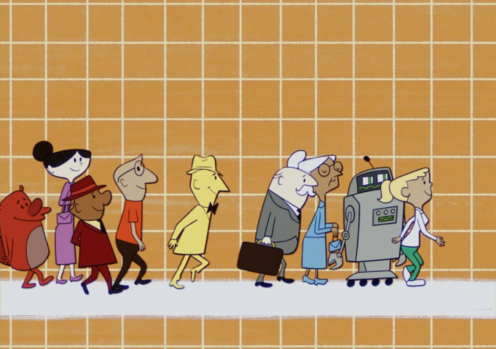
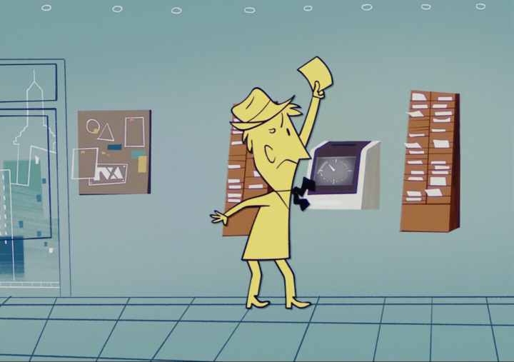
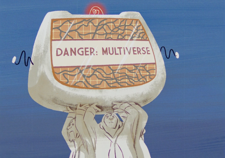
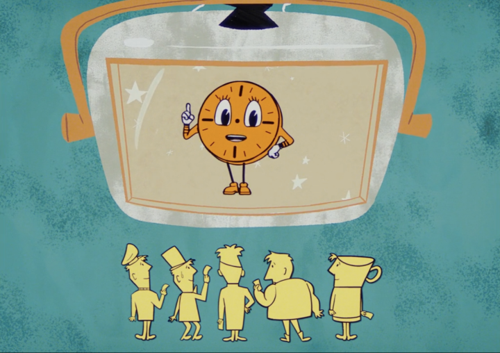
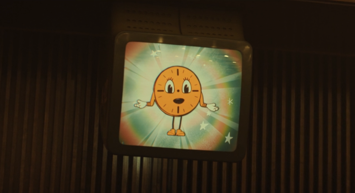
One of the highlights is a short animation, voiced by TVA mascot Miss Minutes, explaining what the agency does – for the audience’s benefit as much as Loki’s. It’s beautifully realised in what starts out as an 80’s Ulysses 31 homage before slipping into a 50s style similar to Charley Harper or some of the Halas and Batchelor cartoons like ‘Automania 2000’.
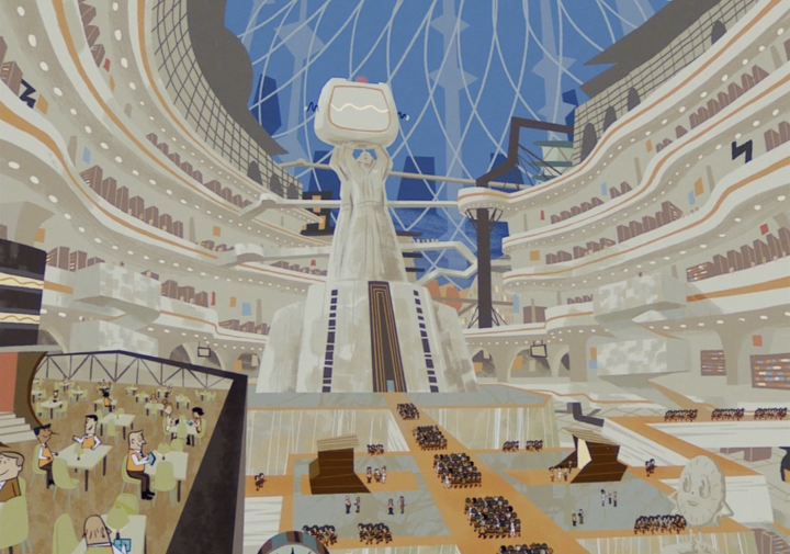
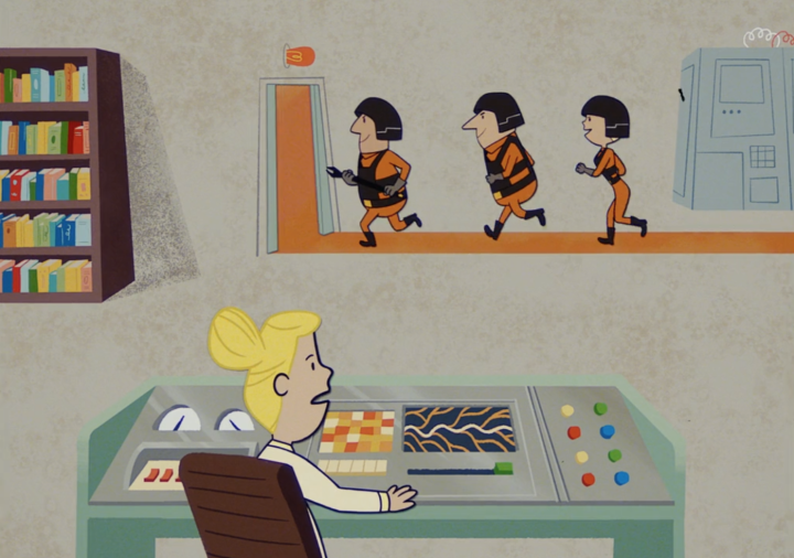
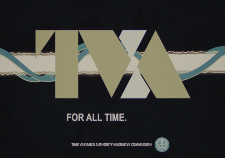
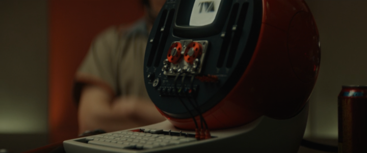
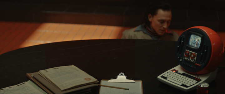
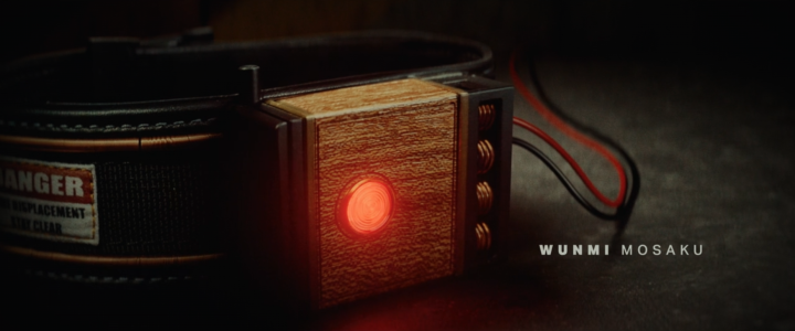
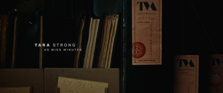
The TVA identity is nearer a 60’s/70’s airline / IBM look with employees wearing enamel badges, belt buckles and uniforms bearing the insignia as well as using headed notepaper and retro tech. Just like the work they do, design timelines seem to converge from different eras at the Authority.
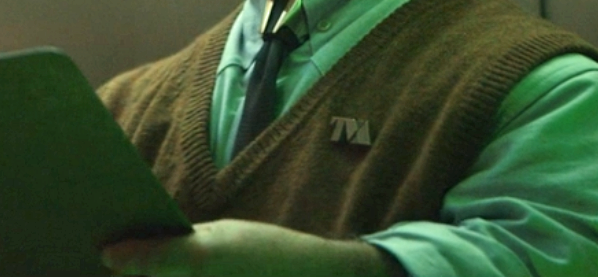
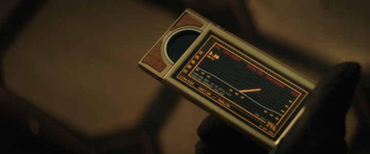
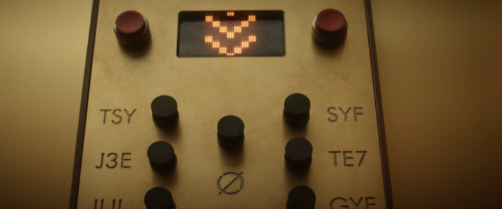
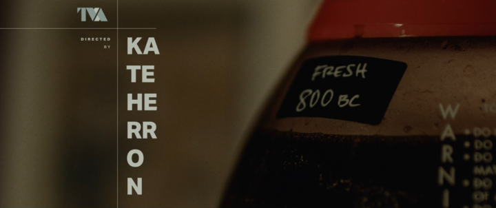
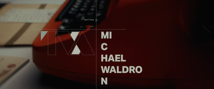
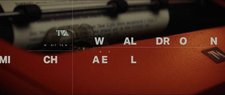
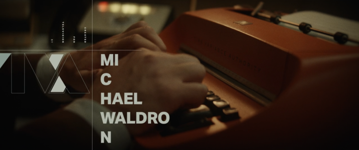
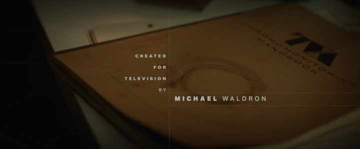
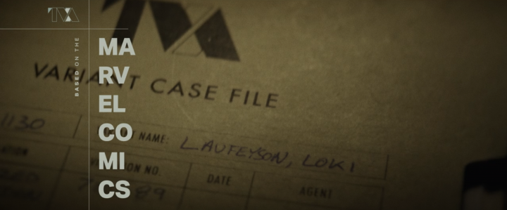
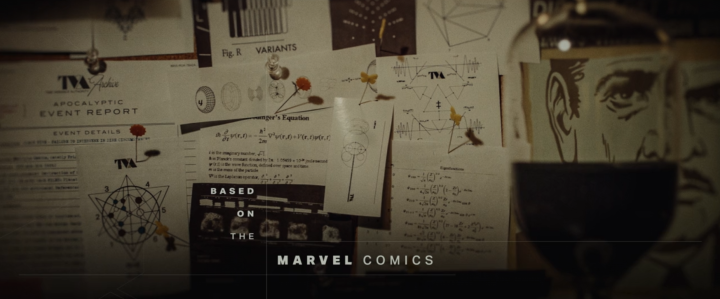
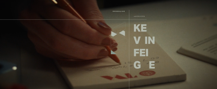
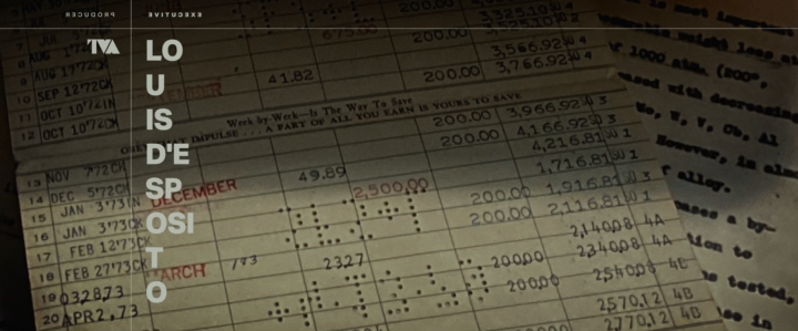
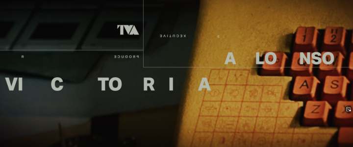
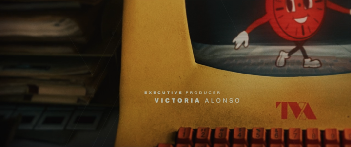
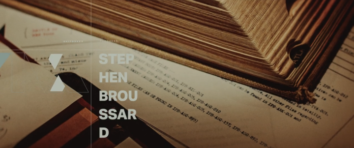
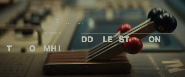
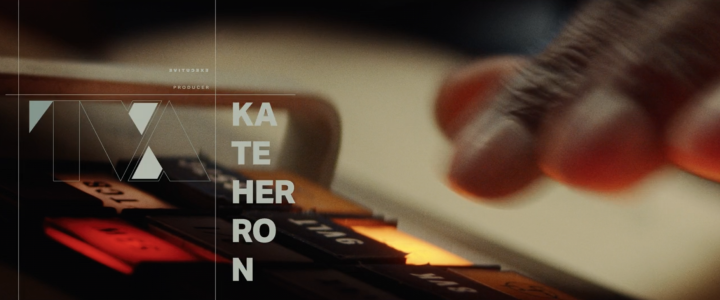
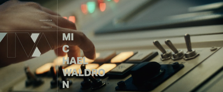
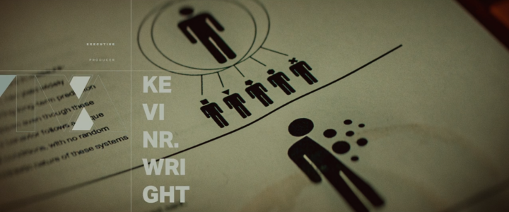
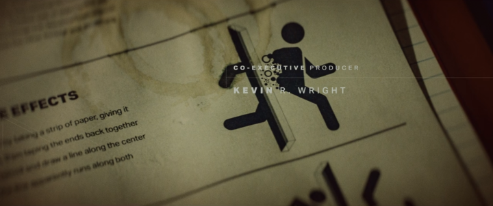
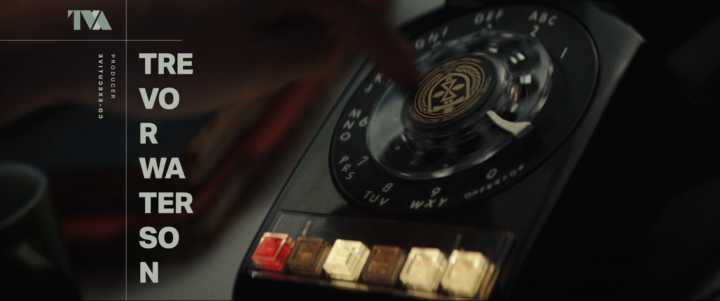
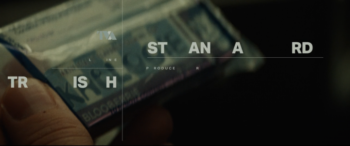
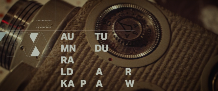
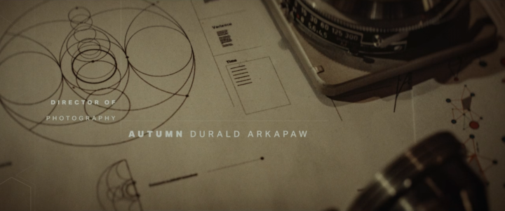
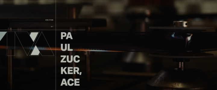
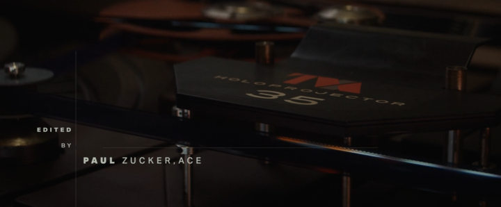
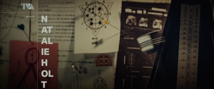
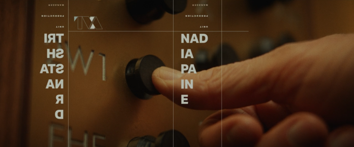
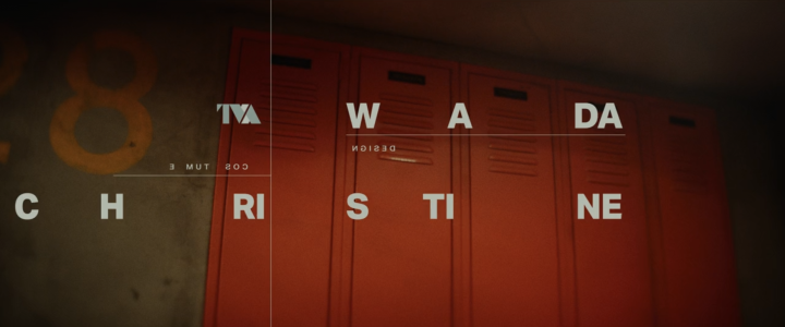
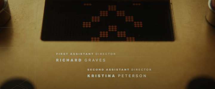
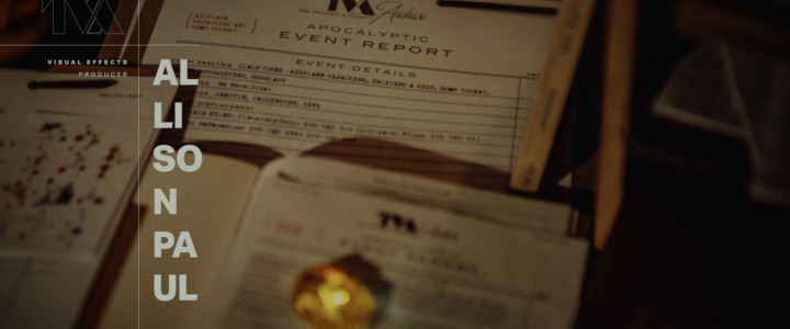
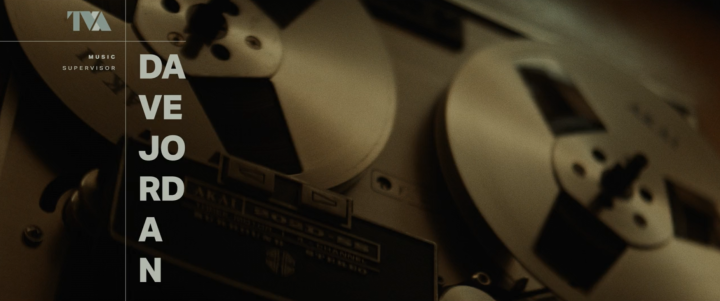
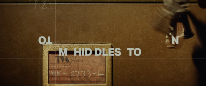
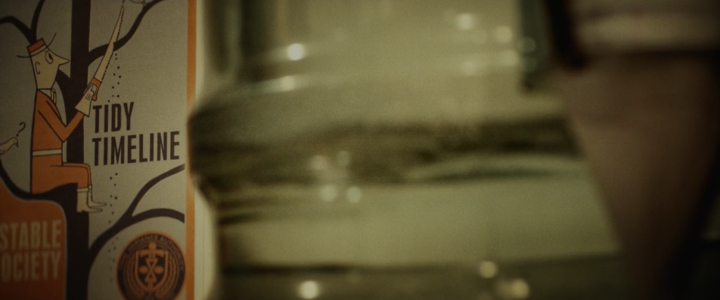
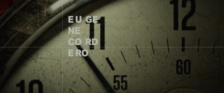
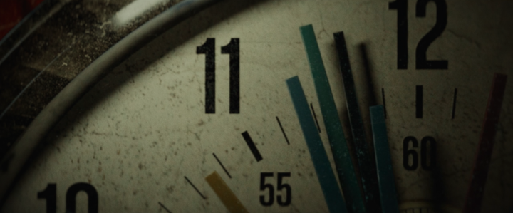
But the icing on the cake is the end credits, beautiful short focus close ups of many of the production details yet with contemporary typography details that you’ll miss if you blink. Everything is saturated but sepia-tinged for that nicotine-stained, low lighting look. Forgive me such a graphic-heavy post but this is all so tastefully done, so many great details like the clock with multiple hands.

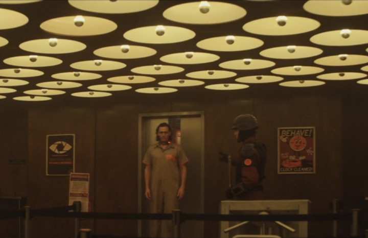
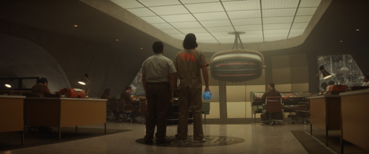
Outstanding post, lovely high-res screenshots…higher than mine, anyway. Nice to see someone else is as obsessed with the look and the end credits of Loki. I’ve found quite a few of the actual office machines online but there’s a circular mounted wall phone in a fight scene, episode 3 I think, that I can’t find anywhere. Anyway, thank you. Great post.