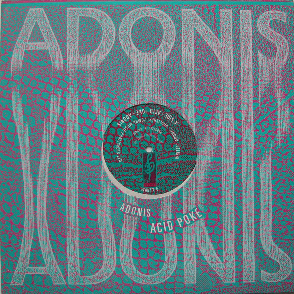
 A few weeks ago I posted a selection of sleeves from the acid house era of Desire records‘ releases which, for a brief moment, showcased some of the best house music to come out of Chicago. The uncredited designer, Andy Vella, was tasked with wrapping these releases in a distinctive house style and, curious about how they came about and who made them, I did some detective work and tracked him down. He is best known for his work with The Cure for the Fiction label (of which Desire was a subsidiary) and I fired him a few generic questions first, to give context and history:
Where, when and what did you study?
I studied at various places, which to be honest were less than effective, however, luckily I ended up at The Royal College of Art and my creative life started to fly.
What was your first notable design that the public would have seen?
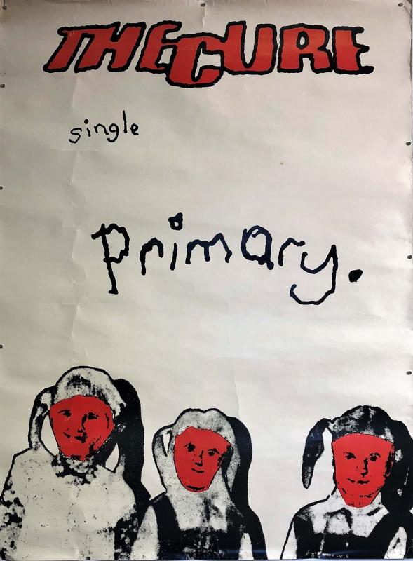
The first bit of work the public would have seen was the 60×40 fly poster for the cure’s ‘Primary’ single (it got to number 44 in the charts 1981), I do remember being 18 and walking down Oxford street thinking, ‘that looks familiar’, then realising I had worked on it.
How did you come to work with the Cure and Fiction Records?
Pure fluke really….and as luck has it I am still working with them.
(From the biography of Andy’s website: “It all began when Andy, then a teenage student in Worthing, had a chance encounter on a train with Porl Thompson, some-time guitarist in the Cure. The pair would go on to form the Parched Art design company, but not before Andy’s photographs had caught the eye of the Cure’s front man Robert Smith who asked him to design the covers of the album Faith and its single Primary.”
Looking you up on by name on Discogs, there’s a gap between 1981 and 1988 and this seems to be the golden period of your collaborative work with Porl Thompson for the Cure under the ‘Parched Art’ banner. Obviously it’s not a complete list of your work though as you aren’t credited for any Desire sleeves at all.
I went through a phase of not putting my name on lots as I thought it was uncool.
Whose decision was it to start releasing dance music on Desire, up until the mid 80s it had been sporadically releasing indie rock I think?
Chris Parry, he was also the manger of The Cure and supremo A&R maestro.
Where you into the music? Did you go clubbing in those days?
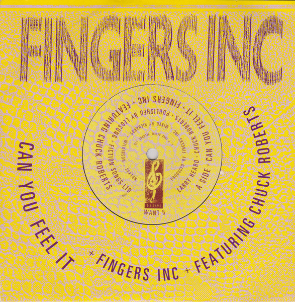
I loved it. I used to go and hang out with all the guys in Chicago Trax (Chicago of course), they were great and so accepting of me, Fingers Inc, CAN YOU FEEL IT…Yes, Ben Mays, Bam Bam, Destry, Lil Louis was always hanging about.
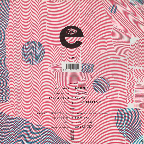
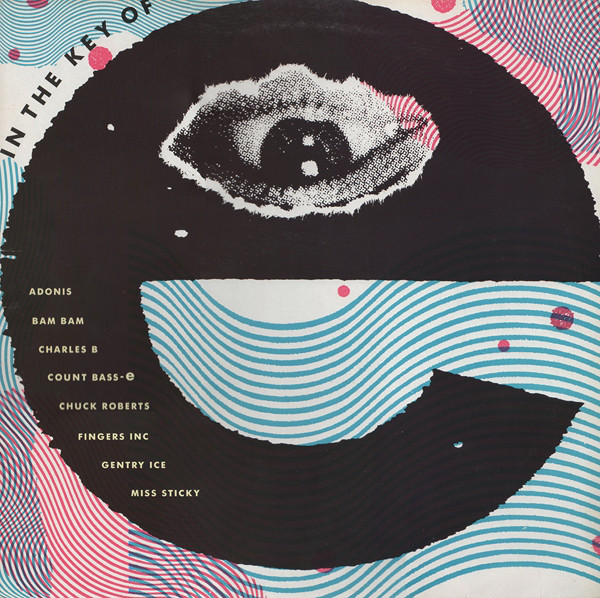
I remember Chris gave me £20 and an ecstasy tablet and said go to the Café de Paris and design me an album sleeve (In the Key of E) it was great, changed my whole world, shame as later that night ended up in Harry’s and DJ Fat Tony and his mates esp. some bloke who is now a famous author (I should name him) kept referring to me as a rent boy with total hatred in their eyes. Glad I had had the mitsibushi tab otherwise I probably would have thrown them out of the window, homophobic DJs and posse for you.
The world will come and eat you up boys.
You used photocopying extensively for those early sleeves, not just for distorting type but also for texture too, What influenced you?
Being experimental was always key in my design, trying things out.
You were working in largely uncharted territory with very little except the smiley logo and the early DJ International graphics from the US as any kind of look for the genre, were you left to interpret the music in your own way?
Always like a challenge, recently I designed a book for Glen Matlock about the Sex Pistols (Filthy Lucre tour) and like then, coming up with design/art that does not follow the cliche known style is what good design should be.
Were you working in isolation or did you have assistants? Were you aware of what other designers were doing in the field like Trevor Jackson at Champion and Gee Street or the Designers Republic at Warp?
At this time just working on me own and the artists in Chicago, they loved this stuff.
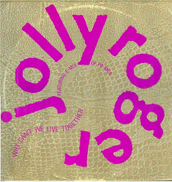
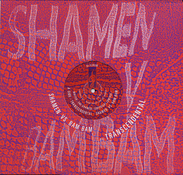
You had a thing for type wrapped around curves, I’m presuming this is was all pre-computer and hand-cut and pasted?
Sure was, its so easy now, every letter cut out and pasted down.
There seem to be several releases that re-use old sleeves folded inside out, was this a money-saving exercise?
It was me being really early into re-cycling, this was in 1989, the printers throw this stuff away, I hated the idea of this, so re-purposed it and used it inside, my fav is ‘In The Key Of E’ printed on the reversed board with the Desire house bag on the inside.
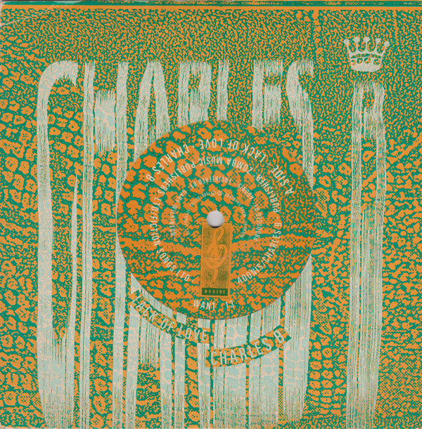
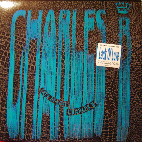
The Charles B ‘Lack of Love’ release has multiple different covers in different colours, was this to distinguish different versions or because of printing errors?
I can’t remember that, maybe I liked the idea of the sleeve forever changing, I did used to swap the printing plates about.
Double Trouble and Rebel MC (both together and separately) were most prominent on the label after ’88 and both hugely successful. The licensed US releases stopped, and your stretch lettering and snakeskin look with them. Why was this?
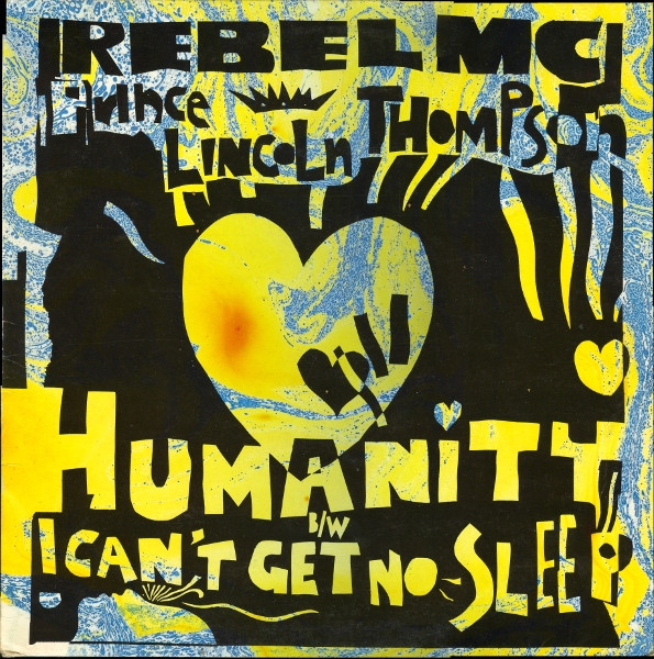
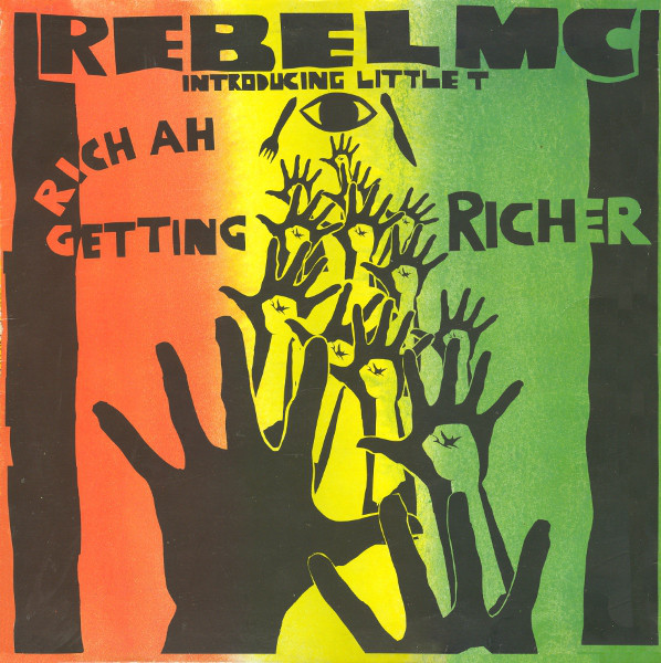
Not sure, guess it was because it was way more commercial. Later on I designed all the Rebel and his Tribal Bass label and created very nice roots-based paper cut-out graphics, based on African art.
Did you work for any other labels around this time (aside from Fiction) or do other work for dance music like flyers, posters and T-shirts we wouldn’t have seen?
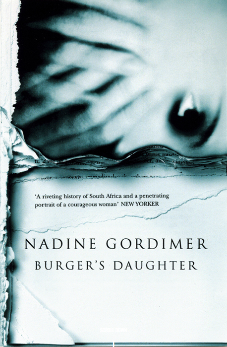
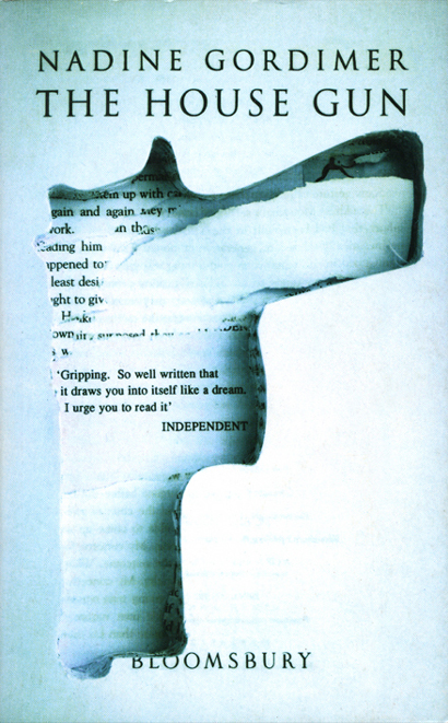
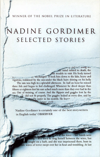
On the back of working with Rebel MC and creating the drum and bass rootsy style, Island records snapped me up and later I worked with many companies and designed all the paperback book covers for Bloomsbury publishing.
The rest of your work seems to have been more in the indie rock sector, was Desire a case of being in the right place at the right time?
Just love designing and creating.
Are you aware that some of those early releases are now considered classics of the genre and worth a lot of money?
That’s nice, eh?
Do you have any favourites from this time, both musically and design-wise?
All of them, I had a blast and still am. I guess ‘In The Key of E’, it’s a great compilation too. Roger Dean of Yes fame always loved ‘In The Key of E’ and asked me to send him a signed version of the cover, I was flattered beyond belief as he was the hero of every school kid when I was growing up, so nice!
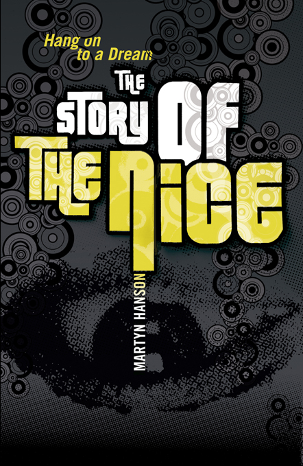
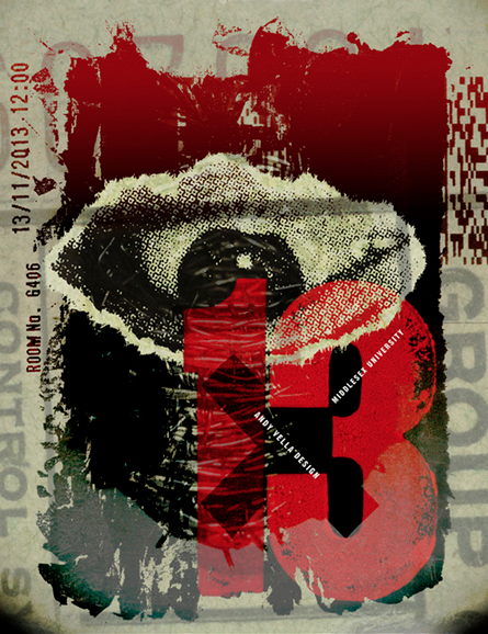
Andy’s website is here with an extensive gallery of work, you can see him reference the eye from his ‘In The Key of E’ LP cover above at least twice.

