

- DESIGNED: 1994 / 2000 / 2008 / 2010
- FORMAT: n/a
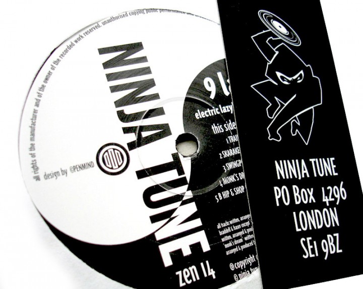
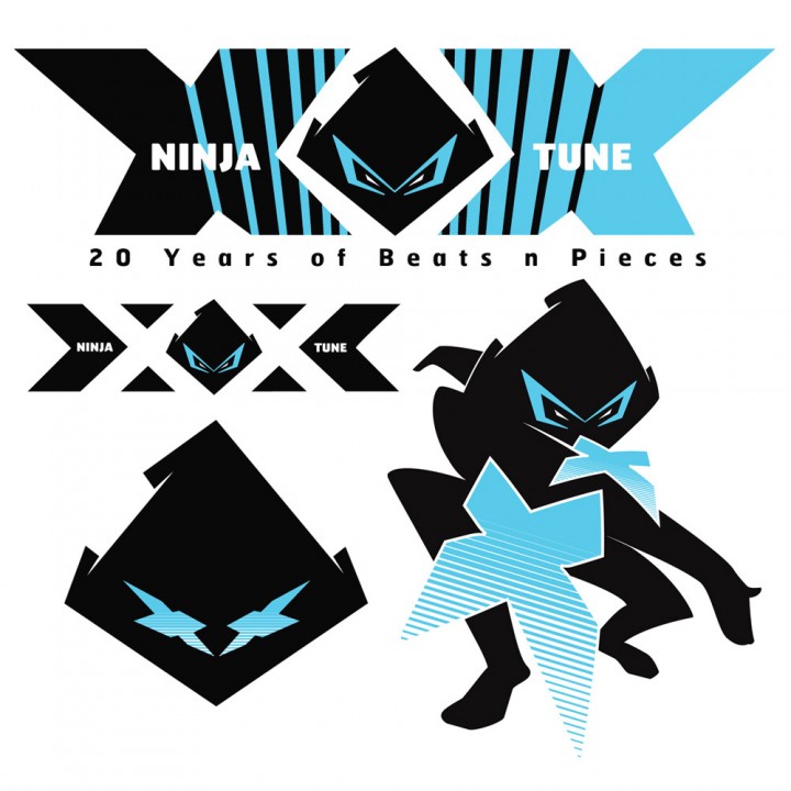
- LABEL: NINJA TUNE
- DESIGN: Openmind
- EXTRA ZEN: www.ninjatune.net
My first job for Ninja Tune in 1994 was redesigning their logo into what became the classic face of the label. Over the years it has changed, most notably in 2000 when the pose changed and the jumping Ninja finally landed and threw the record it had been brandishing all those years.