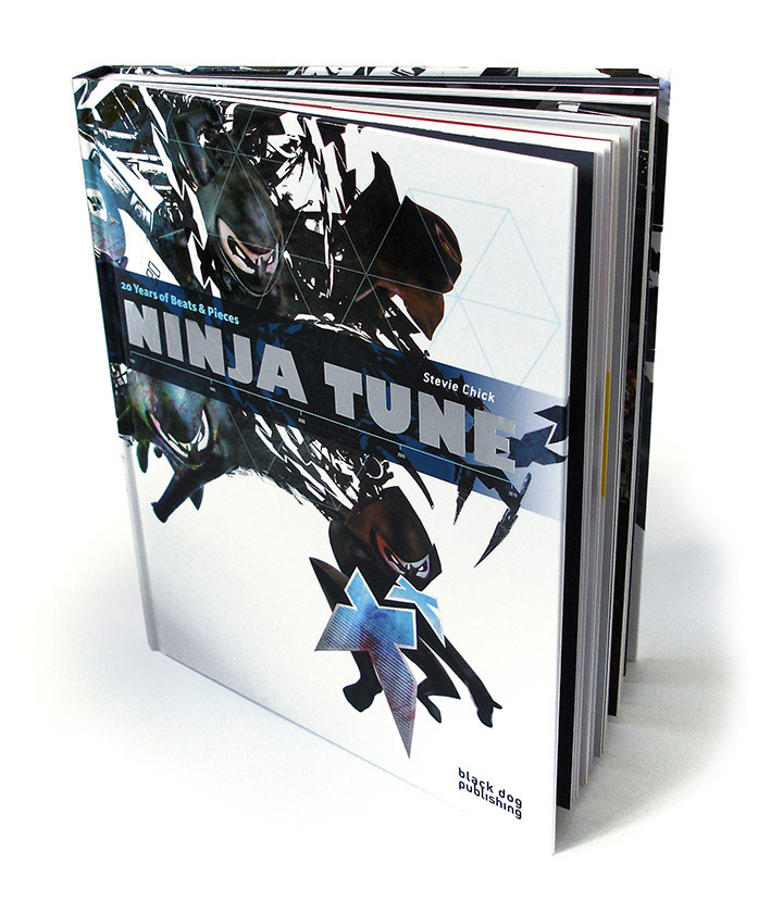
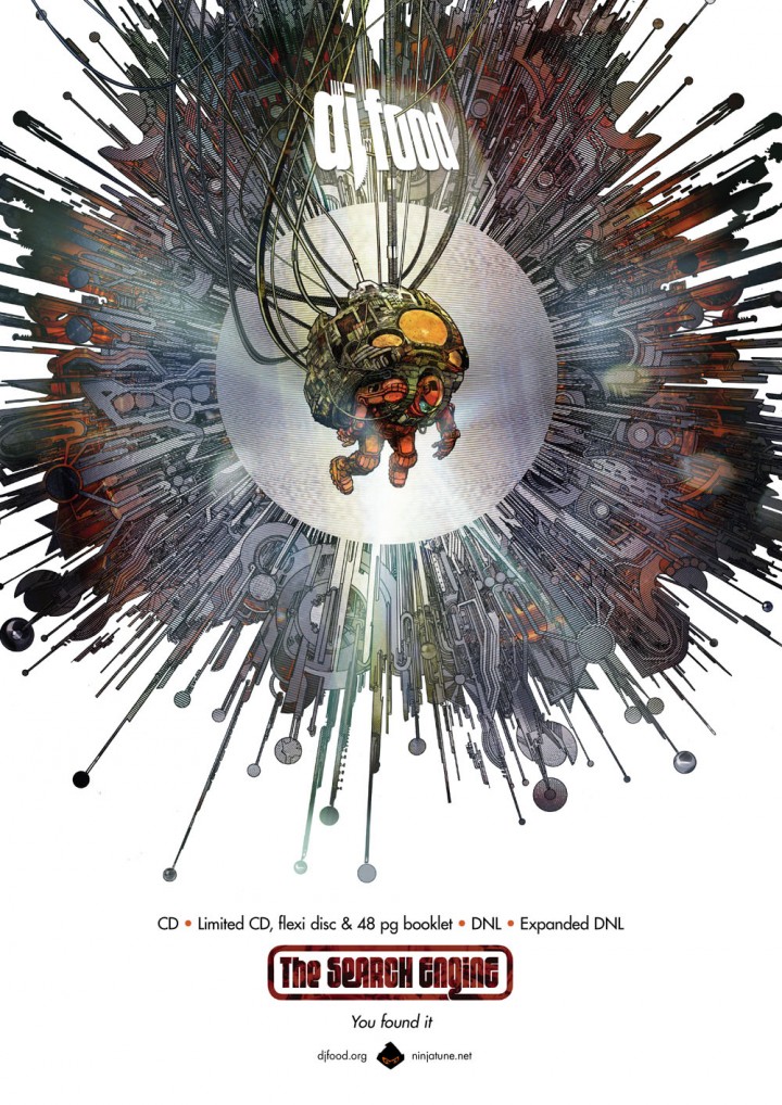
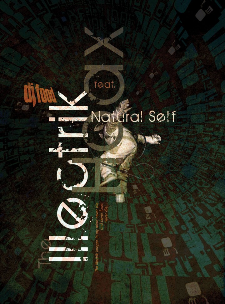
- RELEASED: 2012
- FORMAT: various
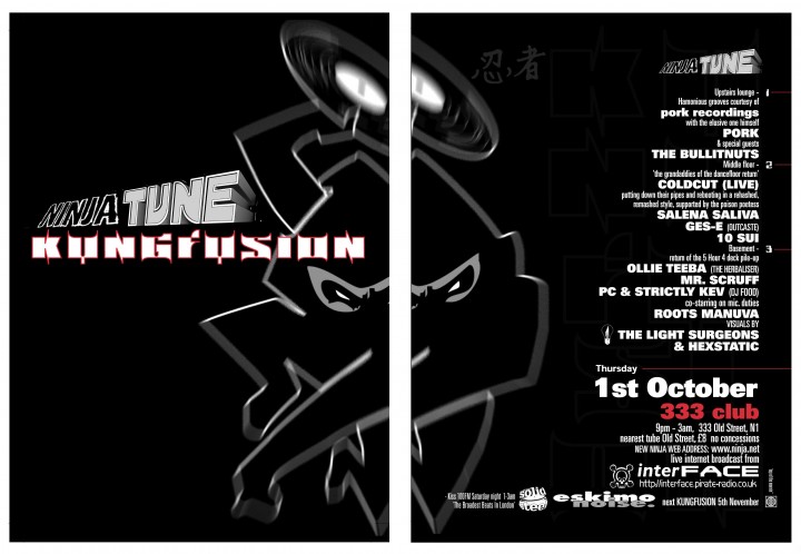
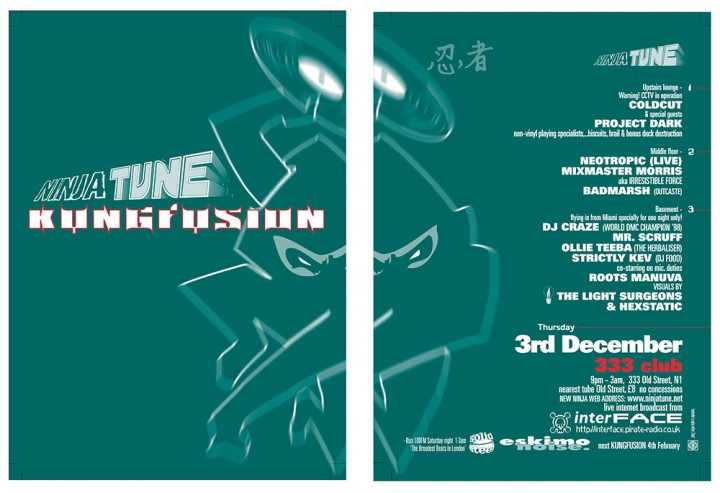
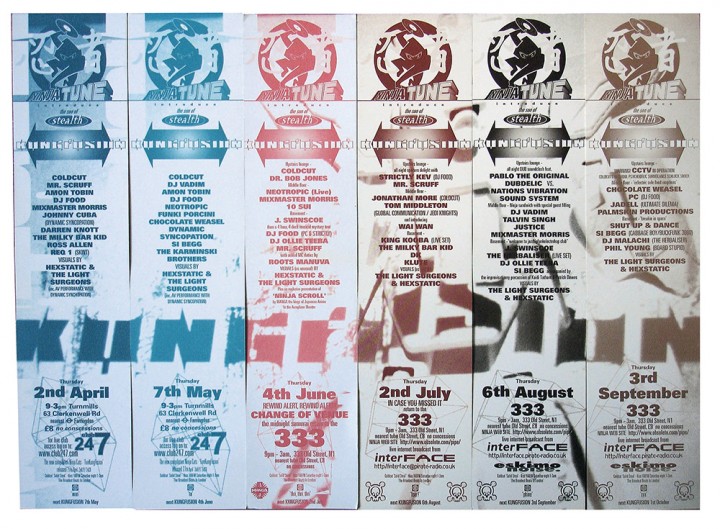
- PUBLISHER: Ninja Tune
- DESIGN: Openmind
- ILLUSTRATION: Henry Flint
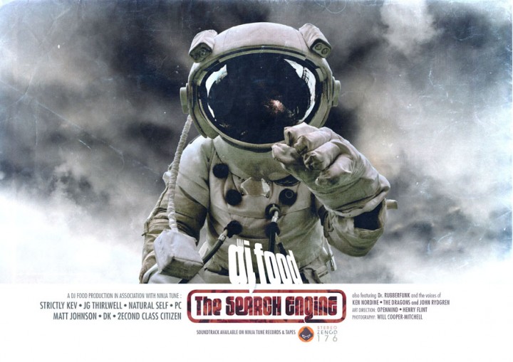
- PHOTOGRAPHY: Will Cooper-Mitchell (Cosmonaut)
- EXTRA ZEN: ninjatune.net / BUY (‘The Search Engine’ poster)
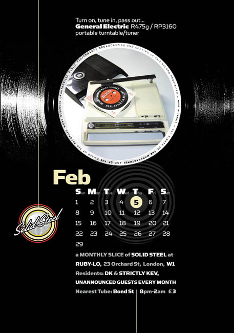
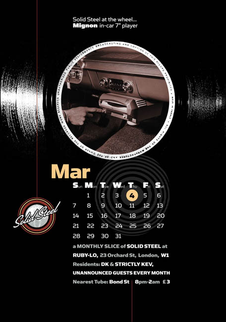
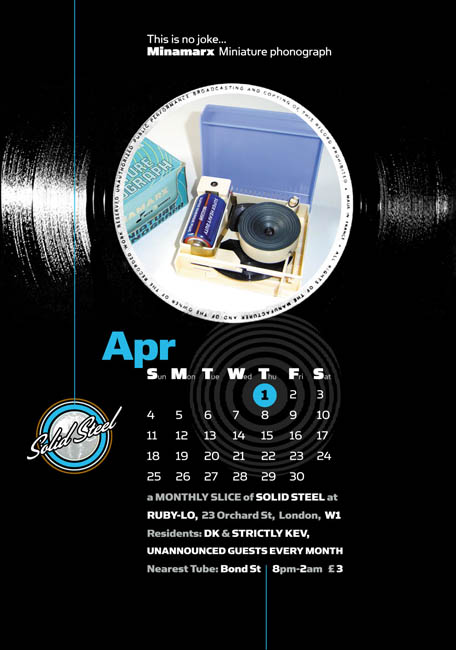
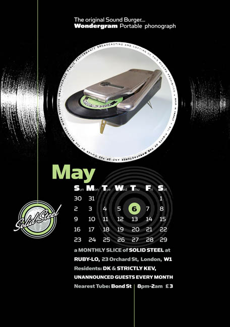
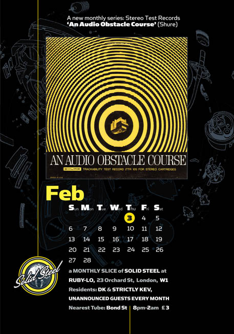
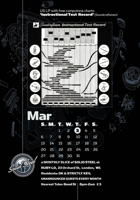
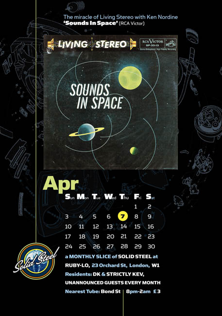
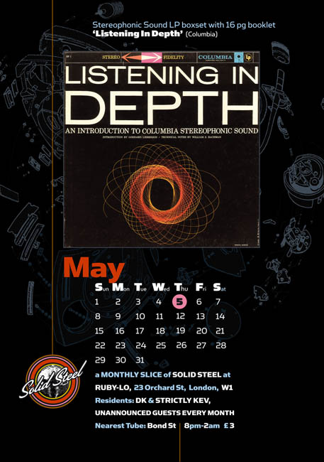
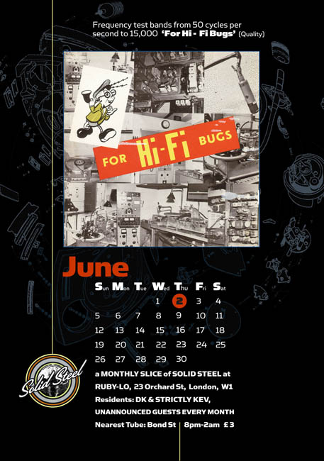
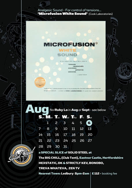
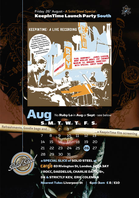
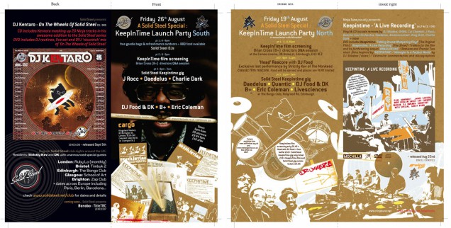
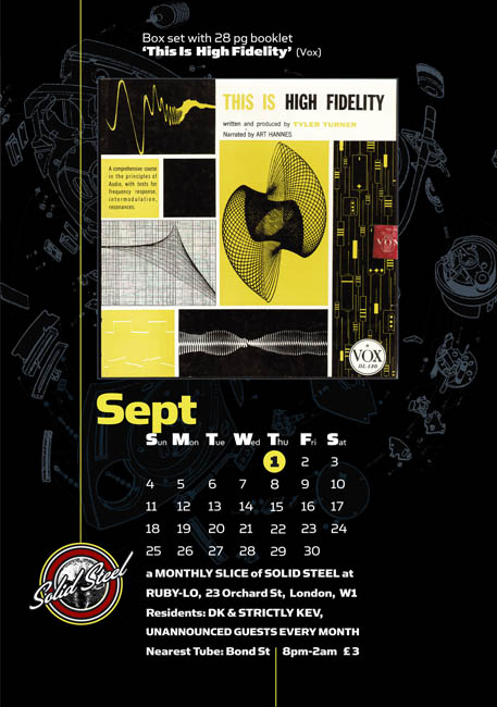
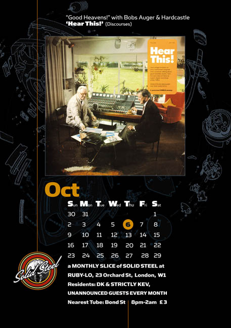
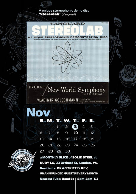
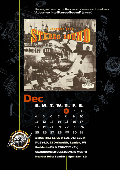
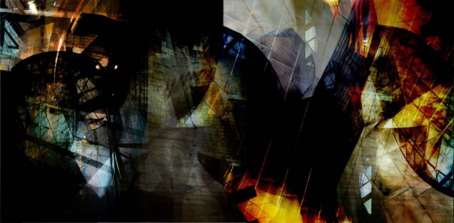
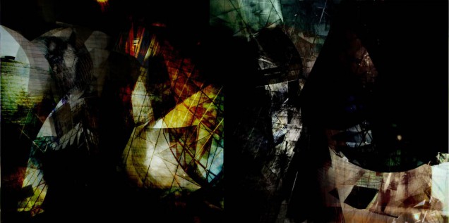
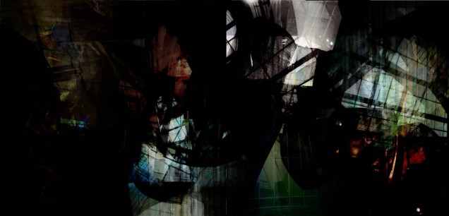
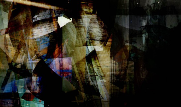
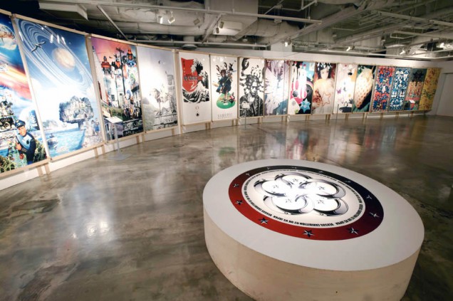
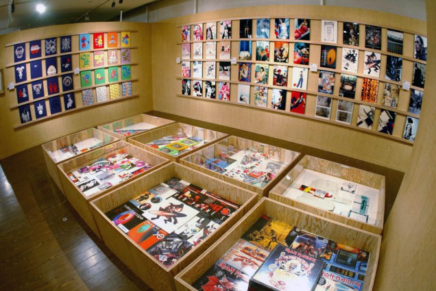
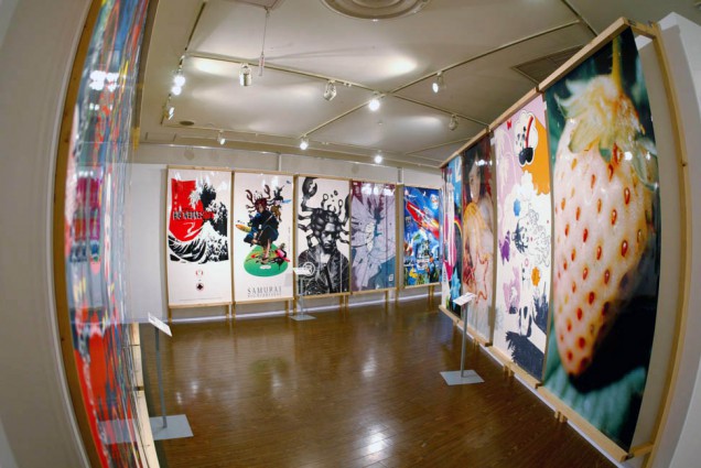
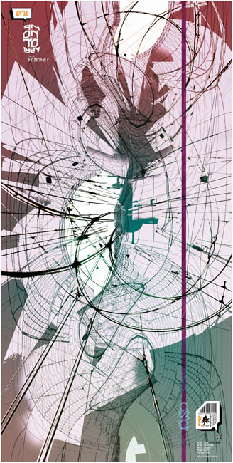
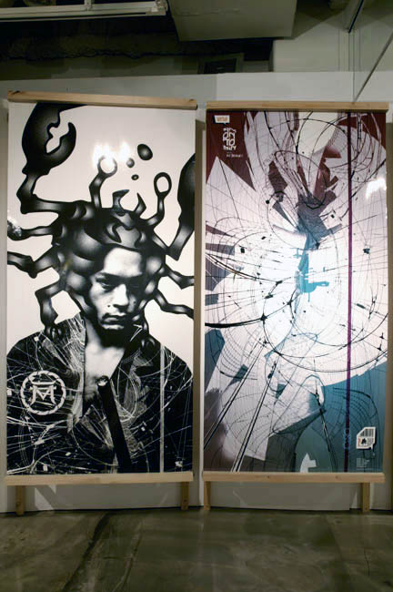
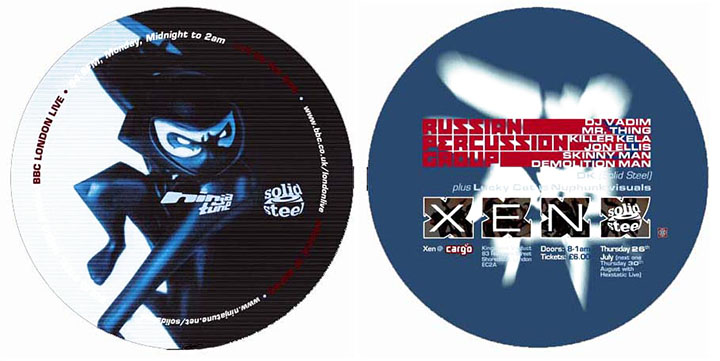
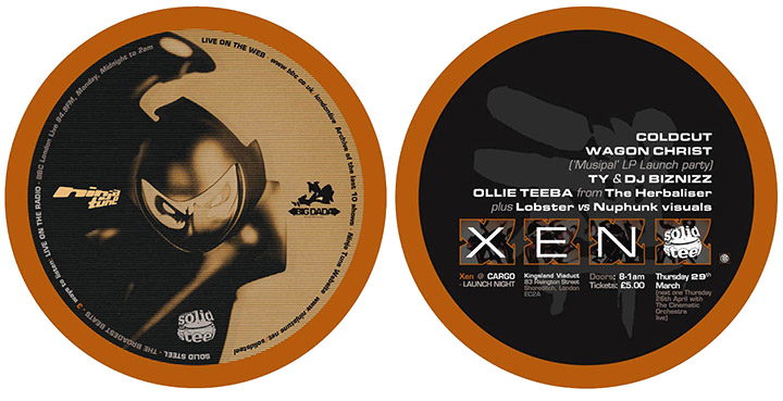
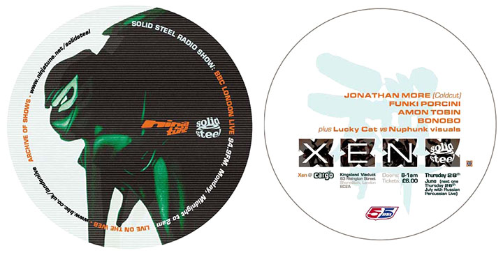
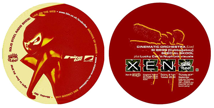
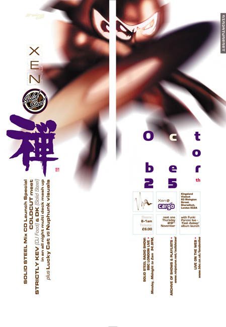
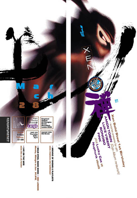
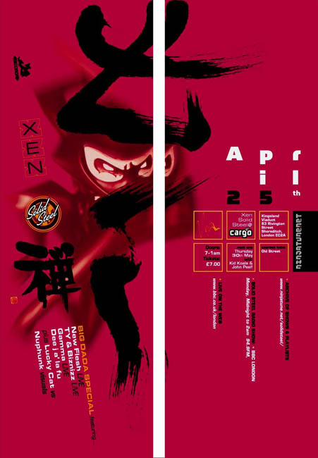
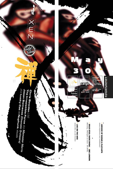
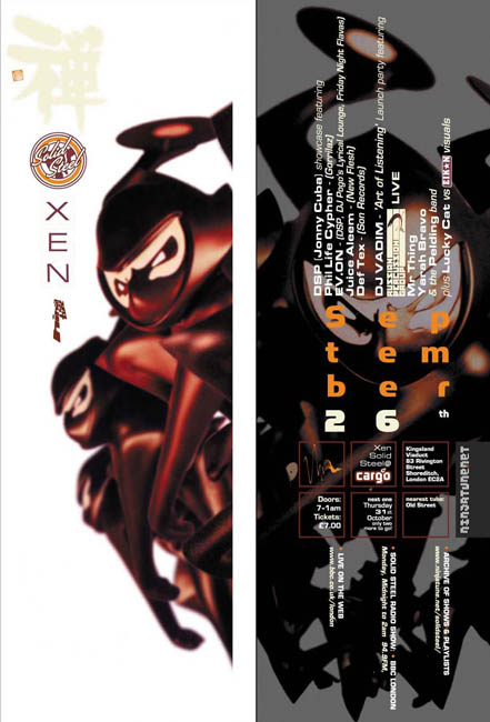
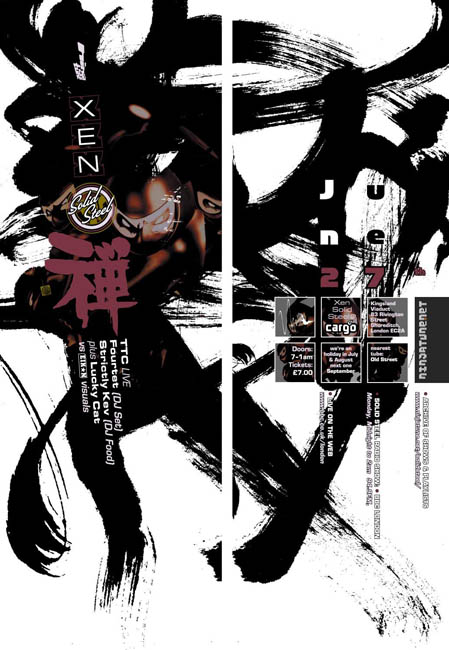
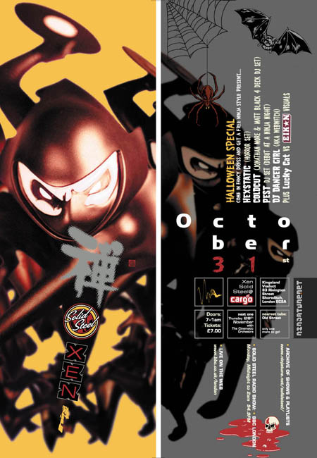
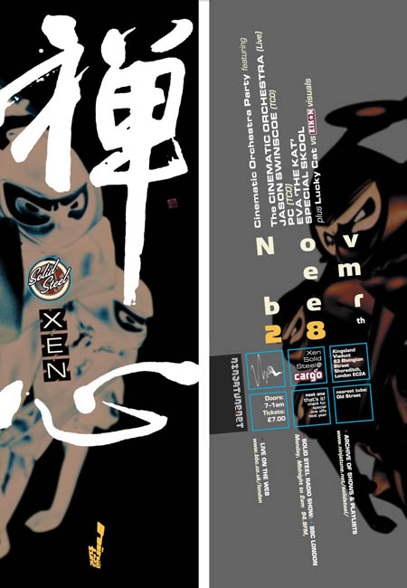
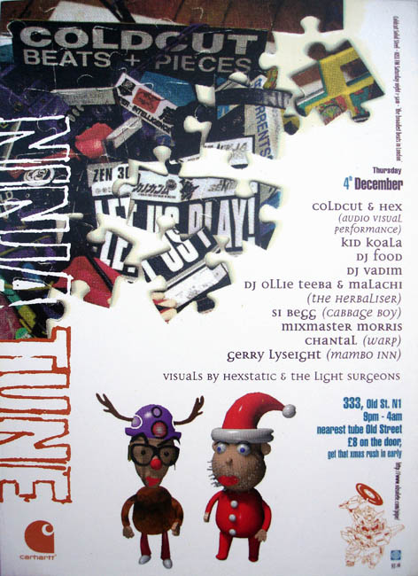
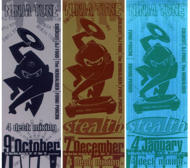
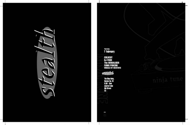
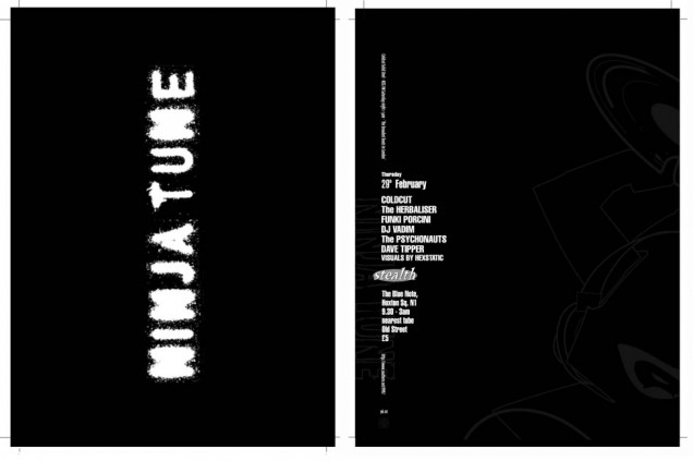
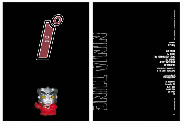
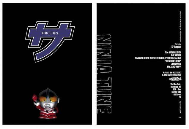
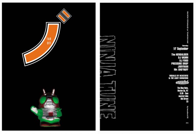
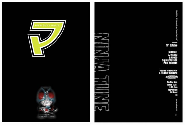
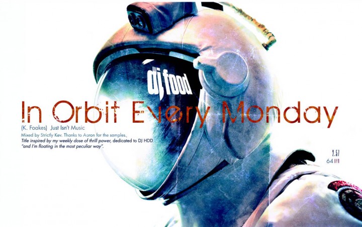
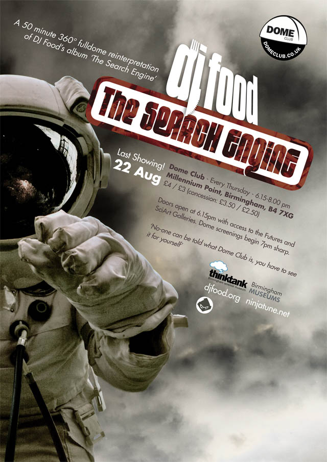
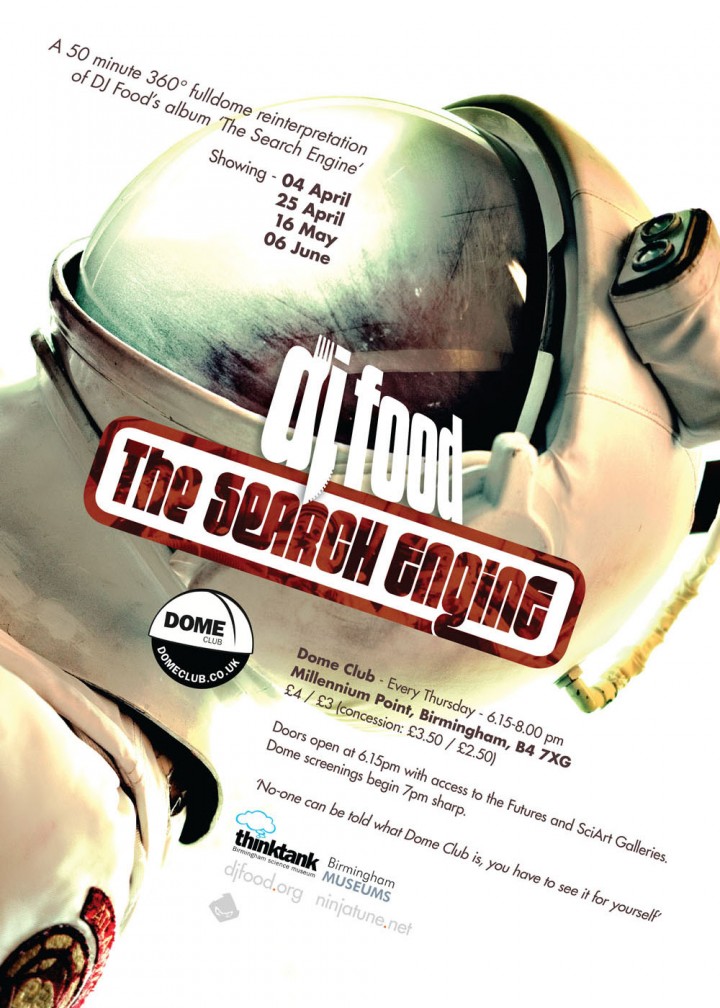
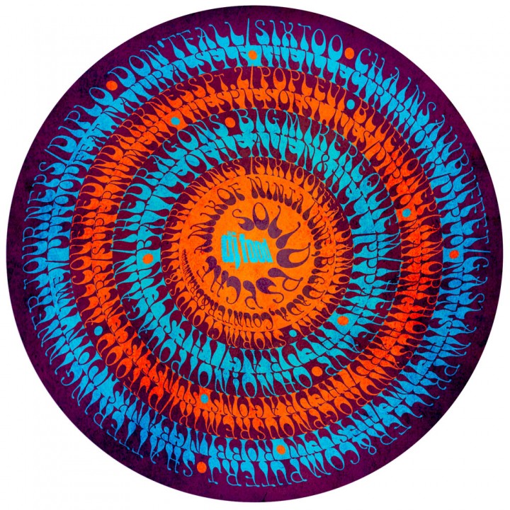
Various posters I created around ‘The Search Engine’ album release. The ‘Solid Psyche’ one was remade from the artwork of the CD of the same name purely because I liked the design and thought it would make a good print.