
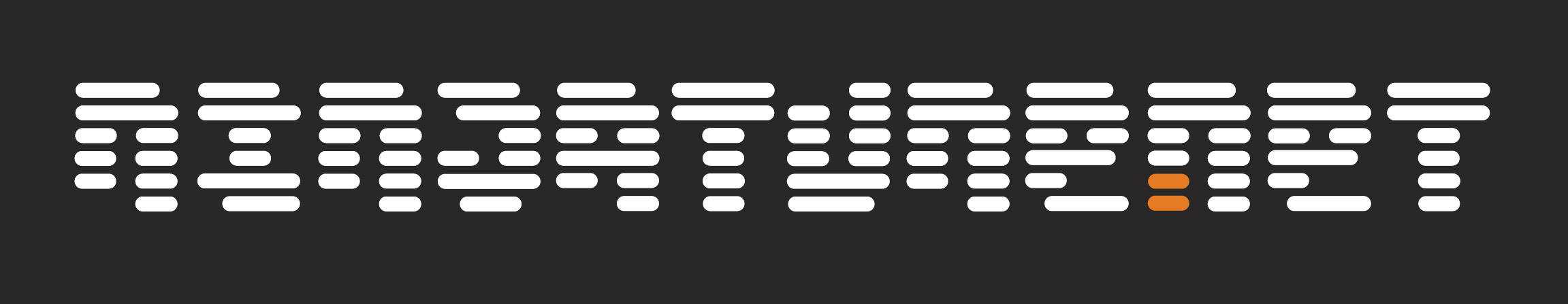
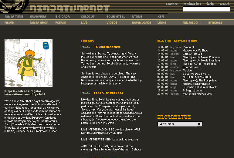
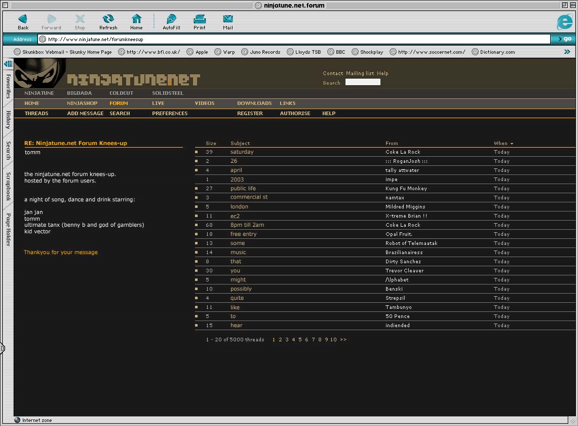
Searching through old discs for something else I ran across these line-based designs for what became the Ninjatune.net website identity in the 00’s. Old heads will immediately recognise the Ninja Tune forum layout and colours. For a few years, after the mass Warp forum exodus had settled, it became a buzzing hive of creativity and connections in the pre-Myspace and Facebook era of social media. I still have good friends that I made through the forum and much fun was had on it over the years. Sadly, like anything, times change, people come and go and the largely unmoderated board eventually became overrun with trolls and any new blood attempting to join was faced with a barrage of abuse or an inpenetrable wall of in-jokes that would test even the hardened fan.
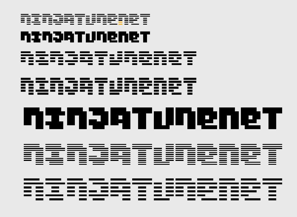
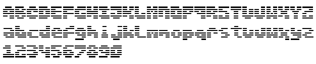
Anyway – here’s some of the design work, made so that it would be quick and easy to see at different sizes and pixel ratios I seem to remember – at least that’s what I was told to do by the web designer at the time. It all looks a little blurred because it’s been upscaled from Index-colour pngs to RGB jpegs. The bottom image is a flyer for a forum party, something that occasionally happened, self-initiated by users who wanted to meet the faces behind the names.

Oh good old times …
I loved that design. The effect of the logo with hoovering the mouse on it.
It was also the time with information on websites … (including the full catalog sorted by catalog numbers – for collectors)
It was also the time of my ninja heros … from A(mon) via F(unki Porcini) to T(he Herbaliser) … Z?