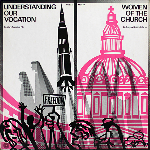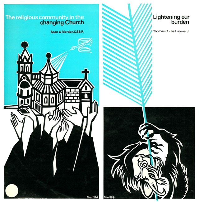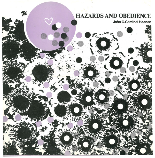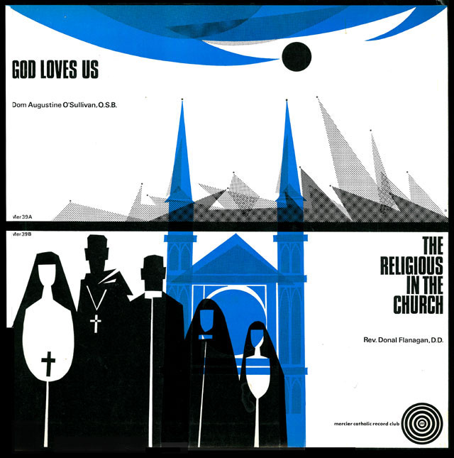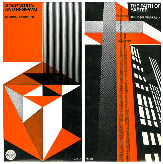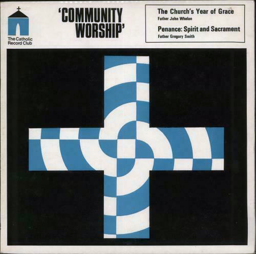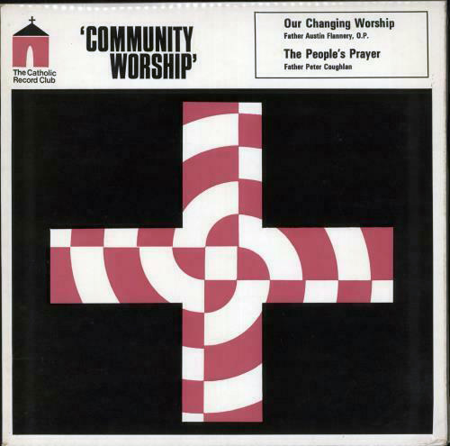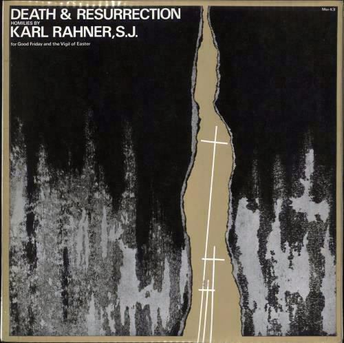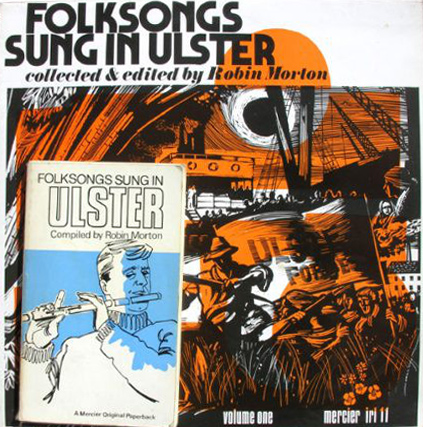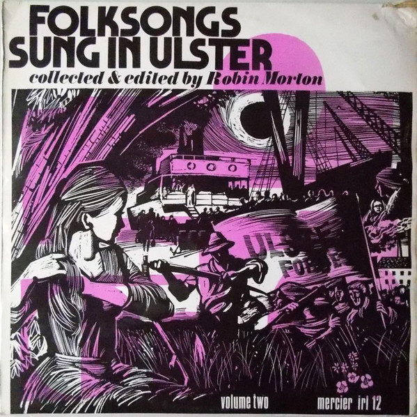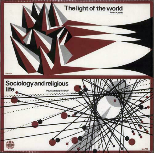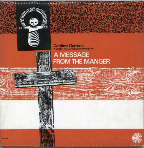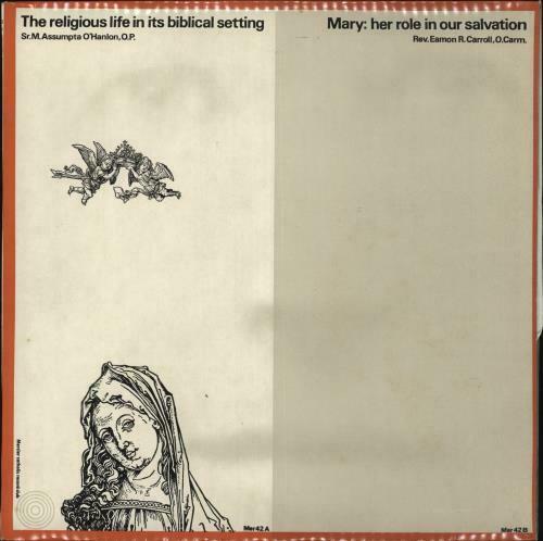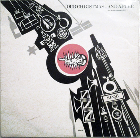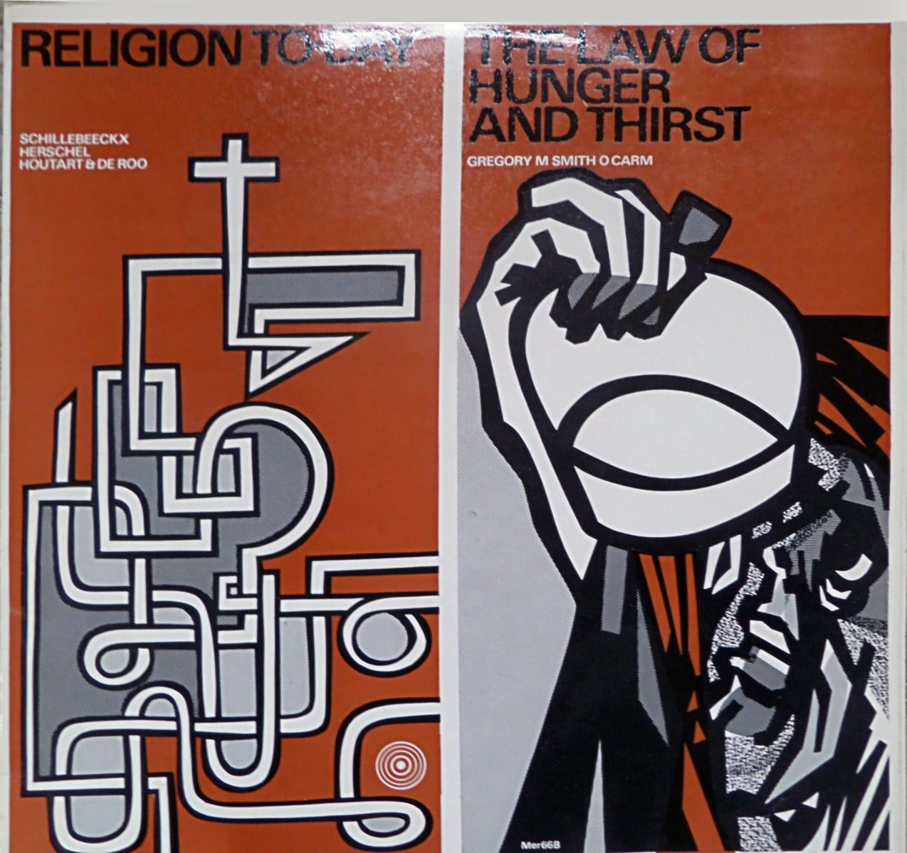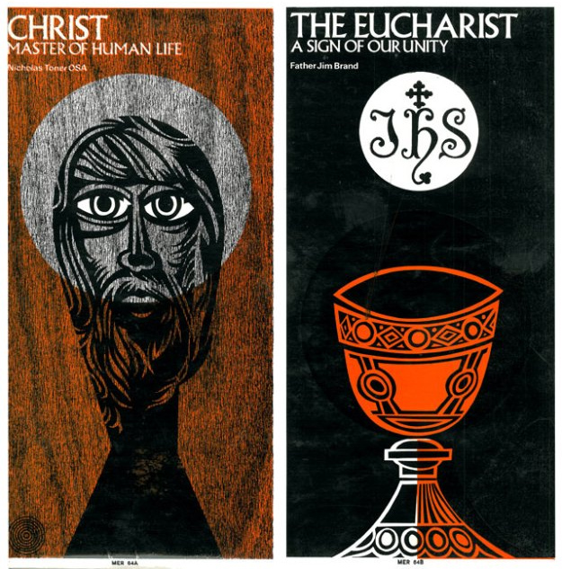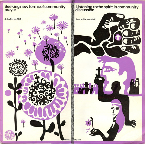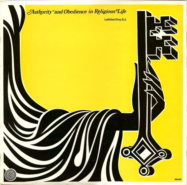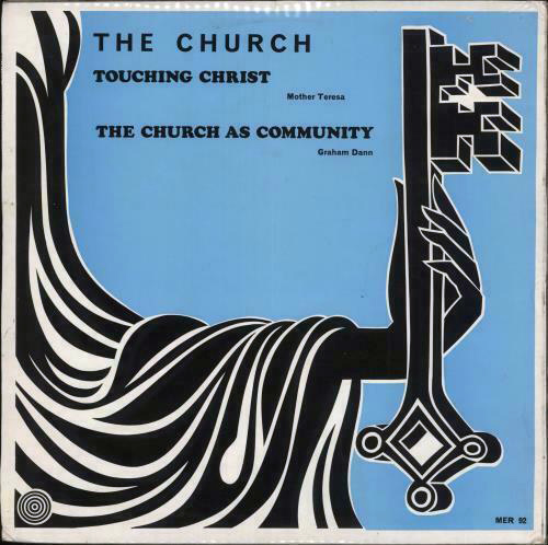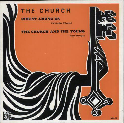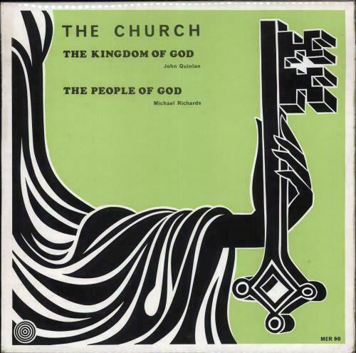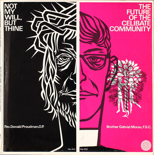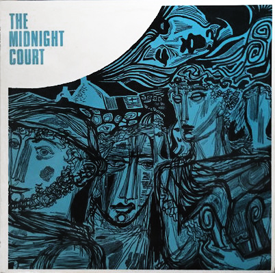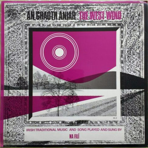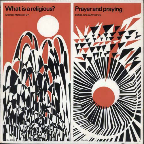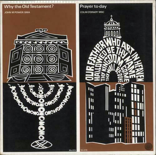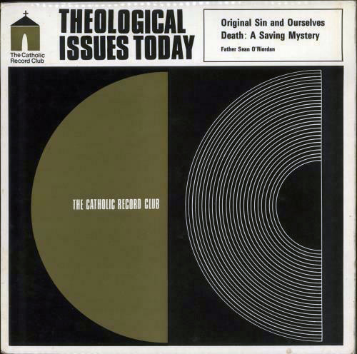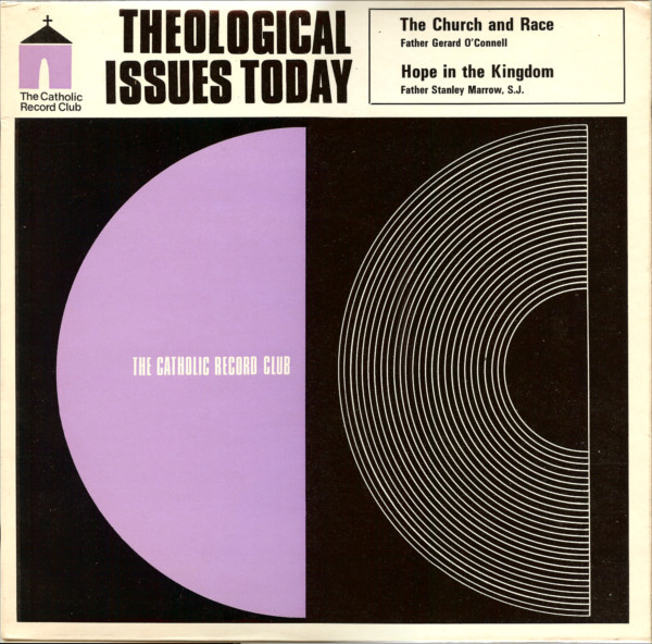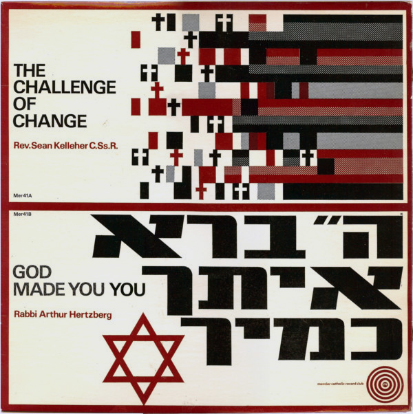
Hipped in part to this label last year by collector Andrew Divine, I have been collecting images of the Irish imprint’s output from all the sources I could find on the web. Mercier Press, the famous Irish book publisher founded after WW2, also released many religious spoken word records from the 60s onwards under its own name and under their Mercier Catholic Record Club banner. In the 1960s and 70s the Mercier paperback books had a distinctive cover style which usually consisted of an illustration, in both pen & ink and brush & ink, and always in two colours.
The Dutch designer Cor Klaasen who had studied in Germany and Switzerland before coming to Ireland was Mercier’s main cover designer as well as the artist John Skelton (1925-2009) – Skelton worked as an art director and book illustrator before concentrating full-time on painting in 1975. The record labels mirrored this beautiful sense of design and graphic identity of the books with clean cut illustrations and vertically or horizontally split covers delineating each side of the album. There are even more on this Flickr page