Seeing as The New Obsolescents album is up for pre order today I thought I’d break down how we made the cover as it was quite an involved job using obsolete materials and analogue processes without the aid of automation. Part of the concept behind the group name is referencing the use of largely obsolete practices and equipment and I thought I’d carry this on with the artwork. This post is about the printing and there’s another about the assembly here.
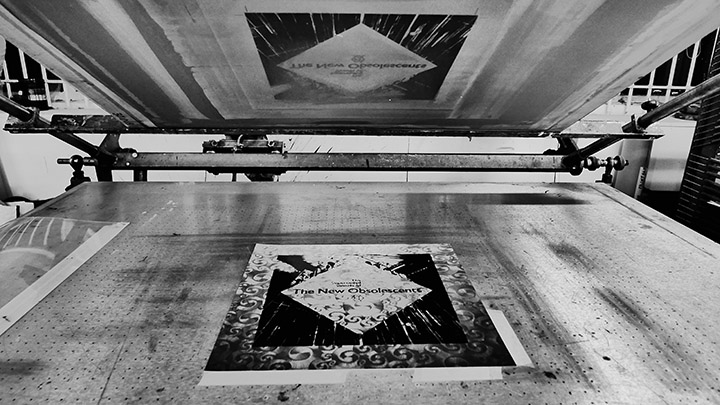
I met Jonas Ranson a couple of years back when I got him to print a poster for the De:tuned 10th anniversary exclusive via Bleep (I think they even have some left). It was a complex 6 colour job and I was impressed with how diligently he worked to get it as good as possible using tests to determine the best results and revising screens with me after we both agree the first tests didn’t look right. So the sleeves for The New Obsolescents LP cover required a similar touch as this was printing onto delicate foil covered card that marked if you ran a fingernail across it.
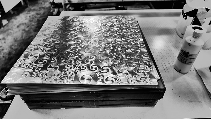
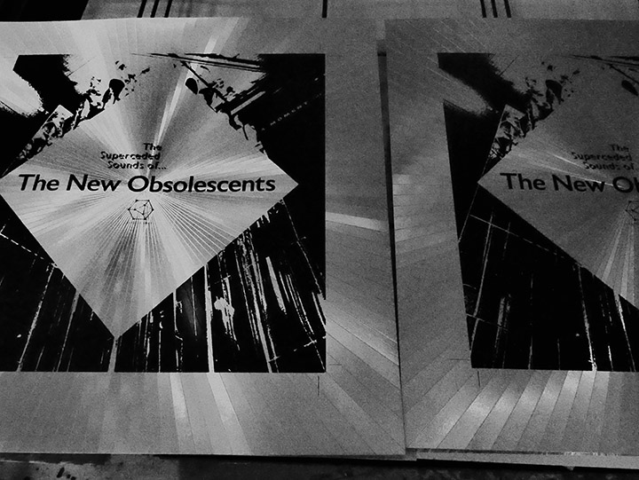
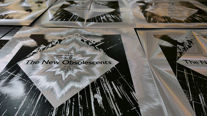
To rewind slightly, since discovering the Philips 21st Century Prospective series of French musique concrete LPs on tour in Europe the 90s I’d been fantasizing about one day making a record with a Héliophore patterned silver foil cover. The patterns etched in the covers are achieved by minute differences in the angles of the foil coating which then reflect the light and appear to animate when moved. These legendary and increasingly expensive LPs contain critical works from an international array of leading artists in the tape and electro acoustic field, spearheaded by Pierre Henry who also released many of his own works on the label.
Tracking down the company who made the original Philips covers in France led to a dead end many years ago as they had long ceased to exist so I gave up hope. Unknown to me a British company had managed to replicate the process under the name Dufex in the UK. Sadly they’d also wound up business in 2019 but via a chance encounter on a separate project I managed to find the final stocks of card from the business at a lighting company so I filed that away for future use.
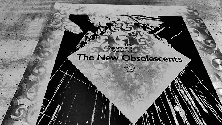
Once The New Obsolescents’ album was in the bag we started to think about artwork and I knew that this collision of tape loops and turntablism was the perfect record to sleeve in foil as a homage to the Philips series. Those familiar with the originals would immediately make the visual connection and it would set the tone for the sounds contained inside as the group name would be unfamiliar to most. When we sent the album out to record labels it included a mock up of the cover art with foil and that was part of the package we wanted to produce. Colin Morrison at Castles in Space was fully on board with the sleeve idea from the beginning and it’s a testament to his belief in the project that he was prepared to trust me with the whole process despite the considerable extra costs.
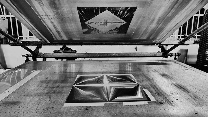
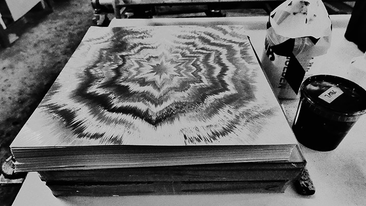
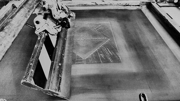
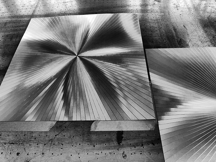
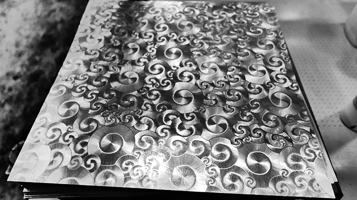
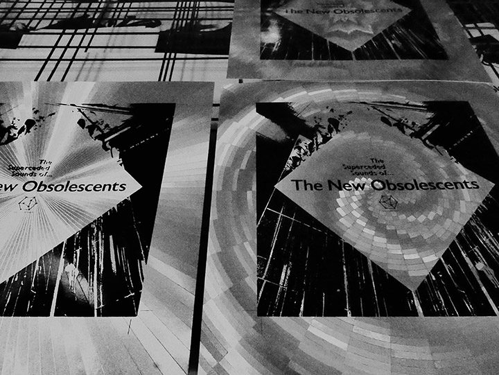
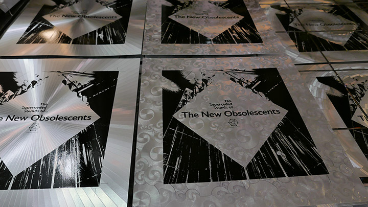
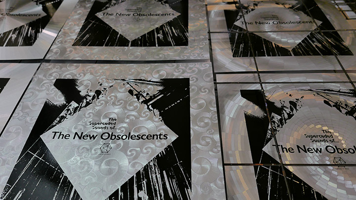
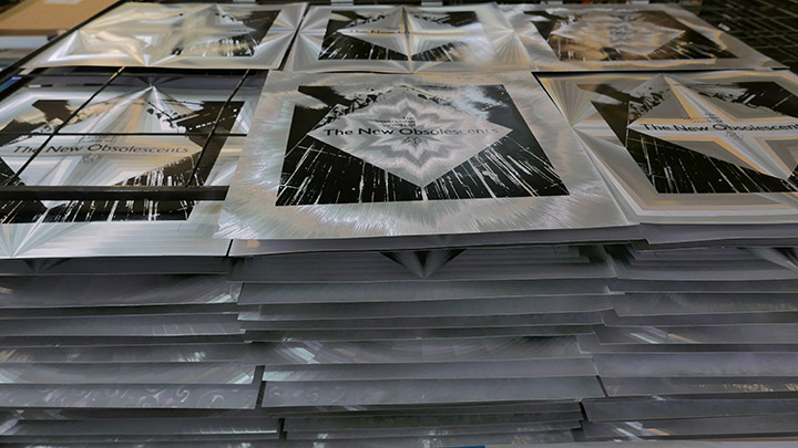
Ordering 300 sheets in five different designs, I gave them to Jonas at paperHAUS who carefully but expertly screen printed each panel with the cover design, making sure not to scratch the extremely delicate foil. I specified that the designs be printed dead centre to take advantage of the symmetrical nature of the cover graphic and asked Jonas to document the process as I wasn’t allowed in the studio due to lockdown restrictions at the time. Many thanks to Jonas, these are his beautiful photos of the job and you can contact him and see his work at www.jonasranson.com/paperhouse
All photos © Jonas Ranson 2020