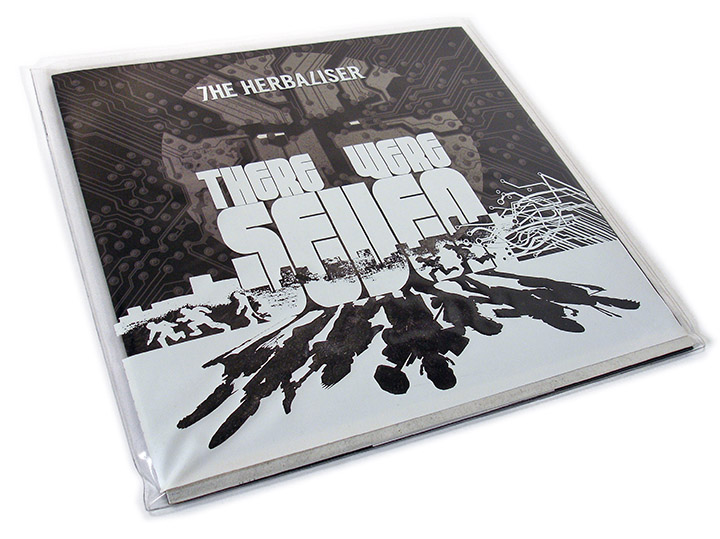

- RELEASED: 18 May 2013
- FORMAT: 12″ / DL
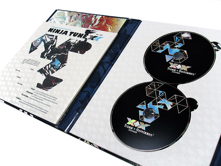
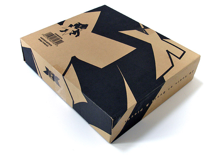
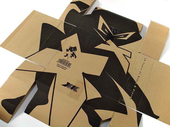
- LABEL: NINJA TUNE
- CAT No.: ZEN12357 / ZENDNLS357
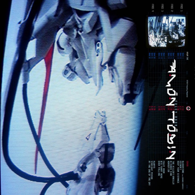
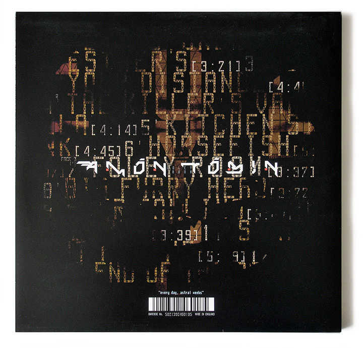
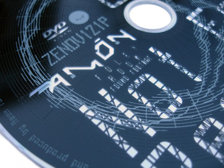
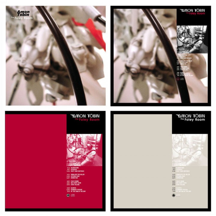
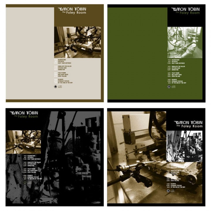
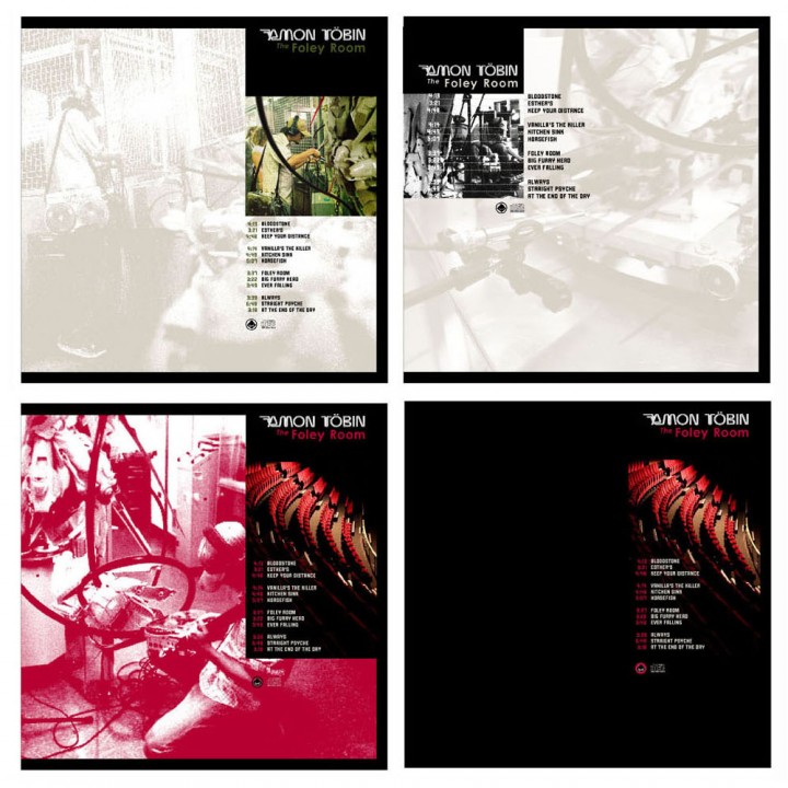
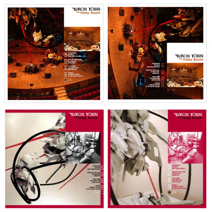
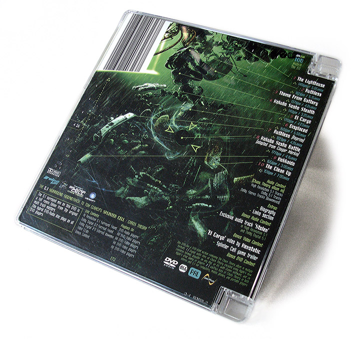
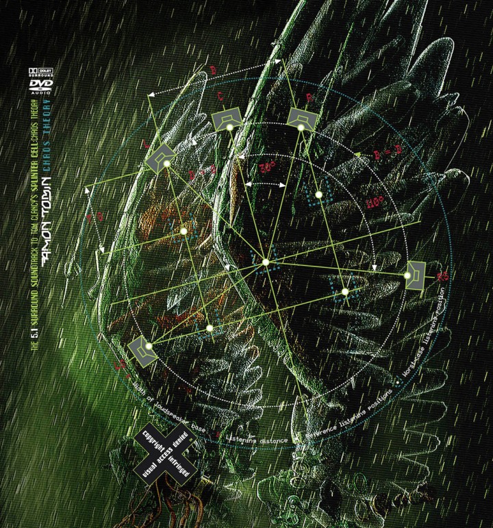
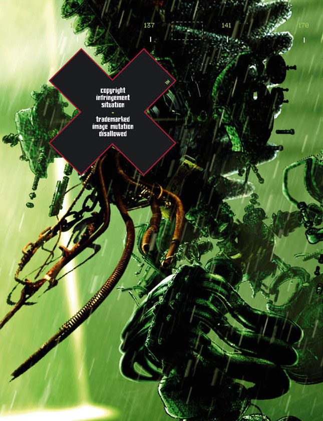
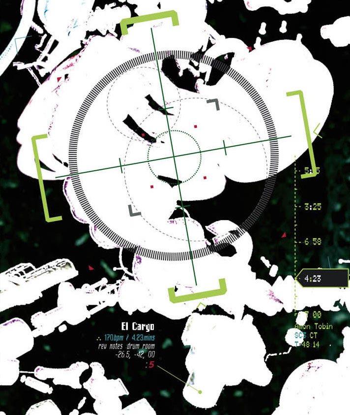
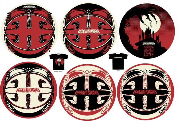
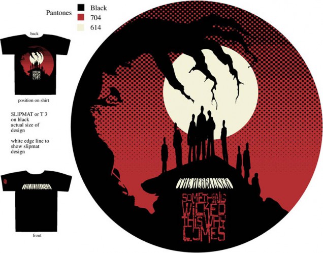
- DESIGN: Cirrus / Openmind / Leif Podhajsky
- EXTRA ZEN: ninjatune page / BUY
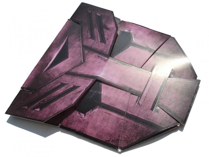
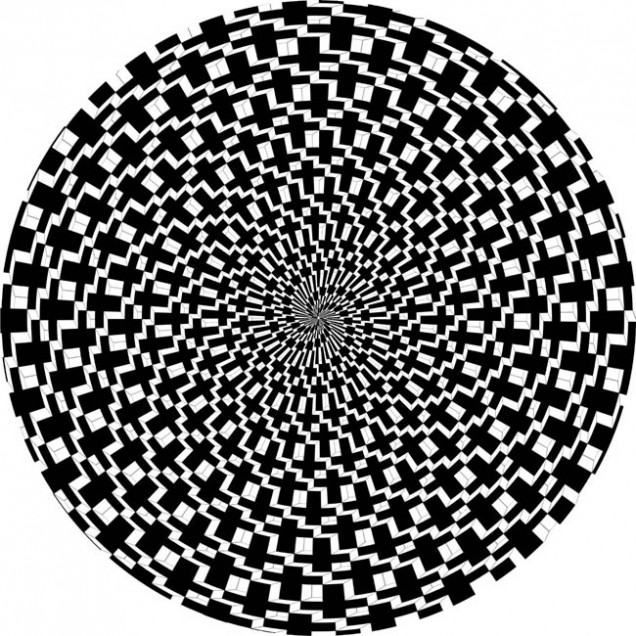
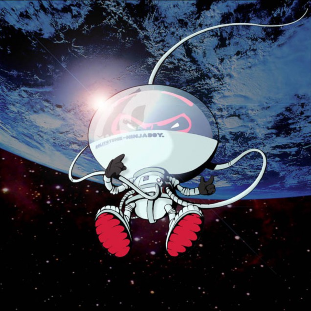
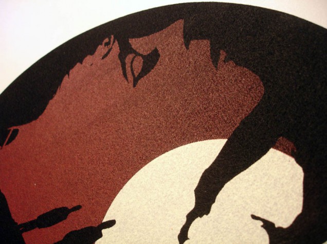
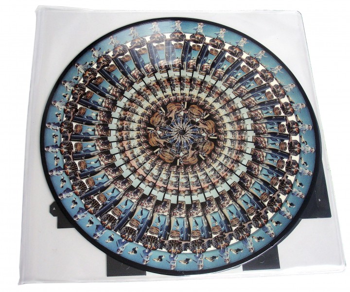
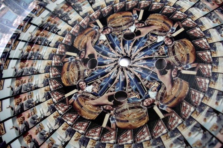
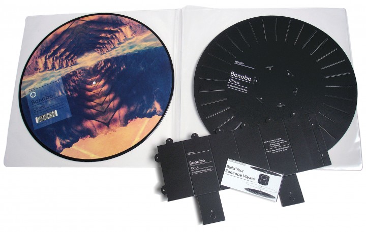
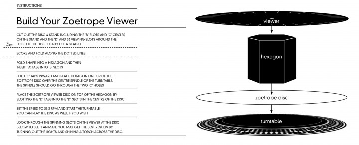
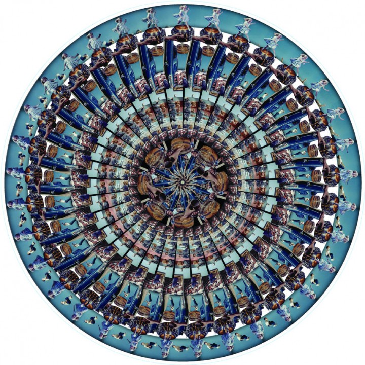
12″ picture disc with zoetrope side and card viewer, made specially for attendees of a Bonobo gig at the Roundhouse, London. I took the original archive loops from Cyriak‘s incredible video for the track and broke them down into circular visuals to make a spinning animated version. Dating back to the first primitive animation techniques of our time, the zoetrope relies on a viewer to see the action happen.
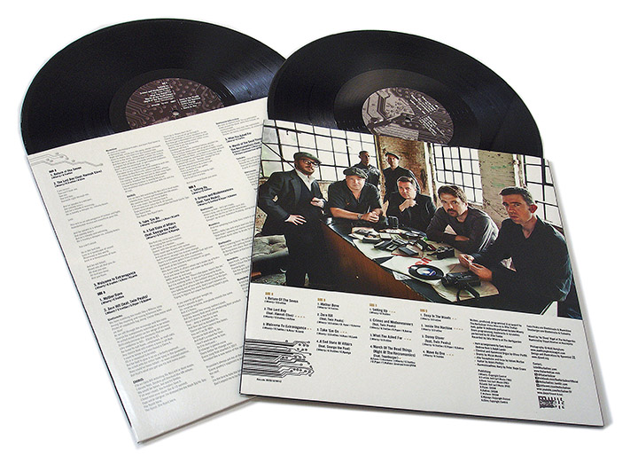
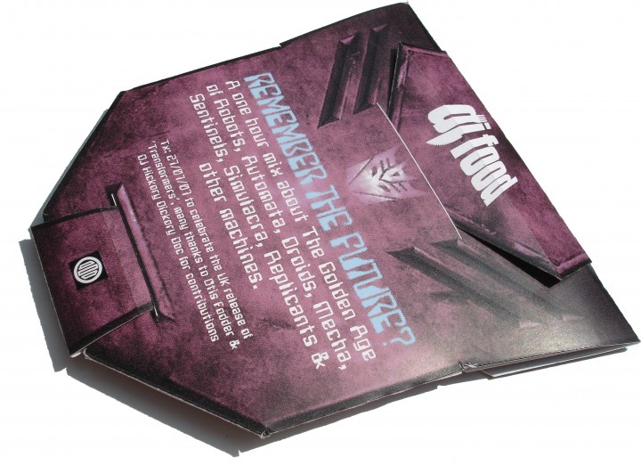
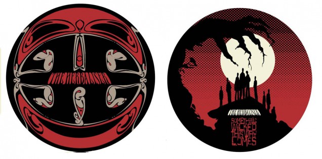
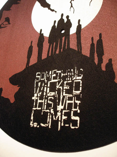
This is included with the disc along with assembly instructions so that people can watch while the disc plays. See this film for an approximation of what the disc does when spinning. This is all rounded off by a beautiful Leif Podhajsky design on the reverse side.