Below is a post from my ‘other’ blog – ArtOfZTT.com – where I post artwork relating to the ZTT label and interview the people who made it. 
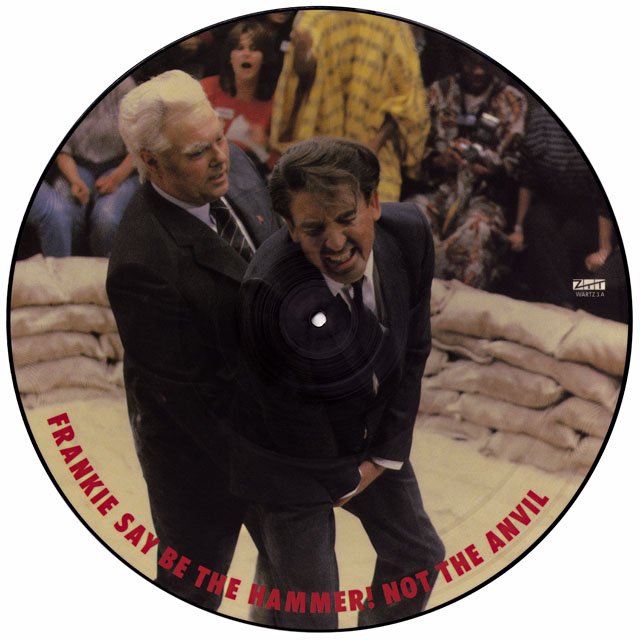
I arrive early, at a pub just outside Hither Green station in deepest South East London, to meet Tony ‘AJ’ Barratt, renown music magazine photographer and key ingredient in the early days of ZTT image-making. His photos of spanners, statues, masks and landscapes gave an identity to (the) Art of Noise as well as gracing the first release from the label, ‘Into Battle’. He also did many live shots, promo and video stills for Frankie Goes To Hollywood and Andrew Poppy.
It’s Friday evening and the place is filling up, the only photo of Tony I’ve got for reference is 30 years old and he’s told me to look out for ‘a hairless Glenn Gregory, ex of Heaven 17 lookalike’. After about 10 minutes a guy comes in who might fit the bill and I catch his eye, ‘Tony?’, ‘Yes’, he says, shaking my hand but with a very puzzled expression on his face. ‘Tony Barratt?’ I enquire, ‘ah, no, you’ve got the wrong person, he says, ‘but my name IS Tony though’. With perfect timing, the right Tony walks through the door holding a copy of the Ambassadors Theatre program for ‘The Value of Entertainment’.
He does indeed look like Glen Gregory, albeit without hair, and is instantly warm, engaging and candid about his early experiences in the music business. We’re joined by his partner, Jan, and after a couple of pints we repair to his house nearby where I notice the 12″ picture discs for both ‘Relax’ and ‘Two Tribes’ amongst the many pictures hanging on their walls.
 How did you get it touch with ZTT? Presumably you knew Paul from working at the NME or was that later?
No, it’s much more personal than that, I moved down to London with Paul’s sister, Jayne (they were an item). I knew Paul in Stockport, vaguely…
Is that where you’re from?
Yeah, and he bought out a fanzine – ‘Out There’ – sent it down to the NME and they said, ‘you’ve gotta come down and speak to us as soon as you can’. He went down and started off his career, this must have been early eighties so that kind of fits in. I moved down to London with Jayne in ’83 and I was a photography student at Harrow. In my second year there, obviously Paul Morley was (at) the NME and he was doing all this great stuff, (so) I took my stuff to the NME. This was before the Art of Noise or whatever. I was shown the door.
I went to the Melody Maker and started doing work there, concert stuff and photos and things, and then as time went by, Paul suddenly started to get involved with… I’ve no idea how that whole thing came to be – that he met with Trevor Horn, you might know a bit more about it or it might be mythologised by Paul or whatever.
The accepted story is that he interviewed Trevor when he was in the Buggles…
Yeah I remember that.
…he slated them, but when Trevor got the opportunity from Chris Blackwell (head of Island records) to start a label, he remembered Paul and got in touch. That would have been at some point in ’82 or ’83 presumably so you would have done those Art of Noise photos in the summer?
(Laughs) It’s awful to say but I have no memory of when or how, you have to remember that I was coming to the end of my photography course, I don’t think I’d actually left and there was this vague idea of some vague photos that might be needed for this vague idea of a group. And it was never something that was kind of like, ‘here’s a brief, we would like you to go out and do this’. The record label started and there’re all very exciting PAs at the Camden Palace with the Frankies, all sorts of bands were signing and people were interested and it was going to be the artist event of the… which it turned out, in some ways, to actually be.
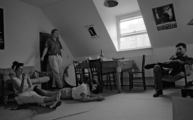 AJ (with cable release), Paul Morley (with phone) and friends circa ’83 – AJ: “I took this from across the room with the cable release, if I remember, Paul was on the phone to Trevor sorting out the ZTT thing.”
But I can’t actually remember. I remember it being a great time, I’d moved down to London, I was on the guest list of these great parties and it was free drinks and I thought, ‘oh my god I can’t believe this’. And then there was this record label and there was the Frankies and this vague idea of this thing called The Art of Noise and it was never like a… Because the members were so busy all the time, it was never like, ‘the group are going on tour now, etc.’ So there was no real sense of urgency.
They weren’t a group in the classic sense were they? They were producers, studio engineers and arrangers, which is commonplace today, but back then… They were ‘the music’ and Paul was ‘the image and the words’ and he knew how to present them.
Yeah, I’m not sure how you’d describe it, and he would chuck things in, he really did chuck things into the mix there, but there was never any sense there of… a plan. I got the impression that the music they made was at the end of a hard day producing whoever the hell it was.
The initial ideas for the Art of Noise apparently came from producing Yes, they stole a drum track which was going to be wiped, which then became the basis for ‘Beatbox’.
Well, if you listen to ‘Owner Of A Lonely Heart’ by Yes, there’s a bit in the middle where it kind of flips up and I remember that being crucial to the Art of Noise. I think that’s when Morley kind of went, ‘that’s what the Art of Noise should be’.
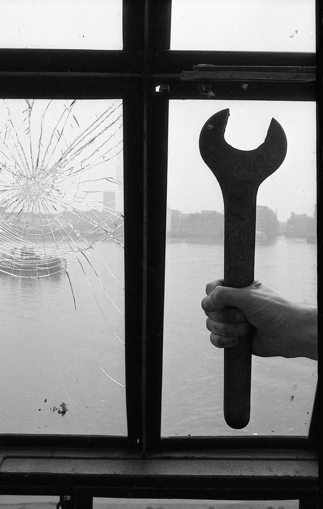
When you took all the images like the hand with the rose and the spanner, that was just you on your own or did Paul come with you, did he give you those props?
My memory of that is that, at that time, I would just go out and take photos. When Paul was talking about the Art of Noise, what kind of came into my head was like Russian Constructivism, Futurism… The Human League did an EP called, ‘The Dignity of Labour’ and I always thought of this idea of labour being a fantastic idea to get into, you know, the ‘strength through joy’ kind of thing.
I know what you mean, like SPK, imagery of spanners and hammers, almost acting out Russian Constructivist posters.
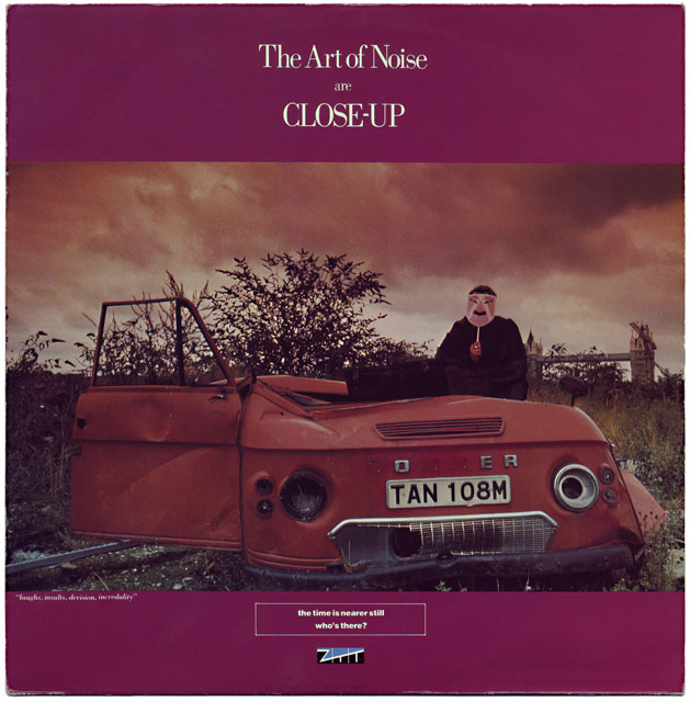
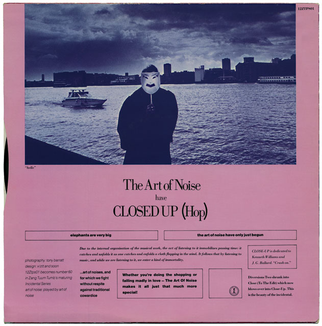
So, I would just go out on a Saturday afternoon, go down to parts of London that I didn’t know and I’d just wander about, climb into things and take photos of things and mess about. Where those photos were taken, where that crane was that I climbed into, the same place as the van (from the ‘Close Up’ sleeve). It has obviously been a scrap metal yard at some point but you can see Tower Bridge in the background and when you think about London 30 years ago, there’s a piece of scrap land that you can see Tower Bridge from, that’s unbelievable.
It’s fascinating for me to see the contacts for the original Art Of Noise spanners etc., just seeing the outtakes or different shots. (AJ had provided me with original contact sheets for some of these shots).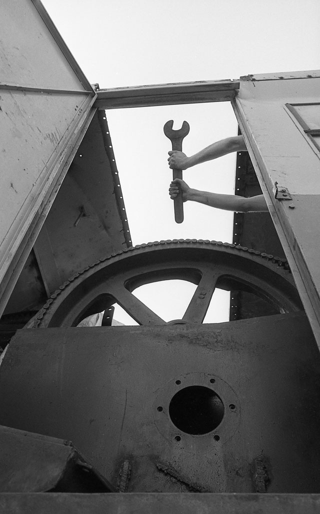
The spanner photo (above) is my favourite of all time because it’s my arms, I set the shot up and I judged how high up I should put the spanner and I did the cable release with my foot. Strange but true, when I saw it, I just thought, ‘wow’. It’s very rare that, you know yourself as a graphic designer, that you do something and…‘bosh’, it works. I was fairly pissed off when Morley didn’t put it on the cover. The one with the van is at a completely different time when I took my mate Phil down.
I’d figured that, I was going to ask, who was that in the mask?
(Laughs) In those shots it’s a friend of mine from college called Phil Priestman, where is he now?
Because you’d assume it was Paul.
Really? Do you think so?
Well, if there’s an image of the group, he was presenting that so you’d assume (that). It doesn’t matter who’s behind it though. Was that the same with the figure on the beach?
No, that was Jayne (laughs)
I’m not sure I want to explode any of these myths (laughs). This is the thing, I’m very aware that by explaining all this stuff it could just sort of pop the bubble. I don’t necessarily want to do that.
Well, I think it’s all well and good actually, the shots on the beach were at a place called Birling Gap, up between Brighton and Newhaven, very nice because of all those rocks and things. Me and Jayne went for a nice day out and…
“Put this cloak and mask on love…’ (laughs)
It was a cape actually, Jayne used to work at the National Theatre as a dresser and she borrowed it (laughs). If memory serves I was given the mask at ZTT and we took it down with us, or Paul dropped it around to where we lived back then. It had never crossed my mind that people would take for granted that that was Morley.
Well, who could it be? No one knew who it was… it was The Art Of Noise in some respects.
(raucous laughter from Tony) Trevor Horn?
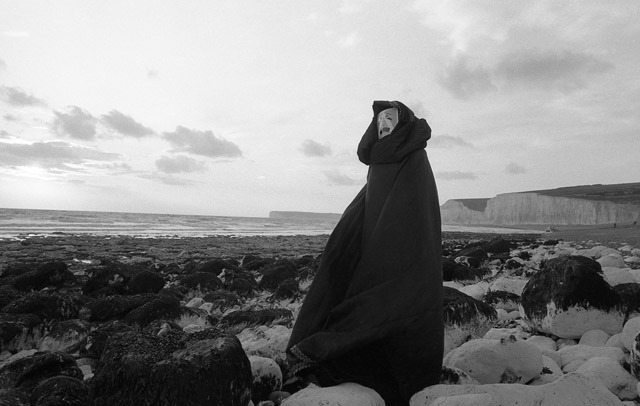
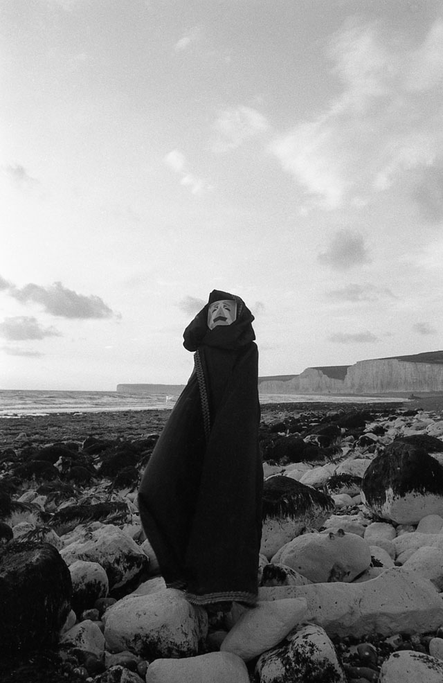
You would assume he’s the guy in the cloak, you know? ‘Don’t look behind the screen’, kind of thing. So there’s me thinking it’s Paul and it’s actually his sister!
That’s great.
I didn’t know who it was, there’s one on the back of ‘Close Up’ and there’s someone holding the mask and you can see some slicked back hair…
Yeah, that’s Phil Priestman (laughs). Who happened to have the same kind of haircut but that’s really interesting, I’d never thought of that.
In all the Art of Noise sleeves – their greatest visual asset (to my mind) was the masks and they dropped that completely once they’d moved to China records.
‘Close Up’ is my favourite Art Of Noise 12″ bar none. For everything about it – the music, the cover, the photos, the colours – that epitomizes them for me.
I’d say you’re right actually.
I would stare at that record, like many other ZTT sleeves, and just try and find clues because that was what ZTT was about, it never gave you the answers it just posed the questions and that was half the fun of it.
Well that was part of Morley’s…mystic.
Because he got so much stick over other things, he hasn’t really gotten the credit for the art direction.
Having known him since… when I first met Paul he had hair parted down to here. Tangerine Dream, Nick Drake, reggae, he loved all that. I have the utmost admiration for him, but having said that, I have watched him chance it and throw it out there so much, actually to the detriment of his health. Like all his heroes, he believed that if he kept that up, he could keep throwing out those great ideas, ‘their fourth number one’, let’s put sperm on the cover, this’ll go. And it got to the point where actually, Jill Sinclair and Trevor were saying, ‘well look, we need to make some money here’.
You can kind of see that in the sleeves and such, that playfulness, ridiculously indulgent whilst the coffers are filling up from Frankie’s success. He had a couple of years of ‘the dream’, the honeymoon period, if you like, and then he was reeled back to reality.
The cemetery pictures for ‘Who’s Afraid of the Art Of Noise’, was that Highgate with all the statues?
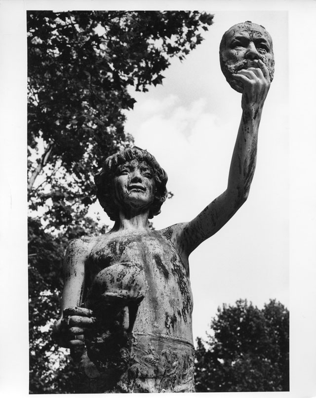
I don’t know which one because there are a few, I think the cover is Anton‘s (Corbijn), that’s nothing to do with me. I used to get really pissed off at it actually because I’d be ‘Art of Noise photography: AJ Barratt’ and then there’d be this image that wasn’t mine – Anton Corbijn. Because there was no real brief… there’s a photo of a statue holding up a mask, I can’t remember what it’s on? (Moments In Love 12″ sleeve). That’s in a Paris cemetery, I thought, ‘mask, statue, that’ll do for me’ and off you go. There’s another one in Paris from the same time where there’s a wall and a bit of graffiti and a statue behind, that’s at the Eiffel Tower, it was the same time. But the whole thing with the Art Of Noise was, if you see a little image like that, from my point of view, ‘take it’ and take it to Paul who would say, ‘I like that, we’ll see what we can do with it’. And the next week it’d be on a sleeve and you’d go, ‘er, alright Paul, should I chuck an invoice in?’, ‘yeah’, ‘alright, thanks’.
So, what would happen with this? Would you ever meet the designers or would you give the stuff to Paul and he would sort it?
I didn’t have much contact with designers – I was a photography student at the time. I remember going to a design studio in Soho in, maybe, Carnaby St. and I’d take stuff in and talk to them about it. They were really nice actually.
That would have been XL
It was XL, it wasn’t Tom though (Watkins) because he was the manager. I remember taking some stuff in and them saying, ‘what was the brief with this?’, and I said, ‘hey, this is ZTT, Paul Morley’..., you know? See if you like it and work around that.
He was famous for coming in with little things like beer mats with scribbles on and then working from that.
He directed the ‘Moments In Love’ video and I remember doing the stills on that and getting a picture of JJ (Jeczalik) who had the make up on, holding a rose. And then going round to Paul’s house once when he was sick to get permission to use it and him shouting, ‘AJ, what were you thinking?’.
You did the shot of the three of them and they’re made up as, almost clown / marionettes? It looks like it’s in a hairdressing salon.
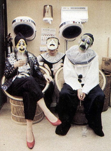 No, no, that’s backstage at The Tube (80’s TV music show) when they were on it, I did take those, yeah. We flew up to Newcastle, it was a horrible flight, bumpy all the way.
I love that photo, that’s the nearest they came (whilst on ZTT) to ‘being the group’, Anne and Gary have face paint and JJ has a mask. It’s interesting that when the Art O Noise signed to China records they made lots of records with guests – Tom Jones, Max Headroom, Duane Eddy – and they needed a front man because Paul had previously provided that.
I think they suffered from that, there was no guiding voice.
Who has these negatives then? ZTT?
Um, you see, when we moved abroad a lot of stuff got destroyed and lost but I would love to say that everything was filed up beautifully from A to B, but it isn’t. But yes, they did go to ZTT and they might well have disappeared.
At this point we have to disappear too so we’ll end part 1 here having sampled AJ’s memories of the Art Of Noise. Part 2 will be along shortly where we conclude with tales of Frankie tours and frustrating videos shoots.
All photos except the backstage of the Tube scanned from AJ’s negatives, © AJ Barratt. All sleeve and picture disc art scanned from my personal collection, © ZTT. All text © ArtOfZTT 2013.
Postscript: “Trevor Horn once told me, every studio in the land has a cupboard, where they’ve nicked all his samples” (laughs).


