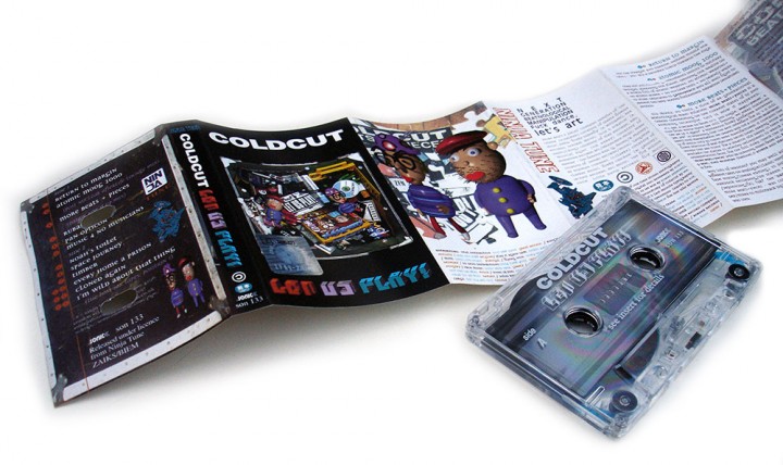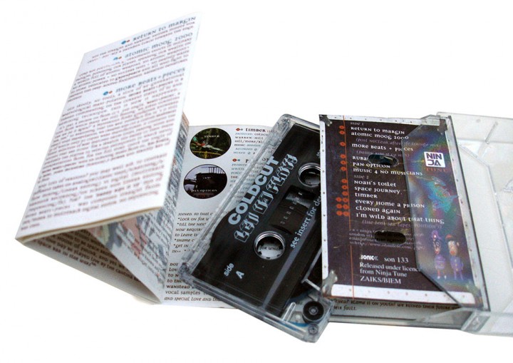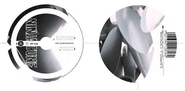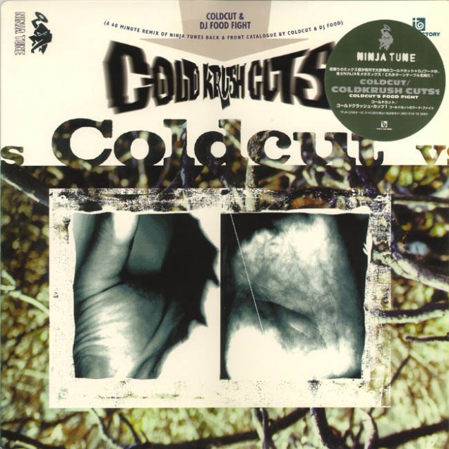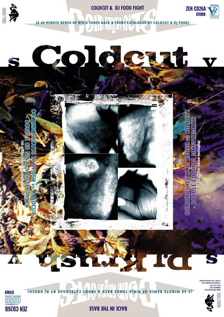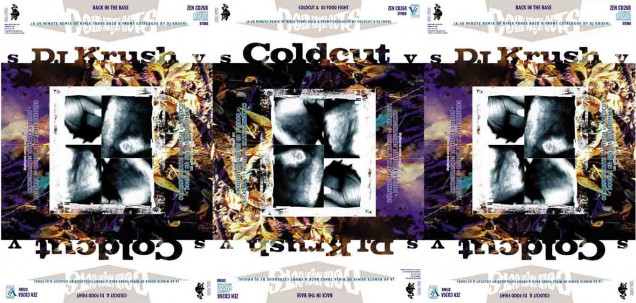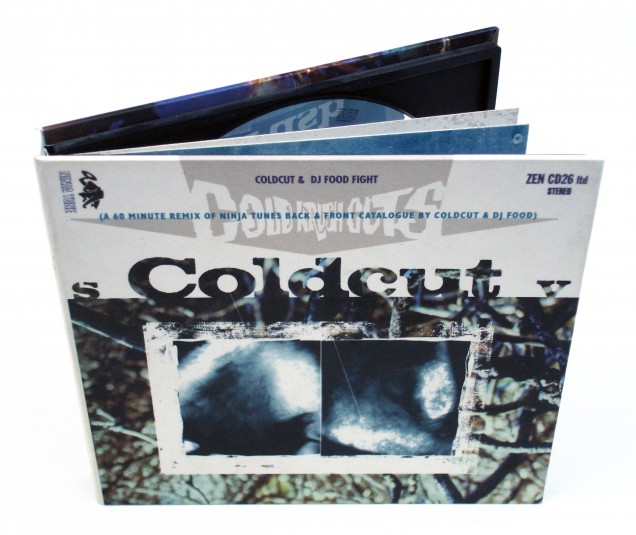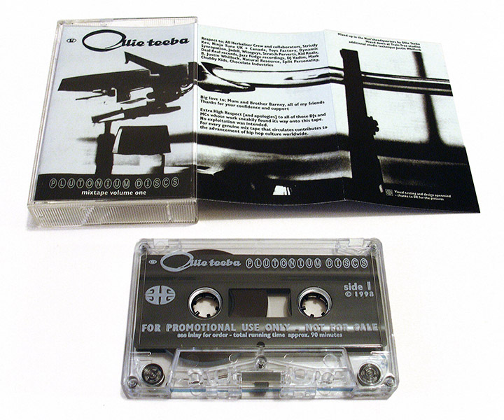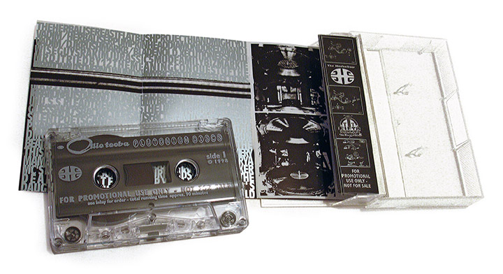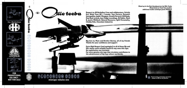
- RELEASED: Nov 1998
- FORMAT: 2xLP / CD
- LABEL: NTONE
- CAT No.: NTONE30 / NTONECD30
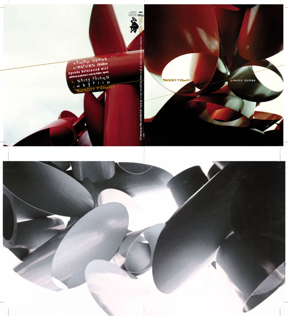
- DESIGN: Openmind
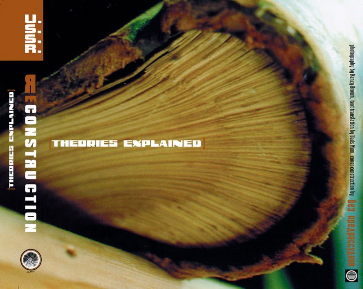
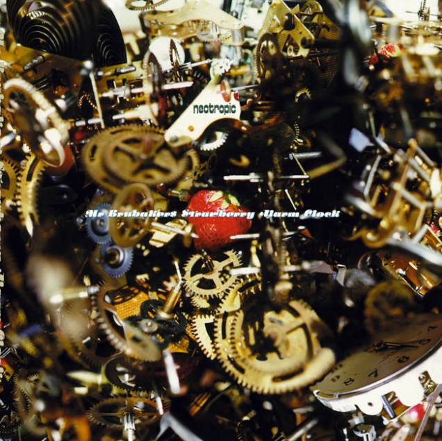
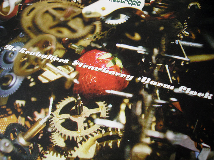
- PHOTOGRAPHY: Nancy Brown
- EXTRA ZEN: ninjatune page / BUY
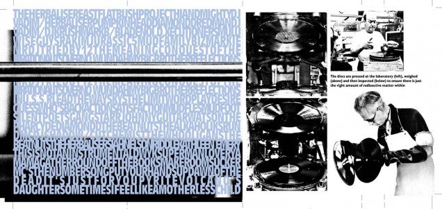
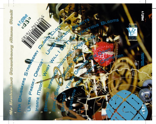
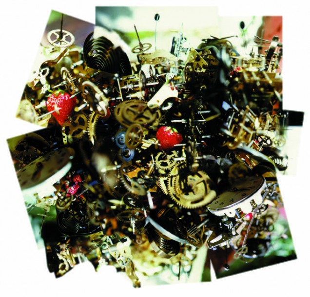
Riz went all psychedelic with her titles and I – for once – attempted a literal imagining of the album name after buying a big bag of clock parts at Brick Lane and a punnet of strawberries. This was shot by Nancy Brown in the back garden of a flat I shared with Ollie Teeba after I had formed a ‘cage’ of clockwork for the strawberry to sit in. It was a lovely day, hot with bright sunshine and we sprayed the strawberry to make it look fresh.