Love this tumblr of Olly Moss-inspired minimal movie posters. You’ll need a while to go through them but I’ve picked some that caught my eye, I seem to be obsessing over circular designs at the moment.
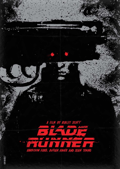
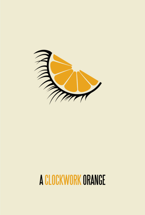
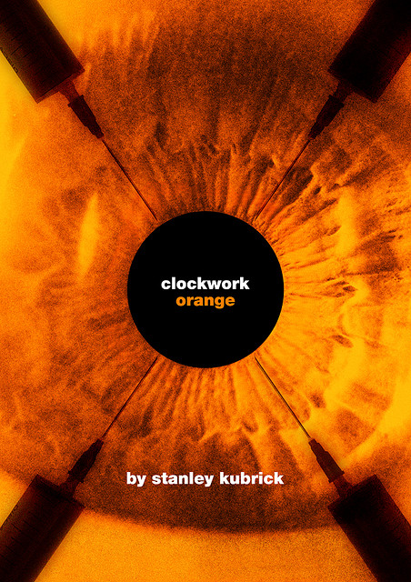
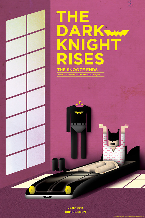
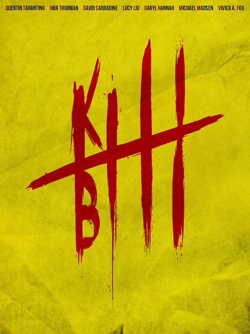

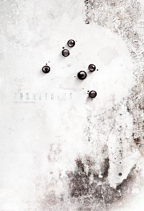
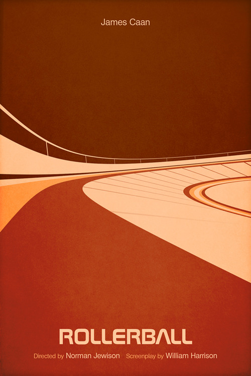
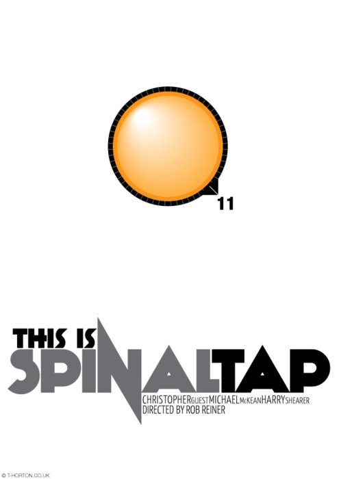


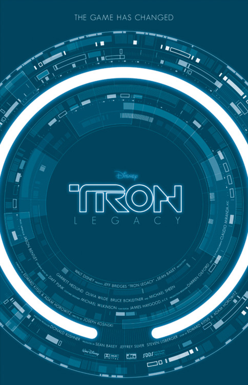
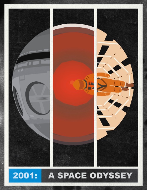
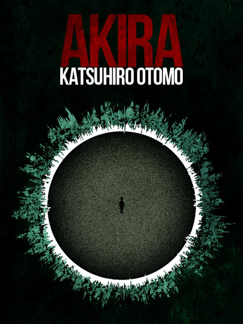
Love this tumblr of Olly Moss-inspired minimal movie posters. You’ll need a while to go through them but I’ve picked some that caught my eye, I seem to be obsessing over circular designs at the moment.
 Felt Mistress aka Louise Evans has a book coming out of her creature designs from the last 18 years. 400-pages feature over 1,650 photographs, previously unseen drawings of her partner Jonathan Edwards’ original design ideas, details of every Felt Mistress collaboration with other artists and more. With in-depth interviews with Loiuse, Jonathan, Jon Burgerman, Pete Fowler, Ben Newman, John Knox, Nobrow and more, it looks like the definitive article.
If you pre-order the book from the publishers Blank Slate you’re in with a chance to win an actual Creature made by Louise which is featured in the book. One book will come with a felt ‘You Win’ ticket as seen below and details of how to claim your prize.

There are also versions of the book with Mr Tippy characters in regular and gold editions and, if you still can’t get enough creature love, you can hear Louise and Jonathan talk about the book at Foyles on Charing Cross Rd. on Dec 11th at 8.30pm. The talk is free but you have to book a place online and Jonathan will be doing creature portraits on a first come first served basis.
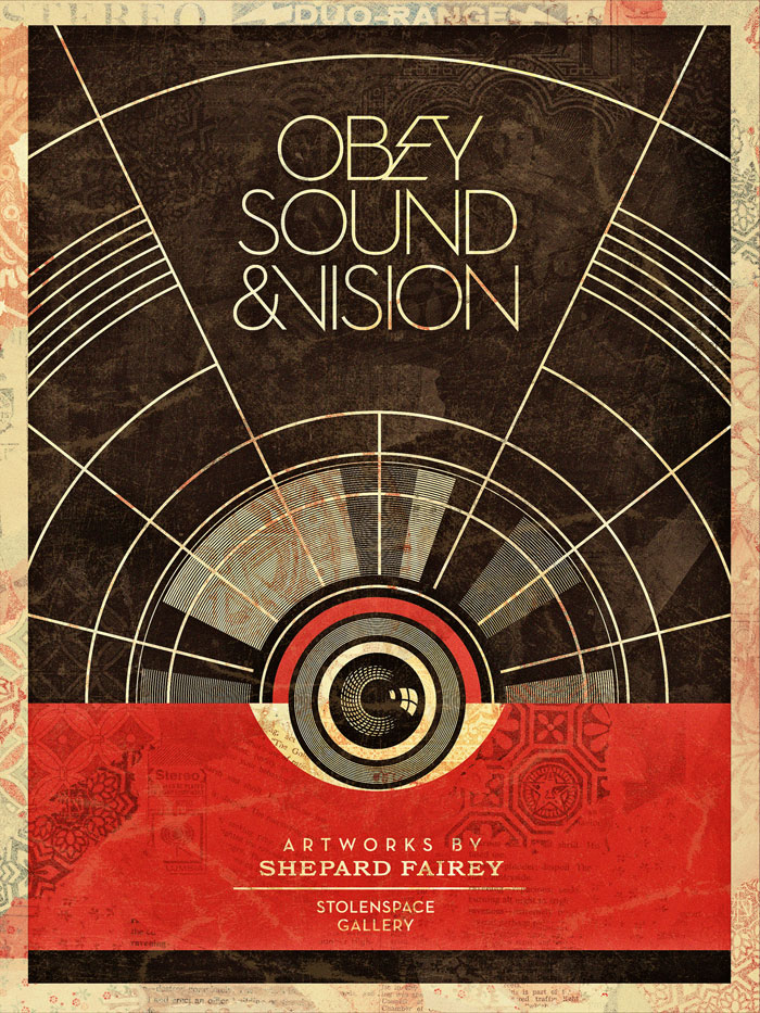
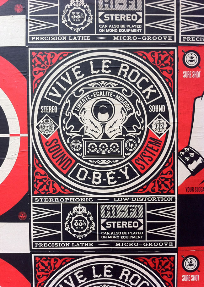
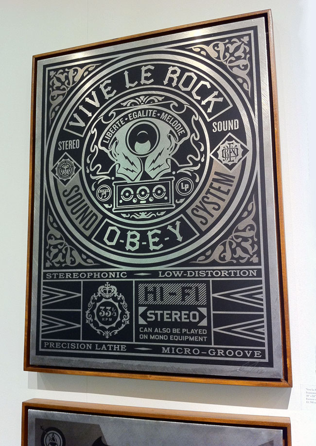
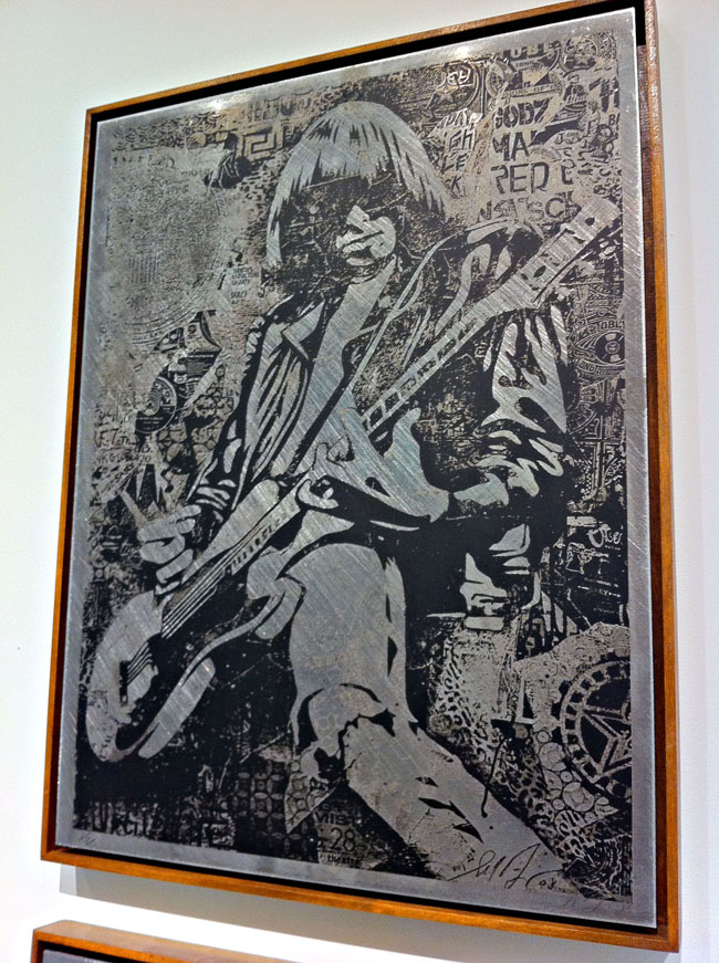
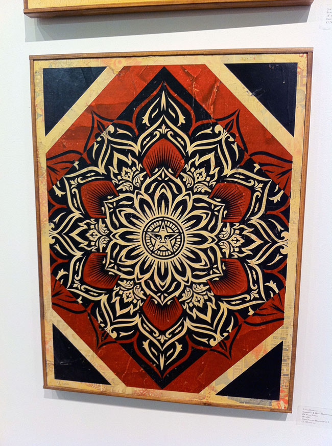
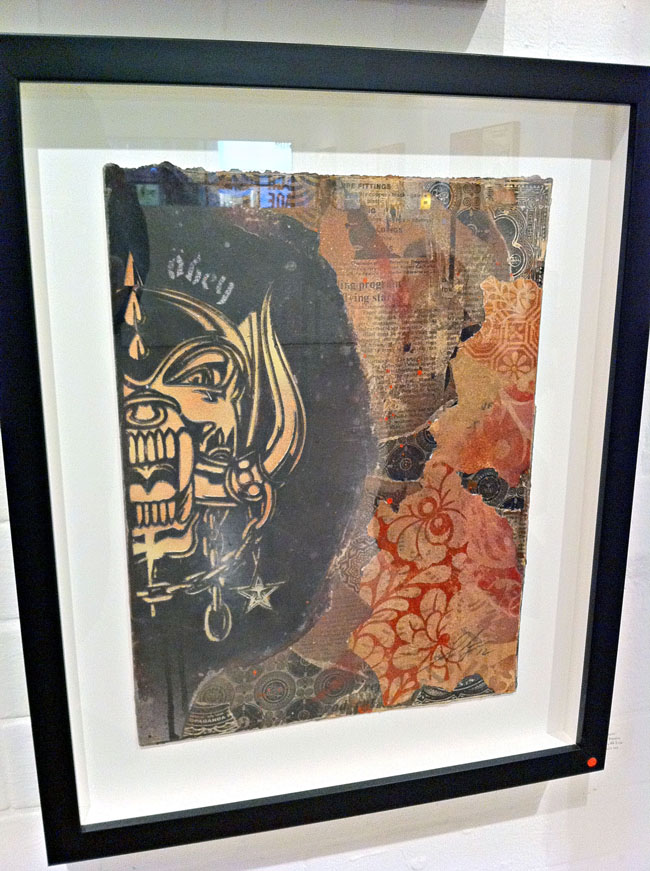
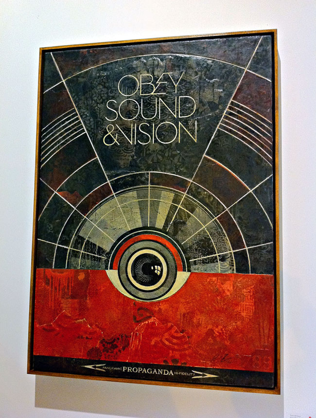
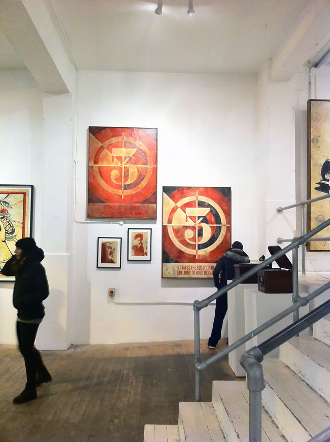
 I finally got to see the Shepard Fairey ‘Sound & Vision’ show at StolenSpace over the weekend and it is highly recommended. There was a vast amount of work pitched between two galleries with a shop in between for good measure and as a body of work it’s very impressive. I’ve been a fan since seeing his early paste ups in New York in the mid 90’s and attended his first London show in ’99 at the Horse Hospital. That he was doing a music-themed show was music to my ears (sorry), given that he’s designed sleeves and videos for a number of acts over the years and knows the language, always inserting musical icons into his work. For those that know Fairey’s style – it’s not a massive departure visually, the red, cream and black colour scheme dominates throughout and that’s fine because it’s a classic. He really doesn’t need to mess with the formula as there’s more than enough here to see and it gives everything a certain coherence.
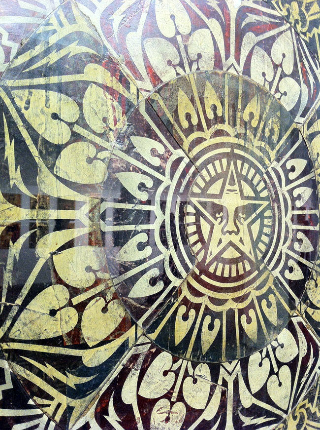
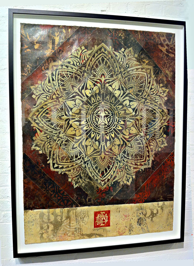
He’s experimented with other ways of presenting though, a series of A2 images are repeated on brushed metal in one part of the gallery and there’s an underlying collage feel to some of the pieces where he’s pasted several layers of paper together before printing over the top, much like the fly-postered surfaces he goes over on the streets. Elsewhere multiple copies of the same print have been dissected, mixed up and reassembled so that geometric patterns are present from the different print and paper colours. These are stunning to see in the flesh, like some ancient scrolls unearthed from an Eastern archive, each one is dirty as if layers of varnish and glue have been applied and their edges remain ragged. Elsewhere he has ‘retired’ stencils pasted into collages, edges thick with paint and given a new lease of life as the tools become exhibits in their own right.
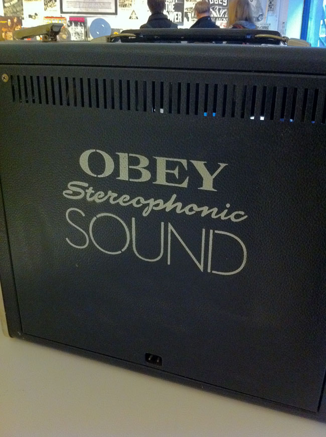
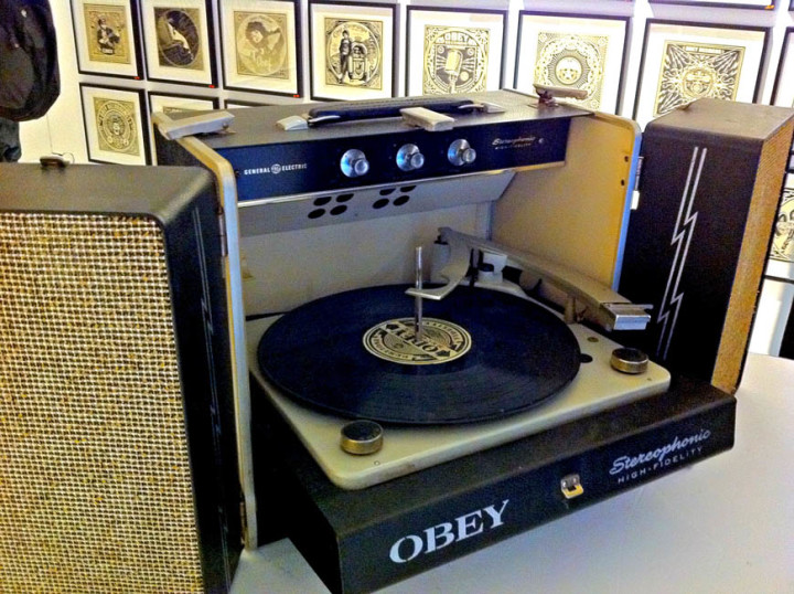
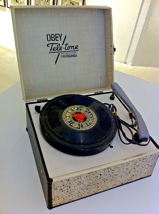
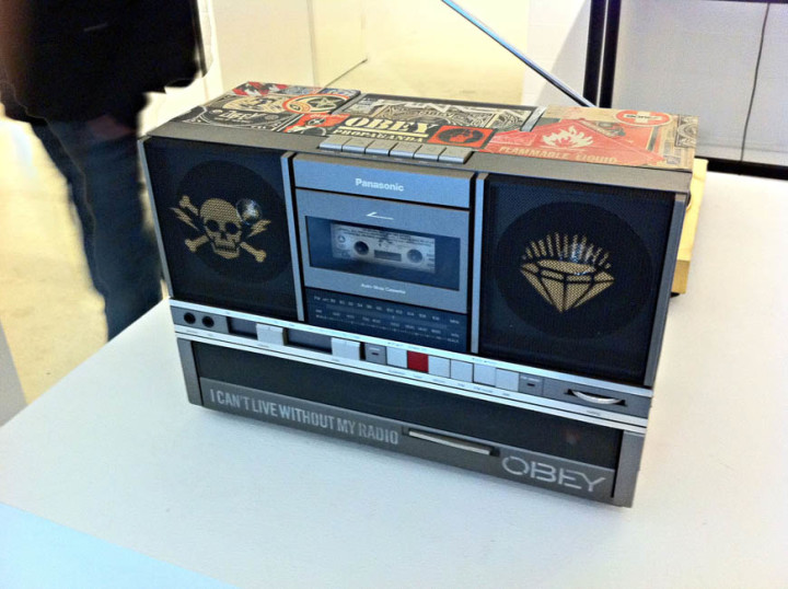
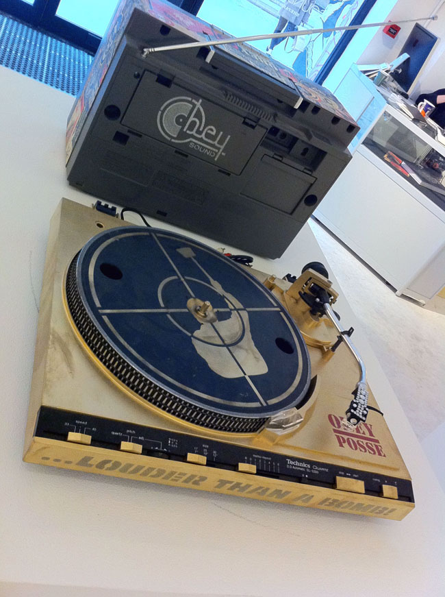
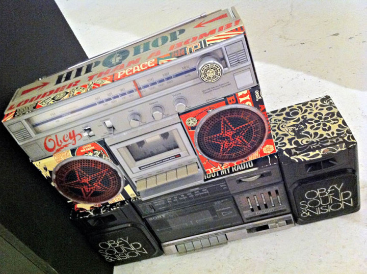
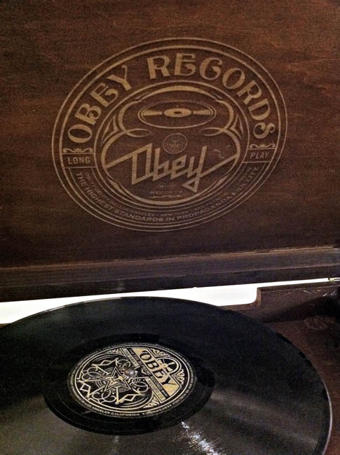
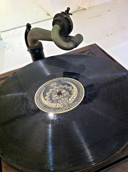
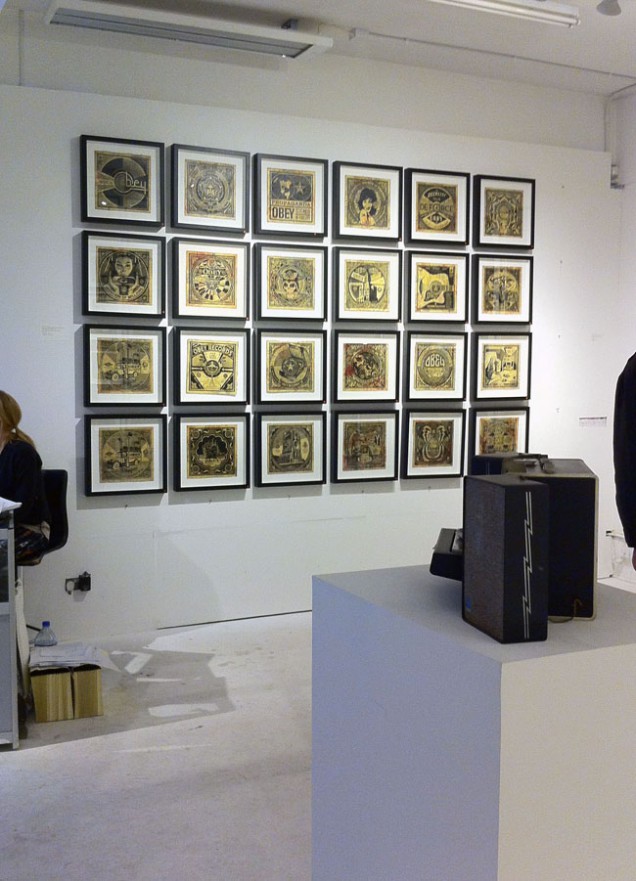
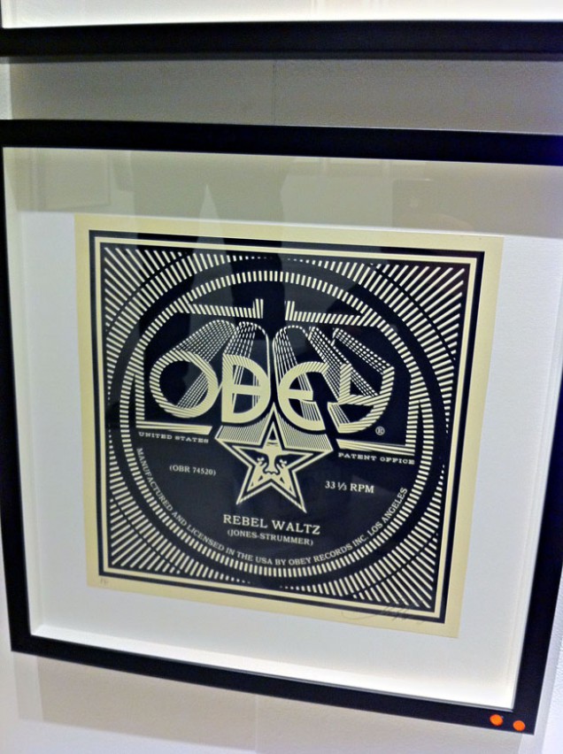
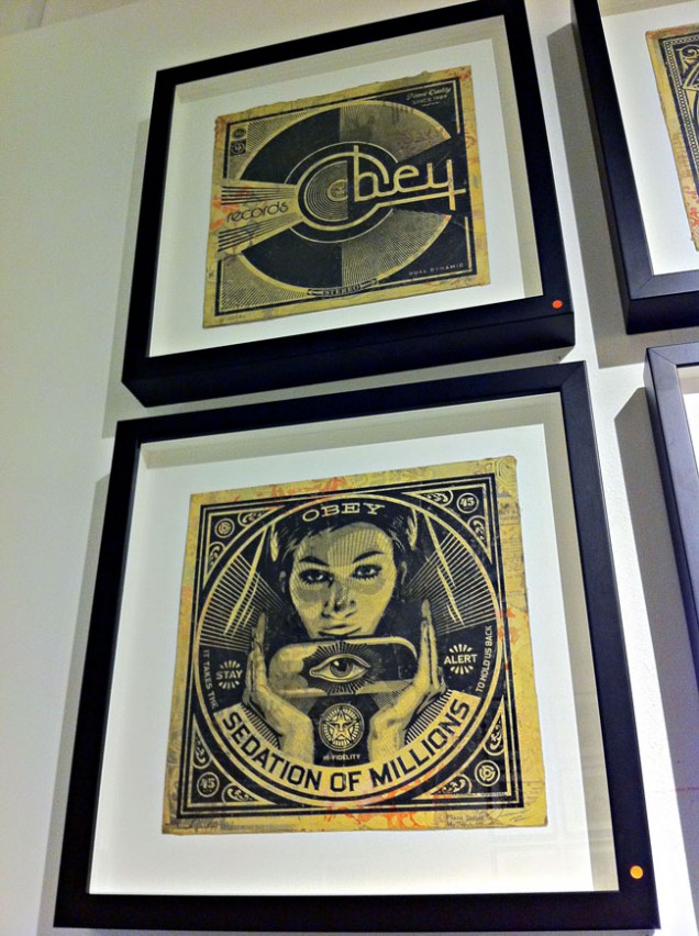
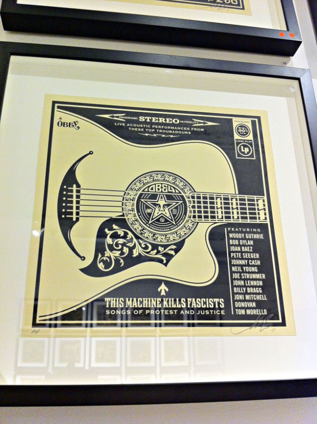
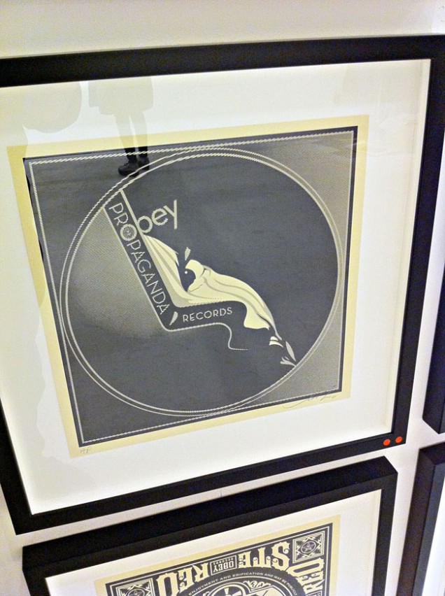
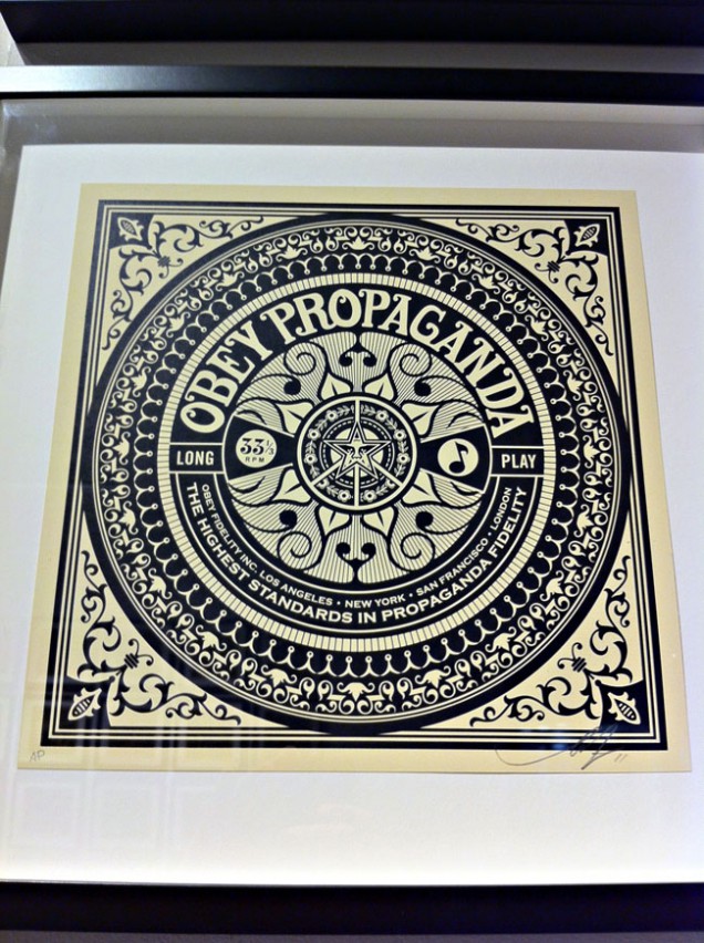
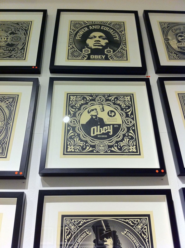
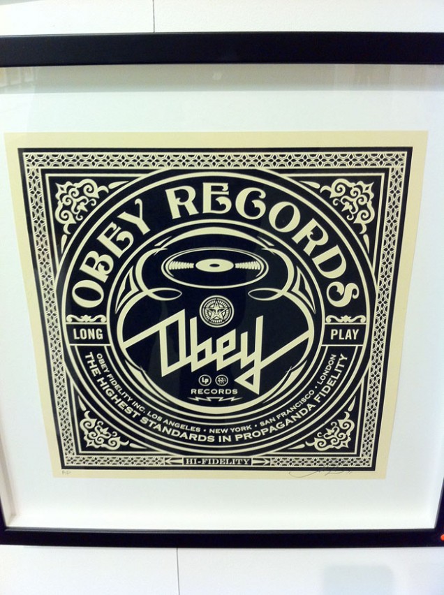
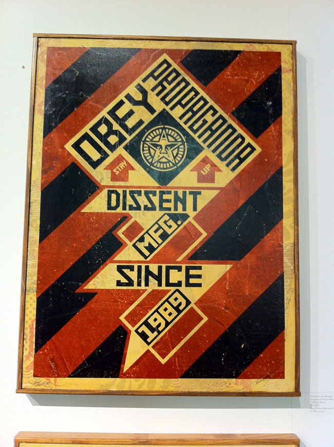
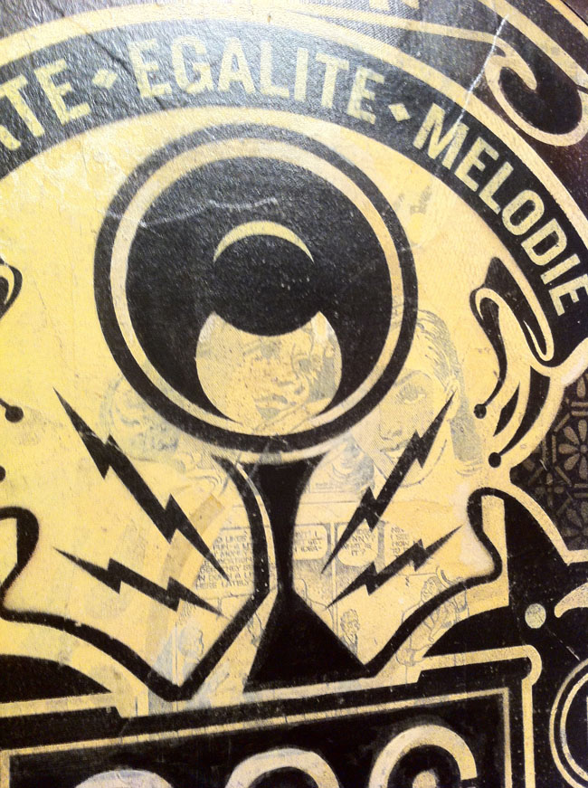
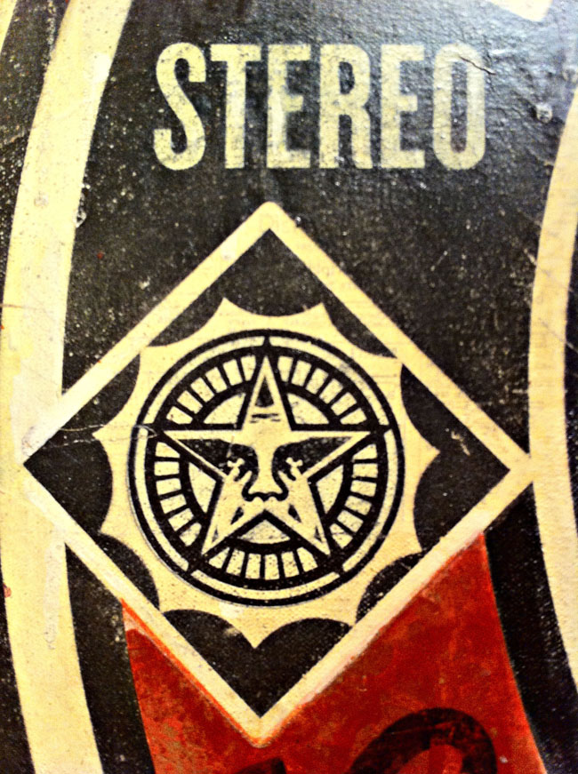
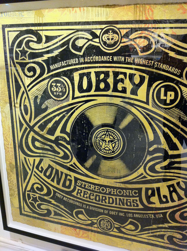
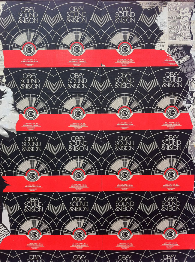
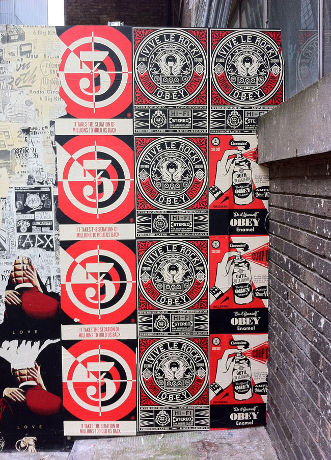
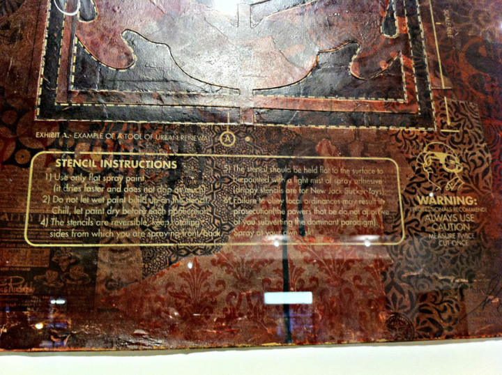
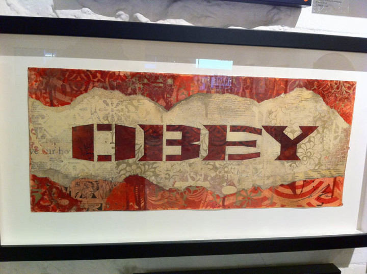
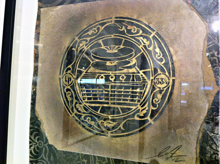
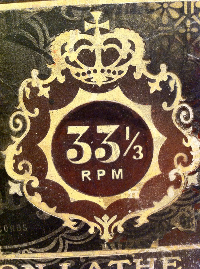
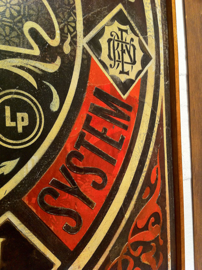
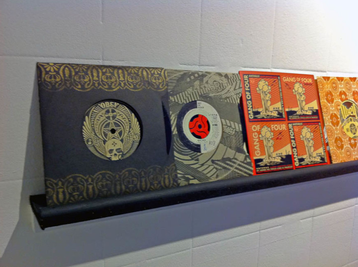
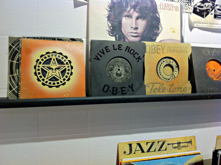
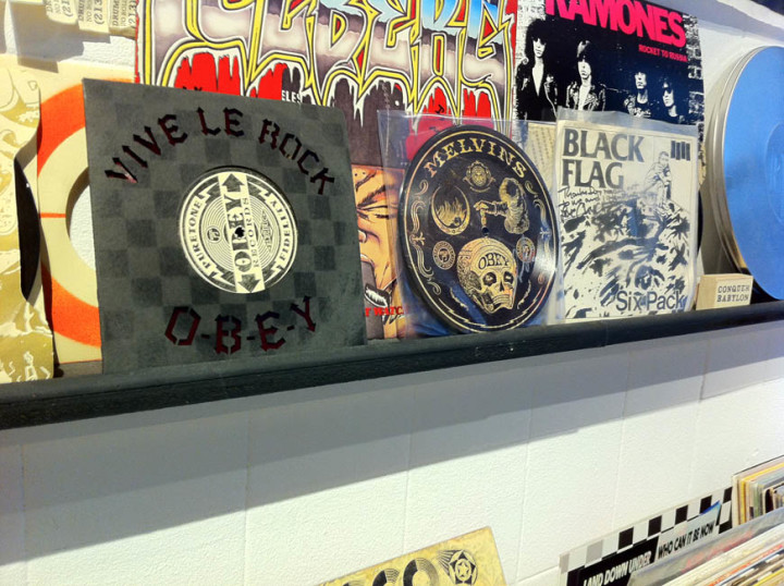
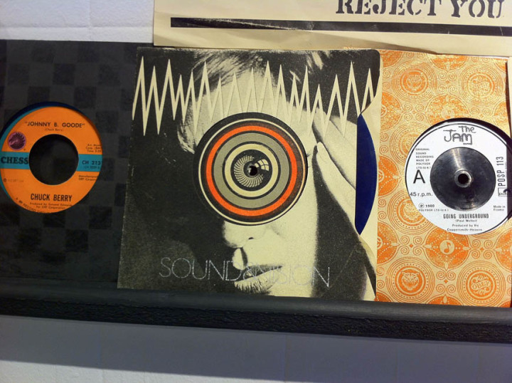
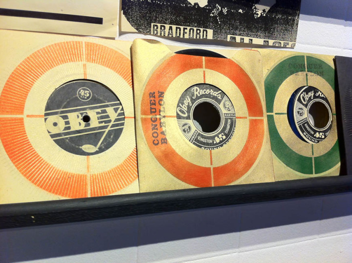
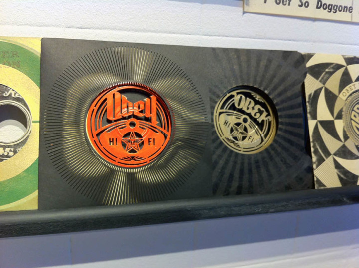
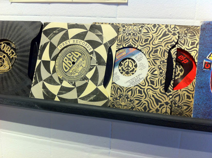
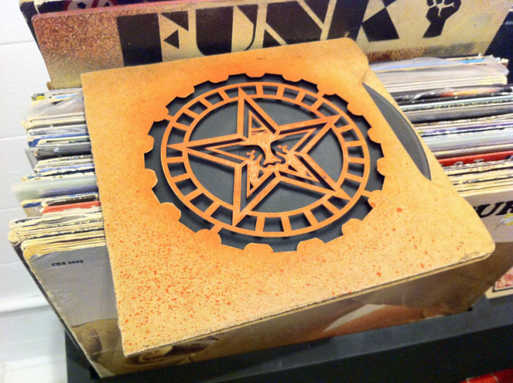
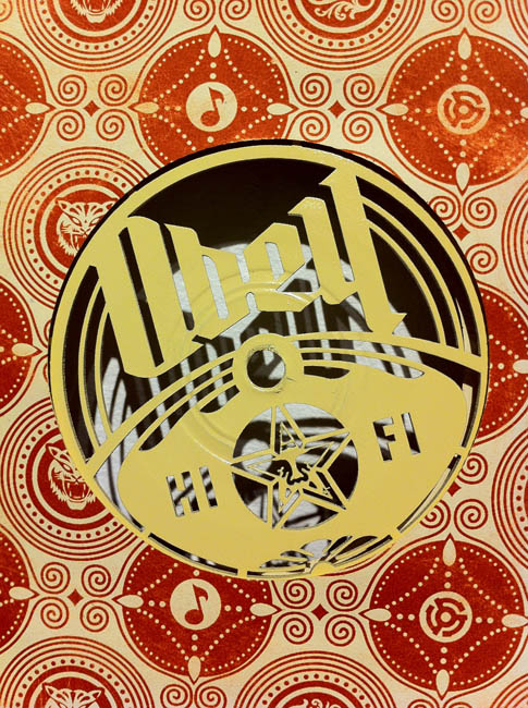
The part of the show that I thought most successful was the gallery with the records in racks, (part of Fairey’s own collection), customised turntables and 12″x12″ prints. Copies of sleeves he’d designed were randomly inserted throughout the vinyl as well as a tantalising selection of 7″ custom ‘Obey Recordings’ laser-cut sleeves and record labels. These were beautiful objects and the fact that you could touch them just added to the experience, sadly they weren’t for sale and I wanted to steal one so badly but resisted. Various vintage record and tape players were dotted about with stencils and stickers added to personalise them in the Obey way, you could even play the records on some of the turntables which was a nice touch. A lot of the prints in this gallery were fictional Obey record sleeves using advertising logos and jargon from the classic Stereo Test record era mixed with Fairey’s usual propaganda-type slogans. There was repetition of the imagery but each design held it’s own and it was hard to pick a favourite as they were all beautiful. Above the record racks sat a wall of black & white gig posters, except they weren’t. Fairey had taken existing images and posters and retooled them with his own logos and messages and this is where I start to have issues with some of the work.
Before everyone pulls me up and says, “Shepard Fairey using other people’s work? surely not!? Next you’ll be telling me bears shit in the woods?” I’m pretty well versed in his history. He’s always appropriated the imagery of others, subverted existing logos and messages to his own needs, he’s by no means the first or the last to do this and various lawsuits have been filed as with any successful artist – ‘where there’s a hit there’s a writ’. The whole argument for and against appropriation could fill books and I’m not about to go into it at length here, also given that I use others materials in my own work there’s an element of the pot calling the kettle black. However I have my own yardstick for how much of something is used, abused or hinted at in any work and far too often he goes over the line with parts of his designs here. I find this work to be the weakest and it cheapens the rest of it somewhat as it’s a quick and easy thing to take an existing image or logo and reinterpret it – it’s lazy for the most part, a quick artistic crowd-pleaser.
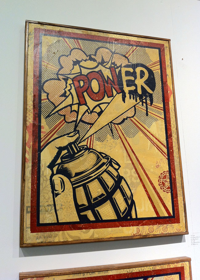
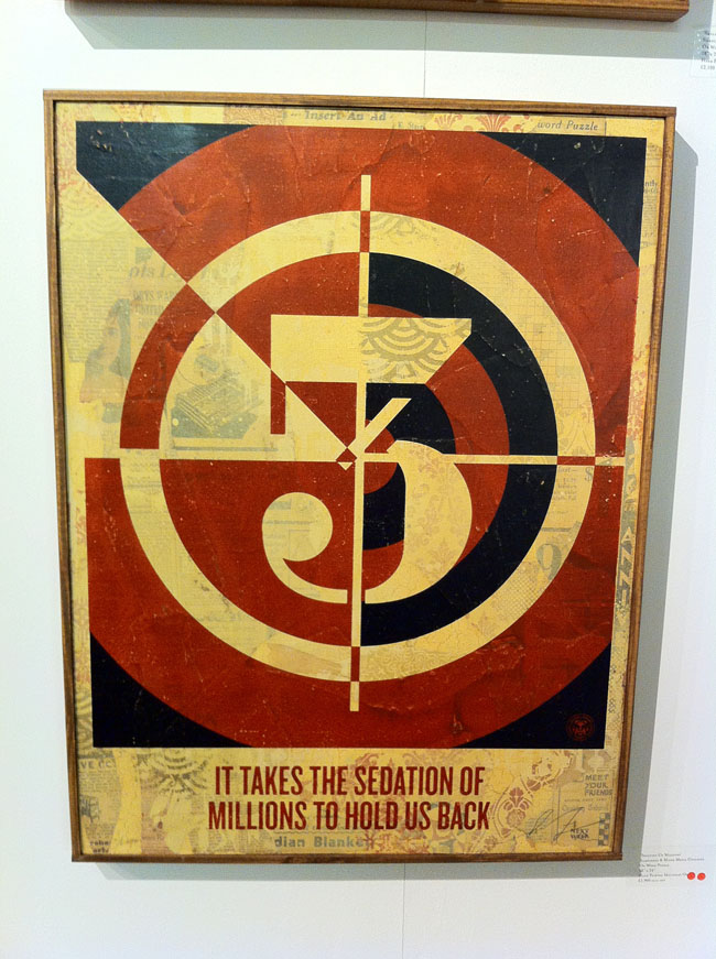
I find it more interesting to take the benign and turn it into something beautiful by re-contextualising it like Warhol‘s Campbell’s Soup tins or Lichtenstein‘s comic art appropriations (although this still doesn’t discount the matter of copyright infringement). Fairey does this well with the various nods to the design language of 60’s and 70’s era record graphics: turntable speeds, 45 adapter shapes, retro fonts and patterns – you’ve seen it, or something like it, before but it’s not a complete rip. But by taking existing gig posters and redesigning them into more gig posters in his own image he’s not bringing anything new to the medium, just basking in the reflected glory of others’ work. Chuck D‘s Public Enemy logo is modified so that the silhouetted figure in the crosshairs now has a pasting brush, Lichtenstein’s pop art is parodied with a grenade as spray can adding an ‘er‘ to a ‘POW!’ speech balloon, Jamie Reid‘s ‘No Future’ Sex Pistols tour poster is modified and Joe Petagno‘s Motorhead logo is just used straight in a couple of pieces. Another one takes Jasper Johns‘ multi-layered number paintings as inspiration and just changes the typeface, again using the collaged bed for texture that worked far more successfully on the previously mentioned pieces where he’d used his own designs.
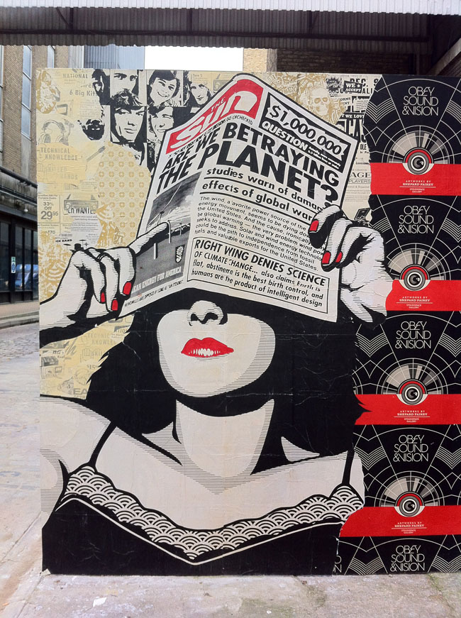
By parodying other artists’ work I feel Fairey is cheapening his own art, I think he’s better than this, well, I know he is because of all the other work in the show. It is littered with cultural bookmarks and (mostly Rock) icons – Joey Ramone, Lennon & Yoko, Lemmy, Iggy, Cash, etc. – again taken from existing (uncredited) photographs and homogenised in the clean, smoothed out style he made famous with his Obama ‘Hope’ poster. 80’s graffiti heroes like Haring and Basquiat feature alongside enough punk and post punk legends to fill an issue of Mojo. And that’s fine but I’m not sure what he’s trying to say by including these aside from the inherited ‘cool’ factor and the rebel nature of a lot of the subjects, linking into the subversive attitude and message in many of the other pieces no doubt. Grenades feature in several pieces and the grenade as spray can image from the ‘PowER’ piece is an extremely strong icon which he should revisit and exploit in future works rather than have relegated to a Lichtenstein pastiche.
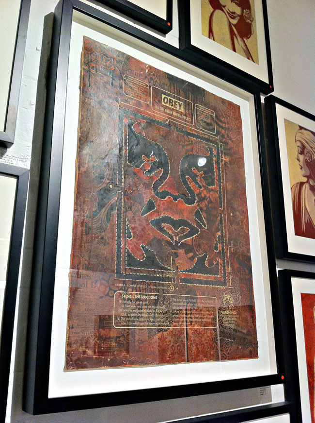
I found the upstairs of the main Stolen Space gallery the most uneven of all the work including a few larger pieces that looked like they were experiments in a new direction but with little visual direction apparent. Interestingly, whilst virtually every piece had sold throughout the exhibition, these had not, possibly more due to their high price tag than the virtual absence of anything that said ‘Obey’ about them. It was this elevated section that seemed to have the left overs in it, odd sized pieces which didn’t fit elsewhere so had been clustered together when a few less and a bit more surrounding space would have given them more impact and taken any filler out. The best here were the retired stencils – one of his classic Andre The Giant with painting instructions – and the design for the show poster itself which greeted you when you walked in. Overall though there was way more good than bad and to have such high quality throughout with that number of pieces – there must have been around 200 or more – is some feat.
The show ends on Nov 4th so you have less than a week to check it out and we feature Z-Trip‘s soundtrack mix for the exhibition on this weeks Solid Steel.
 Now that is pretty gorgeous, new print from Tycho, whose ISO50 website you should really check out if you’re a regular reader of this blog and haven’t ever been over there.

 .
.
.
.
Is it a circuit board? Is it a map of the London Underground? Is it a radio? It’s all of the above apparently.
I don’t usually go for things like this – one household object adapted to form another, like those vinyl record bowls – but the Tube map is a design classic and I have a thing for circuit boards.
Designed and built by Design Museum artist-in-residence Yuri Suzuki, these images come via the DesignBoom website. More info and a short film over there.


 After stopping inexplicably after 8 episodes back in August with virtual radio silence as to why, Tron Uprising returns to Disney XD tonight at 7.30pm. Yay! We finally get to find out how Tron turned into Rinzla…
 Love Reso‘s stuff, always interesting to see where he’s going with things. Great cover on this one, slightly reminiscent of the Tame Impala one I posted below with the pink/red sticker and abstract image.
The track, ‘Check 1,2’, is a killer slice of 100bpm break beat thunder which reminds be of some of those old Prodigy B-sides that were better than the A-sides. Remixes come from Starkey, DJ Kentaro, Emperor and Danny Scrilla and it’s out on Civil Music on 12″ and DL with an album forthcoming.
 Really liking the new Tame Impala album, ‘Lonerism’, especially the glam-stomp of the single, ‘Elephant’. Love these covers too, not sure who did them but I’m guessing it’s the excellent Leif Podhajsky who did some for them before maybe?


 Sculpture recently posted these zoetrope designs on their site, if you print them and spin at the right speed you can get some amazing animated effects. The complexity of these blows my mind, there’s so much doing on I could look at them revolving forever it seems. The Digitalis label are releasing edits of ‘Slime Code’ (a tape-only release in an edition of only 7 copies (!) from earlier this year) and you can listen to excerpts here. I’m hoping that at least one of these designs will be on the vinyl release in November.
They also have a new Tumblr too.

 The forthcoming Pepe Deluxé ‘Queen of the Wave’ deluxe edition will have an EP of easy listening versions of album tracks by the mysterious Yol Gorro. Here’s the front and back covers, follow the progress of the edition on Facebook as more is revealed weekly in the run up to release.


 Love this cover and I was talking to the photographer who shot it the other week because he was explaining that it’s all real, not CGI as some people might think. They’ve been lugging it about all over the place photographing it in different locations but I’ll be damned if I can remember who it was I was talking to? Frazer Waller maybe?
 Incredible stencil work done by Snub23 for the ultra limited edition (and sadly sold out) deluxe LP bundle for The Herbaliser‘s new album, ‘There Were Seven’. You can however buy the regular vinyl (but not for long as that’s a limited run too), designed by yours truly, from the Herb’s online shop, (click the red ‘store’ button top right for a pop up). Each one comes with two printed heavy card inners inside a screen printed PVC sleeve with a downlode code too.


 My friend Duncan who runs the Clockwork Shorts site (some of the best film reviews out there, mixes too) sent me these photos of a custom Gelaskin he got made for his Nexus 7″ tablet – nice
 My good friend Sarah Coleman, aka Inkymole, who recently put on an exhibition of mine and Henry Flint‘s work, has done the cover for the new US edition of Playboy!
No, she hasn’t given up the pen to strip off and become a bunnygirl but that’s her hand drawn type all over the cover. The mag has recently gained a new art director who is keen to get back to the days of old when it had some genuinely original designs fronting it.
For more info, and a look at past designs sourced from the ever-handy Secret Oranges blog, go to Sarah’s Inkymole site.
 Very jealous of those who will be able to go to this

A match made in heaven, Syd Mead designed Gundam robots, some of which you can get in kit form.


 These images recently came up in an old 1994 2000ad monthly my friend David Vallade got from his local library. Carlos Ezquerra‘s original designs for Dredd, his lawmaster bike and law giver gun.
The style of the 70’s is present in the chopper-esque bike proportions and flared gloves. Note the diagonal zip on Dredd’s uniform and lack of eagle shoulder pad.
“Dredd’s breast chain and badge actual predated punk fashion and with the black clad uniform, screened by a black helmet and his knee-length boots, he was the most exciting British comic book character that radiated menace” – Steve MacManus‘ ‘The Judge Dredd Story’ 1994.


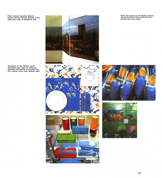
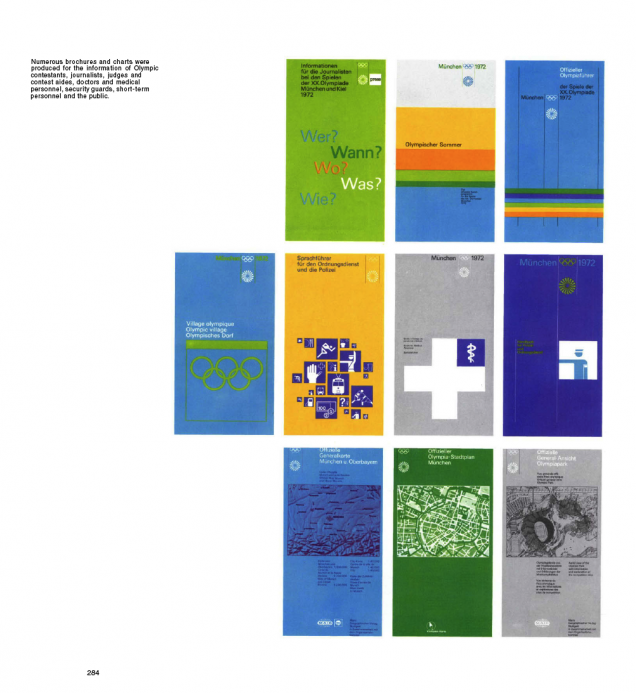
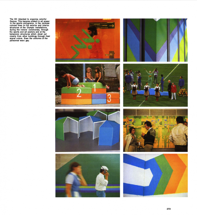
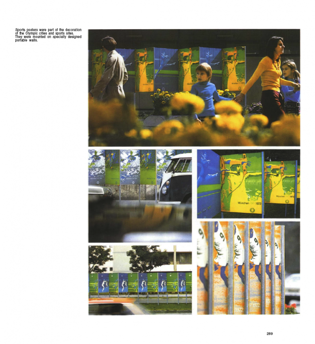
To the news that George Obsbourne just got booed by a stadium of 80,000 at the Paralympics medal giving ceremony, I bring you more beautiful design from the games’ past.
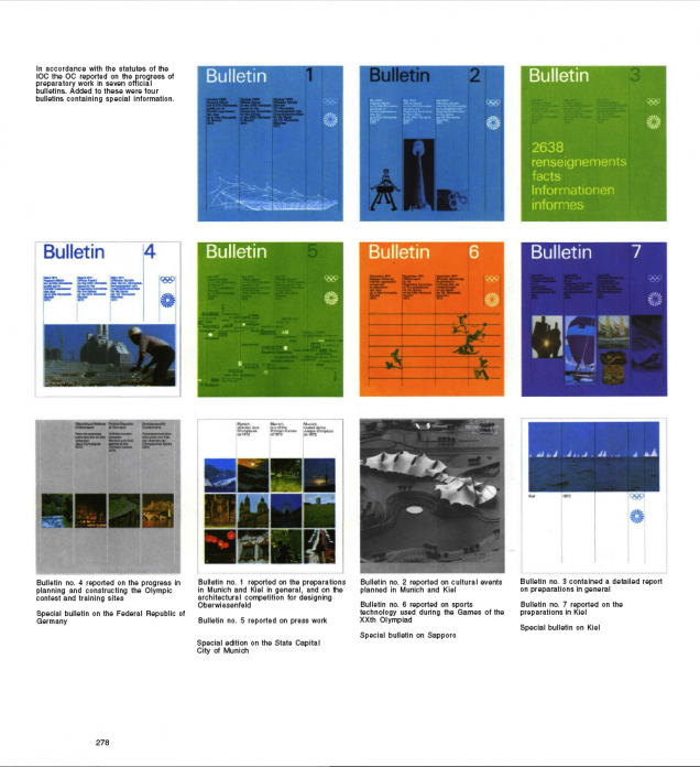
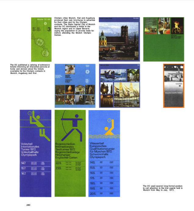
The gorgeous look for the Olympic Games held in Munich in 1972 was designed by Otl Aicher and his team. This is widely credited as a superb reaction to such a wide-ranging brief with everything working together in harmony to create a perfect look and feel. 


 Wah Wah 1&2 – Barcelona’s best* new and used store for weird, psychedelic, electronic and everything else besides (*well it was the last time I was there).
I’m always on the lookout for interesting designs of all kinds and on my travels over the years I’ve kept a small collection of the more interesting record store bags I’ve found.
 Rotate This – One from the many, many fine stores in Toronto, I love this, simple one colour on a brown paper bag.

 Hi Fi – A Chicago staple, clean and simple (and they remembered the address)
Hot Wax – An oldie from Tokyo, the shop is down in a basement, the store that’s there now might not be called Hot Wax any more though.

Borderline Records – From Brighton, UK – the edge to edge illustration is pretty nice.


Fantastica – Great 60’s inspired design on silver plastic (you can’t really see that in the scan) This was a little shop in a back street on the first floor in Shibuya, Tokyo. It had the greatest collection of weird and wonderful records I found in that city in the 90’s. They even had an original copy of Afrika Bambaataa’s Death Mix 12″ but after picking out a ton of stuff with less than half an hour left before we had to go to the airport I discovered they didn’t take credit cards!
Aquarius – Nice Blue Note-esque design for San Francisco’s premier store for the weird and wonderful

Vinyl Planet – Another of the 50+ record shops rumoured to be open in Shibuya alone. This design is screen printed white onto a transparent bag (note Edan record inside).

Echo – Return of the Bag – They know what i’m talking about, unfortunately this design is let down by the fact that they didn’t put the shop address on it so I don’t know where to go back to get more records.