Amon Tobin – Permutation 25th anniversary reissue

ATP purple 2
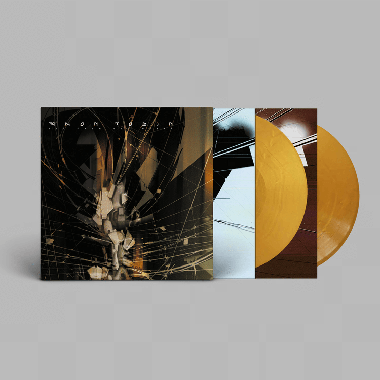
Big legacy reissue just announced – I started working on the artwork for this last summer and I’d say it *might* be even nicer than the original.
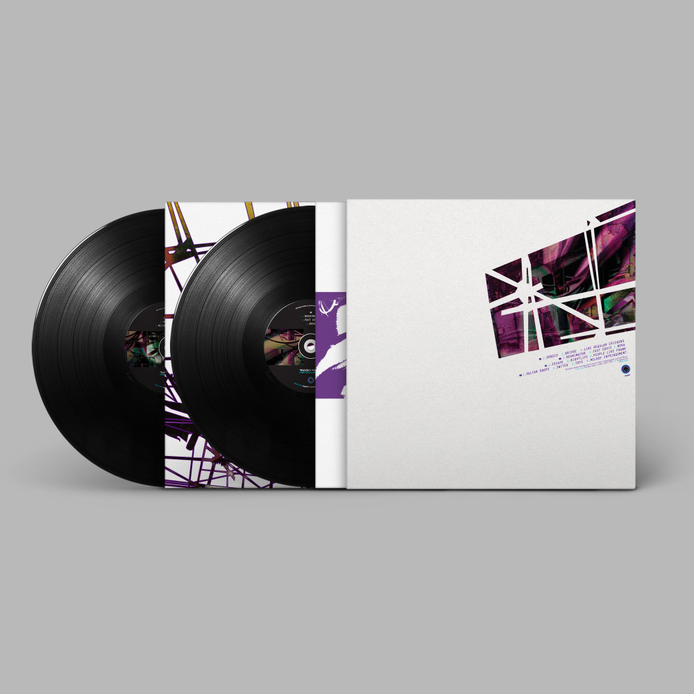
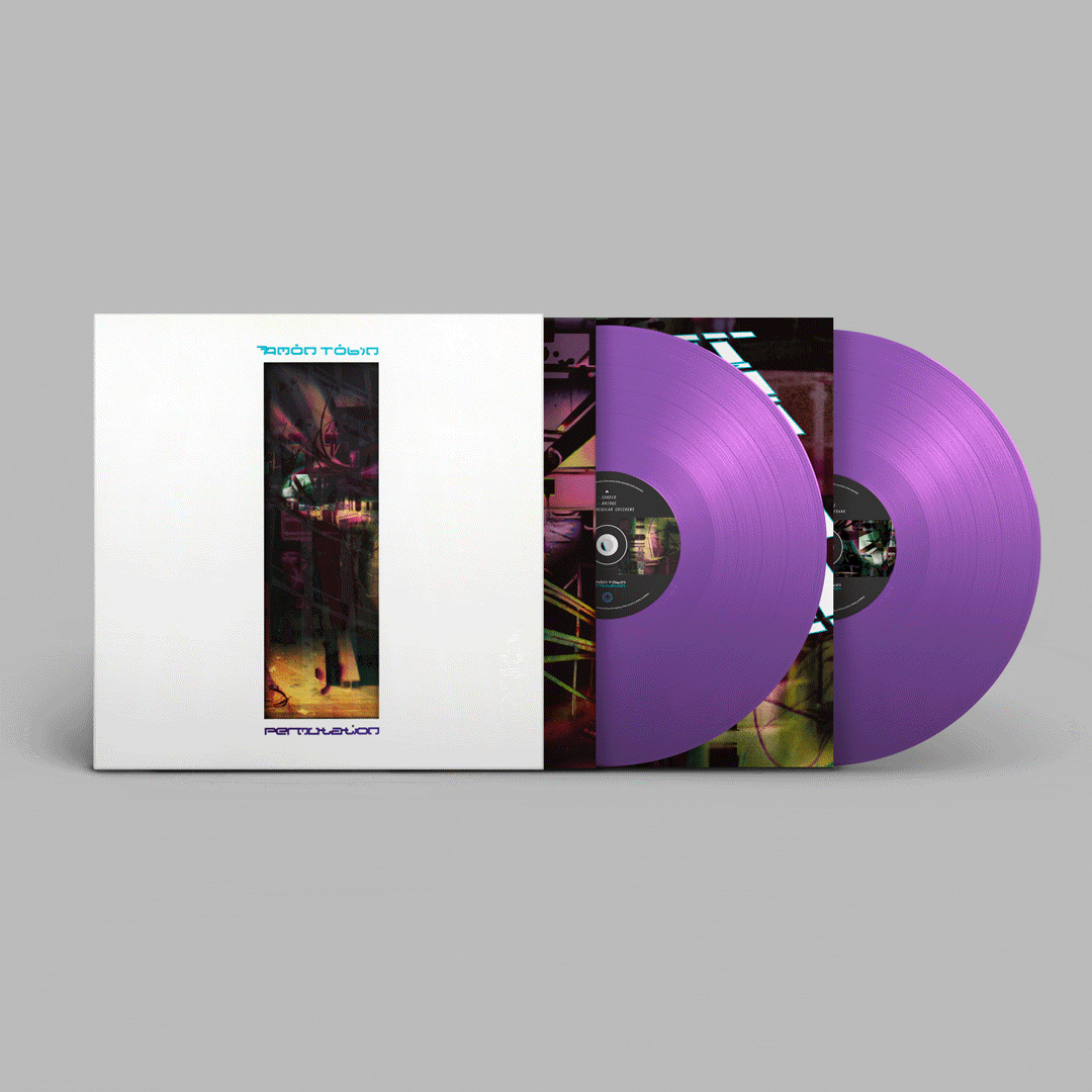
Amon Tobin‘s second LP for Ninja Tune – Permutation – gets a 25th anniversary reissue at the end of May.

AT P purple 1
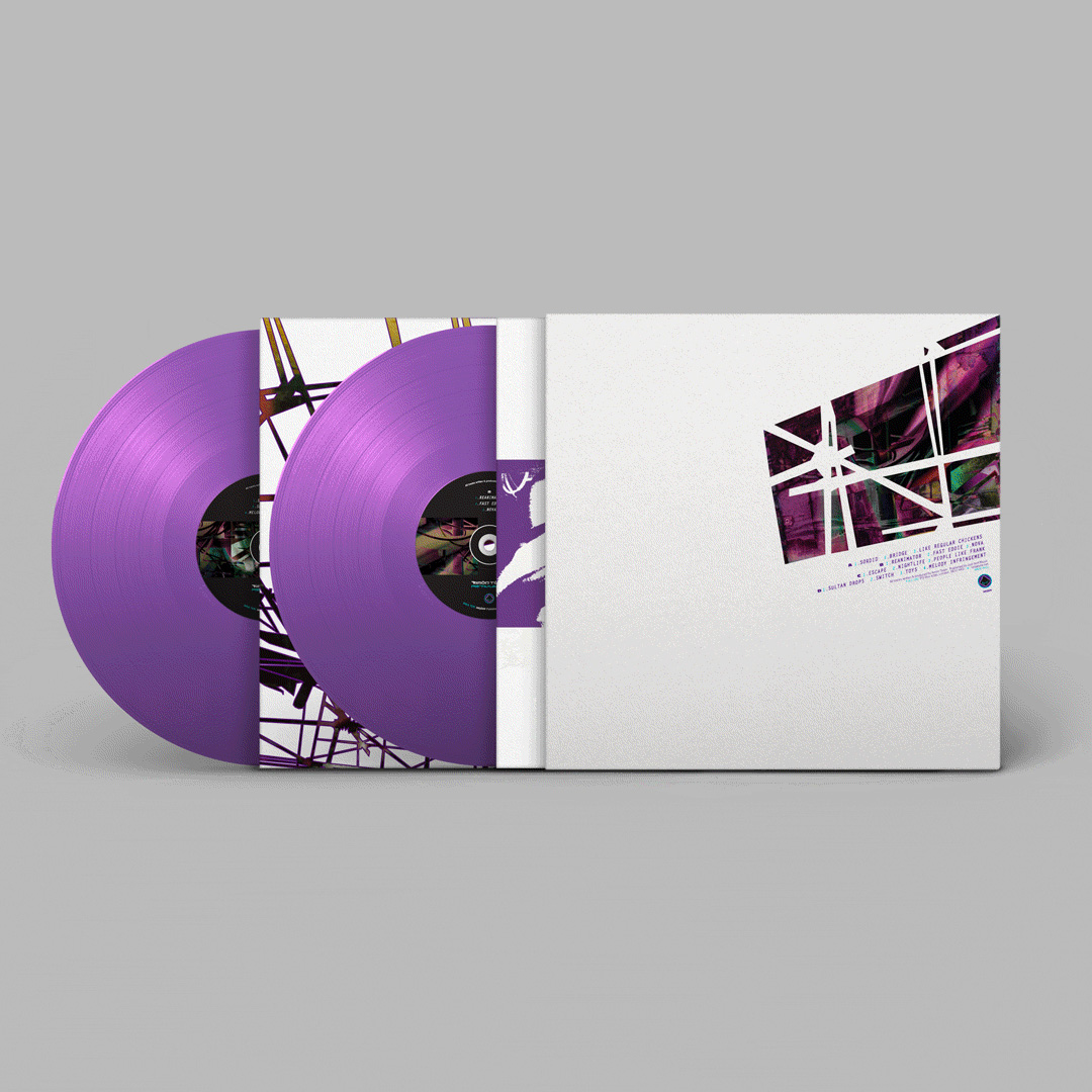
We’ve gone to town on it and I can’t wait to get a copy in hand. Yes it will have the spot varnish plus a die cut front cover and reimagined inner sleeves. It’s a Ninja Tune co-release with Turntablelab who have an exclusive purple vinyl version.

permutation-25-year-anniversary-reissue-main
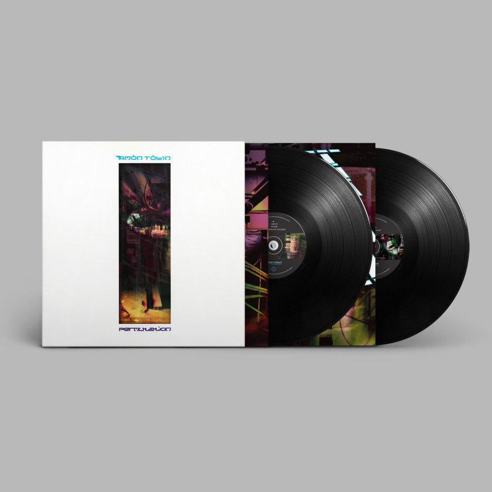
Pre-order is up now for a May 31st release. I’m indebted to Graham Needham of MacStrategy who helped access Freehand Mac files from 1998 so that I could remake the sleeve from the original elements

permutation-25-year-anniversary-reissue-2

Amon Tobin – Out From Out Where repress

Amon OFOW
Just announced, Amon Tobin‘s 2002 classic, Out From Out Where, is being repressed in a new edition this September. Pressed on opaque gold vinyl with fully printed inner sleeve, a 60x30cm poster and phosphorescent varnished sleeve. I remade the artwork from the original near 20 year old files and I’m so pleased with this as it’s one of my personal favourite designs, not just for Amon but for any artist I’ve worked with.
Pre-order here:

Amon Tobin ‘Chaos Theory Remixed’ (Soundtrack to Splinter Cell 3D)

  • RELEASED: 21 Feb 2011
  • FORMAT: LP / DL
  • LABEL: NINJA TUNE
  • CAT No.: ZEN171 / ZENDNL171
  • DESIGN: Openmind / Ubisoft
  • EXTRA ZEN: ninjatune page / BUY

A refreshed version of the original ‘Splinter Cell’ soundtrack art, this time with the emphasis on red rather than green. I added 3D effects on one inner sleeve and wanted to have the cover printed this way too but Ubisoft vetoed it thinking that people would think it was printed wrongly

Posted in . | Comments Off on Amon Tobin ‘Chaos Theory Remixed’ (Soundtrack to Splinter Cell 3D) |

Amon Tobin ‘ISAM’ exhibition & live show

[youtube width=”640″ height=”385″]http://www.youtube.com/watch?v=U0GRxu0oIEA&feature=player_embedded#at=22[/youtube]

I went to the opening of Amon Tobin and Tessa Farma‘s exhibition last night, showing original sculptures from the ‘ISAM’ album artwork at the Crypt Gallery in St. Pancras, London. It’s on between the 26th May and the 5th June 2011 and is free, before being taken to Paris (Galery Art Roch) between the 13th and 23rd June. Dates are also being confirmed for Brussels, Berlin, and North America later in the year.


Also very much looking forward to seeing Amon’s live set when it comes to town, it debuts at Mutek next week.

[youtube width=”640″ height=”385″]http://www.youtube.com/watch?v=Umf0C0WCsr8&feature=player_embedded[/youtube]

Amon Tobin – Splinter Cell Remixes

Amon Tobin‘s 2005 Splinter Cell game soundtrack has been remixed to coincide with the release of a new 3D version of the game. Various Ninja Tune artists such as Daedelus, Kid Koala, King Cannibal, The Qemists, Eskmo and Lorn have worked their magic on the tracks alongside a couple of new pieces by Amon himself.

For the artwork I was required to update the original and decided to experiment a little with the 3D analyph technique you can achieve in print. If you have a pair of red and blue 3D glasses to hand, have a look at this from the inner sleeve of the vinyl. The physical LP and CD versions are released in April but you can buy the download version right now from the Ninjashop.

ZEN171 3D cover 650

Amon Tobin ‘Verbal’

  • RELEASED: 30 Sept 2002
  • FORMAT: 12″ / CDS
  • LABEL: NINJA TUNE
  • CAT No.: ZEN12118 / ZENCDS118
  • DESIGN: Openmind & Alex Rutterford
  • SPOTTERS DELIGHT: Different covers for Euro and US releases
  • EXTRA ZEN: ninjatune page / BUY

For this single I made 3 completely different overall designs before Amon gave approval. The first was a distorted version of a famous rapper who was sampled in the song, the second was an abstract image with tramlines that I had photographed in Switzerland but neither of these were up to scratch. I was nearly at the end of my tether when showing him the 3rd ‘Gundam’ version but he loved it and it’s one of my favourite pieces of work.

I used some of this unpublished work (the 2nd version) for an exhibition called Versus I took part in at Parco in Tokyo where one image was made into a huge banner and part of the design was made into an exclusive Amon T-shirt.

Posted in . | Comments Off on Amon Tobin ‘Verbal’ |

Amon Tobin ‘Recorded Live’

  • RELEASED: July 2004
  • FORMAT: CD
  • LABEL: NINJA TUNE
  • CAT No.: ZENCD90
  • DESIGN: Openmind & Eikon
  • PHOTOGRAPHY: Various
  • SPOTTERS DELIGHT: The Euro and US versions of the mix differ slightly due to licensing constraints
  • EXTRA ZEN: ninjatune page / BUY

Amon’s Solid Steel differed a bit from the previous three in that it was a live mix rather than a studio constructed one although it had to be edited down to fit on the disc and a few pieces sliced out due to licensing problems. As a result it was part mix, part live set so the design used some of the graphic images created by Eikon for his live show and some tour photos provided by various road crew.

Amon was using Stanton’s Final Scratch software to play everything digitally during the tour so this was also a big factor to integrate as Ninja were tying in promotion with Stanton to maximise the scope of the release within tech mags as well as music ones. I adapted the Final Scratch soundcard ‘pod’ into both the Solid Steel logo and a 3D graphic for the cover, kind of in keeping with previous ambiguous machine designs for his albums.

Posted in . | Comments Off on Amon Tobin ‘Recorded Live’ |

Amon Tobin ‘Foley Room’

  • RELEASED: 21 Feb 2007
  • FORMAT: 2xLP + DVD / CD+DVD / Ltd CD+DVD / DL
  • LABEL: NINJA TUNE
  • CAT No.: ZEN121 / ZENCD121 / ZENCD121X / ZENDL121
  • DESIGN: Openmind
  • PHOTOGRAPHY: Nicholas Casonova, Julie Elie, Marianne Allard
  • SPOTTERS DELIGHT: Additional DVD attached to the inside of the vinyl gatefold, limited gatefold digipak CD/DVD, pdf booklet with iTunes download, individual track images with download from Bleep.com
  • EXTRA ZEN: ninjatune page / BUY

During my long association with Amon I have always tried to progress the themes and graphics in the artwork with each release. ‘Foley Room’ was no exception and started with a subtle revamp of his logo, something that started life as a typeface made by graffiti artist She One and has since morphed this way and that into what it is today. After initially starting from scratch with an entirely new logo and getting nowhere I made the original spikier and sleeker, cutting sections diagonally to make it seem like it would cut you if  touched.

For this record Amon had made a series of field recordings of sounds that he then sampled and used as the bulk of the record structure. He’d also had the good sense to document these trips on both film and photo for a DVD to be included with the record. He wanted photography used in the artwork that would show everyday situations and tally with his field trips but he didn’t want it to be a literal document – he wanted a twist of some kind.

Next came designing the look of the record and I took inspiration from the Folkways and Nonesuch record labels that specialised in field recordings and unique events. The Folkways records often had a plain black card sleeve with a big wrap around sticker that would cover the front but only reach part way across the back. They usually used a minimal palette of 2 or 3 colours and a black and white image so I designed a mass of variations in different colour combinations in this style. Whilst not yielding anything definitive it gave the layout an initial structure and produced some interesting results which I then began to work on by substituting one image for another until I found the right combination.

I had previously done the Tag The System train customisation and had figured that it would be ideal for an Amon record in one form or another as it used a similar process – albeit in a 3D context rather than a 2D one – to previous album artwork. With this in mind I made sure I photographed the model extensively after it was finished and showed some of these images to Amon who loved them as he had recorded train sounds for the album so saw a connection. After photo-shopping sections of the model images into his recording photos – so that it looked like Amon was recording robots, the twist he had wanted.

I experimented with shooting the images through the TV screen to add texture and grain. At the time I was having a rekindled love affair with Eno & Byrne’s ‘My Life In The Bush Of Ghosts’ album as it had been reissued and the TV feedback cover art had always been a favourite of mine. The results threw up all sorts of new angles; as well as distorting and blending the Photoshop results together they exaggerated the contrast, colour and lighting of each image and gave it that ‘documentary’ feel.

When you shoot a TV on a slow speed the camera can’t keep up with the constant flicker of the screen refreshing so, sometimes, you get a black band across part of the image. It was one of these photos which became the front cover because it was perfect for setting the cover text as I had decided to put the titles on the front rather than the back (for some reason). Of all the photos of the train that were used I took good care to make them as ambiguous as possible and few people who had seen the original model made the connection when they saw the artwork.

The TV gave them a nice blue hue which coloured some of the black and white images too. Next was which typeface to use as a basis for the record: I wanted something ‘technical’ without resorting to the obvious Data 70 or LCD-type fonts. I settled on the Airport/Luggage family which is based on airport timetables boards, all squares and triangles that make up each character like an LCD display but with many more options. This font is incredibly detailed so it looks great large but blends into a regular character at small sizes, hence the large and small instances used on the sleeve.

The next problem came with the DVD as Amon was adamant that it be included with the vinyl as well as the CD. The CD posed no problem, you just add a double tray or a second card sleeve but the disc needed to be fixed to the cover to keep it from getting scratched and I didn’t want it just thrown inside a sleeve to rattle around. The first idea was to have it attached via a plastic sleeve to the outside but this would cause problems when the records were stacked together as it could catch and rip and also make an indentation in the sleeve next to it meaning possible returned copies marked as ‘damaged’.

The second idea was to attach it to a 12 x 12 piece of card to be slotted into one side of the gatefold cover, again this would have potentially caused an indentation on the cover so a recessed version was mooted. This would have meant two thick pieces of card stuck together, one with a disc sized cut out so that the DVD could sit ‘inside’ the card and not cause damage – alas, too expensive.

The final solution was to do a gatefold with a very thick spine (1cm!) and sit the disc on a foam button inside the gatefold opening itself, near to the middle as there is a gap where the card doesn’t meet due to the thickness of the spine. The whole package would then be shrink wrapped to ensure that if a disc fell off it wouldn’t be able to escape – this was actually very cheap and simple to do and worked well. Frustratingly the whole package fell at the last hurdle though through a myriad of printing cock ups where approved artwork reverted back to old versions, images were resized or missing for no apparent reason and one bright spark at the pressing plant decided that the DVD should look the same as the CD and changed the ink on the background colour!

Posted in . | Comments Off on Amon Tobin ‘Foley Room’ |

Amon Tobin ‘Chaos Theory’ (Splinter Cell 3 soundtrack)

  • RELEASED: 18 Jan 2005
  • FORMAT: 2xLP + Poster cover/CD+slipcase / DVDA / DL
  • LABEL: NINJA TUNE
  • CAT No.: ZEN100 / ZENCD100 / ZENDVA100 / ZENDL100
  • DESIGN: Openmind / Splinter Cell
  • SPOTTERS DELIGHT: Ltd. foldout poster cover with screen printed PVC sleeve with vinyl, screen printed slipcase with CD, PAL & NTSC versions of DVDA
  • EXTRA ZEN: ninjatune page / BUY

What a bugger this was to get off the ground. For those who don’t know, Splinter Cell is a computer game based on the novels of Tom Clancy and a highly successful one at that – this being the 3rd installment. Dealing with major companies in other areas is immensely time consuming, frustrating and tedious, neither side fully understands the others needs and both want their own way. When Amon recorded the soundtrack for this computer game Ninja decided to release it and suitable artwork was needed that appealed to both the computer game’s audience and Amon’s fans. Putting a straight image from the game on the cover was never a consideration but the record needed to use elements of the game graphics to tie the two together.

Splinter’s Cell’s premise is based on a soldier running around with night vision goggles on, shooting all manner of foes and most of it takes place in the rain and in the dark. I was sent a load of layered graphics and logos and – jumping on from the ‘Remixes and Collaborations’ artwork – I envisaged some sort of potential creature / foe that would be encountered if Splinter Cell collided with ‘Amon’s world’. At the time I was into cross-section diagrams and put together a being made from various instruction manual graphics I found of anything from washing machines to motorbikes. The legs and body came very quickly but I had trouble with the arms and the head looked a bit boring and I tried to think of ways to make them more exciting.

The arms had to be doing something but I didn’t want the thing holding a gun or weapon although without one it looked like it was dancing which just looked bad. I’d found an image of a big squid that I’d used for a part of the mouth and the contrast of animal/mechanical that I use as a template for Amon’s work set me thinking. Substituting the arms for wings worked way better and made the ‘thing’ look very odd – something vaguely birdlike but made from cross sections of airplane wings into the bargain. I added rain and a strong light source and then it all came together. Here was my main album graphic but what to do with it?

I’d recently met up with Michael C. Place of Build after admiring his work for a long time and wanted to collaborate with him so we hatched a plan that he would take my image and add his graphic touch to it with a die cut slipcase that would show through parts of my design underneath. The first design he came back with didn’t really fit colour-wise with the overall themes of the game graphics so he redesigned it to make it blend in a bit more but unfortunately Amon and Ninja didn’t like it. Here are images of the mock ups I made from his print outs of the proposed artwork and we agreed that this was a collaboration for another day and another artist.

So, back to the drawing board and I had an idea centered around a transparent slipcase with printed raindrops and a gun night sight on it. The game has a wealth of these from the player’s viewpoint and a main graphic was the 3 green goggles looking through a window. As this is an ambiguous image and could have referred either to the creature I had created of the main game hero I decided to have this as the cover. Looking out from behind a transparent sleeve streaked with rain, which would be printed on, a single drop of blood running down as per the game image. When the buyer slid the sleeve / booklet out of the transparent sleeve it would reveal the creature behind the glass in a foldout poster and the accompanying graphics tied in with the game night site icons.

Getting the rain effect printed on a transparent sleeve was easier said than done and countless phone calls to the printer seemed to arrive at a solution but it was all guesswork. There had to be some kind of white base because otherwise any other colours wouldn’t show up and it would all blend into a mess against the black background underneath. I can’t remember exactly what I did but I do remember a distraught Jeff Waye – Ninja North America’s manager – who had gone to the pressing plant on December 27th to check the print – ringing me to tell me that it looked like the Grinch in a snow storm! It wasn’t quite that bad but it didn’t look great so the first batch went out like that and then it was changed. Luckily we hadn’t done the vinyl so we fixed it for that and everyone was happy. I’m pretty pleased with the final result but it’s all clouded by to-ing and fro-ing associated with the whole thing.

Posted in . | Comments Off on Amon Tobin ‘Chaos Theory’ (Splinter Cell 3 soundtrack) |

Amon Tobin ‘Remixes & Collaborations’

  • RELEASED: 28 Apr 2003 / 07 Jul 2003
  • FORMAT: 12″ / 12″ / CDS
  • LABEL: NINJA TUNE
  • CAT No.: ZEN12130 / ZEN12138 / ZENCDS138
  • DESIGN: Openmind / Openmind & Doug Bowden
  • SPOTTERS DELIGHT: Different covers for both Euro and US versions on both EPs, different again for the CD release. Collaborations EP comes with a gatefold sleeve that the Remixes 12″ fits inside.
  • EXTRA ZEN: RemixesCollaborations

This came out of the ‘Out From Out Where’ album – the Remixes being the ‘Verbal’ single – and it was always my intention to echo the musical process with the graphics when it came to the artwork. For ‘Remixes’ I took all the same elements I had used for ‘OFOW’ and remixed them into something new, adding various new components as I went. The crouching figure is made up of exactly the same elements as the object on the cover of ‘OFOW’ and – as with the previous album – I did multiple variations of the image for various different formats.

For ‘Collaborations’ – guess what? – yep, I collaborated, with designer Doug Bowden this time, a guy who had shown me his portfolio a few years hence after being recommended by a friend. I immediately liked him and, although his work didn’t have that ‘something’ I could hook into, I could see he had all the right elements in there but needed a break and some experience. At the time I needed some help with the graphic side of Ninja as there was so much work and he has since done work for them as well as Big Dada, Son and many others. Check his work out at www.pandayoghurt.co.uk/

Anyway – being a control freak – I led the brief but got him to start it, the idea being that he construct a ‘being’ using the methods I usually employ and then hand it over to me to put into a setting. He did something, not a world away from my ‘OFOW’ cover, which you can see the original of on his cover for Amon’s ‘library’ CD seen here…
I took this, flipped it (literally), added and subtracted a few bits and set it in a kind of underwater environment, taking the tramlines I’d previously used but making them more like tentacles. At one point I wanted the image to look as though the being was above and the viewer was underwater, looking up as the tentacles pieced the surface and caused ripples, distorting the above image. I tried a load of different Photoshop techniques but just couldn’t get it to look convincing but here is one that nearly worked.

Again, multiple versions were made that were spread across the European and US editions and, with these two releases, I began to deconstruct the Amon Tobin logo a little more each time so that it became more of a graphic symbol but would still be recognisable and readable by fans instantly. I had made sure that the ‘Verbal’ vinyl version was printed in a small inner sleeve sized cover at the time of release which may have puzzled some people but all was revealed when ‘Collaborations’ came out. The disc came in a sleeve the same size as ‘Verbal’ but housed in a gatefold cover that had a side for the ‘Remixes’ disc to be stored thus completing a two part set. This set, along with ‘OFOW’, is some of my favourite artwork I have ever had the pleasure of making. A few years later someone pointed out how much like William Blake’s ‘Newton’ the cover looked and asked if it had inspired it. It hadn’t but I have to admit that it’s definitely similar and I do know the piece so maybe it was a subconscious thing.

Posted in . | Comments Off on Amon Tobin ‘Remixes & Collaborations’ |

Amon Tobin ‘Out From Out Where’

  • RELEASED: 14 Oct 2002
  • FORMAT: 2xLP / CD
  • LABEL: NINJA TUNE
  • CAT No.: ZEN70 / ZENCD70
  • DESIGN: Openmind
  • SPOTTERS DELIGHT: Different covers for Euro and US releases
  • EXTRA ZEN: ninjatune page / BUY

My whole ‘thing’ with Amon is for a mechanic/organic mix of imagery as I find his music highly technical but naturally flowing and melodic. With all his artwork I’ve been exploring these themes and in this series of sleeves I scanned parts of un-built Gundam robot models. I reassembled them in Photoshop to make forms and creatures that have a quality that I would associate with his previous sleeves. Each part, once assembled into a form, was then shaded via airbrush and various layers of colour tones, lighting and textures applied until I had something I wanted.

I’ve been a fan of Gundam for years and always loved the forms and angles of the models, this time I wanted to build my own object and Amon’s work was the perfect platform for that. This is by no means the end of my work involving these shapes but for the next Amon record I moved onto something else. He’s one of the few artists who leave me to do what I want, he trusts me to make something on my own but he knows what he likes and what he doesn’t so I make a lot of material that gets discarded. For the LP I did around 15 different variations of the cover image, some made the LP and inner sleeves and some went on to the US version and the first single (Verbal). Oh yeah, and the vinyl sleeve was actually printed totally in metallic inks where I got the printer to replace the CMYK process with the nearest equivalent metallic ink. It’s a very subtle effect and makes the image paler than usual but I wanted to try it anyway.

Posted in . | Comments Off on Amon Tobin ‘Out From Out Where’ |

Amon Tobin ‘Supermodified’ album / ‘Slowly’ / ‘4 Ton Mantis’ singles

  • RELEASED: 01 May 2000 / 04 Sept 2000
  • FORMAT: 2xLP / CD / 10″ / 12″ / CDS
  • LABEL: NINJA TUNE
  • CAT No.: ZEN48 / ZENCD48 / ZEN1092 / ZEN1294 / ZENCDS94
  • DESIGN: Openmind
  • SPOTTERS DELIGHT: There was a promo CD of Slowly designed for the US territory but it’s not certain if it was actually manufactured
  • EXTRA ZEN: Supermodified / Slowly / 4 Ton Mantis

Whilst on tour in LA in ’99 I was walking around the downtown district near our hotel and found another sculpture by Alexander Liberman, this time it was white and on display in the financial district outside some office blocks. I photographed it just because I liked the shapes but didn’t want to repeat the same trick for another album. What I ended up doing was layering up the images – similar to that I had done on ‘Permutation’ – using transparency filters to bring parts through each photo from underneath except, instead of two layers I had ten or more.

There are about 20 different transparency filters in Photoshop, each doing different things, some more subtle than others, and by moving around layers or making certain ones invisible there are an infinite number of results that you can get from this process. I did endless shifting and filtering with Amon sitting in beside me, and saved each one that we thought looked good before carrying on, knowing that I would never find my way back to something we liked before. We ended up with something like 20 different images that I used across covers for both singles, the album and the inner sleeves. Amon liked the images where forms seemed to be emerging and I can always see amorphous robots hidden in the images when I look at it. Again, the inner sleeves join up and, if you look closely, you can see a street sign reflected in one of the background windows which gives away the location of the sculpture.

Posted in . | Comments Off on Amon Tobin ‘Supermodified’ album / ‘Slowly’ / ‘4 Ton Mantis’ singles |