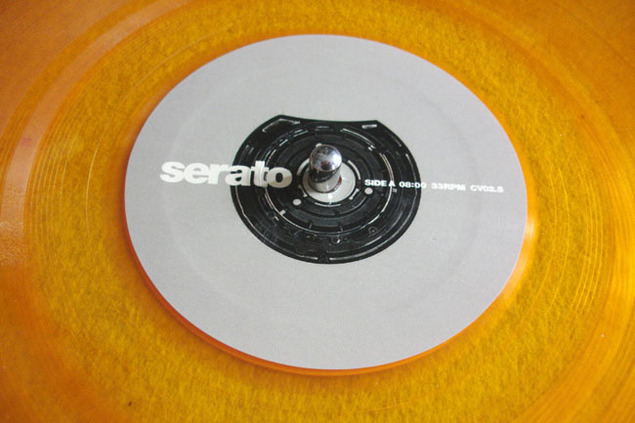
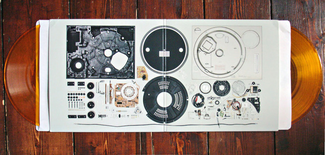
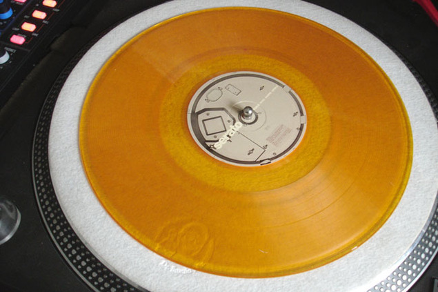
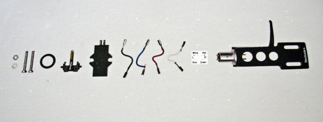
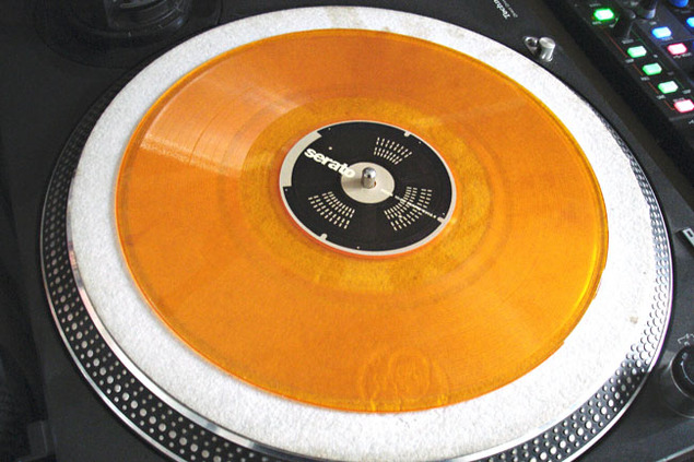
 Those lovely people at Serato just sent me several sets of these luscious clear orange 10″ controller records. Packaged in a mini gatefold sleeve with a deconstructed Technics turntable spread across the center, they are a beautiful object to behold indeed. Thanks guys!
Records
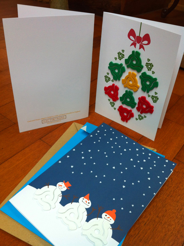
 OK, I’m unequivocally biased because they are friends of mine but – damn – if these Factory Road 45 adaptor designs aren’t the best Xmas cards you’ll see all year then I don’t know what are. They’ve upped the ante in 2013 with new recruit Graham Robson‘s ‘Wizard’ design with a crown of dinks.
For those of you who don’t know what these little plastic wonders are, they’re adaptors for 7″ records with large cut out centers that would have gone into jukeboxes and are a part of vinyl history. Order them HERE – QUICK!
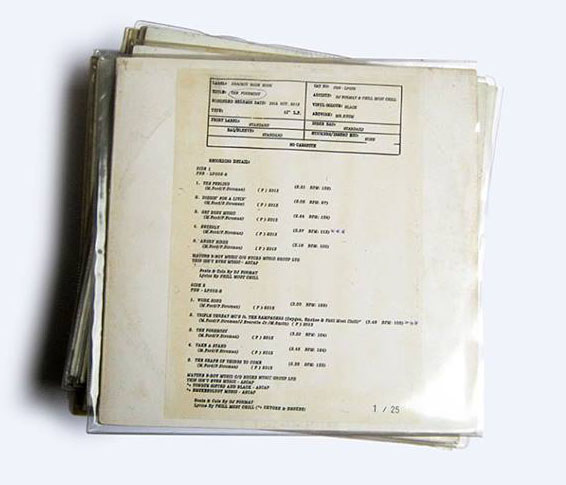
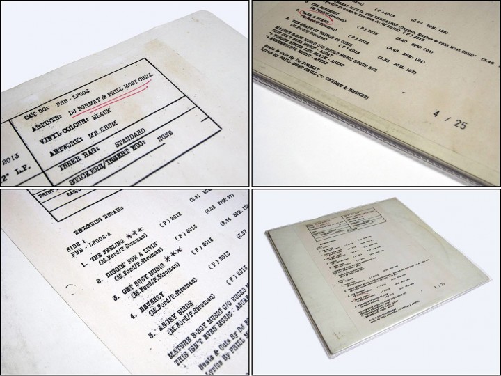
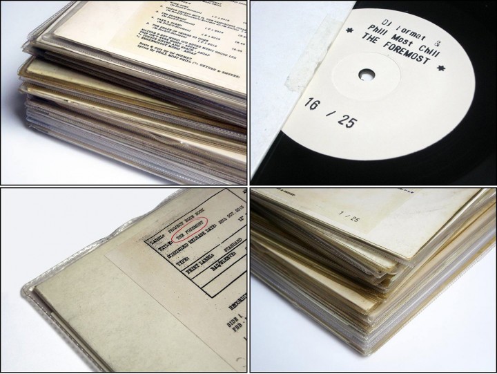
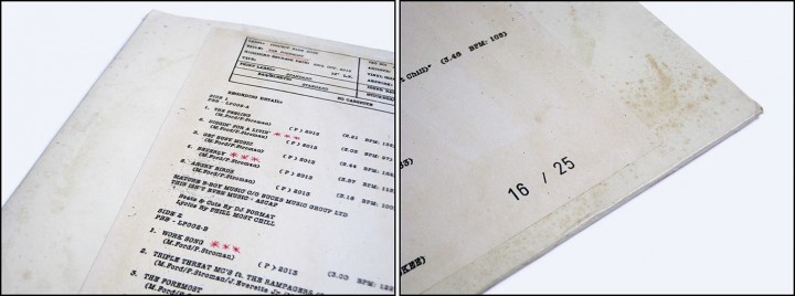
Check out these DJ Format & Phill Most Chill ‘The Foremost’ Test Pressing versions by Mr Krum. Sold blind in an edition of just 25 to members of the DWG board a few months ago – no one knew what they were going to look like and those who took a chance are reaping the reward now.
25 hand-crafted sleeves were made with recycled, organically-aged jackets, paste-on info sheets and unique hand written comments/markings. All copies were individually number stamped and placed inside vintage ‘rope-seamed’ PVC sleeves.
Sadly these are all sold out now but the good news is that the regular LP isn’t and has an even doper sleeve, again by Mr Krum whose Facebook page these photos come from (check his other work too!). The LP is a classic in every sense, the sound, the look and the very spirit of it stake their claim as soon as the needle hits the groove. Buy it here.
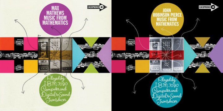
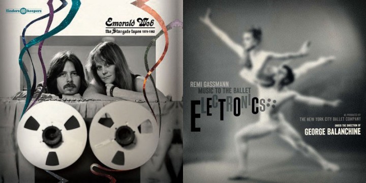
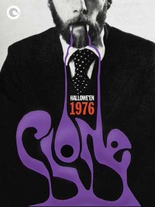
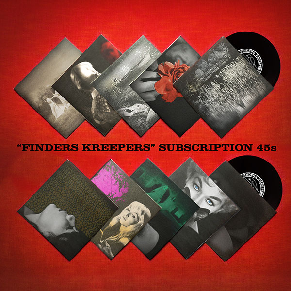
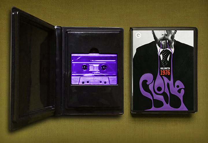 Beautiful new sleeves for a slew of releases on Finders Keepers and associated sub-labels like Cacophonic and Cache Cache. Explore for more here.
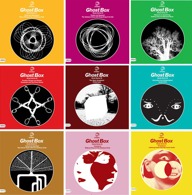
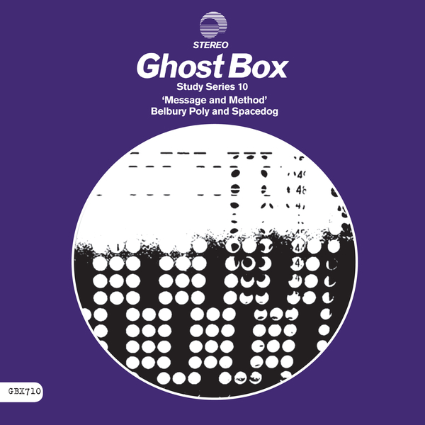 The final Ghost Box Study Series 7″ arrived this week and it’s a great one to close the 10 part set with, one of my favourites in fact. The sound definitely harks back to earlier GB releases with the nostalgic sound of summer, spoken female vocals and found sounds. Belbury Poly is joined by Spacedog (new to me) for two tracks wrapped in the usual, minimalist sleeve from Julian House. Nice to have the whole series at last.
 As one ends, another begins, over at Finder’s Keepers they’ve launched a 10 disc Finder’s Kreepers subscription series – which I’ve just seen is sold out already! They’ve also reactivated their Disposable Music series for a second run of 5 LPs which is still available as well as a whole raft of new releases and an overhauled website.
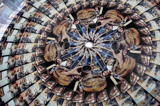
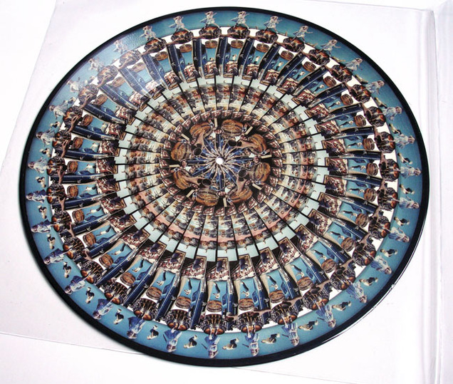
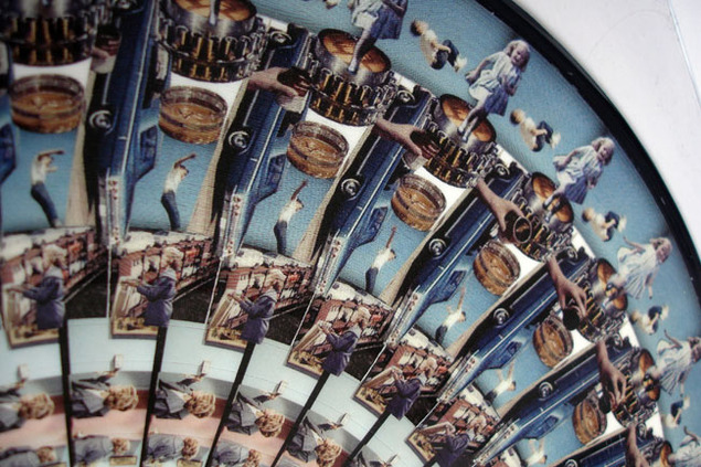
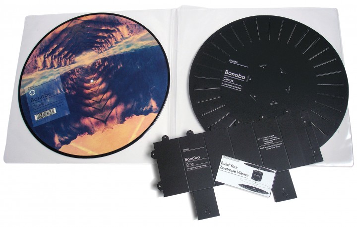
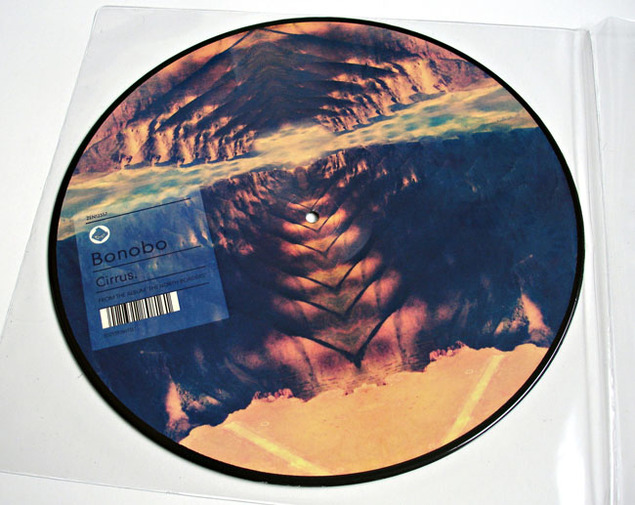 Bonobo ‘Cirrus‘ – 12″ zoetrope picture disc and viewer.
A side: Video sequences by Cyriak, laid out to form a zoetrope by Openmind.
B side: Graphic by Leif Podhajsky
Available exclusively in the Bonobo online shop now…
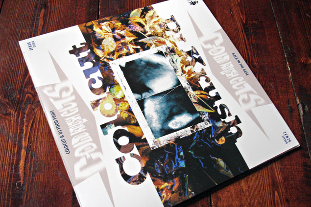 Out now via Ninja Tune‘s Beat Delete repress label – the mix PC and I did in 1997 for a face-off between Coldcut and DJ Krush. It’s a triple disc with the mixes on opposite sides of each disc, if you have two decks you can even mix the beginning and end parts together to form the full thing.
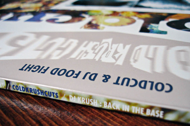 I remember recording this in a professional studio somewhere in London’s West end, I think it took us less than a week after some initial ideas had been gone over in our own studios and a selection made.
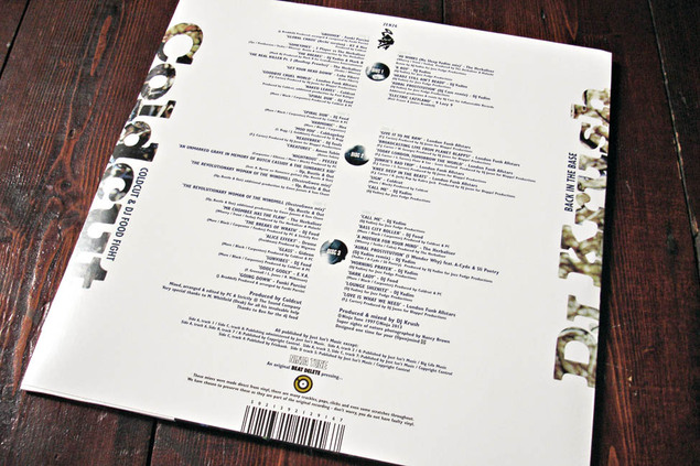 The brief was for only Ninja and Ntone releases as this would be easy and quick to license. We did add a lot of spoken word from other sources though. We also made a conscious decision to include some of the more esoteric sides of the label as we second-guessed the kind of material Krush would go for. We were thrilled to have him as a part of it as MoWax was (and still is) one of our favourite labels.
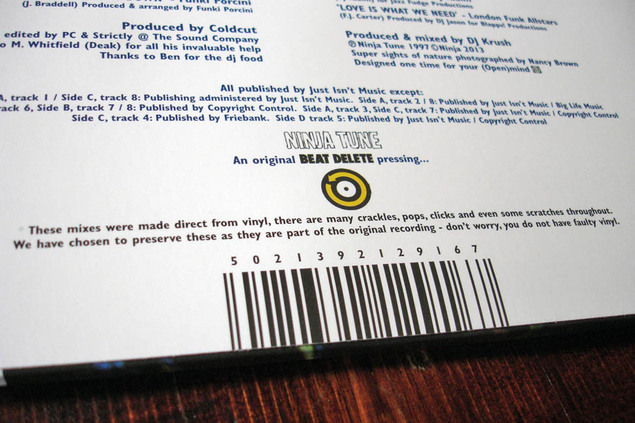 This is the mix with the infamous ‘Bug’s Eye View’ spoken piece that I detailed the source of earlier in the year. We had an engineer recording and editing what we did the whole time, tracks would be mixed live and then sections edited together and overlaid if need be.
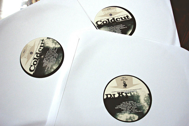 It was nice to give the artwork a good brush up and sort out the myriad of spelling mistakes that were on the original. I never liked what I did first time round and, whilst this isn’t a million miles from it, it’s a hell of a lot tidier and easier to read. The idea was that the cover could be placed either way up and that East met West from either direction, being that Krush hails from Japan.
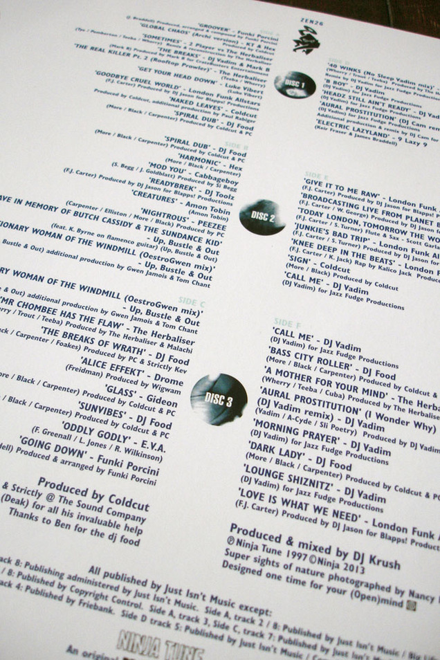 ‘Nightrous’ by Peezee was an exclusive track that only features here, PC pulled it out of the bag when we needed something to fit into a troublesome section. Listening back to the mix recently for the first time in 15 years I really enjoyed it as a time capsule of the label at a point where the Trip Hop thing was coming to an end and the label was set to branch out with the ‘Funkungfusion’ compilation the next year.
You can buy it now direct from Ninja Tune.
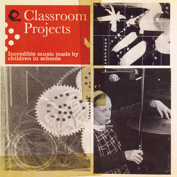 Two creatives I love on one project: Jonny Trunk‘s faultless curation for his Trunk label and Julian House on cover art duties. ‘Classroom Projects’ is out later this month, more info here.
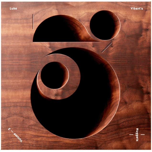 Coming in October from Lo Recordings – the third installment of Luke Vibert‘s ‘Nuggets’ compilations. Digging deep from the Bruton vaults he’s unearthed another 26 tracks.
“Packed full of Sci-fi funk jams, truly cosmic disco and robot rock this was music designed to soundtrack the future, or at least a bright and optimistic early eighties vision of what the future might be”, says the press release.
Mmmmmmmmm… double vinyl too.
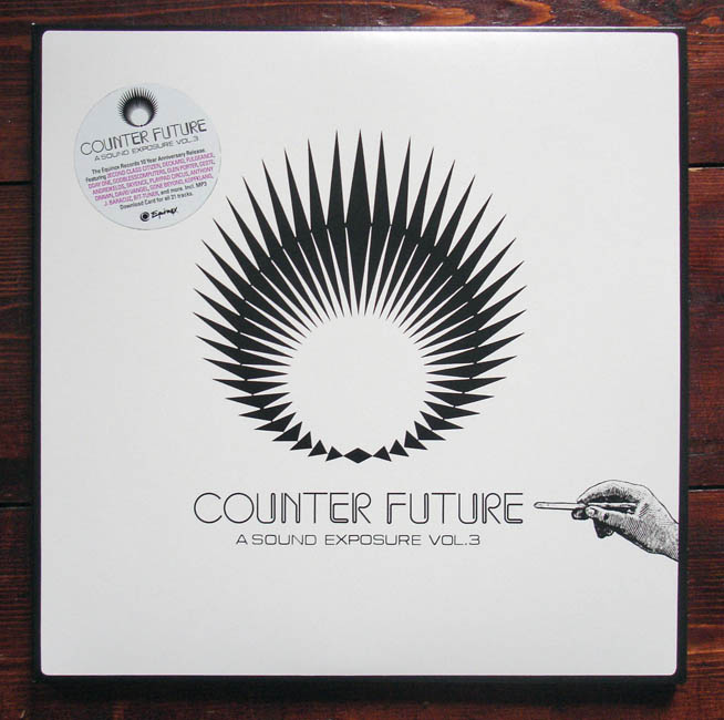
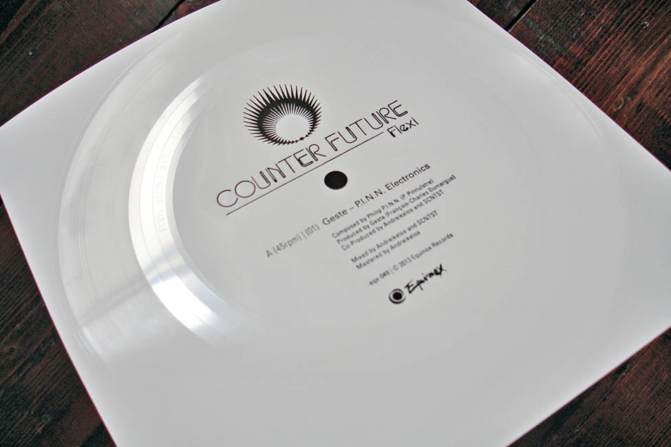
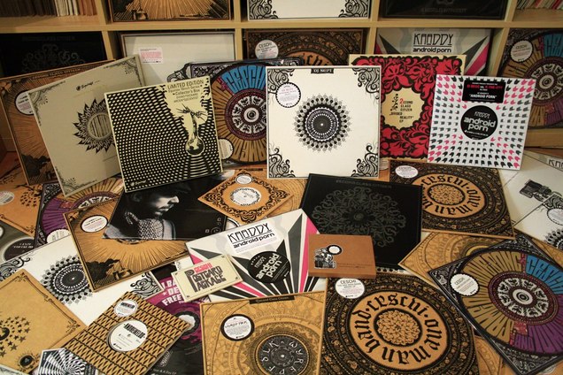 Genuinely saddened to hear of the demise of Berlin’s Equinox records, the label run by DJ Scientist who we featured with his ‘Soviet Solid Steel’ mix earlier in the year on the radio show. Not only has it produced some great music from the likes of Deckard, David Vangel, DJ Scientist himself and of course 2econd Class Citizen, whom I collaborated with on my last record. But it has consistently gone way above and beyond with the artwork, formats and packaging, creating an instantly recognisable look with heavy use of its signature brown card amongst the mainly black and white design work. I’m a sucker for circular designs and Equinox was the king of the design mandala with always inventive typography treading a perfect line between brand new and vintage.
Always pushing for new formats, they did everything from clear 7″s to etched 12″s, 5″ records and cassette box sets in sometimes miniscule runs. I remember Gunter – the label boss, aka DJ Scientist – being one of the first people to contact me when he learnt that I had found a place to press flexi discs after years of searching. He was also the first person I saw do a postcard record set and I was very proud to have my mix of 2econd Class Citizen’s second album appear as a limited release on the label last year.
I’ve featured several of the releases before on this blog but if you want a refresher of what’s been and gone then go here, here and here. The remaining stock is still for sale on the Equinox website and they recently posted the entire catalogue for free. Scientist has written a long piece about the label and both 2econd Class Citizen and David Vangel have shared reminisces and photos on their sites (Aaron’s photo is one that I nicked above). David’s album ‘Breadth Control’ is up for free download for another day and all the prices in the Equinox shop have been lowered so grab those last pieces quick.
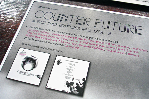
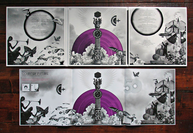
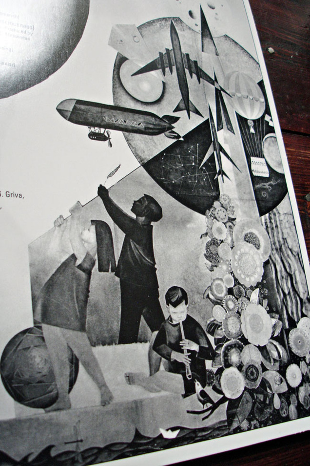
The final release – ‘Counter Future’, a 3 LP and flexi disc compilation of the label’s roster – is a beauty to behold and listen to with many of the artists presenting original tracks unavailable elsewhere.
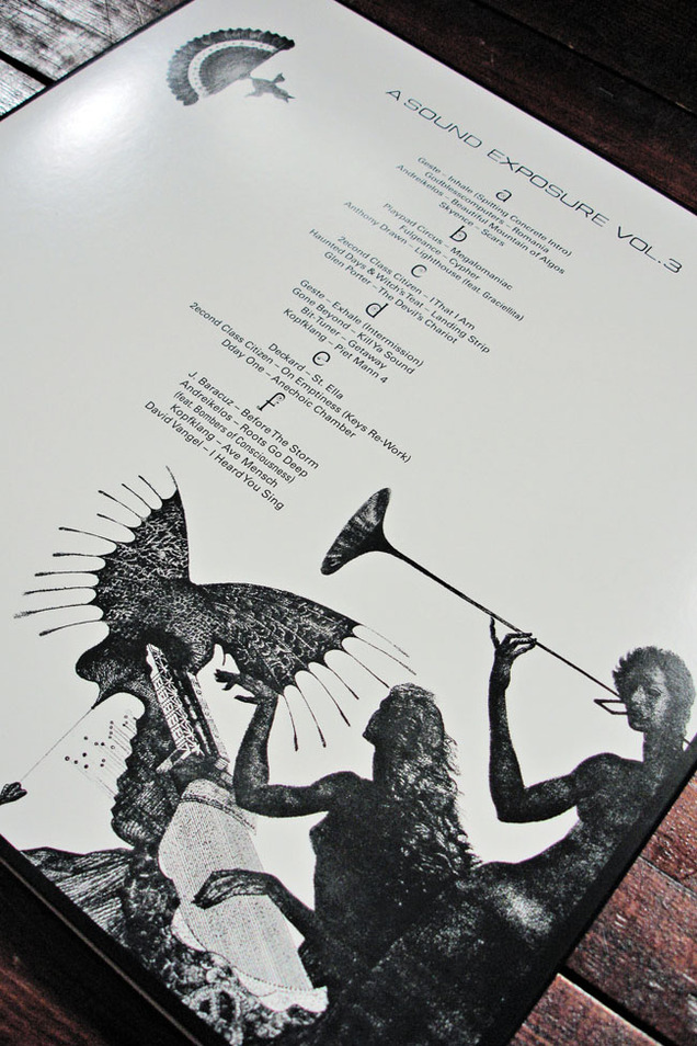
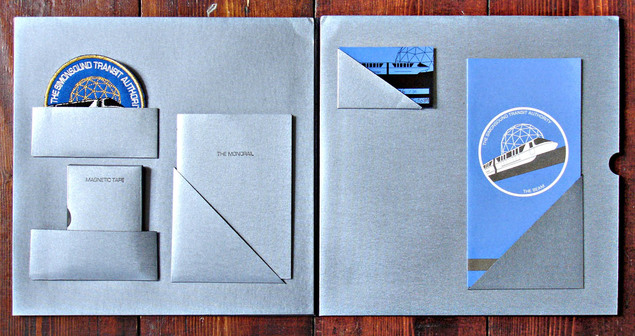
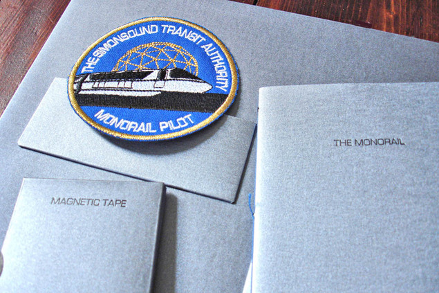
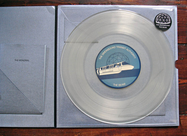
 At long last, after featuring it here months ago and then a pressing plant quality control issue meaning that the release was delayed, it’s finally here. The Simonsound‘s new single, ‘The Beam’ in all its 10″ clear vinyl, ‘Pilot Pack’ space age glory. After the wait it more than lives up to the expectation, this is one of the most amazingly packaged records I own, how much it must have cost is beyond me.
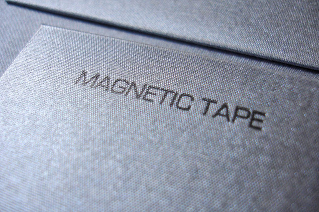
Designed by Emily Macaulay at Stanley James Press who has done all the artwork for the band so far, the photos here really don’t do it justice. Firstly – the material the sleeve is made of is a silver textured card with a silky smooth finish, I’ve never seen a record jacket like it. The cover is plain with a high quality sticker wrapped around it and reminds me of an instruction manual from the 60’s, which I’m sure is the intention.
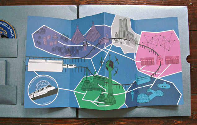
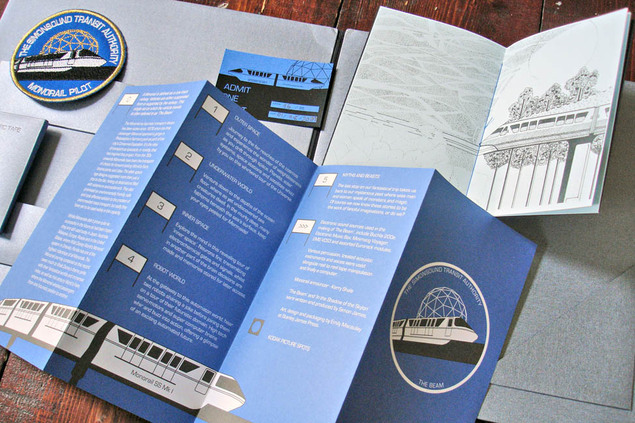
Inside the gatefold you’re treated to several pockets, each holding a different item, before we even get to the vinyl: A NASA-styled Simonsound Transit Authority embroidered patch, a numbered, signed ticket to ride, a double-sided tour map of the Monorail route, a 20 page booklet about the Monorail and, last but not least, a unique tape loop from the project.
The attention to detail here is absolutely stunning and spot on for the subject matter, the blue, white and silver colour scheme is the perfect mix of transport design meets pilot of the future uniform. When we finally get to the 10″ record – extractable via a tasteful thumb cut in the back half of the sleeve – lo and behold, it’s on clear vinyl! A great final touch but one that delayed the original release date because of warped pressings from the original plant tasked with making them.
What about the music though? ‘The Beam’ is a modular trip through different worlds via the Monorail at a fantasy science park, taking in Outer Space, Robot World, Underwater World and more. The tour guide takes you through the different stages and the soundtrack changes to suit (the original idea was to get Ken Nordine to narrate but he wasn’t available). Simon has used the manufacturing delays to recut the vinyl with more material than the original pressing so we get a montage of various sounds and effects he’s generated on the reverse of the disc in addition to the second track.
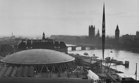
The B-side is actually my favourite, ‘In The Shadow of the Skylon’, an ode to the iconic structure that was built for the 1951 Festival of Britain on London’s Southbank. This track has shades of Kraftwerk circa Man Machine with a definite feel of ‘Neon Lights’ about it, my only criticism is that it’s too short. It was commissioned for Musicity – a location specific music project featuring tracks inspired by buildings and structures around the World. The track itself is also accessible on the site where the Skylon used to stand, using the free Musicity web app.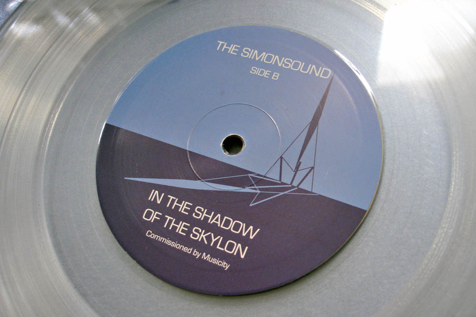
You can read more about the release and score yourself a copy (sorry, the Pilot Packs are all gone) on The Simonsound blog and Bandcamp page.
I’d also recommend checking out the video for ‘The Beam’ below as it really fleshes out the concept of the whole thing being that it’s a soundtrack more than a club track.
 and there’s more – The Simonsound live at Herstmonceux
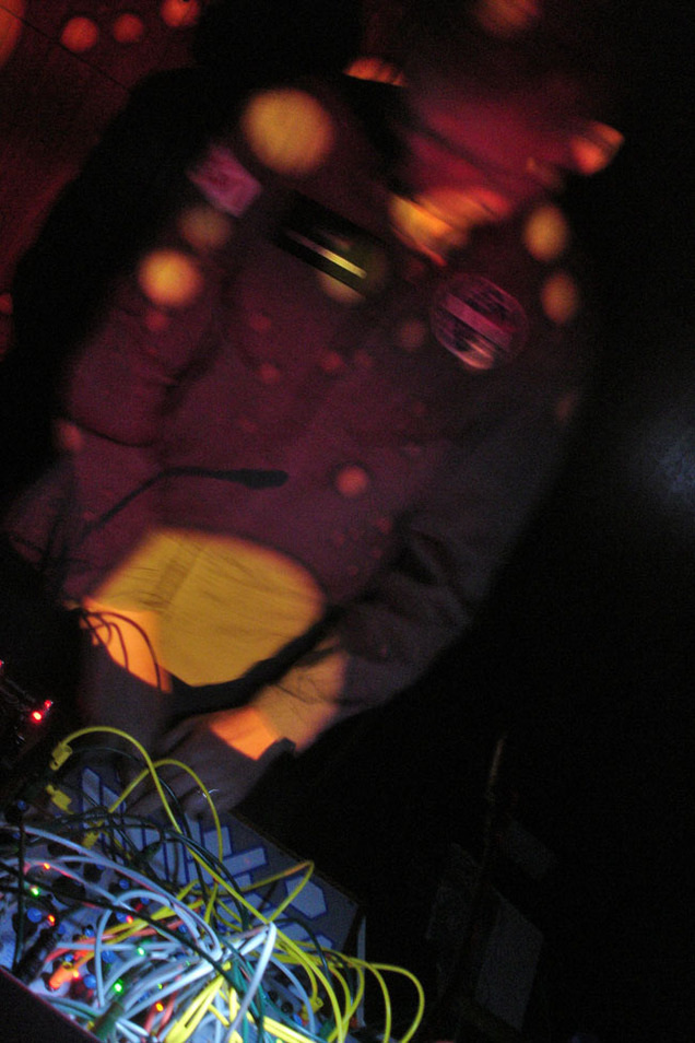
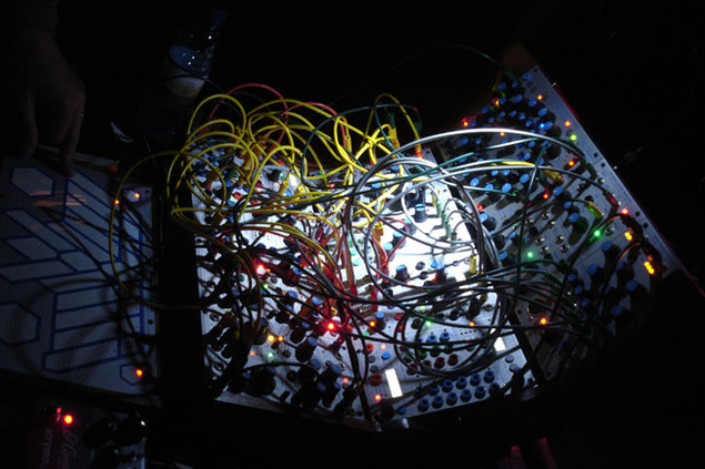
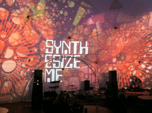
A few weeks ago, I journeyed down to St. Leonards-on-Sea for an event called Kosmic Krash at the Herstmonceux Observatory where Simon was playing live inside one of the domes with his new Buchla modular synth. He has kindly put up a 45 minute excerpt of the set on his blog for us all to enjoy, it was the highlight of the evening for me, sitting inside one of the domes next to a giant telescope, listening to this electro musique concrete.
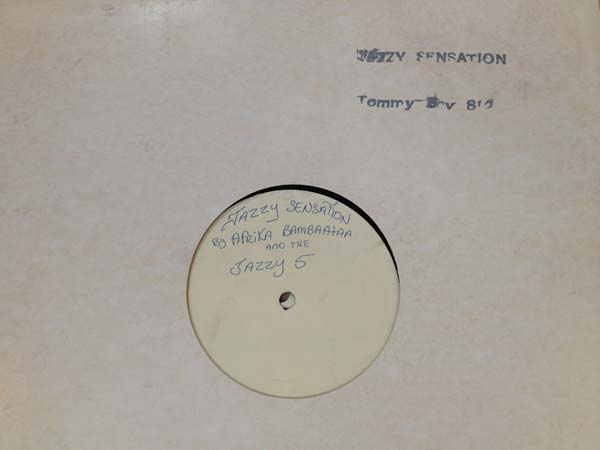
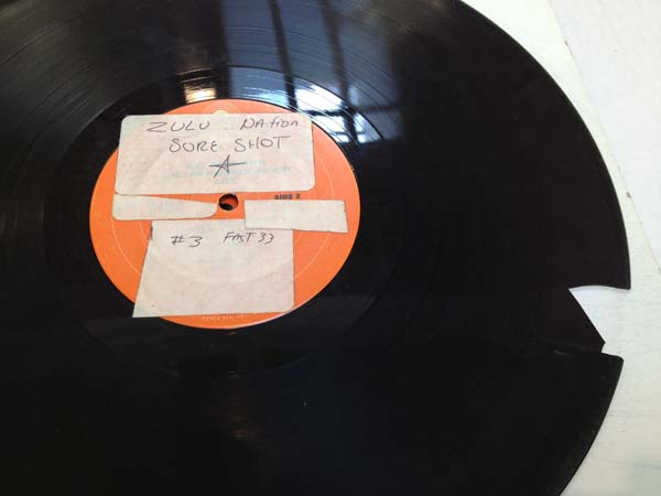
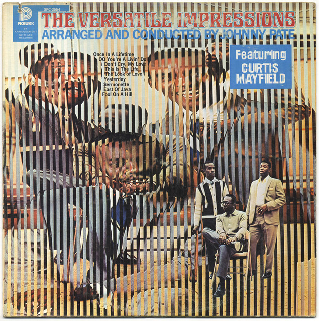
I know I’ve already posted about this before but the Egotripland blog has a feature on Bam’s collection with more photos and guess who turned up in them?
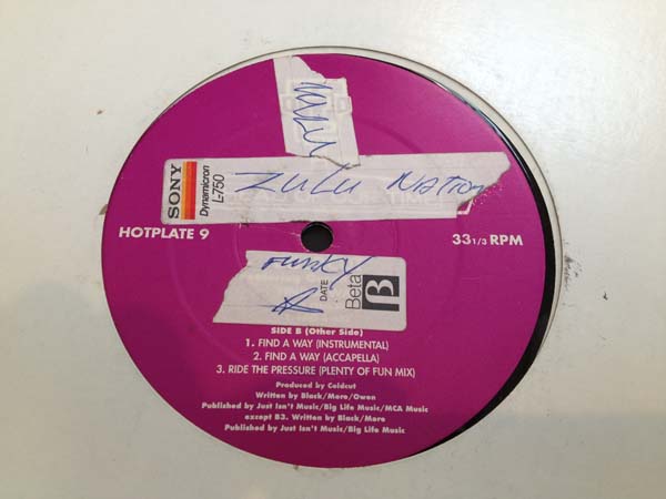 Check the link above for many more photos which concentrate on the defacing of some of the sleeves, below are my highlights.
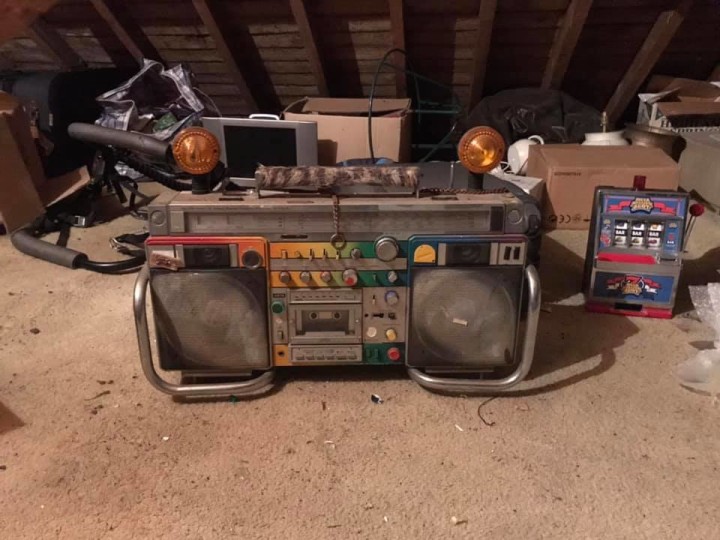
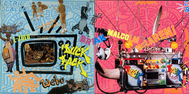 Nice interview with Nick Egan over on the Album Cover Hall of Fame blog about the design process for Malcolm McLaren‘s ‘Duck Rock’ LP. Easily one of my favourite records of all time along with being a pivotal influential moment in my musical upbringing. With artists such as Dondi White, Keith Haring and Vivienne Westwood‘s wares vying for space on the sleeve it’s a wonder it all hangs together but somehow it does. I wish the interview had gone into the making of the ‘Duck Rocker’ boombox a little as I’d love to know who made it and where it is now.
The mystery revealed: Ron West – who made the original Duck Rocker(s) posted this on his Facebook page at the end of 2020. It’s lost its horns and the graffiti is in a drawer but that is a copy of the original from the LP cover. Apparently Malcolm lost the original in the States and asked Ron to make a copy for promo purposes.
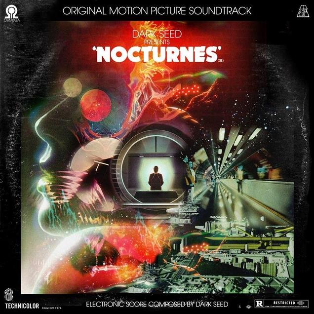 Sold on the cover art alone. Richard Norris and Luke Insect‘s new Dark Seed project gets its first sleeve. Pre-order HERE. Comes with a free fold out poster too!
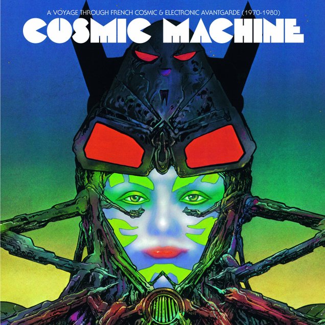 Love this cover for a new comp of French Cosmic and Electronic music. Very Phillippe Druillet, if not cribbed directly from one of his works. See the tracklist and pre-order here.
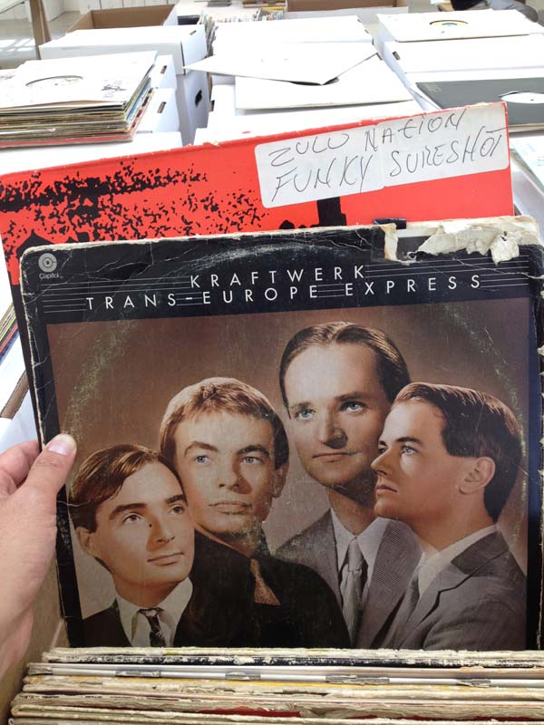
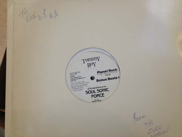
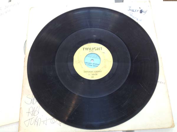
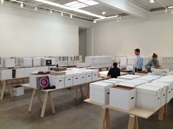
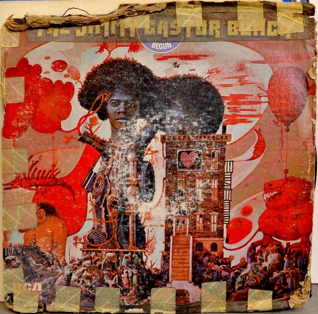 There’s a great article about the public cataloging of Afrika Bambaataa‘s record collection over on Wax Poetics’ site.
Friends on my Facebook page recently will have seen a new photo album called ‘The Devil’s In The Details’ where I’ve been posting design finds that I’ve photographed whilst going through a load of records recently. All these details are hidden on the backs of sleeves or on the actual labels, another example of something that’s disappearing with the digital age.

I’ve been having a clear out recently, I’ve not properly weeded out my record collection for years apart from going through the Hip Hop last year and it’s always fascinating to realise what you have and what’s contained within the artwork as well as the grooves. Speaking of Facebook, I now have a dedicated DJ Food Official page for gig news and official releases.
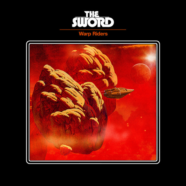
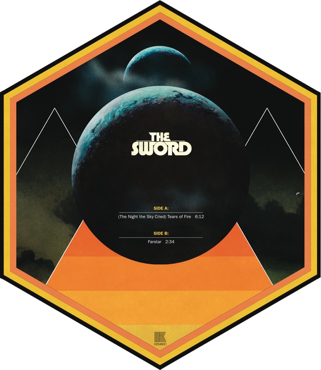
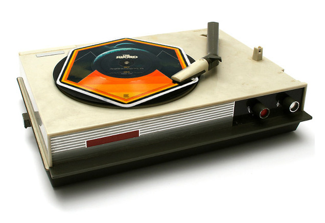
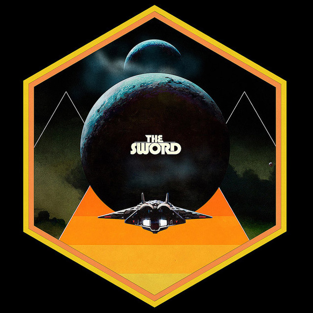
More old Dan McPharlin designs just because they’re so fantastic, this time for The Sword, check out the hexagonal picture disc.
