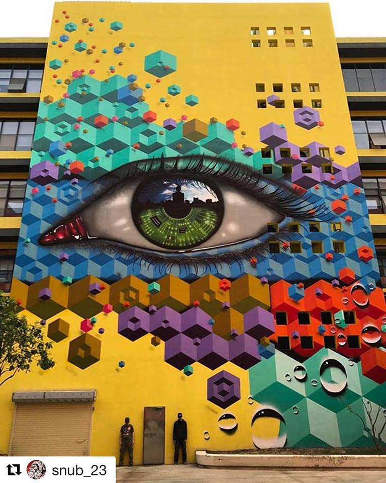
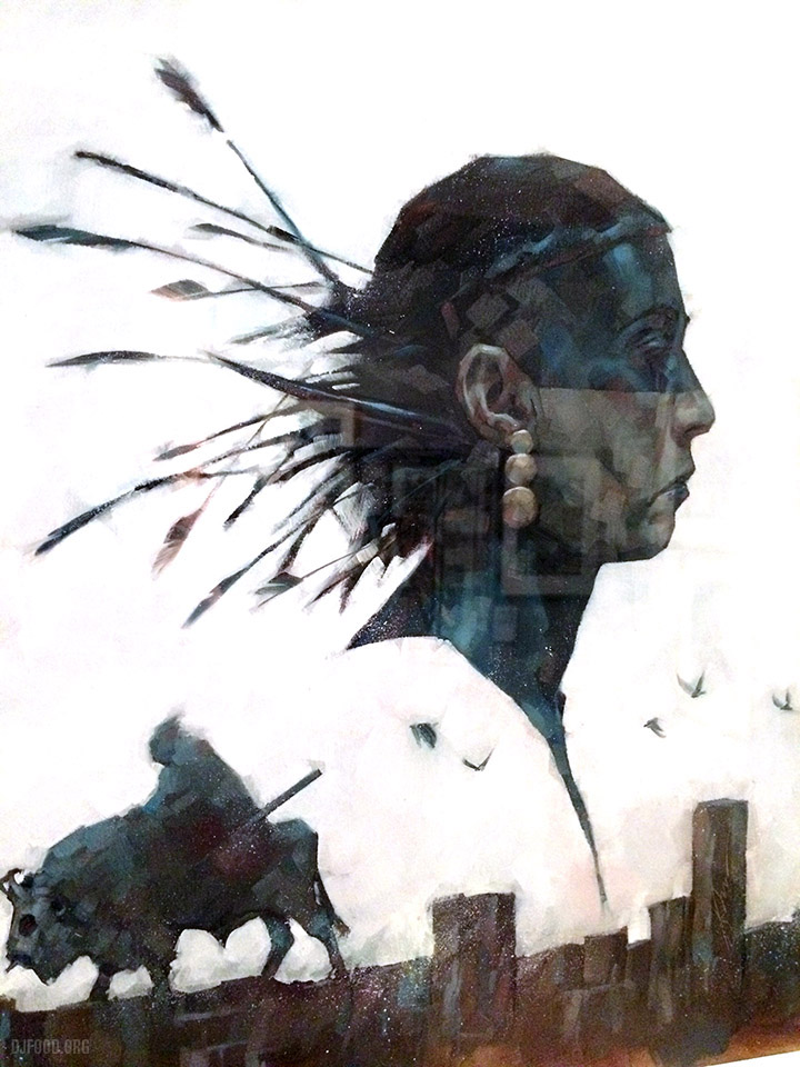
My Dog Sighs and Snub23 are excited to reveal ‘Future Vision’. Painted over 6 days in GS Park, Shenzhen, China, as part of a large two year mural project run by Snub23. So good.
Art
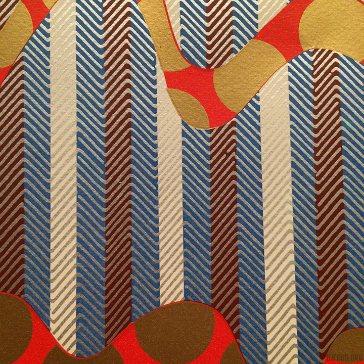
Now that’s a poster!
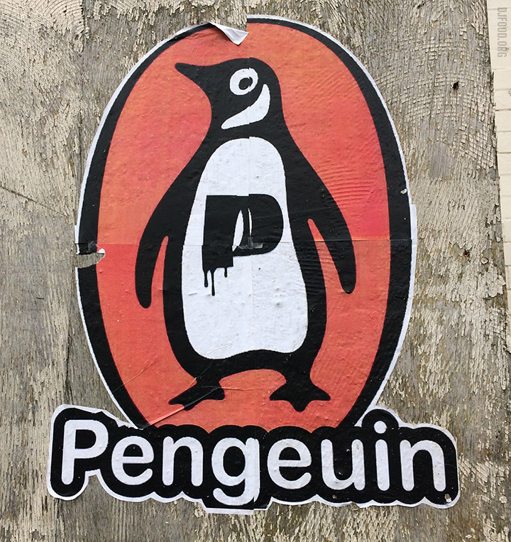
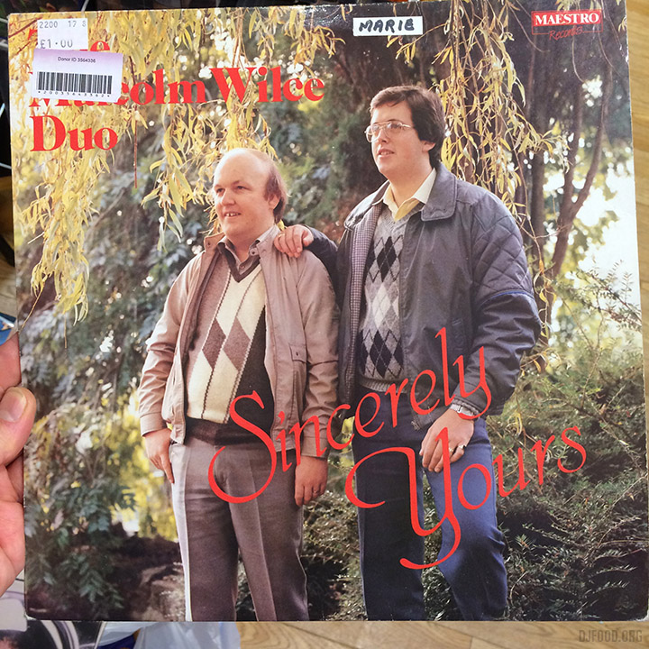
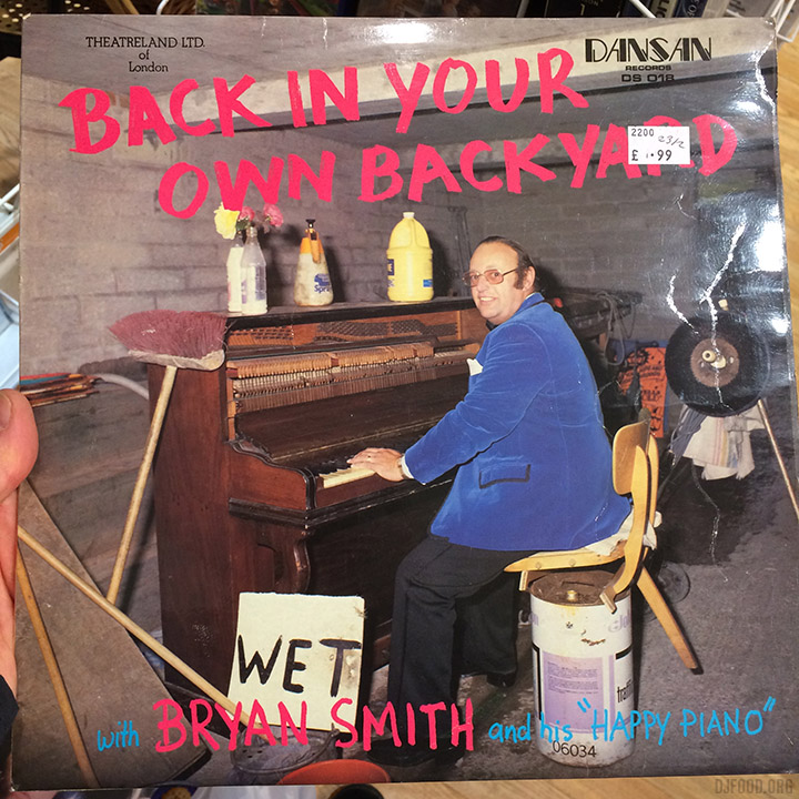
I found myself in Penge today, which is a rarity, and there was plenty to see in the quiet South East London suburb. The Penge / Pengeuin paste up above doesn’t really trip off the tongue but it’s always nice to see the orange logo. A little further down the road was a fascinating shop, with a colourful mural outside, that looked like it had been shut for many years. Inside the grilled window were old lamps, bottles, heads and all sorts, stuffed to the rafters but locked up and inaccessible.
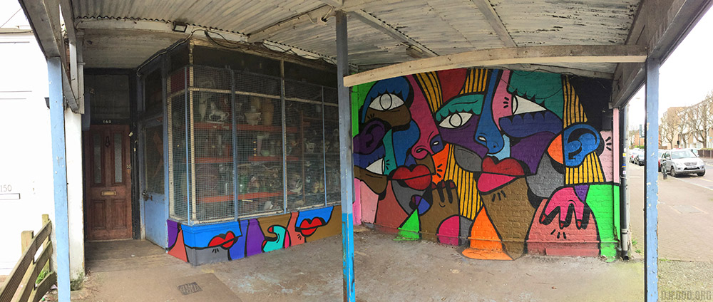
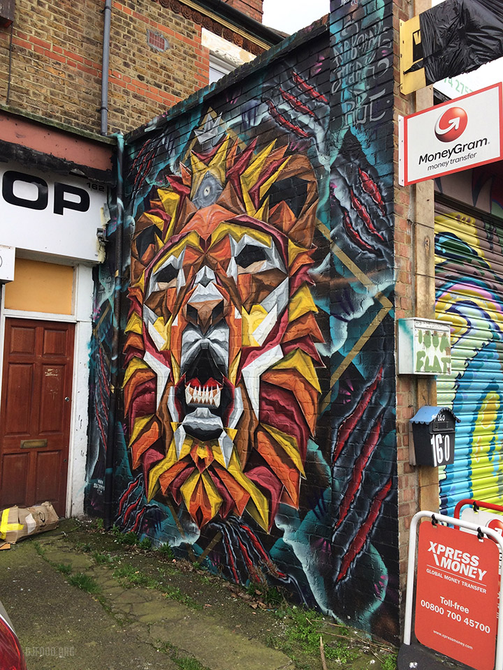
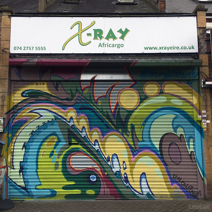
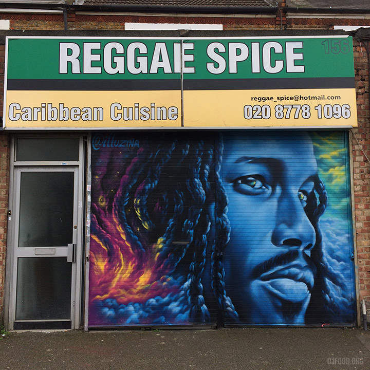
Next were a brace of shops with fresh murals on side walls and shutters.
The local charity shops threw up a couple of fabulous covers, brilliant in their unstyled glory.
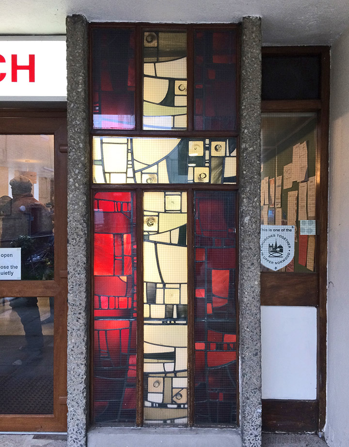
Later, up the road in Crystal Palace, I came across this amazing stained glass window on a church.
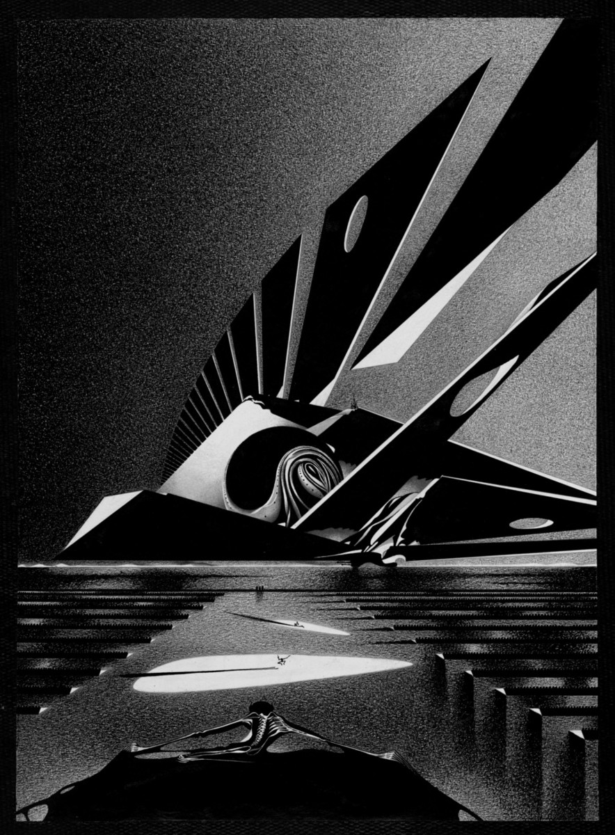
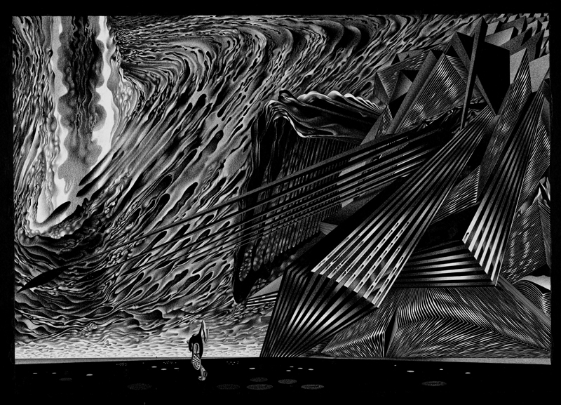
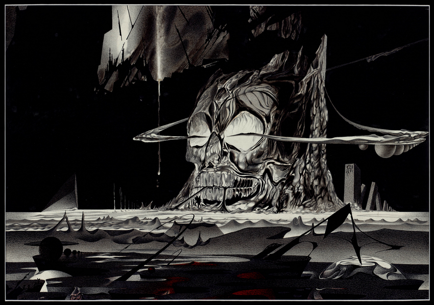
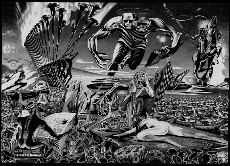
Ladies and Gentlemen – Anatoly Fomenko – wow! Don’t know anything about him aside that he has Soviet connection and is also a mathematician. Incredible, thanks to Jamie Tilley for hipping me to him.
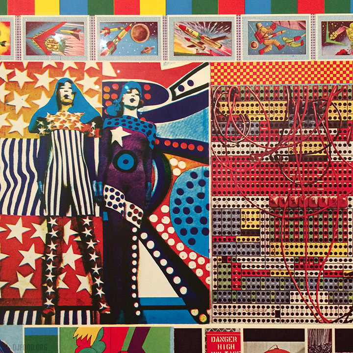
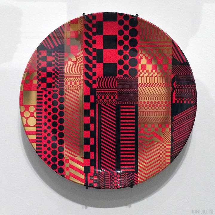
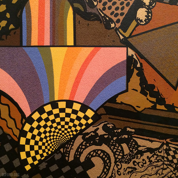
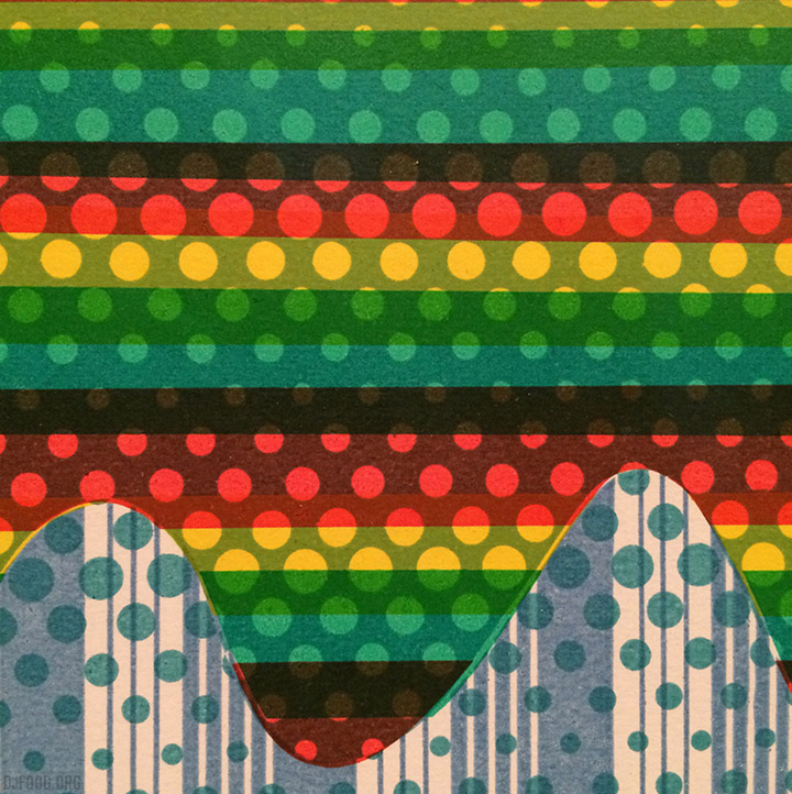
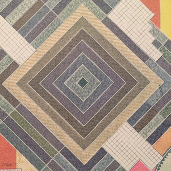
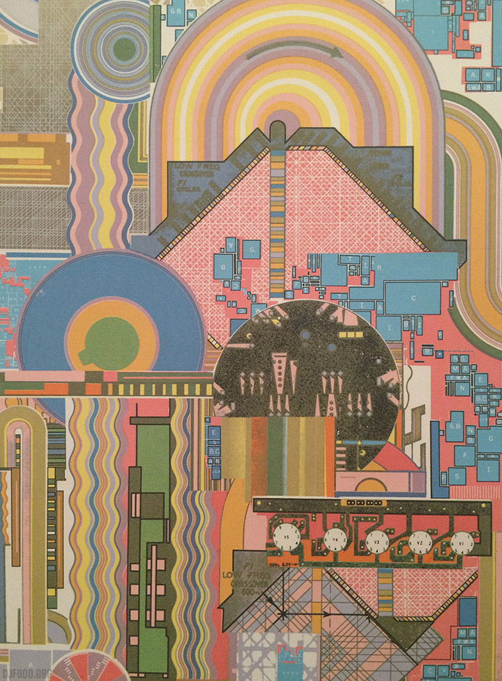
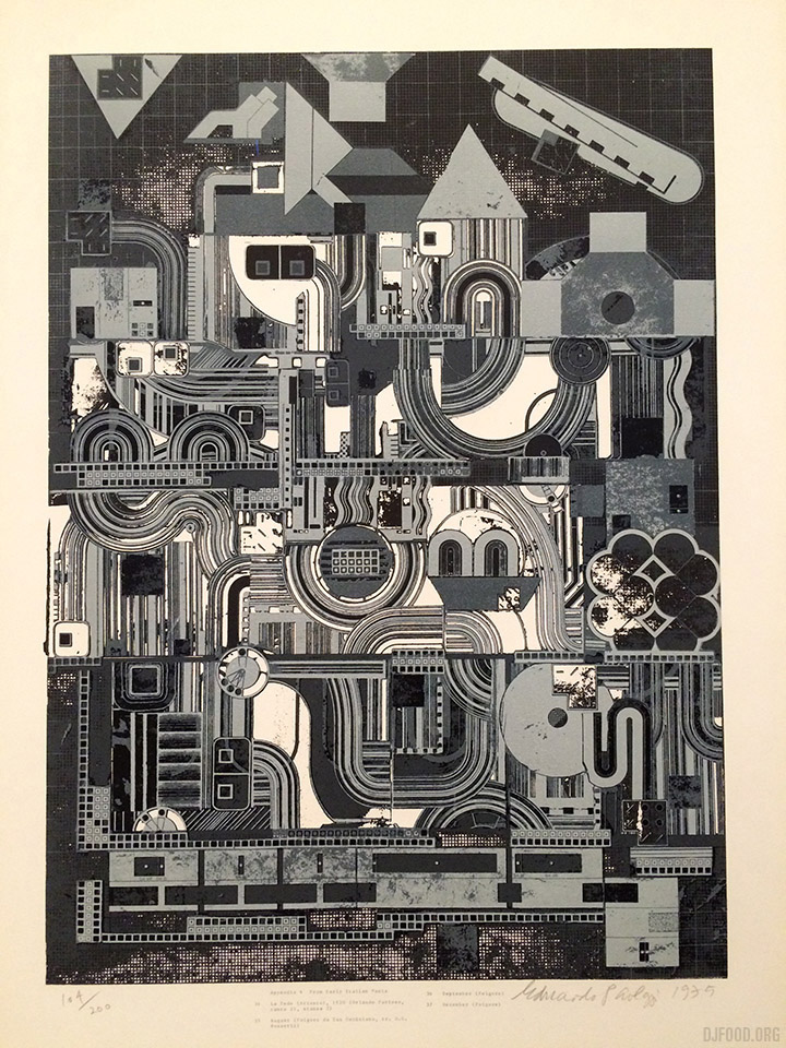
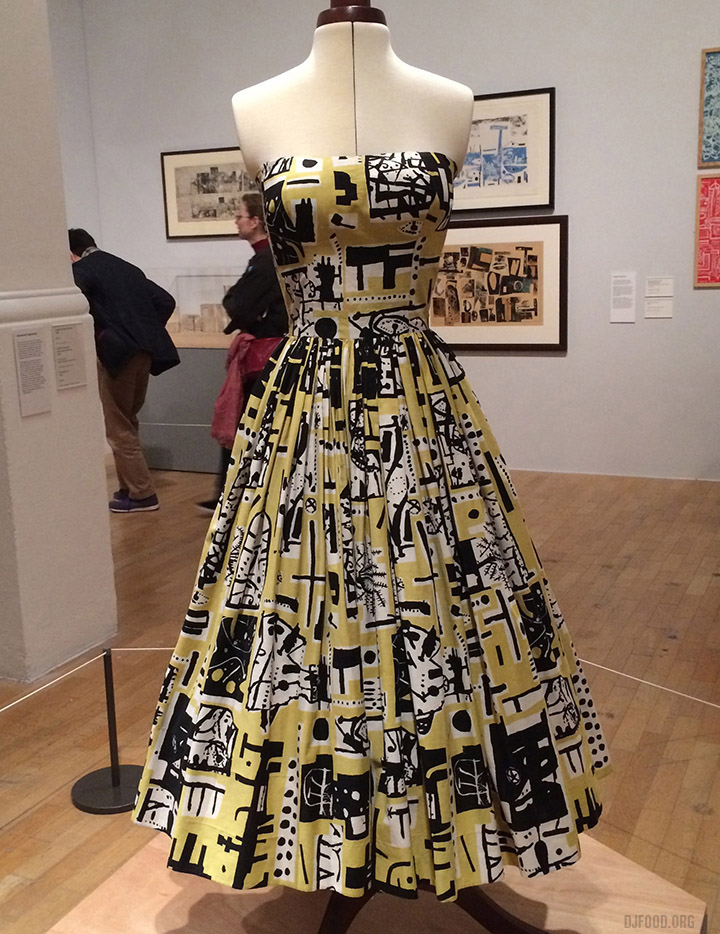
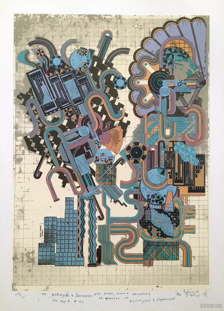
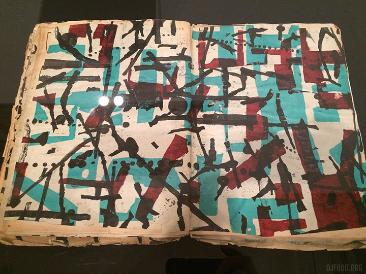
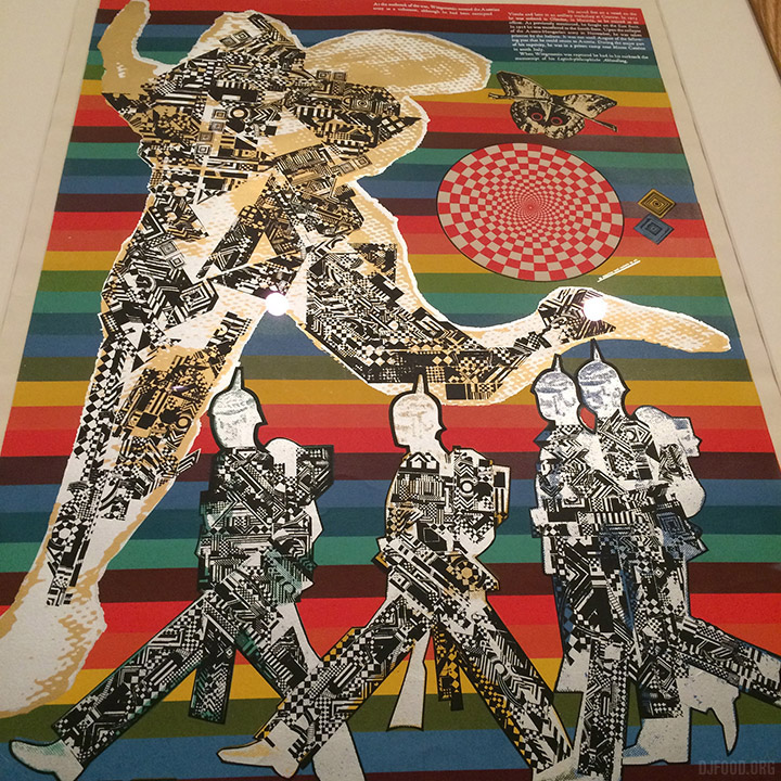
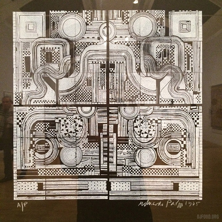
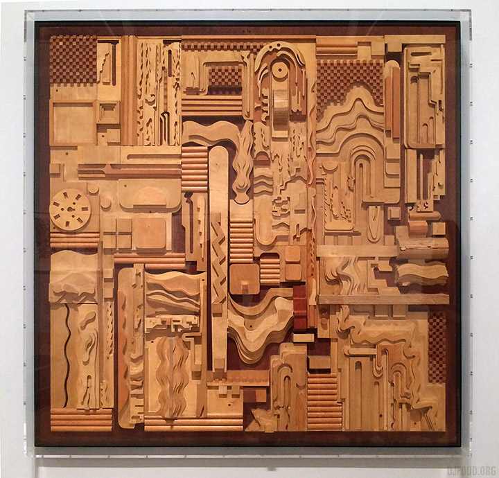
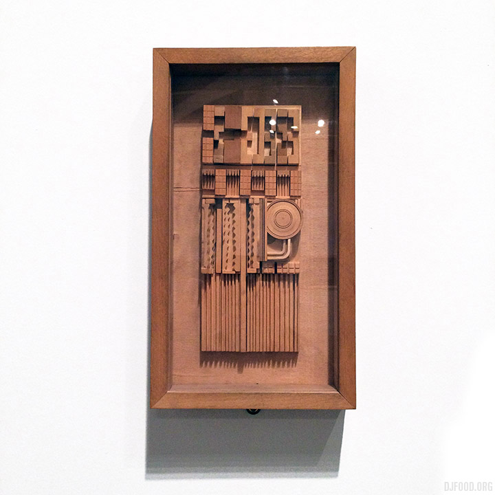
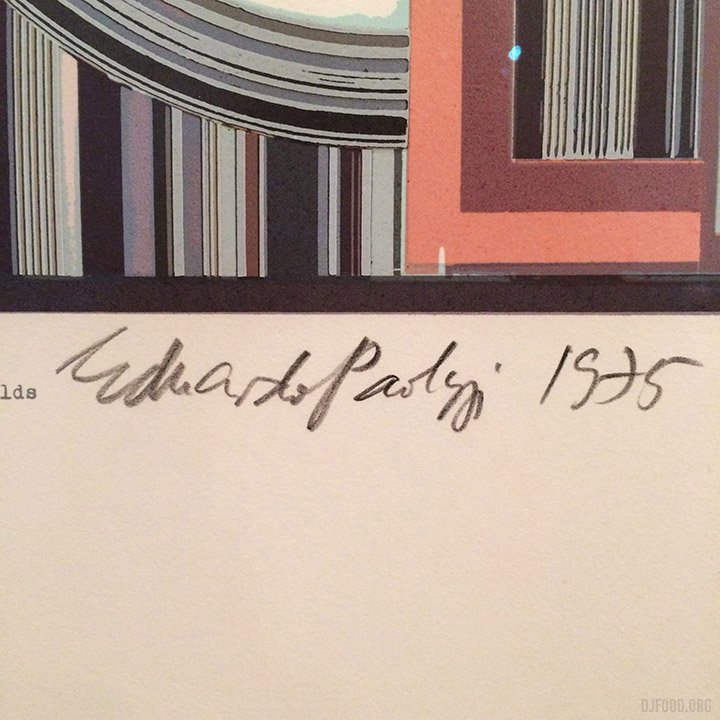
Continuing the Paolozzi love on this blog, I visited the new retrospective of his work at the Whitechapel Gallery in East London. Over 250 of his works are on display and it’s more than worth the price of admission. Prints, sculptures, paintings, textiles, photos, films and collages stretch over two floors and the breadth of his work is amazing. What’s also apparent in most of it is that it’s barely dated and is quite timeless, his early Pop Art collages being the only exceptions which can be forgiven as he was one of the originators. The technical level achieved in the screenprints is beyond anything I’ve seen as well, I would love to see the original screens for these or the prints that went wrong. Two mediums I hadn’t seen his work in before really stood out: the textiles and a couple of works in wood, the latter, made with different kinds and varnishes, were gorgeous. Highly recommended.
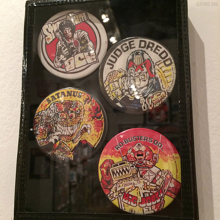
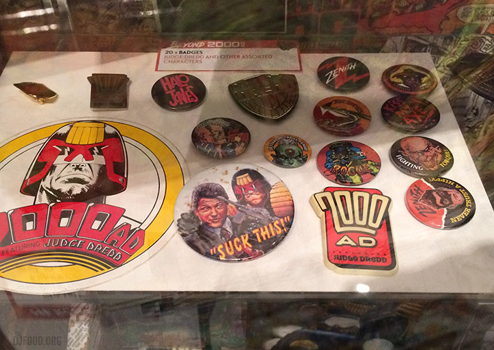
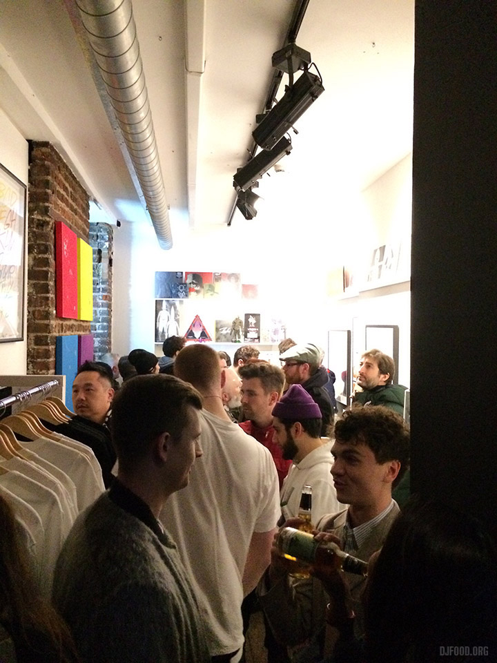
 I finally got time to pop into Orbital Comics and see their small but packed exhibition of 2000AD offshoots, tie-ins, cash-ins, memorabilia, music, magazines, toys and so much more. Not having an opening party because it would clash with the comic’s own 40th celebration a couple of weekends ago they’ve decided to have a closing party on Friday March 10th where there will be a podcast recording and music by yours truly among others.
I also just guested on the Big Mouth podcast pre-record, talking about the comic’s legacy which will be available online this coming Sunday. More details as I have it.
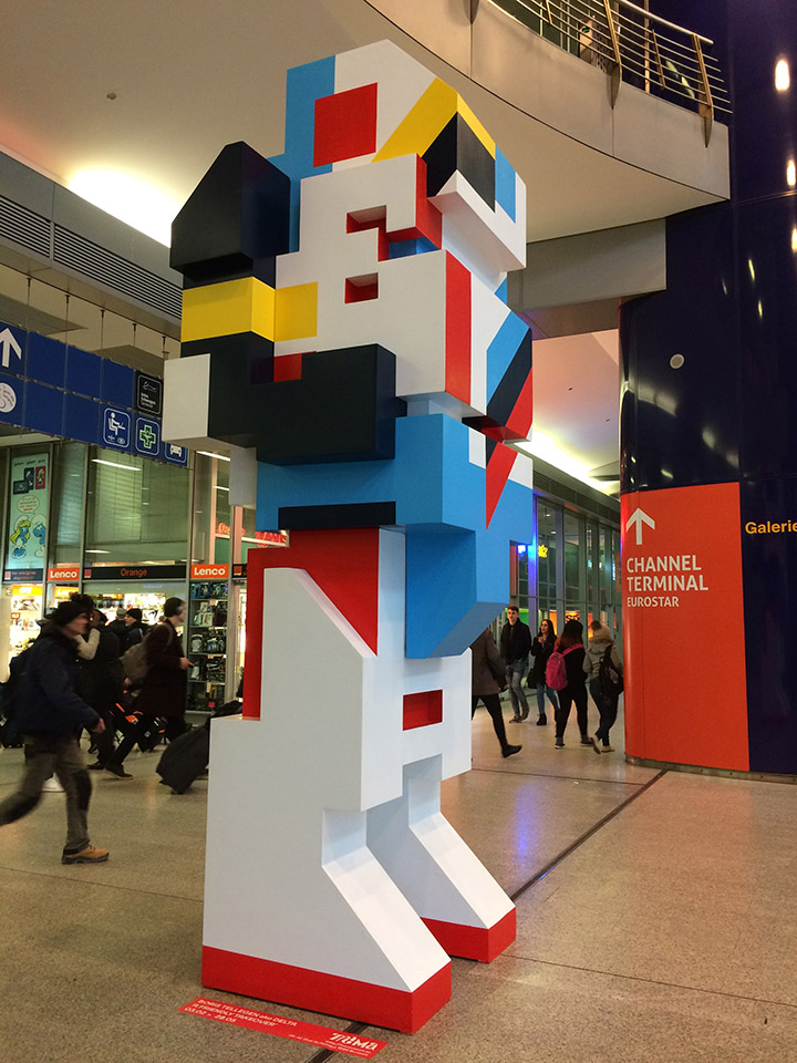
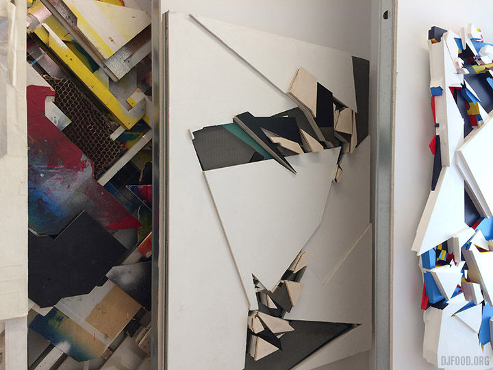
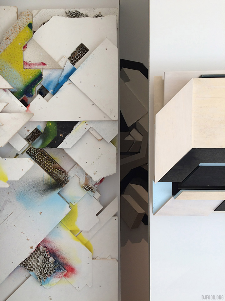
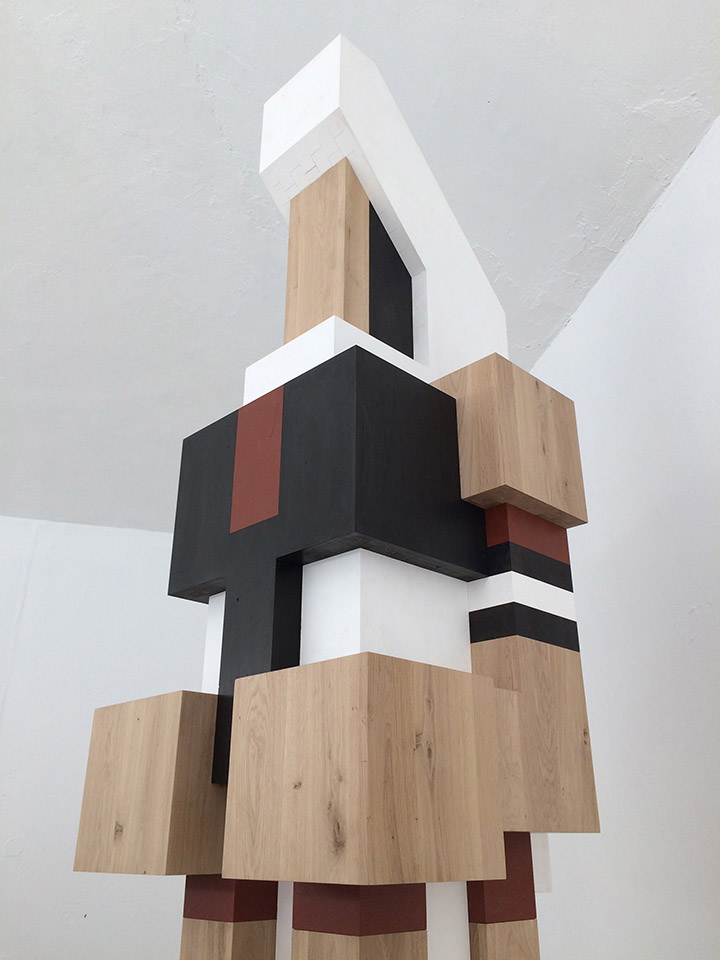
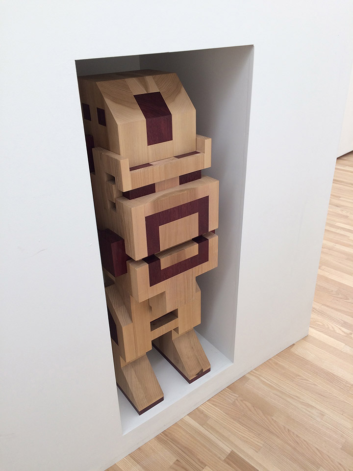
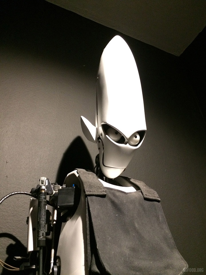
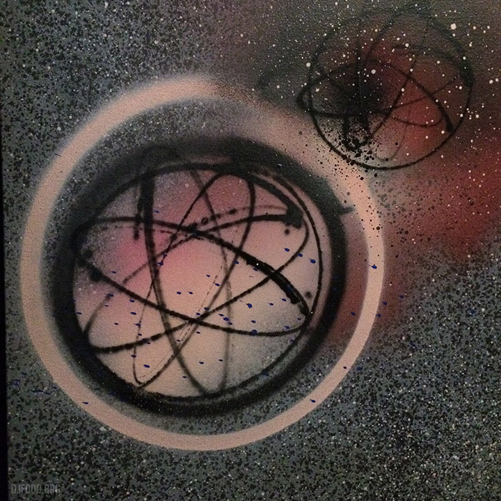
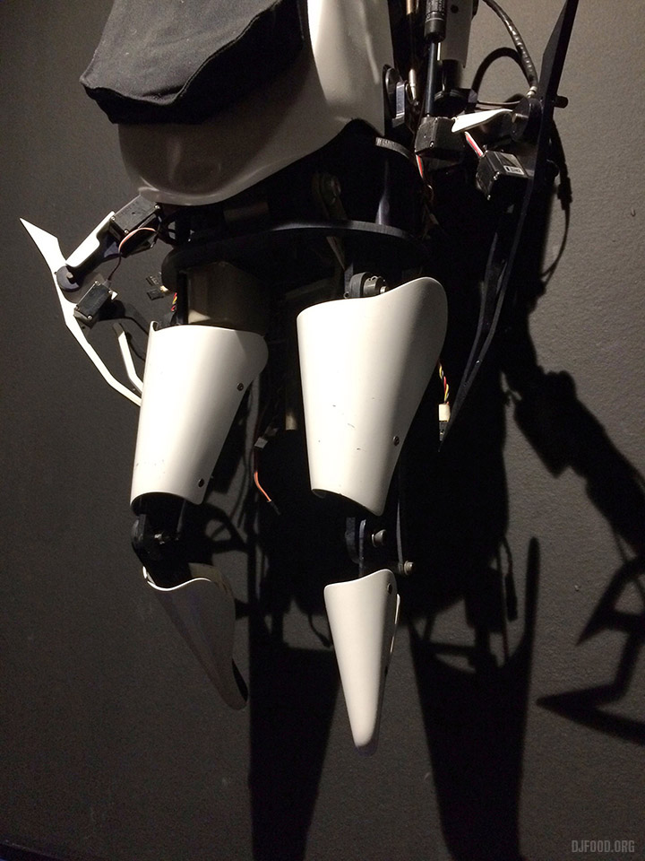
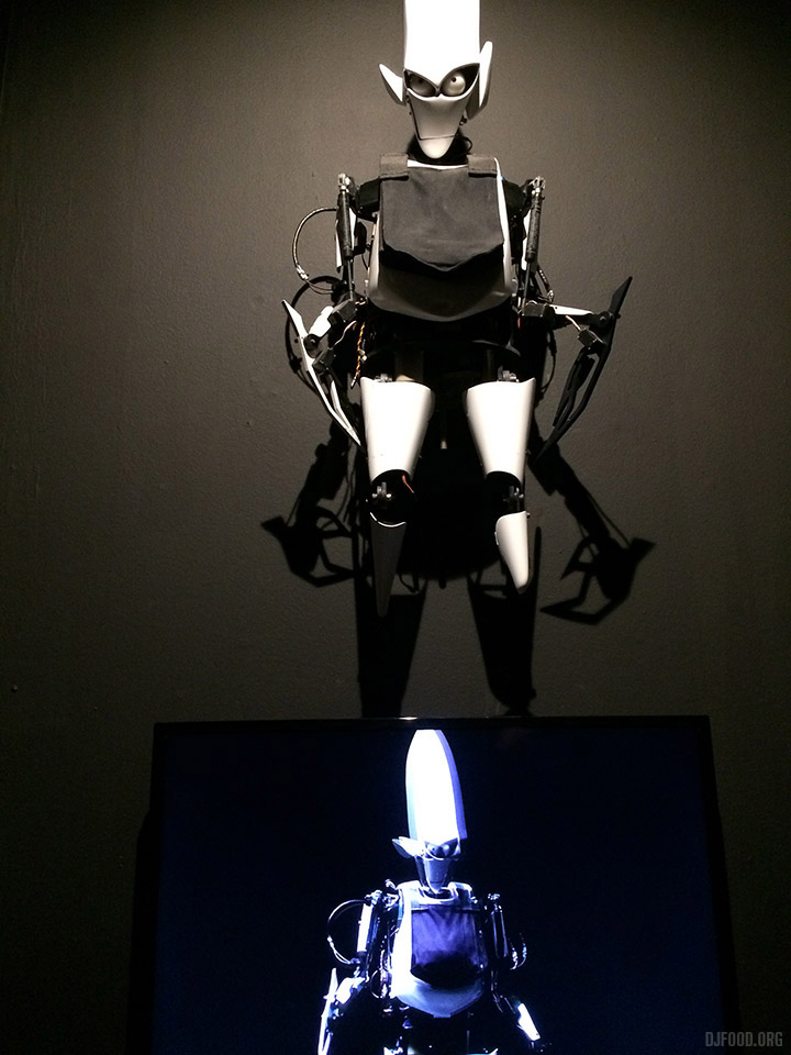
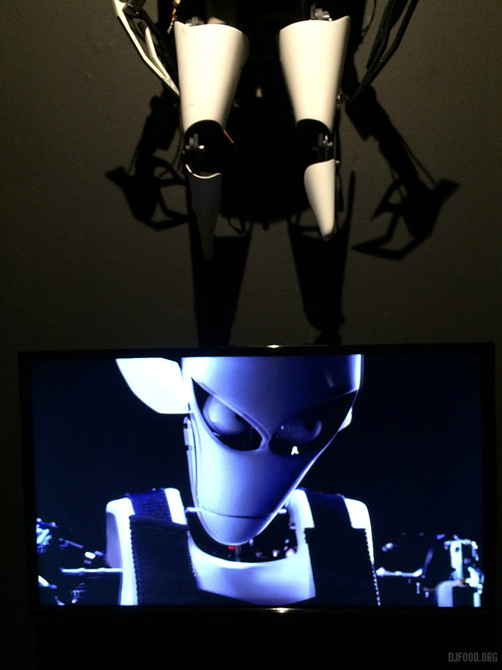
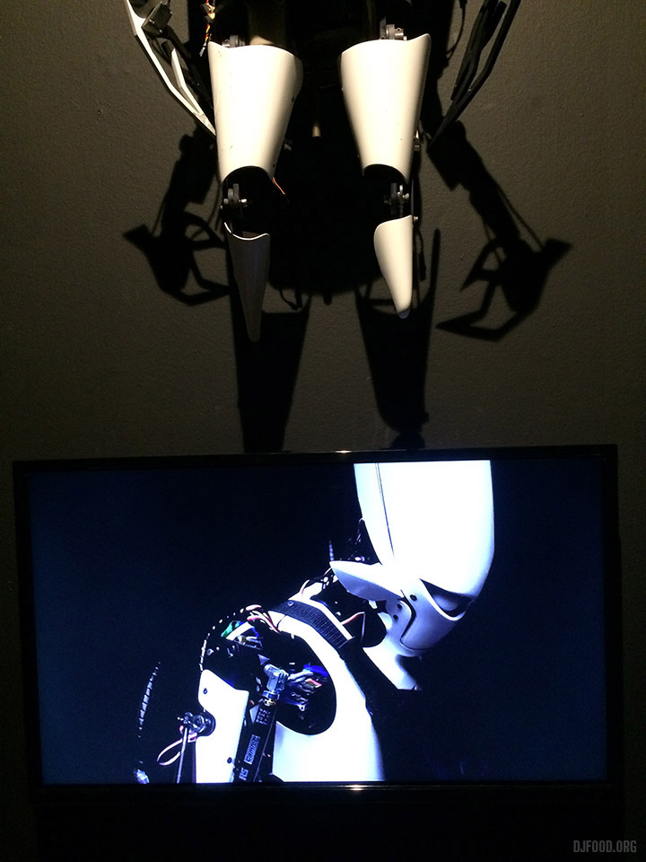
Over the weekend I was in Brussels to play a couple of gigs and was lucky enough to have enough spare time before my train home to visit the Mima museum in Molenbeek district about 20 minutes walk from the Central station where I was greeted by the figure above. Created by Boris Tellegen aka Delta or Mess (in his graffiti days) the construction advertised the ‘friendly takeover’ of the museum he had undertaken over three of its floors.
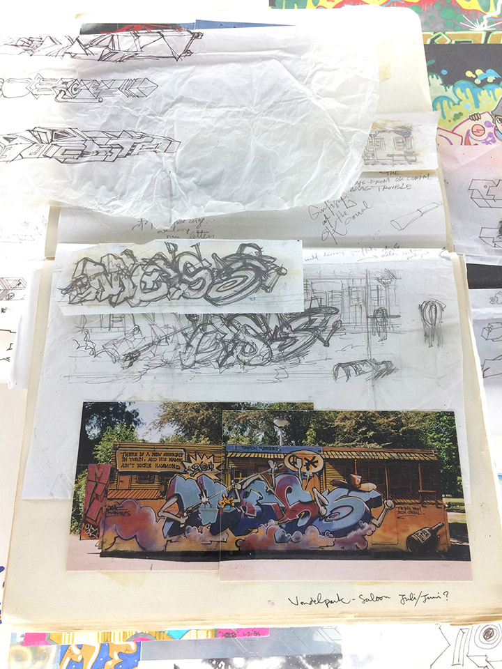
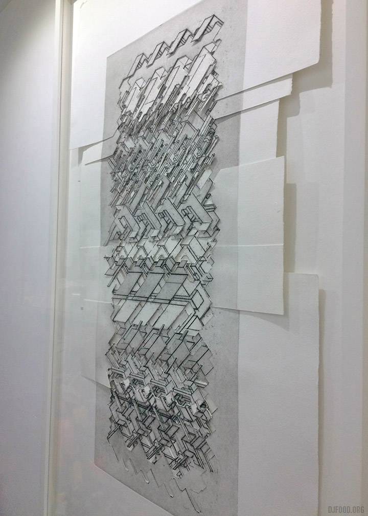
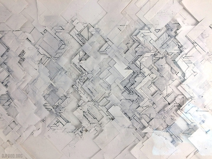
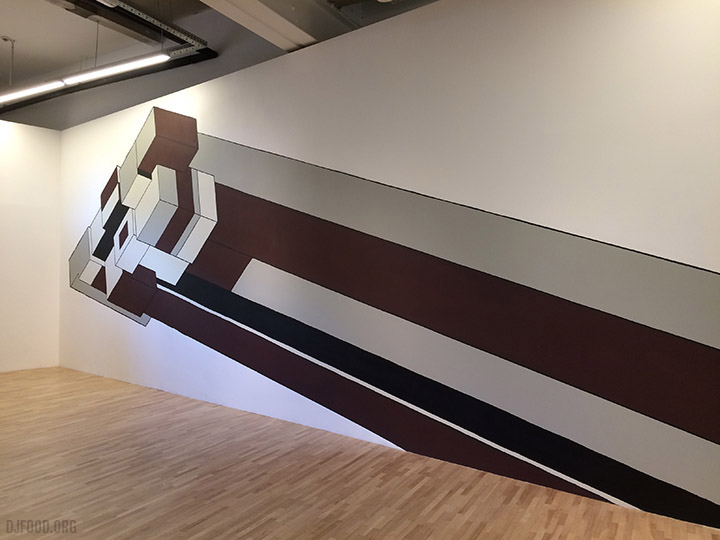
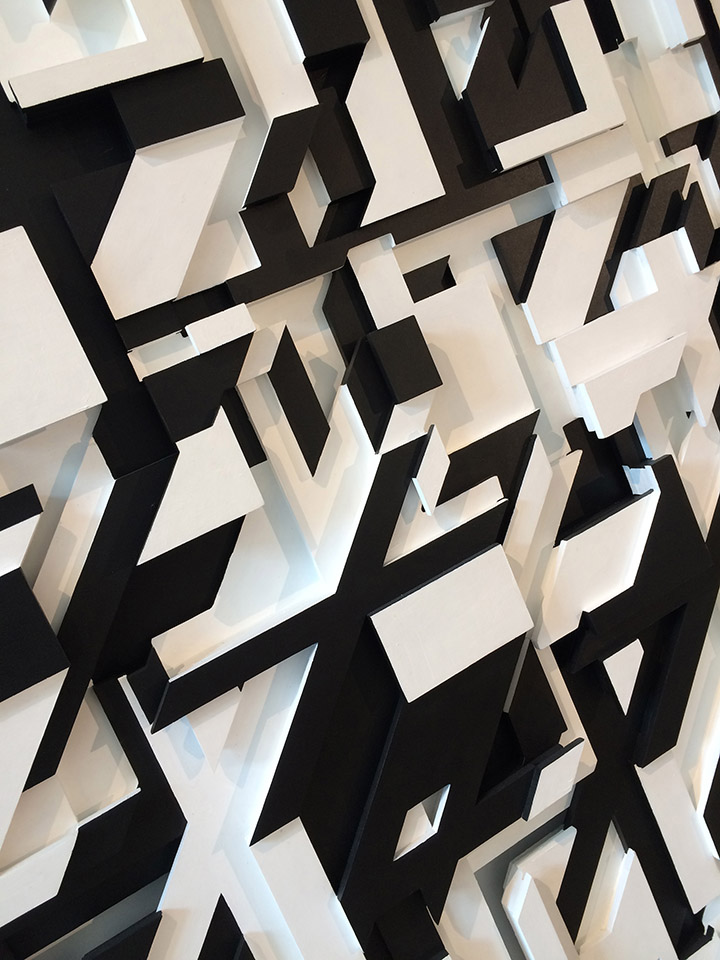
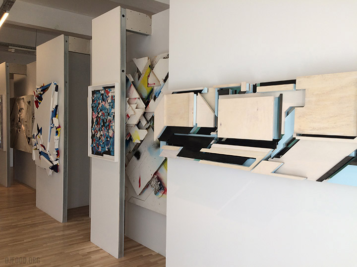
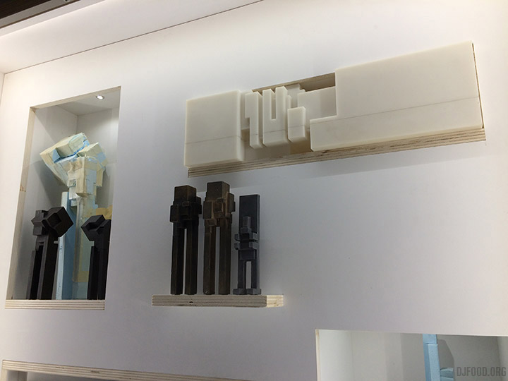
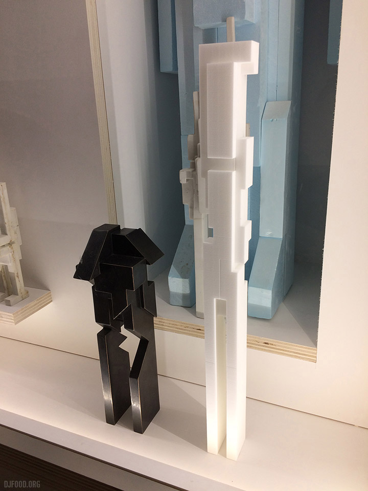
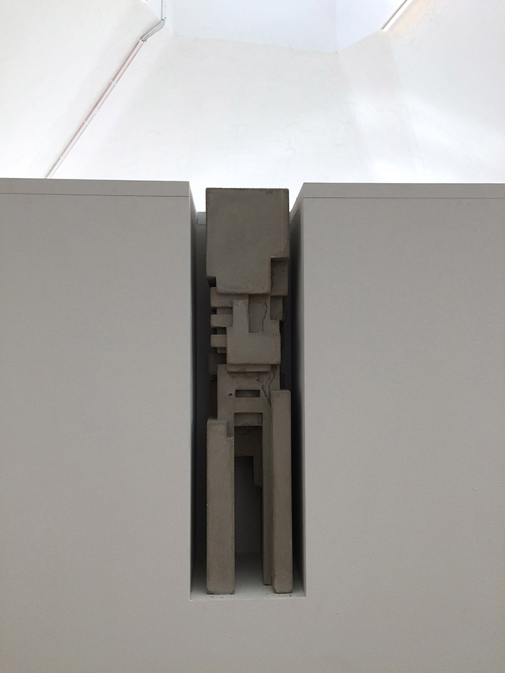
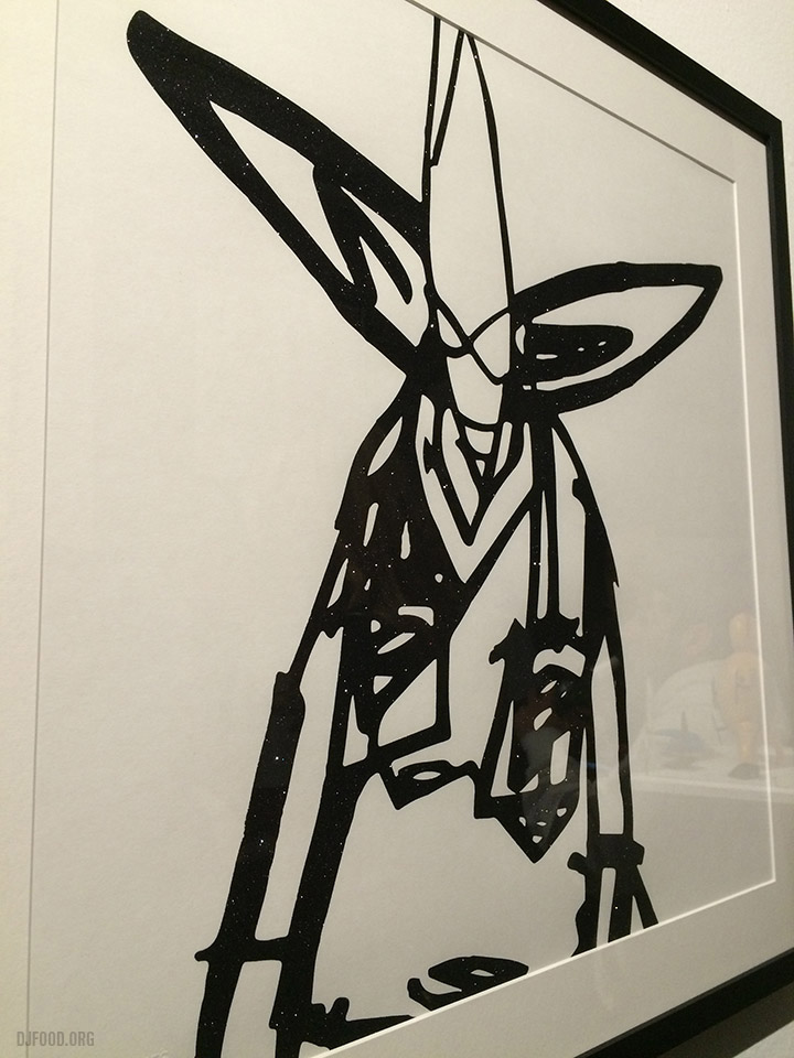
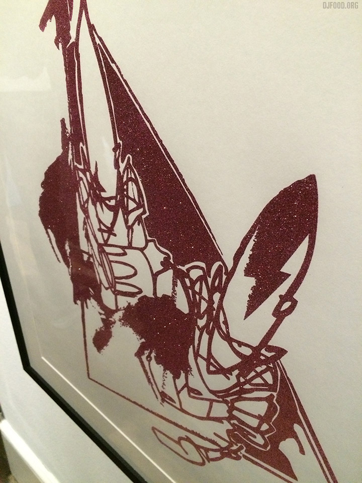
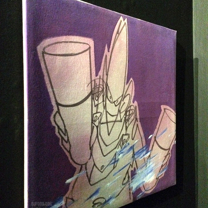
Once inside the viewer is greeted with a very different experience to the usual galleries with work around the edges. Boris’ work is all about 3 dimensional space and he has a legitimate claim to popularising the 3D graffiti lettering style in Europe later taken up by artists like Daim, Toast and Loomit. His work also uses collage, layers and exposed sections and the contents of the exhibition are displayed thus.
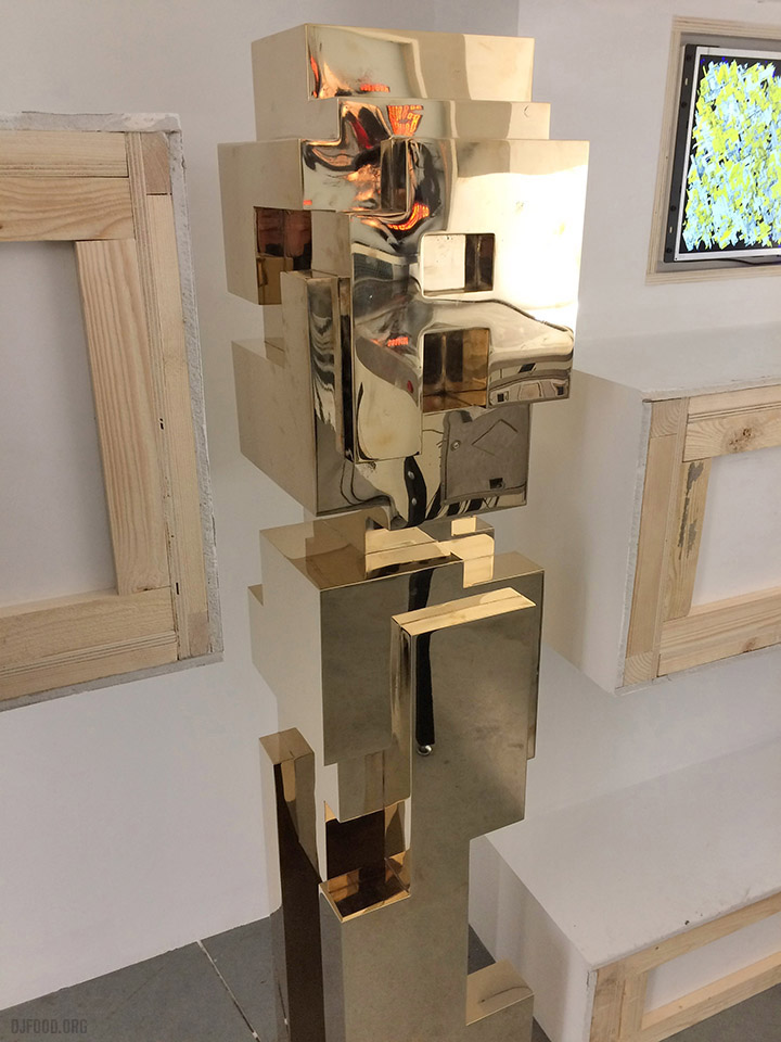
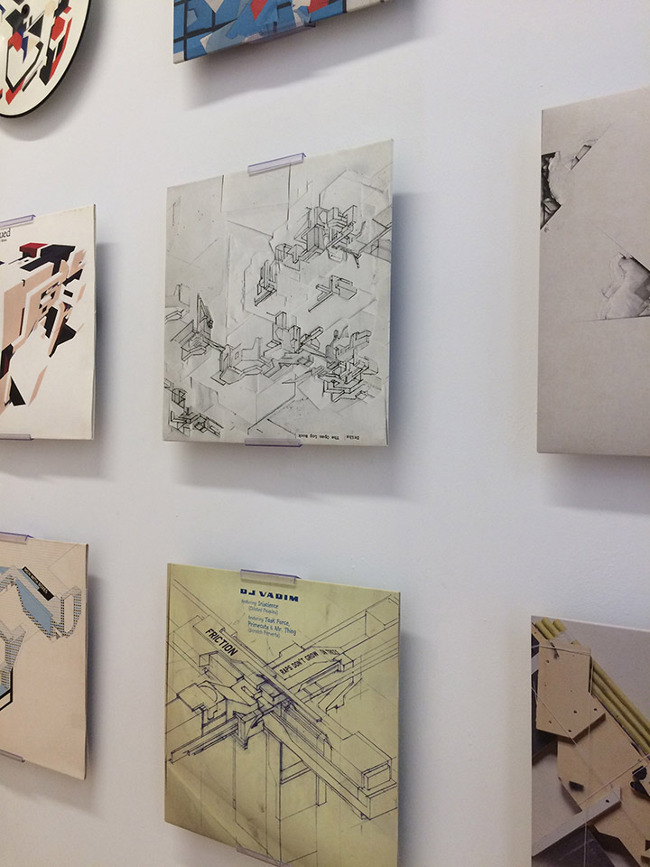
His many record sleeves are on display including a few we collaborated on in the late 90s for DJ Vadim and Ninja Tune. I’m also featured in some of the films dotted around the galleries talking about how we met and worked together. For me this was the most interesting room, when he work was a hybrid of letter forms and architecture, always suggesting three dimensional forms, blueprints and later, broken, ripped or smashed structures that give a looseness and random feel to his work.
You’re forced to peer inside, through or at cross-sections of several pieces which have themselves become part of a larger artwork in what almost seems like an anti-exhibition, hiding more than half of some works in the pursuit of a new way to experience them. See some examples from a 2011 exhibition here.
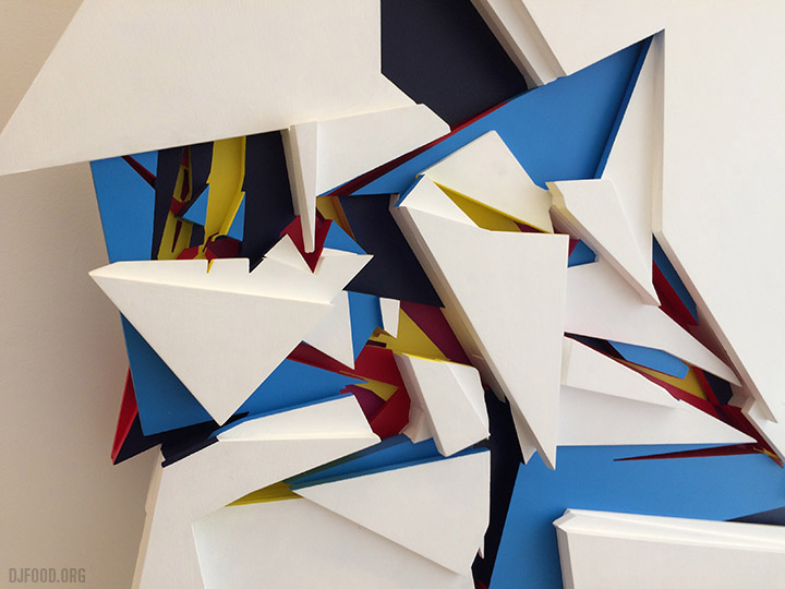
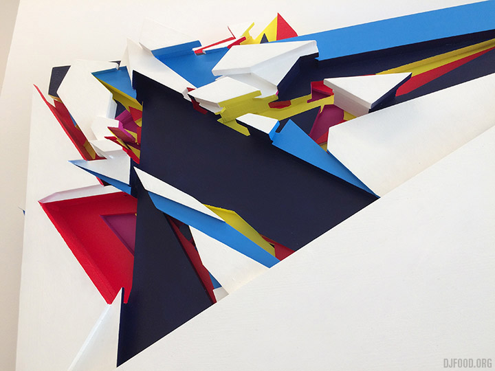
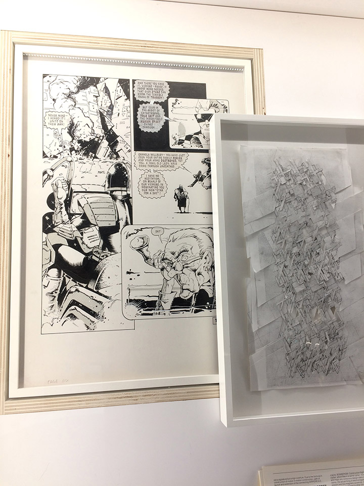
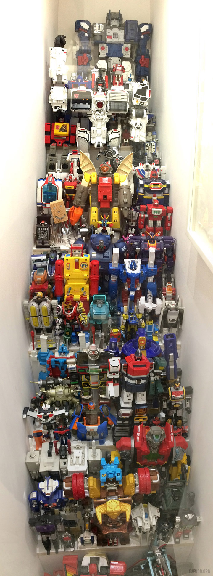
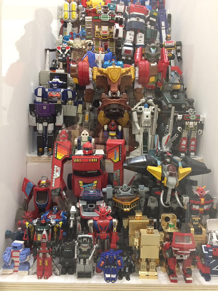
His letter figures (extract the name DELTA from some of their forms) remind me of Giacometti, Paolozzi and vintage robots. In fact, on the first floor he adds in some of his inspirations, including a huge collection of toy robots and a page of original art from a Judge Dredd story. When I visited his studio in ’97 one of the first things I saw on the shelf was a Japanese Gundam toy and a Todd McFarlane Spawn robot figure and it all made sense.
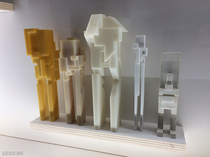
Some smaller figures are hidden inside larger ones including a train set nestled inside the body of a huge reclining figure on the third floor, visible through a glass window. The exhibition is on until the end of May and is a fascinating retrospective of sorts of an artist who keeps on pushing and evolving. Also look out for the incredible ’86-97′ book which faithfully replicates his two graffiti black books created between these years.
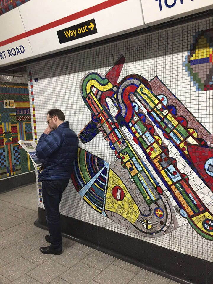
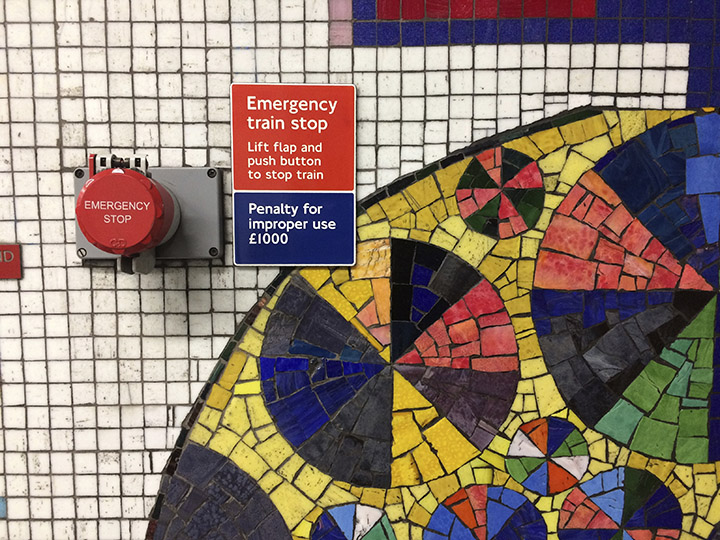
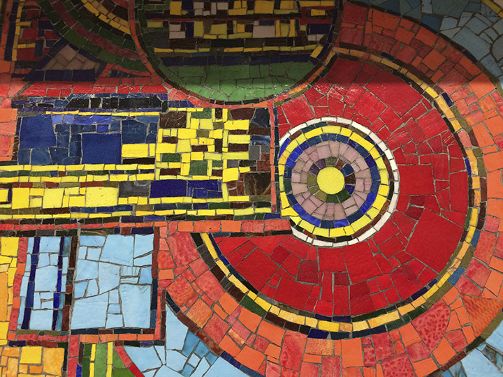
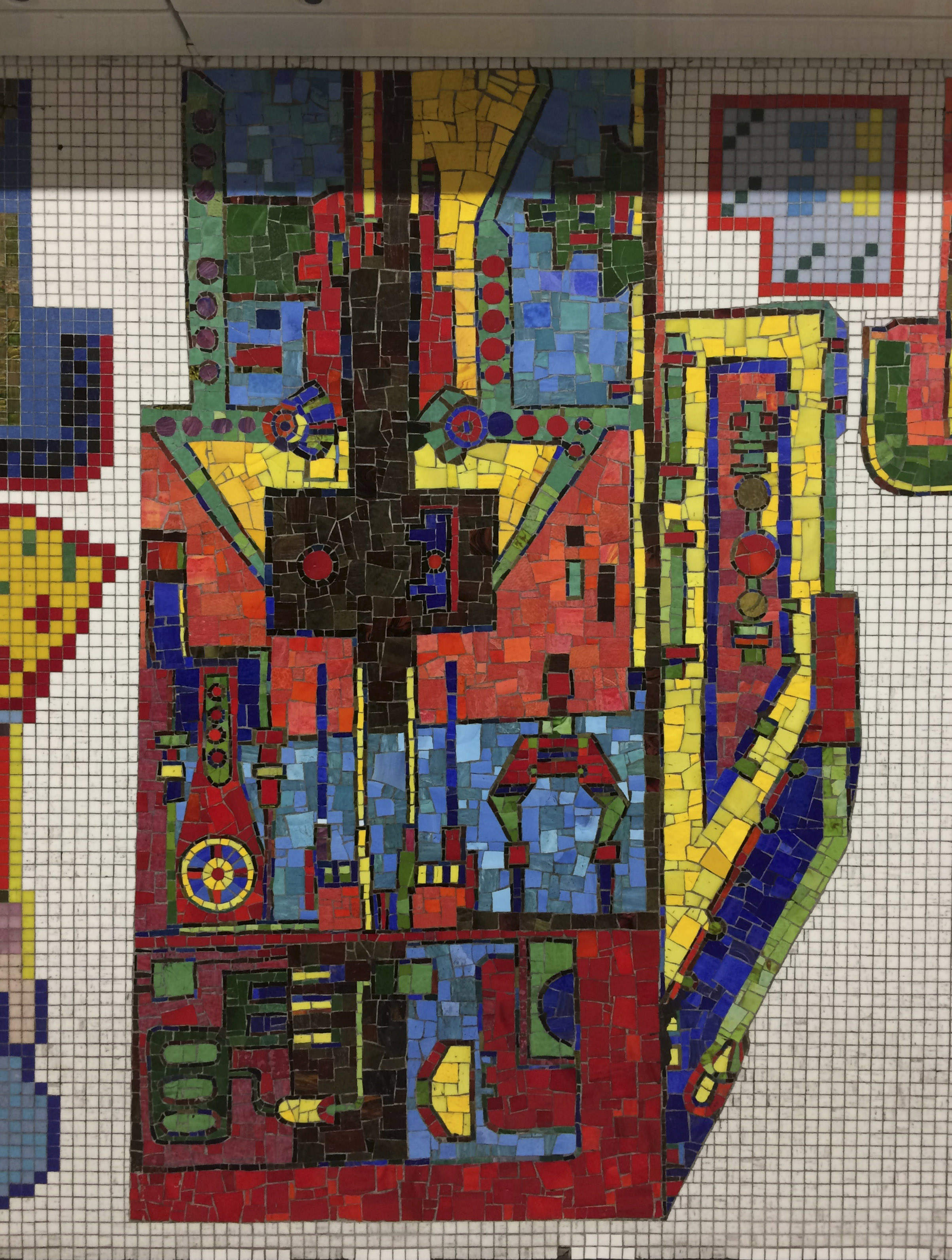
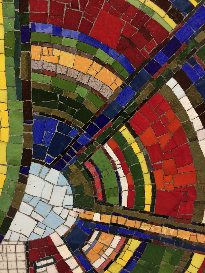
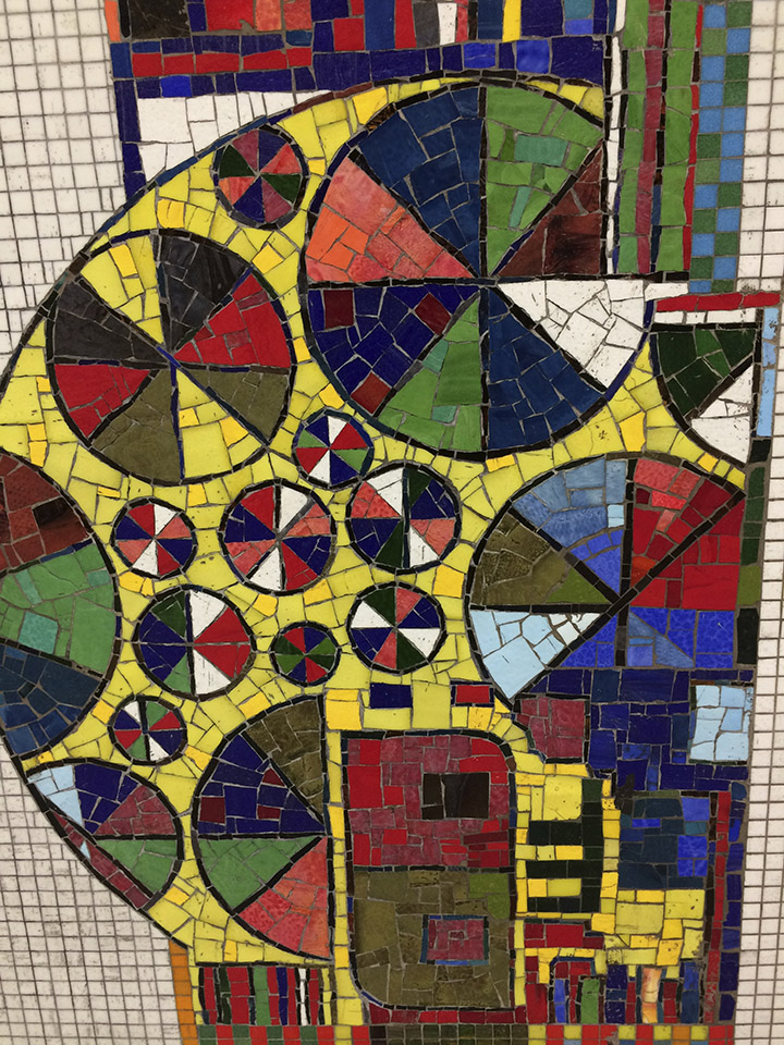
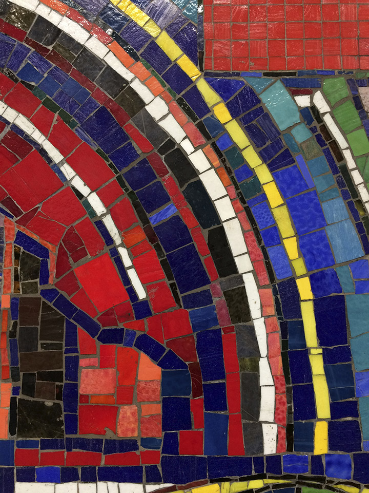
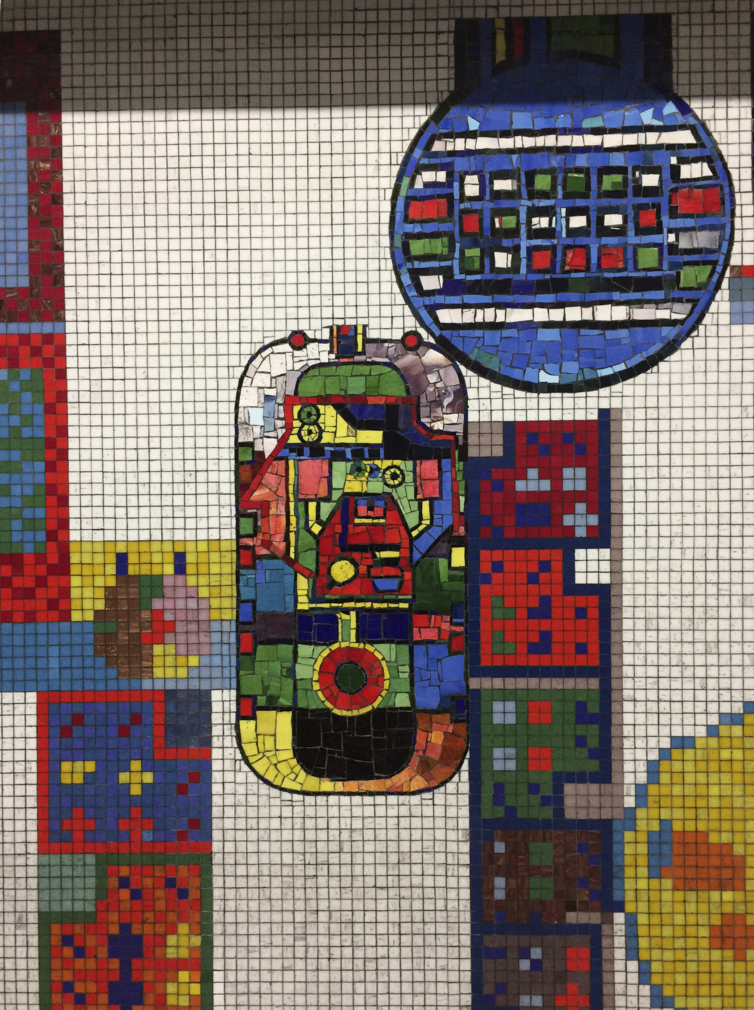
Tottenham Court Road underground station, in the heart of London’s West End, has had a huge influx of Paolozzi mosaics restored and reinstated into the platforms and passageways. The mosaics originally come from elsewhere in the station and had been removed when it underwent huge infrastructure changes over the last few years to accommodate Crossrail. The original platform mosaics are easy to spot as they’re all square gridded tiles but the ‘new’ ones are more freestyle and have been expertly inserted into the walls in spaces not already used. For more info see the short film below.
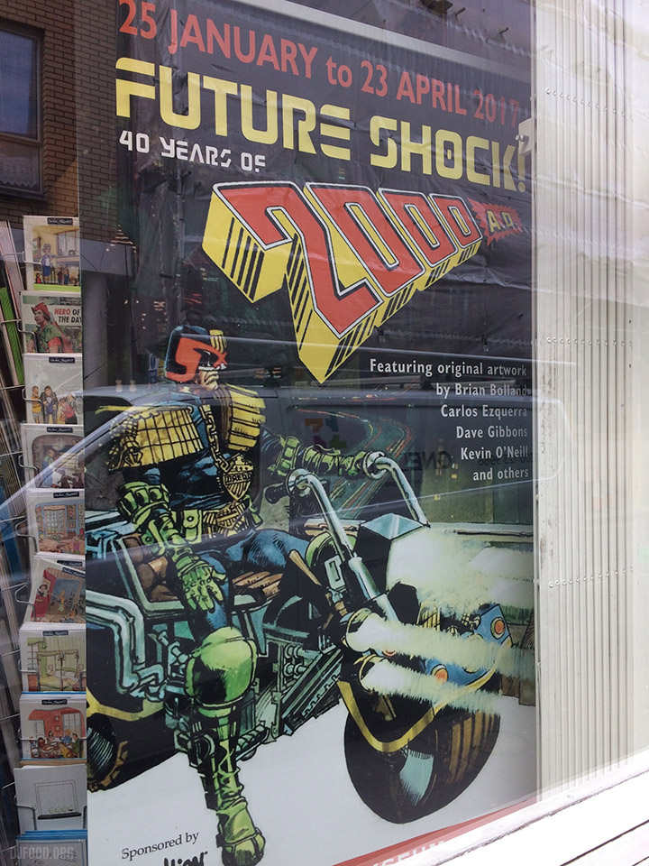
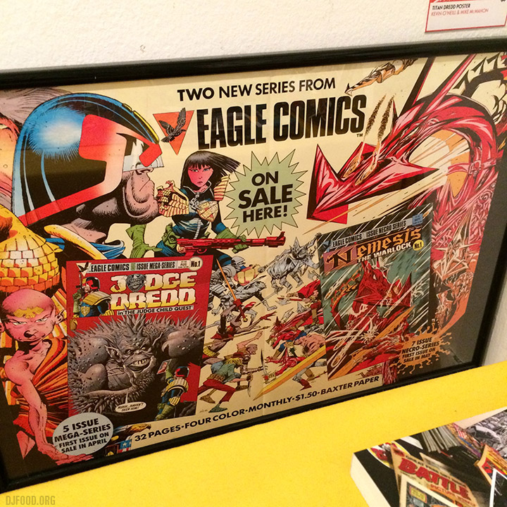
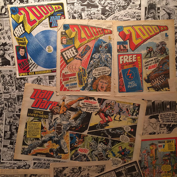
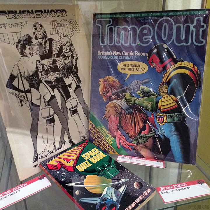
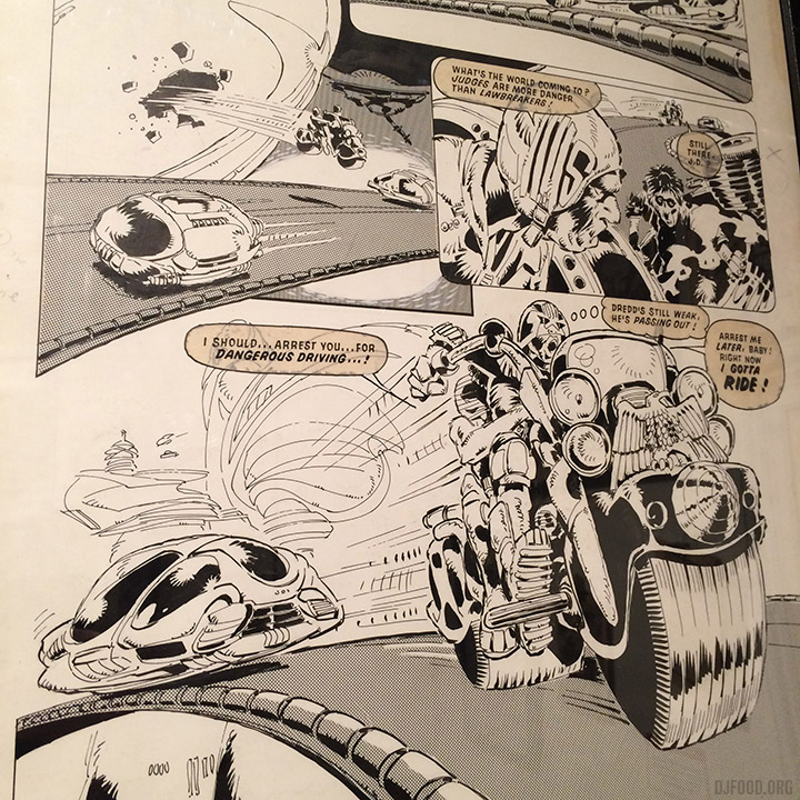
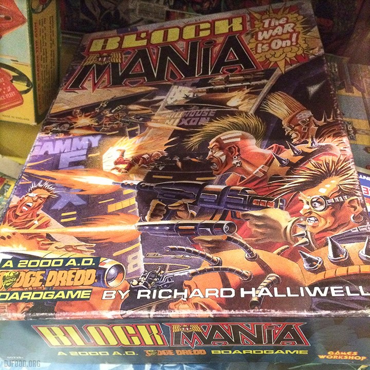
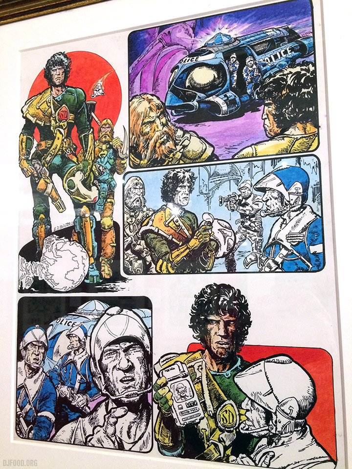
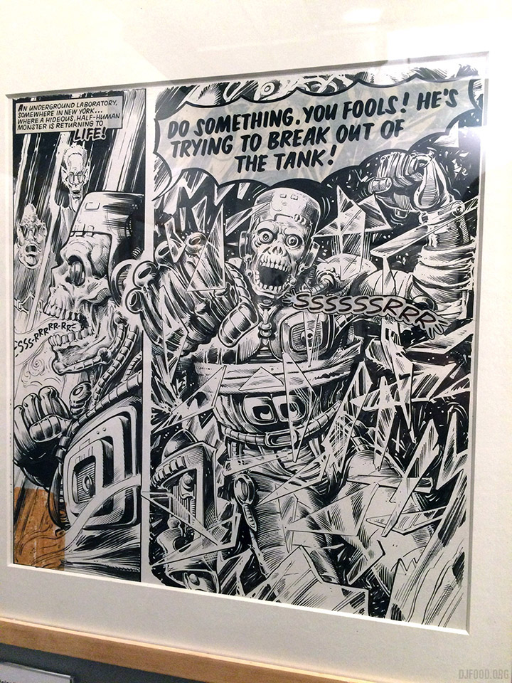
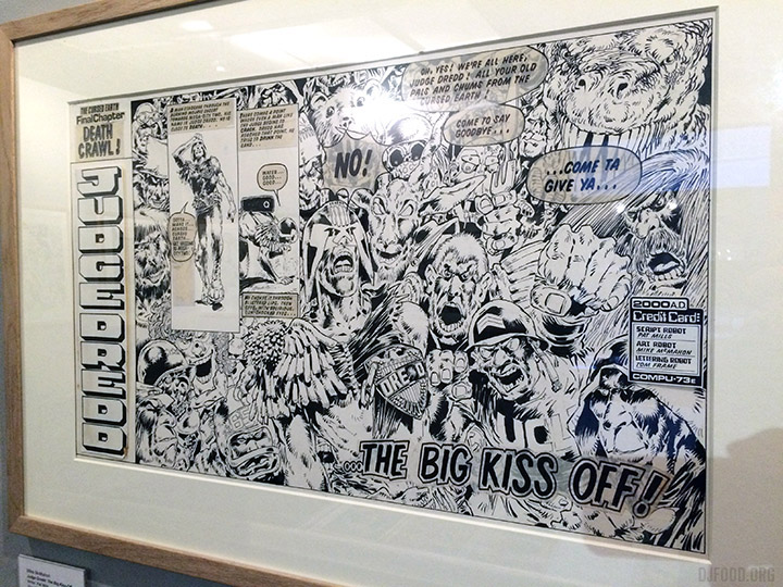
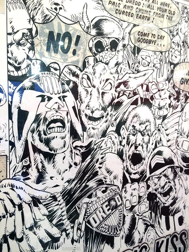
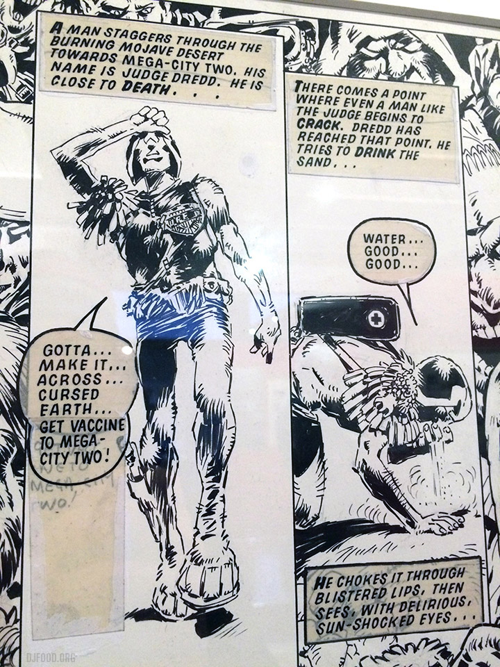
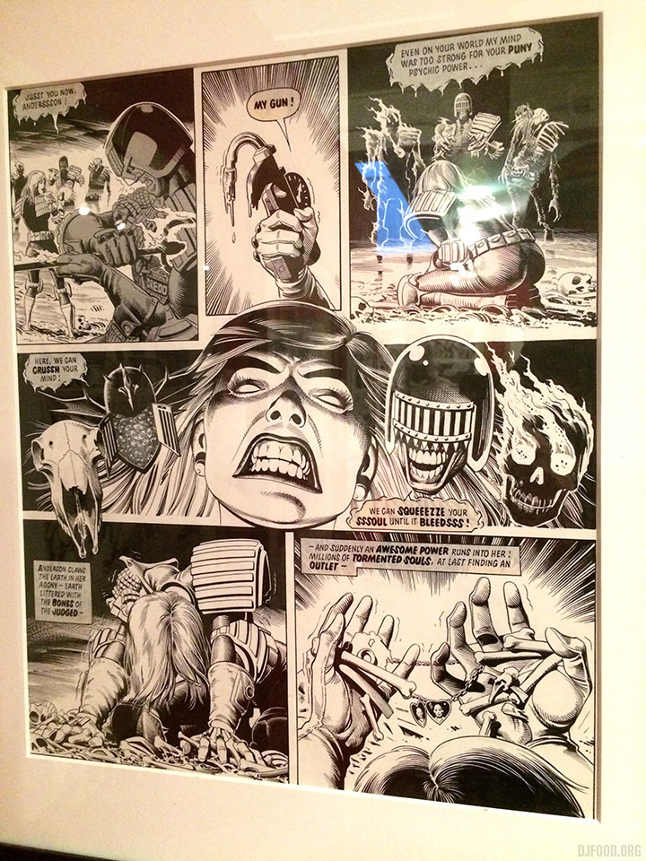
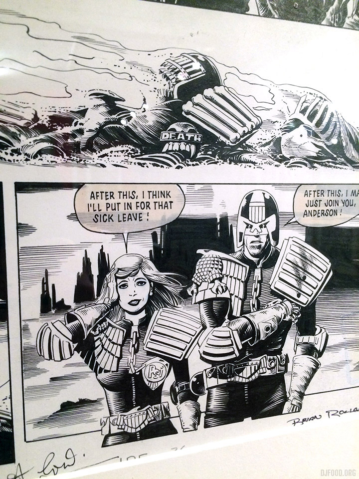
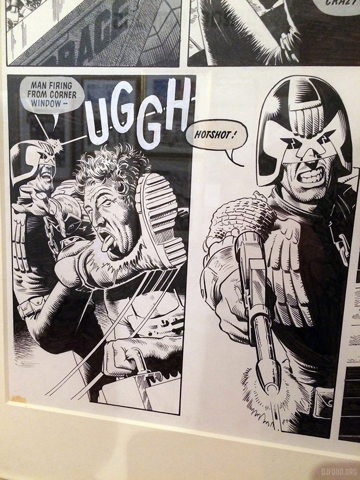
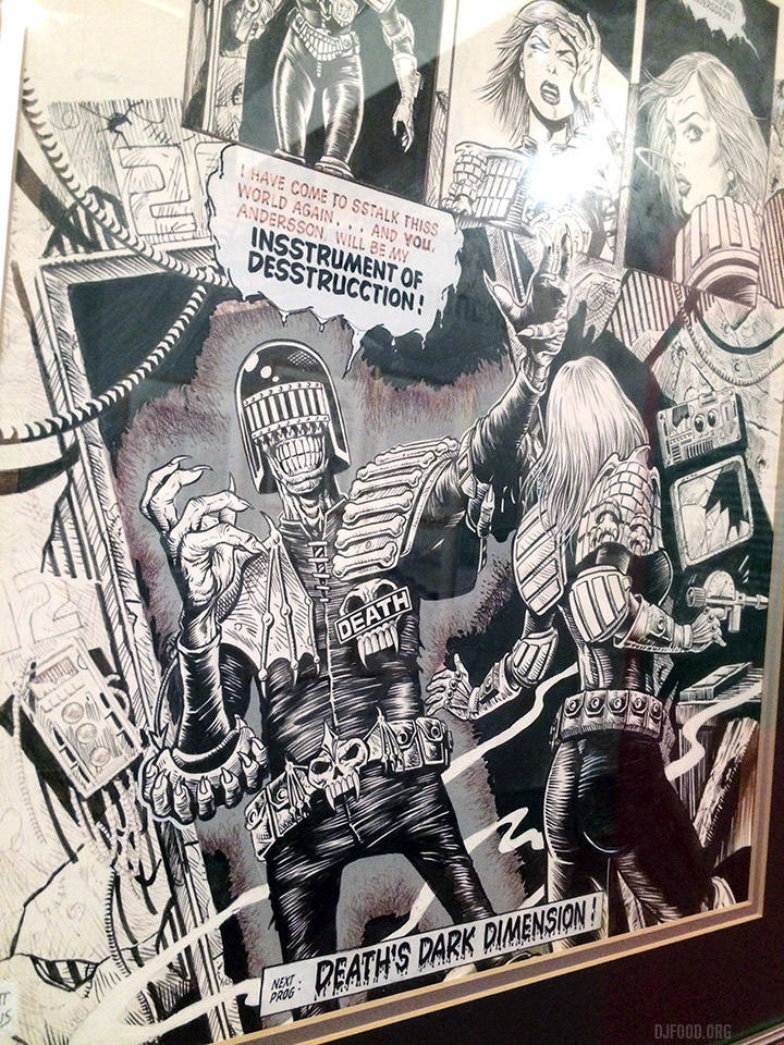
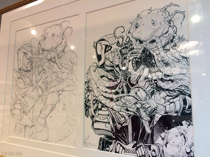
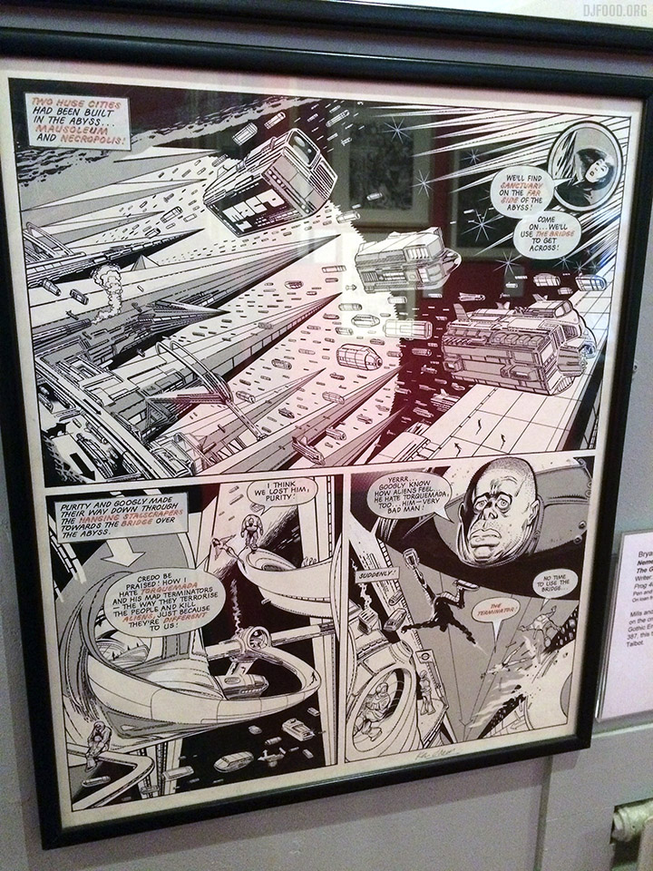
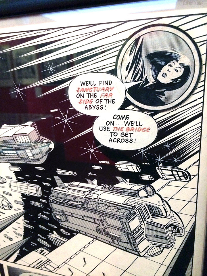
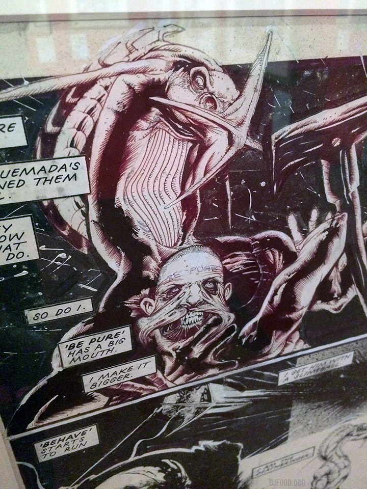
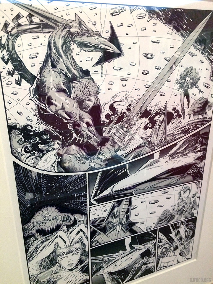
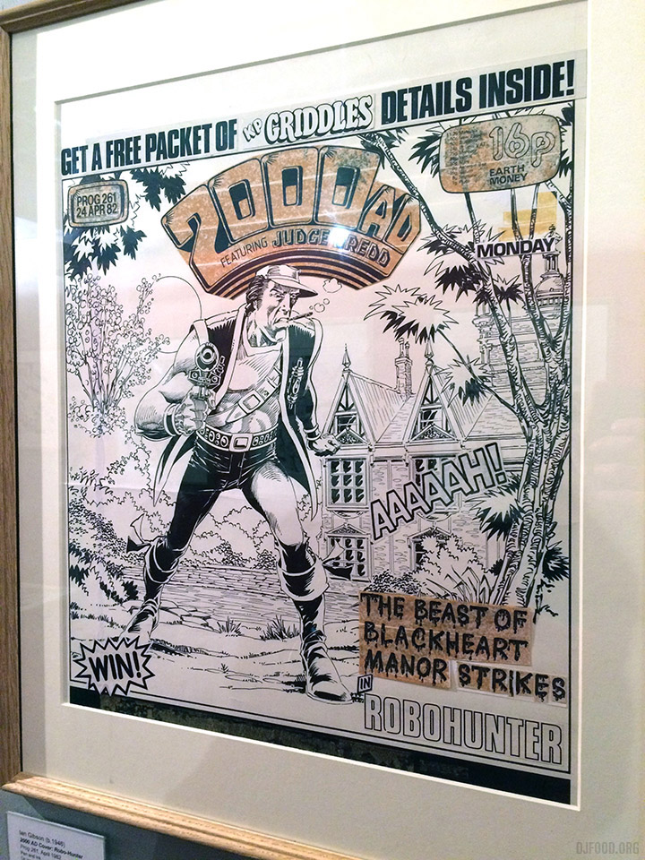
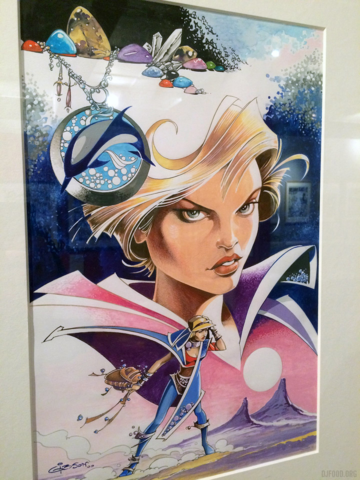
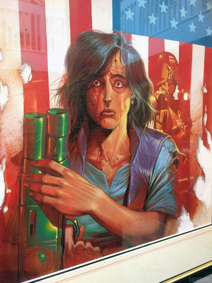
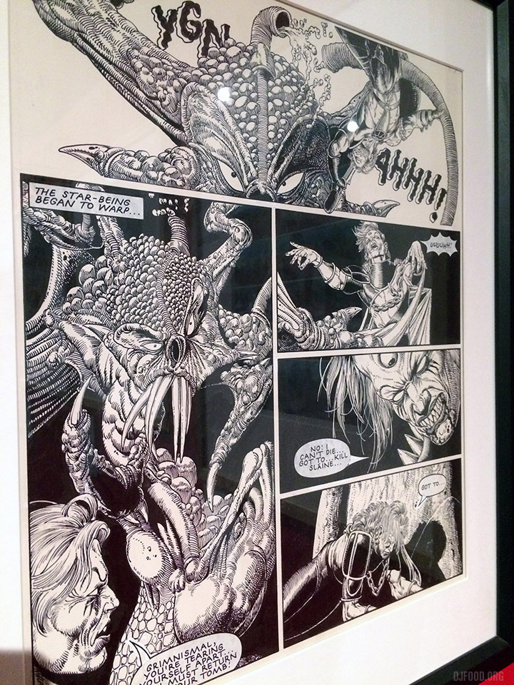
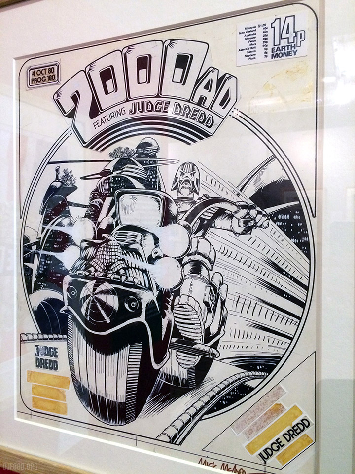
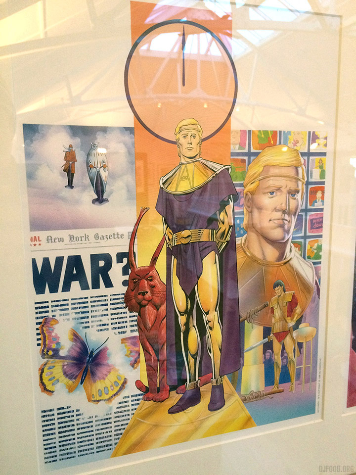
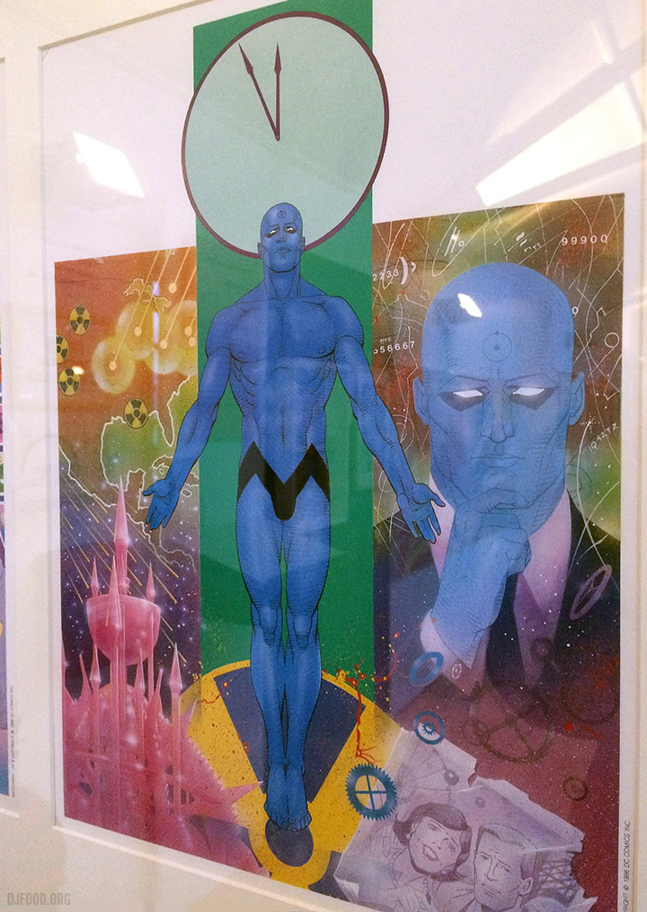
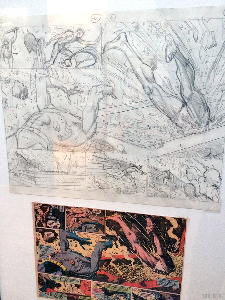
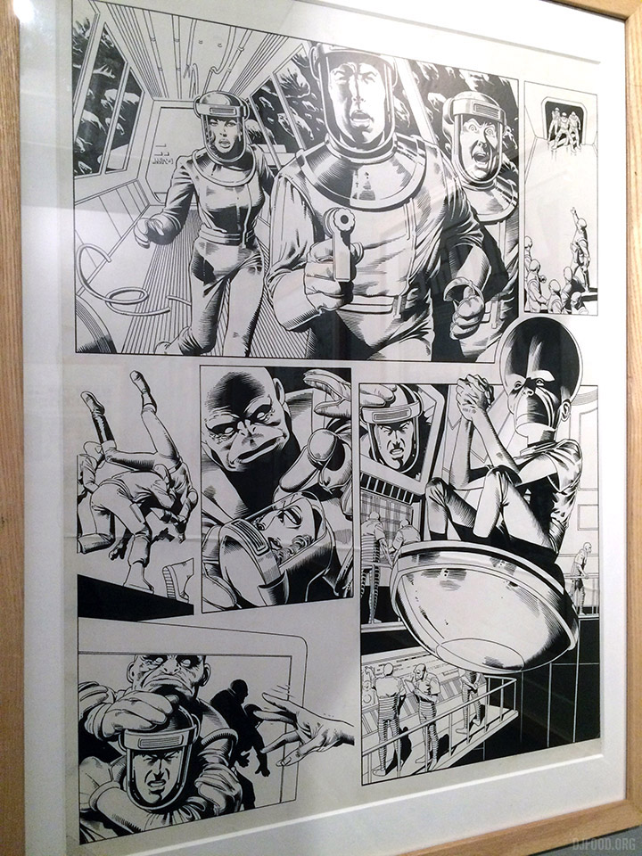
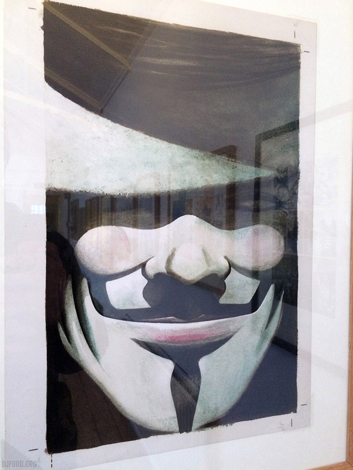
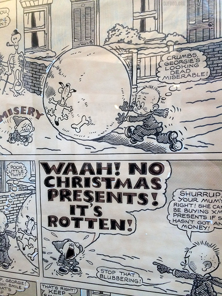
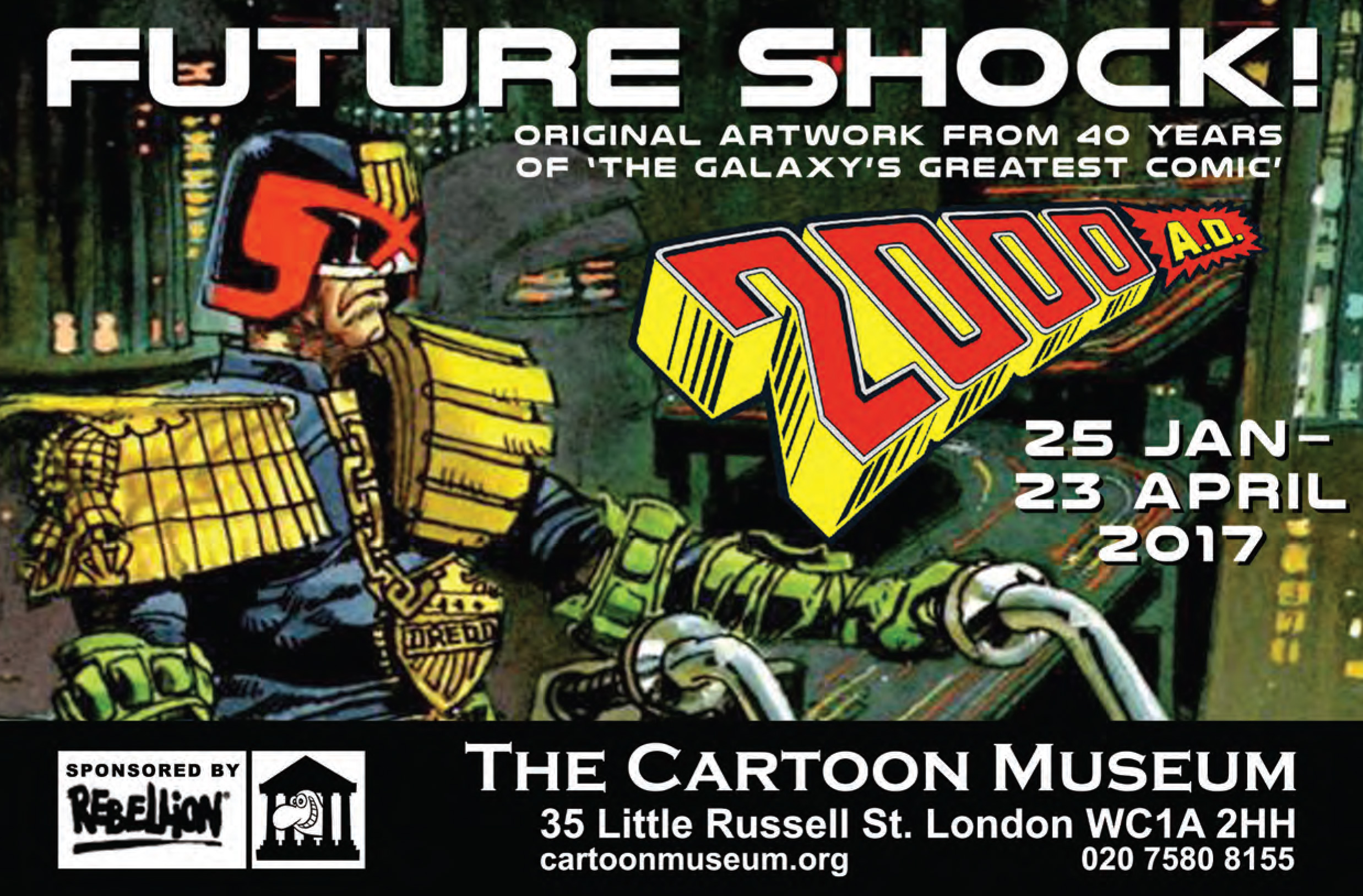
I finally got a chance to see the Future Shock exhibition of 2000AD classic original art the other day at the Cartoon Museum, tucked away in the back streets near the British Museum. It costs £7 and once you’ve navigated past some of the most miserable/bored looking staff you’ll ever see you can peruse the galleries of comic and political art.
As far as pieces by key artists of essential stories and characters go, this is one of the best collections of art you’ll see aside from Rufus Dayglo‘s blink-and-you’ll-miss-it exhibition this coming weekend at Geek 2017 in Margate. The bulk of it comes from long-time collector Wakefield Carter who runs the Barney database and regularly trades or sells original art. All the major names are here, with examples from some of the classic stories too (Dredd Cursed Earth and Dark Judges to name but two) and there’s a lot of it. Shown here are just a few of my personal highlights.
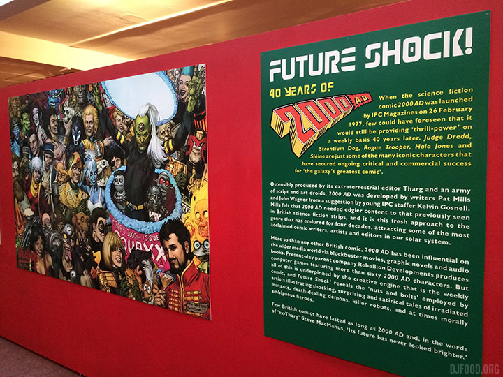
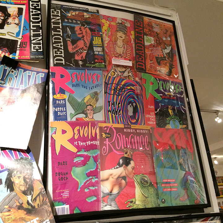
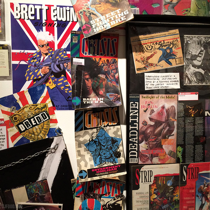
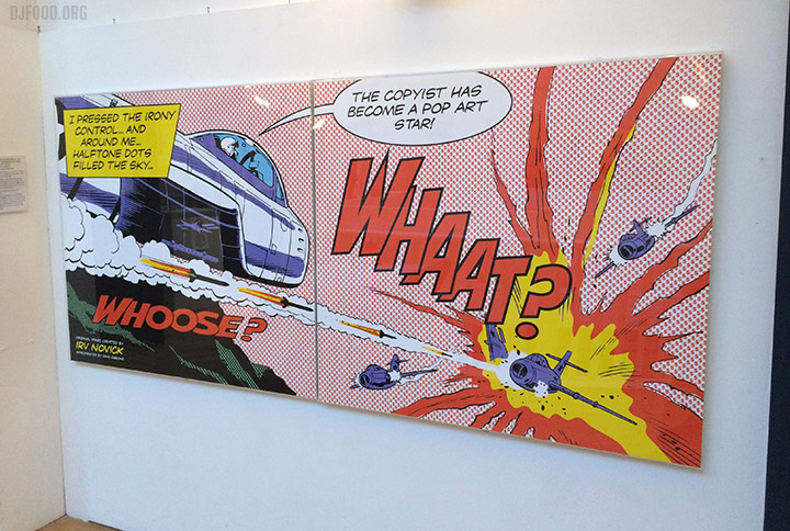
Upstairs, the regular exhibition is full of classic images, characters and artists too inc. Dave Gibbons‘ Lichtenstein-baiting ‘Whaat?’, Watchmen, Batman, Dan Dare and V For Vendetta art and original Leo Baxendale pages.

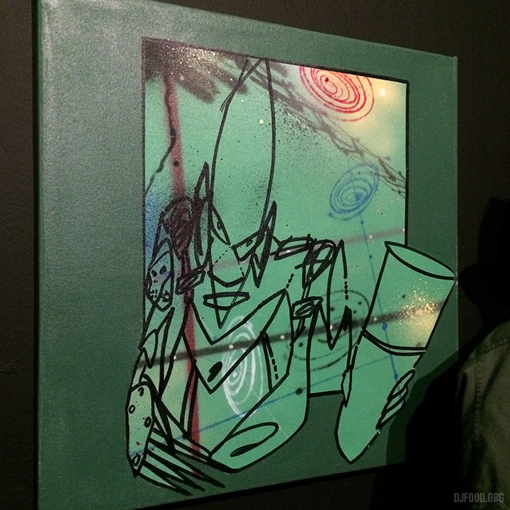
A retrospective exhibition of the extraordinary artist Boris Tellegen aka Delta opens in Brussels this week for nearly 4 months at the MIMA museum. Promising ‘A Friendly Takeover’ there should be a broad spectrum of his work from sculpture, painting and constructions. I contributed images and filmed memories of our time collaborating on DJ Vadim’s ‘Life From The Other Side’ album for Ninja Tune. I’ll be visiting Brussels next month so hope to post a full report, certainly one of my favourite artists working today.
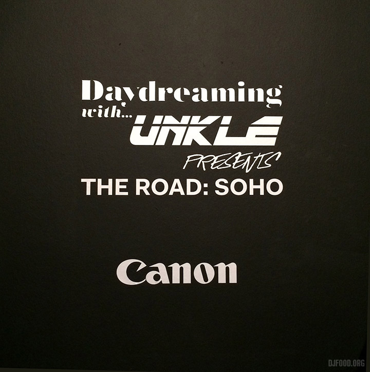
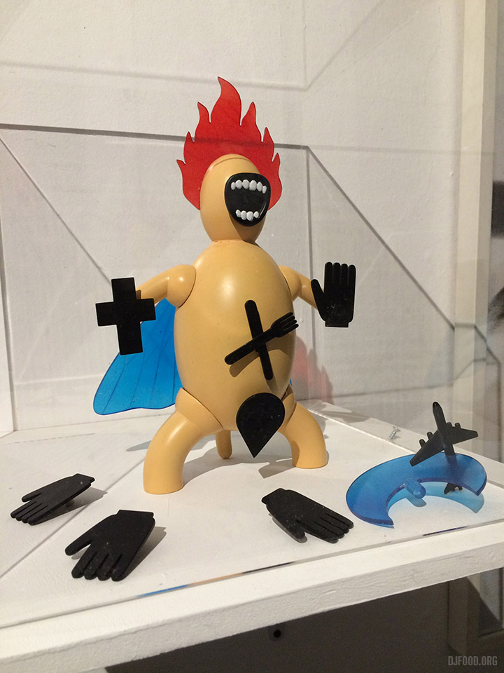
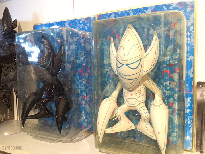
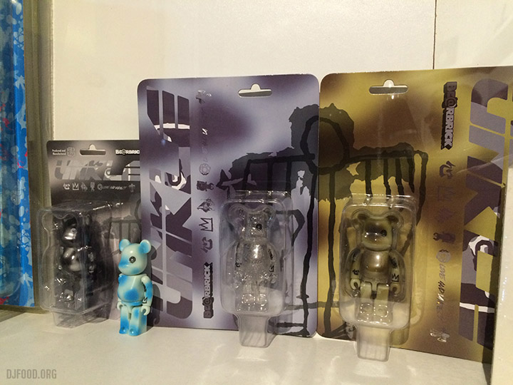
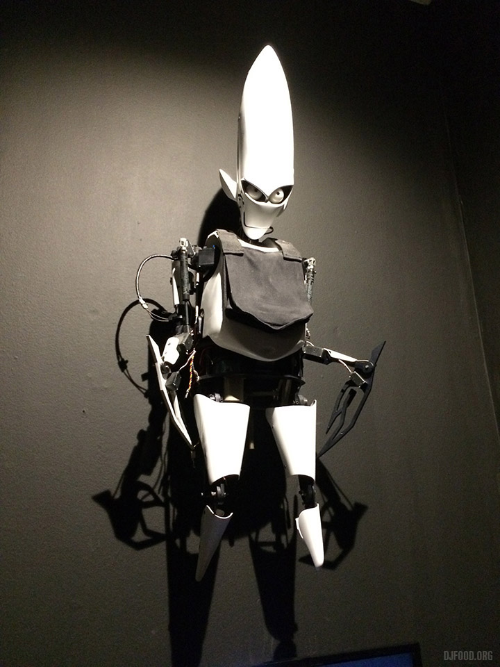
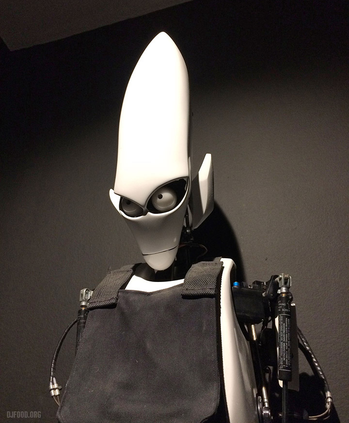
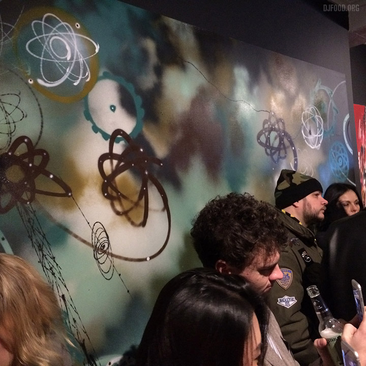 The James Lavelle-curated Daydreaming with UNKLE show opened last night at the Lazarides Gallery in London. Full of original Futura 2000 and 3D canvases, prints, toys and record sleeves, video rooms and virtual reality headsets. The last was heavily oversubscribed so I didn’t get a look but Doug Foster’s arched videos accompanying new UNKLE material were beautiful, enhanced by a mirrored floor which gave the work another dimension. Favourite exhibit was the robotic Pointman figure from the 2010 video to ‘Runaway’. The show is on until February 23rd, worth it just to see the many iconic Futura pieces that have graced so many MoWax sleeves.
Two different 2000AD original art exhibitions mark the comic’s 40th anniversary this coming Feb. The first opens at the Cartoon Museum in 13 days for 3 months. The second is on for a blink-and-you’ll-miss-it 3 days mid Feb at Geek 2017 at Dreamland in Margate and, I believe, is mainly culled from Rufus Dayglo‘s incredible collection – certainly one of the best I’ve ever seen.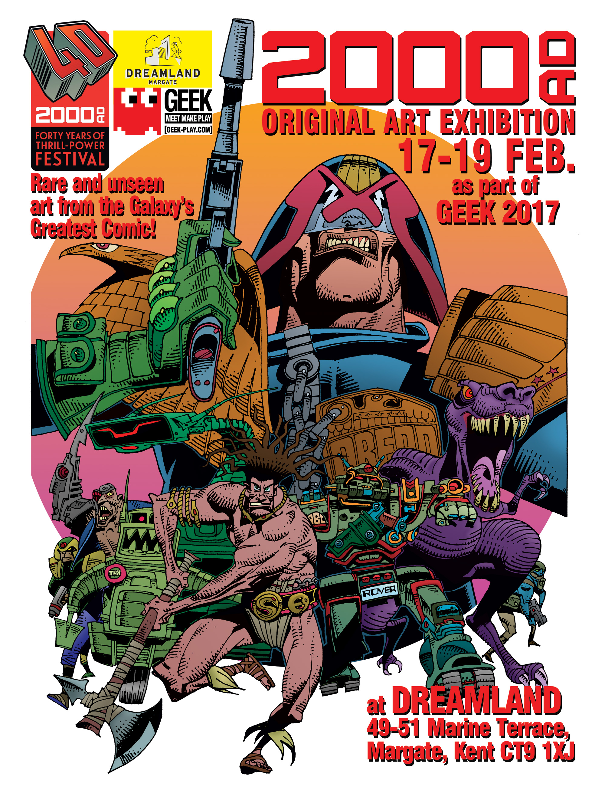
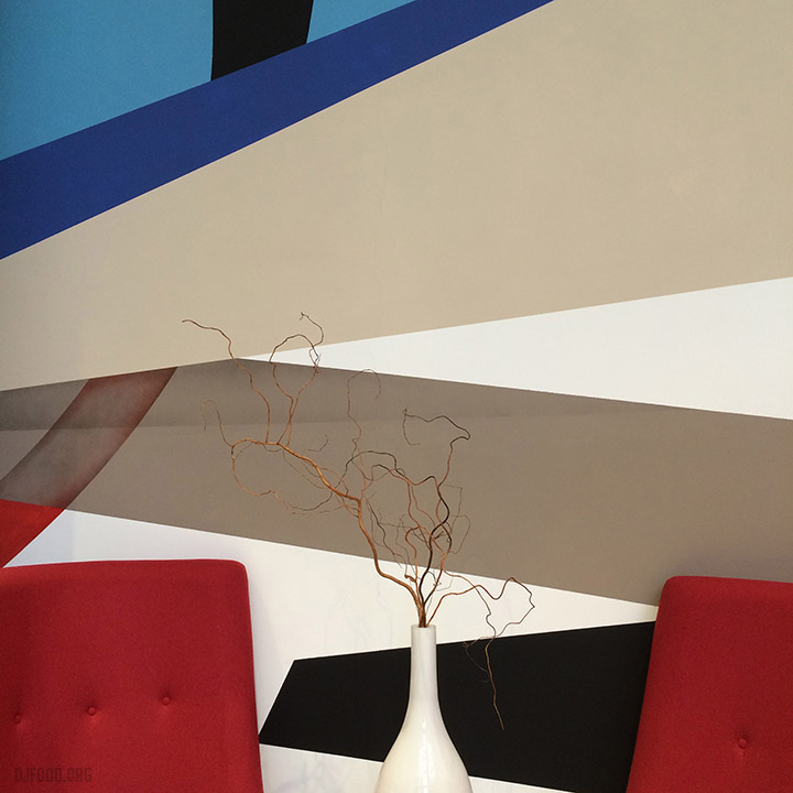
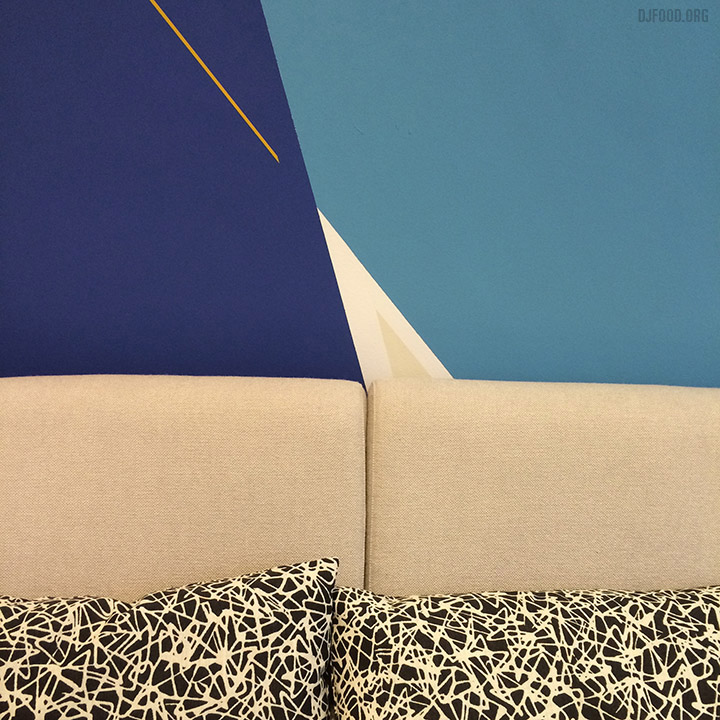
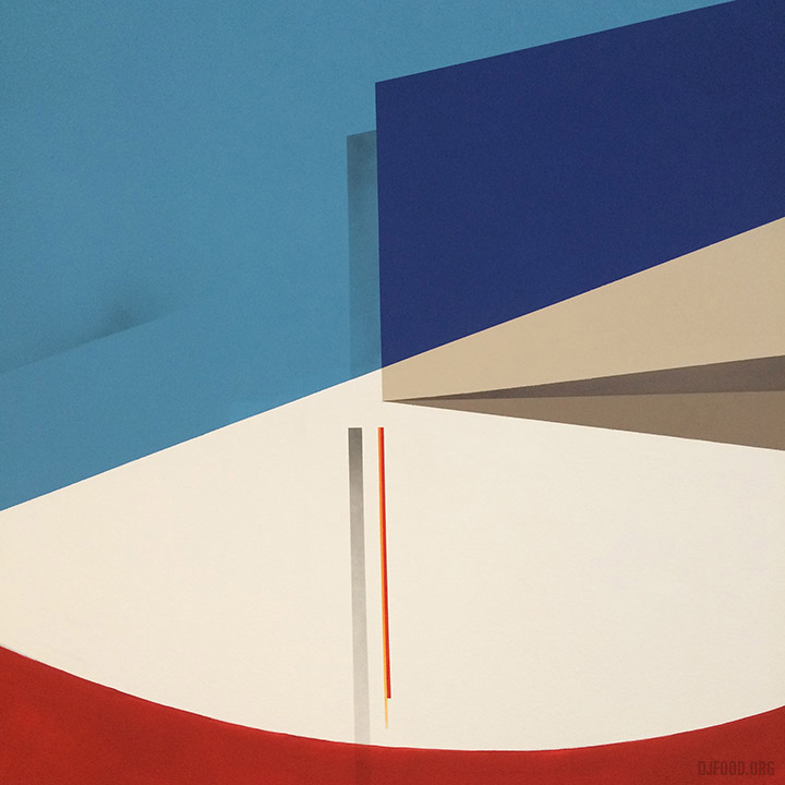
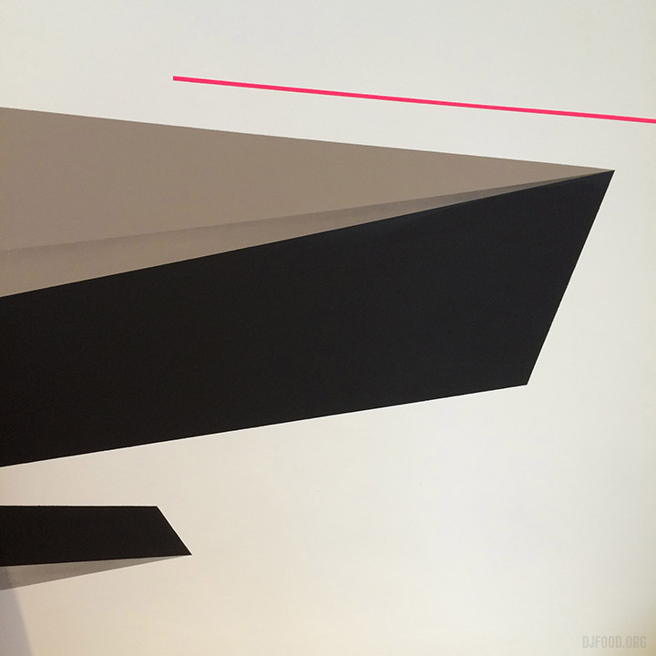
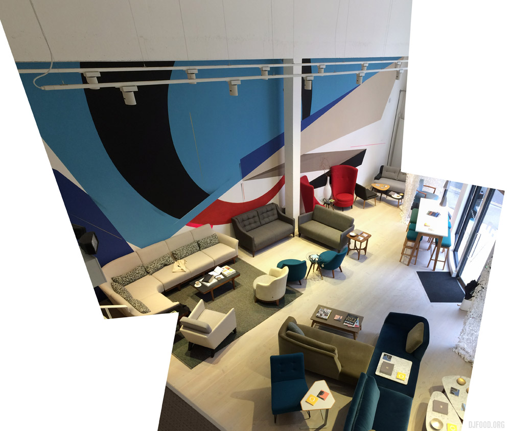
I visited the Morgan Furniture showroom in Clerkenwell today to see Remi/Rough‘s beautiful painting before it’s removed in the next few weeks. Amazing space and very nice people too
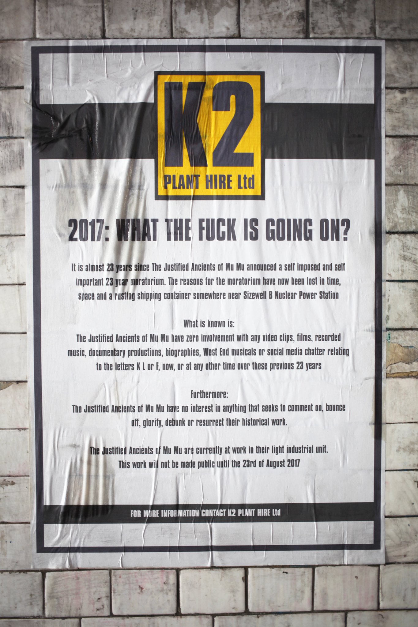
You may have seen my name loosely connected with The KLF in various different articles over the last few days due to a speculative comment in my end of year post coupled with a year old video made by my old friend Dave Hopkinson that appeared on New Year’s Day teasing a possible return. After speculation and denial we get a confirmation (or do we?). This story seems to be progressing by the hour at the moment. Follow K2PlantHire here
For those wondering what all this is about – here’s some history, a mixumentary by United States of Audio.
A little caper myself and Mr Trick cooked up in 2005, playing at being the JAMMs, wishful thinking for a return…
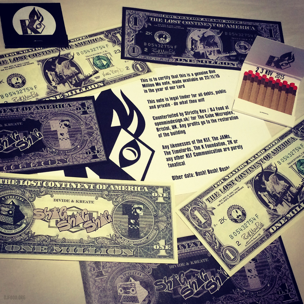
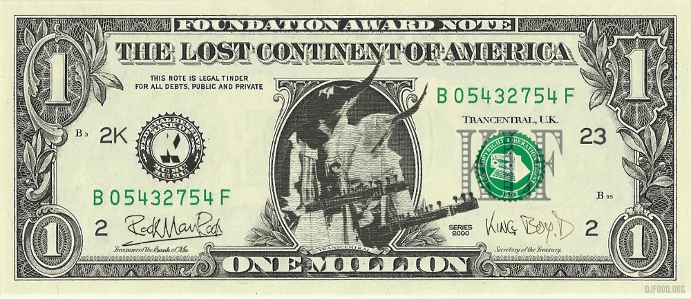
Some Million Mu notes that I designed for the KLF-themed event held at the Cube Microplex in Bristol in 2015.
After the amazing feast that was Foetus on Triple J – the John Jacobs plunderphonic interview with JG Thirwell from 1986 on Tim Ritchie‘s show – we rewind even further back to 1984. In a continuing series of lost Antipodean radio-phonic works unearthed by DJ HDD, and preceding a series entitled The Worx, we have another Jacobs piece, ‘Inside TV‘.
“A comedic cut-up/critique of Australian television thrown together by John Jacobs with a pair of domestic VHS decks… The edits are rough and jumpy, an analogue pause-button aesthetic. The sync rolls, the loops swing. The image is smeared and lurid as it goes down the grimey tube of VHS generations. Not having any outlet for these pre-Internet video cutups, John took the moniker ‘Built in Ghosts’ and secretly dubbed them back onto the ends of hire tapes for random late-night discovery by fellow video junkies.
Hopefully more to come…
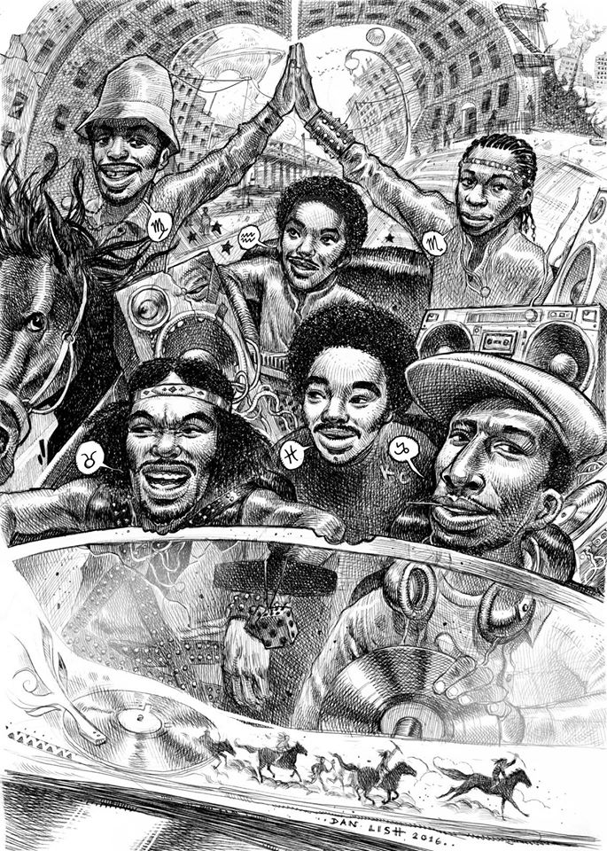
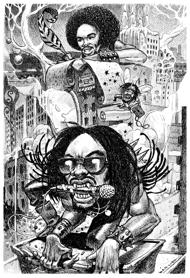
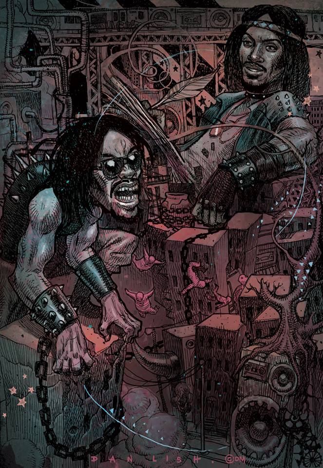
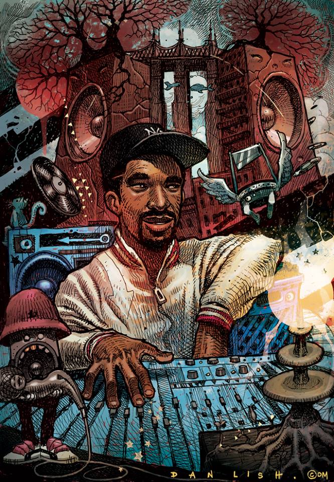
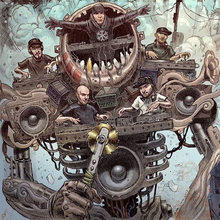
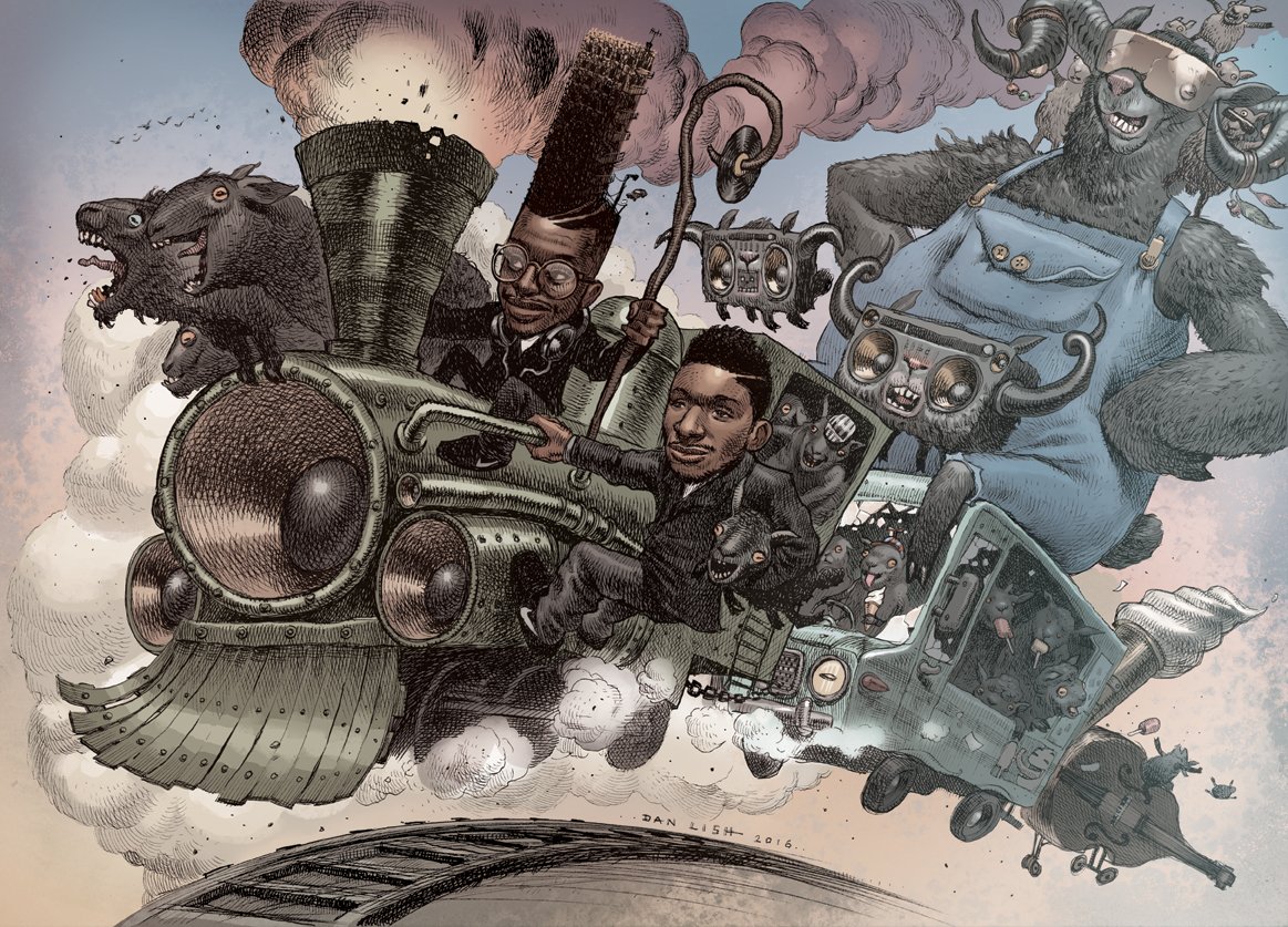 I’ve not posted any Dan Lish Egostrip images for a while and he’s been crazily busy doing covers for all sorts of artists so it’s good to see the world catching on to his talent. As always, you can buy various giclee or lithograph prints over on his site and hopefully 2017 will see him complete the 100 drawings he wants to do before he collects them for a book.
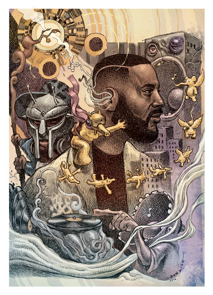
Above: Black Sheep. Below: The Beatnuts, Grandmaster Flash & The Furious Five, Melle Mel 1, Melle Mel 2, a revised Madlib/Lord Quas/MF Doom, Marley Marl, Snow Goons ‘Goon Bap’ album artwork.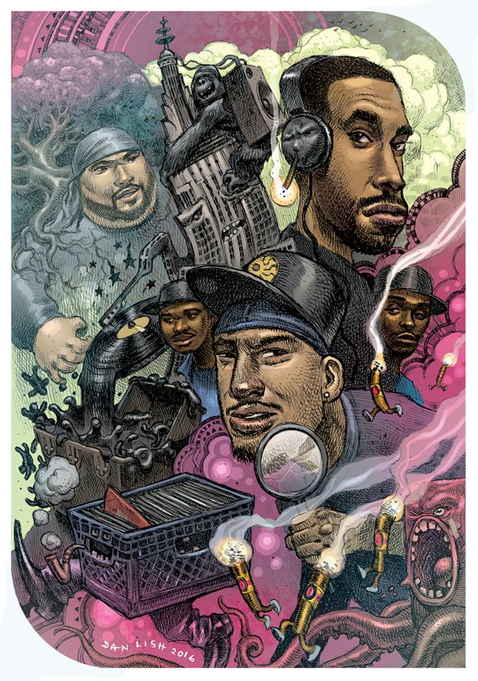

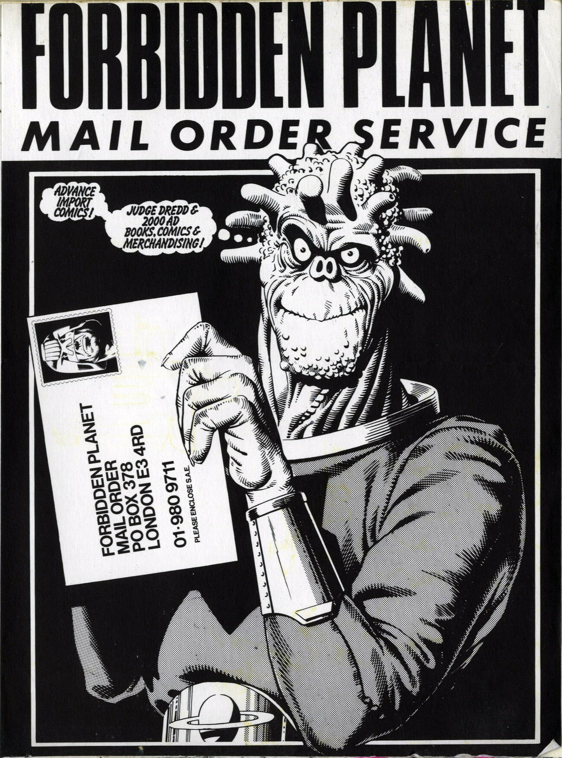
Found this in an old sketchbook recently – more of Brian’s Forbidden Planet promo work here
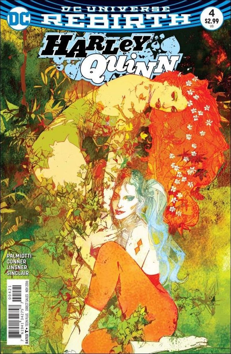
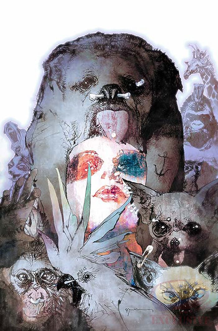
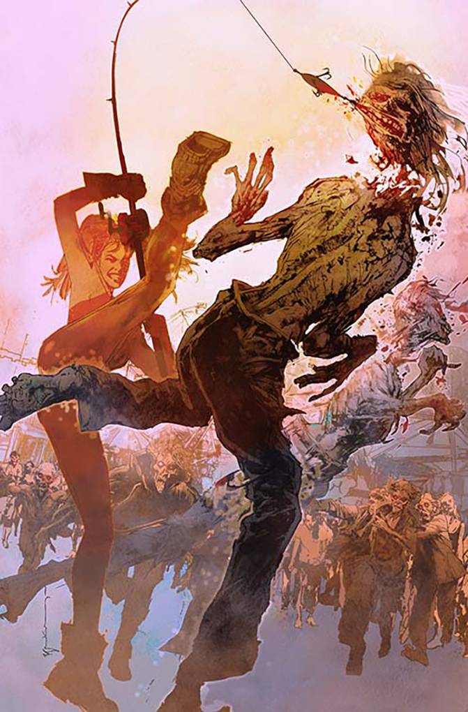
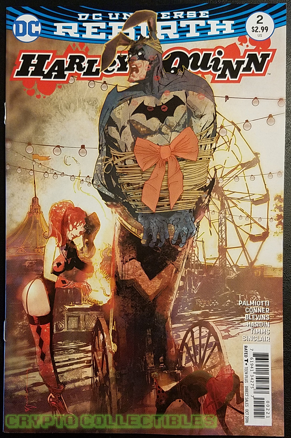
I saw these Harley Quinn variant covers the other day and they jumped off the shelf, good to see Bill still has it and draws like no one else.
 q
q 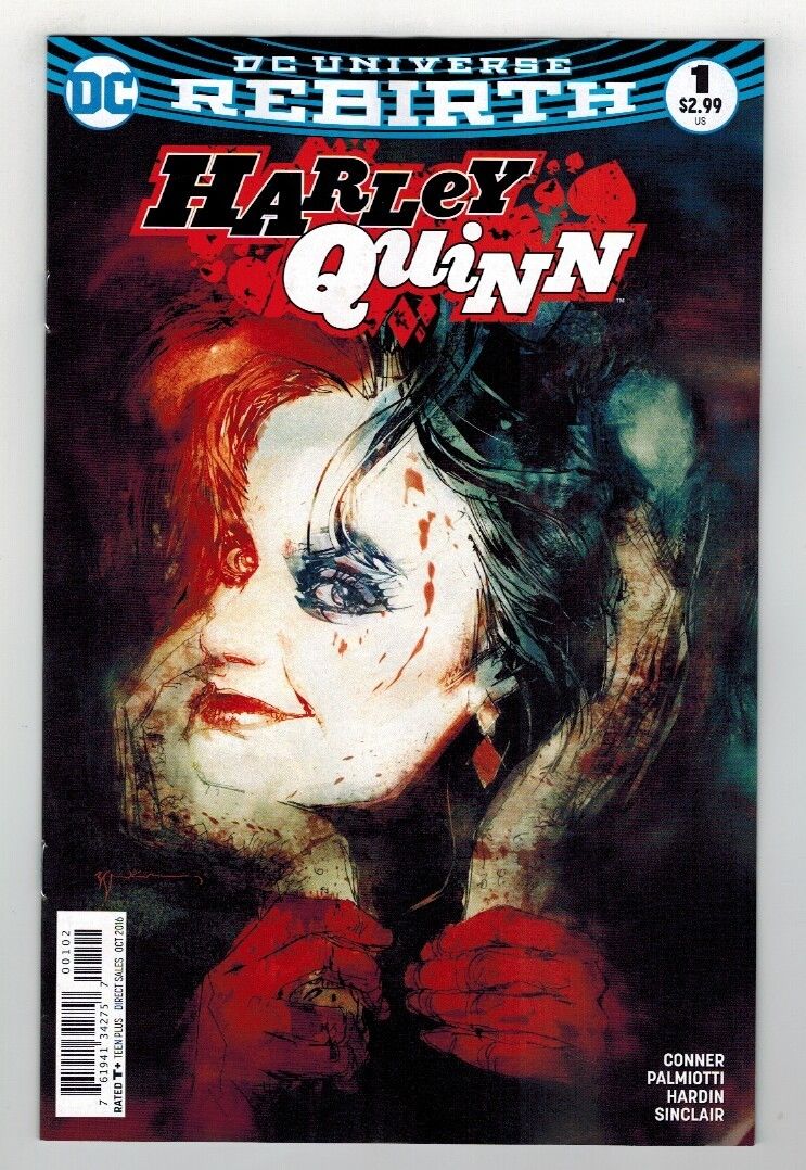
It seems anniversaries are everywhere these days, this week alone sees three decades since the release of both The The‘s ‘Infected’ LP and the Beastie Boys‘ ‘Licensed To Ill’ album. DJ Bobafatt has put together a little sample mix of the latter complete with original samples and interview snippets to mark the occasion.
Whilst never my favourite Beasties album, I was a fan and saw them on the Raising Hell tour opening for Whodini, LL Cool J and Run DMC in ’86 as well as the Licensed to Ill tour in ’87.
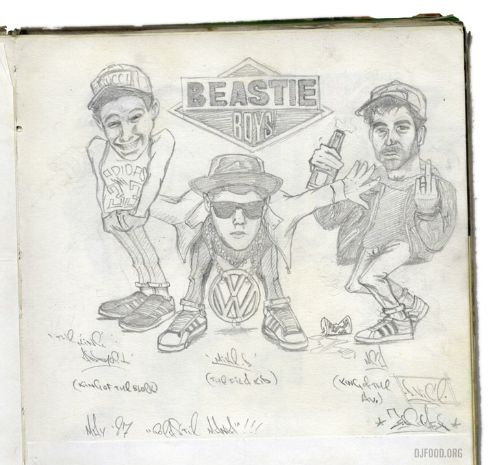
Looking through old sketch books this morning in search of something else I ran across this, done May ’87 during ‘Beastie Mania’. D-Vice was my first graffiti tag at the time and 3DGrafX was our crew (it was the 80s).
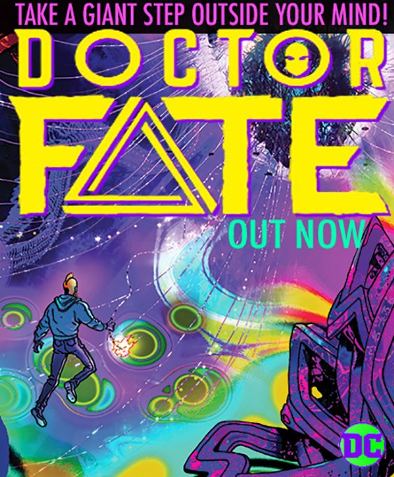
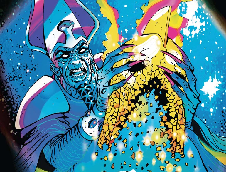
Out yesterday – coincidentally timed to appear just as the Dr Strange film opens? – Brendan McCarthy‘s latest 2-parter for DC Comics, Dr Fate. Looks good!