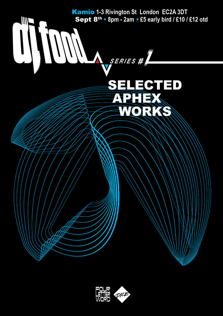
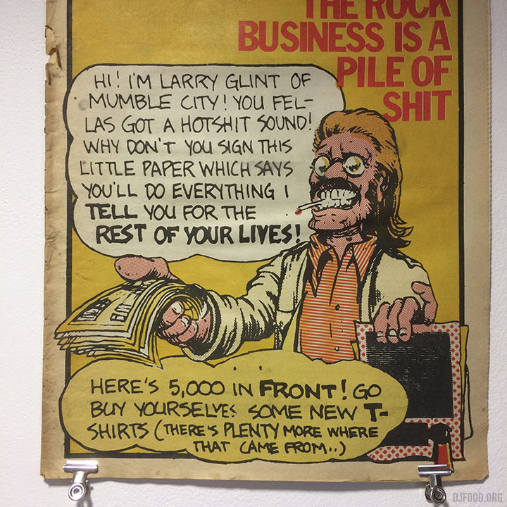
 Tickets just went on sale for this at Kamio in Old Street, possibly the last chance to see this set in London before I retire it. It’s the first of a series of themed AV gigs I’m set to do at the venue and they even let me design the flyer. I’ll shortly be announcing several other special gigs for the autumn months too…
Design
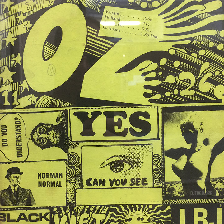
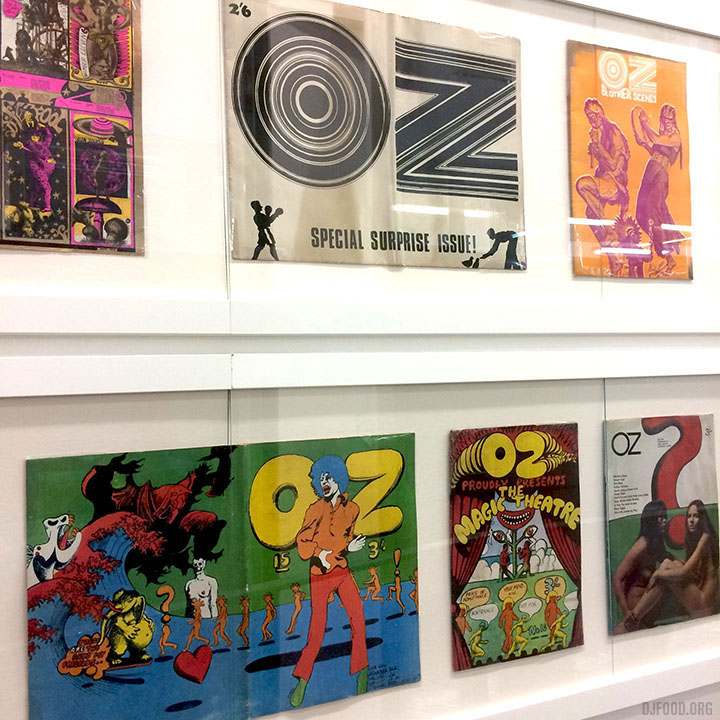
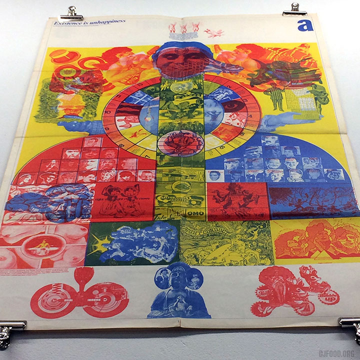
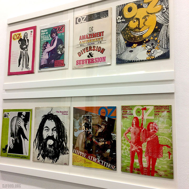
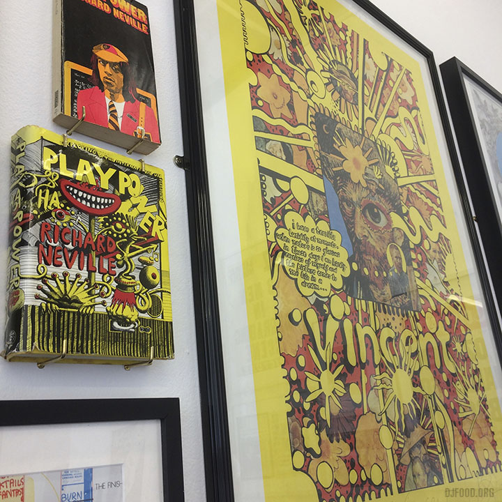
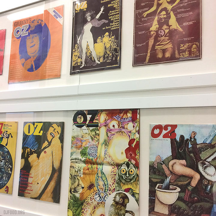
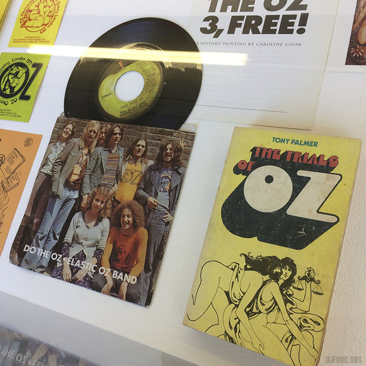
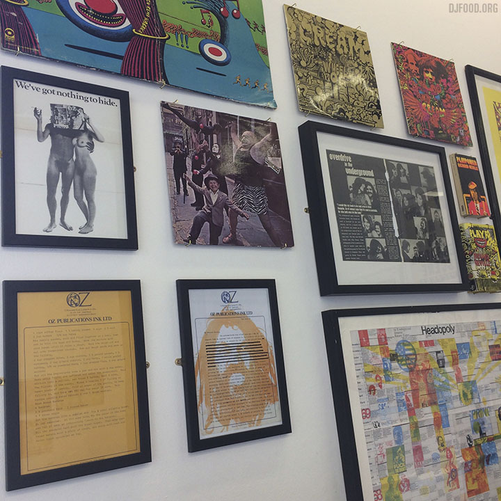
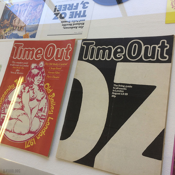
Chelsea Space at the Chelsea College of Arts in Pimlico has recently opened an exhibition looking at Oz, it’s obscenity trials and the counterculture magazines of the 60s and 70s that sprang up around it. Featuring every issue of both the Australian and British runs, posters, letters, films and all manner of ephemera from the estates of Richard Neville, Martin Sharp, Felix Dennis and many private collections of those who worked on it, it’s a lovingly curated selection by Cherie Silver who was minding the exhibition when I went last week and was eager to answer questions.
If you’ve never seen issues before then here’s a chance, there are some that can be looked through and one wall lays out the Magic Theatre issue, comprised entirely of a stream of consciousness collage. It finishes on July 14th and is free, usually open between 10.30-11am.
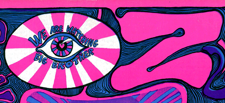
* I rather like the graphic above, subverting George Orwell‘s 1984 maxim, unfortunately they could never have foreseen the Big Brother they’d be watching half a century later.
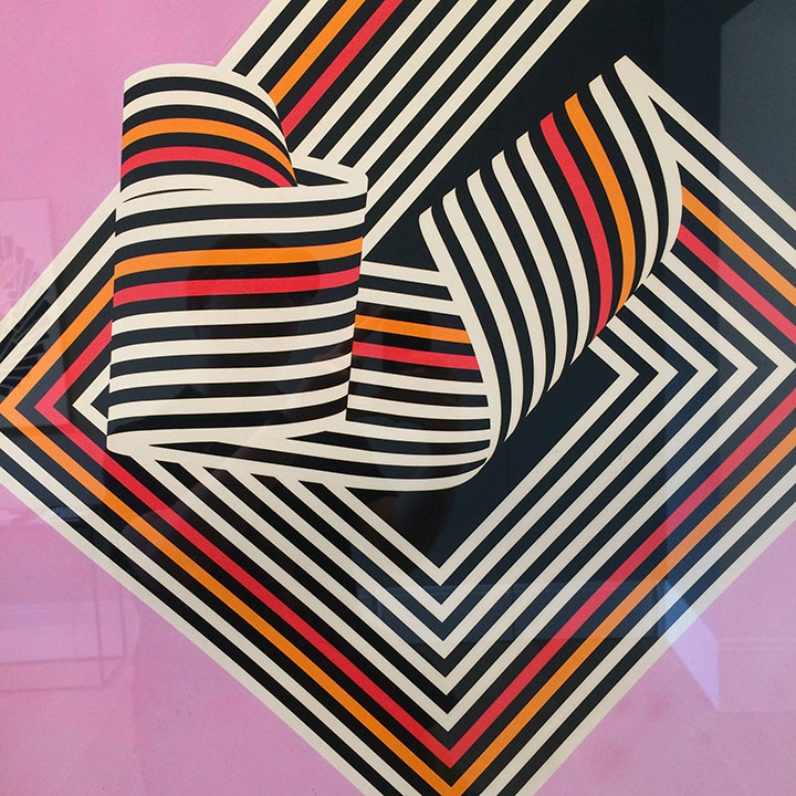
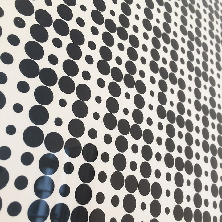
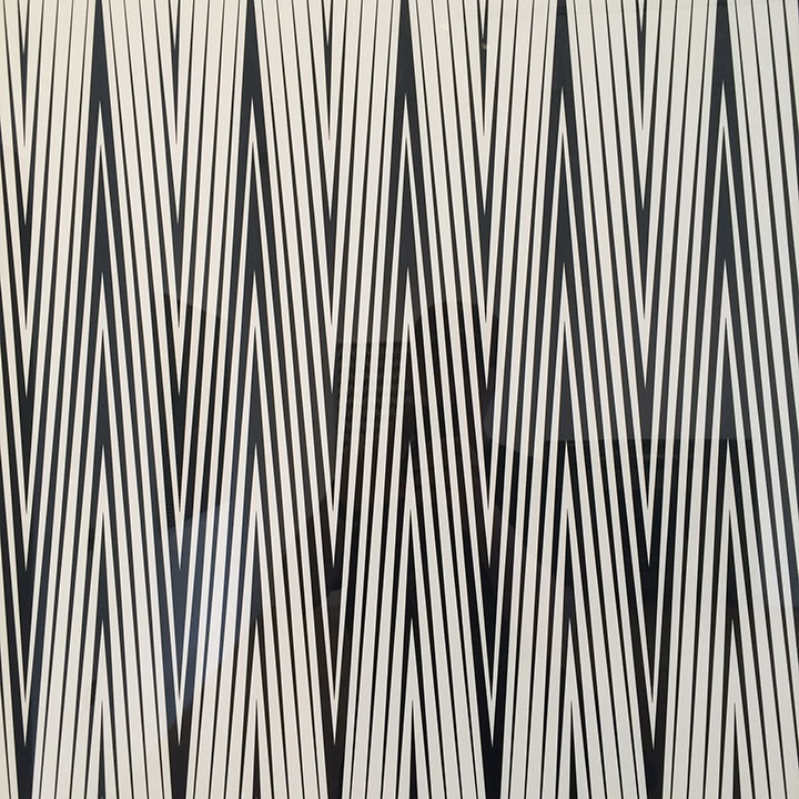
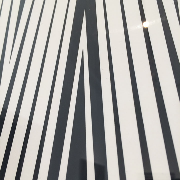
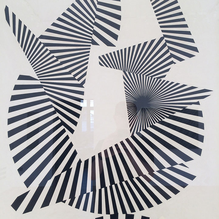
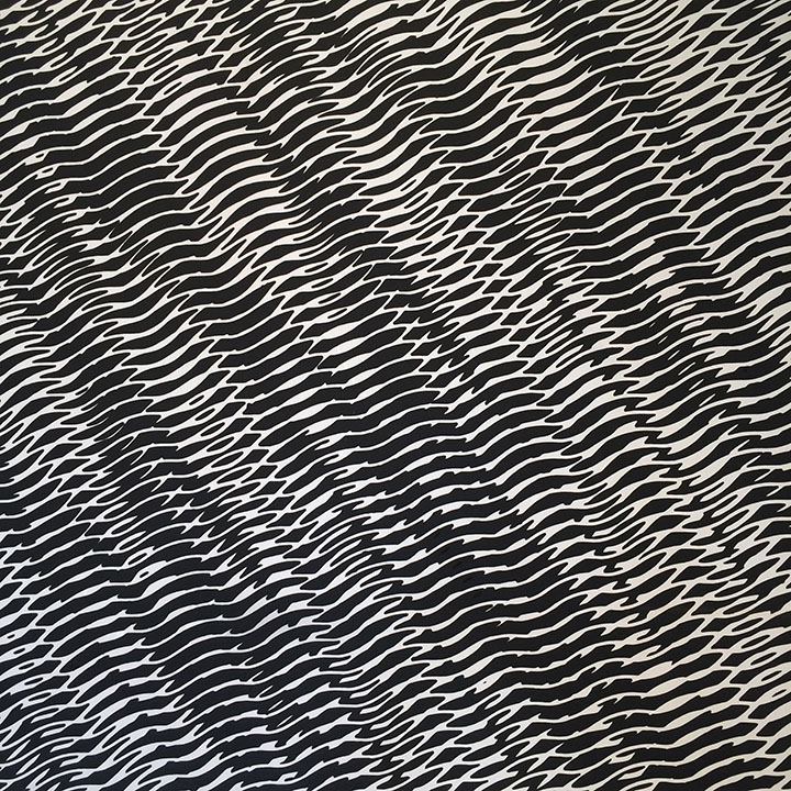
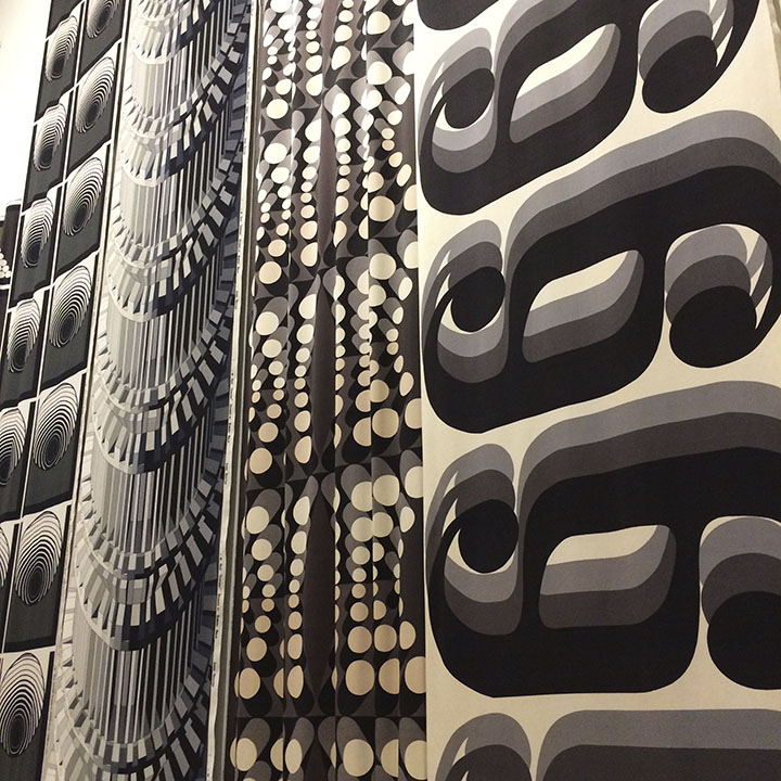
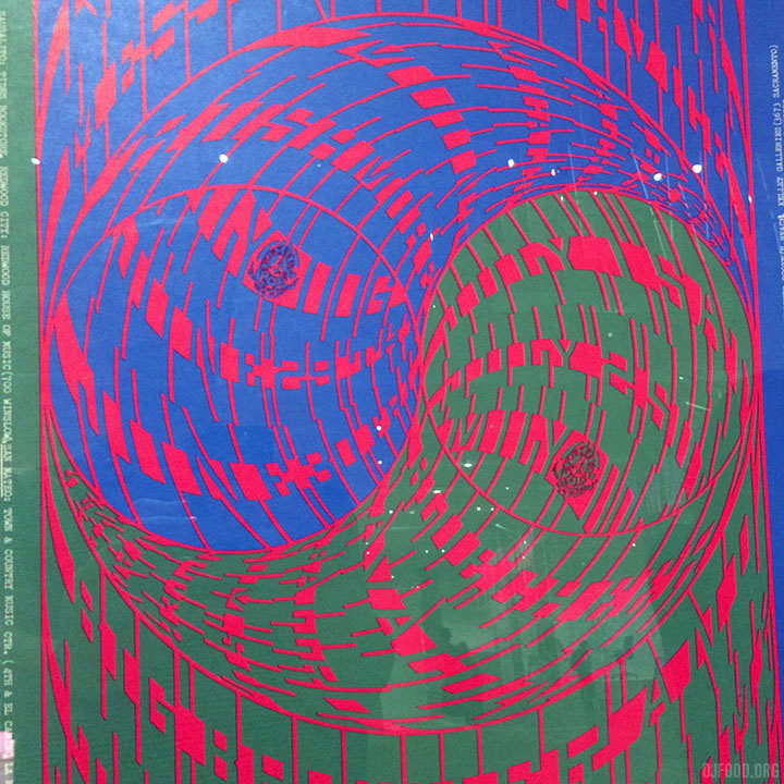
Italian artist and designer Franco Grignani is the subject of a free exhibition at the M&L Fine Art gallery near Green Park in central London at the moment. The precision of the execution is breathtaking and there’s another exhibition opening in July which should have more of his design work.
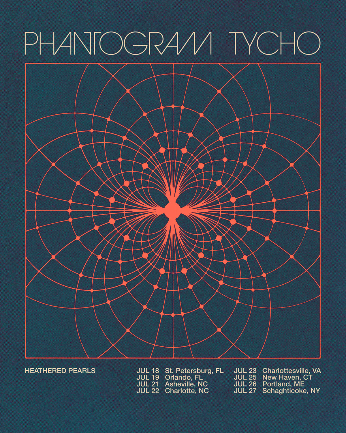 Love this poster for the upcoming Phantogram and Tycho tour – more info here.
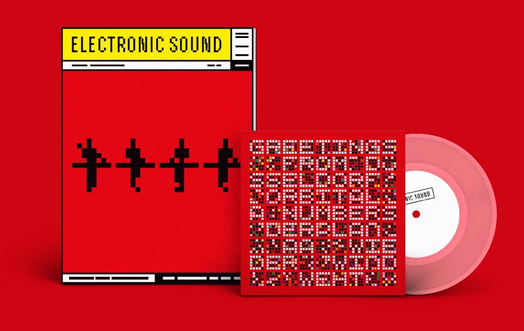
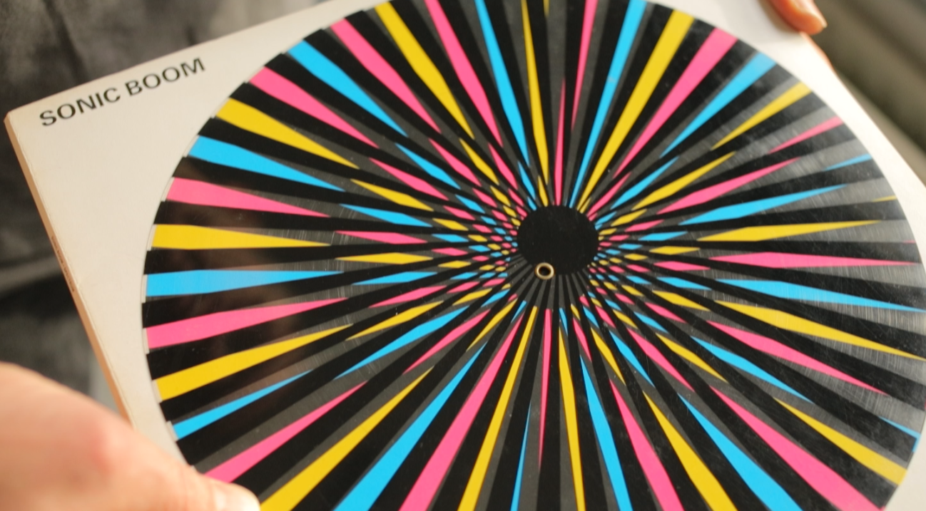
Pre-order the new issue of Electronic Sound and get the special bundle with the Orbital cover of Kraftwerk‘s ‘Numbers’ on clear vinyl 7″ – only available from them direct and limited in stock
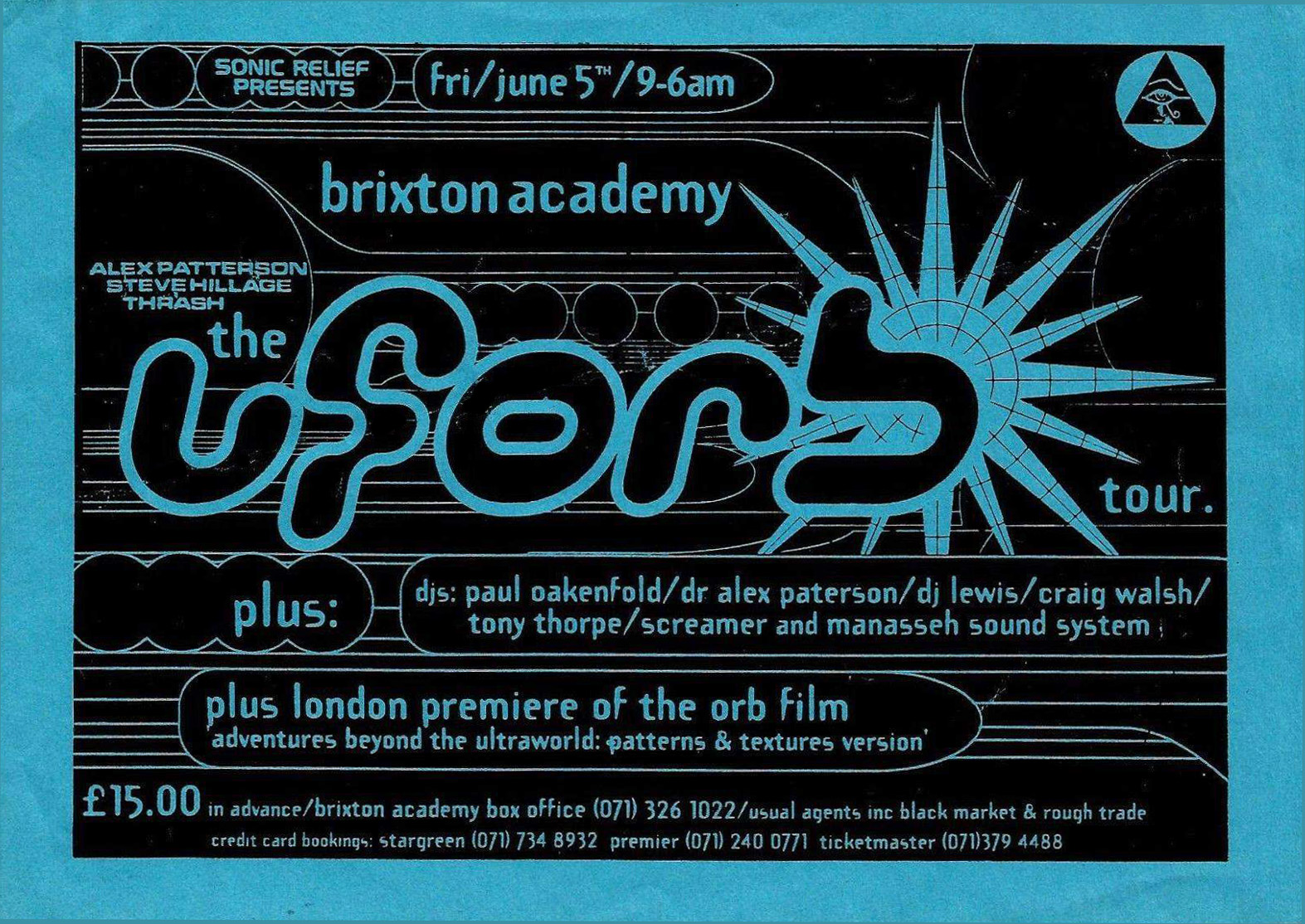
Twenty five years ago my friend David Vallade and I traveled to Brixton to see The Orb, being poor students we ended up buying last minute tickets from a tout outside. When it came to entering the venue David got in and I didn’t as my ticket wasn’t deemed valid. Gutted, I returned home and David was left to do the all-nighter on his own. Above is the flyer, found online earlier this year, a fly poster version of which I had on my wall for years with its early typography by The Designers Republic that was later changed for the album artwork.
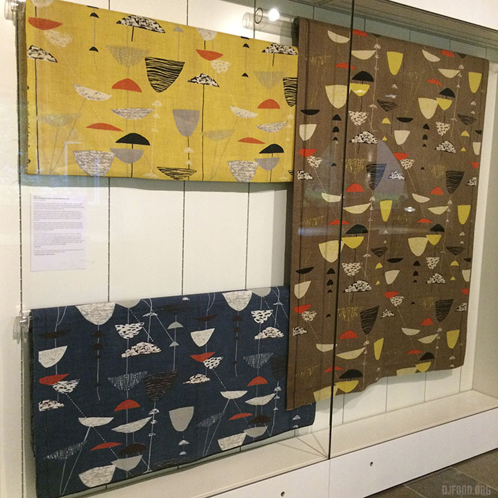
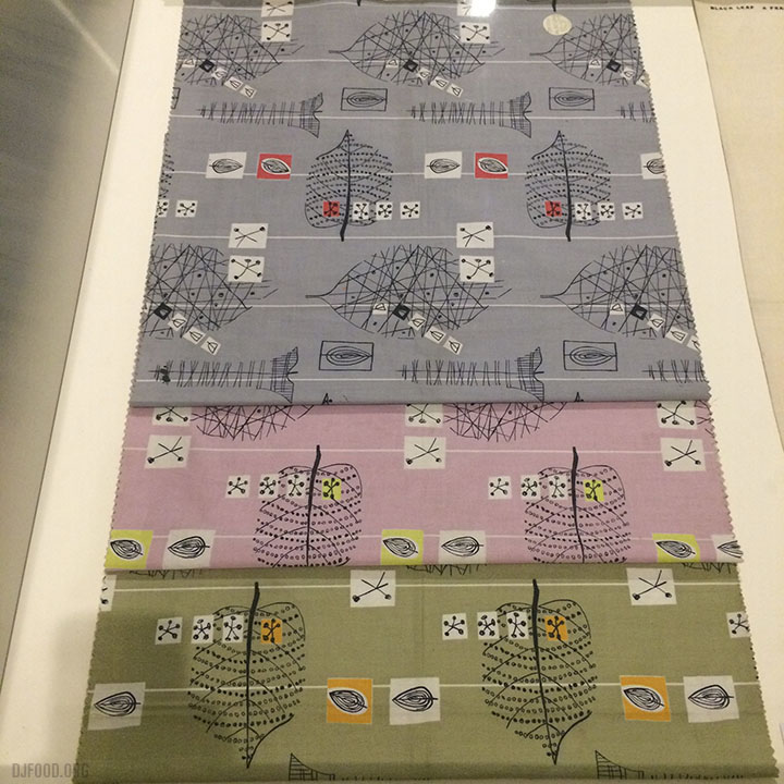
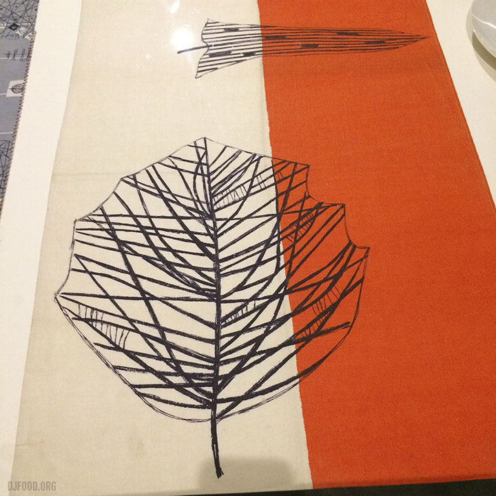
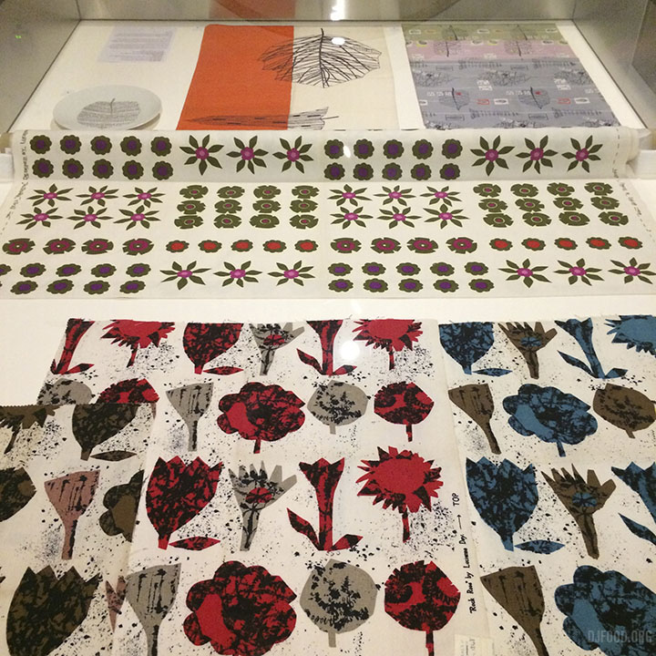
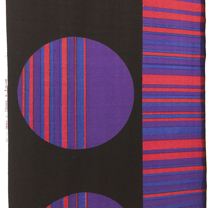
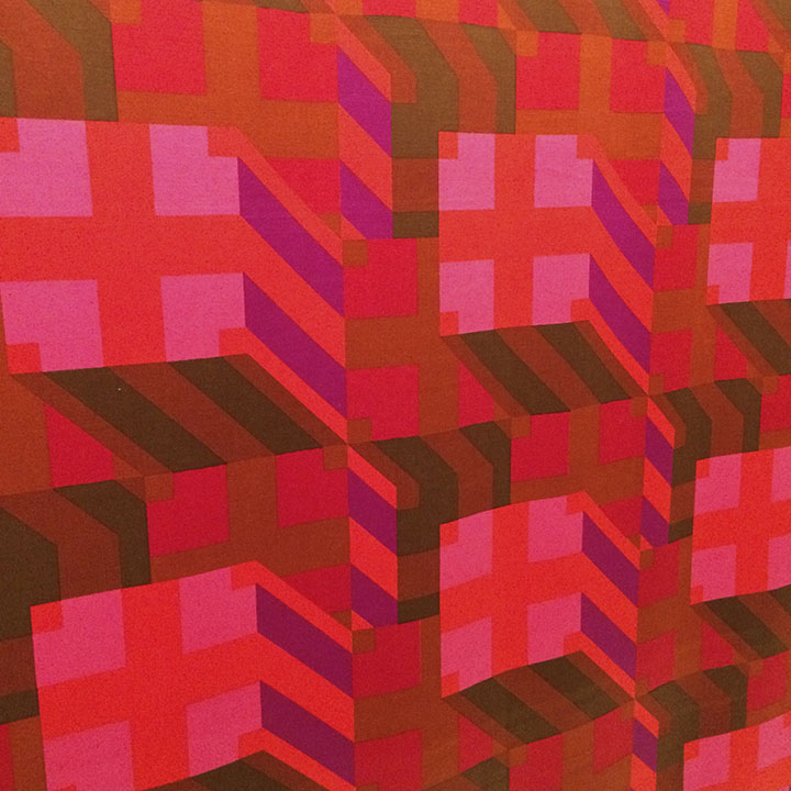
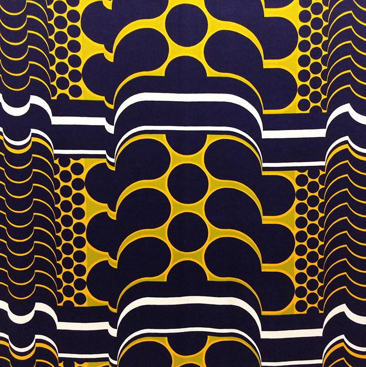
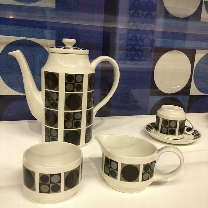
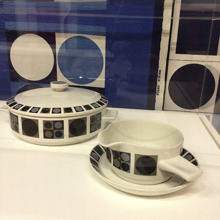
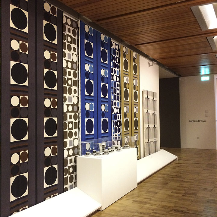
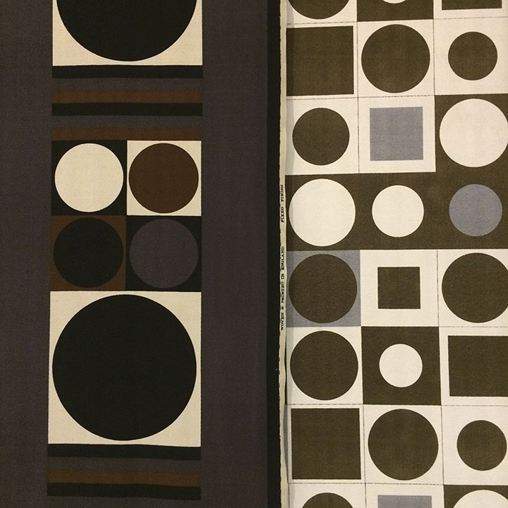
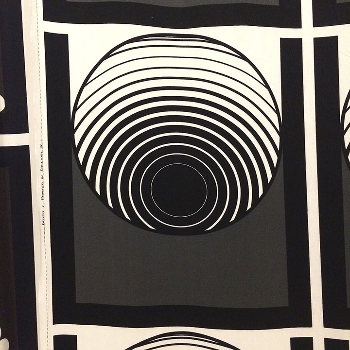
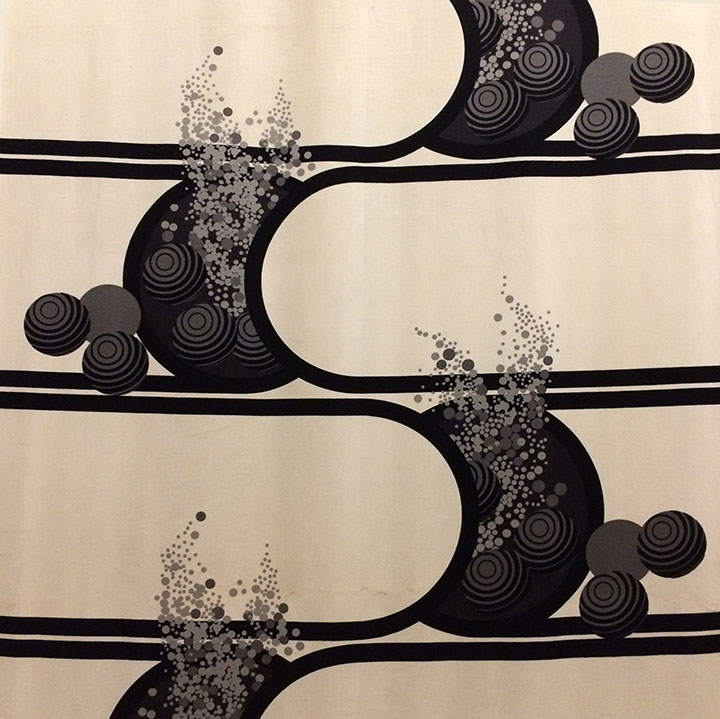
After checking out the Barbara Brown retrospective upstairs (see previous post) I ventured into the lower ground floor of the Whitworth Gallery to see a selection of Lucienne Day textiles, flowers and plants being the overriding theme – just beautiful.
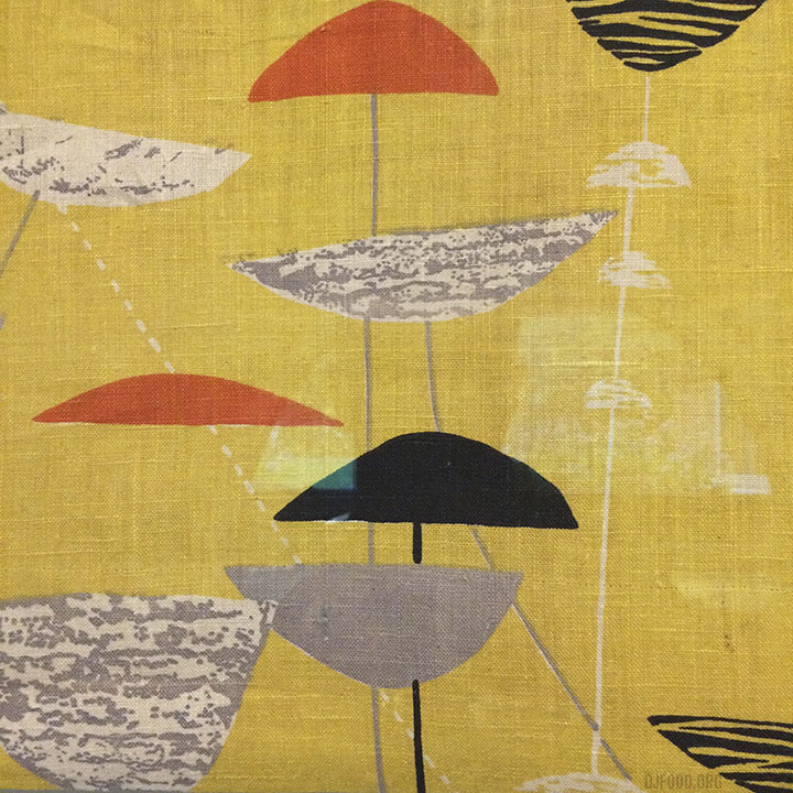
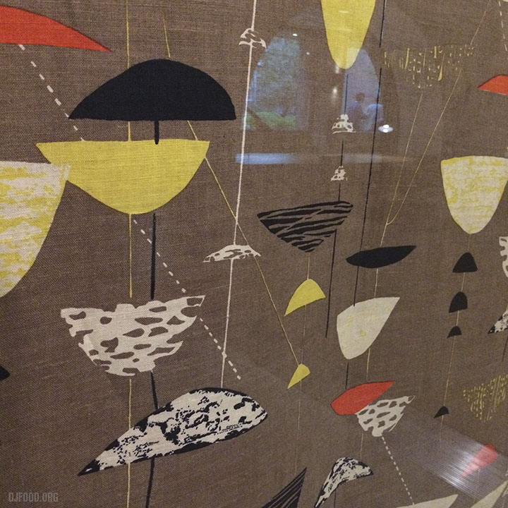
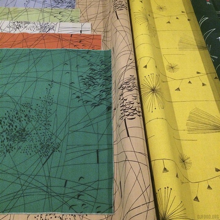
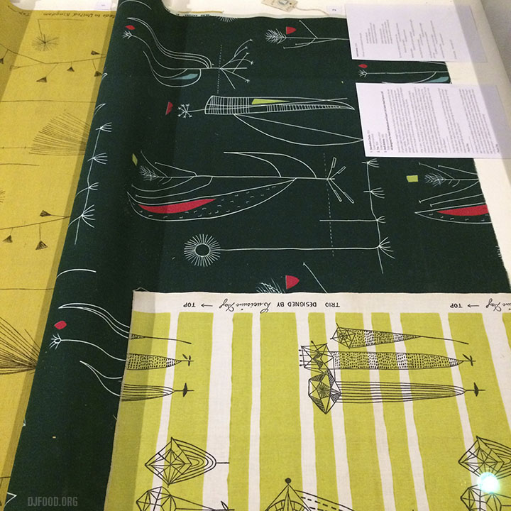
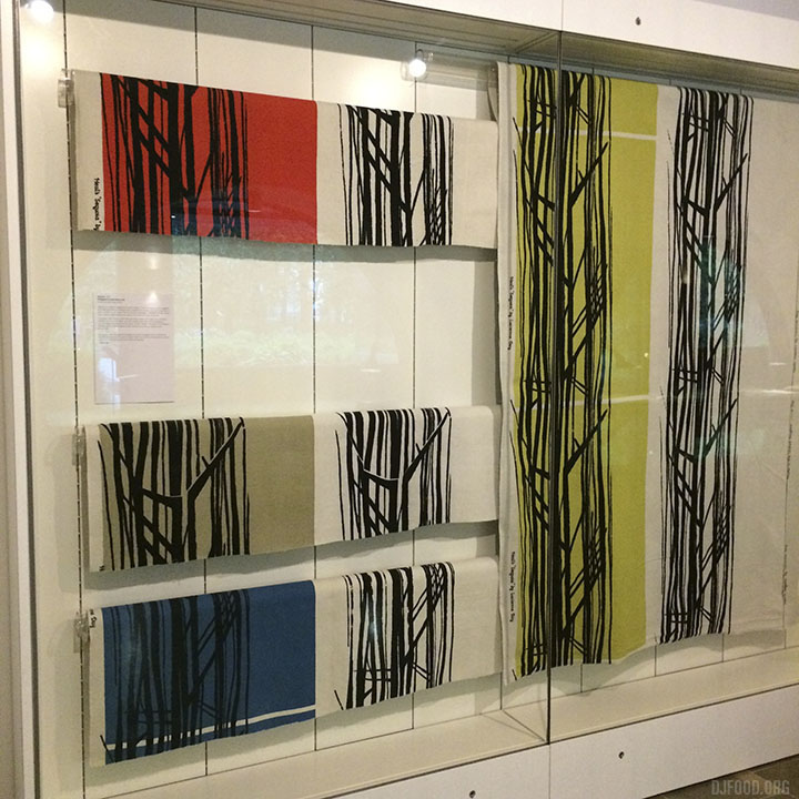
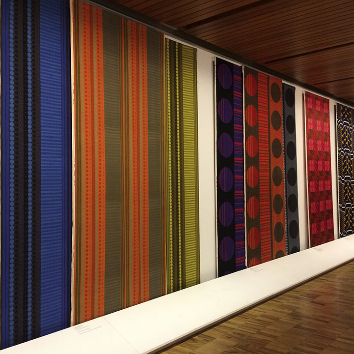
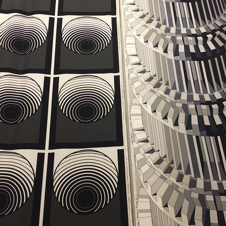
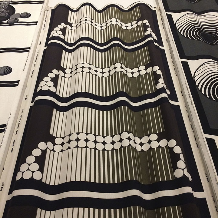
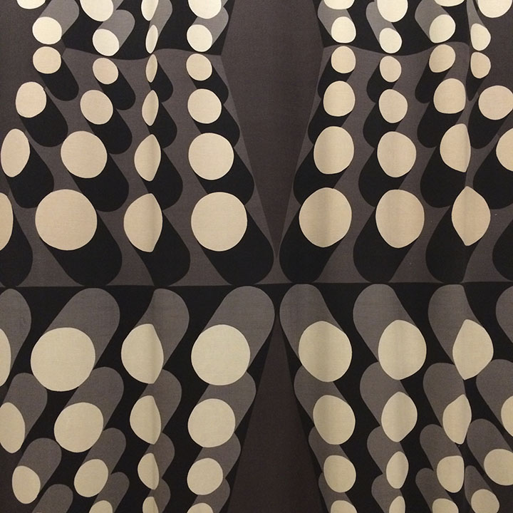
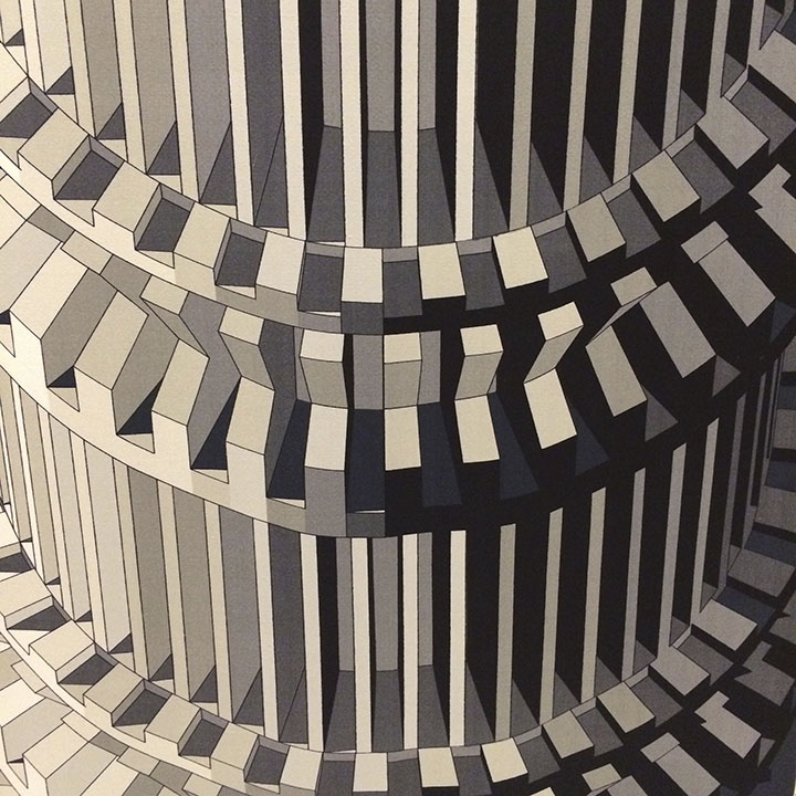
Just before I played my recent Selected Aphex Works AV set in Manchester recently I got the chance to nip out to the nearby Whitworth Gallery and see the Barbara Brown retrospective. She’s one of my favourite textile designers, embracing Op Art in her work for her 15 year run designing for Heals. The material was presented in huge rolls to stunning effect, it’s free entry and on until December, plus in the basement, there’s an equally beautiful Lucienne Day exhibition too (see other post).
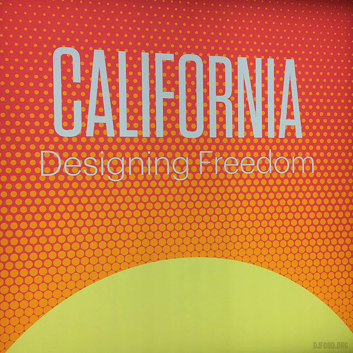
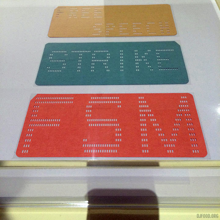
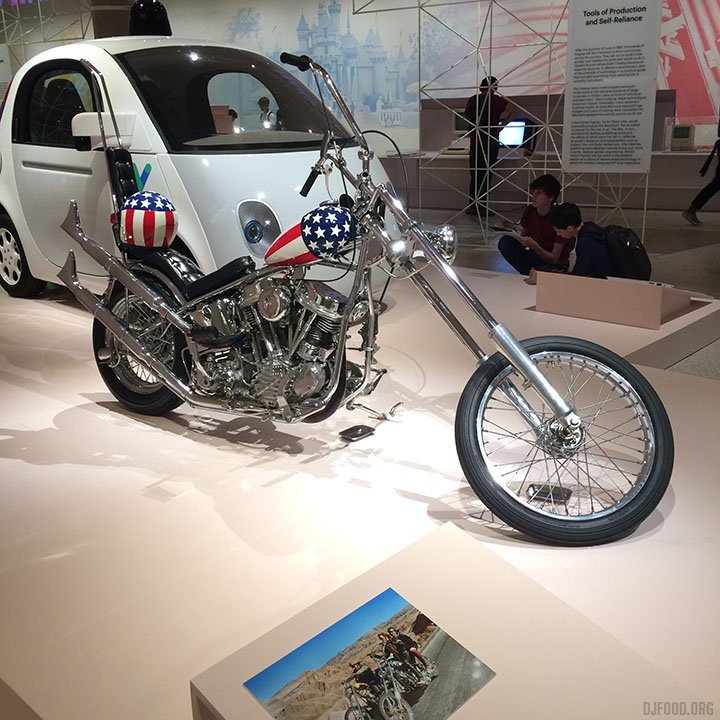
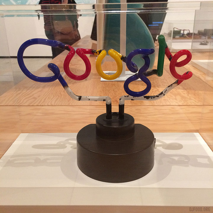
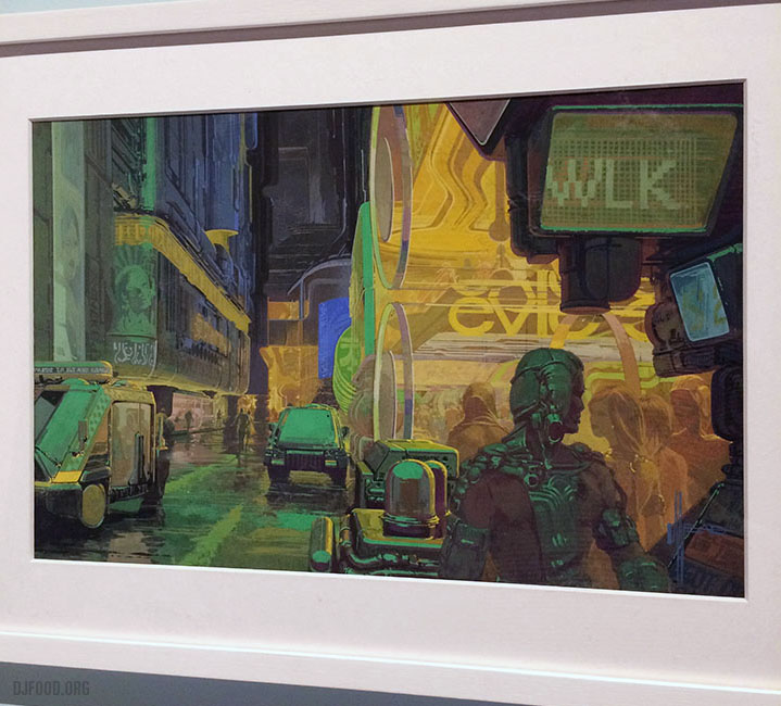
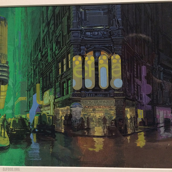
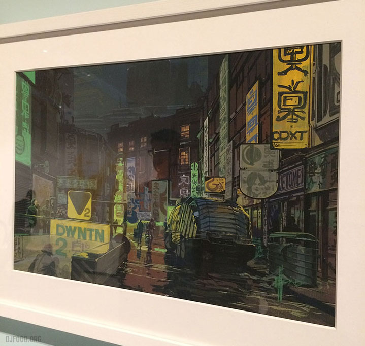
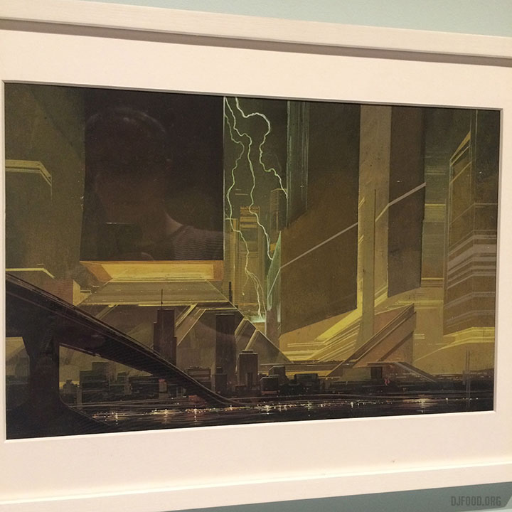
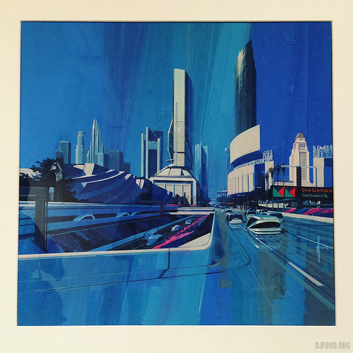
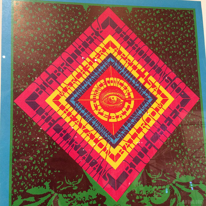
The California: Designing Freedom exhibition at the Design Museum is an odd collection of art, print, tech, media and curios that flimsily hangs on the premise that it all originates from the state of California. From the screen print innovations of Sister Corita Kent to the Family Dog psychedelic posters to David Carson‘s Ray Gun magazine design and the skate board craze, on to a recreation of the iconic Easy Rider chopper bike, real Hell’s Angel jackets and the Buckminster Fuller-inspired dome-building communities of the 70s. The links are tenuous or non-existent but all point to people following their own path, whether working alone or as part of a movement. The future looms large from the earliest Apple computers to videos gaming design and Google‘s place as a part of our everyday lives. A joy to behold are some of Syd Mead‘s original concept paintings for Blade Runner which were much smaller than I imagined but no less powerful. It’s on until October, well worth a look…
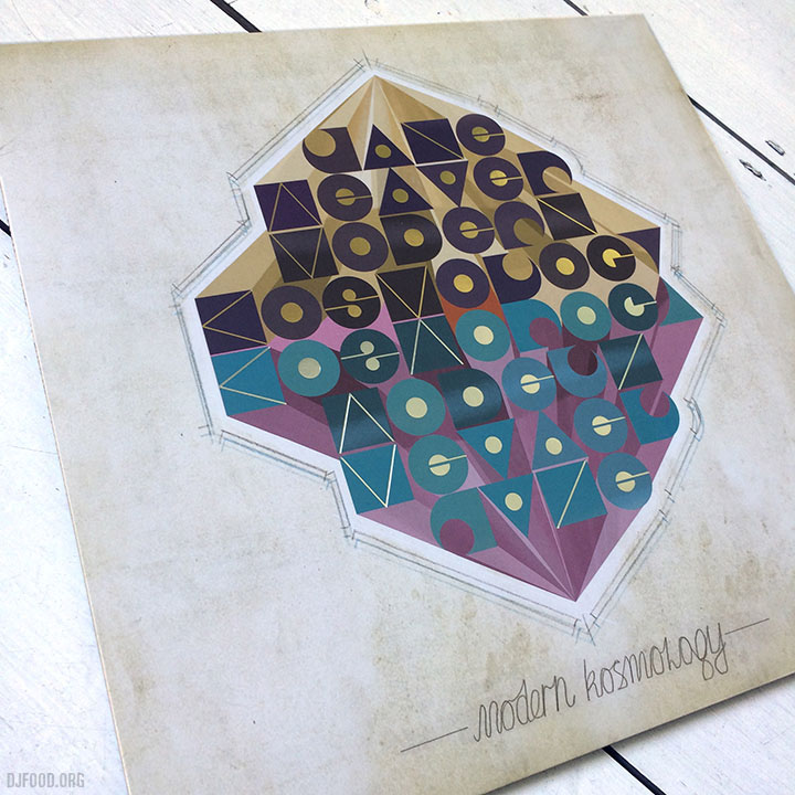
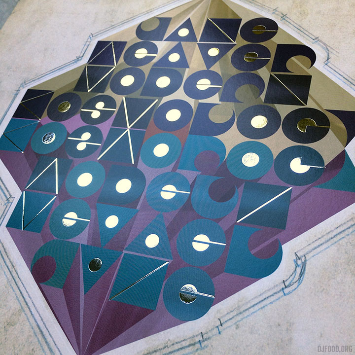
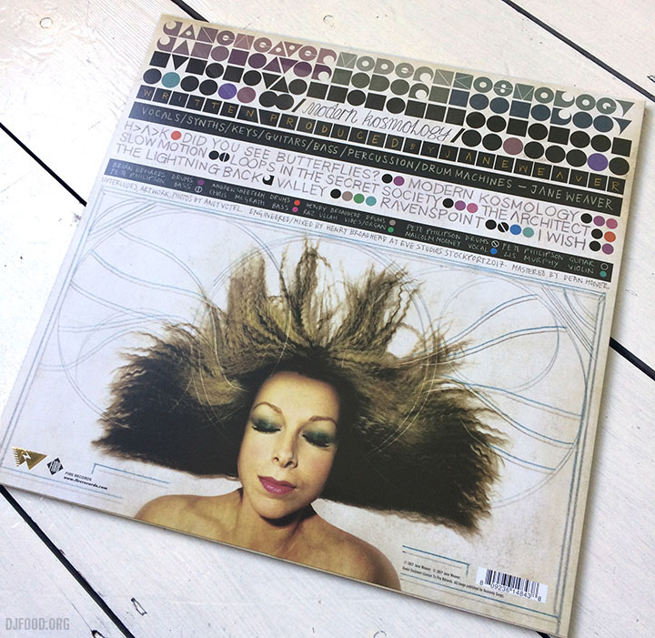
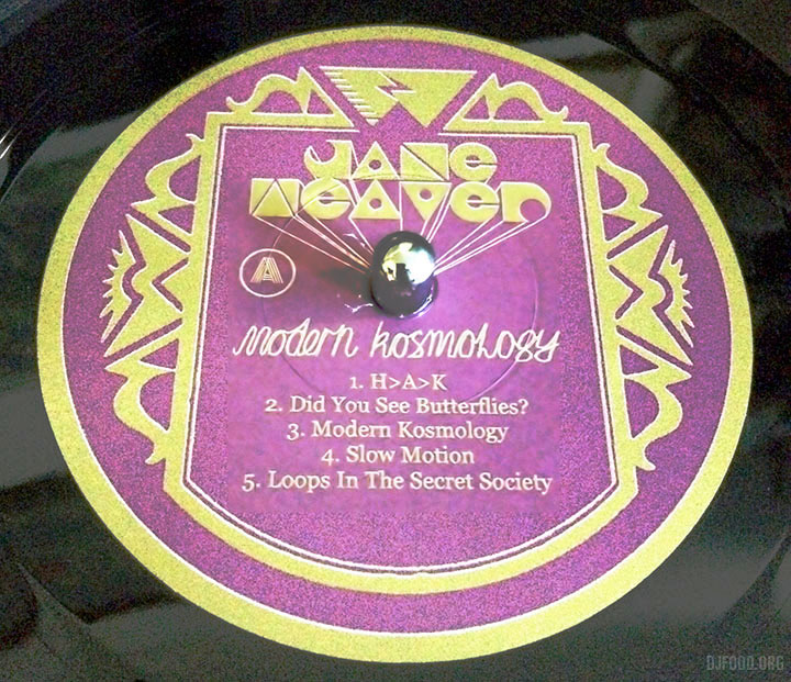
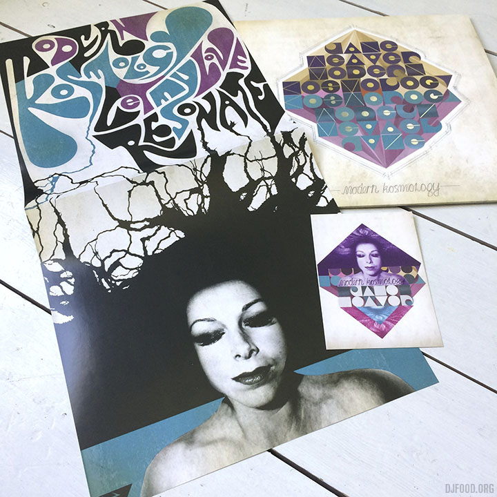
The new Jane Weaver album is absolutely blinding, debuting at no. 50 in the UK charts this week too, the highest selling record in independent shops around the UK last week. Available on limited vinyl, regular, CD and digital, it’s an instant contender for album of the year lists. Buy it here
The artwork by Andy Votel is beautiful too, full of detail and tiny design flourishes, the foil printing being beautiful to touch.
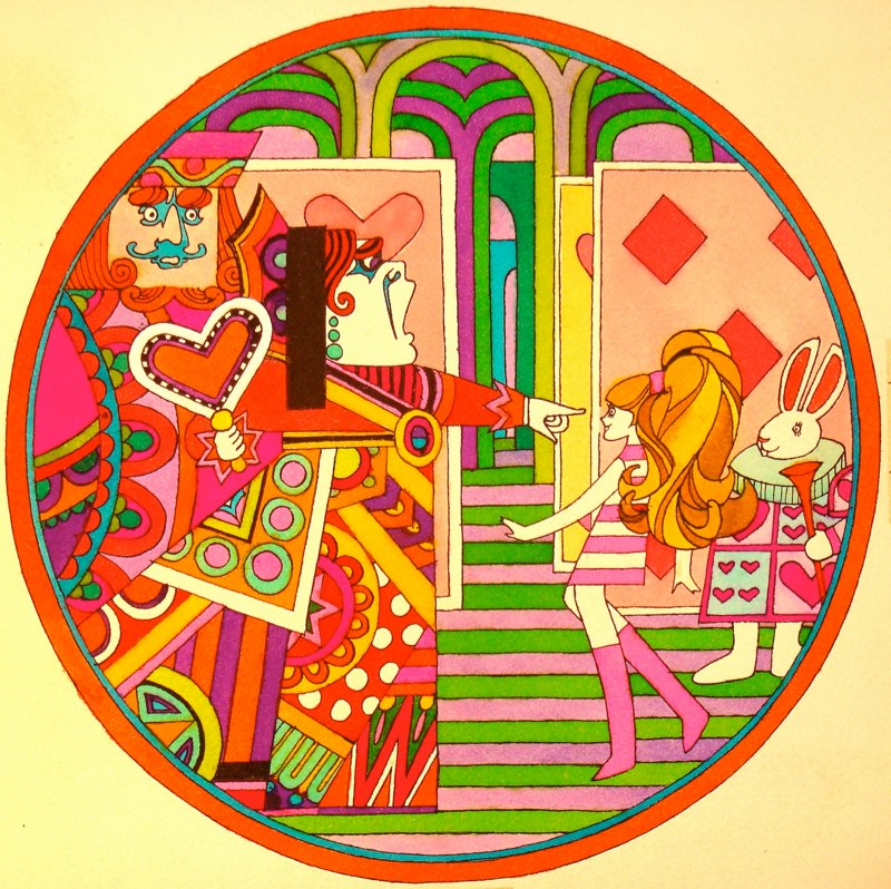
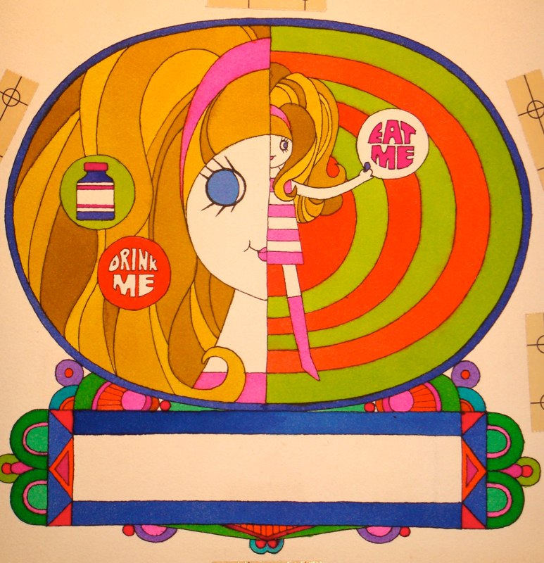
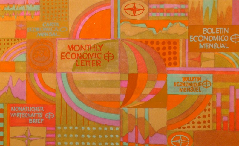
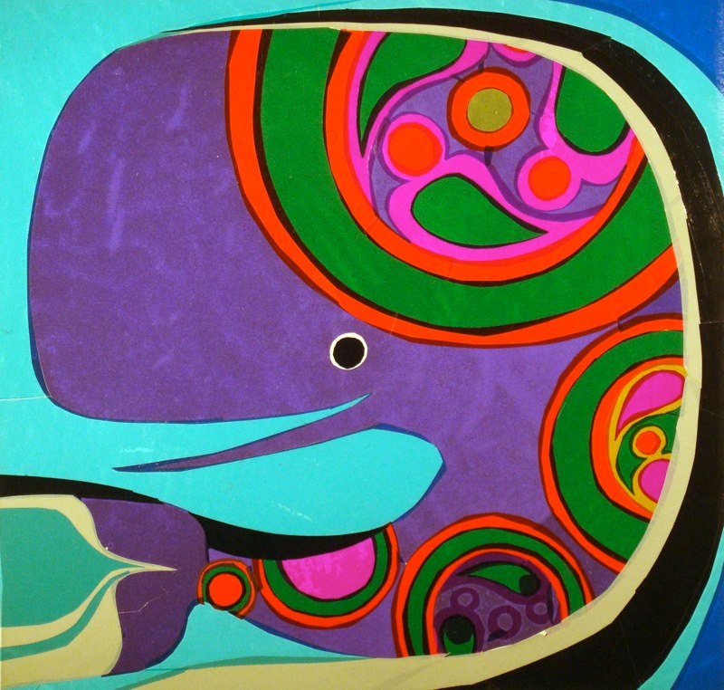
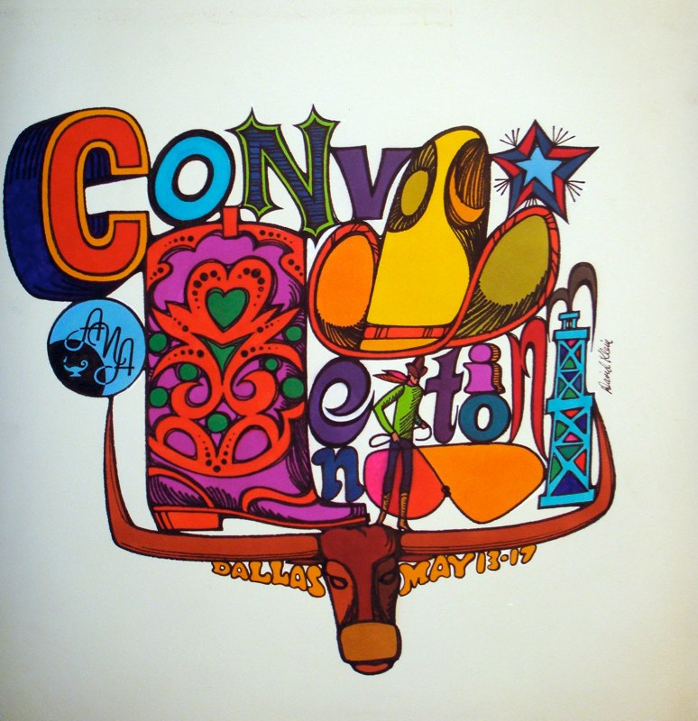
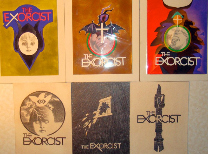
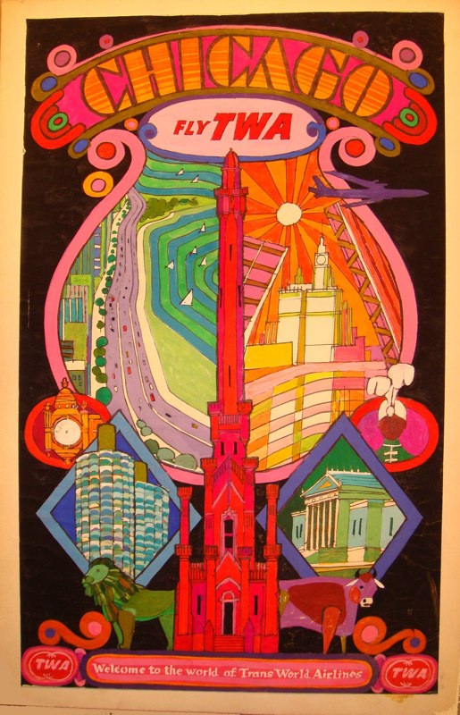
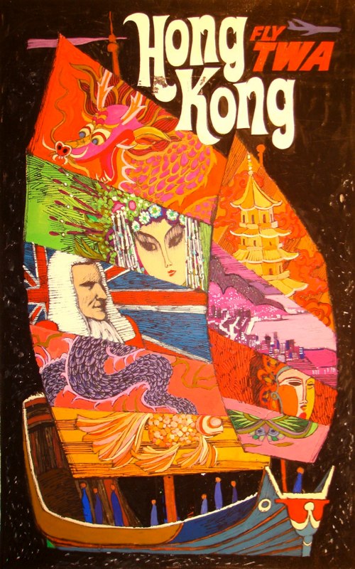
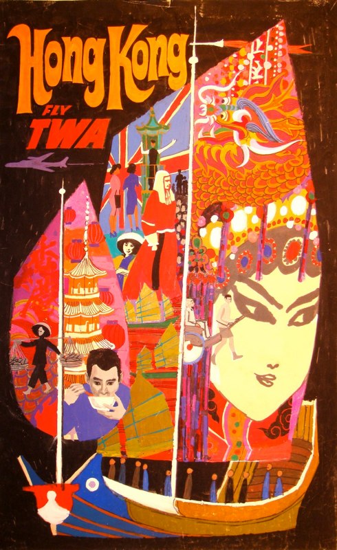
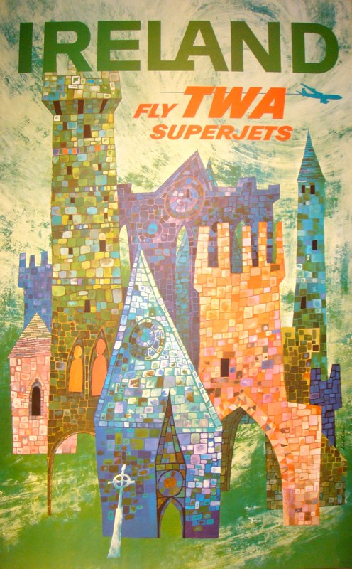
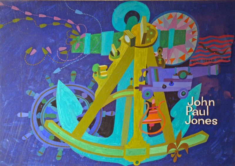
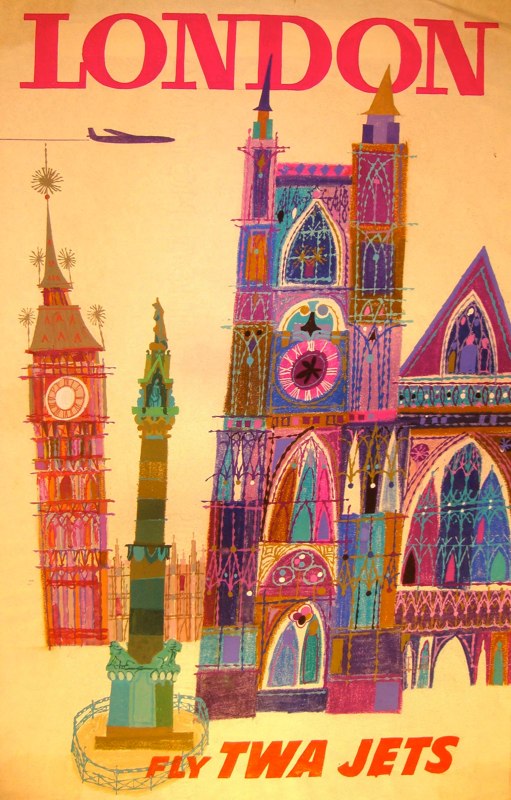
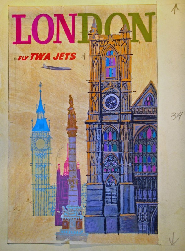
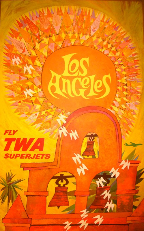
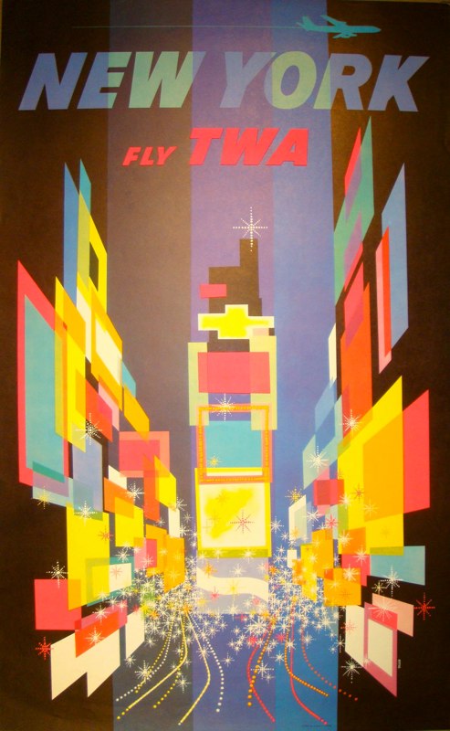
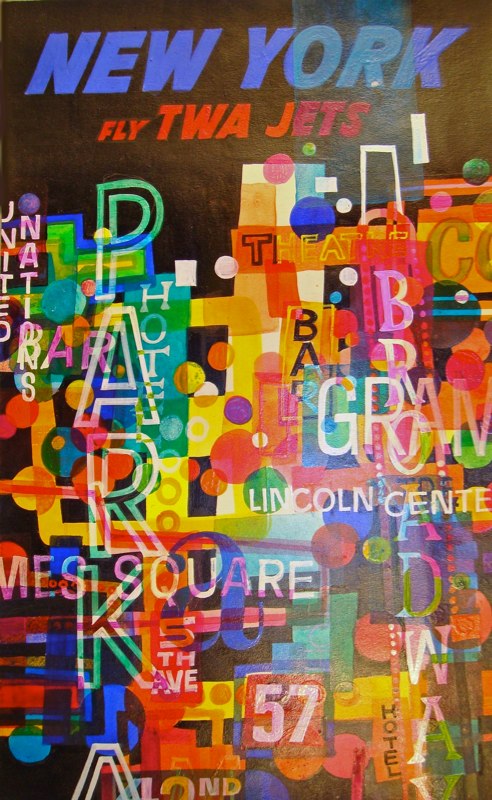
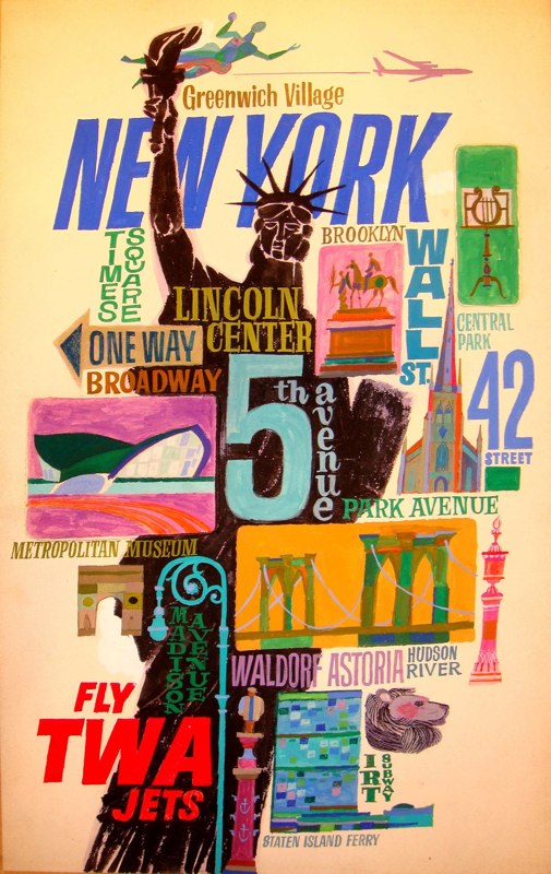
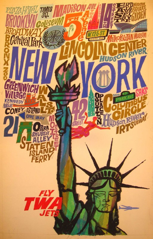
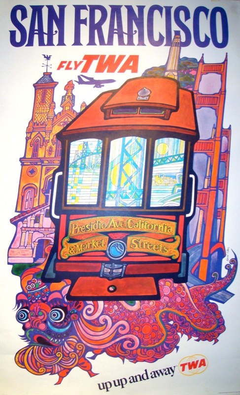
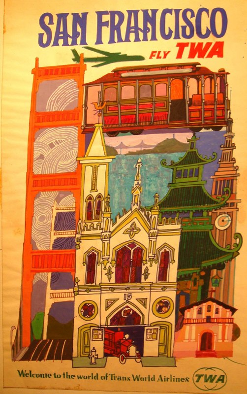
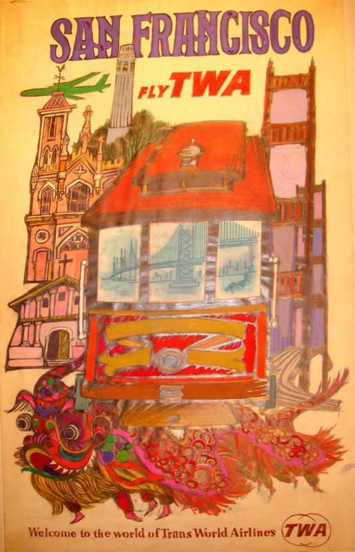
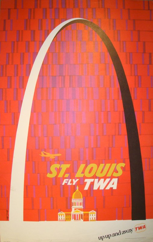
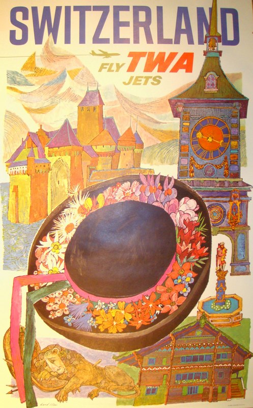
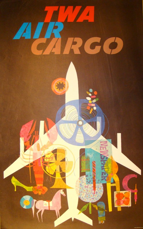
Whilst combing the web for something else entirely I stumbled across the work of the late David Klein. I’ve always been envious of artists who can seemingly use every colour in the palette and not make the result look like a dog’s dinner and there are some wonderful combinations here. His travel posters are lushous examples of a bygone era that occasionally resurfaces when illustrating period pieces like Mad Men. His psychedelic version of Alice In Wonderland is one of the best I’ve seen and there’s an oddity of what looks like six unused prelims for The Exorcist in there too. Visit his website to find out and see more…
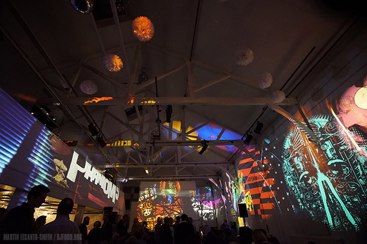
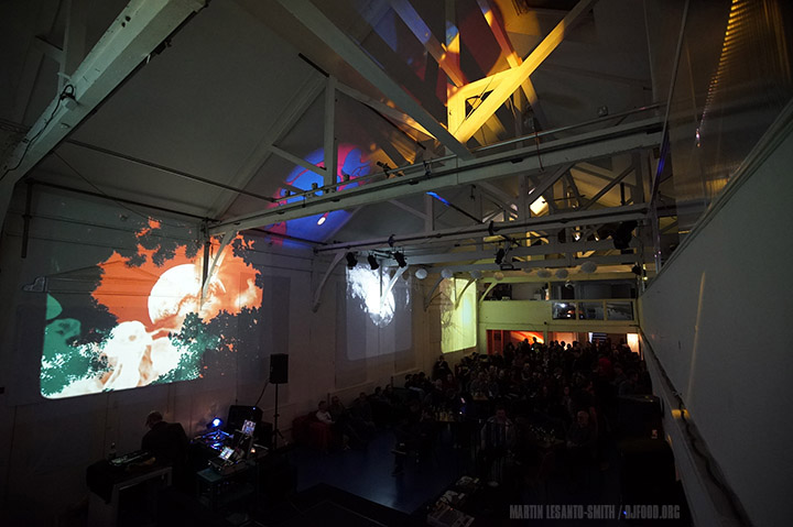
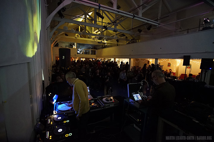
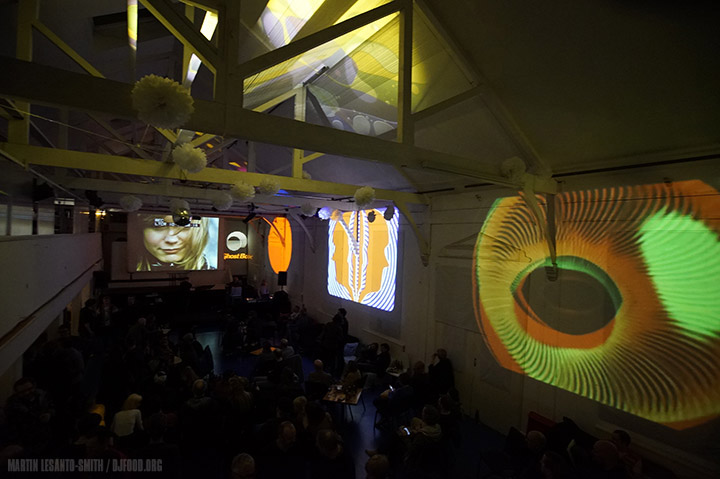
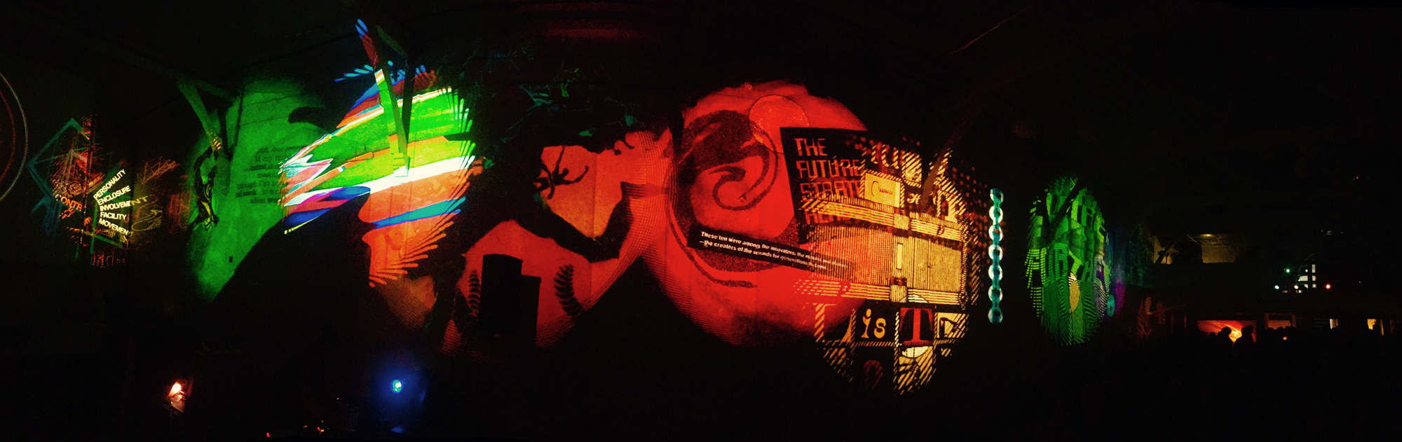
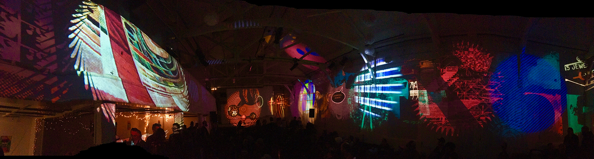
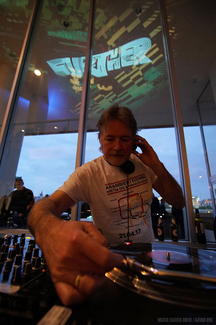
Pete Williams and I opened and closed our first Further at the Portico Gallery on Saturday. We’d spent the past six months or more preparing for this, creating over 350 hand painted slides, video loops, chaining projectors together to automate them remotely and working out the best way to transform the gallery into a canvas for our work. During my set I looked around and finally relaxed, feeling dwarfed by the encompassing visuals, most of which I’d been painting under a microscope only a few weeks earlier. This is just the beginning, we have plenty more to show and do…
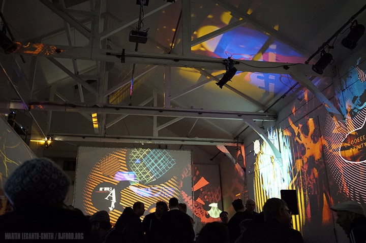
I’ve been posting photos of each of the acts every day here and we’ve set up a new Facebook page for the venture where you can get a peek at all the photos right now, please ‘like’ our page if you do that sort of thing whilst you’re there. Martin LeSanto-Smith took the photos and without him we wouldn’t have been able to physically set the thing up. John Price from the Portico Gallery let us make it happen and was supportive all the way – massive thanks to both of them and also for Hannah Saunders from Big Fish Little Fish who gave advice, loaned projectors, helped on the door and bar and was generally a hero on the night.
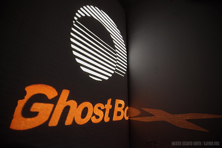
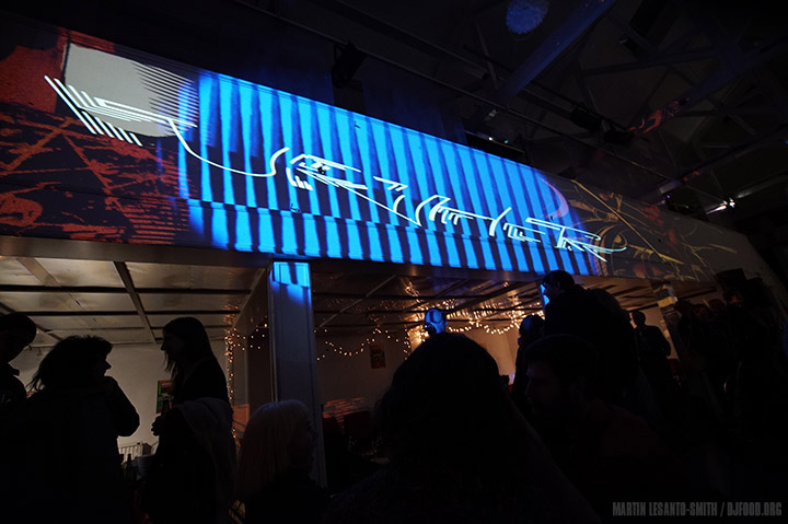
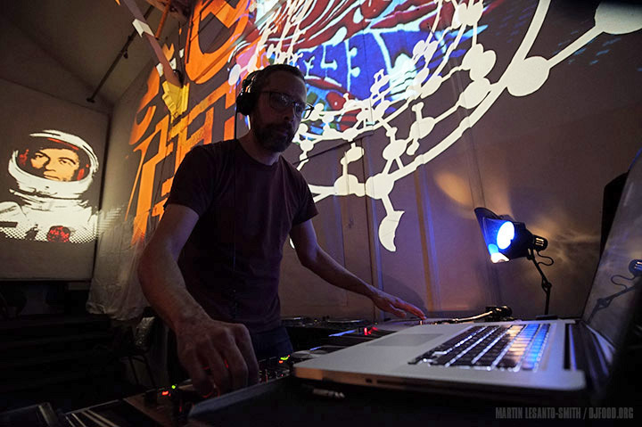
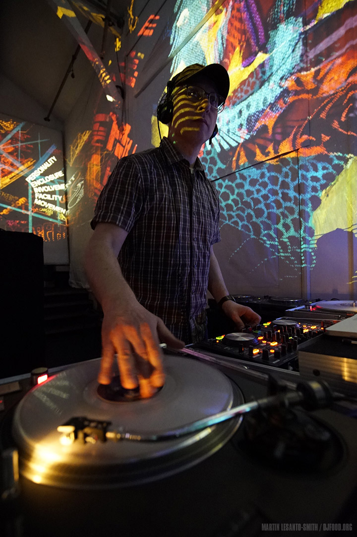
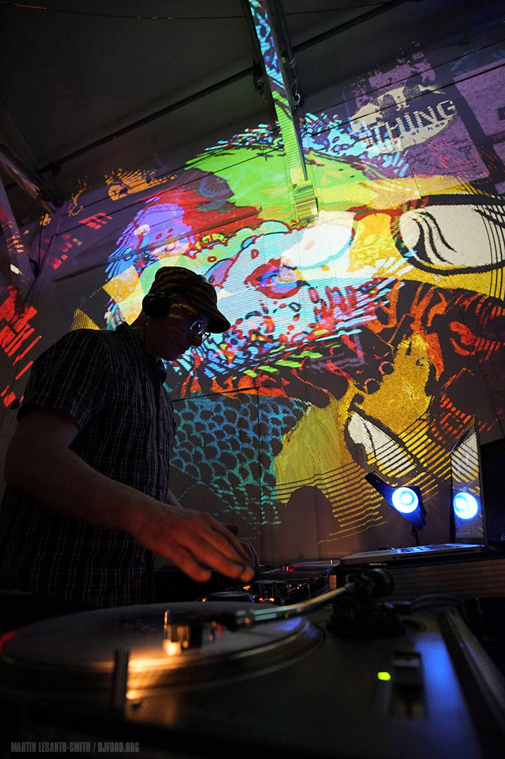
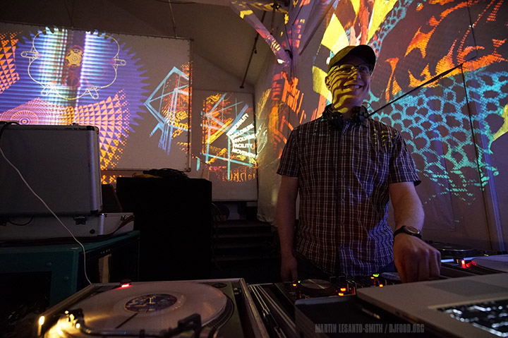
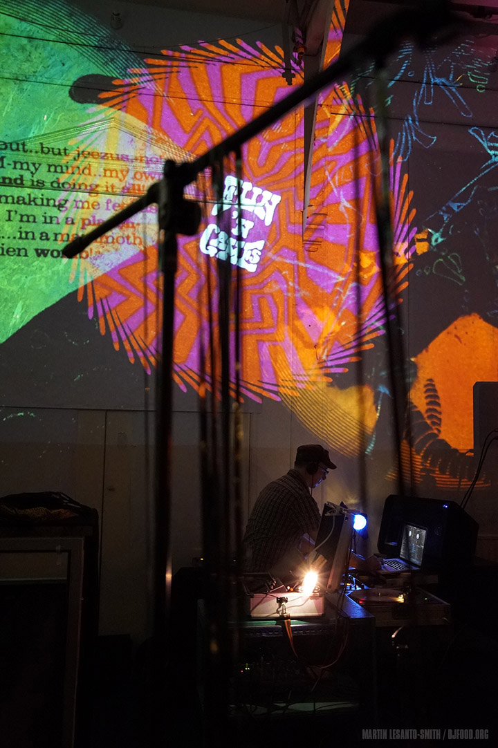
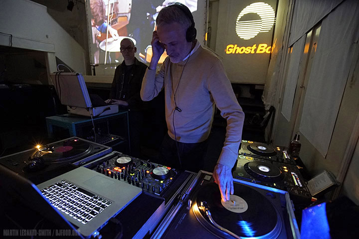
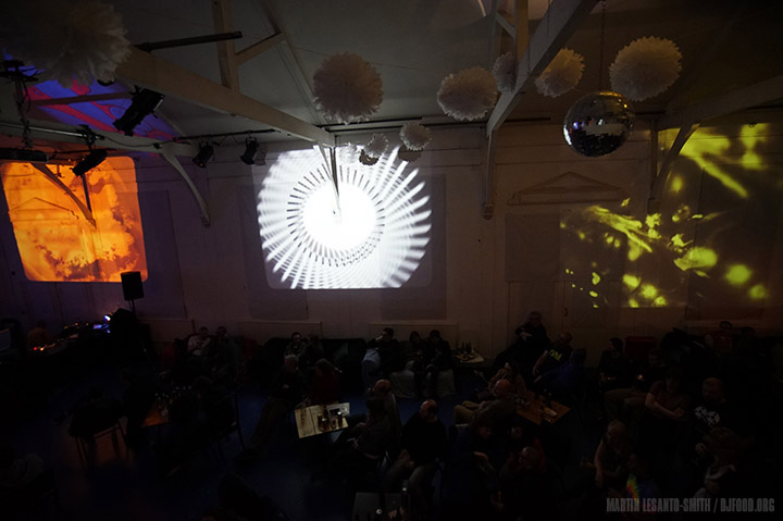
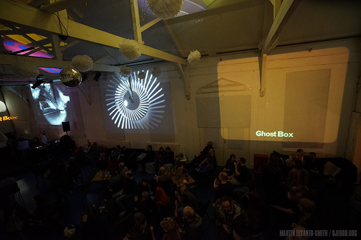
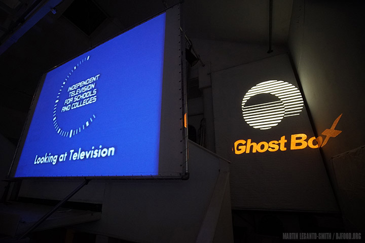
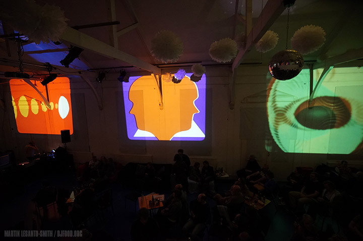
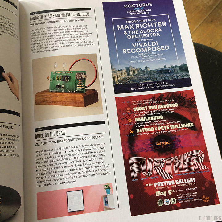
Jim Jupp (Belbury Poly) and Julian House (The Focus Group) from Ghost Box graced us with a 90 minute AV set for the first Further on May 6th. With Julian DJing off vinyl and CD and Jim playing with a small suitcase of tricks it was a rare treat to host them and project their visuals around the hall. Martin LeSanto-Smith took the photos. I’ll be posting photos of each of the acts each day here and we’ve set up a new Facebook page for the venture where you can get an early peek at the photos right now, please ‘like’ our page if you do that sort of thing whilst you’re there.
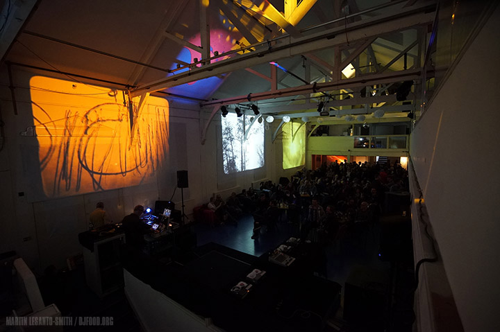
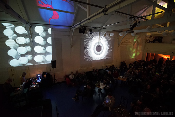
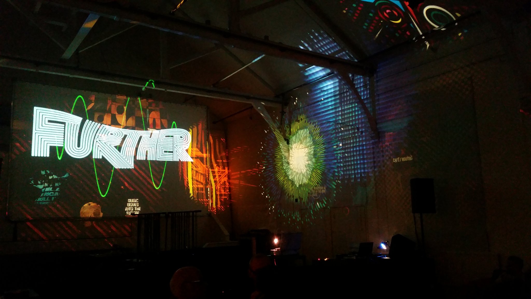
The reason it’s been a bit quiet on here recently is because of a little (big!) thing called Further that’s been occupying my time for the last few months. Myself and Pete Williams hatched this idea last summer, started talking about it seriously in the autumn and stockpiling equipment over the winter. A studio space was found early in January and we started planning an event that brings together lots of the things we love into one space. Music, visuals, records, food & drink, analogue techniques and leftfield artists. After a test run a couple of weeks ago, at the behest of Alex from The Orb, at the Royal Festival Hall we unveiled the first evening at the Portico Gallery in West Norwood on Saurday May 6th.
Featuring guests Jim Jupp & Julian House from Ghost Box records playing an AV set and Howlround presenting the premiere of their live rescore to Steven McInerney‘s film ‘A Creak In Time’, we opened and closed the night with our own multi-projection slide / oil / video sets. Local café/deli Pintadera came over to provide delicious Italian food and Michael Johnson from the Book & Record Bar down the road set up a record stall selling records by the artists and music sympathetic to the event. The whole thing wouldn’t have been possible without the support of John Price at the Gallery who let us use the building as our own for the night and Martin LeSanto-Smith who helped set up on the day and managed to take amazing photos all night whilst simultaneously being on a date!
 I’ll be posting photos of each of the acts each day here and we’ve set up a new Facebook page for the venture where you can get an early peek at the photos right now, please ‘like’ our page if you do that sort of thing whilst you’re there. There should be a video by the end of the week too but there’s a lot of footage to go through. To give you a taste, here are just a few of the photos harvested from social media, Tuesday I’ll post Ghost Box images, then Howlround, then us on Thursday with the video to follow by the end of the week.
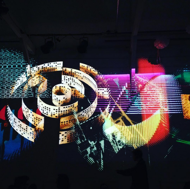
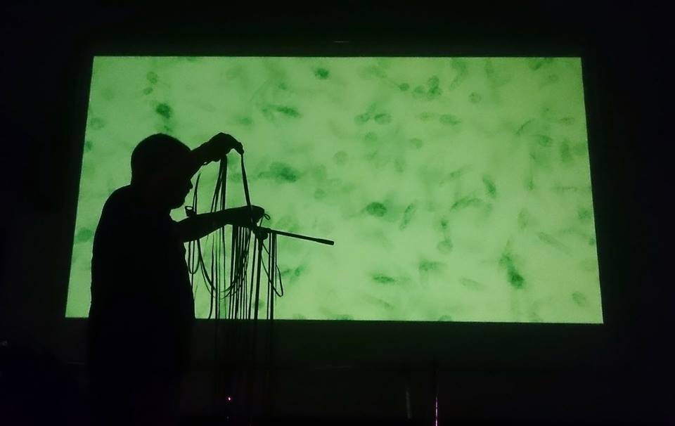
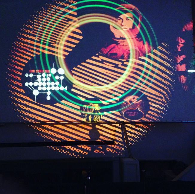
Photo credits: Top: Neil Mason (Electronic Sound), 2x panoramas: Nathan Adams, slide stills: Spectrascopic, Howlround silhouette: Zoe Plumb, video: Tony Coleman (London Electricity)
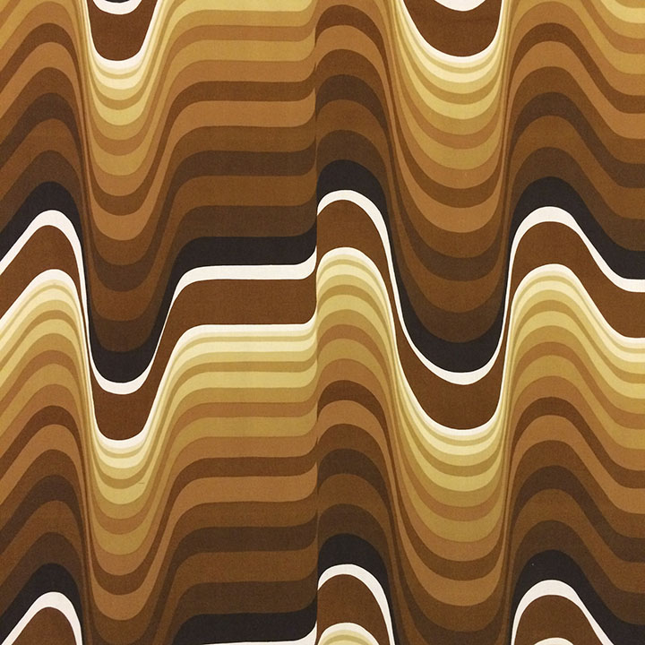
 My latest Freaky Formats piece for The Vinyl Factory is up – this one focus’ on moiré effect patterns on sleeves – read it here and see the sleeves animated. Photos and gif animations by Michael Wilkin.
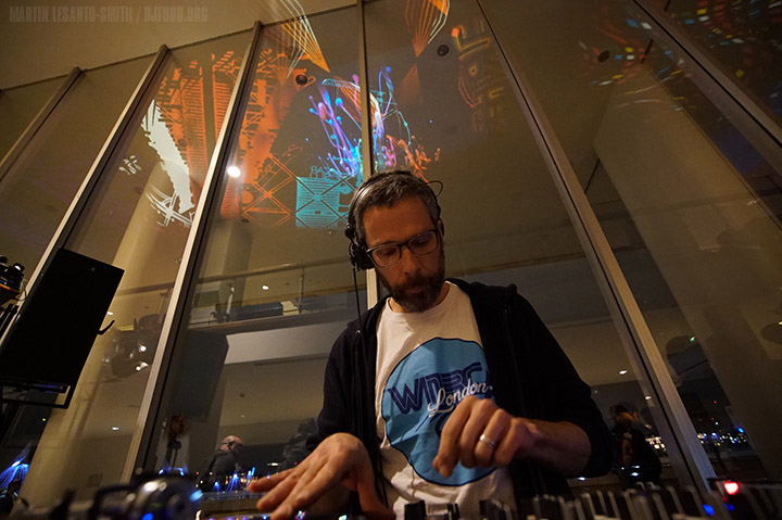
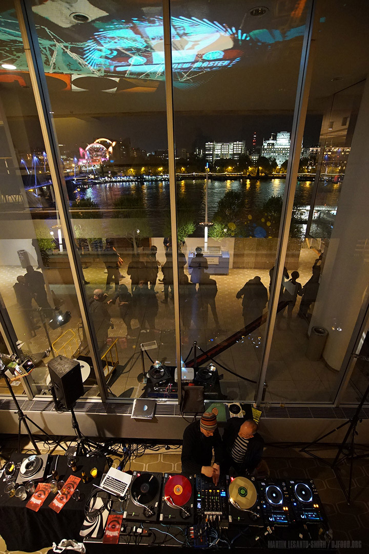
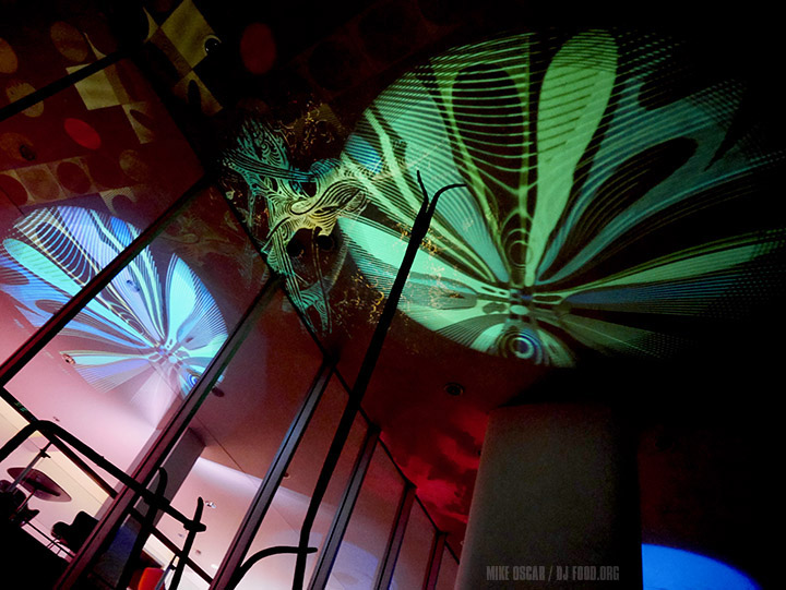
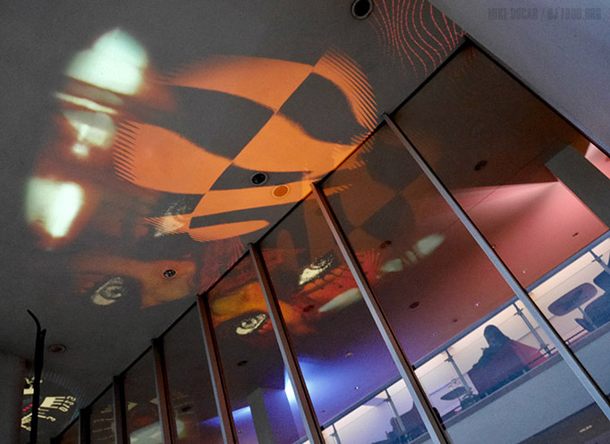
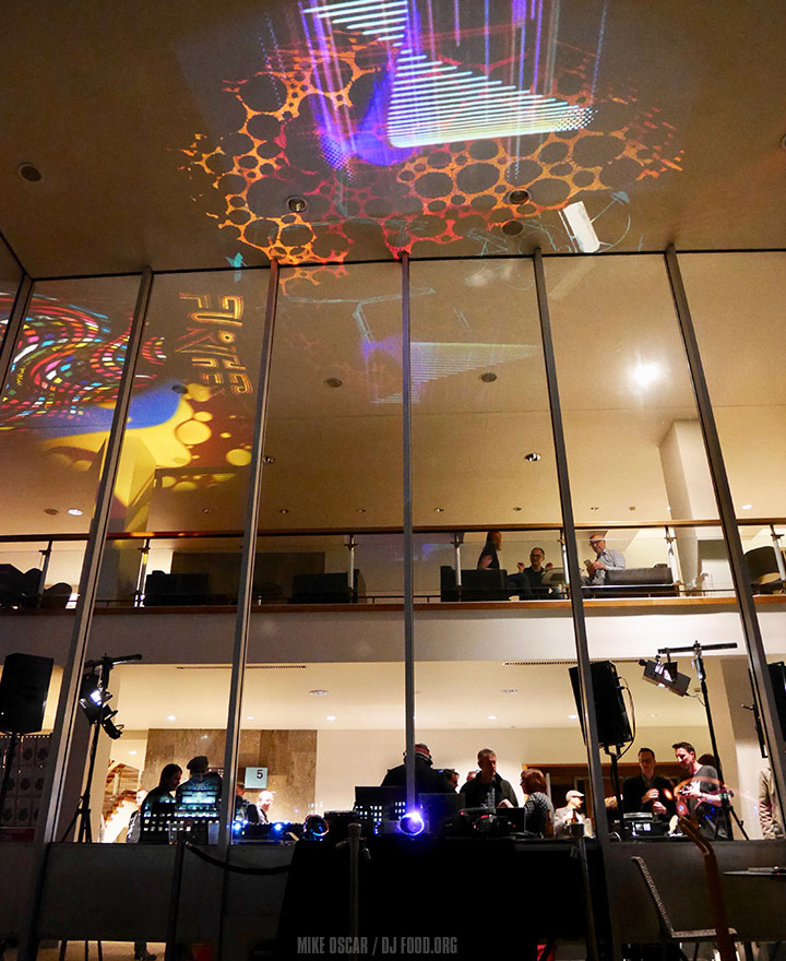
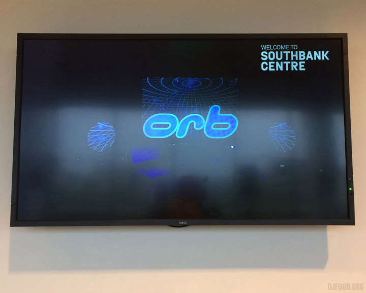 Friday saw myself and Pete Williams as part of the bill for the Orb‘s extravaganza at the Royal Festival Hall on the Southbank, doing a test run for our Further event on May 6th. Upon being asked to play on the 5th floor balcony area by Alex Paterson, we decided to use a load of our equipment to projection all along the roof of the outside area overlooking the Thames. We got in around 1pm and were just about set up by 7pm when Michael from The Book & Record Bar and DJ Dadaist aka George Holt arrived. Teething trouble with getting the lights turned off or down so that we could see the projections were dealt with as were security who suddenly roped off the public space and would only let ticket holders for the gig in the main auditorium in. As the daylight faded and the projections along the balcony pointing across the ceiling appeared, everything clicked into place.
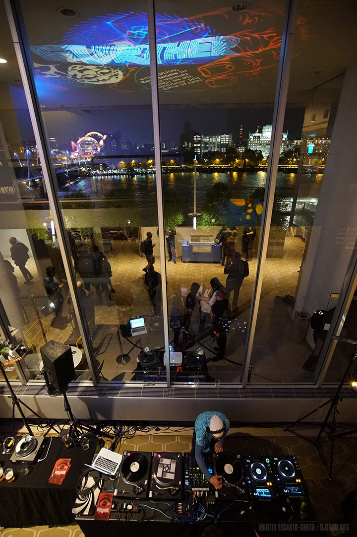
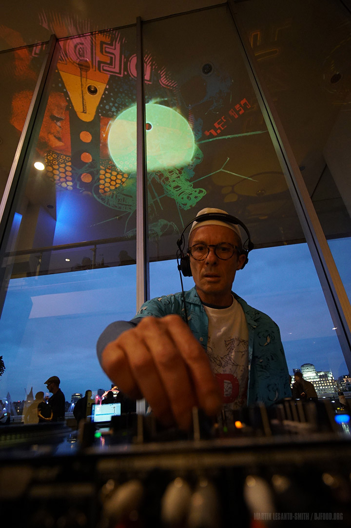
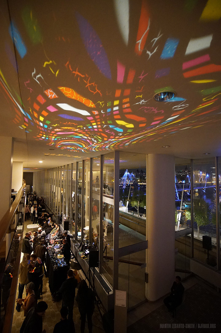
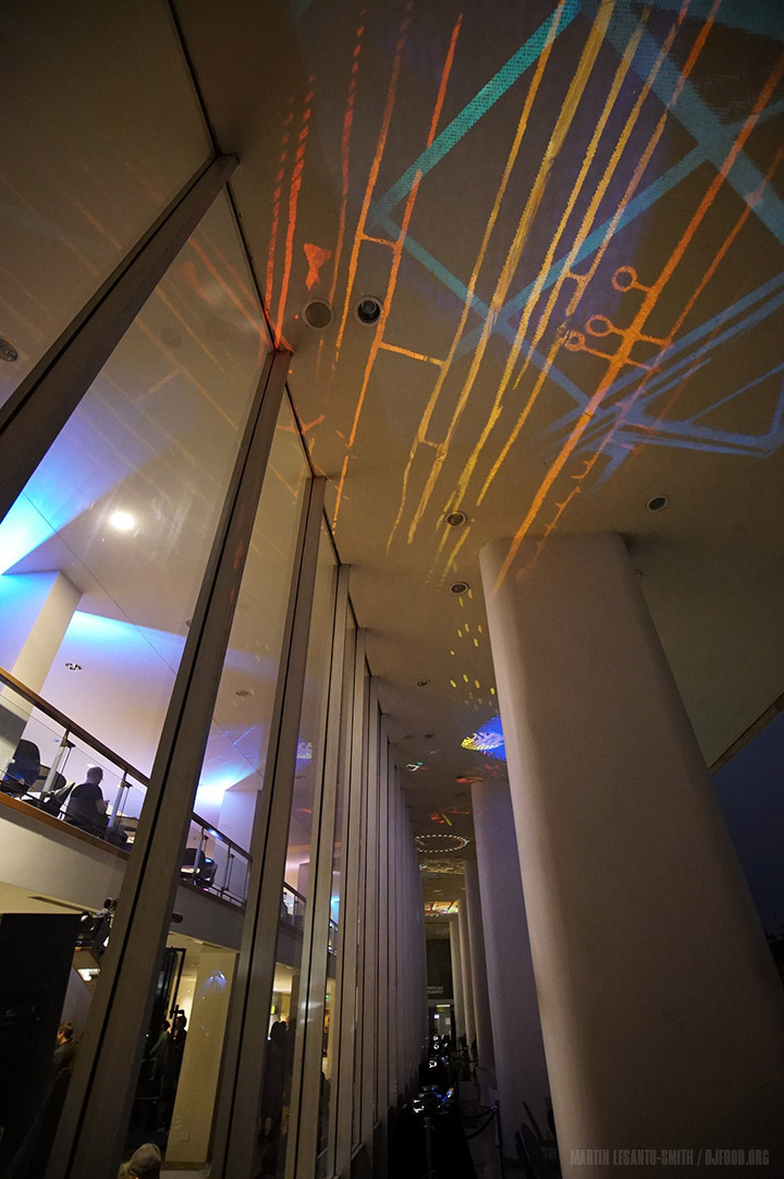
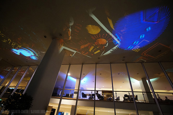
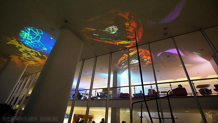
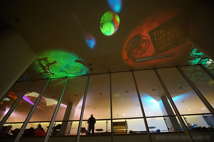
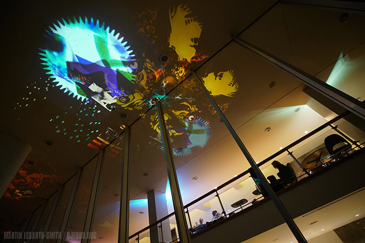
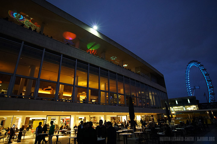
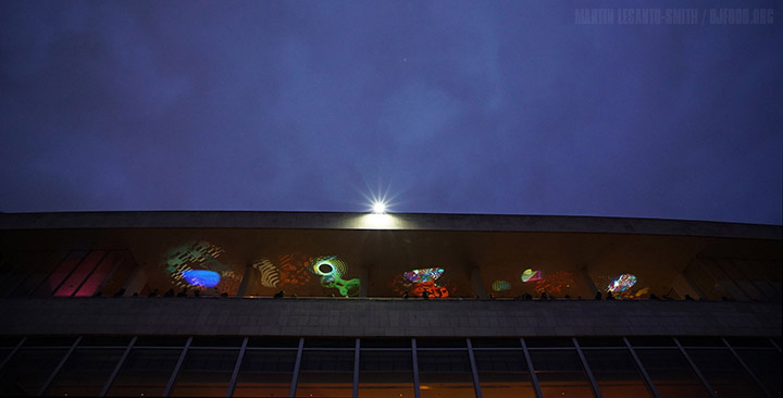
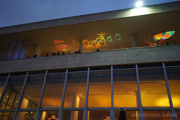
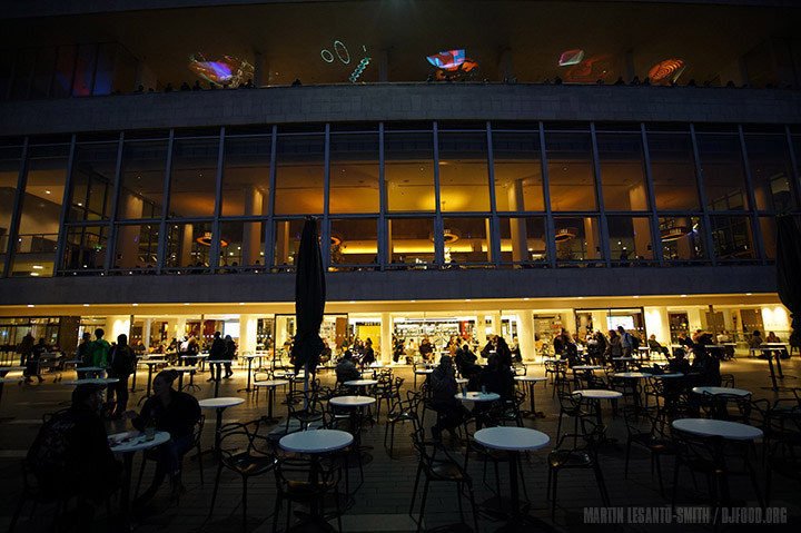
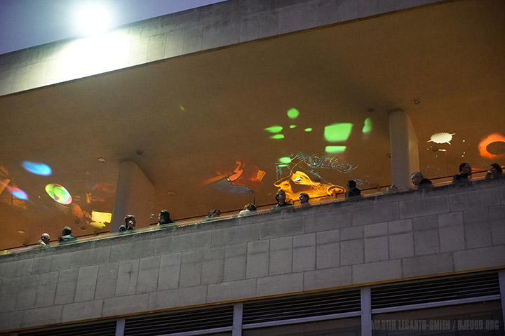
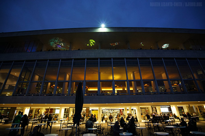
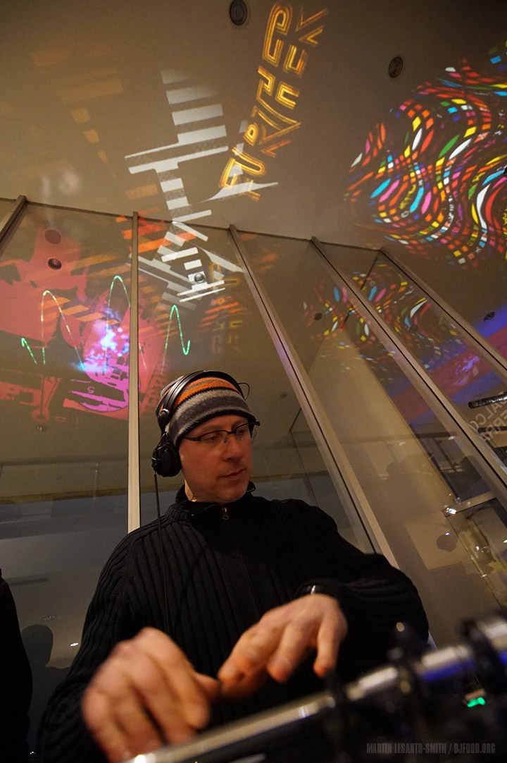
Tons of friends turned up and we managed to get a lot of great photos and footage before the 11.30pm curfew. I even managed to see a bit of The Orb with Youth painting a huge canvas live onstage, walking in just as one of my favourite tracks, O.O.B.E. was playing. Strip down of the equipment took two hours by the time we were loaded out, then driving back to unload and retiring to our beds saw that it was 3am by the time I hit the sack. All worth it though, a very memorable night and a success in terms of what we wanted to achieve.
(Many thanks for the photos above: Martin Le Santo-Smith, and below: Mike Oscar)
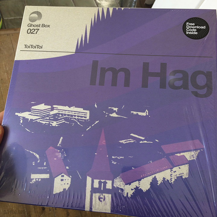
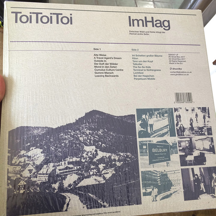
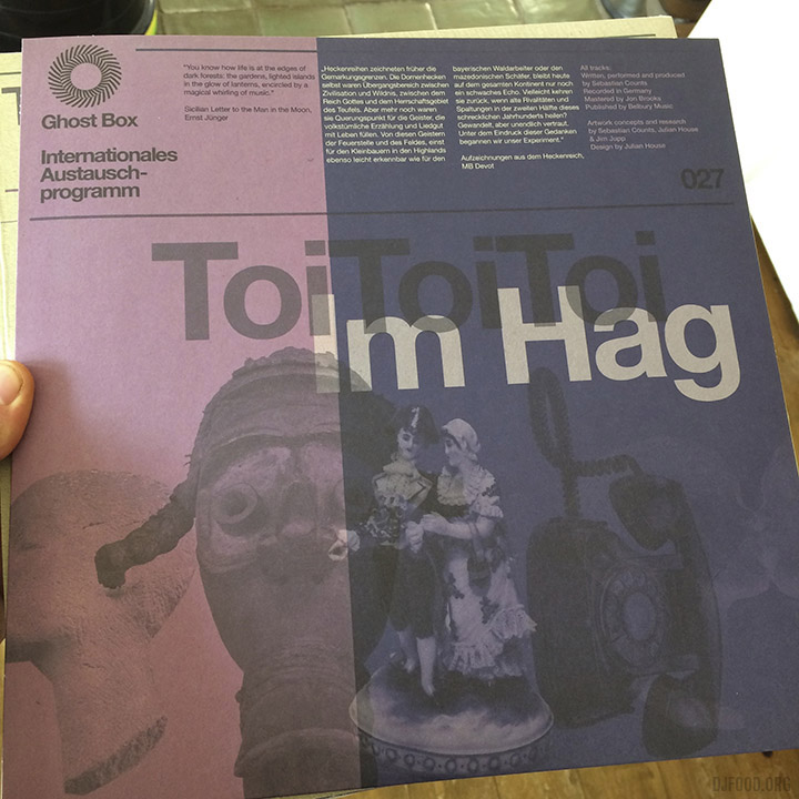
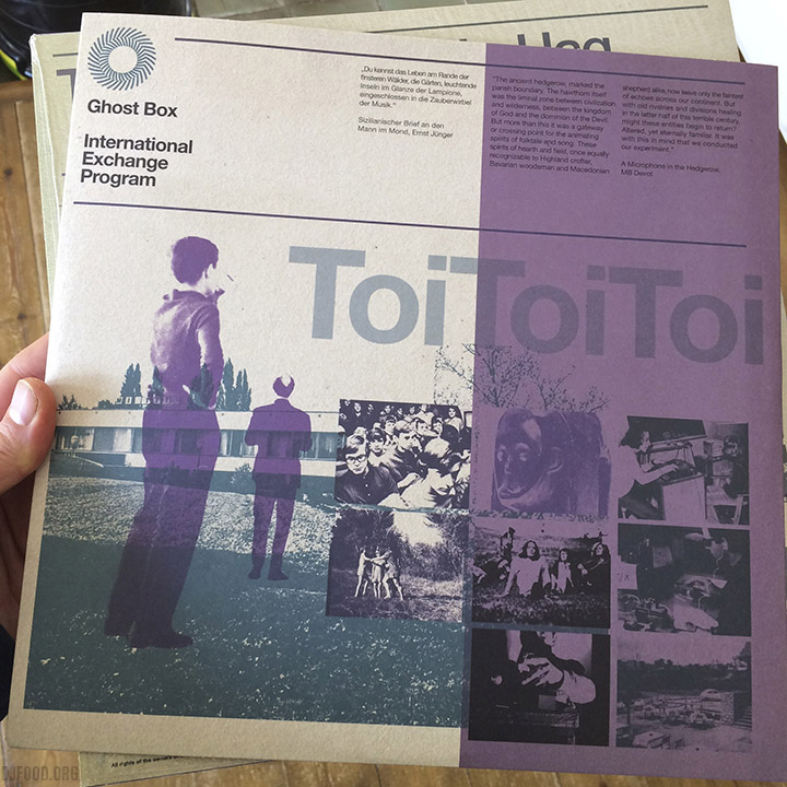
Up for pre-order and released next month, the latest on Ghost Box is from ToiToiToi – Sebastian Counts from Berlin – who has previously had a single on the label’s Other Voices 7″ offshoot. Fans of the Ghost Box output won’t be disappointed, it’s a beautifully assembled work with layers upon layers to discover.
Label heads Jim Jupp (Belbury Poly) and Julian House (The Focus Group and overall GB design) will be some of our guests at Further on May 6th at the Portico Gallery, West Norwood, where they’ll be playing an multi-projection AV set with a ton of label-related visuals. Tickets can be bought here
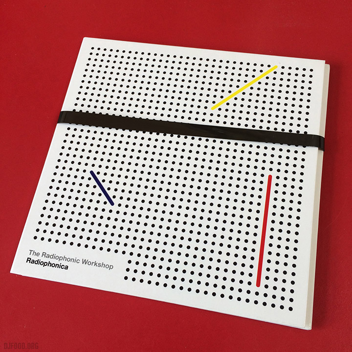
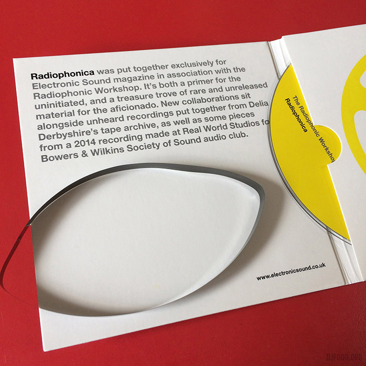
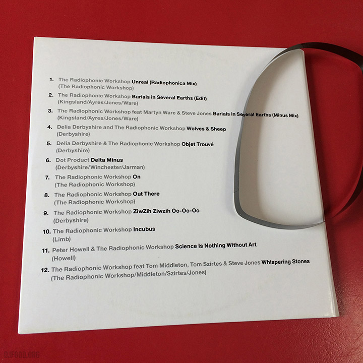
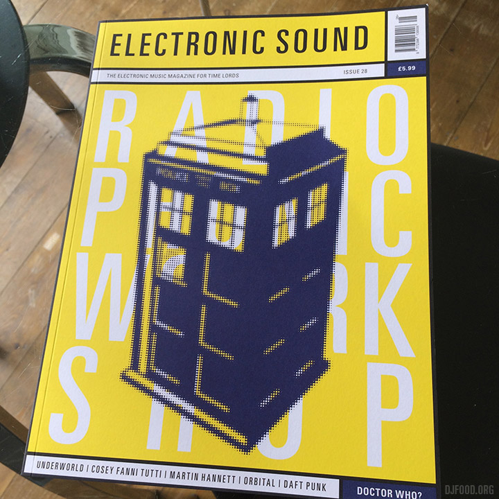
Who says CDs can’t look beautiful too? The Radiophonica compilation CD of new, old and unreleased Radiophonic Workshop material is a lovely piece of minimalist design, bound by a tiny tape loop – lovely touch. It’s only available with Electronic Sound magazine from their online shop, no more free cover mounts I’m afraid, but worth every penny. The 12-track album of never-before-heard collaborations, mixes exclusive to this collection of tracks from their forthcoming album of analogue improvisations, and some Delia Derbyshire archive material that has been worked on by the likes of Tom Middleton (Global Communication) and Dot Product.The same issue has a little ad for something only a few weeks away too…
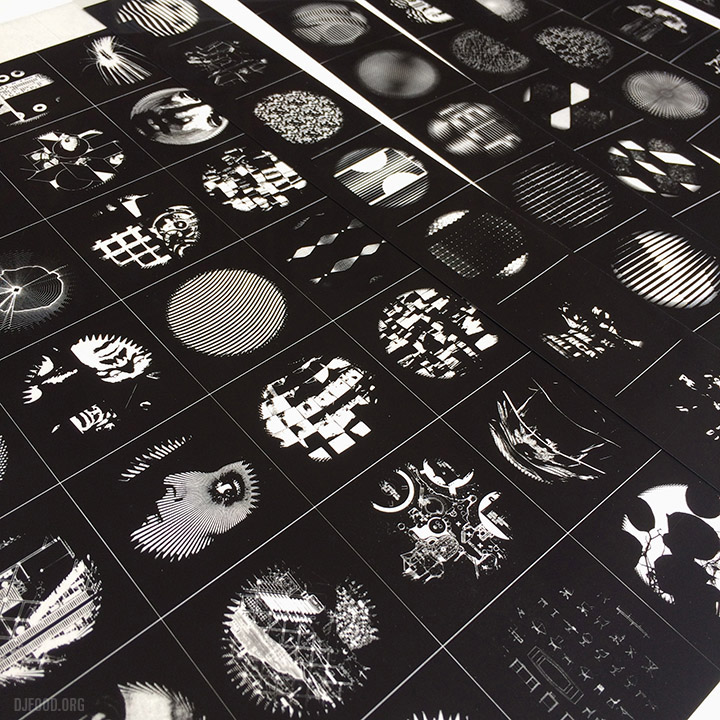
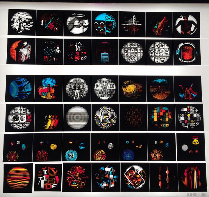
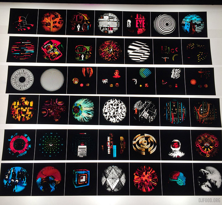
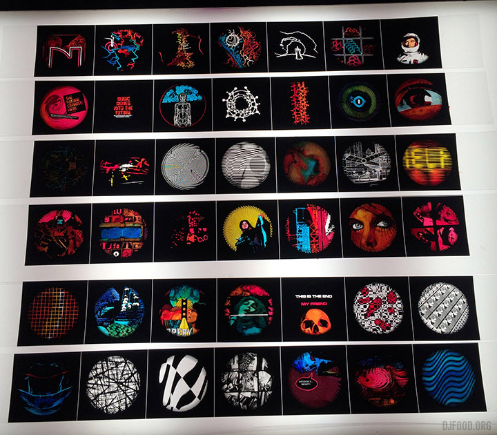
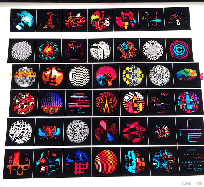
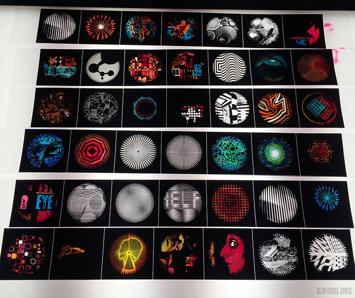
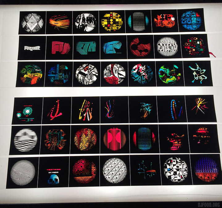
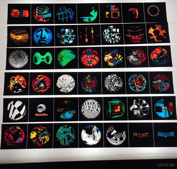
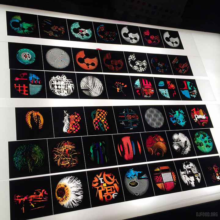
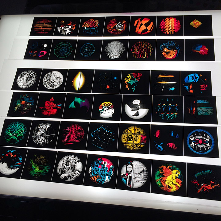
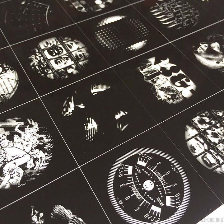 I spent the best part of my Easter weekend hunched over a light box with paintbrush in hand, hand colouring over 350 images on lith film for slide projection at the Orb gig this Friday and Further two weeks after that. Now to mount the buggers…