I caught the amazing end montage sequence of this via the isolated graphics Instagram account the other day. You can watch the whole thing or skip forward to the 17.40 part where the montage begins. Another age but so much of this is more exciting to me than 99% of digital art out there.
Design
![]()
A few weeks ago I stumbled across this badge on eBay from a seller in the UK. The name piqued my interest as The Sunshine Makers was a documentary about Tim Scully and Nicholas Sand, two west coast chemists who manufactured Orange Sunshine LSD in the sixties, considerd the gold standard of acid production.
I wondered if this was connected in some way? Maybe something produced by and for those in the know who also made or distributed the drug? An innocuous signifier to those hip to it that confirmed the wearer as someone to be trusted maybe? The back of the badge bears the hallmark: W.O. Lewis Badge which must be Lewis Badges from Birmingham and puts the origin of manufacture as the UK. They had no info on it either as their records only go so far back.
![]()
I couldn’t find anything about ‘the league…’ on the web aside from the above documentary and a reference to a 1935 cartoon of the same name which is most likely a coincidence rather than anything else.
It niggled me that there was nothing out there, and there was no info in the original eBay listing either but I did find a mental health organisation called Shine who also used a light house in one of their logos. A google picture search returned a very similar looking badge under the name ‘LightKeepers of the Missions to Seamen’ which is appararently an organization that supports seafarers, including those who work on lighthouses and lightships.
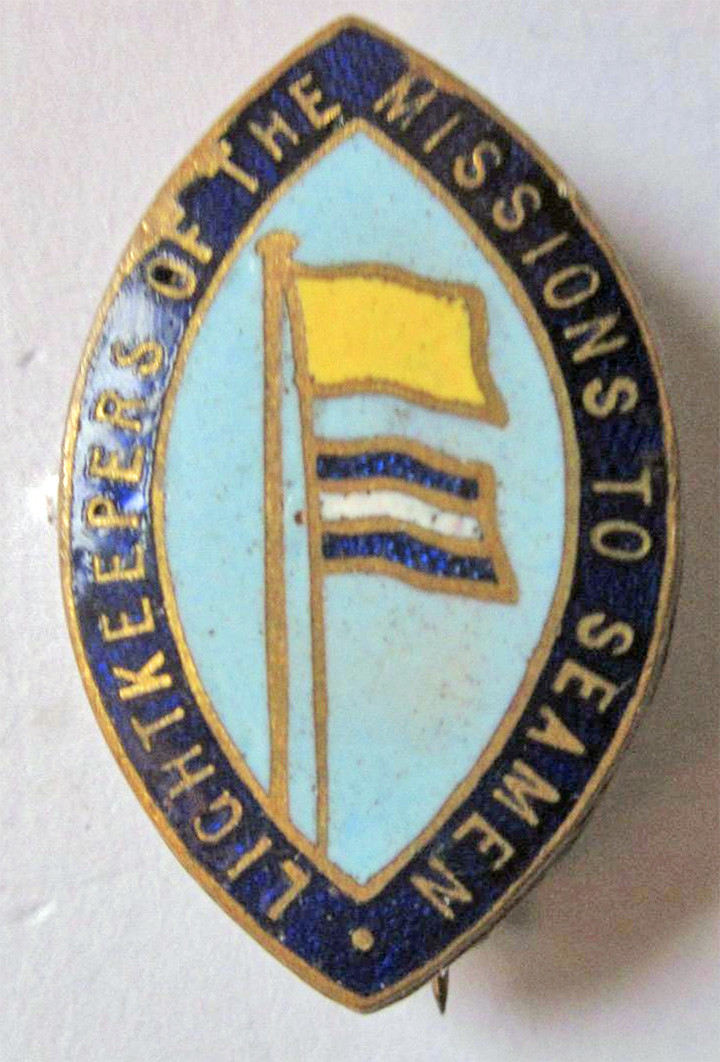
I wondered if the lighthouse pictured was a clue so contacted the Association of Lighthouse Owners in the UK to enquire if they had any reference for it.
Their response came back:
“We’ve checked our catalogue and drawn a blank. If we had such a badge, we would have been sure to record the text. The badge depicts a generic rock lighthouse. If it was meant to represent any particular lighthouse or lighthouse service, one would expect more of a clue.
It might not be lighthouse-related at all. Christian churches and charities frequently appropriate the word lighthouse or lighthouse symbolism for their own missions.”
Now there’s a thought, anyone recognise or know the origins of this oddity? Please leave a comment if you do.
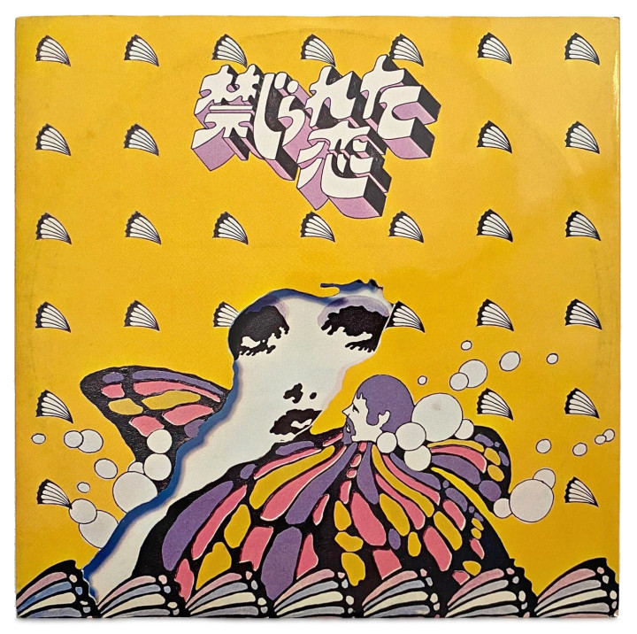
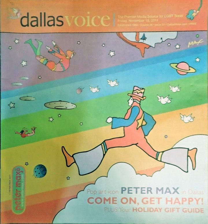
It’s been a while and things have been piling up on the desktop so… above is a Japanese jazz album called, I believe, ‘Forbidden Love’, released on RCA in I’d guess the late 60s. It includes covers of The Beatles and The Mindbenders and the cover looks like either Victor Moscoso or Peter Max but maybe it’s a take off of that style that was so prevalent back then.
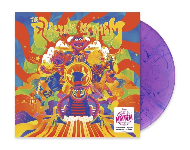
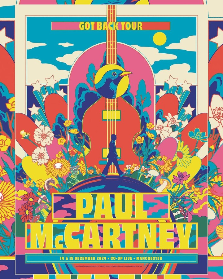
Below is a Muppets Electric Mayhem LP sleeve I discovered by Matt Taylor after seeing his poster for McCartney’s Got Back tour featured below.
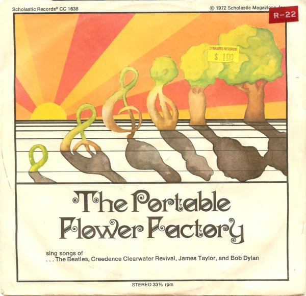
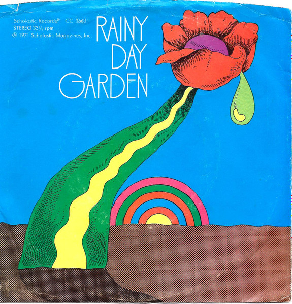
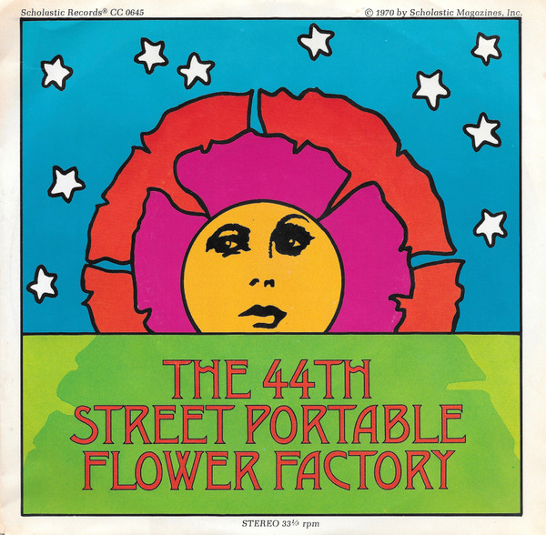
Below are three Portable Flower Factory 45 sleeves, a project from Bob Dorough with cover versions of popular songs for kids on the Scholastic label made between 1970-1972. The artist is uncredited but what fabulous sleeves.
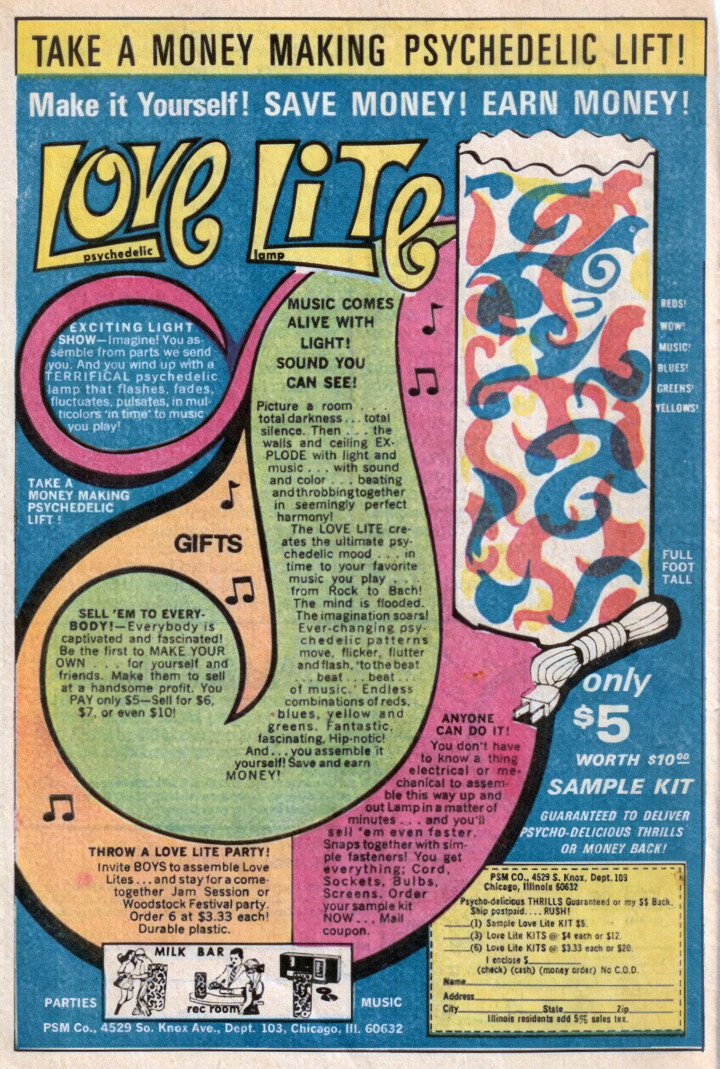
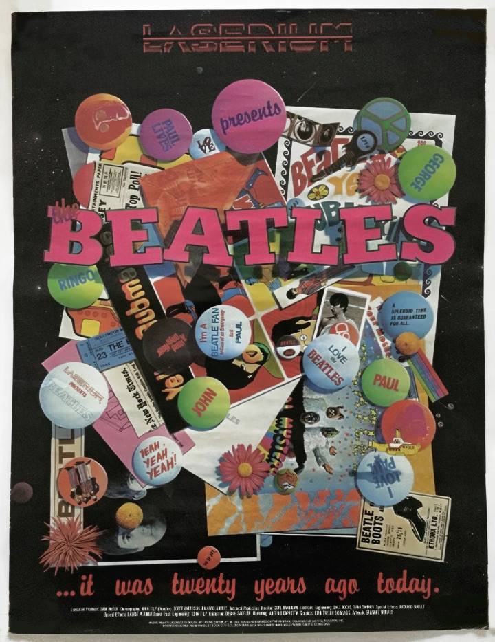
Below is an advert for a psychedelic light from a girl’s comic from 1970, love the “Invite BOYS to assemble Love Lites.. and stay for a come together Jam session” line. Below that a light show of the laser kind for a Beatles-themed run at the Laserium, probably around 1983.
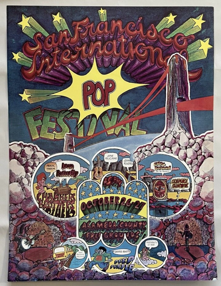
Carson Morris illustrated San Francisco International Pop Festival poster from October 1968.
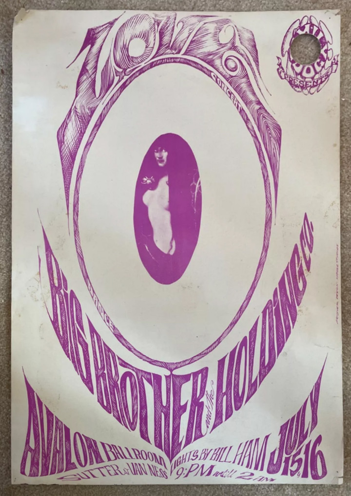
Love and Big Brother & The Holding Company poster with an early design by Stanley Mouse and Alton Kelley from 1966 (+ lights by Bill Ham!)
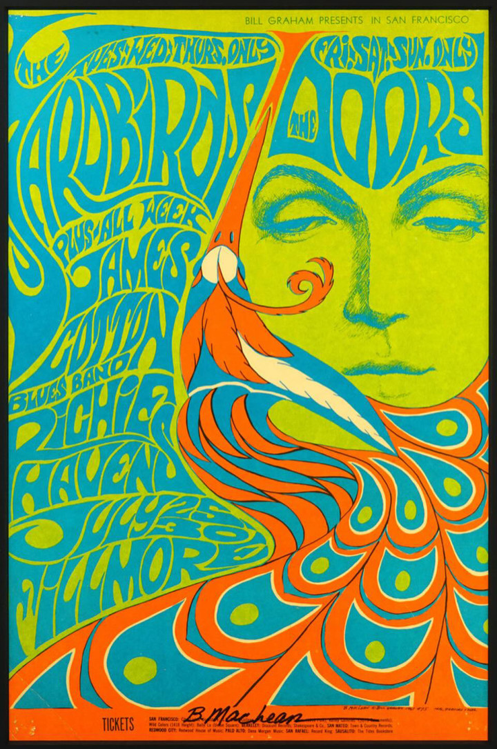
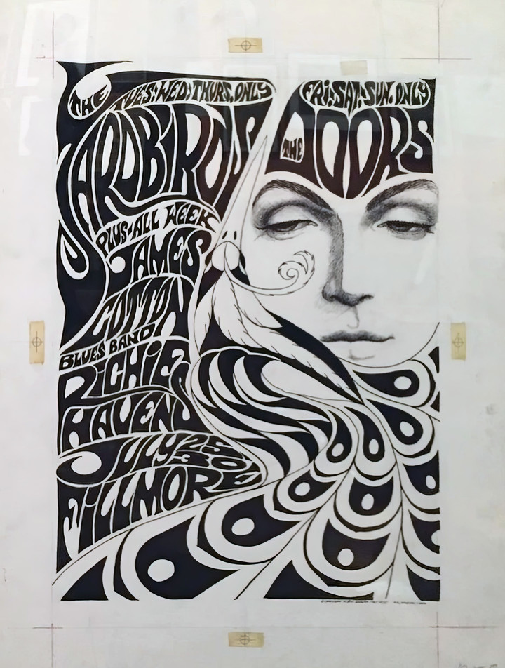
The Yardbirds / Doors gig at the Fillmore, 1967 by Bonnie MacLean with the original below
I curated this month’s Dust & Grooves You Dig? newsletter – tons of record-related links in there for your Sunday
Sign up here for the newsletter
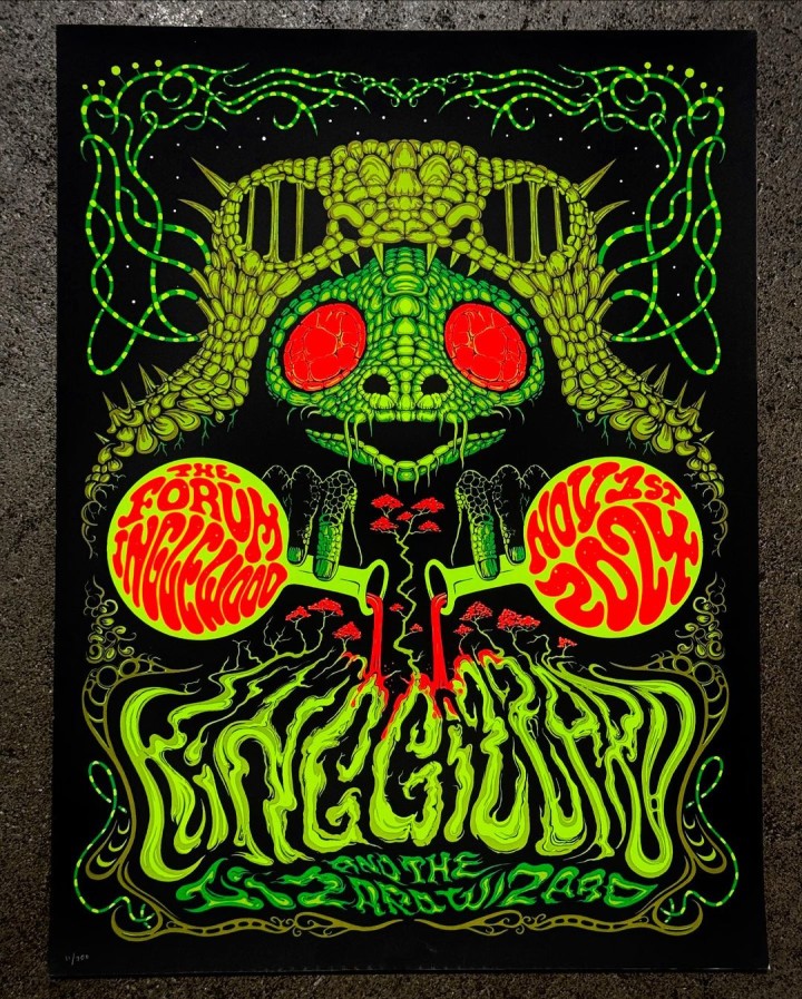
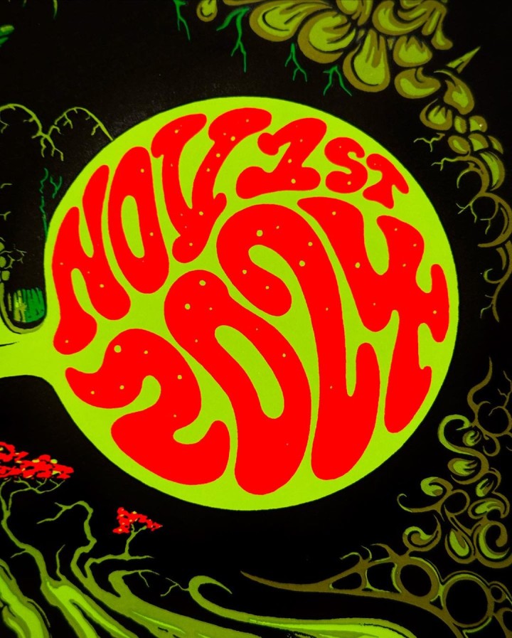
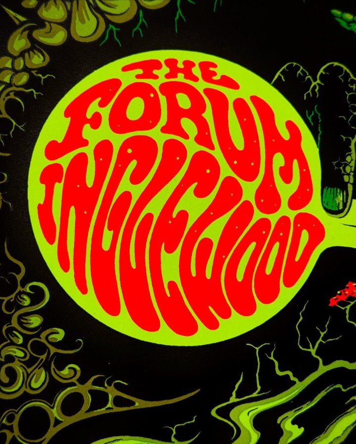
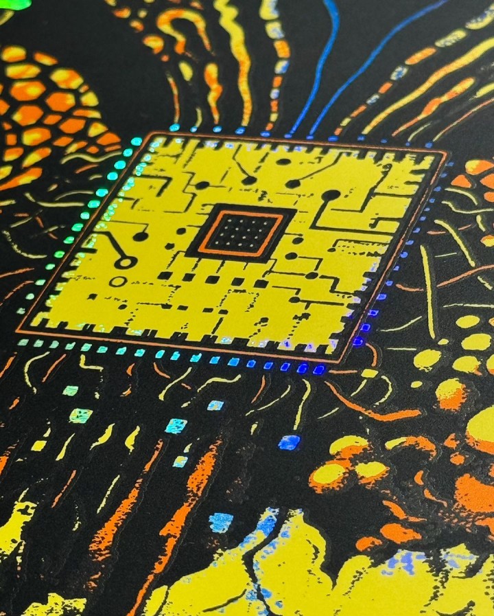
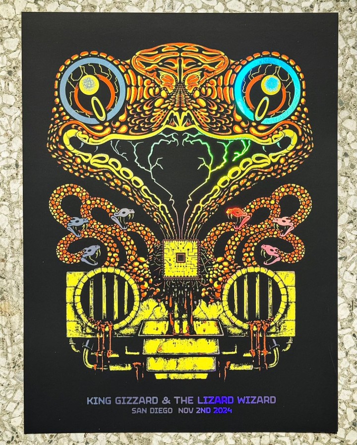
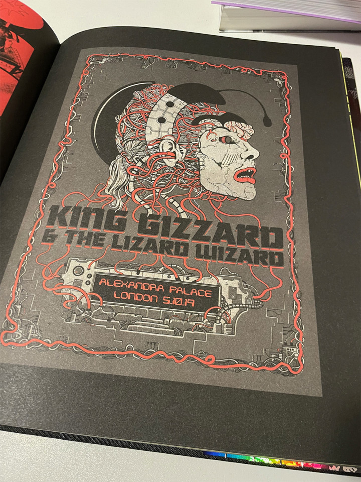
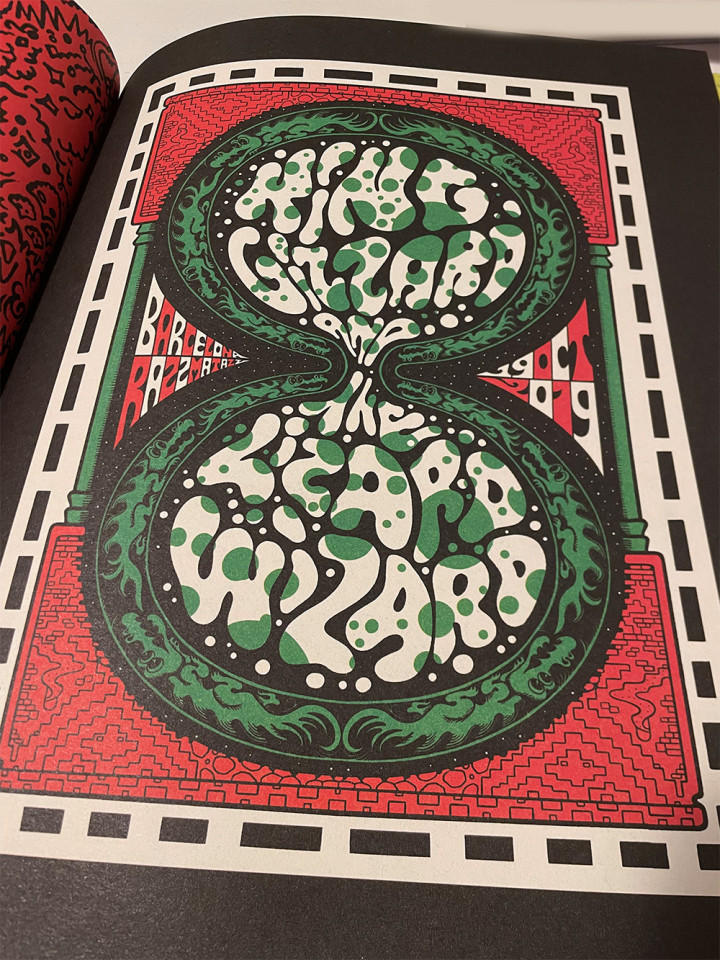
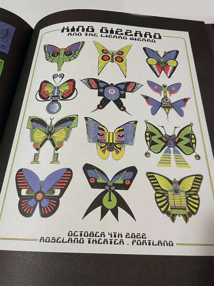
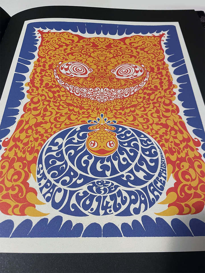
More killer examples of Jason Galea‘s poster work for King Gizzard & The Lizard Wizard who seem to eternally be on tour this year. Through the magic of apps like Procreate we can see one minute timelapses of how these posters were created, films of which Jason posted on his Instagram the day after I started on this entry.
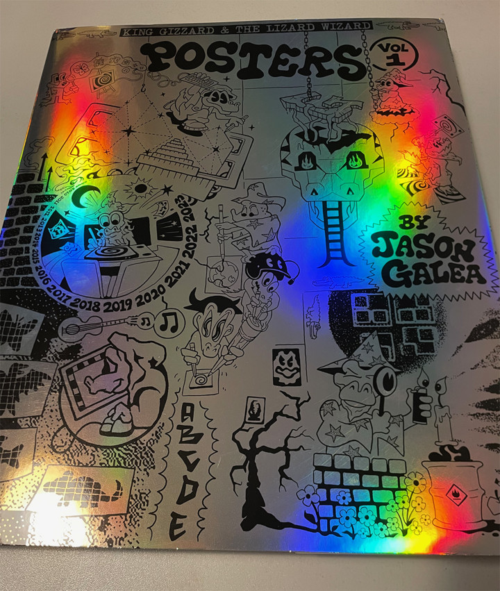
His poster art book just arrived too – ten years of flyer and poster work!
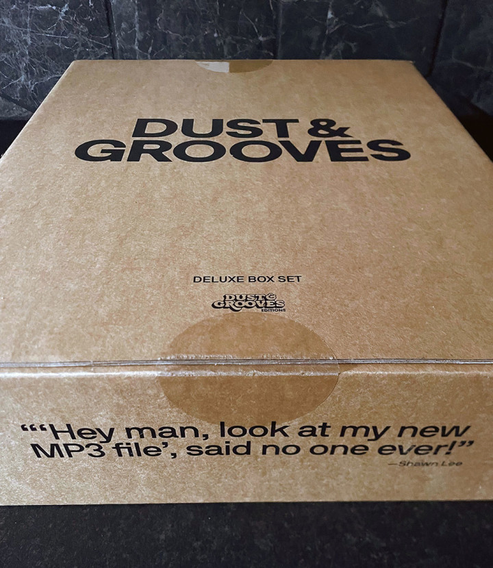
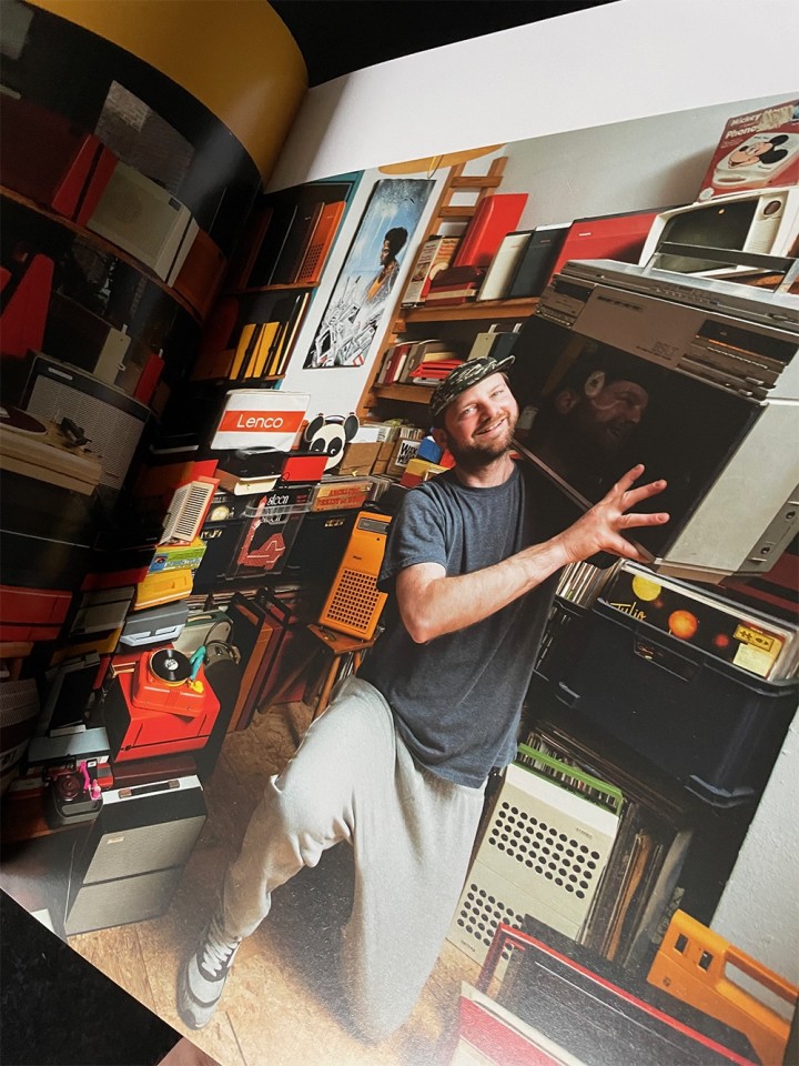
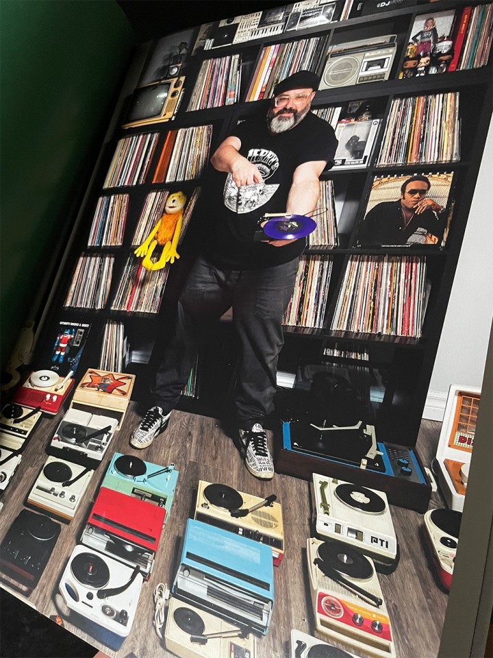
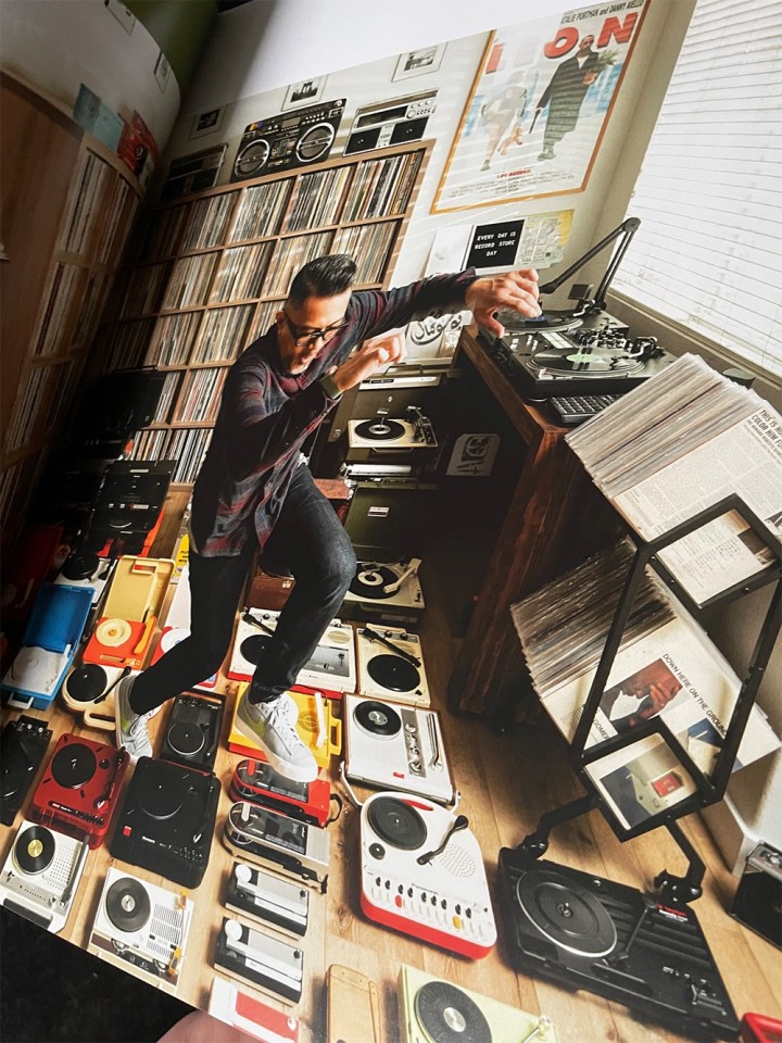
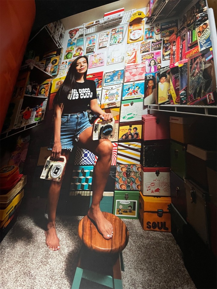
I’ve been waiting for this day for several years – Dust & Grooves delivery day! Having worked with Eilon Paz over the last few years on parts of this I know the blood, sweat and tears that have gone into just a small portion of it but nothing prepared me for seeing the final product last week at the launch night in London.
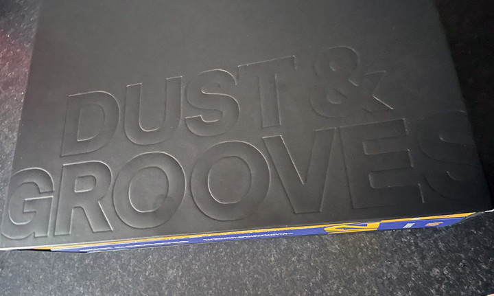
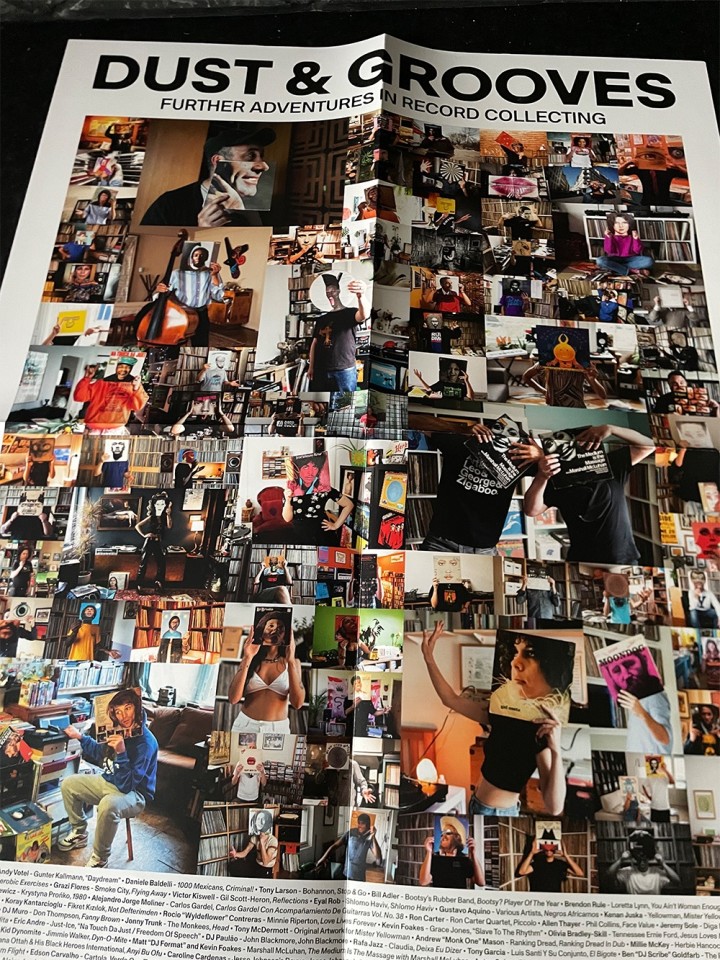
The new book is HUGE, it weighs a ton and looks incredible. The attention to detail throughout is beautiful, with spot varnish and embossing on the slipcase of the deluxe edition plus printed insides and a free poster.
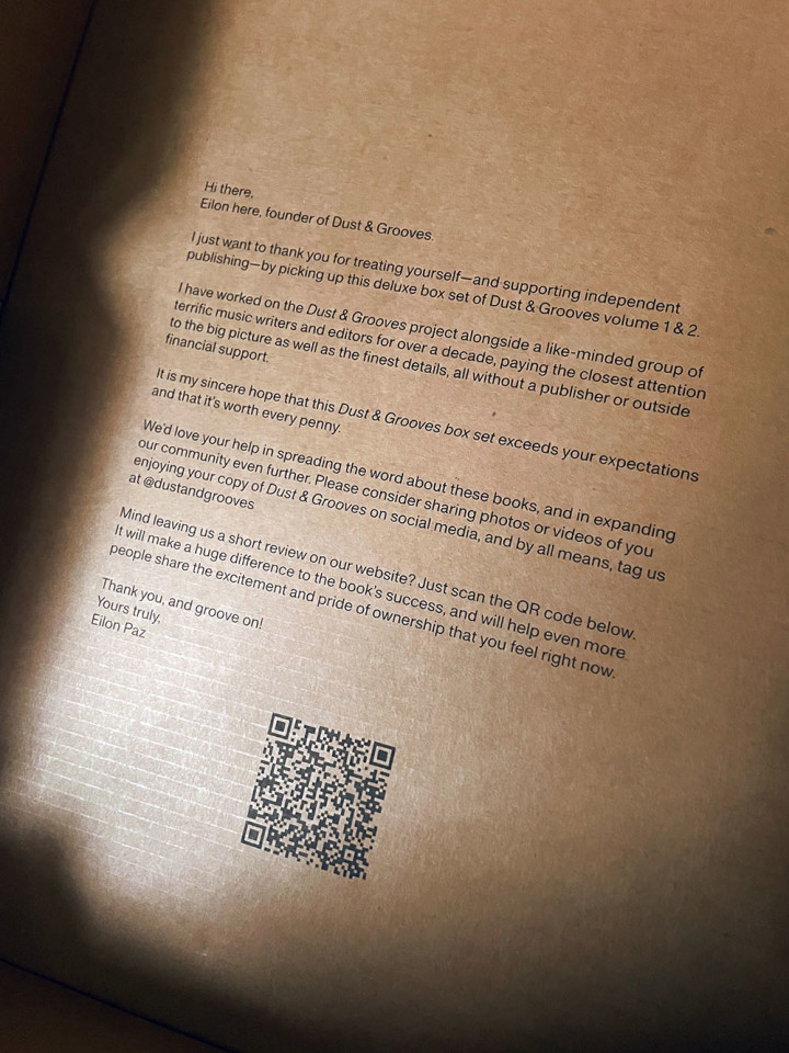
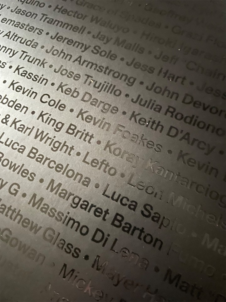
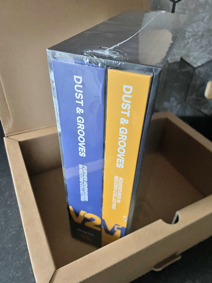
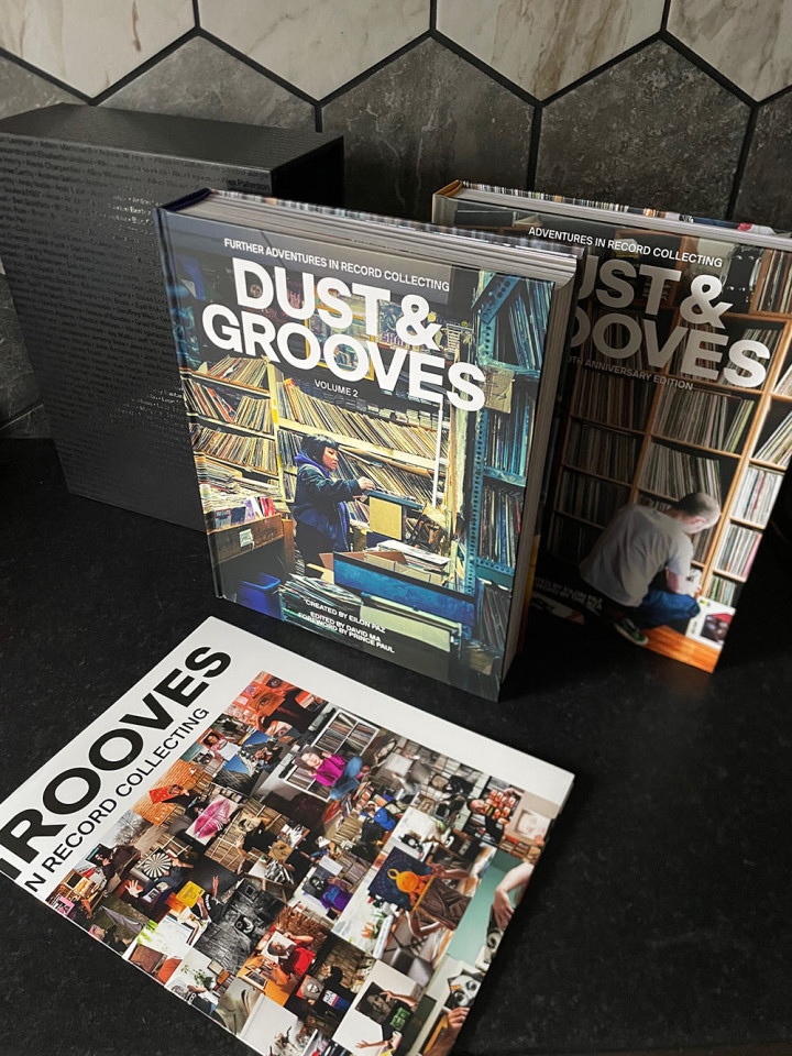
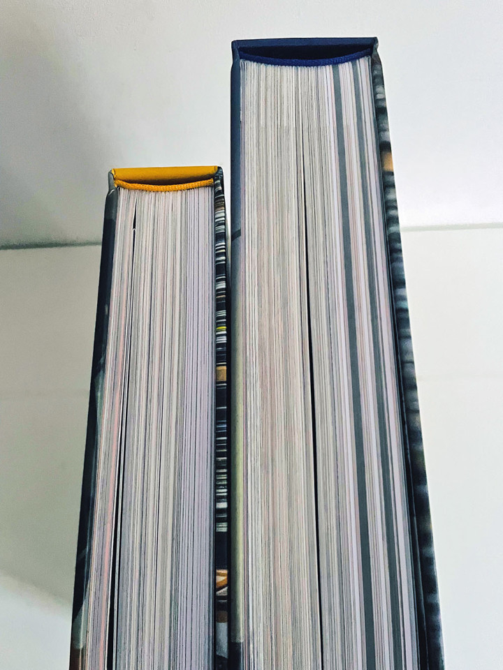
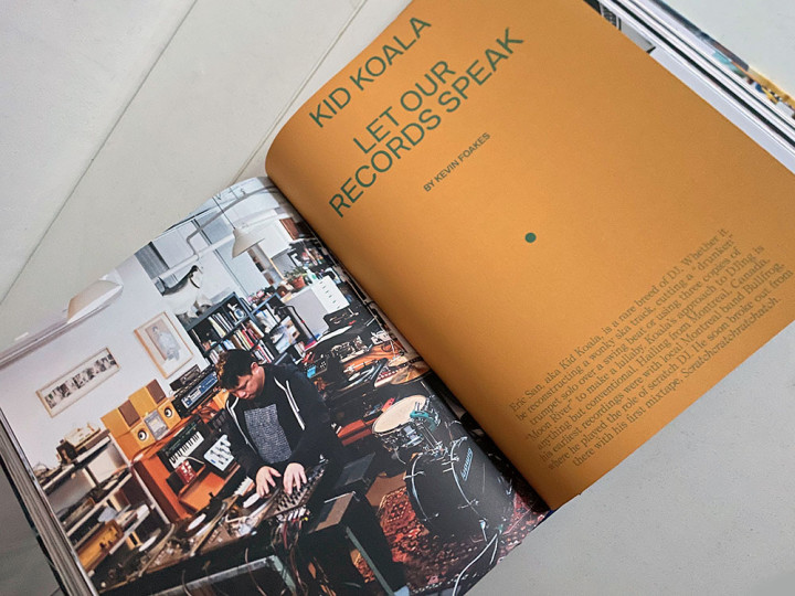
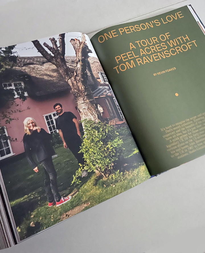
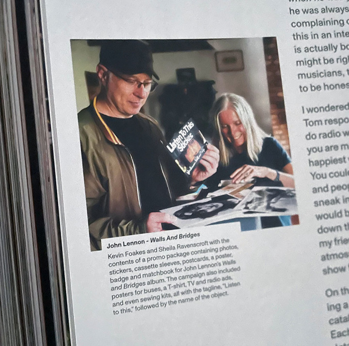
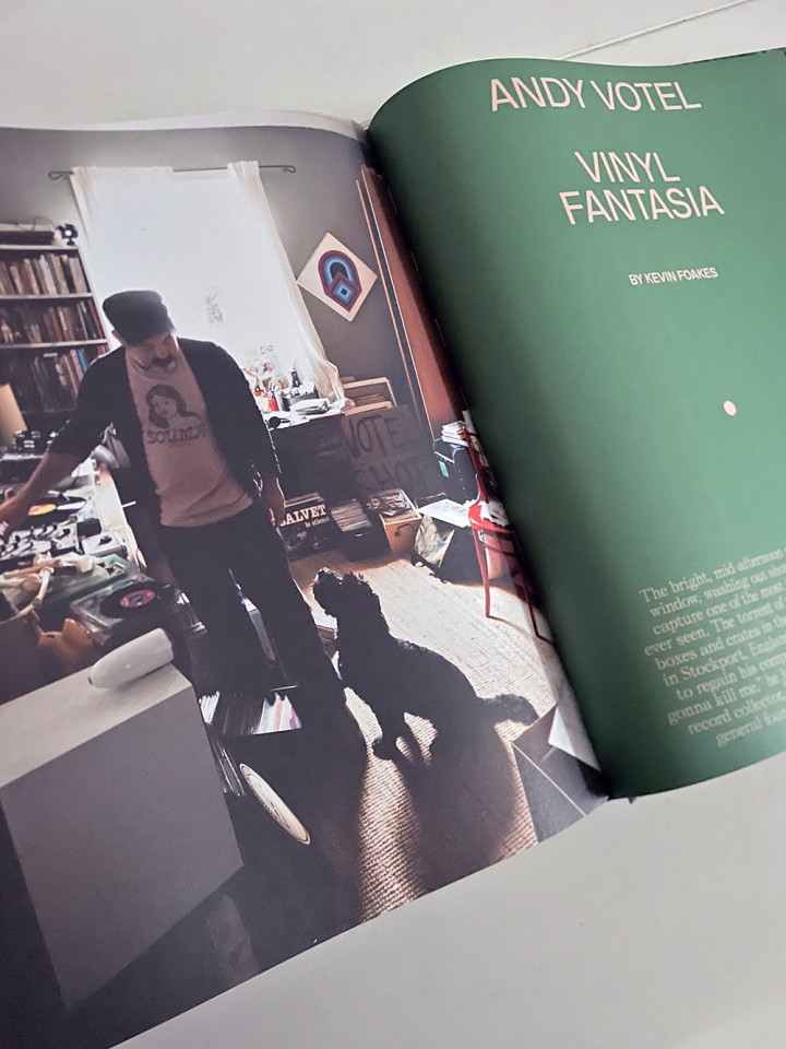
The first volume has been re-covered and fits snugly with the second, make no mistake, this is a huge piece of work and will test the strength of any bookcase. I’m extremely proud to have contributed three extensive features to the back half of the book as well as several for the Dust & Grooves website (the Alex Paterson one is already up there with several yet to come that didn’t fit in the book). Interviews with Kid Koala, Andy Votel and Tom Ravenscroft fill pages alongside Eilon’s incredible photography and make this a must for all serious diggers out there.
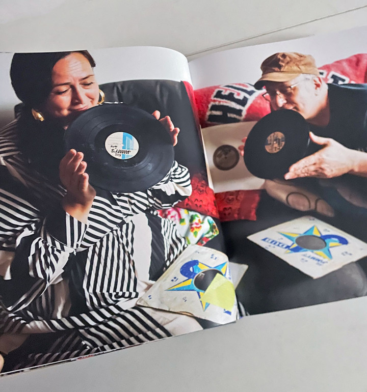
We’ll never own all these records but we can share in the knowledge and stories behind them via this tome. As you could see from the photos of the launch party in London the other week, it bought together collectors from around the UK with nothing but goodwill and shared enthusiasm. Well done to Eilon and all the editors, designers and proofreaders who helped make this happen. Grab your own copy here
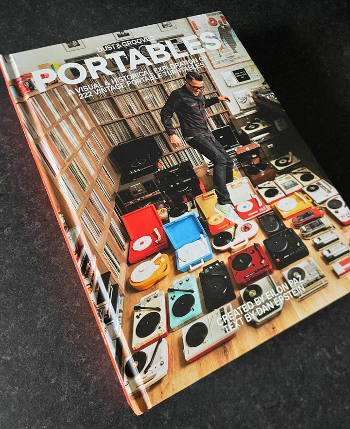
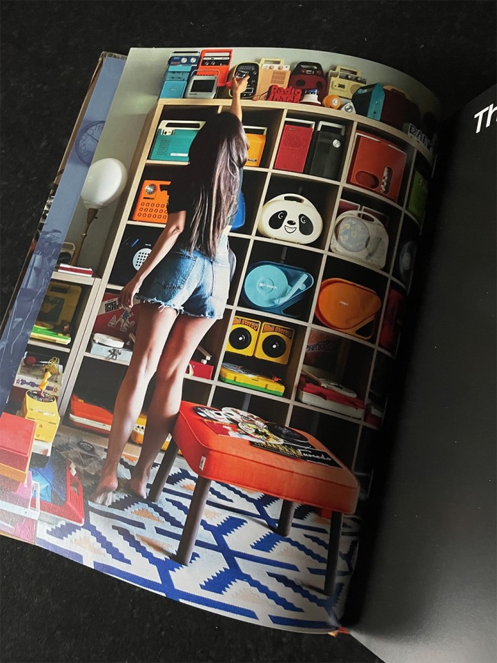
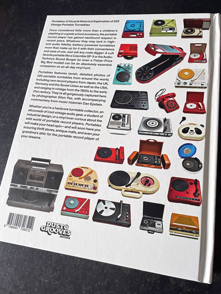
Let’s not the forget the Portables book that Eilon shot alongside the Dust & Grooves volume 2 one! The man’s a machine and this book lovingly catalogues 222 portable turntables – available now, here
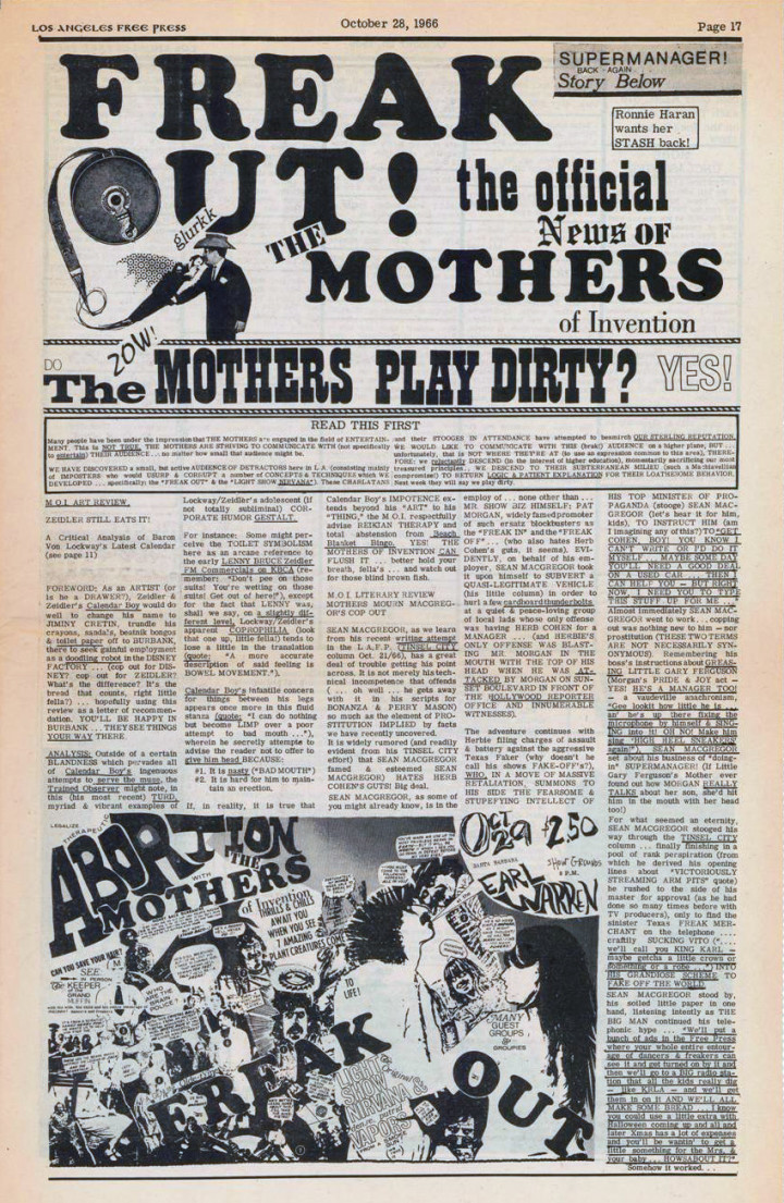
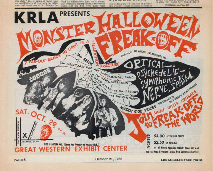
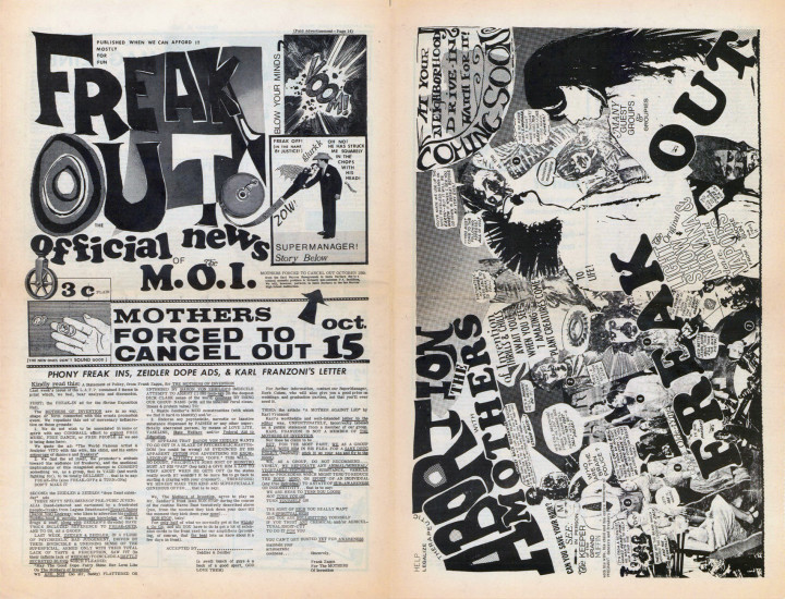
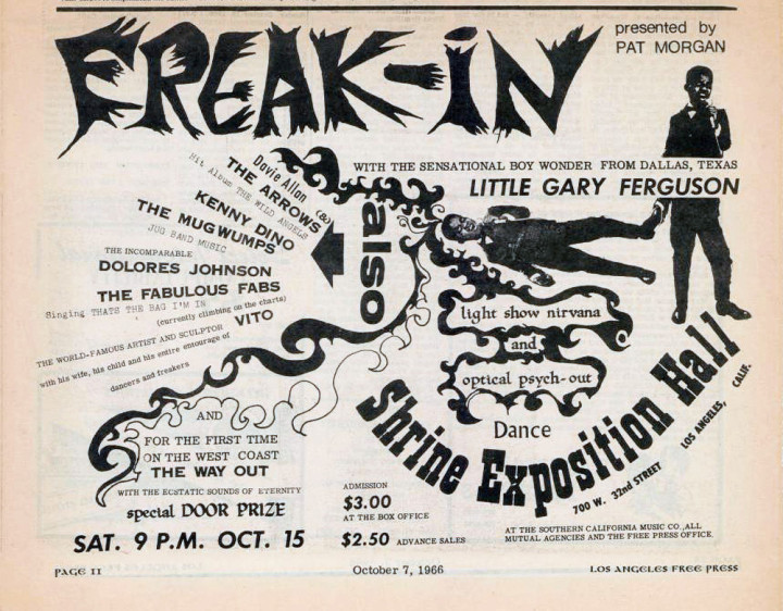
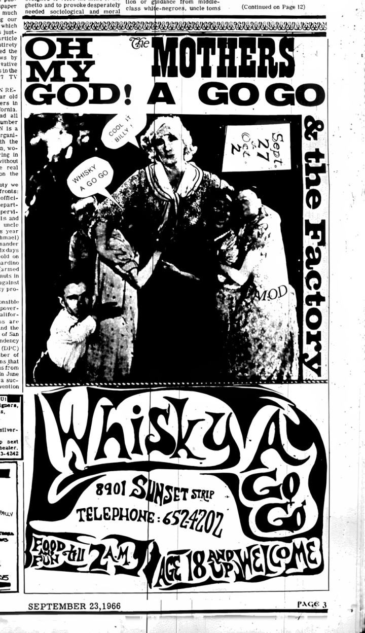
Newly discovered ads featuring Zappa and The Mothers of Invention from the LA Free Press. Some, if not all of these, were designed by Zappa in his spindly lettered, collage style. I’ve featured some of these before but they are generally better quality and some crazy person has gone through all the magazines at the link above, scanning the Zappa/Mothers appearances.
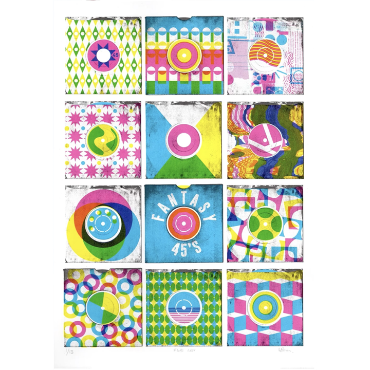
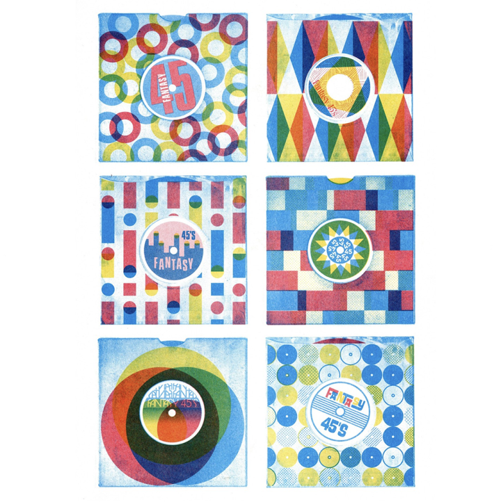
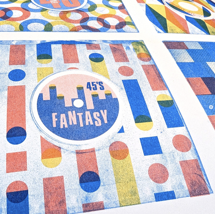
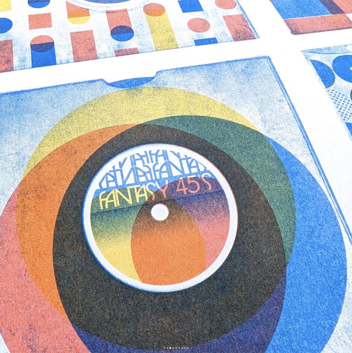
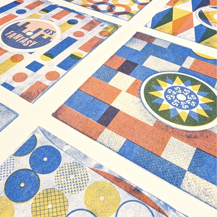
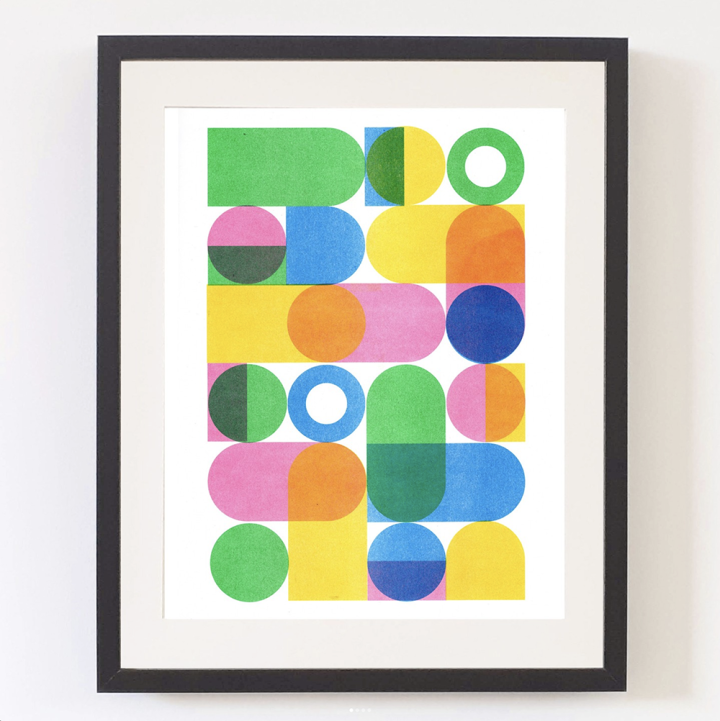
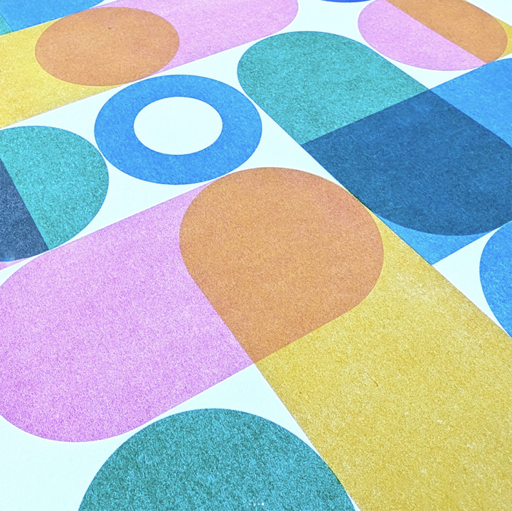
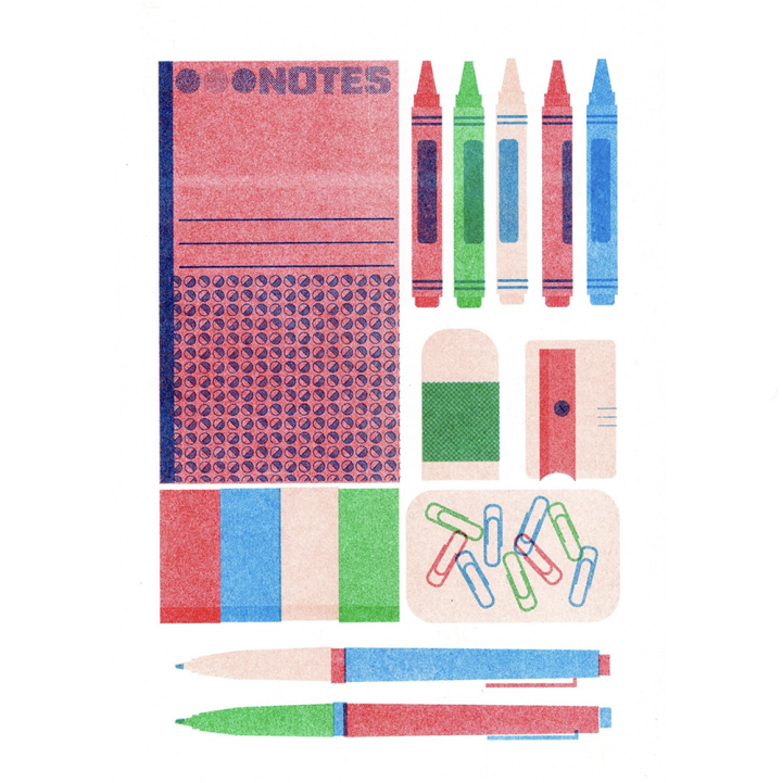
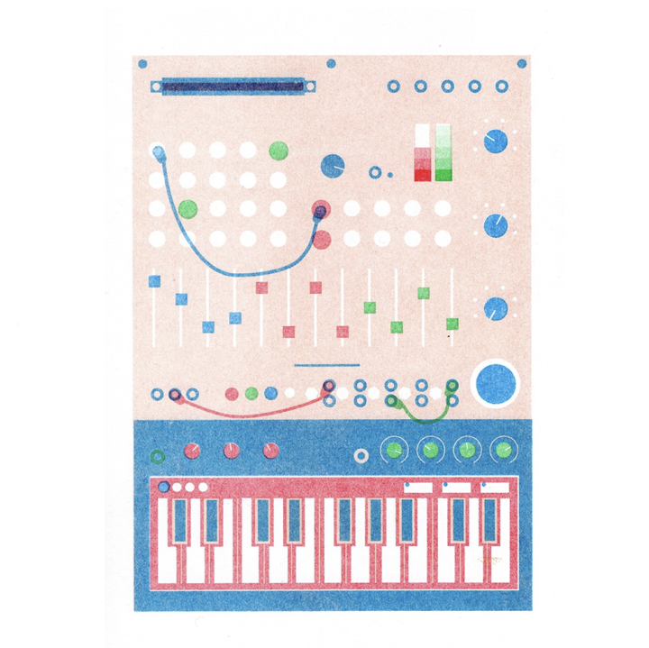
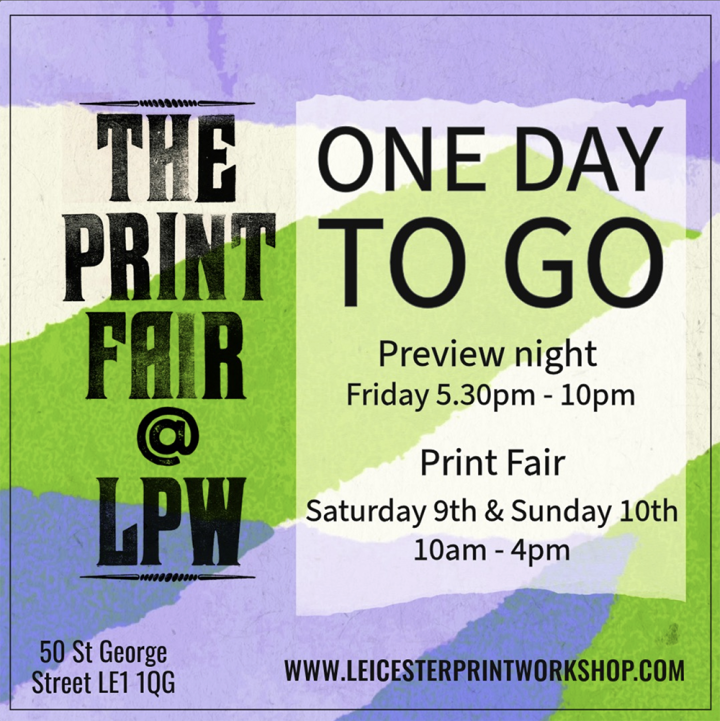
I’ll be at the Leicester Print Workshop this weekend, helping Kvist Studio launch her new Fantasy 45’s screen and riso prints as well as new stationary, Buchla and Galt Toys-inspired risos. These are now online in her shop.
There will be loads of other artists selling and exhibiting with an open evening on Friday to start the weekend. Details on the last image. Come down and say hello!
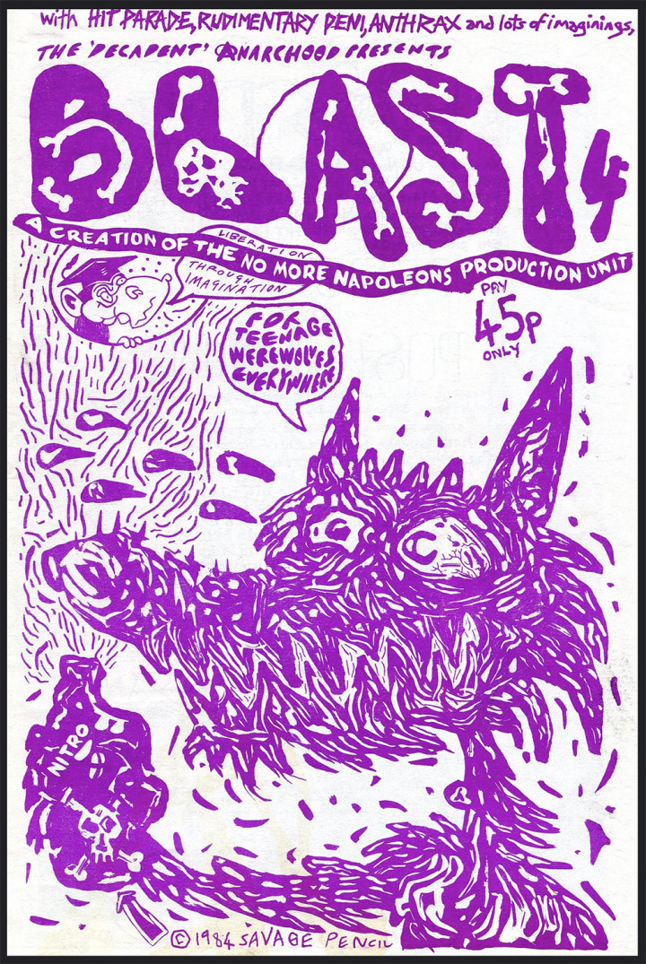
I’ve just finished Matthew Worley‘s excellent Zerox Machine book about UK fanzines from punk into the late 80’s. It’s opened up a hidden world and had me going down several rabbit holes online.
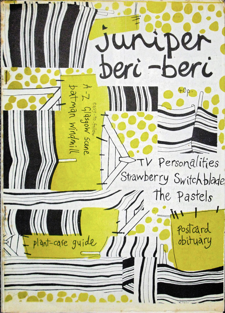
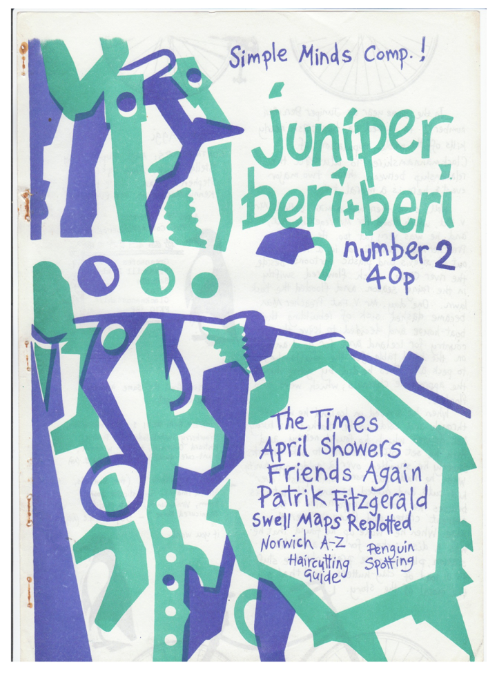
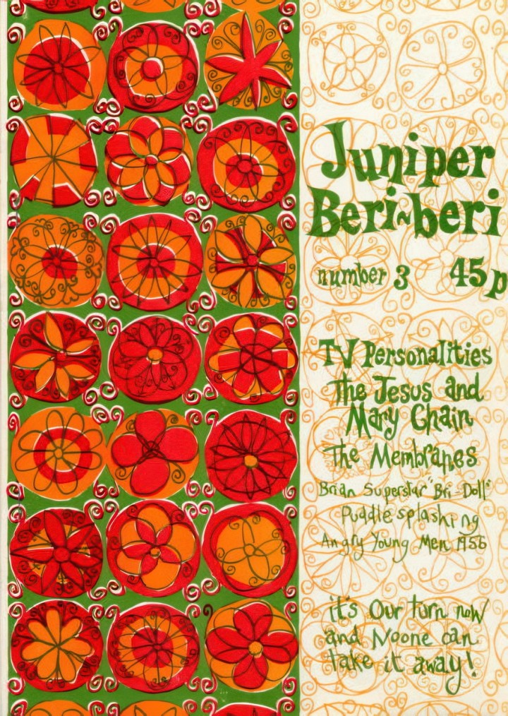
Above – Irish fanzine Blast #4 with a Savage Pencil cover, below the three covers of Juniper Beri Beri, a Scottish fanzine by Annabel, Peter McArthur, Jill Bryson and Stephen from The Pastels.
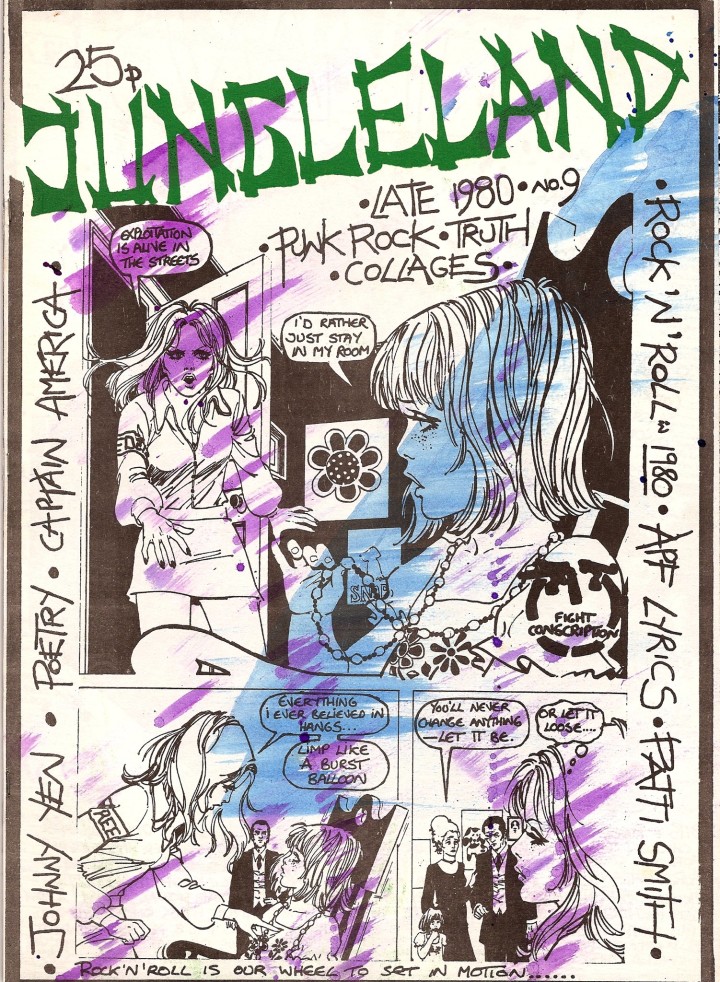
Hand-painted cover of Jungleland #9 – produced by Mike Scott of the Waterboys
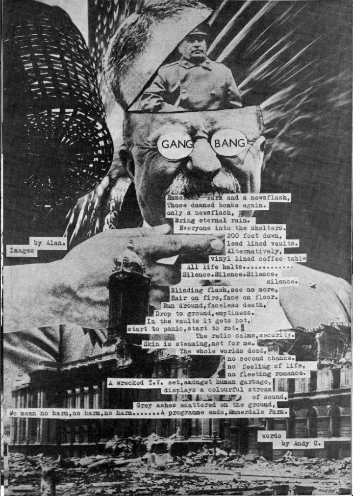
A collage page from Adventures In Reality – issue G by Alan Rider
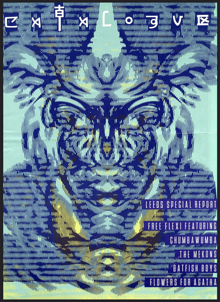
An Ian Wright illustration for 80s magazine The Catalogue
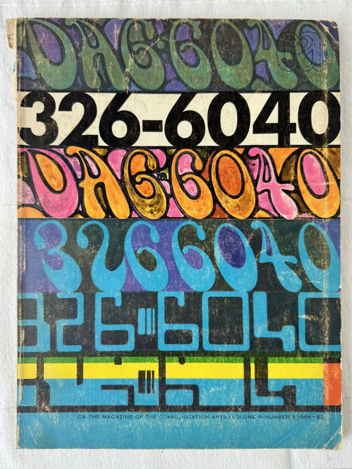
Communication Arts, 1966
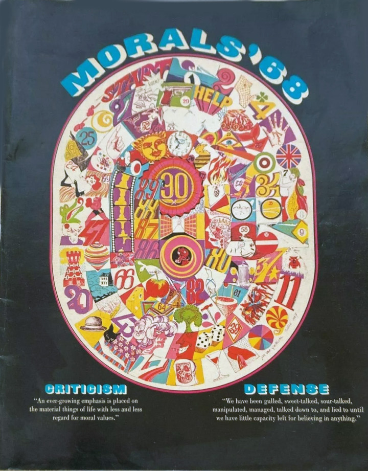
I think this is the back cover of Morals ’68
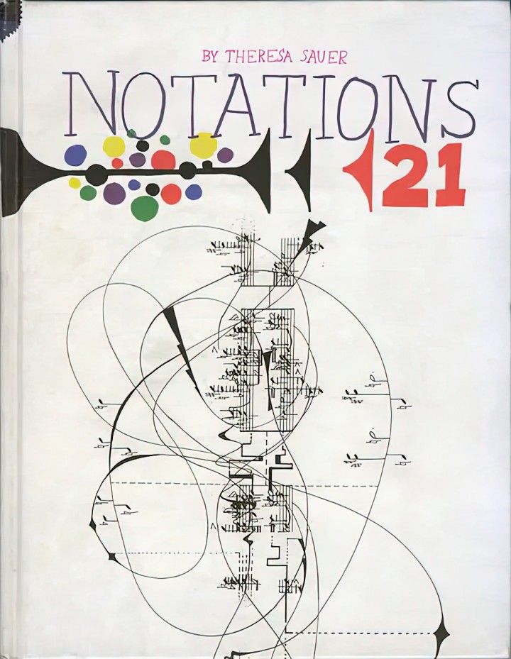
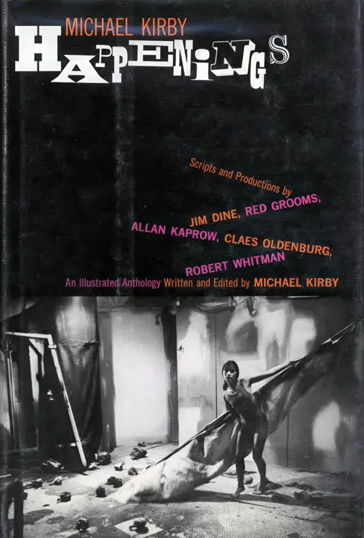
A book of experimental music scores, essays and notations – view it on the Internet Archive
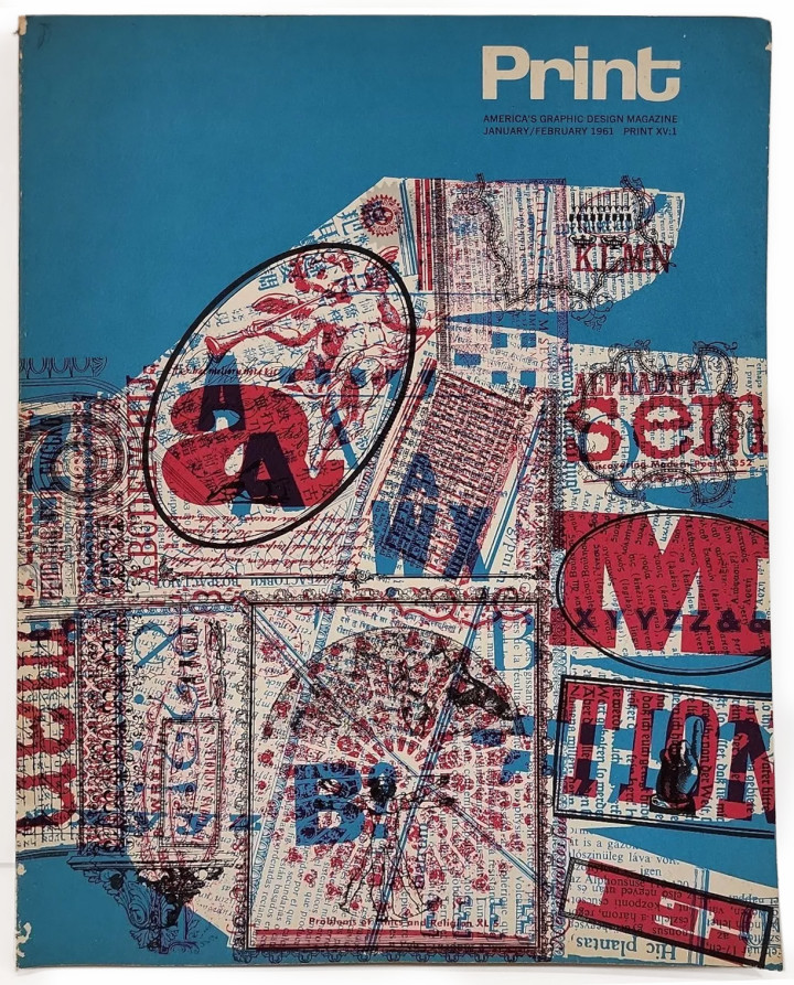
Print magazine, US, 1961
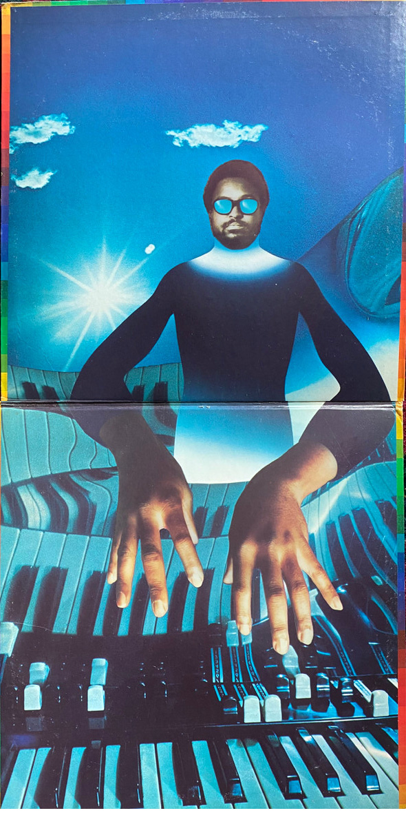
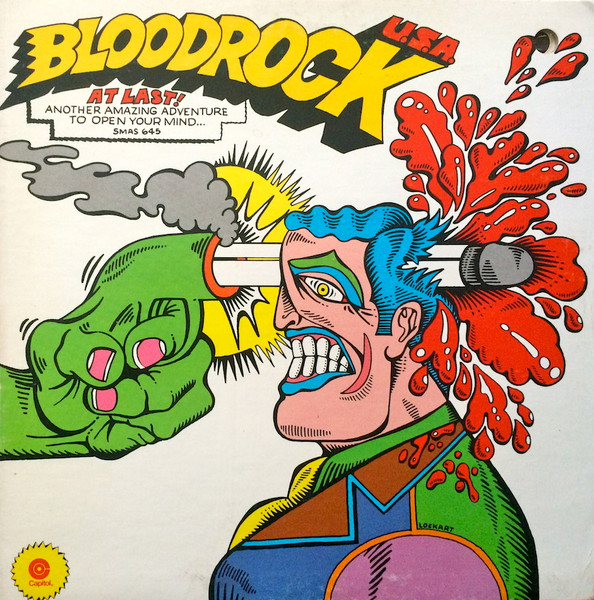
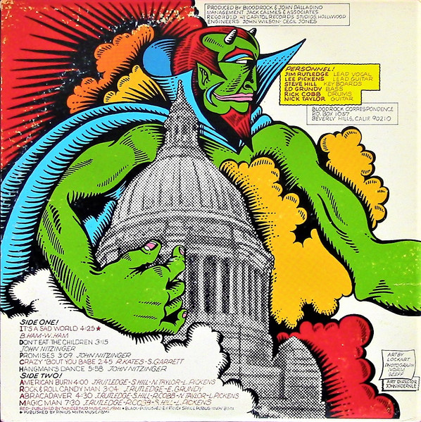
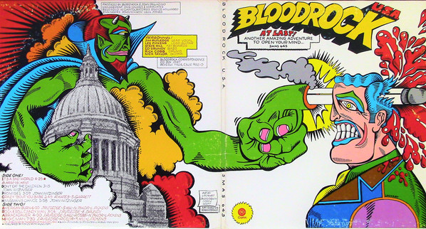
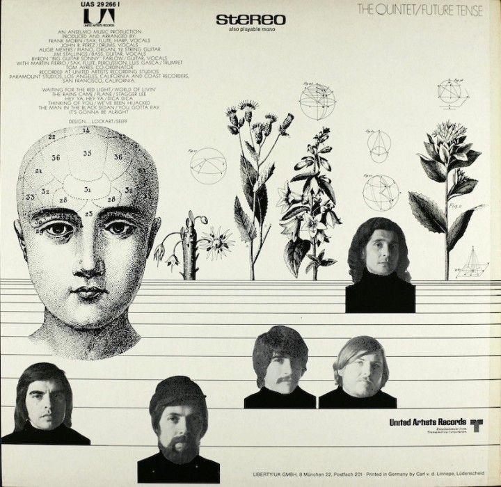
Robert Lockhart has nearly a hundred Discogs entries for his design work and could turn his hand to many different styles. Above is his interior gatefold for Gene Harris of the Three Sounds LP from 1971 which displays a fine grasp of the airbrush as well as collage. Below, his Bloodrock sleeve mixes S. Clay Wilson with Milton Glaser and comes up with something in the middle.
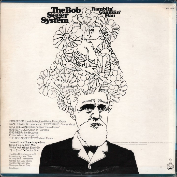
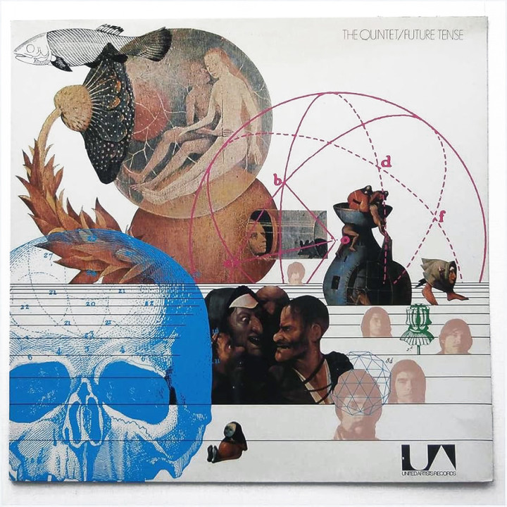
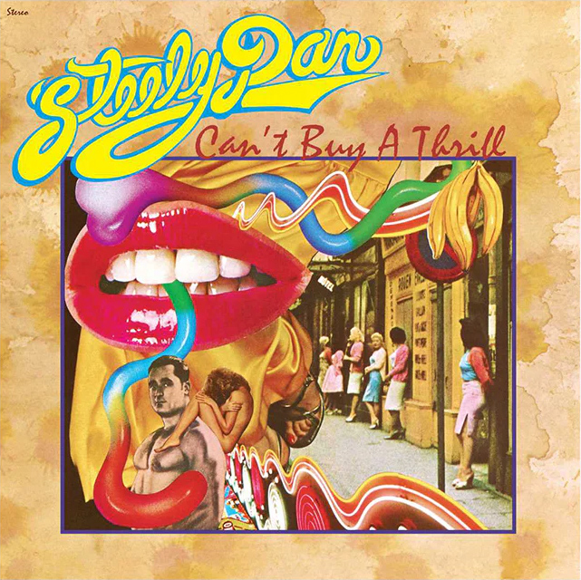
Above’s Bob Seger LP back cover displays more affection for the Milton Glaser style that was so popular back in the early 70s and below Lockhart whips up a fine collage for the front and back of Quintet’s ‘Future Tense’ LP, then channeling Michael English/Richard Hamilton for the cover of Steely Dan’s ‘Can’t Buy A Thrill’.
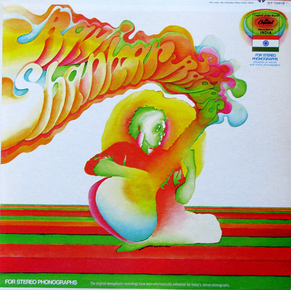
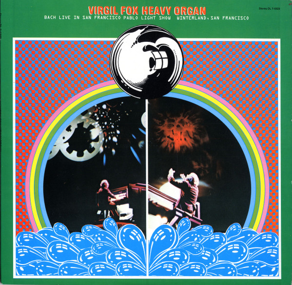
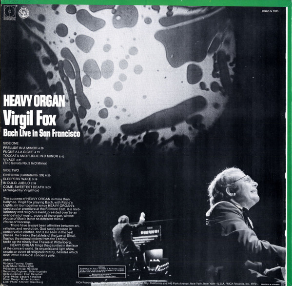
I’ve shown this before; Ravi Shankar goes psychedelic (for the cover at least) and below that an oddity of the Pablo Light Show providing visuals for a ‘Heavy Organ’ recital of Bach in San Francisco with cover illustrations very reminiscent of Victor Moscoso.
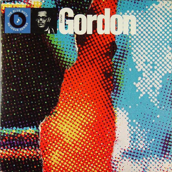
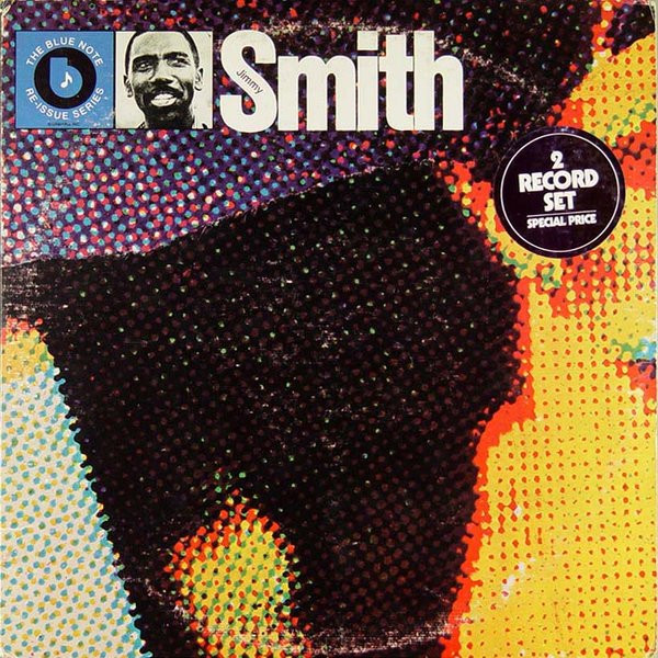
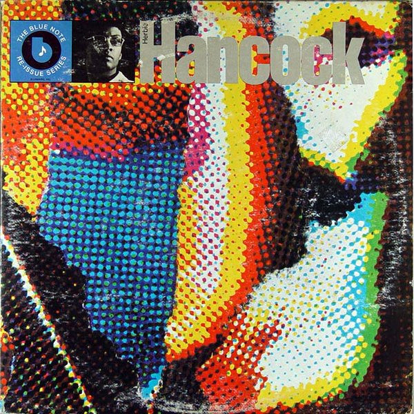
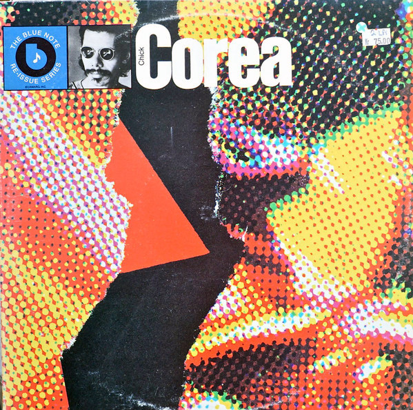
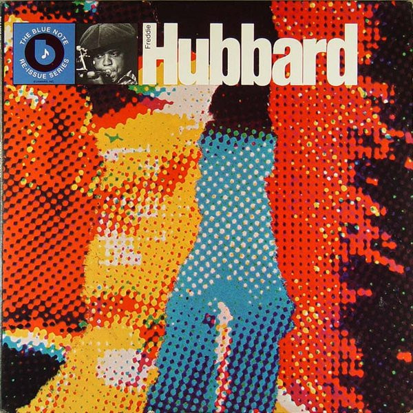
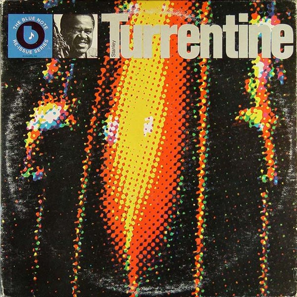
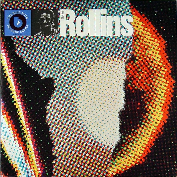
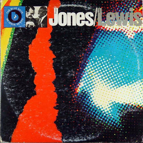
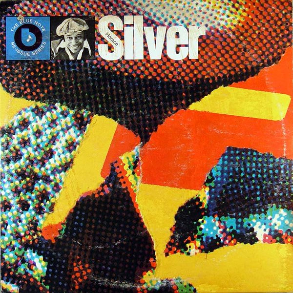
Whilst looking for Gene Harris records I came upon this series of Blue Note sleeves by designer, Bob Cato. I’d seen a few of these over the years but didn’t realise how many of them there were. Cato was an art director, designer, painter and photographer for many major US labels who designed over 550 sleeves, with many of them becoming classics. These torn collage close-ups of halftone prints are more punk than jazz but originated in the mid seventies, the oversaturated colours bring to mind Pop Art rather than the classic Reid Miles era of the label.
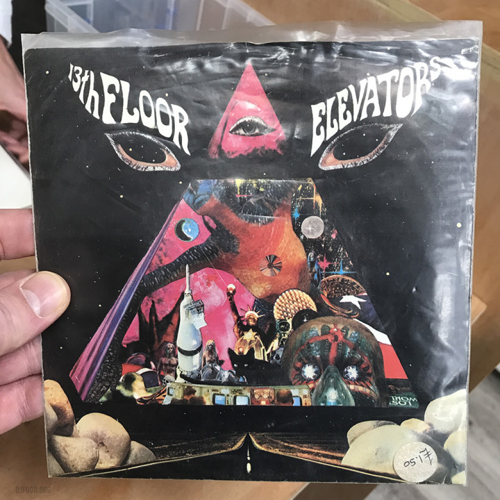
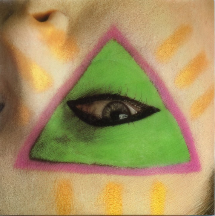
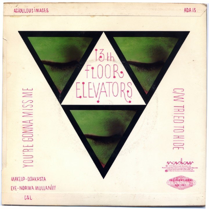
I was in TenPinRecords in Purley the other day and the owner, Lisa, had this beautiful 13th Floor Elevators 7″ on the counter which I had to take a photo of. It’s a bootleg from 1978 of ‘You Really Got Me’ and don’t all jump at once, that £1.50 price sticker was the original, it’s nearer £50 these days. In a bid to find out more about it, including the cover artist (Michael Beal) I went down the Discogs rabbit hole and found a few more nice 13th Floor sleeve designs, not least this great 7″ picture sleeve for ‘You’re Gonna Miss Me’ (front and back shown below).
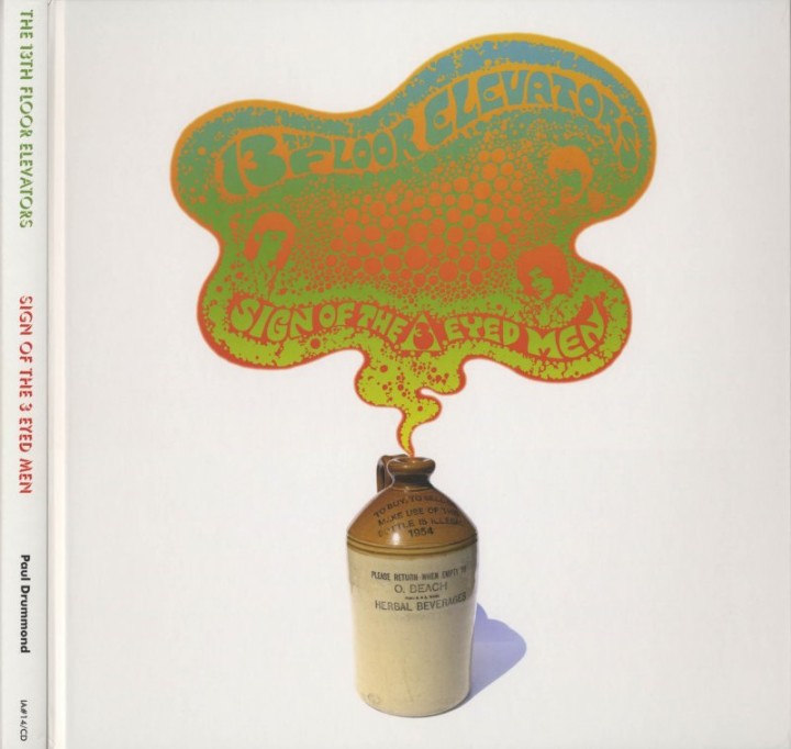
On the reissue front there’s this book cover from the Sign of the 3 Eyed Men compilation, not sure the designer here
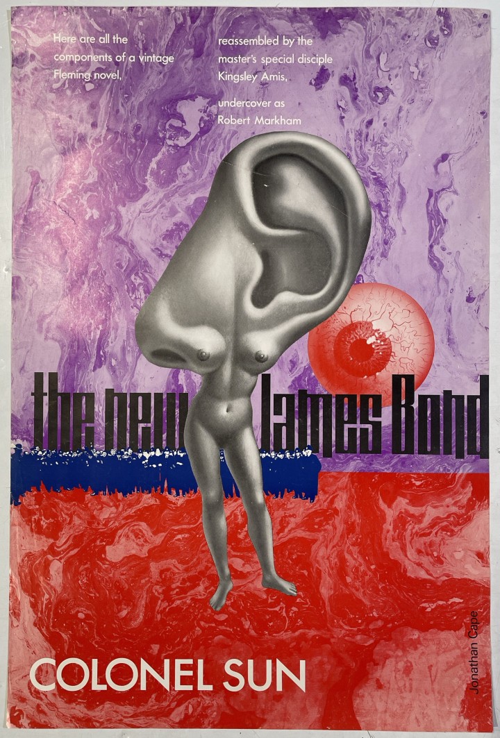
1968 poster for the Robert Markham aka Kingsley Amis’ novel ‘Colonel Sun’
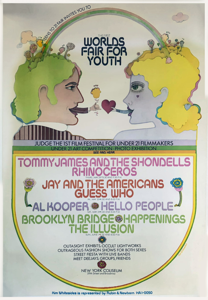
Worlds Fair for Youth poster, 1969, art by Kim Whitesides
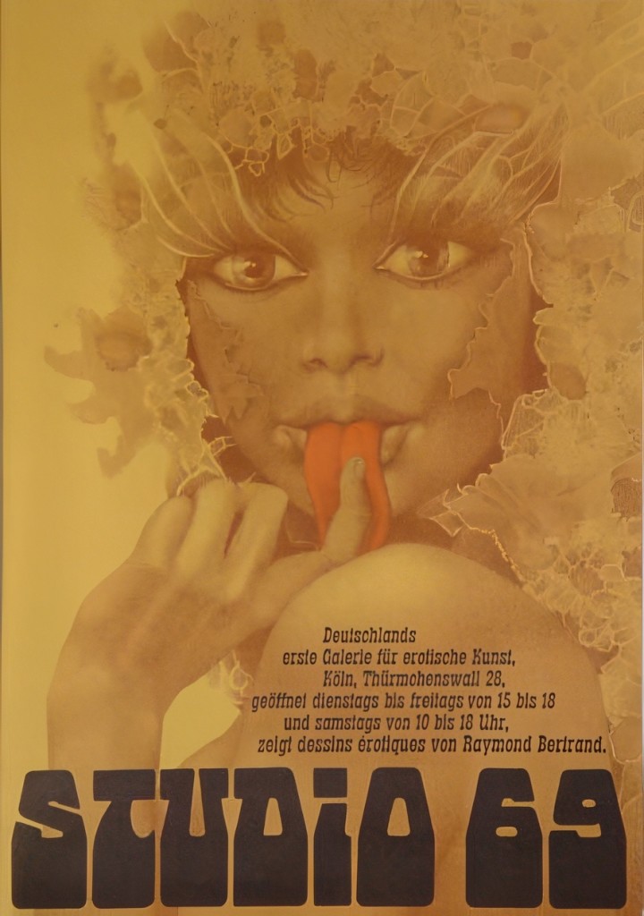
Poster for Raymond Bertrand‘s Studio 69 book – image also used on the cover of Suck magazine issue #1.
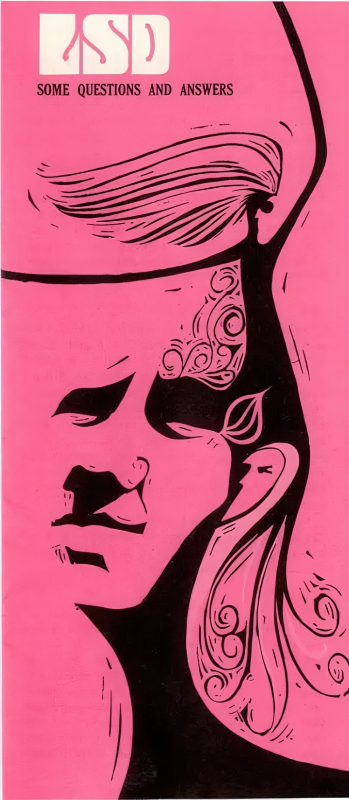
LSD poster, 1969, artist unknown – originally from Acid covers
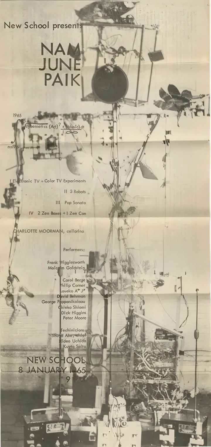
Nam June Paik exhibition poster, 1965
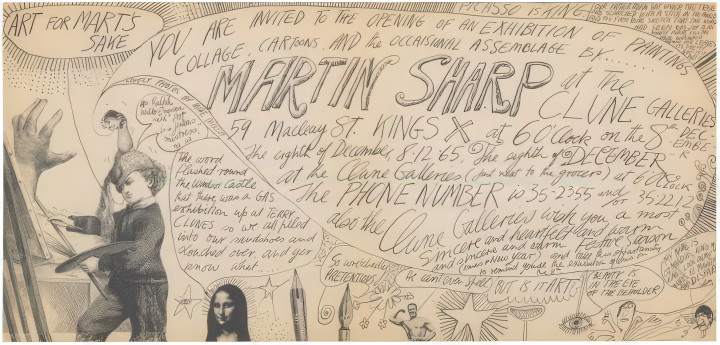
Martin Sharp – Art For Mart’s Sake gallery show invite, 1966 (upscaled)
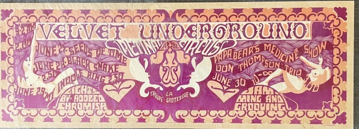
The Velvet Underground at the Retinal Circus poster, 1968.
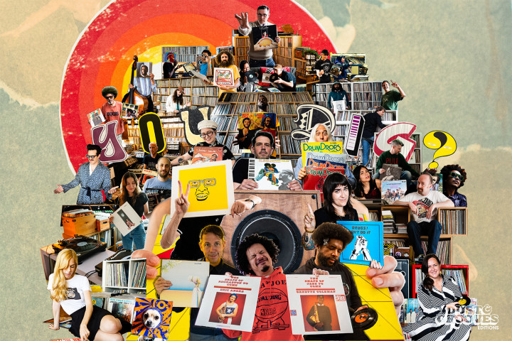
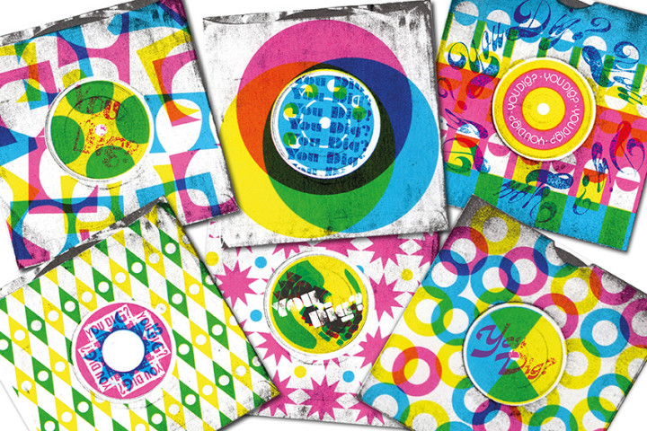
WIth Dust and Grooves ramping up the pressure over the next 5 weeks when Vol.2 and the Portables books are released, today sees the launch of their online newsletter You Dig? A guest-curated monthly round up of all things vinyl associated with the people connected with the book (and believe me, there are a LOT in the new volume) It sports a cover collage by Morgan Jesse Lappin of Brooklyn Collage Collective (spot my cameo) and curation by Rich Headland of Record Shop Stories fame. You can read the first issue and subscribe here and pre-order both new books plus a refreshed vol.1 if you missed it a decade ago here.
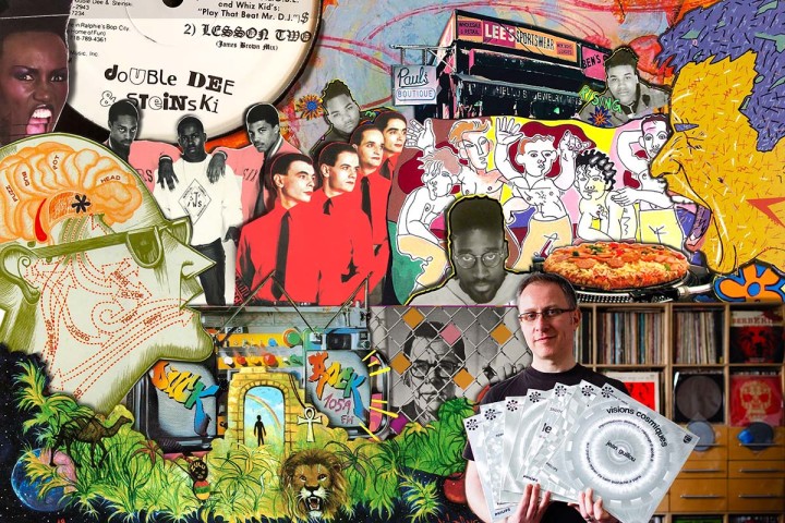
Continuing the D&G love, I was the subject of their From Me To You feature recently where they looked by over my original interview on the site a decade ago and cherry-picked some vinyl highlights. You can read it here, with cover collage again from Morgan Jesse Lappin and if you want the full deep dive interview (probably the best one done yet) including an exclusive influences mix then you can read that here.
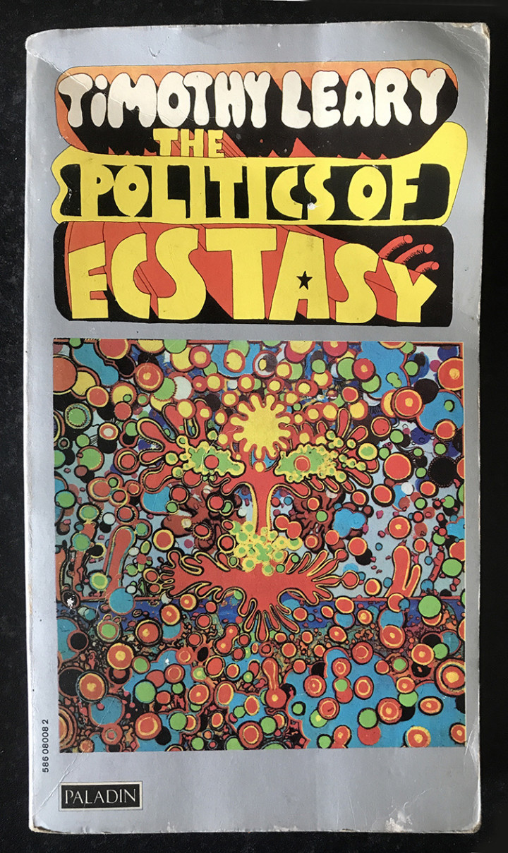
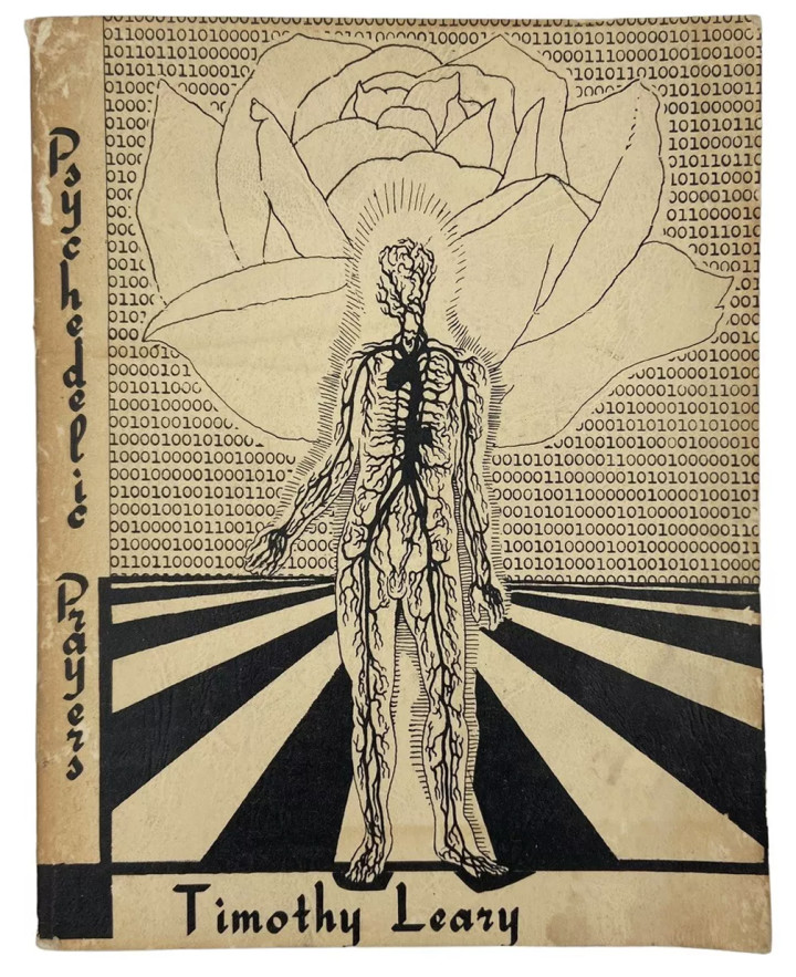
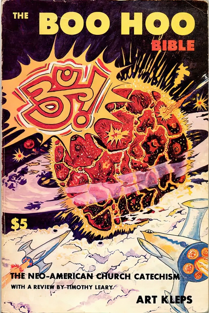
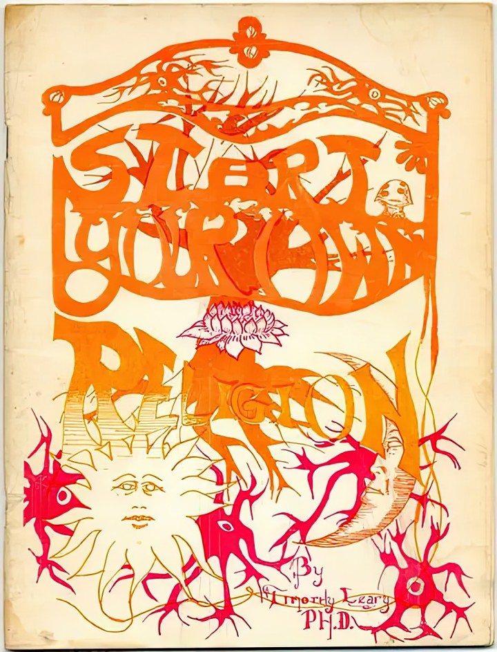
I found a copy of this at the local carboot at the weekend (with Martin Sharp cover illustration) and had been collecting up other psychedelic book covers around the web, coincidentally most with a Tim Leary connection.
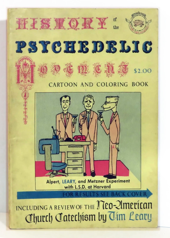
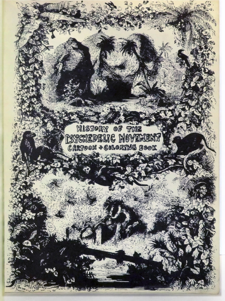
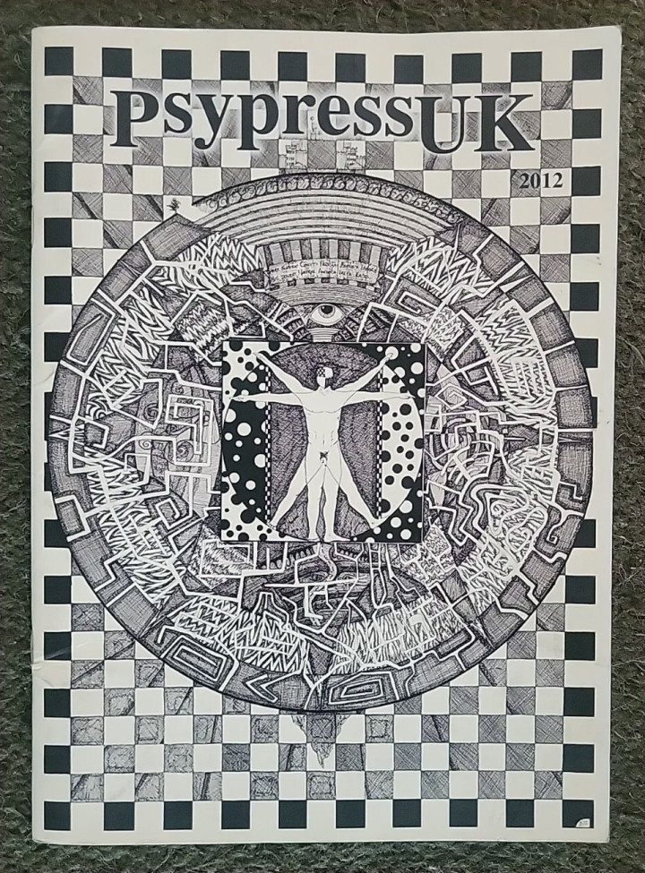
I’ll chuck in this one as it’s in the style of too although not from the 60s or 70s.
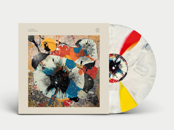
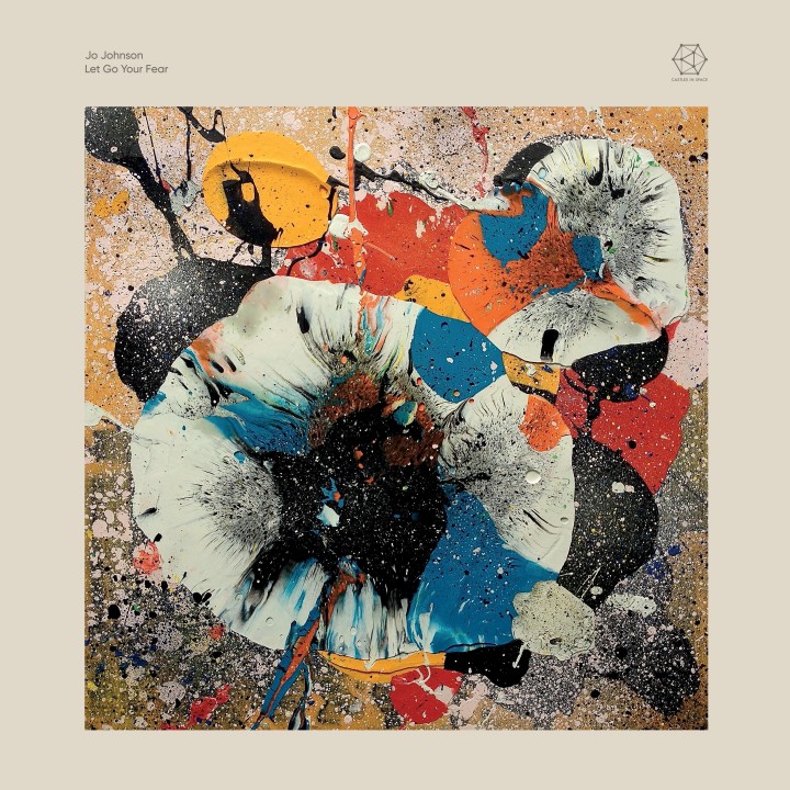
Just announced by Castles In Space – Jo Johnson – Let Go Your Fear – a beautiful album of mesmerising minimalist modular in an equally striking sleeve. When paired with the vinyl it just ticks all the boxes for me. I know some people have a problem with coloured/splatter/whatever vinyl but when the disc fits the artwork it creates a unison unlike any other, something we always try to do with the releases I work on for De:tuned, especially as the process is always random for each disc.
Jo was part of 90s band Huggy Bear and has been ploughing the electronic minimalism furrow for the last decade. During the long, 20 minute final track ‘Unfolding and folding’ there are points where the music seems to stumble, different tangents are tried in real time and the flow is temporarily lost. This is something you rarely hear on studio albums, these ‘mistakes’ would be edited out but Jo states that she wanted to ‘drop the perfection’ and left them in. It’s released August 9th and there’s loads of music to discover on her Bandcamp page if you enjoy this.
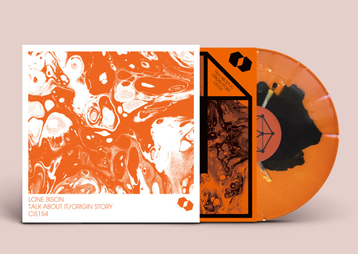
Another great example is the recently released Nick Taylor-designed Lone Bison 12″.
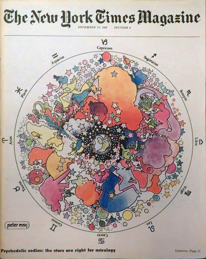
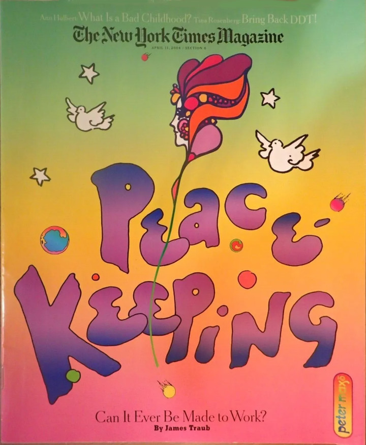
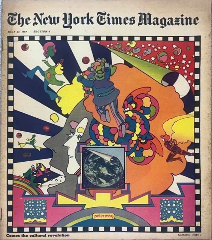
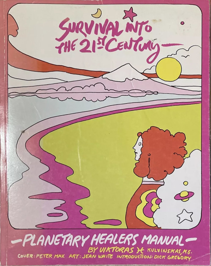
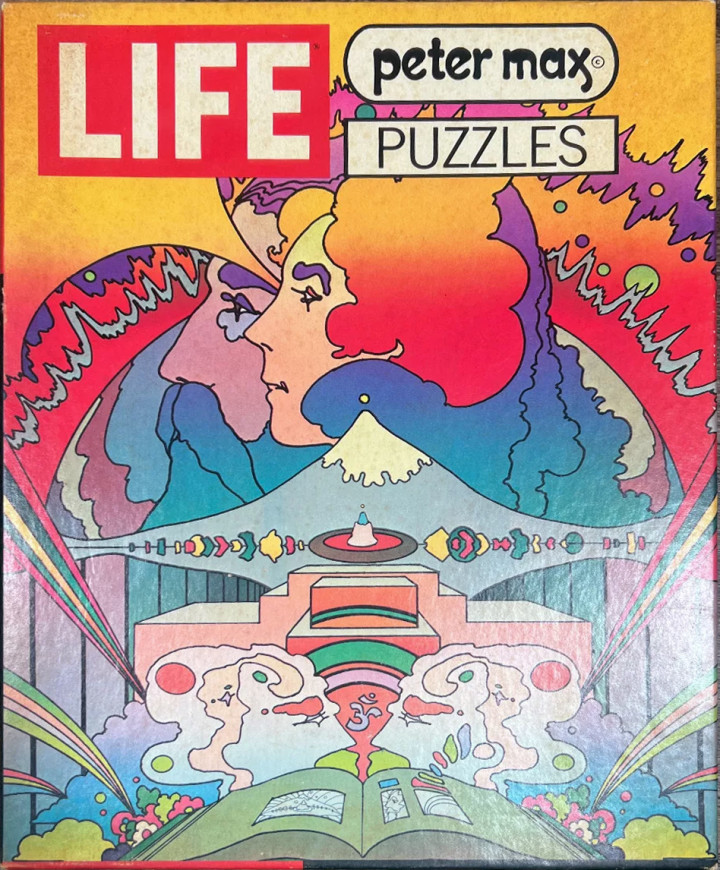
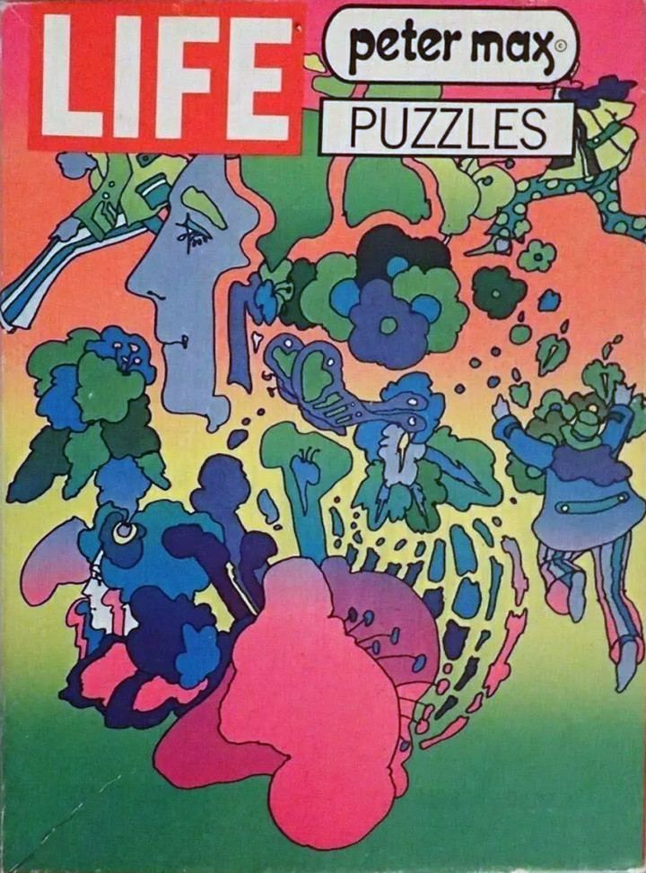
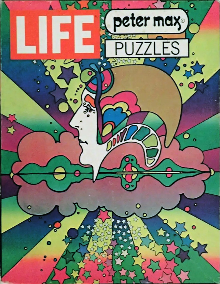
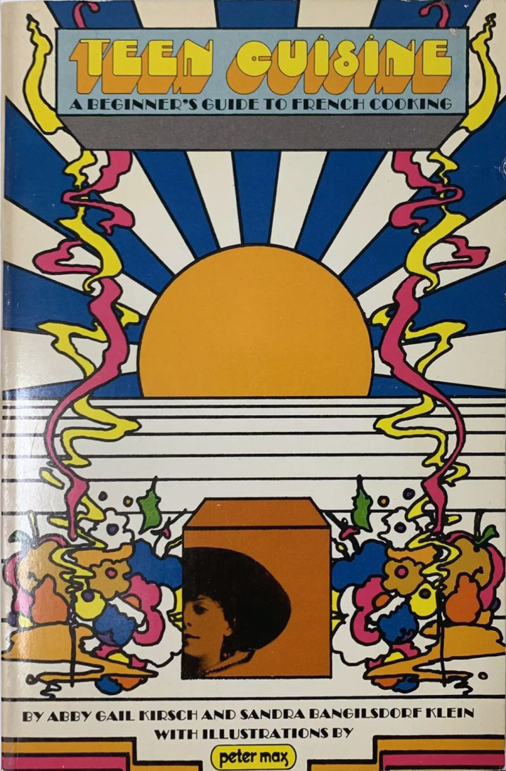
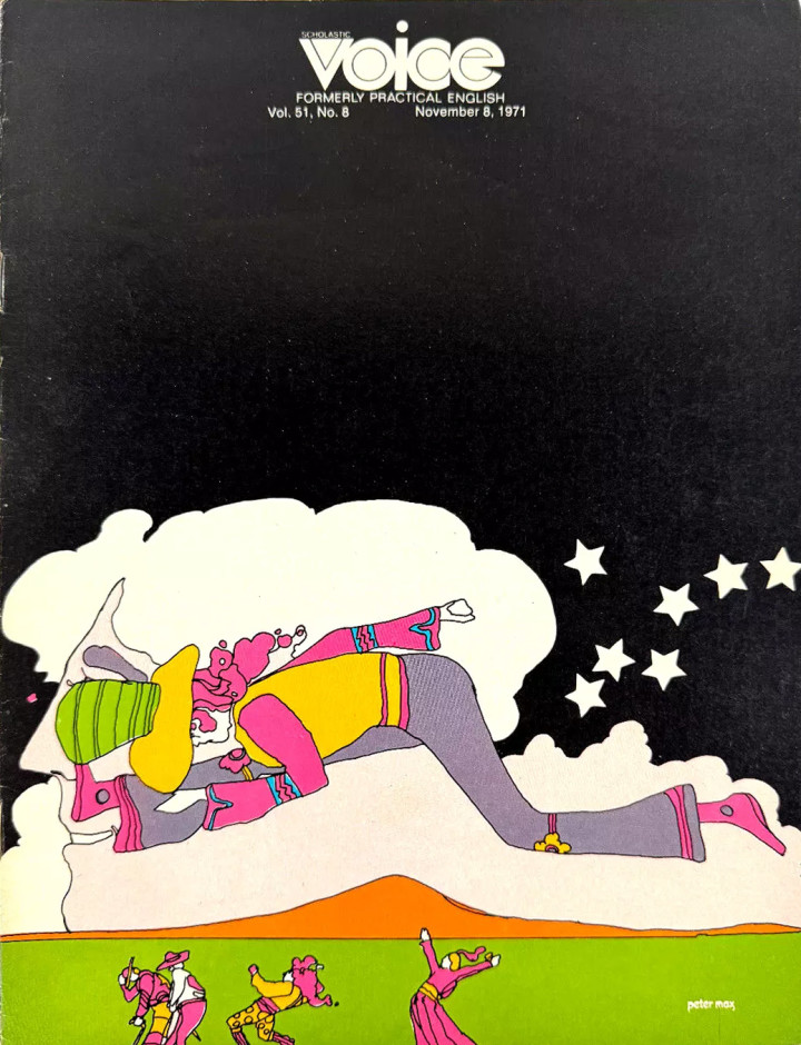
It’s fair to say that Peter Max put his mark all over popular commerce and culture in the 70s. One of the few commercial artists to fully embrace merchandising and recognise that he had a valueable brand, he was arguably better at it than Warhol and had ranges of stationary, puzzles, book, posters and clothing for sale all with his name emblazoned on them at one point. Here’s a selection of stuff I dug up on the web including magazine covers, cookery books, puzzles and a poster for Mary Quant.
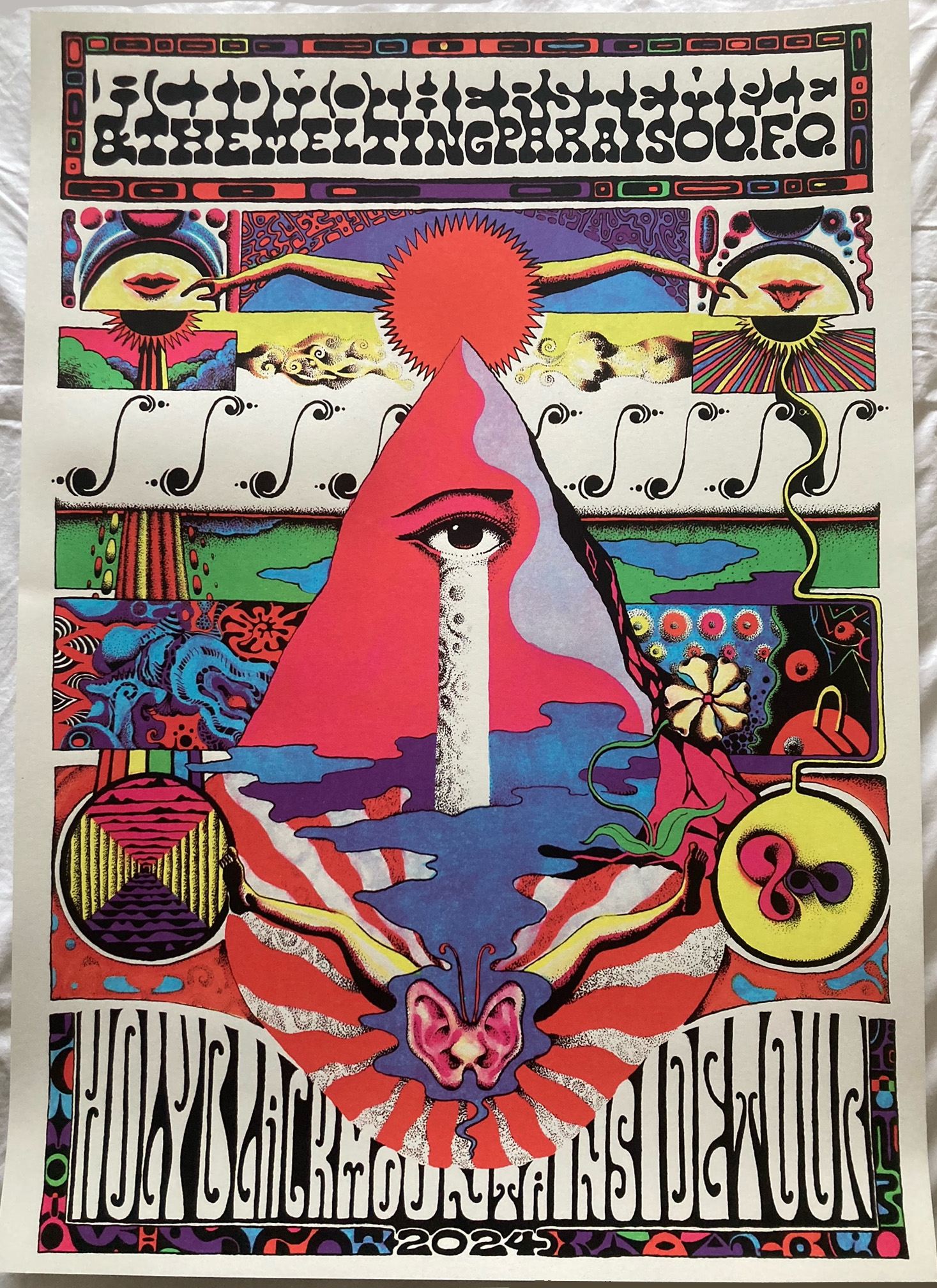
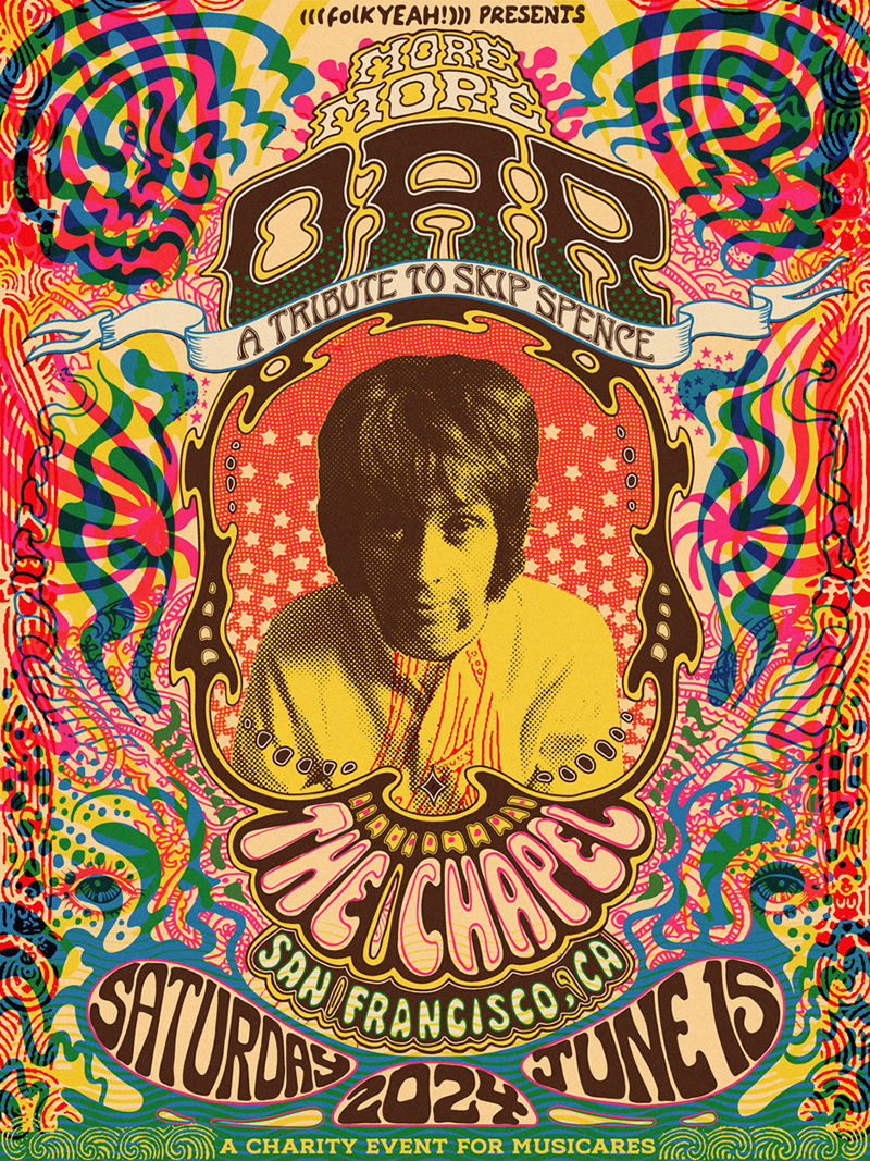
(above) Acid Mothers Temple poster for their Holy Black Mountains Detour tour (below) A tribute to Skip Spence poster by Fez Moreno both courtesy of Neil Rice.
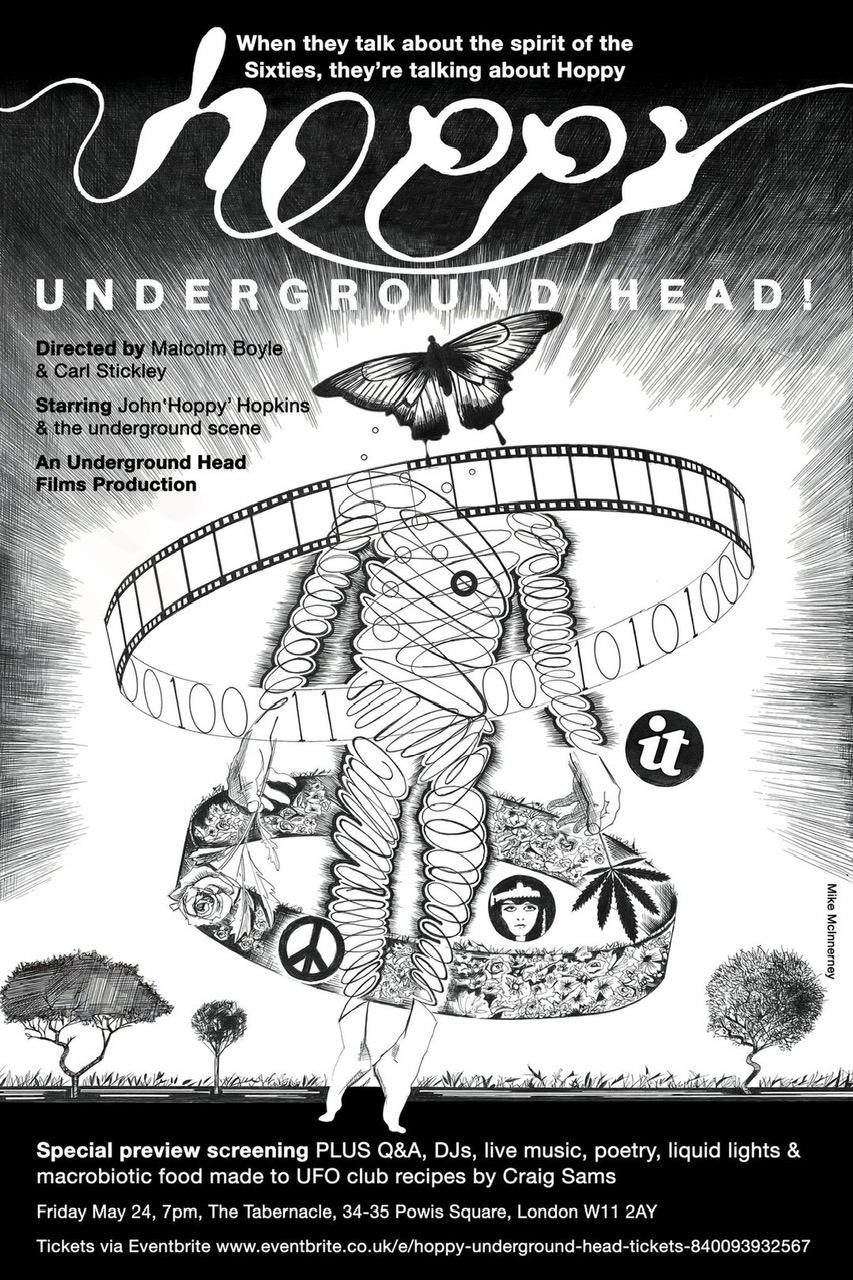
Mike McInnerney prelim poster for the Hoppy documentary screening at the Tabernacle recently (colour to be added)
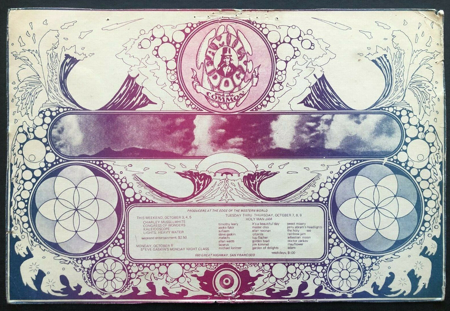
Holy Man Jam Seven Day Venue original handbill by The Family Dog, 1969 – unsure the artist here.
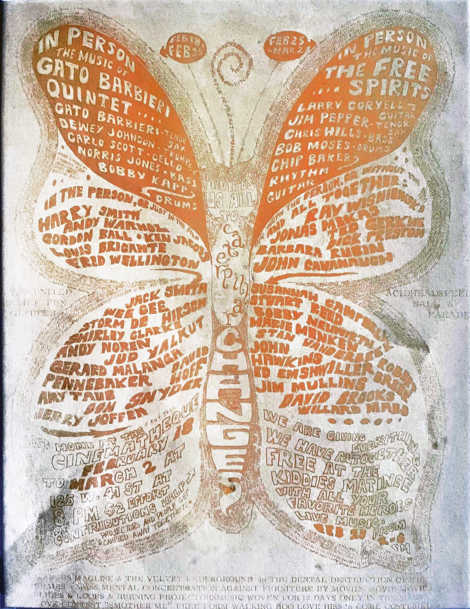
February – March, 1967 at Filmmakers’ Cinematheque, New York – restored from a faded image found on the web, possibly from the Sterling Morrison collection (see Velvet Underground mentioned at the bottom)
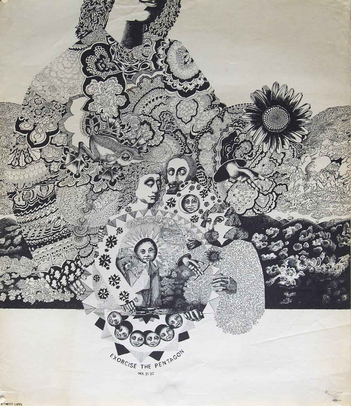
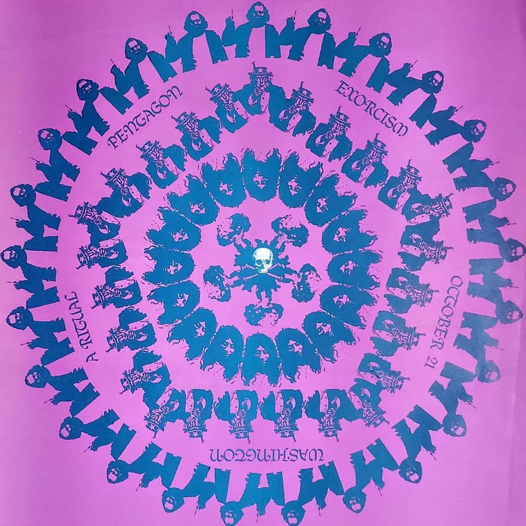
Two Exorcism of the Pentagon Anti-Vietnam posters, 1967 – pink mandala designed by Peter Legeria, black and white by Martin Carey – more information on the event here
I spoke to Rich Headland from Record Shop Stories about design, digging and a few favourite spots both in London and elsewhere.
Give his Substack a follow to view profiles of record shops around the UK and occasional interviews, I’ve already visited several shops after seeing his detailed profiles.