The Simonsound – ‘The Beam’ 10″ + live recording

At long last, after featuring it here months ago and then a pressing plant quality control issue meaning that the release was delayed, it’s finally here. The Simonsound‘s new single, ‘The Beam’ in all its 10″ clear vinyl, ‘Pilot Pack’ space age glory. After the wait it more than lives up to the expectation, this is one of the most amazingly packaged records I own, how much it must have cost is beyond me.

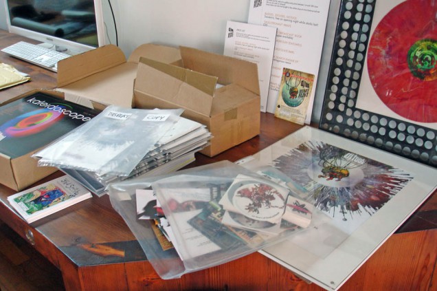
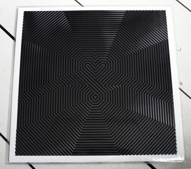
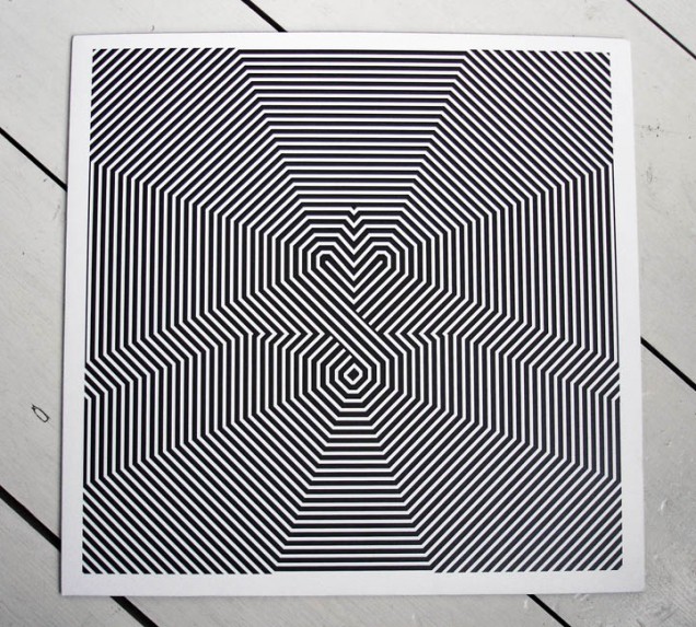
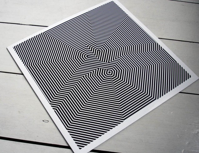
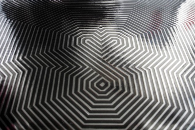
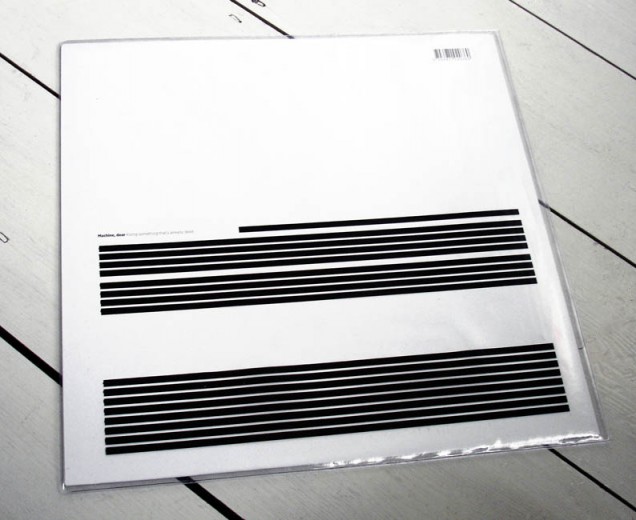
Designed by Emily Macaulay at Stanley James Press who has done all the artwork for the band so far, the photos here really don’t do it justice. Firstly – the material the sleeve is made of is a silver textured card with a silky smooth finish, I’ve never seen a record jacket like it. The cover is plain with a high quality sticker wrapped around it and reminds me of an instruction manual from the 60’s, which I’m sure is the intention.

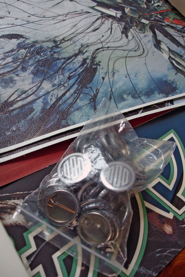
Inside the gatefold you’re treated to several pockets, each holding a different item, before we even get to the vinyl: A NASA-styled Simonsound Transit Authority embroidered patch, a numbered, signed ticket to ride, a double-sided tour map of the Monorail route, a 20 page booklet about the Monorail and, last but not least, a unique tape loop from the project.

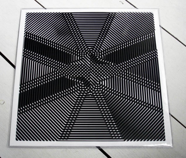
The attention to detail here is absolutely stunning and spot on for the subject matter, the blue, white and silver colour scheme is the perfect mix of transport design meets pilot of the future uniform. When we finally get to the 10″ record – extractable via a tasteful thumb cut in the back half of the sleeve – lo and behold, it’s on clear vinyl! A great final touch but one that delayed the original release date because of warped pressings from the original plant tasked with making them.

What about the music though? ‘The Beam’ is a modular trip through different worlds via the Monorail at a fantasy science park, taking in Outer Space, Robot World, Underwater World and more. The tour guide takes you through the different stages and the soundtrack changes to suit (the original idea was to get Ken Nordine to narrate but he wasn’t available). Simon has used the manufacturing delays to recut the vinyl with more material than the original pressing so we get a montage of various sounds and effects he’s generated on the reverse of the disc in addition to the second track.

The B-side is actually my favourite, ‘In The Shadow of the Skylon’, an ode to the iconic structure that was built for the 1951 Festival of Britain on London’s Southbank. This track has shades of Kraftwerk circa Man Machine with a definite feel of ‘Neon Lights’ about it, my only criticism is that it’s too short. It was commissioned for Musicity – a location specific music project featuring tracks inspired by buildings and structures around the World. The track itself is also accessible on the site where the Skylon used to stand, using the free Musicity web app.

You can read more about the release and score yourself a copy (sorry, the Pilot Packs are all gone) on The Simonsound blog and Bandcamp page.

I’d also recommend checking out the video for ‘The Beam’ below as it really fleshes out the concept of the whole thing being that it’s a soundtrack more than a club track.

and there’s more – The Simonsound live at Herstmonceux


A few weeks ago, I journeyed down to St. Leonards-on-Sea for an event called Kosmic Krash at the Herstmonceux Observatory where Simon was playing live inside one of the domes with his new Buchla modular synth. He has kindly put up a 45 minute excerpt of the set on his blog for us all to enjoy, it was the highlight of the evening for me, sitting inside one of the domes next to a giant telescope, listening to this electro musique concrete.

The Simonsound – ‘The Beam’ single on sale now

Want one of these? The new single from The Simonsound in a special 25 copy ‘Pilot Pack’ with 10″ colour vinyl, two sided colour map, sew on ‘The Simonsound Transit Authority’ Pilot patch, 1 of a kind 1/4 inch tape loop, mini booklet, Monorail ticket, all housed in a beautiful letter press printed sleeve? Better be quick – pre-orders happening NOW.

If they’re sold out or your budget doesn’t stretch to business class you can still catch the monorail in a more regular and affordable standard class version. 10″ colour* vinyl of ‘The Beam’, comes with two sided colour map. (*Colour to be confirmed.) Also, if you’ve not tried the debut LP from the group (Simon James and DJ Format) then you could do a lot worse than grab ‘Reverse Engineering’ while you’re there.


Posted in Design, Music, Packaging. | No Comments |

Record Store Day 2013 ‘The Search Engine’ 4×12″ repress

It’s Record Store Day again and Ninja Tune release a four disc vinyl repress of the EPs that made up my album, ‘The Search Engine’. These are straight represses of the original three EPs (One Man’s Weird…, The Shape of Things… and Magpies, Maps & Moons) plus the Amorphous Androgynous remix 12″ from last years’ RSD (on black vinyl this time though).

The first three 12″s have been out of print for some time now and contain extra tracks plus some different mixes to the CD album, with some tracks also being full length versions. If your bought these the first time round there’s nothing new musically here I’m afraid. The poster covers are replaced by an eight panel foldout sleeve though, with remixed artwork of which you can see more images here.

In the spirit of the title, and to add a little something for RSD, I’ve had ten unique pieces of artwork inserted randomly into the first 600 copies of the album. Six high quality prints of zoetropes that I made for the exhibitions last year and four unique collages as seen in this post. All are 12″x12″ in size, signed, stamped and protected by a transparent sleeve.
If any readers of this blog find one, please let me know, I will post a photo of you here with your find and it will be nice to see how far they go out into the world. Everyone going to a store has a chance to find one of the inserts, they’re completely random and could go out to whoever orders them at stores participating in RSD. Even if you manage to get a regular copy I’d appreciate photos and locations and will post the best ones like last year.

The Ninja Tune online shop will have another 400 or so copies for sale the Monday after RSD so don’t worry if you can’t get to a store.

Secret 7″s project for Record Store Day

It’s that time of year again, Record Store Day looms this Saturday and the Secret 7″ project is back for another year. Initiated by Universal Records, it presents artists and designers with the chance to create a one-off cover for one of seven different releases, both old and new.

This year’s artists are Public Enemy, Elton John, Laura Marling, Nas, Haim, Jessie Ware and Nick Drake. Over 700 sleeves have been created and each will be available on April 20th at Mother, 10 Redchurch St, London, E2 7DD at the price of £40 each with the money raised going to the charity Art Against Knives.

You won’t know who has designed which sleeve or what song you’re buying (although you can take an educated guess) until you buy it, when all will be revealed. I bought three last year and it was one of the most exciting purchases I made in recent memory.

The sleeves were on view to the public last weekend and I managed to catch the last few minutes and snap some favourites before they closed the doors, which reopen at 10am on Saturday. I spotted work by Pete Fowler, Jonathan Edwards and Felt Mistress among them but Gilbert & George have contributed this year somewhere too.

Posted in Art, Event, Packaging, Records. | No Comments |

Demdike Stare – Test Pressing #1


The new Demdike Stare 12″ has a nice twist to the packaging and design. It comes in a paper sleeve, housed in a second thin PVC protective cover with an A4 insert and labels that are either black or white for sides A and B. On the front are instructions that customers would see if they had ordered their own set of test pressings to approve before a release.

For those that don’t know, once a record is finished it goes to a cutting house where they make a master ‘lacquer’ of the disc on a large lathe in real time. That lacquer is then sent off to the pressing plant and a small number of ‘test’ pressings are made, usually called ‘white labels’ due to the fact that a white label is pressed onto the centre where the regular label would go. These are then sent to the artist or record label to check that ‘the cut’ was OK and that everything sounds fine before proceeding with the full run of the pressing. It would be foolish to go through such a delicate and variable process without checking a sample copy before pressing hundreds or thousands of discs only for them to all be defective.

The new release is the first in a series of ‘Test Pressings’ by the duo and the cover sets out the various steps you should take when getting such a pressing yourself. Only the catalogue number appears on the front, no titles or even the group’s name (that’s on the insert) and the same thing is repeated in German on the reverse of the sleeve. I think this is their best release in a while, dark and sinister as usual but more beat-orientated this time around, in an industrial meets jungle kind of way.


Posted in Design, Packaging, Records. | No Comments |

The Search Engine – 4×12″ repress for RSD 2013


On Record Store Day this year (April 20th) Ninja Tune will release a four disc vinyl repress of the EPs that made up my album ‘The Search Engine’. These are straight represses of the original three EPs (One Man’s Weird…, The Shape of Things… and Magpies, Maps & Moons) plus the Amorphous Androgynous remix 12″ from last years’ RSD (on black vinyl this time though).

The first three 12″s have been out of print for some time now and contain extra tracks and some different mixes to the CD album, with some tracks also being full length versions. If your bought these the first time round there’s nothing new here I’m afraid except the poster covers are replaced by an eight panel foldout sleeve, similar to the original limited edition ‘Paul’s Boutique’ LP.

Each disc has its own sleeve and the spine measures a tasty 13 mm in width, easy to find in the rack for sure.
In the spirit of the title and to add a little something for RSD I’ve had ten unique pieces of artwork inserted into random copies of the album. Six high quality prints of zoetropes that I made for the exhibitions last year and four unique collages as seen below.
All are 12″x12″ in size, signed, stamped and protected by a transparent sleeve. If any readers of this blog find one, please let me know, it will be nice to see how far they go out into the world. I’m sure the Ninja Tune online shop will have copies the Monday after RSD so don’t worry if you can’t get to a store, everyone has a chance to find one of the inserts, they’re completely random and could go out to whoever orders them, not just stores participating in RSD.

A Psyche For Sore Eyes compilation

Getting a copy of this little release has been a mission, by the time I found out about it it was sold out on pre-order. I put it on my Piccadilly Records wishlist and hoped, badgered the label to repress it but they couldn’t afford to. Eyed up copies on eBay but didn’t want to give the flippers the satisfaction but finally succumbed when the label – Sonic Catherdral – put up one  of their final copies to raise money for Red Nose Day a couple of weeks back. I think it was the most I’d ever paid for a 7″ (two actually) but it’s going to a good cause so fuck it.

‘A Psyche For Sore Eyes’ is a beautifully realised package, designed by Heretic, to house two coloured 45s, a pair of 3D glasses and a whole heap of psychedelic imagery. The paper engineering is particularly clever in the way it accommodates each component and the glasses aren’t just a gimmick. Rather than have ‘look I can touch it’ 3D the red/green balance works more in an op-art sense, similar to the 3D underground comix designs I posted two years back.

Musically I wouldn’t call it ‘psyche’ as such, – it’s a compilation that swings from indie rock to shoegazing drones to electron-noise. Lead track, ‘The Correspondent’ by Hookworms, is so reminiscent of ‘A Storm In Heaven’-era Verve that it’s hard not to imagine ‘mad’ Richard Ashcroft on vocals. The Vacant Lots have been worshipping at the alter of Suicide but in a good way and the fuzz bass and reverb of Lorelle meets the Obsolete reminds me of both the 60’s and the 90’s simultaneously (see ’60, see ’90, go! anyone?*). Even though it’s hard to find in stores you can listen and buy digitally.


*(bad Bow Wow Wow joke – sorry)

Posted in Design, Music, Packaging, Records. | 1 Comment |

Iron Maiden ‘comic’ covers

Every guy my age has a soft spot somewhere for Iron Maiden‘s covers (some of the music wasn’t bad either but I dipped out around ‘Somewhere in Time’). Their mascot, Eddie, has been with them through thick and thin, morphing and warping into new identities with each album and I just came across these two designs that ape classic sci-fi comics of the 60’s. I’m not sure if these were designs that didn’t make it as there seem to be more traditional versions of the same titles with Derek Riggs‘-style airbrush images too. But if you’re going to do the ‘comic’ look then this is how to do it. UPDATE: turns out that these were by Anthony Dry, see his comments about them down below.

I also found this cover in 3D and couldn’t resist posting it

Pepe Deluxé – Queen of the Wave Deluxe version

When Pepe Deluxé do anything they don’t do it by halves, in fact they go the whole nine yards and then add a load more into the mix for good measure. What emerges is music and imagery so multi-layered it requires repeat listens to pierce the surface and process the motherlode of information contained within.

One of the reasons I love Pepe is because there is genuinely no one like them, they are a one-off and a band seemingly working in and across separate time zones whose records sound so out of place you wonder if they’ll ever even find reappraisal 20 years down the line. This isn’t a criticism, it’s to be admired that a band can strike out so single-mindedly whilst ignoring any current forms of music that are deemed ‘hip’ and ‘cool’. In fact it’s testament to Pepe and Catskills for leaving off the many remixes they’ve had over the last releases as, with the exception of Husky Rescue‘s cover of ‘Supersonic’, none of them came close to Pepe’s vision and sounded like they were trying to force the band into a modern day setting (sorry guys, just my opinion).

The new Deluxe version of their ‘Queen of the Wave’ album is no different, in fact it ups the ante considerably and throws everything AND the kitchen sink at you over 2 CDs, a DVD and a 64 page booklet inside a hard backed book. The original album is present but the ‘Esoteric Pop Opera In Three Parts’ has suddenly expanded to three discs, the second with versions, new and unused tracks and an easy-listening style EP of selected songs. The DVD includes videos for singles both new and old as well as stems for budding remixers. Everything about it says EPIC, the original album is one in itself but bolstered by the 2nd disc, DVD and a book that has crammed enough material for 100 pages into 64 then the deal is sealed.

No space is left un-filled and we learn everything from recording history to how they shot the video for ‘Night & Day’ with real magic tricks and all. The book shouldn’t work, it breaks so many rules of what good design is with up to 10 different fonts competing for space on any one page and a layout that’s more scrapbook than grid. Yet it does work and adds to the music is so many ways, placing the album visually between steampunk and psychedelia with nods to Tiki and Analogue electronics from the golden age. One minute you think you’re looking at an issue of Practical Electronics then it’s a poster in the style of a traveling circus or a Richard Hamilton-esque collage.


Anyway, enough of me blathering on, check the video below as it’s another brilliant Pepe production with the classic ‘Virtual Chicken Little Funk Operator’ set to become legendary. You can BUY the deluxe package from Catskills HERE.

Posted in Books, Design, Music, Packaging. | 1 Comment |

Pepe Deluxé live in London + even more Deluxe!!!!

The excellent Pepe Deluxé are coming to the UK for their first live performance on November 12th at the Scala in London. Tickets are available here from Soundcrash.

The full live experience will be supported by Husky Rescue and guests and coincide with the release of the Deluxe edition of Pepe’s ‘Queen Of The Wave’ album which I rhapsodised over earlier this year.

Apparently the new edition (a deluxe Deluxé edition?) contains 2 CDs and a DVD and comes in a 64 page hardback book with loads of extra artwork to add to the album companions already generated for the original version. Check the front and back covers below and get more info from their Facebook page.

Posted in Books, Gigs, Packaging. | No Comments |

The Herbaliser ‘There Were Seven’ LP pre-order

Be very quick if you want one of these, The Herbaliser have their new LP (designed by yours truly) up for pre-order. If you want CD or download, you’ll be fine, but…

If you want vinyl you have two options: regular double LP with full printed inner sleeves in a screen printed sleeve – only 450 copies though.

Or there’s the super limited (50 copies) deluxe version which comes with hand stenciled covers by Snub23, a signed A2 poster, a T-shirt and a download card. More photos when I actually have a physical copy! Order here (red ‘shop’ tab on the top right) – actually I think you can only order the regular vinyl right now…

Worldwide mag design article extras

When I did the interview on design for music in the digital age for Gilles Peterson‘s Worldwide + magazine I submitted a lot of extra images that weren’t able to be used for space reasons. I thought I’d put them up here as I love them all and they illustrate some of the people I talk about who didn’t get featured visually.

The mag is now available on iTunes to download for the iPad.

Top to bottom, left to right:

Julian House / Ghost Box label,

The Designers Republic / Emigre magazine cover,

Michael C. Place / Build poster,

Vaughn Oliver & Chris Bigg – V23 / Lonely Is An Eyesore deluxe LP,

Pete Fowler / The Magic Numbers LP,

Mr Krum / The Simonsound mp3.


Flint & Food at Factory Road

So much to say about the last few days and the opening of the DJ Food & Henry Flint exhibition at the Factory Road Gallery in Hinckley, Leicester with my friends Sarah (aka Inkymole) and Leigh. I’ve known them for around 15 years now and always enjoy their company so it was a no-brainer when they asked if they could host the work I’d got together for the Pure Evil Gallery earlier this year. What’s unique about this is that the gallery is in their own home, on the corner of a quiet suburban street, not in the middle of a hip part of a big city. A few years ago they did some major architectural restructuring and turned the downstairs of their home into a workspace cum gallery, dependent on what was on at the time. This is the third or fourth exhibition to be held there and, with the help of their intern, Brook, and amazing chef Jed Smith, they managed to make it a very unique event.

The difference between this and the Pure Evil show is that they were keen to feature a sort of retrospective element of my design work with Ninja Tune over the years alongside work that Henry and I had generated for ‘The Search Engine’ album, his book ‘Broadcast’ and past comic work. This took the form of a whole wall running the length of the downstairs plus a tabletop collage under glass of all manner of flyers, sleeves, proofs and other ephemera. Two sides of the central supporting wall were taken up with Henry’s past comic work with prints and original art from the album near the entrance. Near the rear of the gallery we set up a turntable and zoetrope disc to project animations that were also meant for London but didn’t happen as well as a 55 minute mix with visuals based on my planetarium show of the same time.

To add to this Sarah and Leigh always do special merchandise to go with each show, a regular item being a tea towel – or rather a visor / helmet polishing cloth (ooer) – printed locally and hemmed by Sarah’s mum. Also for sale was a limited edition ‘Skullstronaut’ giclee print and locally sourced chocolate bars, cleverly playing on the outer space theme and packaged like freeze-dried astronaut food.

Speaking of food, the killer addition of the night was Jed Smith in the kitchen, whipping up amazing bite-sized, space-themed eats for everyone. The cubed chips, baked pea shells and sauce were the hit of the night, a bowl of ‘space dust’ (homemade sherbert) looked like a moon surface and the dried rice and beetroot dip was literally out of this world (sorry). Everyone who came looked uncertainly at it all, took the plunge and were instantly in for seconds.

It’s rare to attend an opening and to ask the guests if they’ve been to the toilet yet (unless it’s for some sort of nose up) but the bathroom had it’s own charm in the form of Will Cooper-Mitchell’s press shots of me in an astronaut suit, alongside a hand-painted shuttle (by Sarah’s sister, close family ties going on here) and a short musical loop of space-themed sounds.

This, alongside a big barrel of local ale for refreshments, rounded the whole event off beautifully and added to the homely vibe of the exhibition. A steady stream of visitors arrived, both local and from further afield from 6pm until midnight and I talked to everyone from fans to friends, university professors to the local record store owner. Having been there since Thursday afternoon setting up and rearranging things I was beat by then and we had an early start the next morning but that’s another story.

Thank you so much to everyone who came but especially Sarah, Leigh, Jed, Brook and everyone who helped to make it such a success, some of the photos here are by their friend, Nigel, who was also the architect who helped them build the gallery. We realised, once it was all hung and arranged, that we’d fitted in twice the content than in London, in a smaller space too so there’s twice the reason to go and have a look. The show is at 71 Factory Road, Hinckley, Leicestershire, it’s free and on until June 15th, all merchandise is on sale on the Factory Road Shop now.

Factory Road Gallery goodies

Only 3 days to go until the DJ Food & Henry Flint show reopens, revitalised at the Factory Road Gallery in Hinckley. I sent a last load of sleeves, posters, flyers and other assorted memorabilia off for it today and there will be more of Henry’s old 2000ad artwork than we had in London, different pages too – all from my personal collection.

Also on sale there will be these space-themed chocolate bars in requisite silver foil packaging featuring the ‘skullstronaut’. There’ll be more exclusive merch on sale but I’ll post about that later. Sarah and Leigh, who run the gallery from their home, really take care and go to extra lengths to make bespoke items for their shows so that each one is a unique experience. I’m so pleased to be doing something with them after knowing them for over 15 years.

and another… Michael Hansen vinyl cover & animation


Vinyl cover with analog light animation
from Michael Hansen on Vimeo.

Another record employing the phenakistoscope animation technique just popped up – description below abbreviated from Michael Hansen‘s site.

“An album cover for the modern classical composer Allan Gravgaard Madsen . My idea was to translate Allan’s sensorial music into a visual experience with elements of sensuality. There is not an A- or B-side, each has its own front page. ‘Waves’ is a visualisation of the music performed by nine trumpets in a line, as simple as possible with nine circles on a line. ‘Crystal Tapestry’ is a pattern of crystals that has no front or back end, it refers to a crystal that merges into itself. Inside I made a visualisation that combines the two sides, a crystalized wave. On the record I created patterns that gives the design a visual sensuality. I made an analog animation with a 50 Hz strobe lamp and made it interact with the music.”

Beautiful, I wish I could buy a copy.

Posted in Design, Packaging, Records. | 1 Comment |

Machine, Dear lenticular 12″ cover

I received this beautiful item the other day after seeing it on both the RokRiot and Hardformat sites. Upon watching the short film of the record being opened (see below) I knew I had to have a copy. The group is Machine, Dear and the album is called ‘Killing Something That’s Already Dead’. Designed by Klaus Matthiesen of OddFischlein, there are only 150 copies and you can grab one here.

Posted in Design, Packaging, Records. | No Comments |