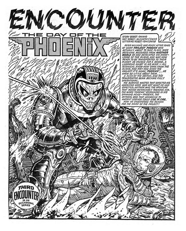
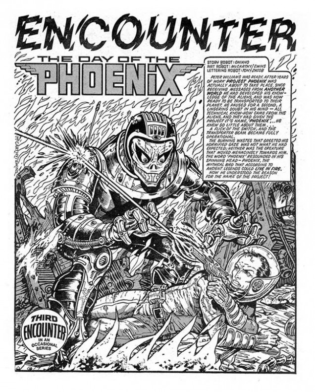
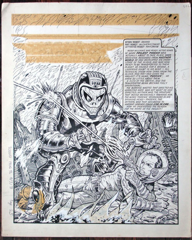
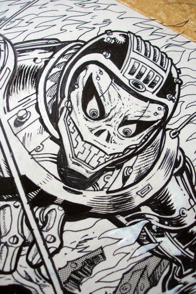
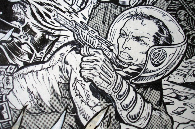
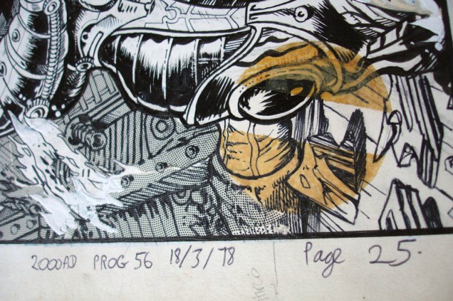
Brett Ewins & Brendan McCarthy – ‘Day of the Phoenix’ illustration, 1978
(485 x 390 mm, ink and letratone on paper).
Encounters one page story, 2000ad.
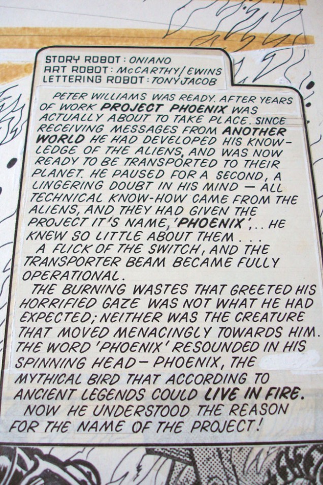
Brett Ewins & Brendan McCarthy – ‘Day of the Phoenix’ illustration, 1978
(485 x 390 mm, ink and letratone on paper).
Encounters one page story, 2000ad.

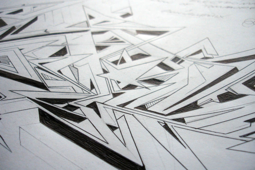
Shaky Kane – ‘Slim Jim, Hateful Dead’ illustration, 2011
(297 x 210 mm, pencil and pen on paper).
Unpublished drawing.
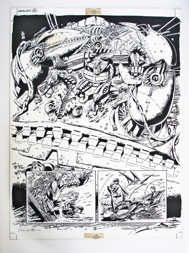
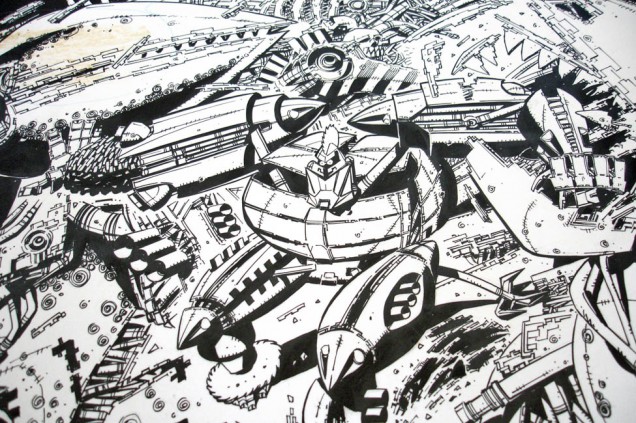
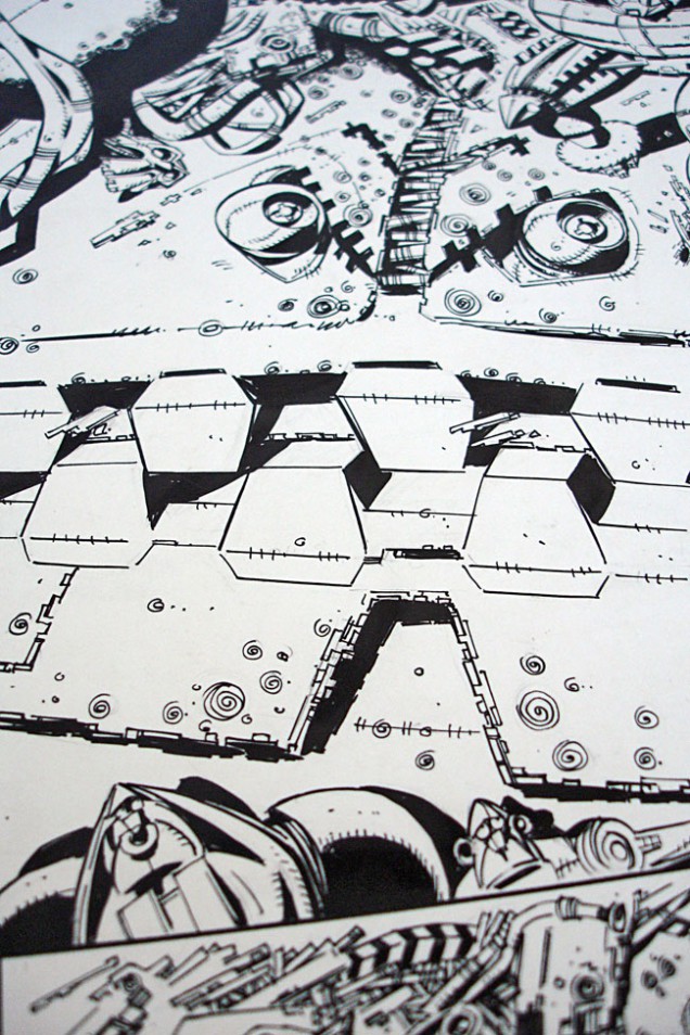
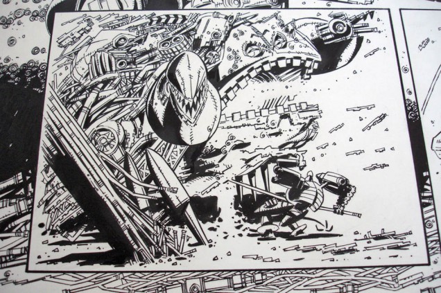
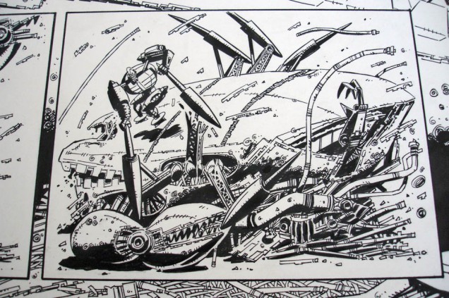
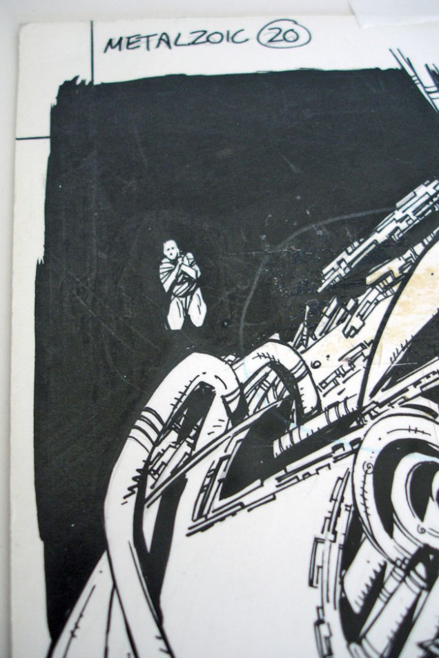
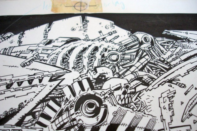
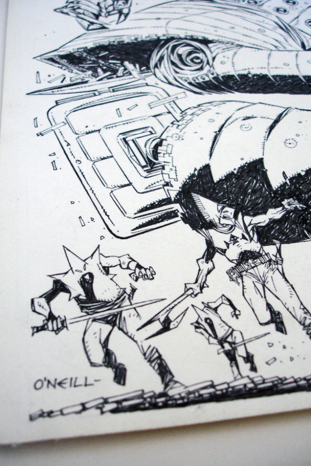
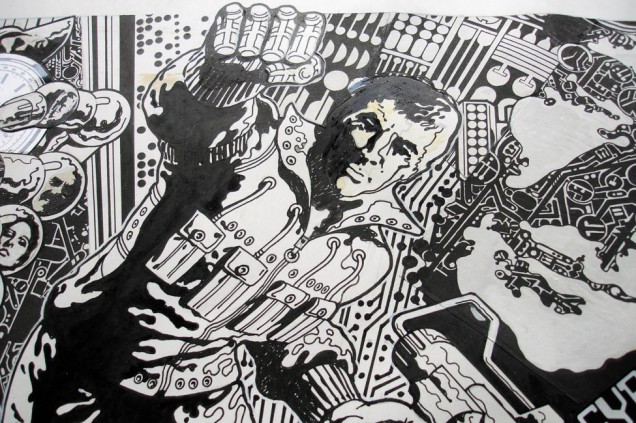
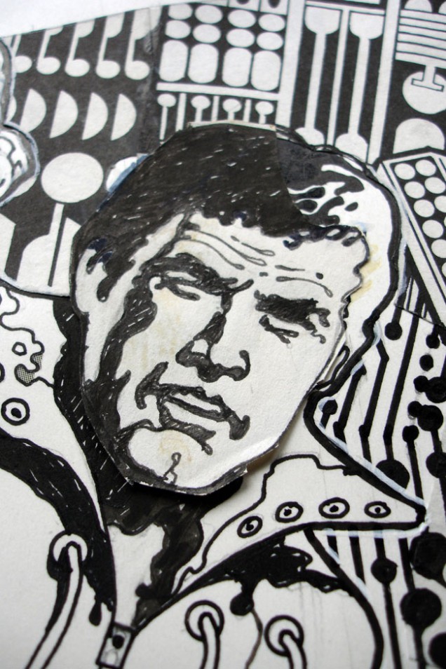
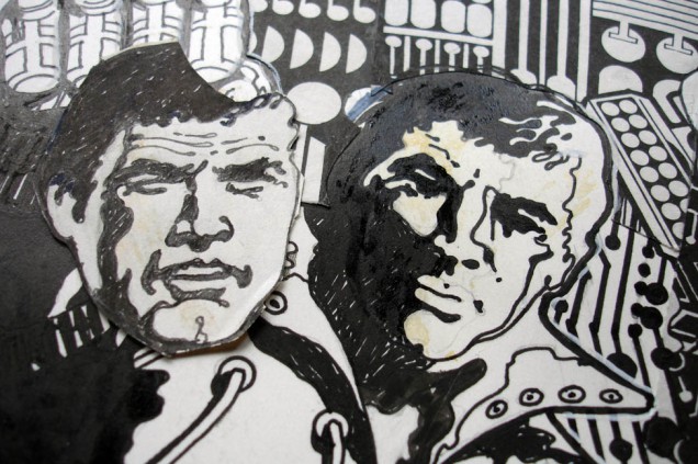
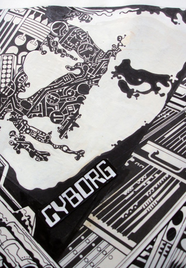
Kevin O’Neill – ‘Raging Armageddon’ illustration, 1986
(440 x 330 mm, black ink on art board).
Metalzoic Page 20, DC comics, later reprinted in 2000ad.
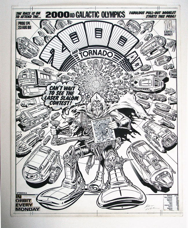
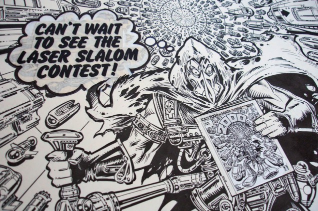
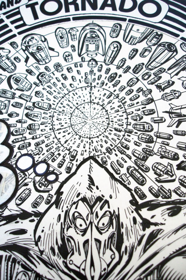
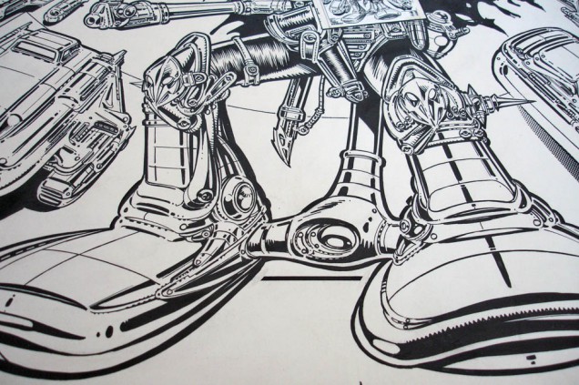
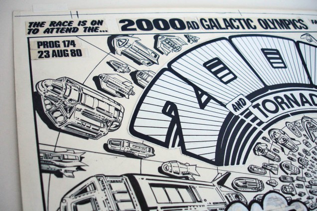
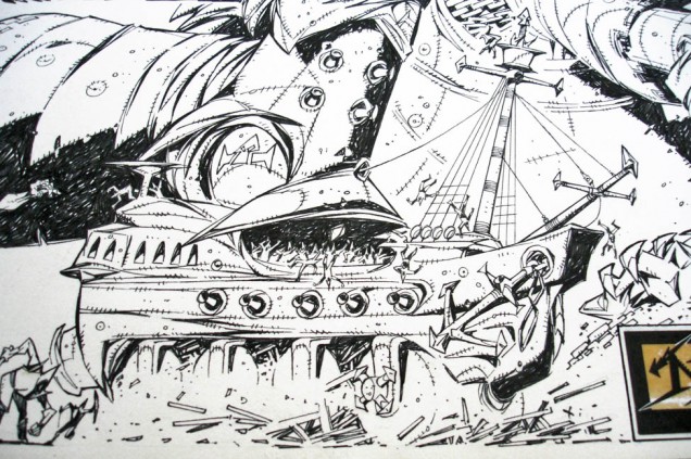
Kevin O’Neill – ‘Tube Warrior’ illustration, 1980
(430 x 360 mm, black ink on art board).
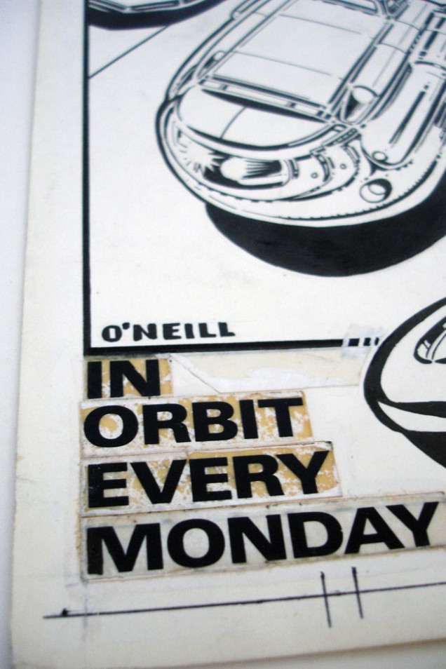
2000ad Prog 174 cover.

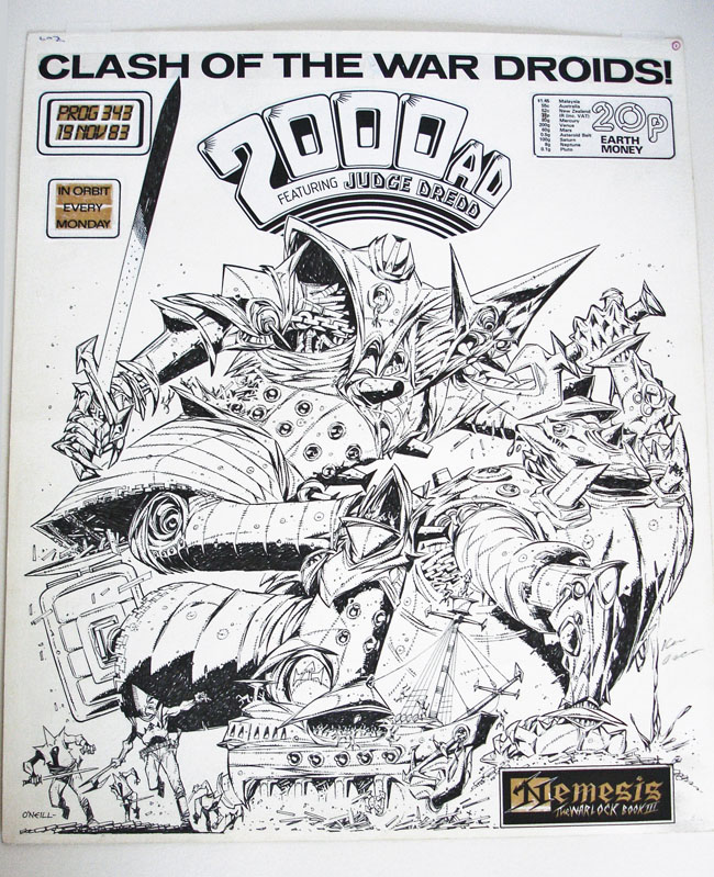
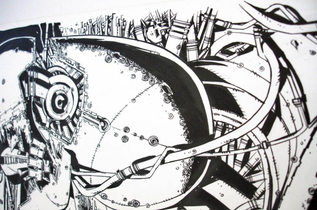
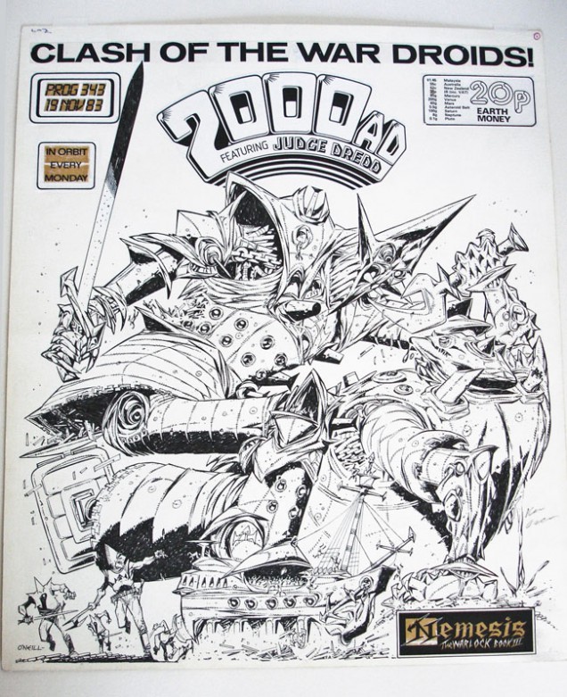
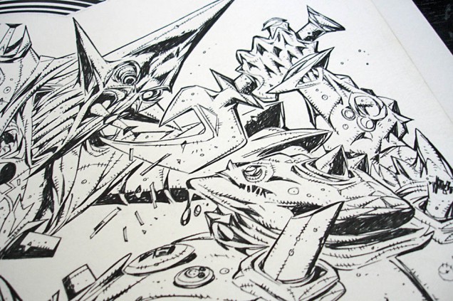
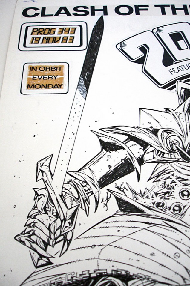
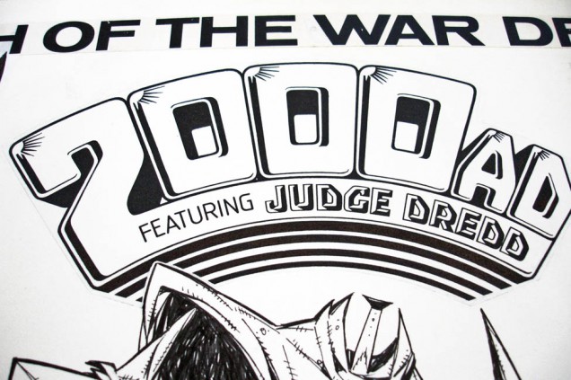
Kevin O’Neill – ‘Clash of the War Droids’ illustration, 1983
(430 x 360 mm, black ink on art board).
2000ad Prog 343 cover.

She 1 – ‘Kev’ illustration, 1997
(240 x 420 mm, marker pen on cardboard).
Doodle on a box full of spray paint.
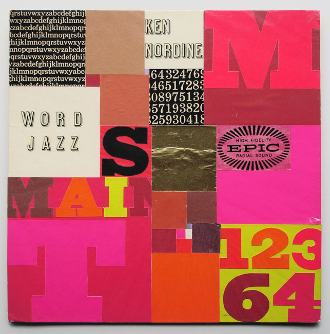
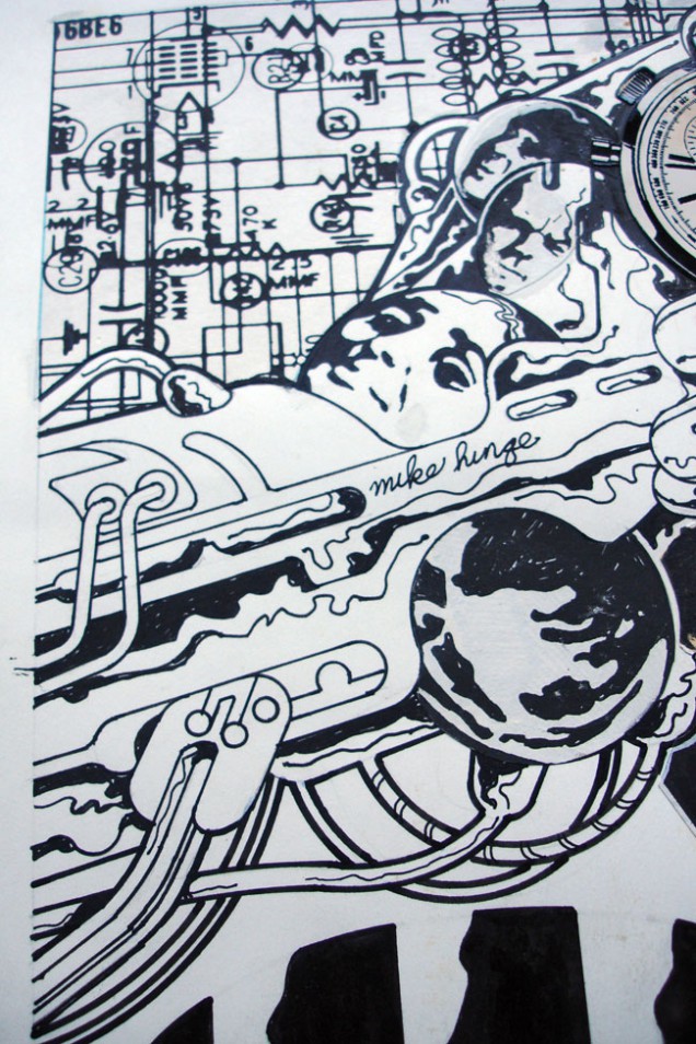
Mike Hinge – ‘Word Jazz’ illustration, date unknown
(25.3 x 25.3 mm, assorted paper and print on board).
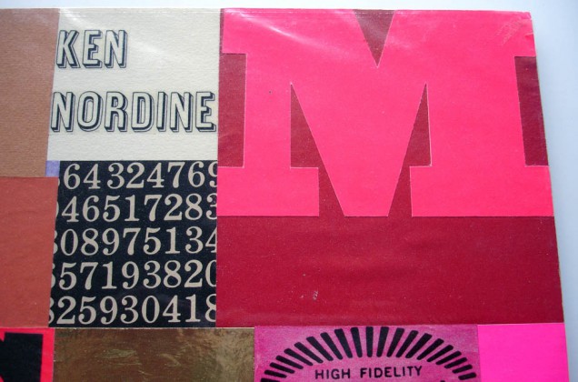
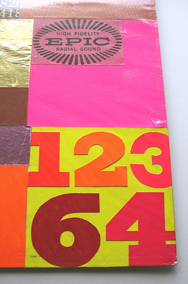
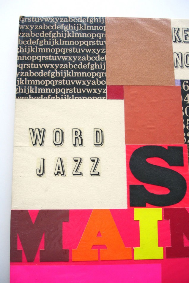
Unpublished design for Ken Nordine’s ‘Word Jazz’ album, possibly a portfolio piece.
Blurb from the sale at the time of sale (2004): “From the estate of artist Mike Hinge, we are offering this unusual example of concept art for an intended album cover for the music of Ken Nordine – Ken Nordine Word Jazz. Hinge was a follower and fan of underground and ‘fringe’ music groups, so it is unknown whether he produced this cover art graphic as part of a commercial assignment, or for a proposed cover that he might have created to solicit work. we are not familiar with Nordine’s early album cover art, so we don’t know if this design was actually used (published) or not. But from the design, we would guess this was created in the late 50s to 60s. The artwork is 10″ x 10″ , paste up design and is in fine shape, kept under plastic since it was created. the piece is part of a large group of original advertising and illustrative artworks to be auctioned from the Hinge estate, all at no reserve. No rights of reproduction come with this sale.”
We represented Mike in the sales of his original sf art until his death in August of 2003, and now are agent for all that remains in his estate, which includes artwork spanning his 45 years as a professional artist and graphic designer. Early in his illustration career he worked for the largest ad agency in New Zealand (where he grew up) before moving to Los Angeles, where he attended the Art Center of the College of Design. In 1966 he moved to Manhattan, where he worked as an art director for several ad agencies. His graphic designs were notable, and his always colorful and psychedelic illustrations appeared on numerous science fiction magazines during the 1970s, including Analog, Fantastic, and Amazing, and on paperback books. Hinge also did design work for 2001: A Space Odyssey and produced illustrations for mainstream publications like Time magazine, including covers featuring Richard Nixon and Emperor Hirohito. He was nominated for the Hugo Award for Best Professional Artist in 1973, plus nominated for 6 Locus awards in the ’70

Mike Hinge – ‘Six Million Dollar Man’ illustration, 1974
(58.2 x 42.2 mm, pen, photocopy, PMT and Letraset on paper).
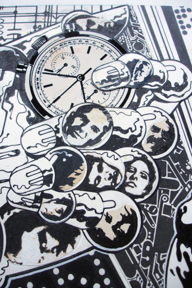
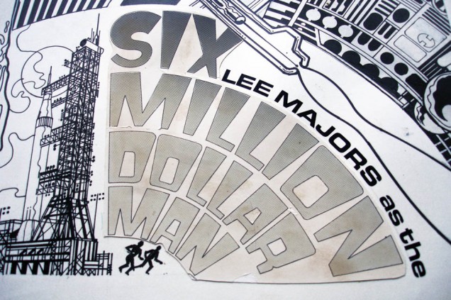
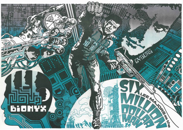
Centre spread poster for Mediascene magazine #10.
From the blurb when I bought the art: “You are bidding on a huge double page spread drawn by Mike Hinge and published in Jim Steranko’s Mediascene magazine back in 1974. Sternako did a layout for the figure of Steve Austin which Hinge redrew and incorporated into his final design. There are numerous changes which were pasted onto the board as the drawing was extremely detailed and complicated. I have a paste on that goes over the face shown and looks like Lee Majors (the old paste gave way and the past over came loose) Nicest line drawn Six Million Dollar Man “cover ” you will find Original art page is in good condition.”

Brendan McCarthy – ‘Dream Tree’ illustration, 2008
(41.5 x 29.5 mm, pen and whiteout on paper).
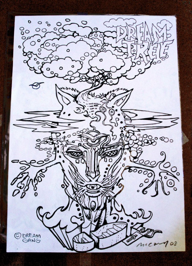
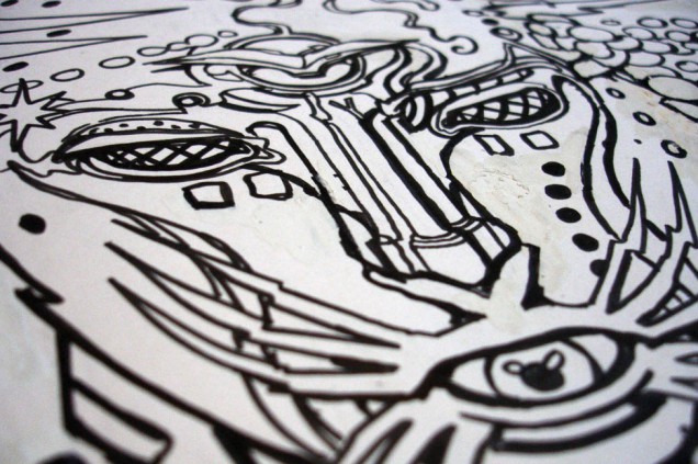
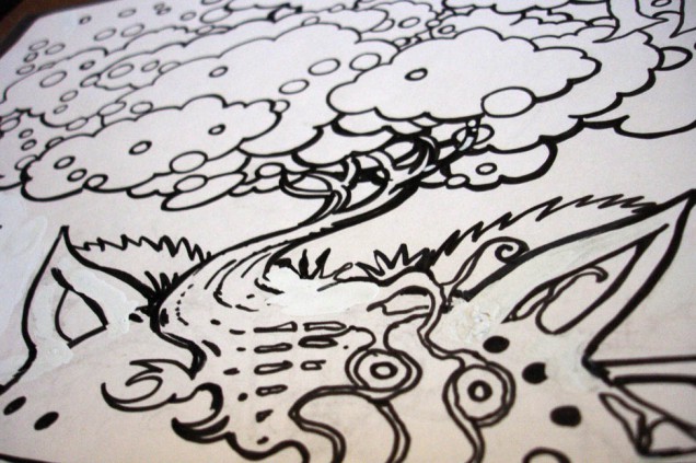
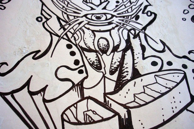
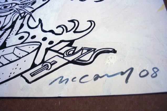
Unpublished illustration for a story concept by Brendan McCarthy – ‘The Fabulous Dreamtrees’.
“The Dreamtree (is) a phantasmagorical tree whose fruit is the source of all dreams. Eat the fruit and experience the dream of yourself. It is the precious thing you will carry back to the waking world.”
– Swimini Purpose, 2005.
 Roger Mainwood – ‘Autobahn’ animation cels, Halas & Batchelor, 1979
(330 x 270 mm, pen and paint on acetate).
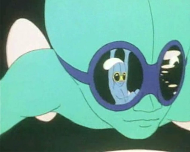
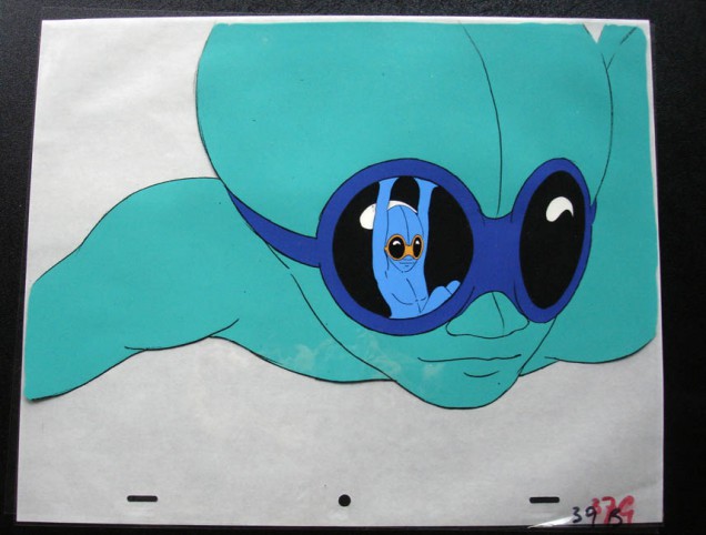
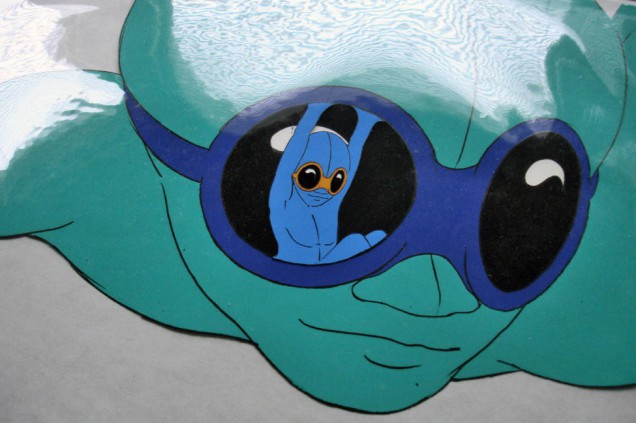
In 1979 animation studio Halas & Batchelor were commisioned by EMI to make a video to accompany Kraftwerk’s song ‘Autobahn’ for a possible laser disc compilation of the label’s back catalogue. These are two original cels from the film, the background and goggle reflections are lost, the laser disc was never released.
You can watch the film in two parts on YouTube, this frame appears at approx 4.22 in Part 2.

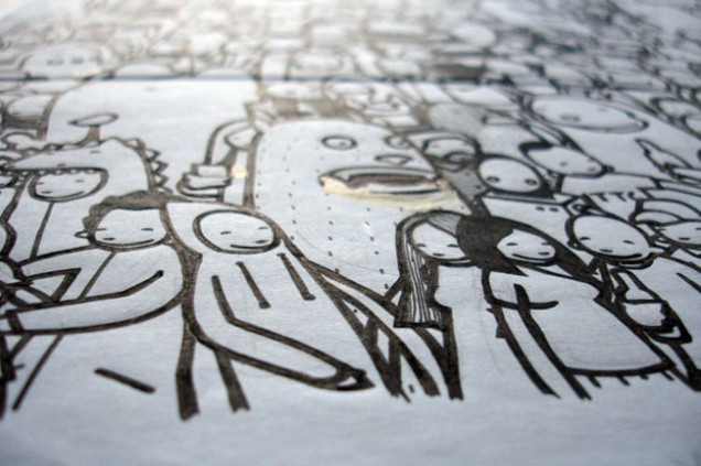
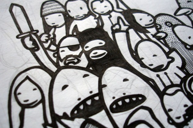
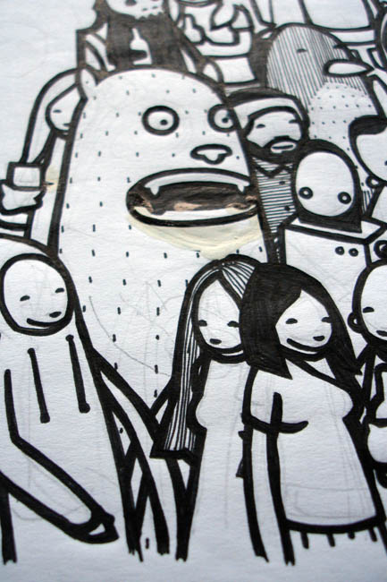
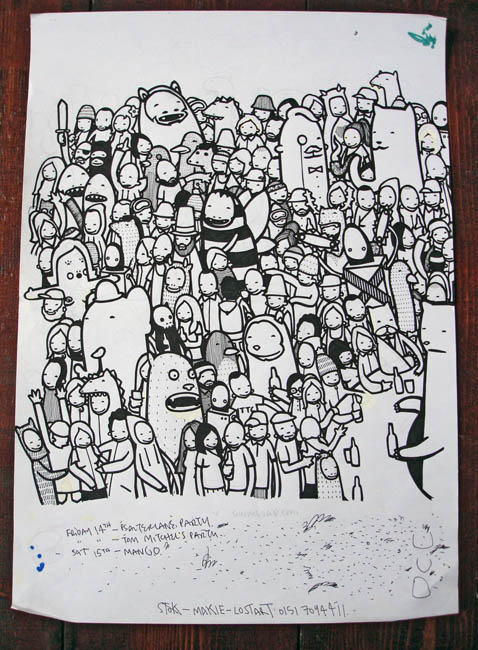
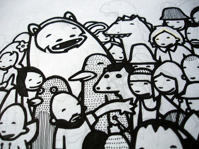
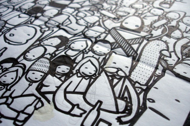
Kid Acne – ‘TTC – C’eci N’Est Pas Un Disque’ LP inside cover illustration (full piece), 2001-2
(640 x 380 mm, pen and pencil on paper).
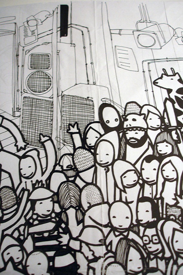
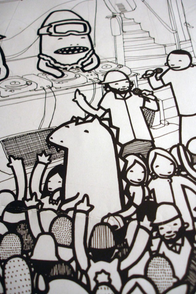
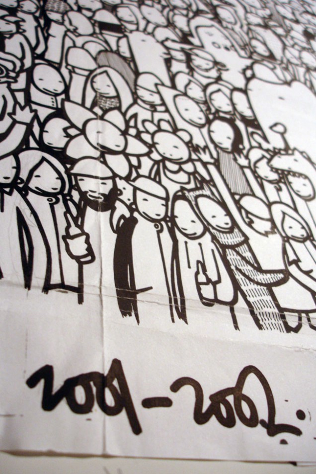
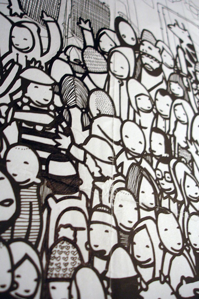
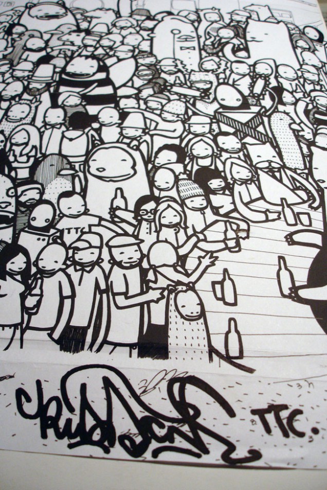

The full piece was created using photocopies of two A3 illustrations depicting the crowd characters. These were then joined and the club background added in thinner pen. The DJs were also added at this stage to complete the scene.
 650")
Kid Acne – ‘TTC – C’eci N’Est Pas Un Disque’ LP inside cover illustration (right hand side), 2001-2 (420 x 297mm, pen and pencil on paper).
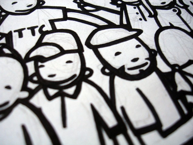
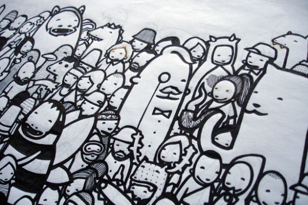
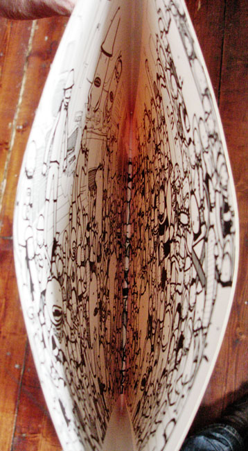
Originally one half of a crowd scene to go on the inside of a gatefold cover for TTC’s first LP. The label couldn’t afford a gatefold sleeve so it was printed on the inside of a single sleeve, the left half is thought to be lost.
 Part 2 – ‘Part2ism’ outline, 2011 (420 x 297mm, biro on paper)
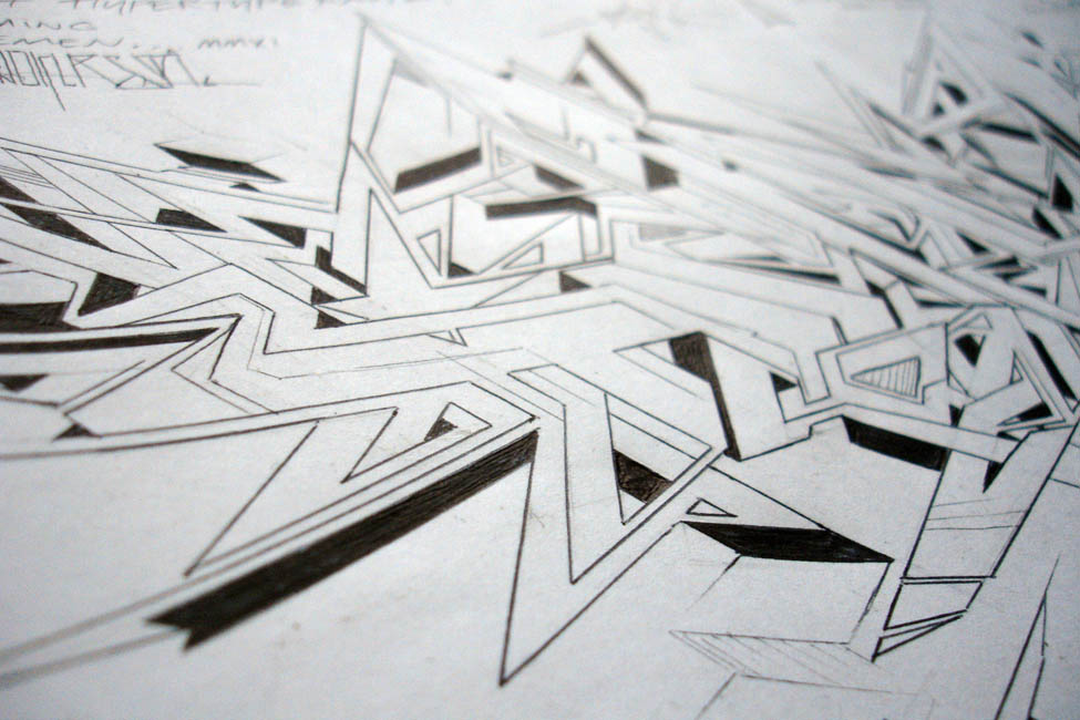
The first in an occasional, on-going series featuring original objects and art with, where possible, the items that they were made for.
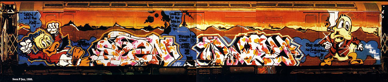
Reading some original Howard The Duck comics the other day I came across the original sources for classic NYC graffiti pieces that have been embedded in my brain since seeing the Subway Art / Spraycan Art books back in the 80’s. The Seen / PJay wholecar piece above is probably the first train I ever saw painted as it was part of a magazine review for the book I discovered on holiday in the summer of 1984. This led me to trying to draw my own designs and eventually seek out the book for the bigger picture. I’d never seen lettering like this but was immediately drawn to it and wanted to know more, from then on I wrote graffiti for the rest of the 80s, only stopping when I moved to London in 1990.
The duck on the right seems to be taken from the panel below on the left from issue 2 of the original 1977 run of Howard The Duck, later adapted with added cigar for the top left corner on certain covers. The hat is missing on the train version, possibly due to space, it’s not an exact copy but this is the nearest image I can find and you try painting something 8 ft high in the dark whilst hanging off a train in the freezing cold and getting it spot on. Seen was a master of characters, using many Marvel, DC, Disney and underground comic creations like Cheech Wizard in his pieces.
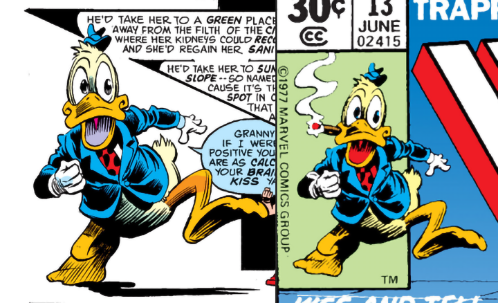
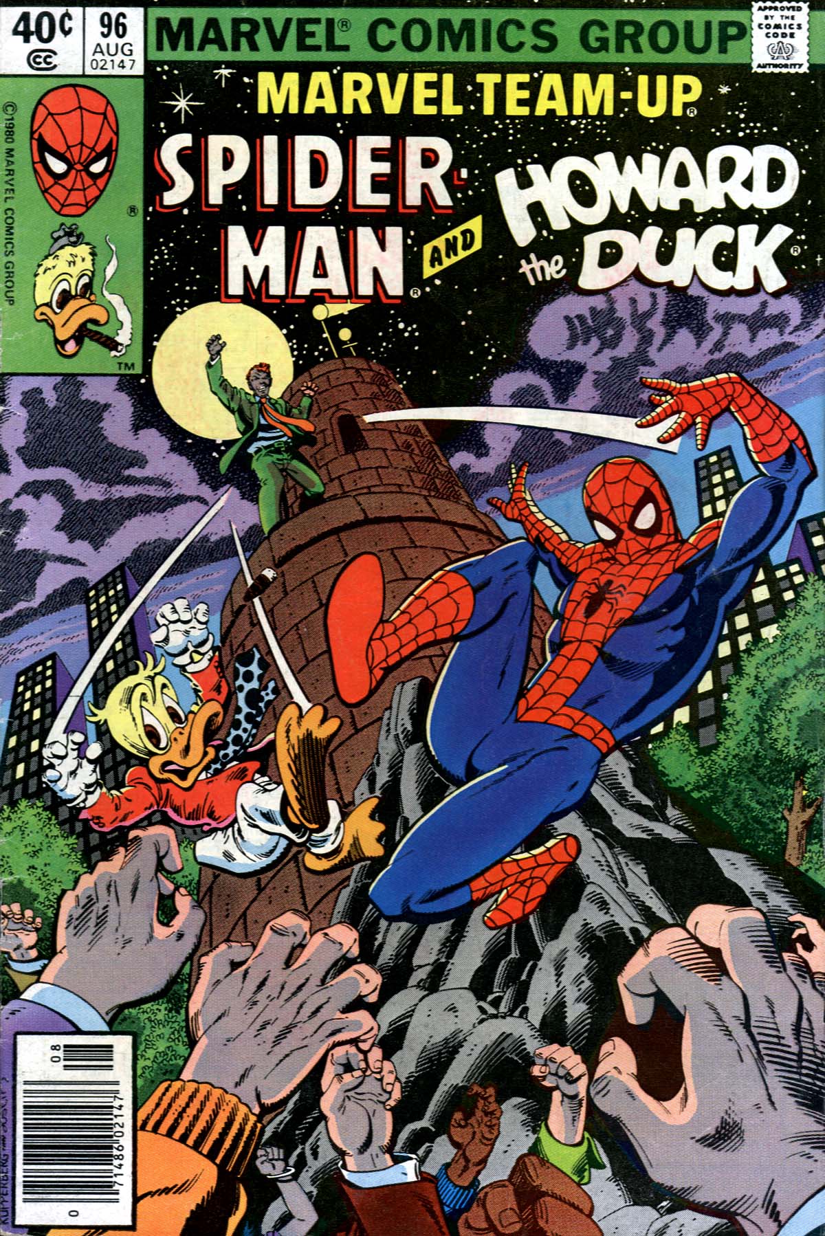
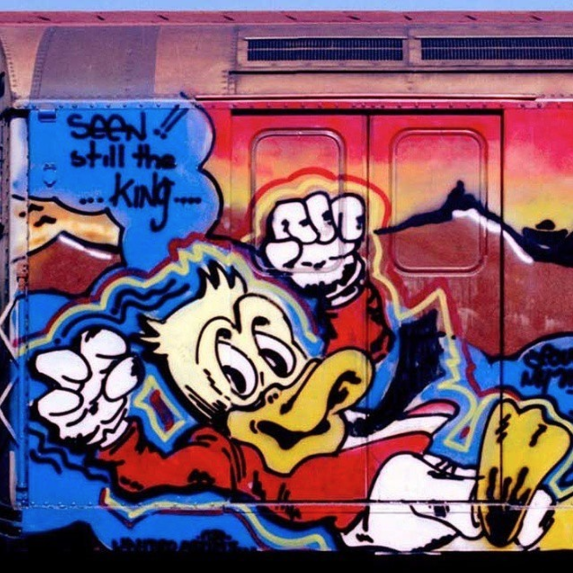 The duck on the left of the car is much closer to the original source and obviously comes from the cover of the Marvel Team Up issue of Spiderman and Howard seen below. Seen recently underwent heart surgery and is currently resting until given the all clear to go back to painting, something he seems to do 24/7, regularly selling canvases and prints out in minutes. I very much hope he makes it through and can carry on where he left off, he’s one of the greats and hugely influential, one of the Godfathers of the whole graffiti scene.
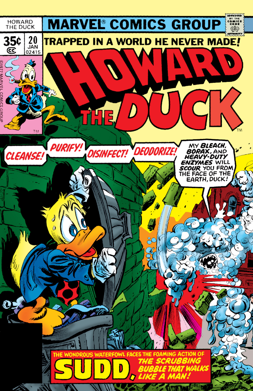
Another classic featuring Howard was by Lee Quinones and covered a whole basketball court in 1980 with the original being swiped from the cover of HTD #20.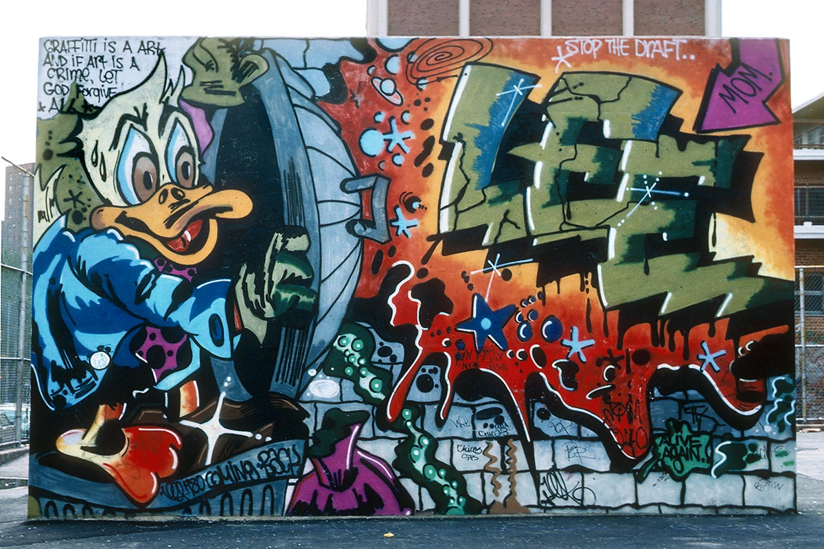
![]() It’s a pretty big week for the UK comic 2000ad – this Friday the film Dredd 3D officially hits cinemas in the UK, based on the anthology’s lead character, Judge Dredd. The day after that the 35 year old publication hits no. 1800 with a whole host of new stories beginning for readers who want to jump on board. Not only that but the sister mag, the Judge Dredd-related Megazine bumps up its page size and includes concept images from the film as well as an exclusive prequel comic to the movie drawn by none other than… regular readers of this blog will know the answer… Henry Flint.
It’s a pretty big week for the UK comic 2000ad – this Friday the film Dredd 3D officially hits cinemas in the UK, based on the anthology’s lead character, Judge Dredd. The day after that the 35 year old publication hits no. 1800 with a whole host of new stories beginning for readers who want to jump on board. Not only that but the sister mag, the Judge Dredd-related Megazine bumps up its page size and includes concept images from the film as well as an exclusive prequel comic to the movie drawn by none other than… regular readers of this blog will know the answer… Henry Flint. 
Being that I’ve read the comic since I was 8 years old and have stuck with it every week, through the printers strikes, the mergers, the format changes and the lean years when a lot of the original creators went to the States to seek fame and fortune (and better deals), this is a very big deal. I’ll be celebrating this nicely timed piece of synchronicity this week with a series of related posts leading up to the big weekend of Thrill Power.
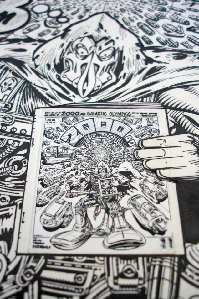
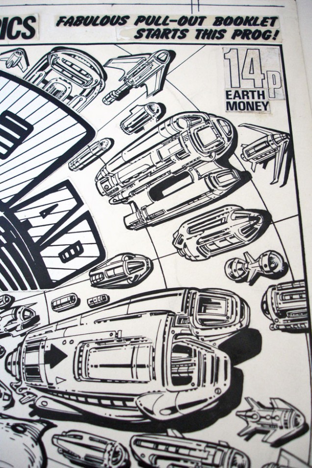
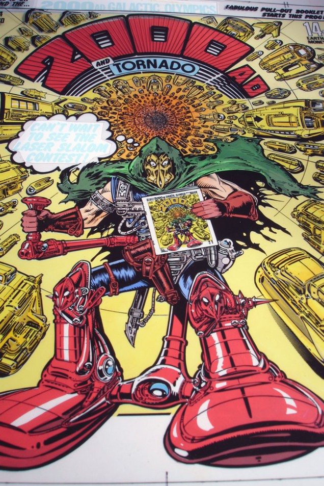
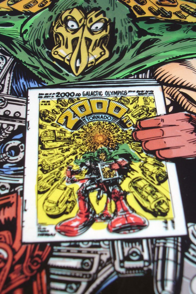
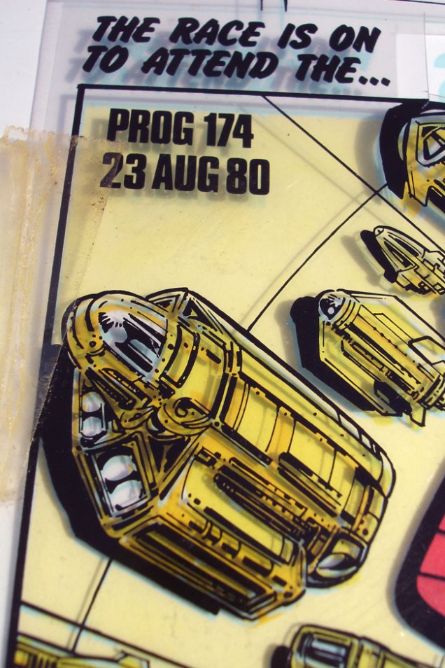
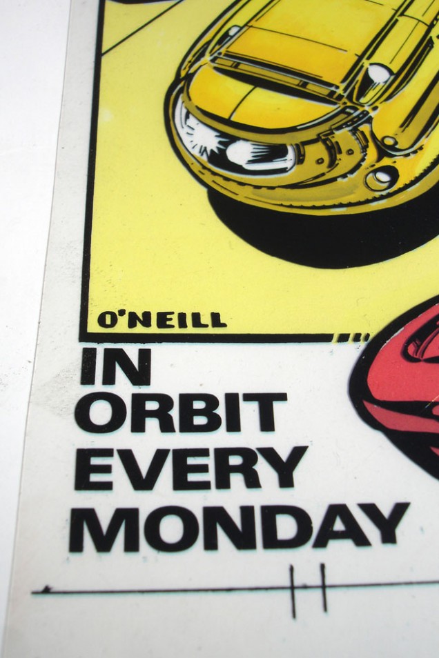
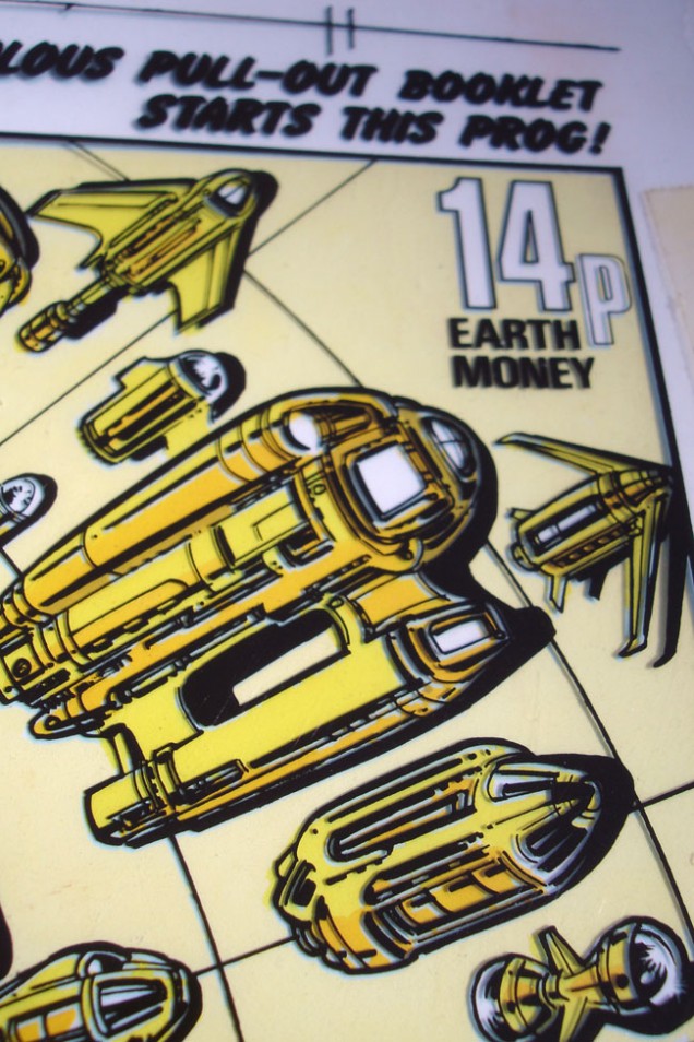
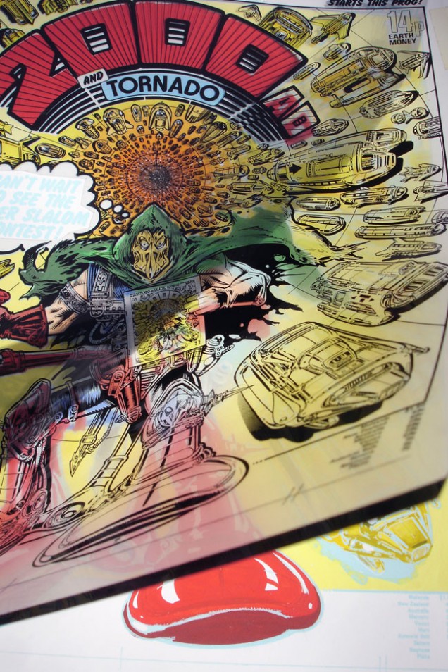
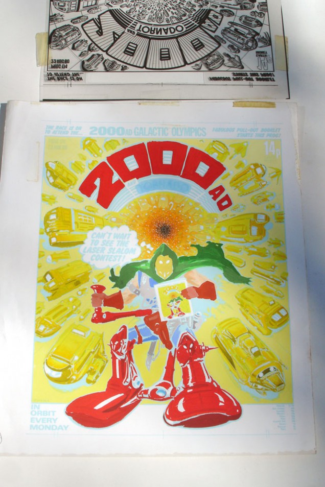
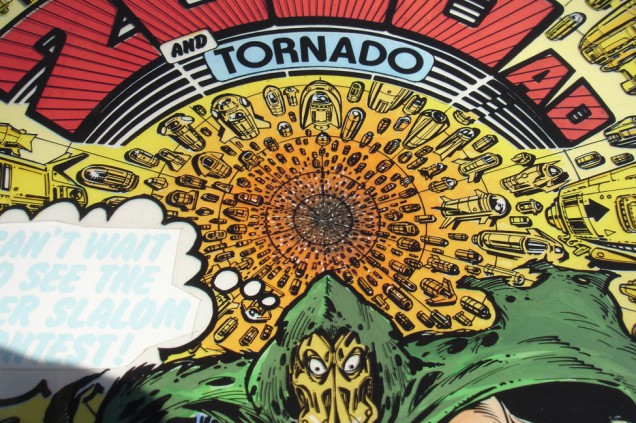
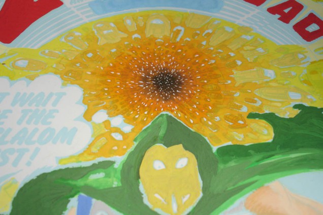
First up I’m digging in the archives for some vintage artwork from the first golden period of the comic. Some of you may remember me posting the original artwork for Kevin O’Neill‘s ‘Tube Warrior’ last year, which is one of my most prized pieces of original comic art. That was the black and white line art but it appeared on the comic’s cover in full colour.
Enter Steve Cook, from the already legendary Secret Oranges blogspot, which amazingly celebrates it’s 1000th post this week. His collection of original production art is vast and we were going through a pile of images at his studio when the colour version of the same piece appeared at the top of the pile. Knowing that I had the original, and probably seeing me trying not to completely freak out in front of him, he graciously presented it to me for my birthday, for which I am eternally grateful. Note the header for the ‘Galactic Olympics’ booklet which was a fictitious games with things like ‘laser slalom’ as I remember.
 2000ad Prog 174 cover production art, 1980.
Illustration: Kevin O’Neill – ‘Tube Warrior’ Colours: Tom Frame
(300 x 230 mm, black line art acetate overlay, paint on paper).
Animated by Roger Mainwood (this post originally appeared on my old MySpace blog, July 2008)

I’m sure many of you will know that I am a major Kraftwerk fan and, whilst hunting out all manner of weird and quirky animation recently, I remembered the late seventies film made for the band’s 1974 hit ‘Autobahn’. If you haven’t seen this gem then see below, unfortunately of atrocious quality – heavily digitised and with washed out colours. It’s in a league of it’s own from a time sadly passed, all Pop Art imagery meeting the late seventies obsession with sci-fi, post Star Wars. It’s a real trip (in more than one sense) for ten minutes plus, and sticks out like a sore thumb in the retrospectively airbrushed history of the German four piece.
Originally commissioned by EMI for a laserdisc release that never appeared because the format didn’t take off as expected, it was then occasionally shown as filler on TV late at night or even during kid’s TV schedules in the eighties. I remember seeing it once or twice and not knowing what to make of it because it was so far removed visually from the image Kraftwerk had at the time. I filed it away in my mind until a few years ago when a random check on YouTube brought it back to my consciousness and a recent showing to my kids elicited squeals of delight at ‘the alien’, the flying lips and ‘Mr Nosey’ (check it, you’ll know what I mean).
I decided to find the animator, Roger Mainwood, primarily to find out if I could obtain a better copy but also to see if he had any of the original artwork to sell. A quick search gave me an email address and, as luck would have it, he had a tiny caché of images stored, a deal was struck and this fine image is now in my possession.

It’s actually two layers although there would have been four in the original image, a head on one, a small figure reflected in his goggles on another, but the background and flashing lights also reflected in the goggles have since been lost. I took the opportunity to ask Roger for more details about the project – his first commissioned film – and his impressions of the song:
Which studio made the film?
RM: Autobahn was made at the Halas and Batchelor studios in the late 1970s. John Halas, the producer, passed away some time ago but his daughter Vivien continues promoting the studio’s work and runs the Halas and Batchelor Collection.
Did you know the song or the band before the commission and did you actually like it once you heard it?
RM: As far as I recall Kraftwerk’s ‘Autobahn’ was an unknown to me when I was presented with the project by John Halas. I think I found it an interesting piece of music but didn’t warm to immediately, although I did think it would be a good piece to animate some images to. I didn’t research Kraftwerk at the time, (we didn’t have Google in those days!). This was probably a good thing as I think I might have then tried to produce something that I thought would find favour with them rather than just going with some ideas of my own. Maybe Kraftwerk would have wanted something more mechanical and controlled than my psychedelic fantasy world that I conjured up. I acknowledge there are many nods to other animated works – The Beatles ‘Yellow Submarine’ for example, and Ian Emes‘ films too, in particular his ‘French Windows’ which was animated to music by Pink Floyd. Neither of those two, I am guessing, would be on Kraftwerk’s favourites list. In case you haven’t seen it French Windows is on You Tube.
How long did it take?
RM: Always a difficult one that because I was fitting it in around other jobs that were coming into the studio. So the answer is on and off over what felt like a two year period.
What process was used to animate it
RM: It was all hand drawn on paper first and then line tested to check the movement, before being handed over to the paint and trace department. Xeroxing drawings onto cel was a technique used at the H&B studio but I thought most of Autobahn was hand inked. Maybe there was a mixture of the two techniques used. It’s a long time ago and I can’t recall exactly what we did. Looking at the monster cars cel, that definitely looks like a pen and ink tracing of a drawing onto the cel. Then the cels are turned over and painted using special animation paint. You had to wait for each colour to dry before applying the next. No wonder it took so long !
Was the film intended to be part of a collection alongside other Kraftwerk films or as just one part of a general EMI label compilation?
RM: My feeling was that it was a laserdisc of just our animated film.
Has it ever been officially available to buy?
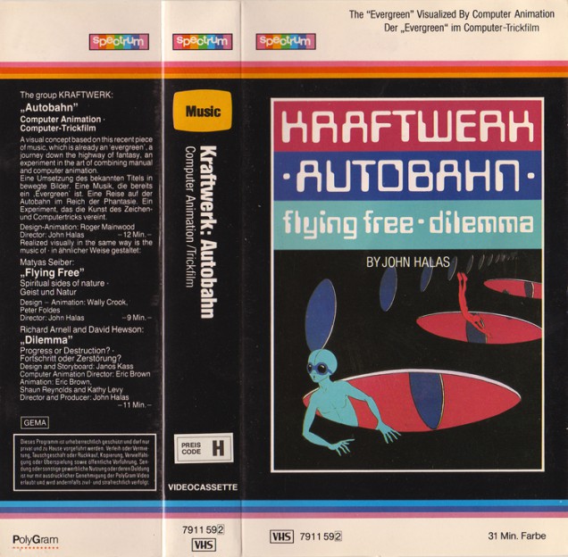
RM: Autobahn hasn’t been available on DVD so far but Vivien was talking earlier this year about a possible release involving a French distributor. John Halas did do a deal with Polygram for a video release of Autobahn (together with another Halas and Batchelor film called ‘Dilemma’), and I managed to track down the front cover recently.
") There are a few more images over in the Originals section where I posted about this last year. Also there are some pristine images from the film over at this site.
There are a few more images over in the Originals section where I posted about this last year. Also there are some pristine images from the film over at this site.
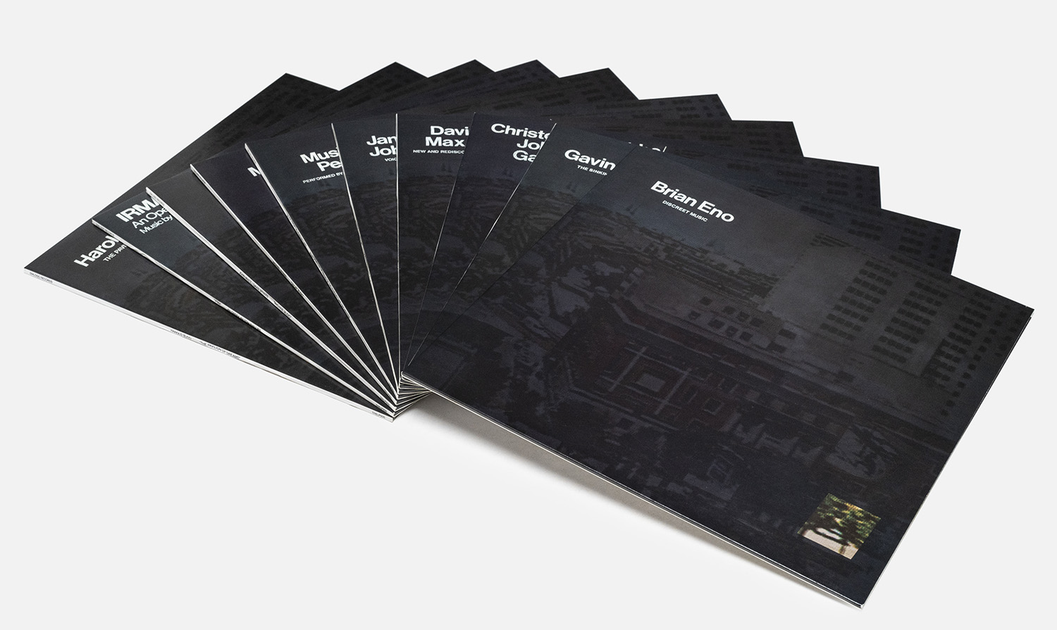
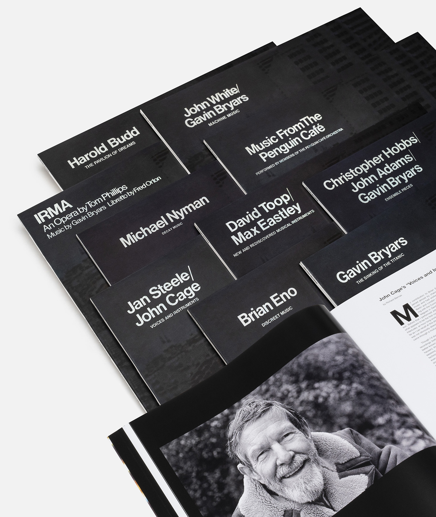
Obscure Records – Brian Eno and Gavin Bryars‘ short-lived record label from the mid 70s – is getting a lavish reissue this month via the Italian label, dialogo. The ten albums released in three batches between 1976 and 1978 are getting the box set treatment on vinyl and CD with accompanying books detailing their checkered histories with new sleevenotes and essays by key contributors. The label very kindly sent me the full digital release and I’ve been revisiting – and in some cases hearing for the first time – all the volumes in pristine, digitally-remastered quality seeing as the handful of originals I have on vinyl have been around the block a bit now.
Co-curated at the time by Eno, Bryars and Micheal Nyman and resurrected by Bryars with full co-operation of all featured artists for this release, the ten albums form a snapshot of a young, experimental set of avant garde composers, mainly from the UK, setting out in careers that would take them in different directions with varying levels of succes, fame and notoriety. The most famous of the set are by the key curators – Bryars’ ‘The Sinking of the Titanic / Jesus’ Blood Never Failed Me Yet’, Eno’s ‘Discreet Music’ and Micheal Nyman’s debut,’Decay Music’, but you’ll recognise others among them too; The Penguin Cafe Orchestra’s first LP is here alongside works by John Cage, David Toop and Harold Budd’s introductory outing.
Several things strike me about these albums; the amount of samples – or ‘found sound’ as they’re called in the sleeve notes – some of them use. At least half the catalogue use or manipulate voice or field recordings, in Discreet Music’s case, affecting or looping sections of another composer’s work as just another instrument. It’s also interesting to note how many of the participants were also working part time in the education system, no doubt influencing future generations in other ways beyond these albums. There’s probably a book to be written about the hidden history of art and music taught through the universities of the UK by some of its most unique practitioners.
The label have done a beautiful job representing these albums as one body of work with the CD version looking like a perfect companion to the Oblique Strategies box on the shelf. The sleeves are facsimiles of the originals, reproducing sleeve notes inside the book along with reflections from Bryars, Toop and more as well as insights into their legacy, the cover reconstructions and even the myriad of different pressings of the originals out there. According to the sleeve notes there was to be an Obscure 11, Eno’s Music For Airports, but at the last minute he changed his mind and started the Ambient Series; four albums that bear similarities to the Obscure releases, not least in their cover designs as well as his hand in their production. Times and the composer had moved on and a new movement was afoot, leaving the Obscure catalogue at a perfect ten, a time capsule of a collective that would splinter in different directions and prove influential in ways none could predict.
An aside concerning the cost of these box sets, they’re not cheap but look worth every penny. Downloads of six of the albums are also available on the label’s Bandcamp for €12 per LP – minus the classics by Eno, Penguin Cafe, Michael Nyman, Harold Budd (which you can find easily elsewhere).
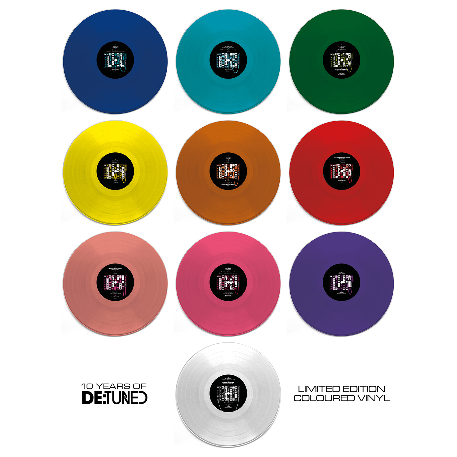
The final (I’m assured) part of the 10 Years of De:tuned release programme – after the initial ten 12″s, the special silver vinyl #10, the poster, the tote bags and the super-limited wooden slipcases for Touched Music – a repress of the entire series on coloured vinyl. Some of the originals sold out super fast and are now going for much more than anticipated so a final edition in a corresponding colour has been arranged.
Listen to the series here: https://soundcloud.com/detunedrecords/sets/10-years-de-tuned-l-de-10-01
Pre-order here:
Bleep: bit.ly/3dQ23RF
Juno: bit.ly/2Zb4iLd
Red Eye: bit.ly/2yaq4nb
Deejay: bit.ly/3dQwPty
Horizons: bit.ly/2WCfMWr
I’ve also done a special promo mix of a selection of tracks from across the series which can be heard here

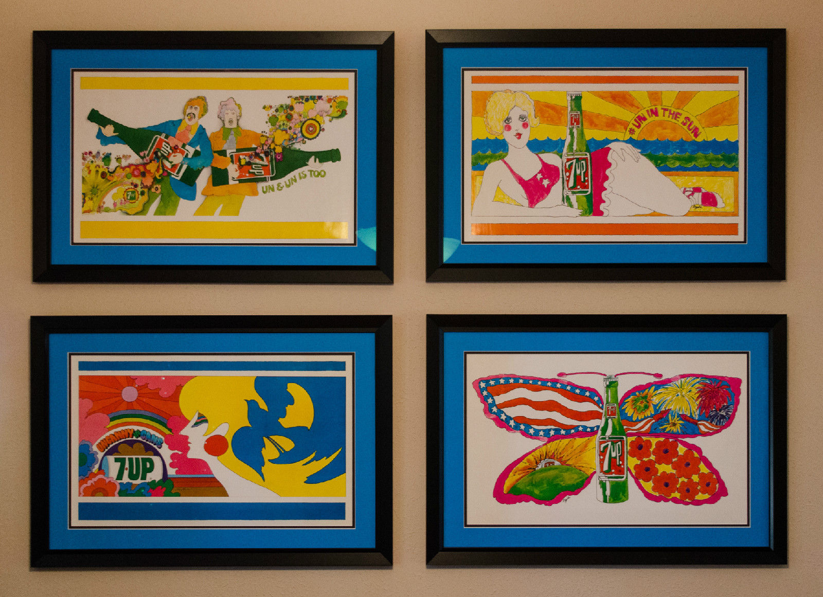
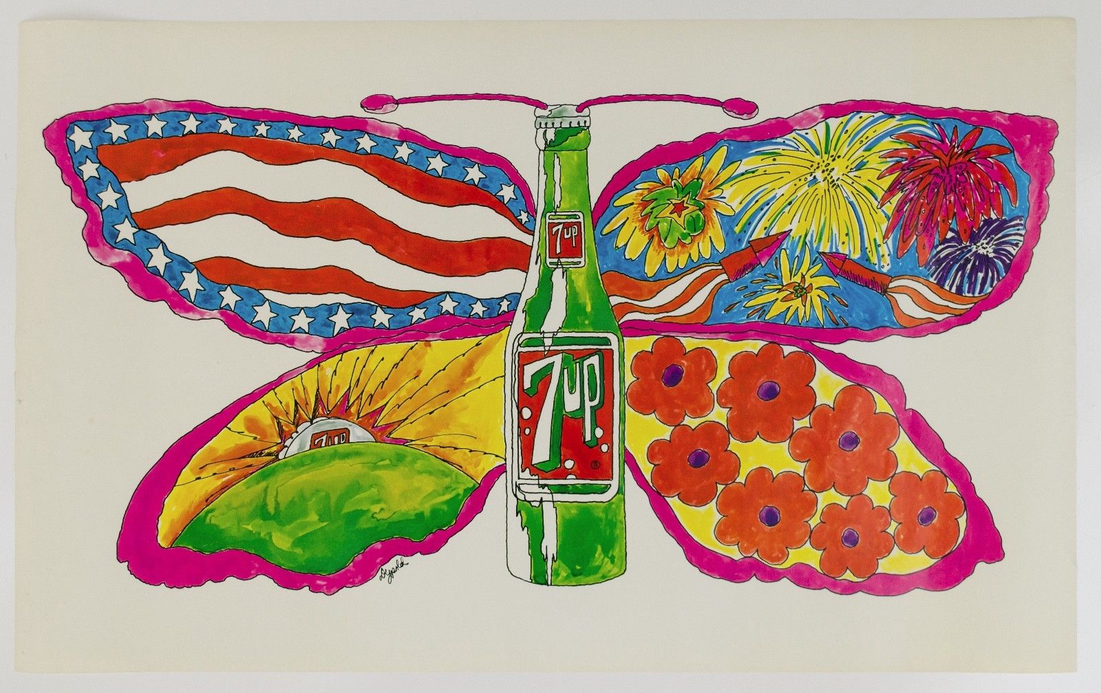
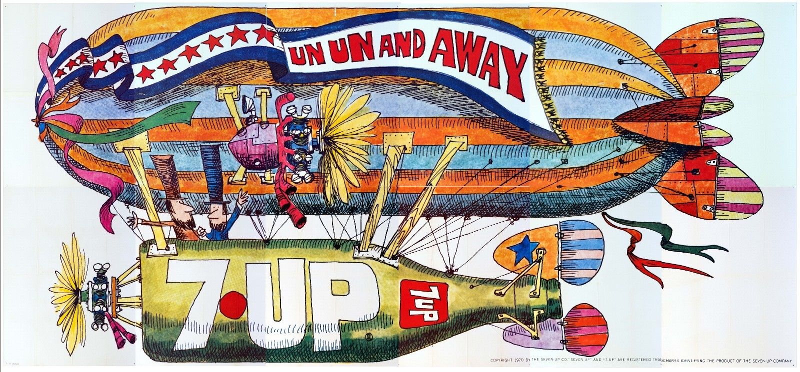
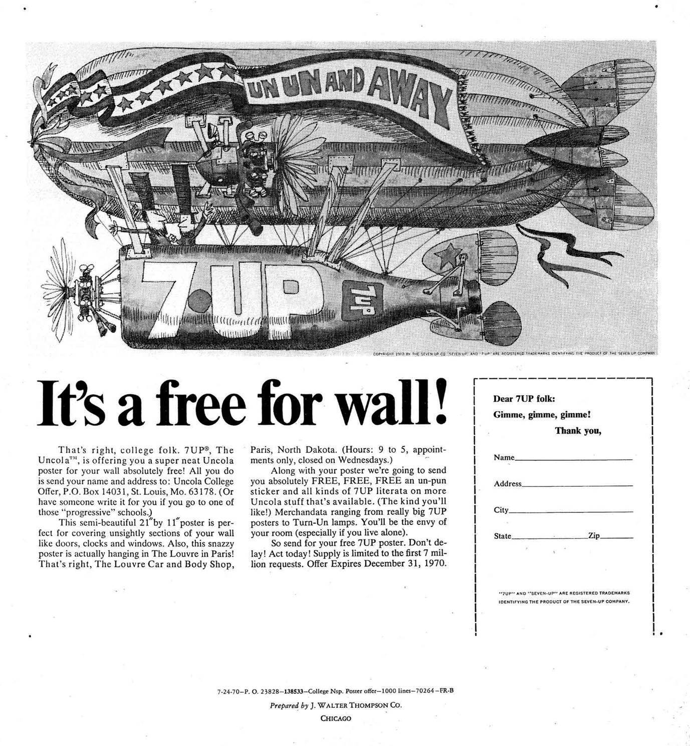
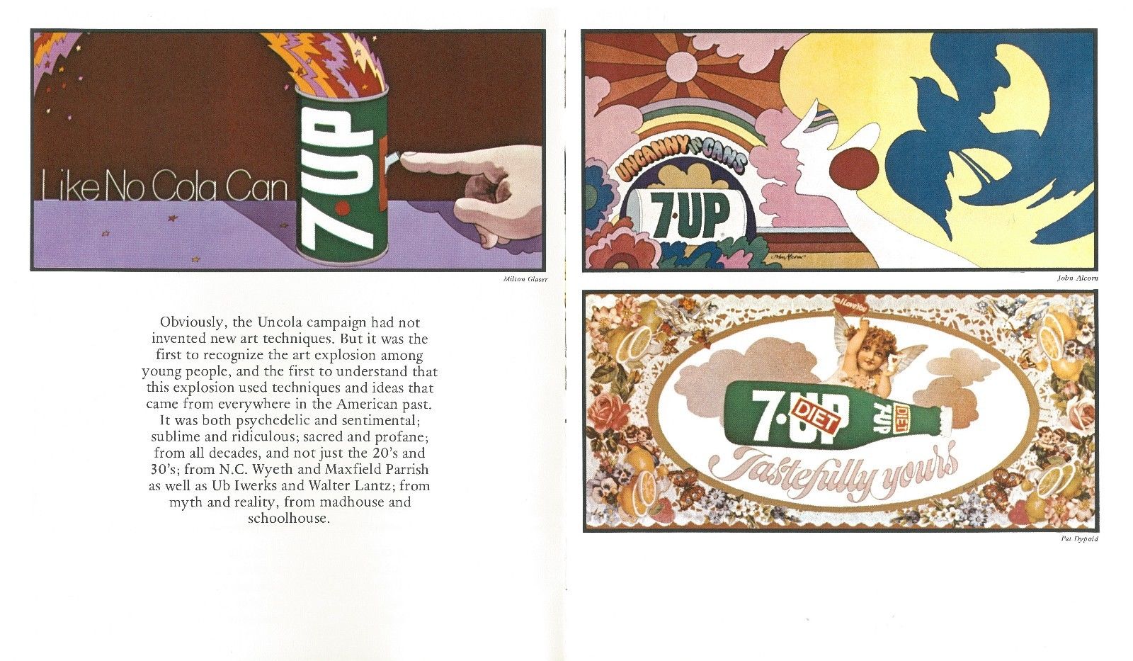
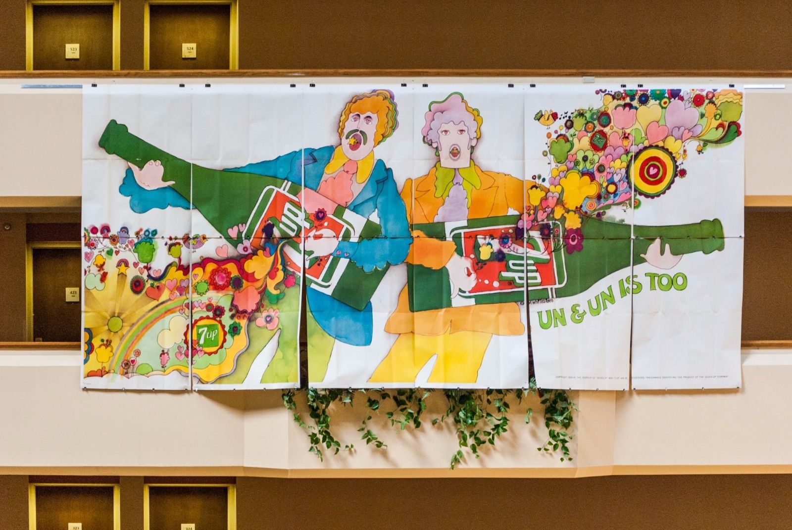
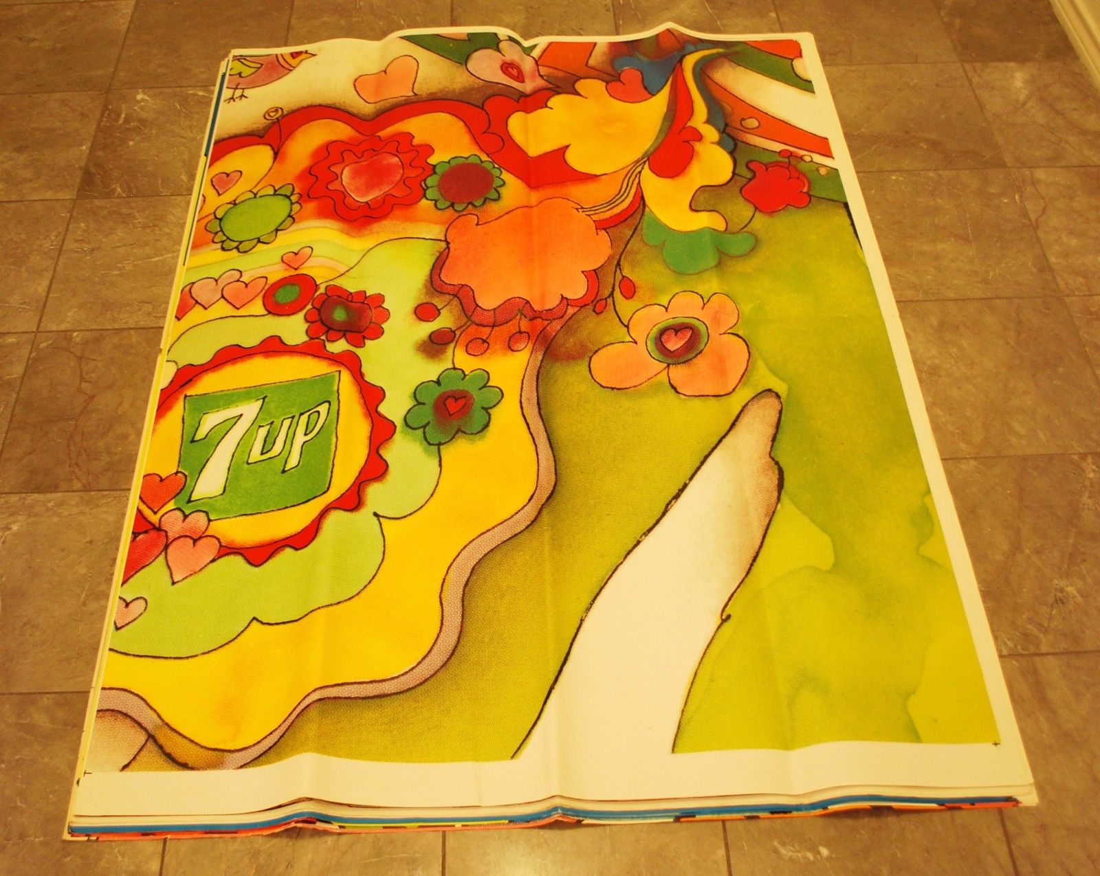
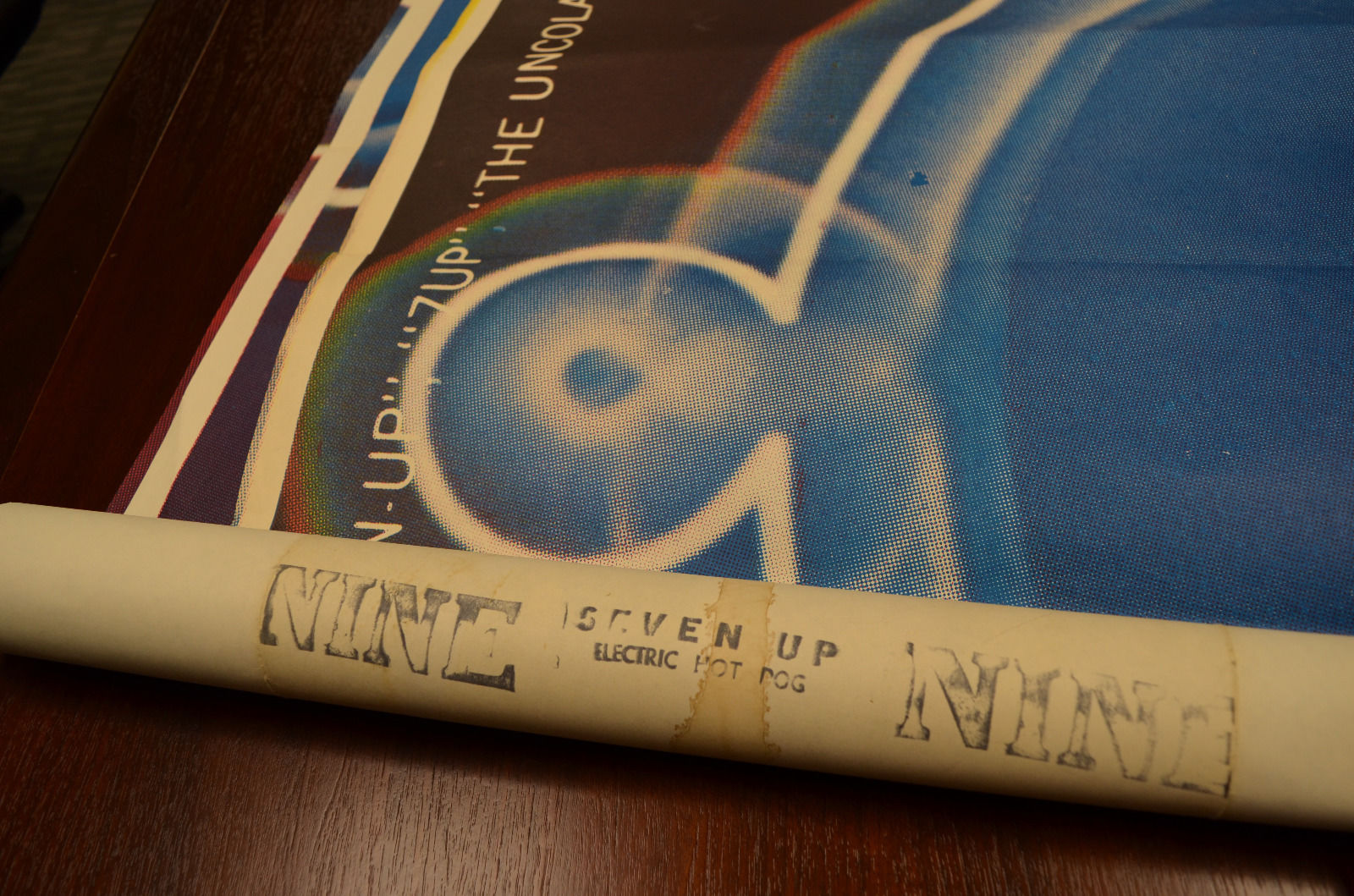
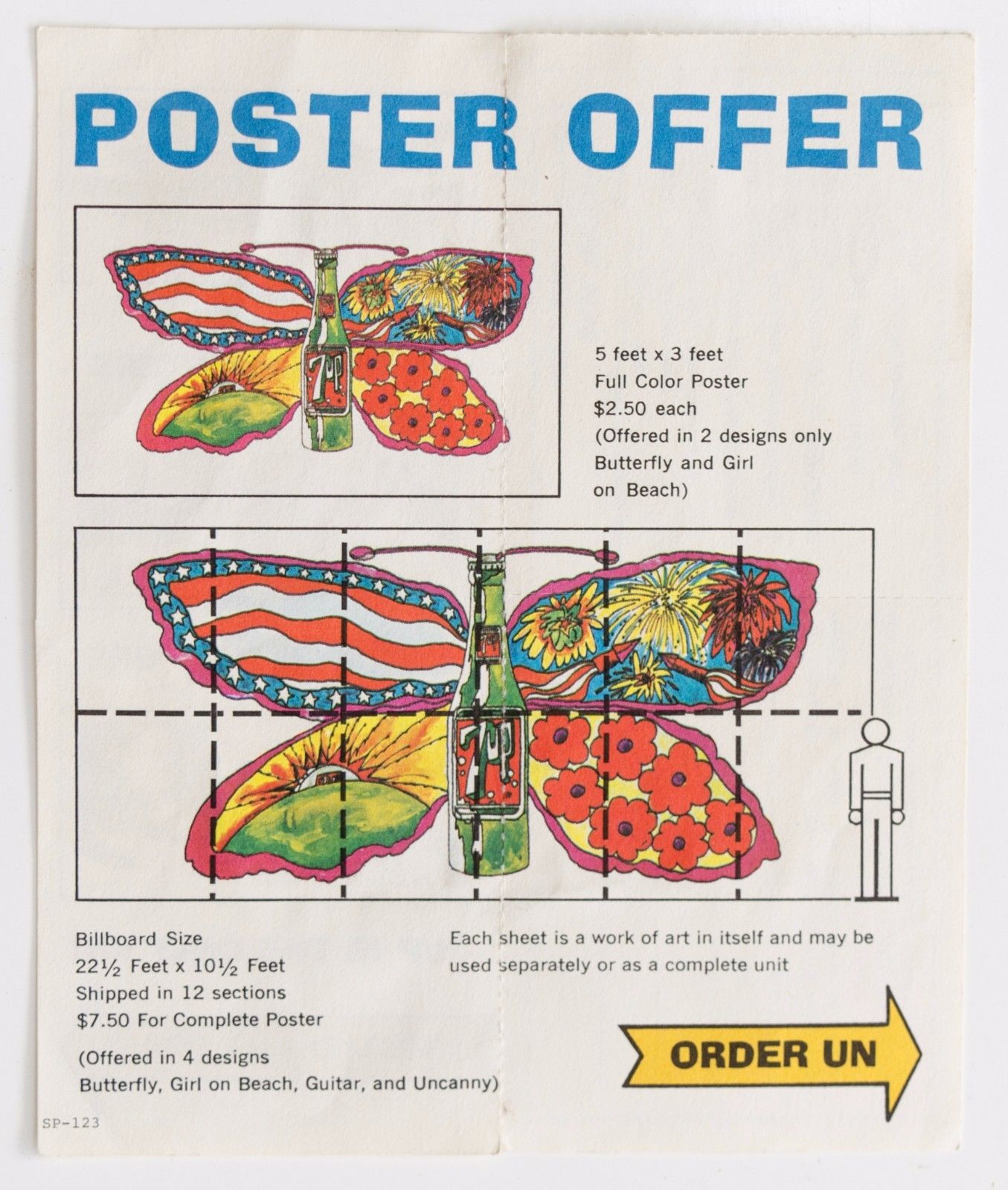
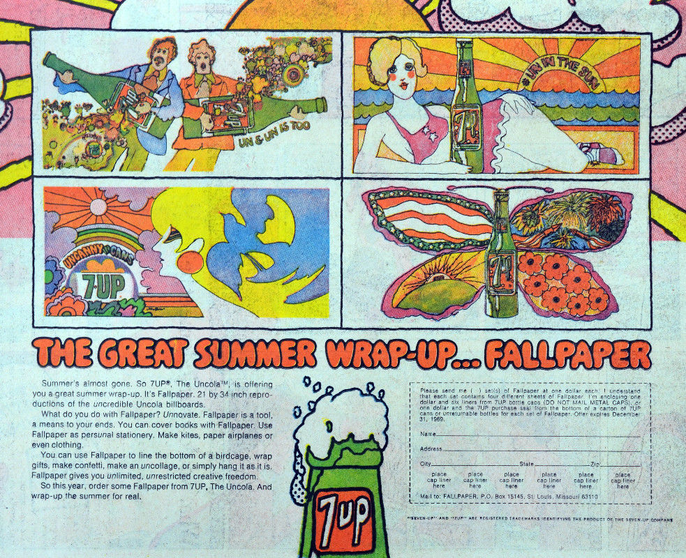
Browsing eBay over the Xmas holiday, a friend came across a psychedelic Submarine poster not a million miles away from Heinz Edlemann’s classic Yellow variant, created for The Beatles‘ film of the same name. In the same brightly-coloured, cartoonish style of the late 60s and early 70s – much popularised by artists like Edelmann, Milton Glaser, Nicole Claveloux and Peter Max – this sub was in fact green and advertising the drink, 7Up – billing itself as ‘The UnCola’. What was remarkable about this eBay listing though was that it was for an original 60″x36″ poster, not the sort of thing that turns up every day.
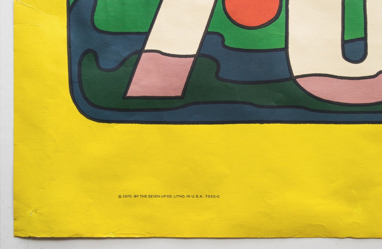
Indeed, further investigation revealed that the seller, Dallas resident, Robert Trent, is the foremost collector of this era of 7Up advertising and was selling off duplicates from his collection. Even crazier was that he was also selling huge billboard versions of some of the designs, some as an un-pasted set of 12 panels over 12 meters in length. Over the course of many entries he had compiled a huge resource of information, links and imagery, all expertly checked and presented without fuss and in meticulous detail. These kind of posters don’t come up every day and he has the whole history up there to give context to the images. After seeking his permission I hereby reproduce some of the imagery and details before it’s lost.
From Robert’s listing: “‘Wet Un Wild (green submarine, aka yellow submarine) 60” x 36” horizontal poster by Ed George.
Note: This is made of thick quality poster paper, not dimpled yellow plastic tablecloth material (modern-day Tyvek construction wrap vapor barrier or “paper dress” nylon material) like the other “Wet Un Wild” posters occasionally offered on eBay.
This one is in excellent, but not perfect condition. This illustration is highly sought after and may be the holy grail of all 7Up UnCola poster images. Ed George illustrated this in 1969, (he) held multiple posts in-house at the J. Walter Thompson [advertising] Co. in Chicago (JWT) over many years.”
Below: 28 of the billboards in Robert’s collection as of writing…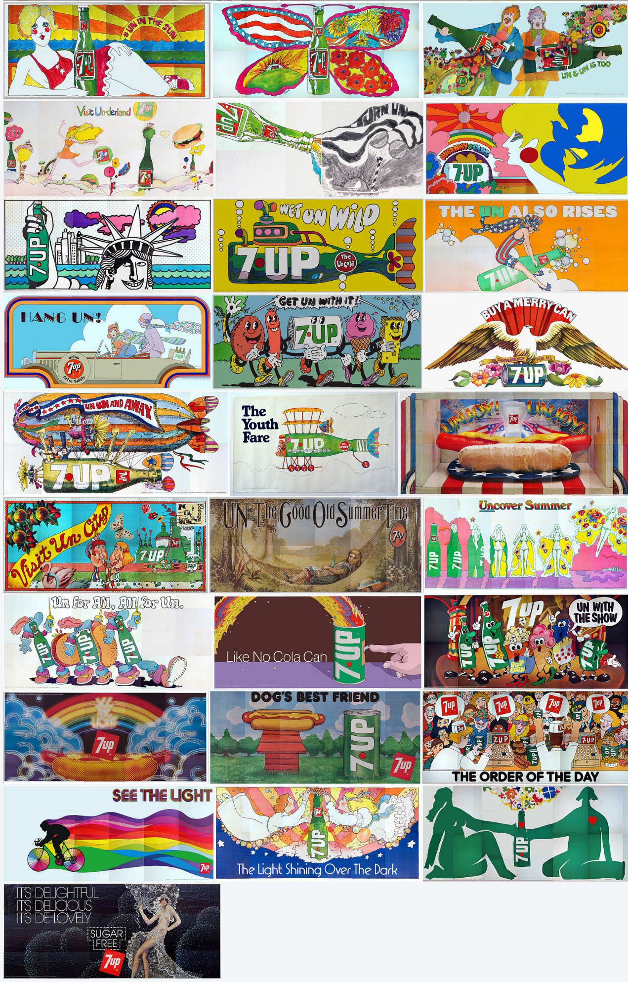
From Robert’s listing: “Most of these images actually graced highway billboards and dorm rooms. They were so popular that the Seven Up Company offered them for sale – few survived. The first batch of billboard sized images were up nationwide when colorful VW vans full of hippies drove to the Woodstock Festival in August of 1969. A “Fallpaper Poster Offer” on the bottom of page 8 of the October 5, 1969 Chicago Tribune Sunday Comics offered a set of (4) 34″x21″ reproductions of their famous billboards seen earlier in the year for, read it and weep – ONE DOLLAR TOTAL (plus 6 bottle cap liners). That offer expired on 12/31/69. The sizes also ranged from small Size “D” posters to giant Size “A” 21’x10′ billboards. These are all ORIGINAL vintage posters – NOT modern giclee photo reproductions.”
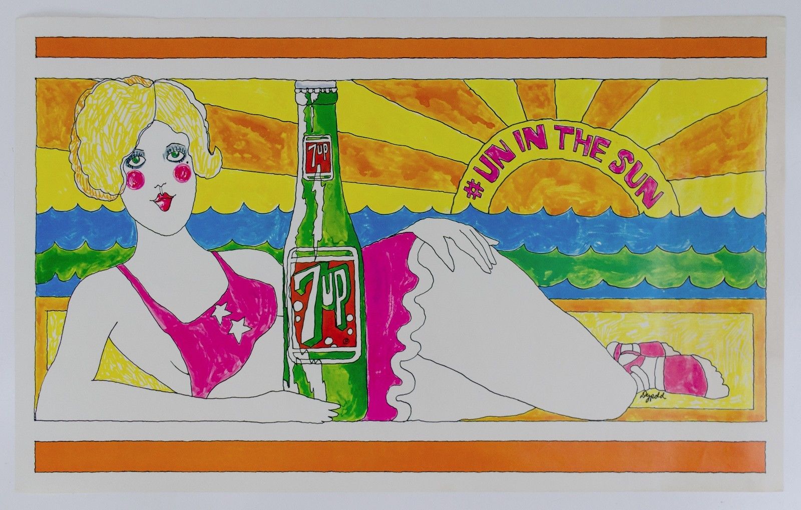
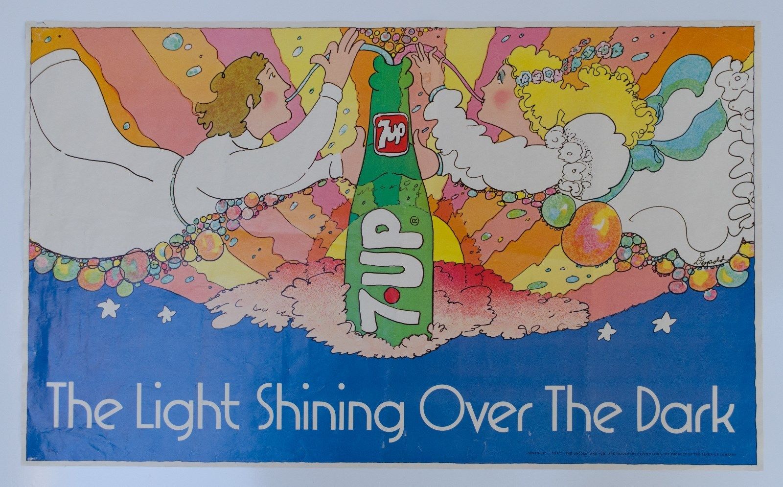
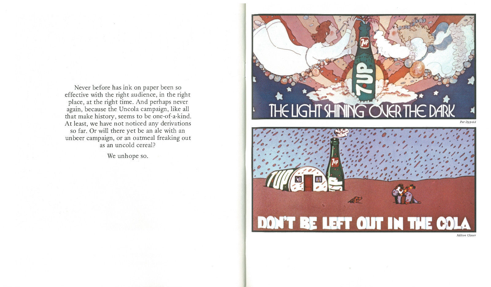
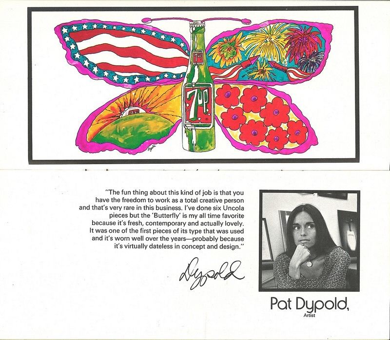
From Robert’s listing: “‘The Light Shining Over The Dark’ This is a vintage 33″ x 20″ horizontal poster that is in excellent condition and VERY RARE. I’m only aware of 2 or 3 other copies, some of which have passed through my hands. The artist’s signature can be seen at the right center in the bottom of the girl’s white dress.
The artist was Pat Dypold who illustrated this by 1973 as a free-lance artist. She did the bulk of the other outdoor ads (billboards) for the J. Walter Thompson [advertising] Company of Chicago (JWT) that orchestrated the famous UnCola ad campaign from about 1968 through 1975.”
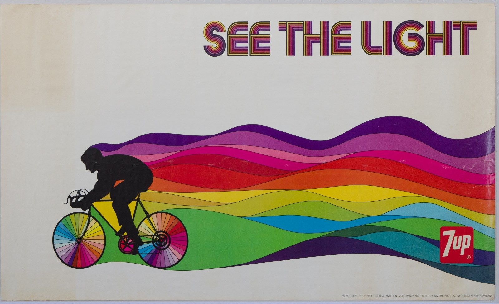
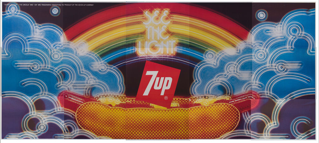
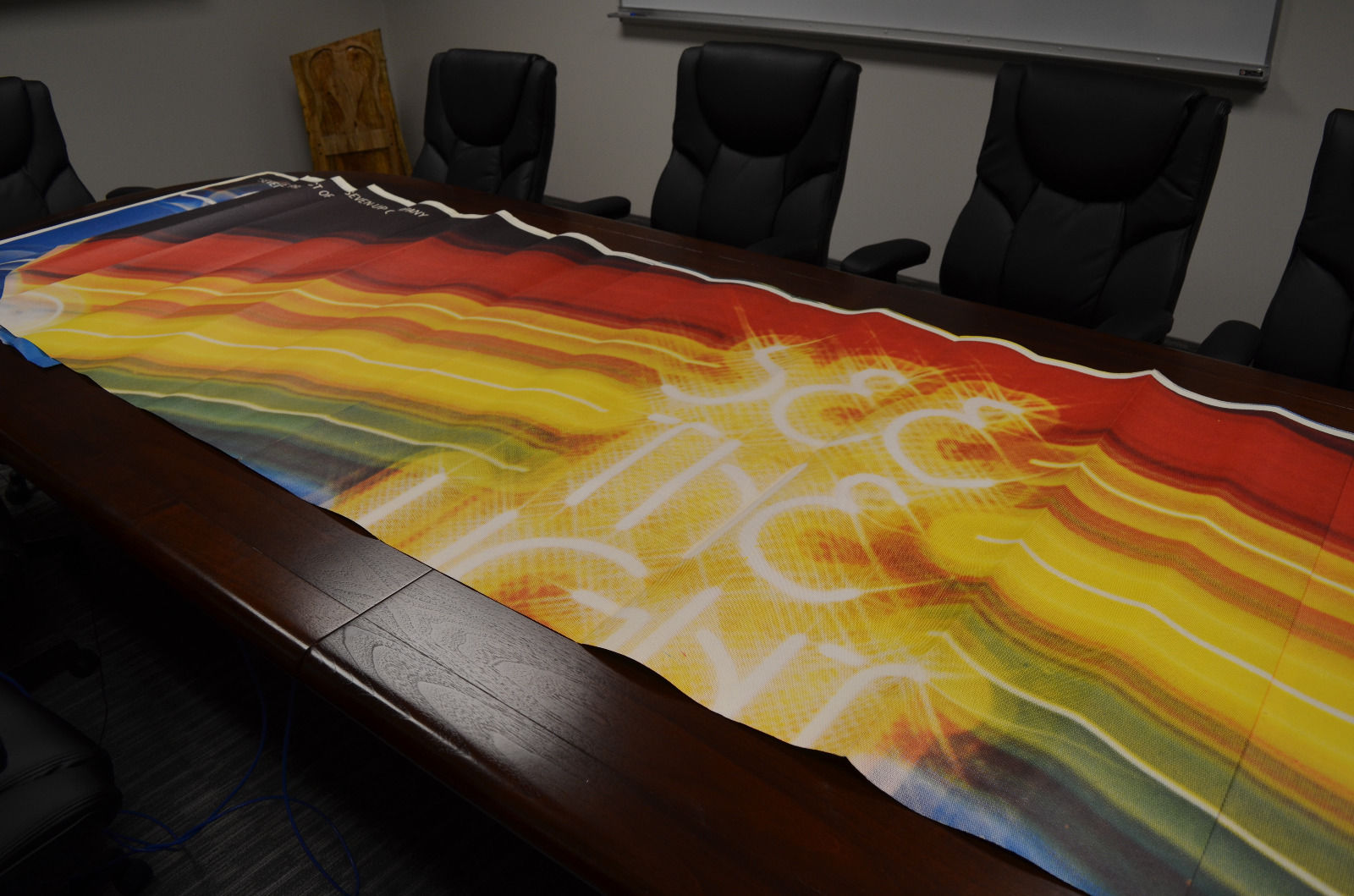
From Robert’s listing: “‘See The Light’ (psychedelic bicycle) 60″ x 36″ horizontal poster by the late Tom Kamifuji (1922-2015) (original concept by Bill Bosworth)
“Hiroyuki “Tom” Kamifuji ran a design studio in San Francisco. He was an illustrator, poster designer, typographer, art director and designer. Yet, for all his legacy of brightly-colored works, there is very little biographical information available. Perhaps his most universal success was the inspiration for the rainbow swath of color within the Apple Computers apple. The concept for this image came from Bill Bosworth who worked in-house at the J. Walter Thompson [advertising] Co. in Chicago (JWT) over many years. However, the actual finished artwork was done by California artist Tom Kamifuji. There is no signature on this “Size B” poster, but the larger “Size A” 21’x10′ “See The light” billboard in my possession has Tom Kamifui’s signature.”
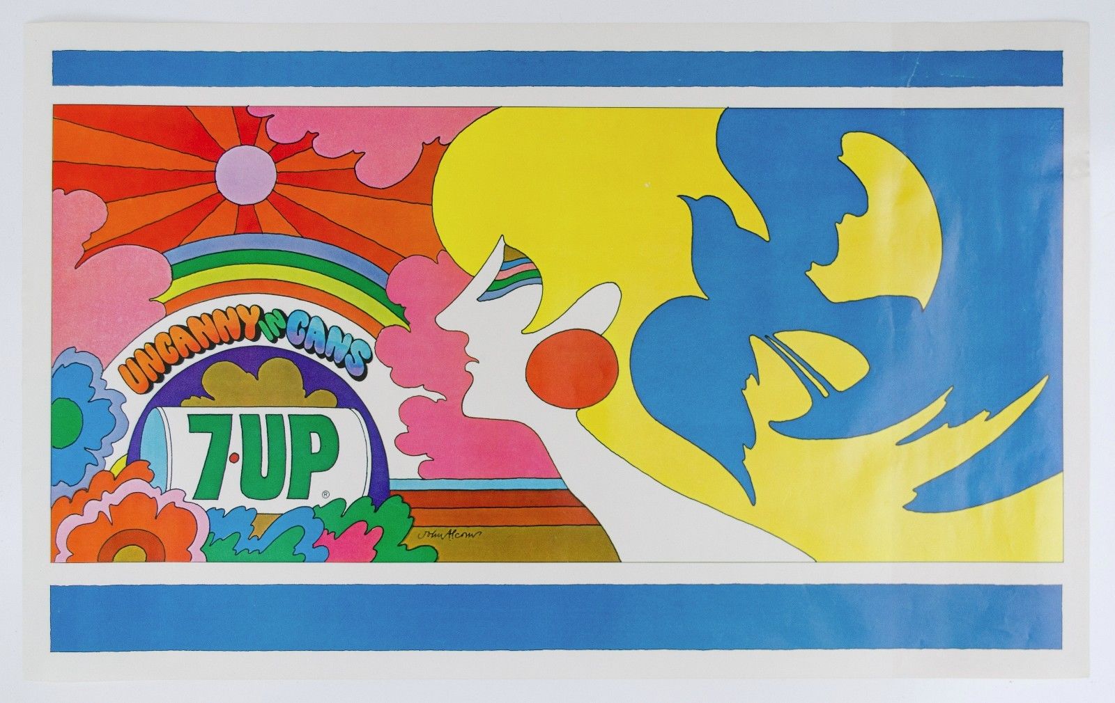
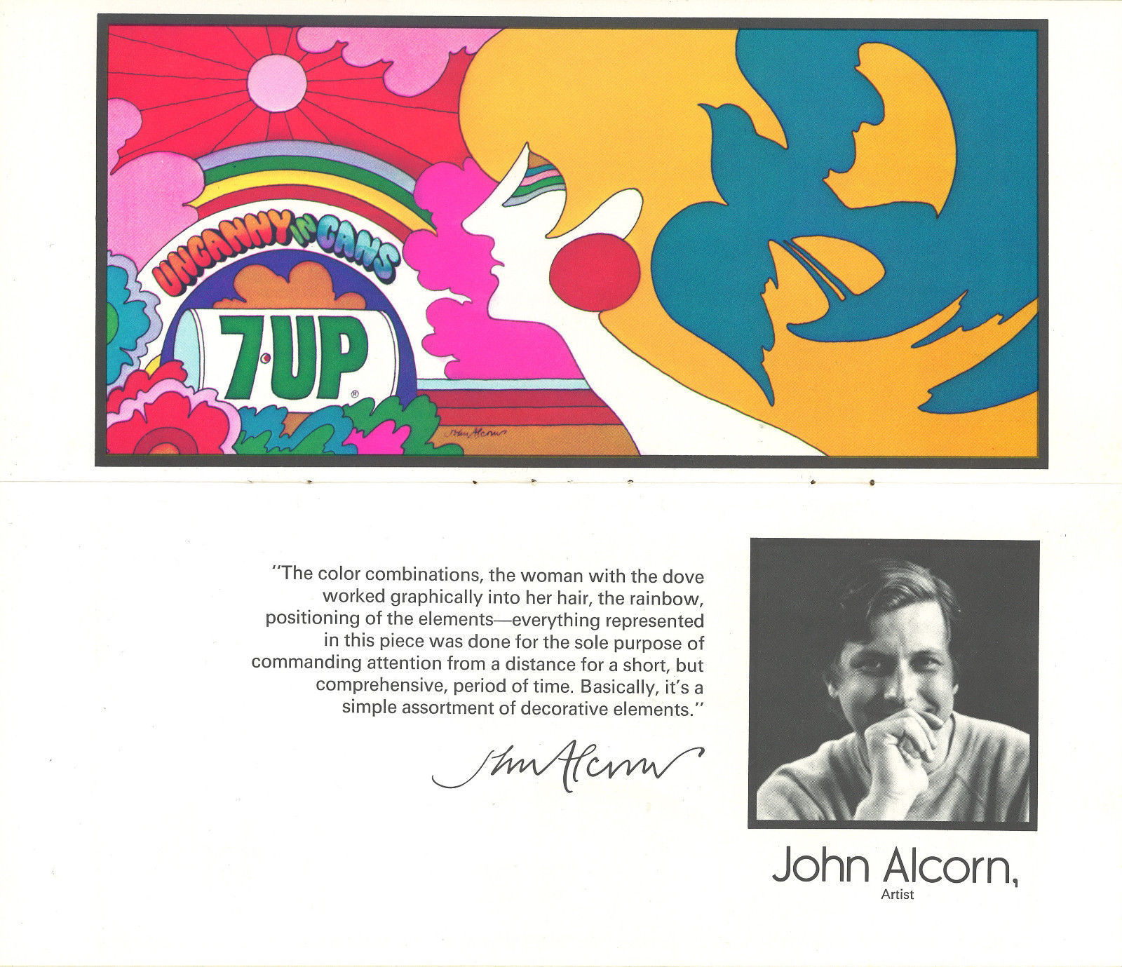
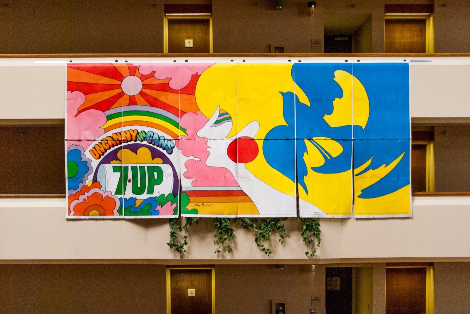
From Robert’s listing: “‘UnCannny In Cans’ This is a vintage 33 3/4″ x 20 3/4″ poster that is in excellent, near mint condition. This is an authentic, traceable representation of late ’60s, early 1970’s pop art advertising. The artist was John Alcorn who illustrated this in 1969 as a free-lance artist. His signature is in the bottom middle brown band. At the age of 24 Alcorn was the 4th person to join Push Pin Studios which was the place to be in the graphics community at the time.
The Seven Up Co. sold 4 different sizes of most images to the general public. BTW – My collection also includes one of the “UnCanny In Cans” Size “A” billboards plus a 60″ x 36″ Size B” version. The poster for sale here is a 34″x21″ Size “C”.
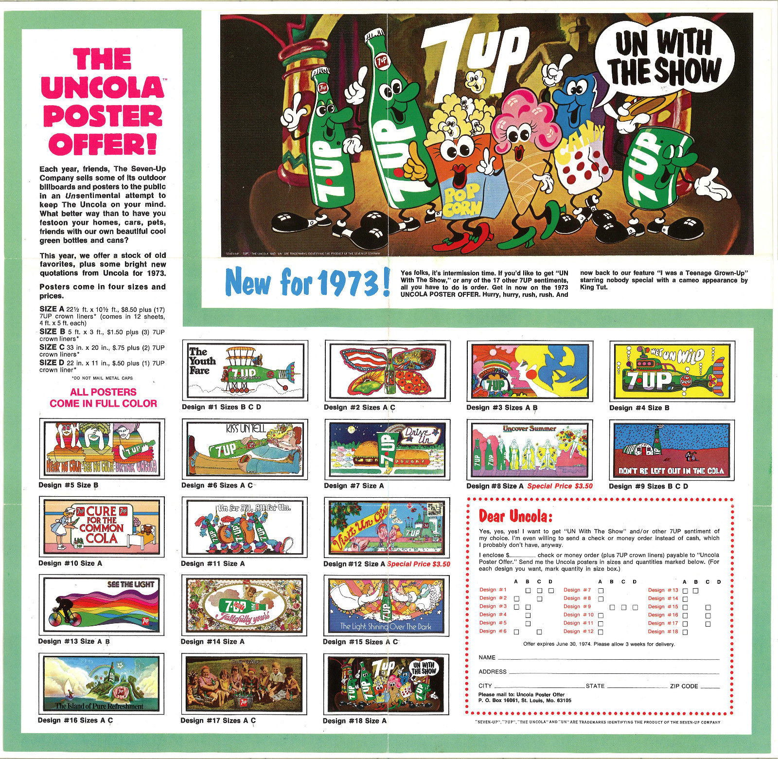
John did a number of well known illustration advertisements in the prior years for Pepsi and Campbell’s Soup and his career flourished for many more years. These outdoor ads (billboards) were commissioned by the J. Walter Thompson [advertising] Company of Chicago (JWT) that orchestrated the famous UnCola ad campaign from about 1968 through 1975. Most of the 53+ extremely colorful billboard & poster images were illustrated by invited outside freelance artists who were allowed to sign their names on the originals if desired – not all did. Only a few images were produced in-house, and never with the artist’s name on them. JWT wisely chose to invite only up and coming artists and not well known graphic stars so as not to let the notoriety overshadow the product itself.
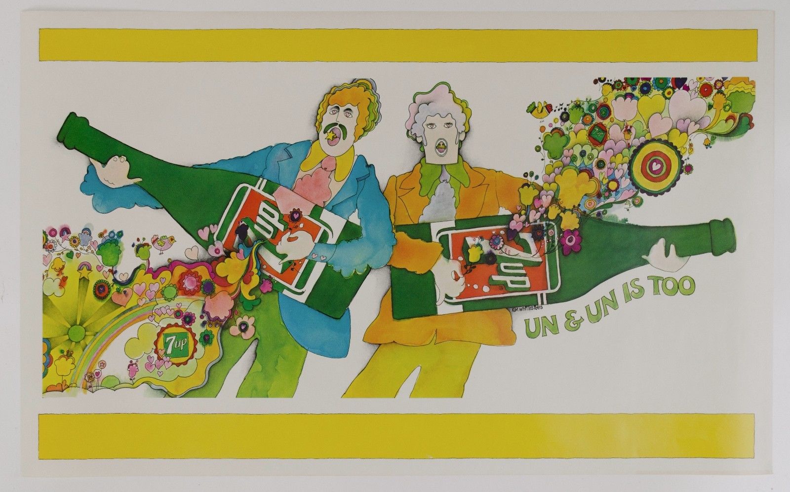
Many of the artists have gone on to great fame in the graphics community Milton Glaser (I [heart] NY logo) (Mad Men final Season 7 poster; co-founder of Push Pin Studios), Seymour Chwast (co-founder of Push Pin Studios) with Isadore Seltzer, John Alcorn (Push Pin Studios), Kim Whitesides, Barry Zaid, Jacqui Morgan, Simms Taback (1st Happy Meal Box in Smithsonian & Caldecott Honor for children’s books), Skip Williamson, Robert Abel (Tron movie), Charlie White III (permanent collection at MOMA), John Craig, Ray Lyle, Heather Cooper, Nancy Martell, Roger Chouinard, Pat Dypold, Bob Taylor, Tom Kamifuj, Bill Bosworth, Ed George, Joanne _ and probably several others.
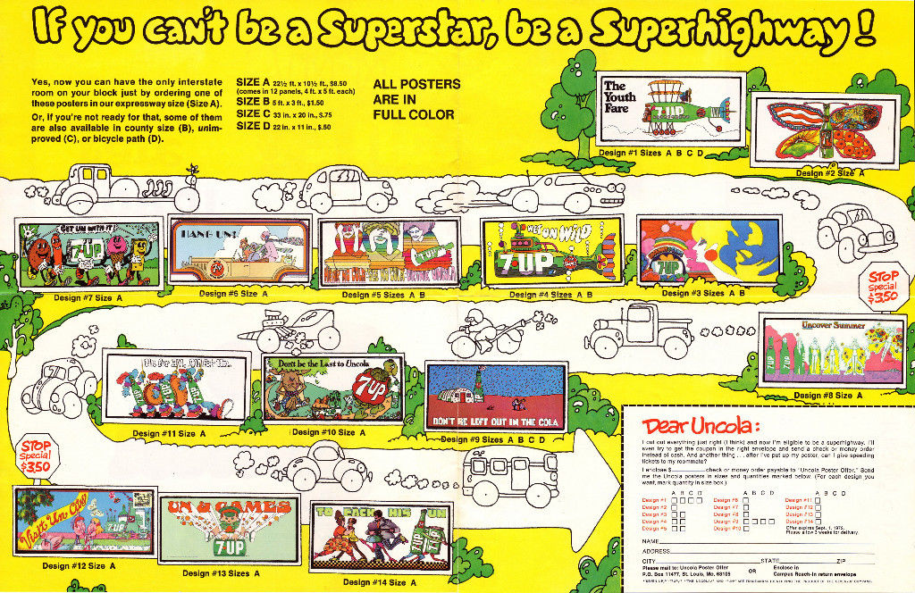
The Seven Up Company executives chose rough “comps” without the artist’s names attached to the submissions. If 1 or more sketches were chosen, the artist would eventually earn up to $2,000 per completed piece. I’ve spoken with some of the retired ad execs from JWT and they reported that this was a fantastic assignment with a dream client that encouraged bold moves. These Midwest Mad Men boosted sales by anywhere from 30-60% under their highly creative reign from 1968 until the mid-seventies.”
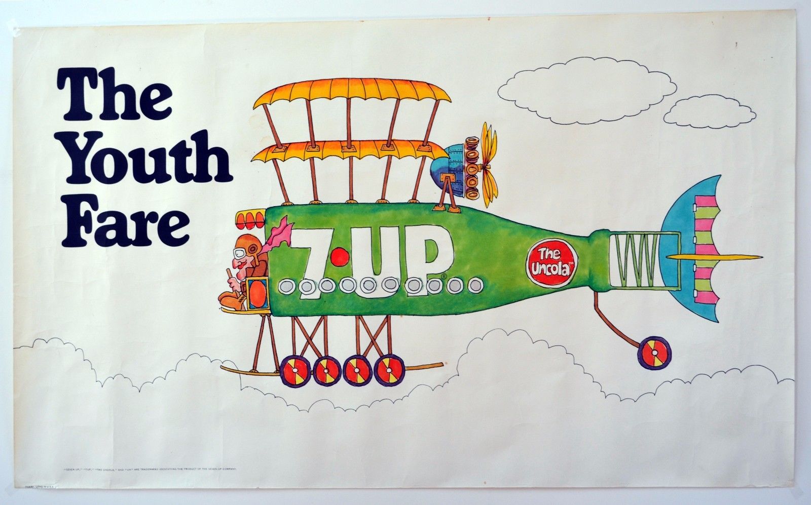
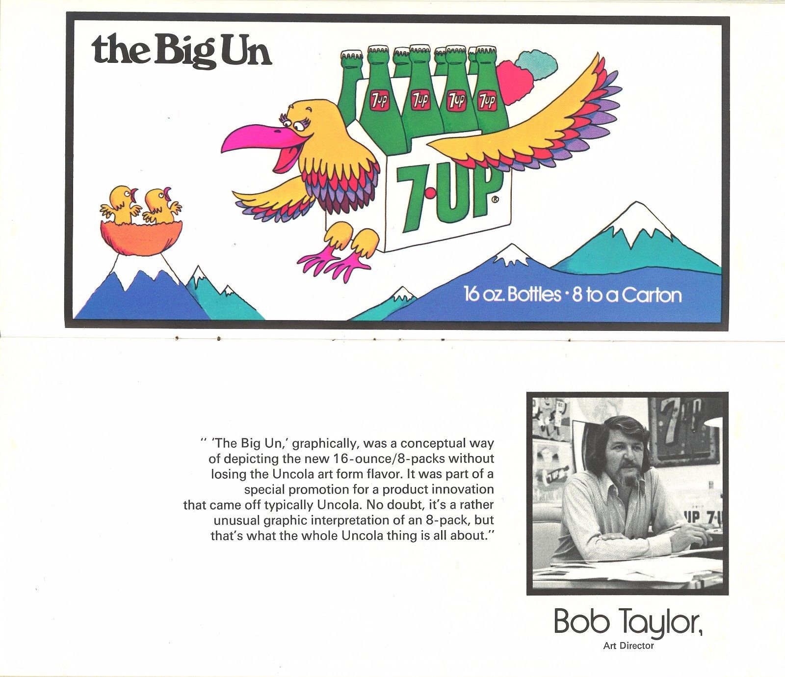
From Robert’s listing: “Bob Taylor was an art director at the famed J Walter Thompson [advertising] Company based in Chicago – the Midwest Mad Men. An American Contemporary Graphics Exhibit booklet from about 1972 featured Bob and a different “cartoony” billboard image of his on pages 9-10. Bob was one of the driving forces behind “The UnCola” ad campaign from the beginning in 1968 until the end in the middle 1970’s. Bob also illustrated “The Youth Fare” in a similar “cartoony” style depicting a green bottle of 7Up as a bi-plane.
This is the 21’x10′ Size “A” billboard version of this blimp image by Bob Taylor available as Design #10 for $7.00 in the billboard and poster offer that expired on 5/31/72. A small 21″x11″ poster was available for FREE if you responded to the poster offer that expired on 12/31/70. Another folding billboard and poster offer that expired on 5/31/72 offered this billboard as Design #12 for $8.50.
As of today, I only know of one other copy besides the 2 billboards in my possession. This piece of advertising history is in NEAR MINT condition and ready for display. To get a sense of scale, a standard sized vehicle would not cover up the blimp itself if laid out flat on a driveway.”
The American Contemporary Graphics Exhibit book laid out profiles of some of the artists along with their contributions and the aim of the campaign.
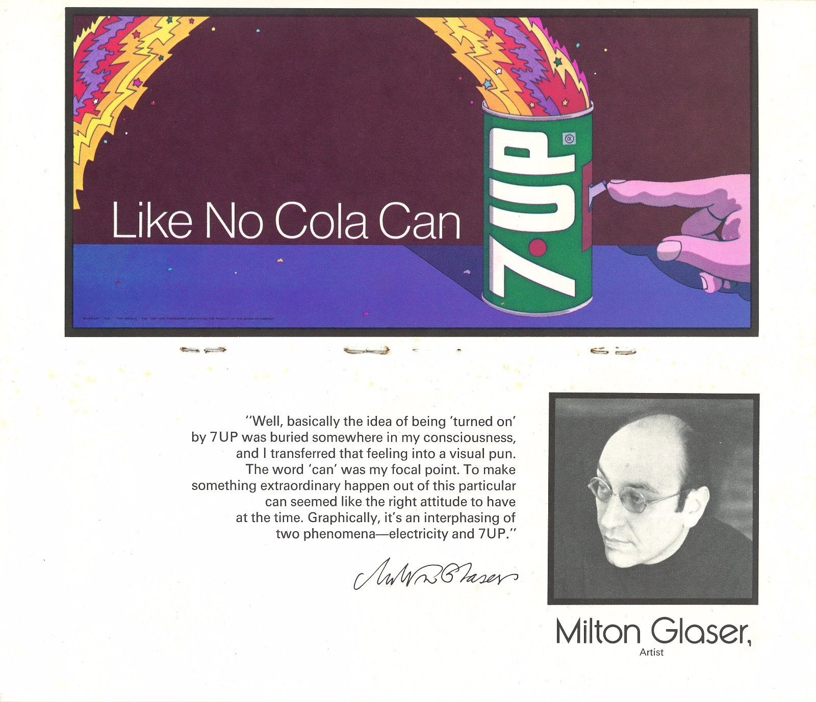
From Robert’s listing: “Milton Glaser (b. 6/26/29) This image was created during his Push Pin Studios era which is the firm he co-founded with Seymour Chwast. It would be another 6 years before he created the most copied “I [heart] NY” logo on the planet in 1977. Scans from 2 different booklets from about 1971 independently attribute this work to Milton Glaser. Here are his own words about the concept for the image:
“Well, basically the idea of being ‘turned on’ by 7Up was buried somewhere in my consciousness, and I transferred that feeling into a visual pun. The word ‘can’ was my focal point. To make something extraordinary happen out of this particular can seemed like the right attitude to have at the time. Graphically, it’s an interphasing of two phenomena – electricity and 7Up”.
My extensive collection includes the ONLY 2 KNOWN COPIES IN ANY SIZE of this particular image. The originals are 21’x10′ Size “A” billboards acquired from someone in the Out Of Home (OOH) [billboard] business that set these aside in the early 1970’s thinking that they might be something special. They are. Even world famous graphics guru Milton Glaser doesn’t have any copies in his vast collection per his archivist. I’ve never seen ANY other copies in ANY other size. I also collect 7Up UnCola “poster offers” but I’ve also never found any offering this image to the general public. Most of my other billboards were offered to the general public for prices between $3.50 and $8.50. For some reason, this one and a few others were not made available although a few like this one were squirreled away. “
Pat Dypold seems to be the unsung heroine of the piece, contributing many illustrations in various styles but she’s not a name I’m familiar with. Robert had a class reunion and hung several of the billboards from the balcony at the venue they held it at, you get a sense of scale with these photos plus some close up details.
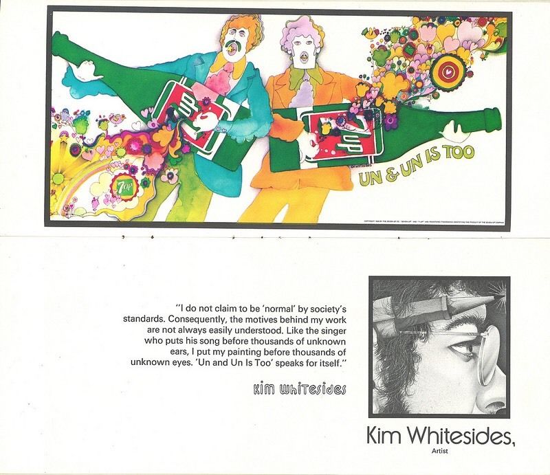
From Robert’s listing: “Giant 21′ x 10′ 7Up UnCola original unused vintage paper billboard illustrated in 1971 by Kim Whitesides. An American Contemporary Graphics Exhibit booklet from about 1972 featured Kim Whitesides and this image on pages 11-12. He did at least 3 other billboard images for The UnCola ad campaign, 2 of which were issued in billboard and/or poster formats.
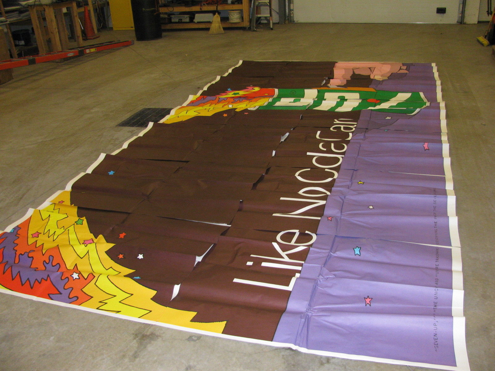
The billboard itself consists of 12 thick paper panels, each 43″ wide x 59″ tall. There’s about a 1″ white margin on the top and right edges of each panel so it can be installed in an overlapping “rainlap” pattern designed to shed water like shingles on a roof (see last image). These were only meant to last outdoors for 30-60 days, and then the next billboard would be pasted over the top – destroying the paper underneath. The only way any of these survived for nearly 5 decades was for them to be set aside and not used as intended. This is one of the rare examples of that being done. Although rare, I have 3 copies of this billboard image in my collection. All 210 square feet of my copy has been painstakingly reinforced with acid-free scrapbooking tape on the rear side, but only as needed to stabilize small rips, week fold lines and other minor imperfections. Any small holes have been patched with matching paper from donor panels from the same era and are barely noticeable up close. In places, colored pencils or markers have been used to refresh missing ink.”
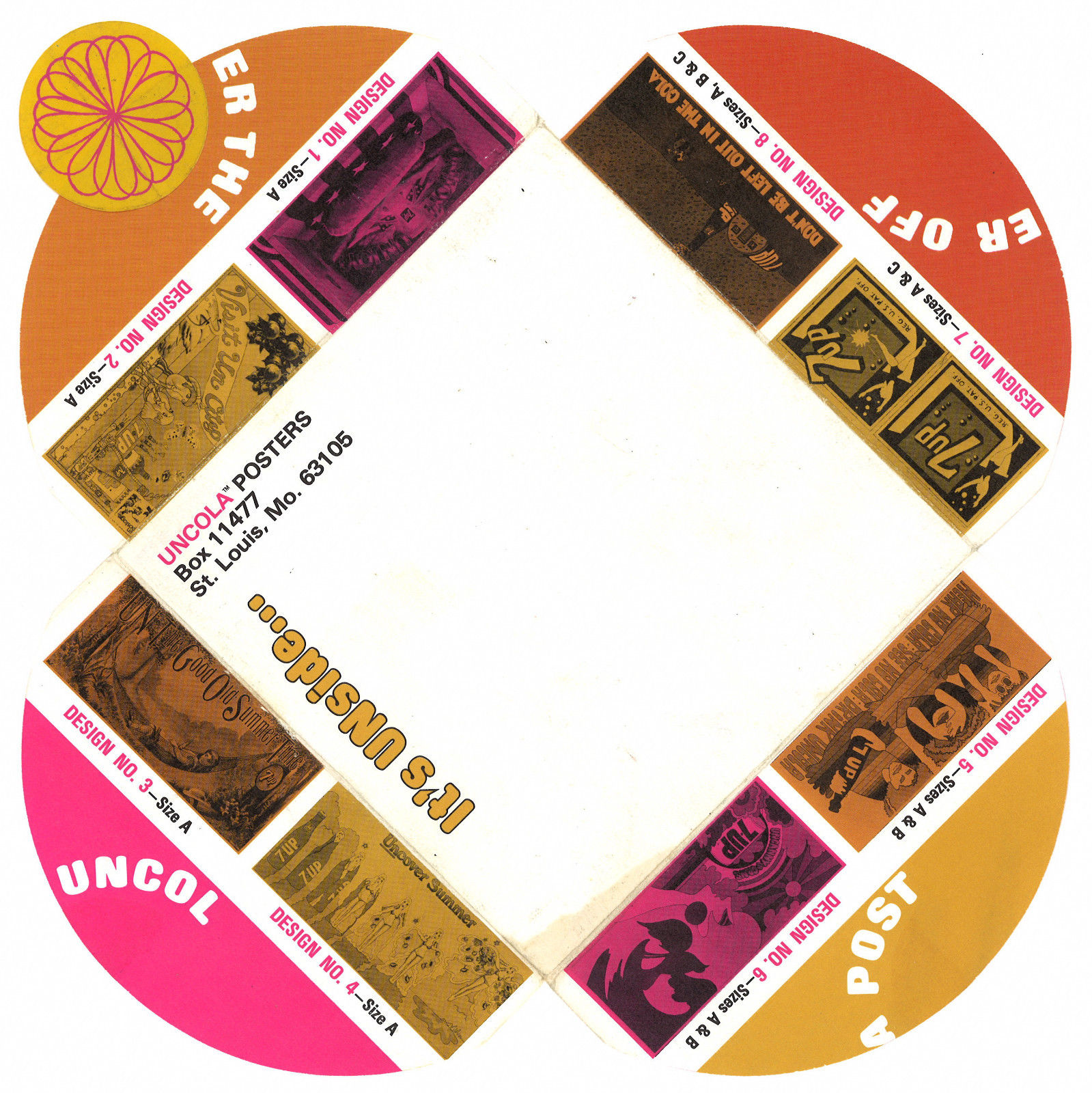
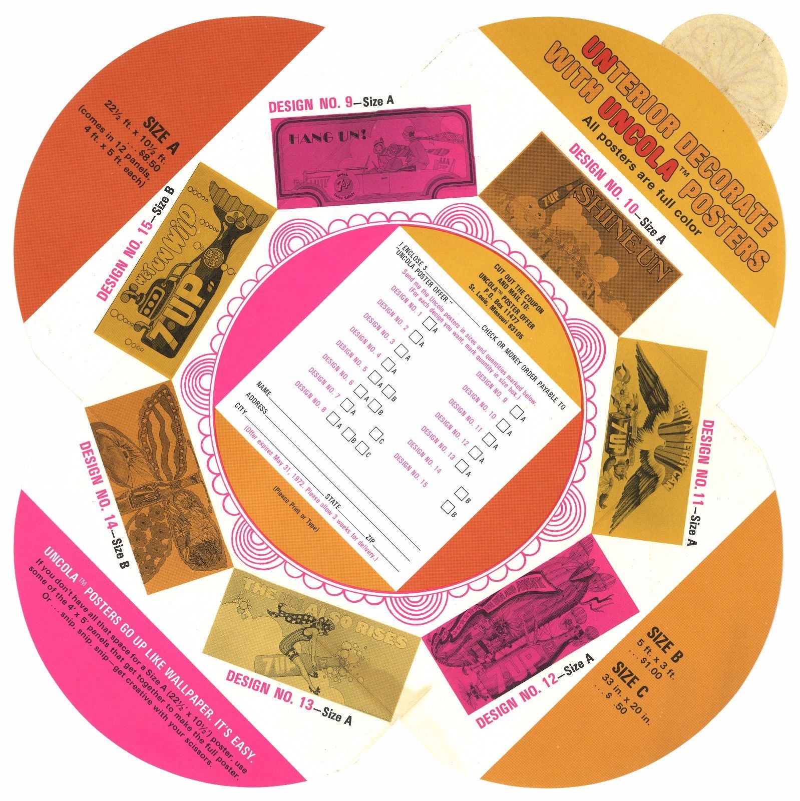
There are examples of many order forms including this fold up mail out, such great thinking going into something so ordinary.
There are two very good articles / interviews with Robert on the web: one with Collector’s Weekly
and one with the ever-reliable Dangerous Minds so head there if you want more info. You can follow Robert on Instagram, view his whole collection on Flickr or peruse his eBay entries for yourself. Masny thanks to Robert for letting me repost these pictures and info.
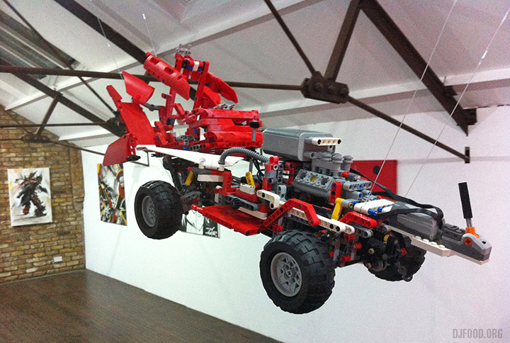
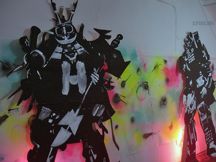
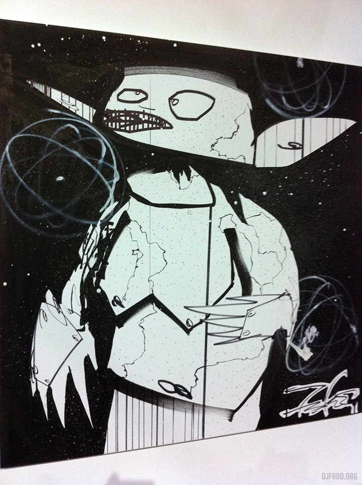
Last week I played at the opening of the ‘Cosmic Flush’ exhibition in London at the Magda Danysz Gallery. The contents of which celebrated the work and life of Rammellzee, the MC and artist who passed away in 2010. Instigated by the Gamma Proforma label, it was full of art from the new album and attended by a who’s who of the leftfield art scene. Pieces by Futura 2000, Kofie 1, She One, Will Barras, Dan Lish and Poesia sat with art from three of Ramm’s crew: Doze Green, Ian Kuali’i and one of Dr Zulu‘s Lego letter racers. There were also life-size cut-outs of Rammellzee in full battle gear by Will Barras with backgrounds by O.Two.
The exhibition will run until 22nd December. The gallery is open daily from 11am-7pm, closed Mondays.
You can buy the seven releases that make up the ‘Cosmic Flush’ album from Gamma’s online store.
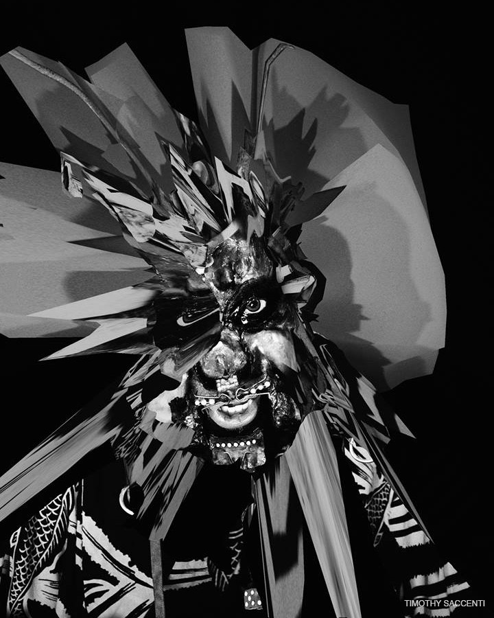
During the run up to the exhibition opening The Quietus website premiered a piece I’d written about Ramm which you can read in full here. It featured a previously unseen image by Timothy Saccenti, made in collaboration with Rammellzee, for a photo session they did in 2005. Here’s another unpublished image from the same time and I’m incredibly grateful to Timothy for letting me use these great images for the piece.
At the opening I played an all-Rammellzee set including a new mix I made for Solid Steel celebrating his musical career. The object was to map an aural history of Rammellzee‘s recorded output, in roughly chronological order, to showcase his music, theories and wordplay for those who wondered what all the adulation and legendary status was about. Take a trip from the early 80s up to the present day, through Ramm’s intricate, confusing, yet always unique recording career from his old school origins through to his final masterpiece.
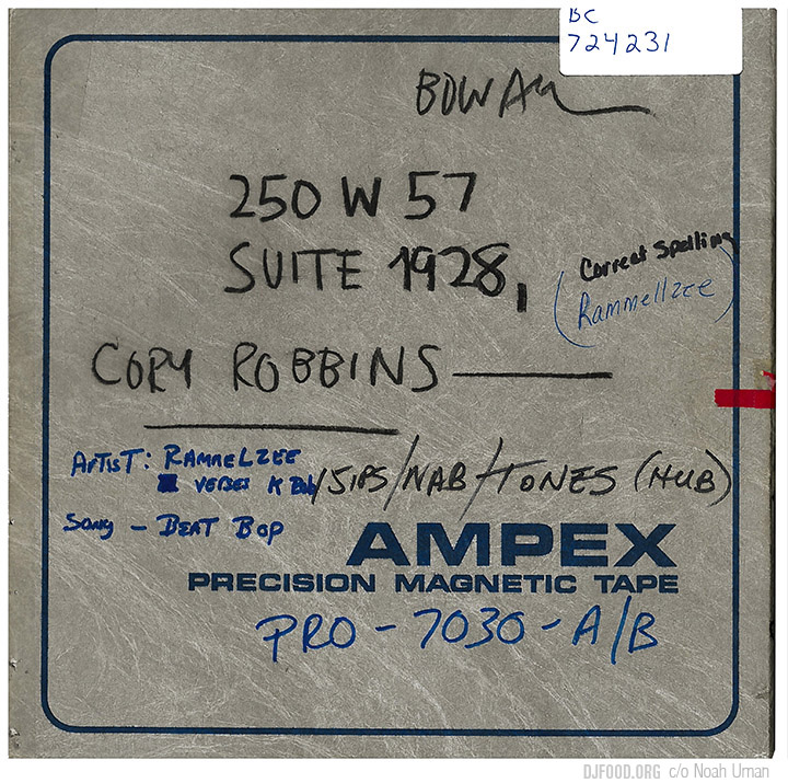
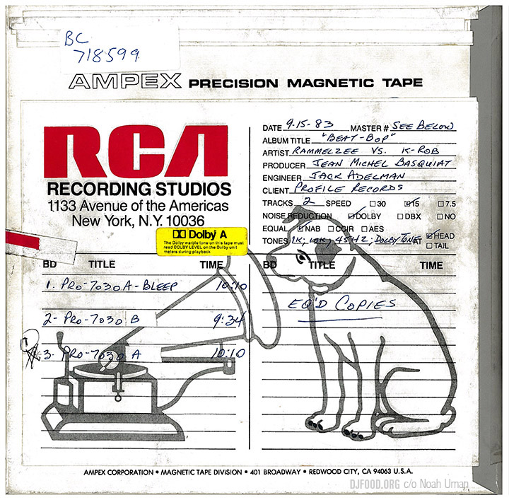
As an addition to The Quietus piece, for which I had way too many images, here’s an extended look at some of his releases over the years. Going back to the beginning, want to see Profile Records‘ original master tape of the ‘Beat Bop’ single? It was recently unearthed by Noah Uman and given a proper reissue after countless bootlegs over the years. Originals now go for triple figures, but here’s the no frills master tape box that was taken from Jean-Michel Basquiat‘s original reel.
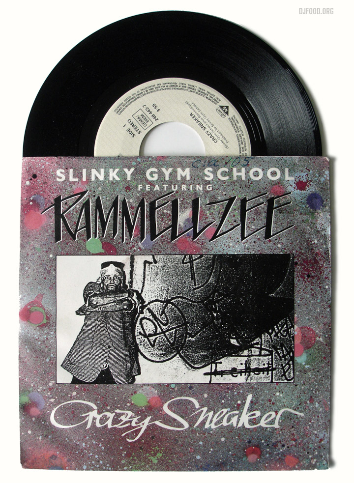
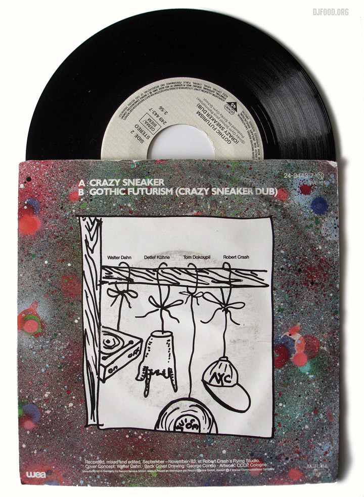
Here’s the Slinky Gym School single he featured on in 1983
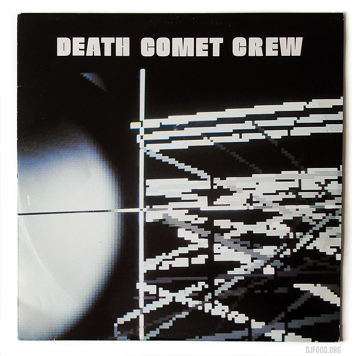
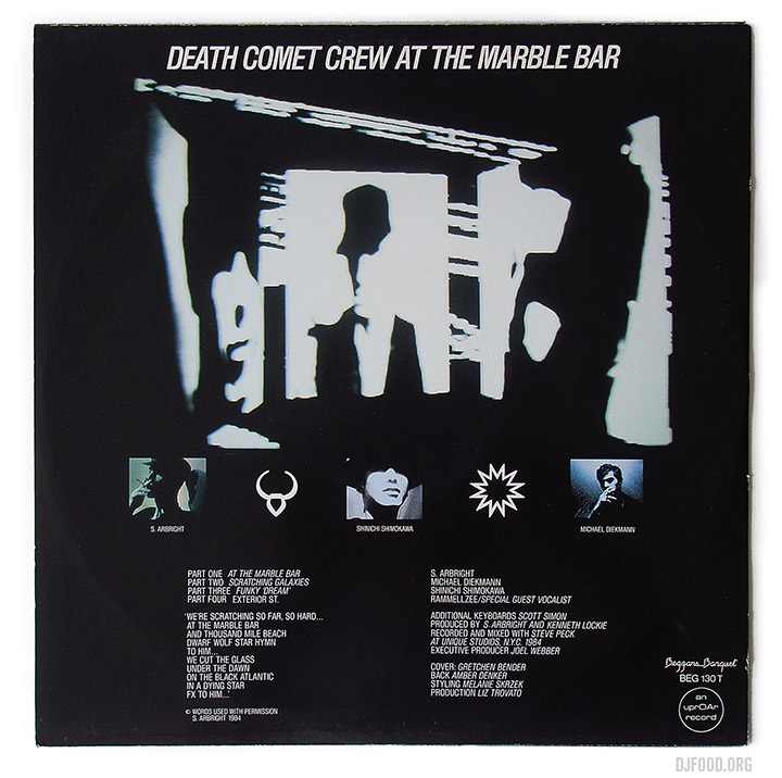
The 1985 Death Comet Crew 12″ on Beggars Banquet
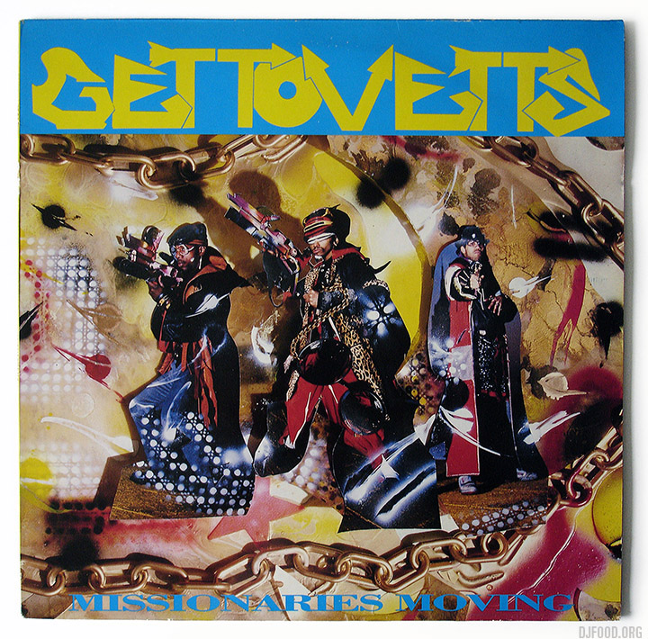
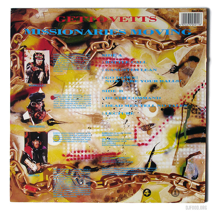
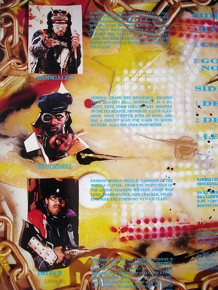
 The Gettovets album with Shock Dell and Delta II, produced by Material on 4th & Broadway in the late 80s
Whilst researching the mix I came across some beautiful sleeve artwork from the various Japanese-only albums and DVD releases in the 00s. Some of these were news to me but well worth tracking down.