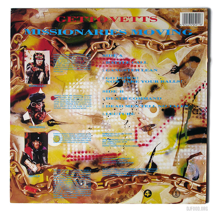
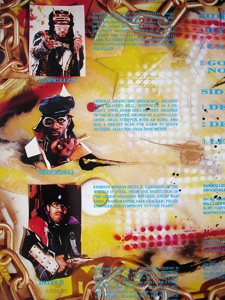
![]()
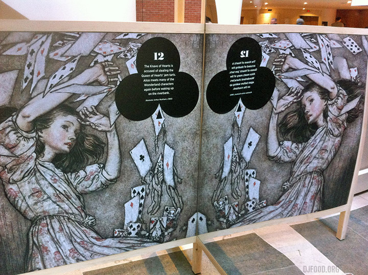
Went to the British Library yesterday to see the Alice In Wonderland exhibition, a collection of many vintage books illustrated by various artists over the last 150 years as well as puzzles, cards, posters and ephemera featuring the characters. Also present were some of Lewis Carroll‘s original notebooks, letters and photos plus printing blocks of John Tenniel‘s original illustrations, used for the first edition.
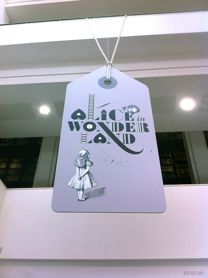
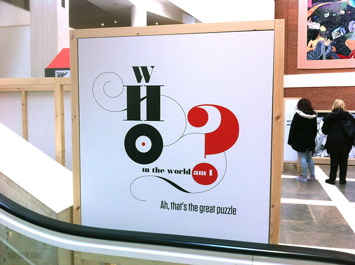
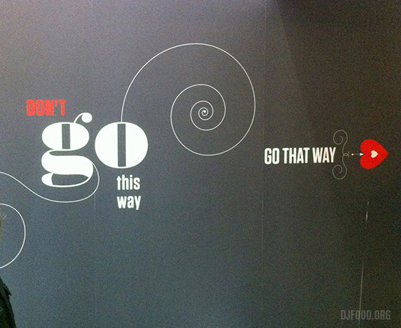
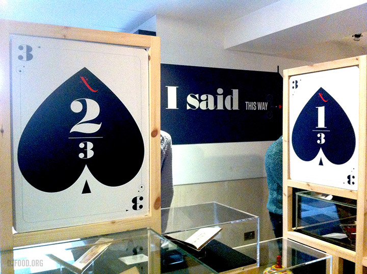
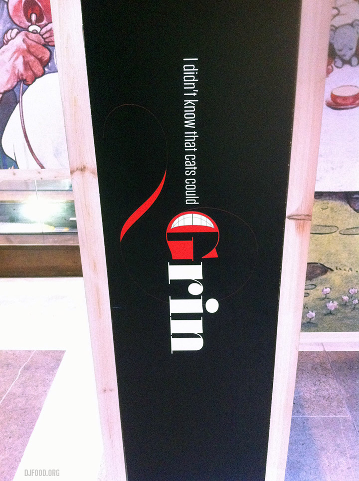
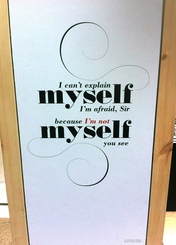
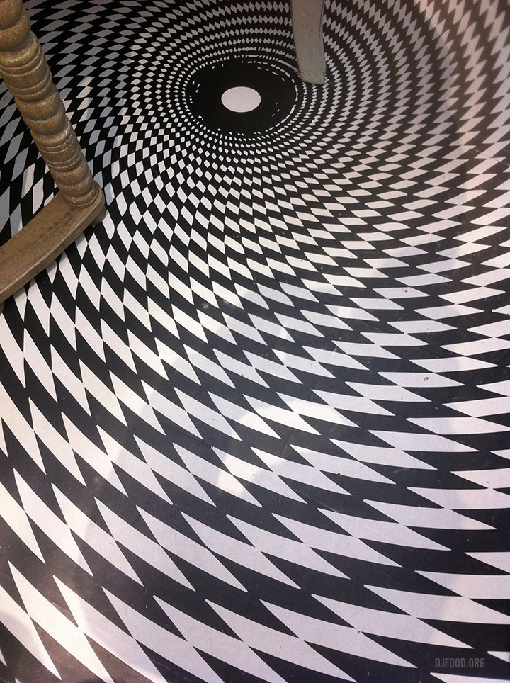
Interesting as all that was though, it was the design of the exhibition that wowed the most, with playful typography riffing off quotes from the book and that fantastic logo hanging from a balcony on a giant tag. I would have got more of it if there hadn’t be an over-zealous security guard warning people from taking photos. Nevertheless, it’s free as it’s in the foyer and it’s worth your time if you’re in the Kings Cross area plus there’s a pop up shop separate from the main one with about 20 different Alice book versions, loads of merchandise and the swirly floor seen in the last photo.