The 64 Bar Challenge mix I did has finally gone up, 29 tracks in 52 minutes, the brief was for each track to be 110 beats per minute and last 64 bars. The series was originated on the Ninja Tune forum by Kovas and driven over 6 different challenges with entries from all over the world.
The quality was really high, largely leaning towards the electronic end of the spectrum, and with roughly 50/50 of the entrants being unsigned or never having released anything. Take a listen and see what you think and contact Kovas at [email protected] if there’s anything here you’d like to know more about, we’d both like to see some of this talent get a lot further. If you go to mixcloud you can see who did what as it scrolls through the mix.
 .
.
•
I love The Orb, one of my favourite groups, and here Alex Paterson goes on a 3 hour mission with all sorts of rare or unheard versions, mixes and the like from their back catalogue. That unreleased remix of U2‘s ‘Numb’ that there are only 2 acetates of? He plays a lot of it here. Unreleased mixes from ‘…Ultraworld’ or a 2010 remix of ‘The Blue Room’. You can listen to it here on The 180, a monthly mix show from Music For Listeners on KRTU in San Antonio. Alex’s is July’s mix and Junes is System 7 whilst August is Thomas Fehlmann with exclusives all round.
•
.
 Yes I can hardly believe it myself, I’ve wanted to have a flexi disc with my music on it for as long as I can remember and today they arrived. The fact that the last major manufacturer of flexis shut up shop in 2001 didn’t deter me from looking all these years and I finally found someone who had restarted the process late last year. David Read over at Vinyl Record Guru in Nanaimo, Canada is the man to speak to and they do a wide range of coloured inks, several different disc colours and both 33 and 45 rpm.
This little beauty will (somehow) be given away with a limited CD of my album sold via the Ninja Tune online shop later this year. More details when I have them (and better pictures too!) I’ve been planning to showcase my flexi disc collection for a while so I might do one a week starting next year in a ‘Flexi-stentialism’ section.

This is wonderfully done – Andrew Kolb has illustrated David Bowie‘s ‘Space Oddity’ as a children’s book. If you go to the Comic Alliance site you can play the song and read the book lyric by lyric (don’t skip to the end and spoil it).


Unfortunately he’s been sent some sort of cease and desist by the song owners and has had to take the book off his own site for fear of a law suit.
I love his take on the Beach Boys‘ ‘Pet Sounds’ too.

If you pay even the remotest attention to the comics world then you’ll know that Sept 2011 is the month that DC reboot their entire line back to Issue 1, sweeping away all continuity, history and character development from years gone by. Jon Morris started a spin off site called DC Fifty-TOO! and asked artists to provide their own interpretations of DC titles they’d like to see redone. Unfortunately we’ll probably never be able to read some of these treats, I picked some favourites but there are loads on the site, complete with artist commentaries.
")


 Seeing as today is the 1st of September – and fans of Foetus will know the signifigence of this – I just clocked this amazing photo of JG Thirlwell (who appears on my forthcoming EP – out Nov 7th) as part of an interview on the Impose site. Photography by Alex M. Smith. JG also featured on Vicki Bennett’s weekly Do Or DIY show last night on WFMU, debuting a rare DJ mix of his own material including an amazing cover of ‘Warm Leatherette’. You can listen to the archive here in a number of ways.
Vicki contributes to ‘The Sound of Fear’ (part 1) this weekend at the Purcell Rooms, London with a cut-up of horror films in her inimitable style. There may still be tickets left…
 Stones Throw have started a new series of direct to disc live albums – the band or artist performs live in the studio and the record is mixed and cut as they play. White label copies are pressed up and sleeved in hand stamped covers in a limited run, unavailable digitally. So far Rick, Gary Wilson, The Stepkids and Major Hawthorne have contributed.


1 & 2 arrived, there’s still time to support by subscribing to the series or buying individual CDs.

This is Will, I spent a fun two days with him shooting some press pictures, with me dressed in a full astronaut suit last month. I’m currently messing with the images and found this among the many hundreds he shot. You will have seen some of his work before as he has taken numerous images of Ninja acts over the years from Bonobo to Fink, to The Qemists to The Cinematic Orchestra, check out the ’20 years of Beats & Pieces’ book for his work. These days he’s rapidly making a name for himself with brands like Panasonic and Wrangler after his services, check his site here.

![]()
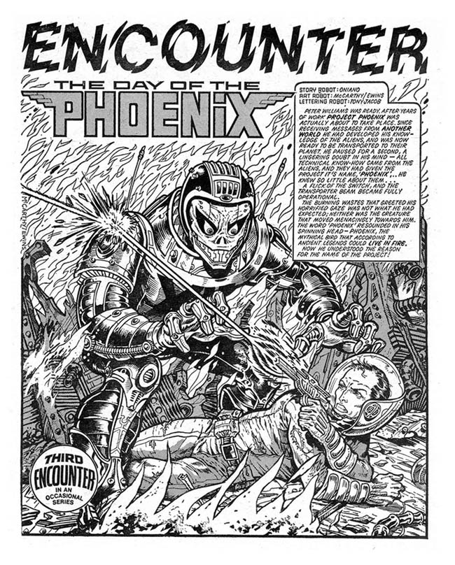
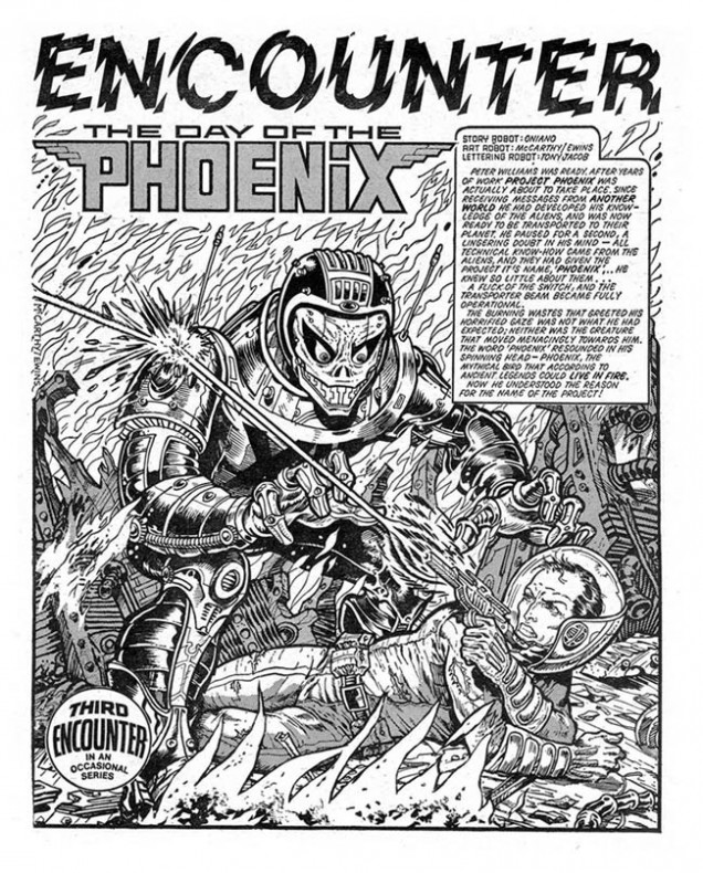
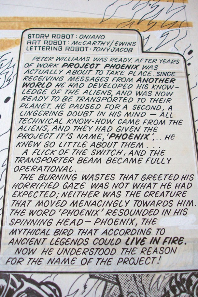
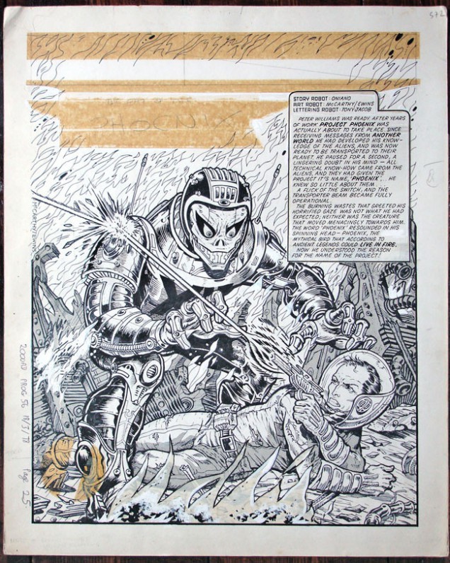
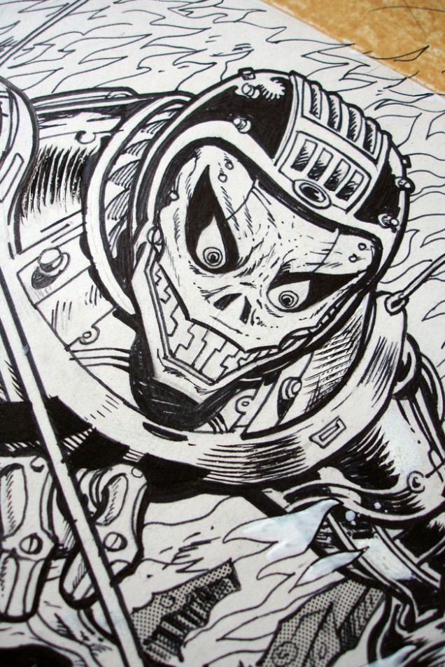
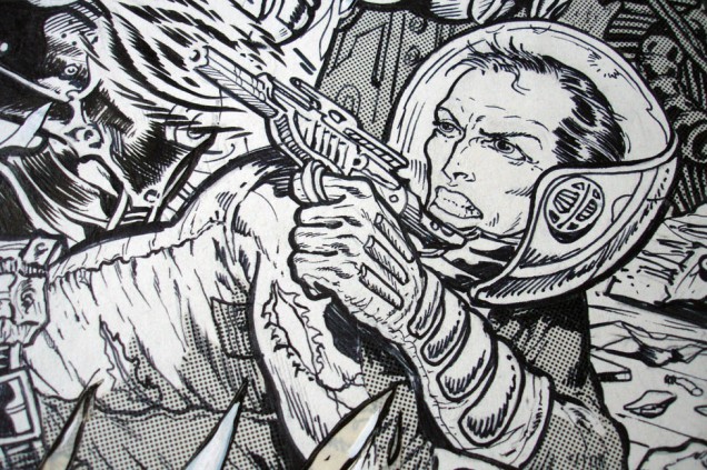
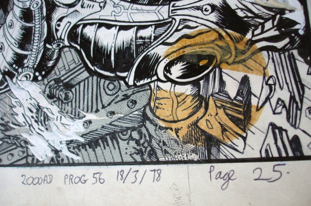
Brett Ewins & Brendan McCarthy – ‘Day of the Phoenix’ illustration, 1978
(485 x 390 mm, ink and letratone on paper).
Encounters one page story, 2000ad.

Just finished this and I waited until I had all 3 issues before reading any. Absolutely amazing, the sense that England is being destroyed in an end-of-the-world scenario is very well done by artist Duncan Fregredo. I’ve been scooping up all the Hellboy books this year and reading one a month to play catch up as I stopped buying it years back, well worth it.
Even more exciting is the news that series creator and original artist Mike Mignola is going to be back drawing the comic again after years on just writing duties, also that the book he’ll draw will be called ‘Hellboy in Hell’.

King Megatrip has been a longtime fan and contributor to Solid Steel over the last decade or more, he’s also subscribed to the weekly series of CDRs the show used to send out to radio stations (it’s all digital now).
As a result he has amassed a huge collection of shows from the last 10 years but the time has come for them to go. See more here and make him an offer
[singlepic id=3154 w=620 h=440 float=left]
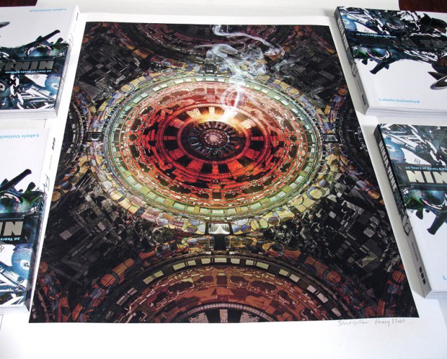
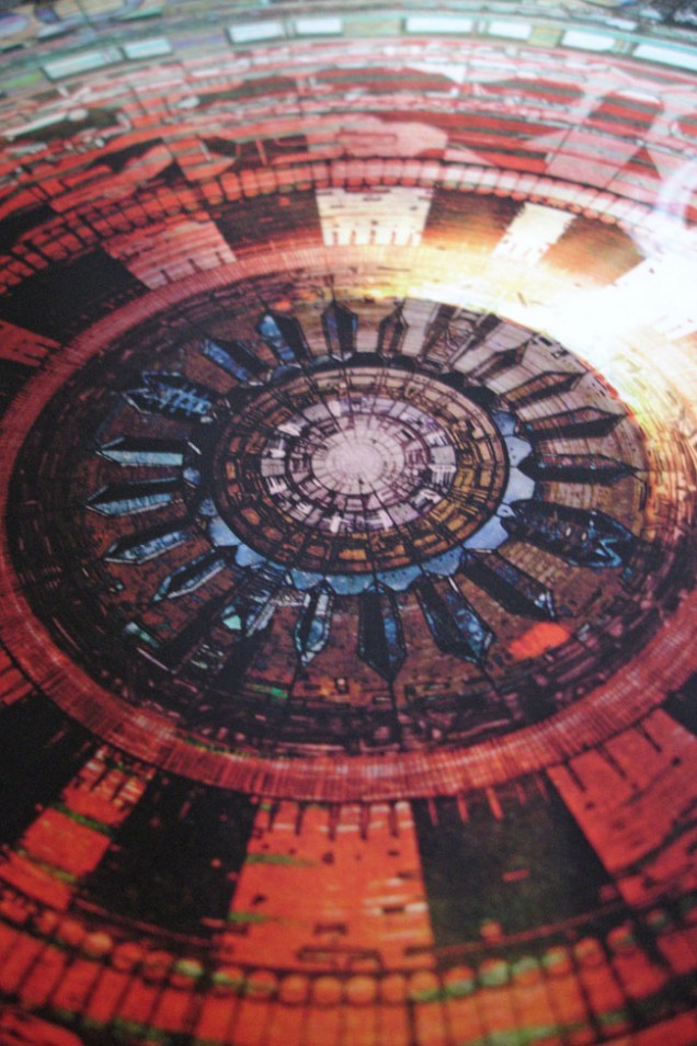
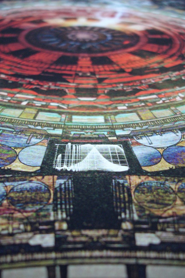
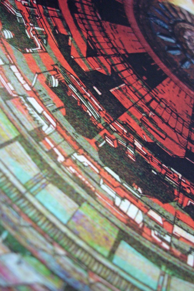
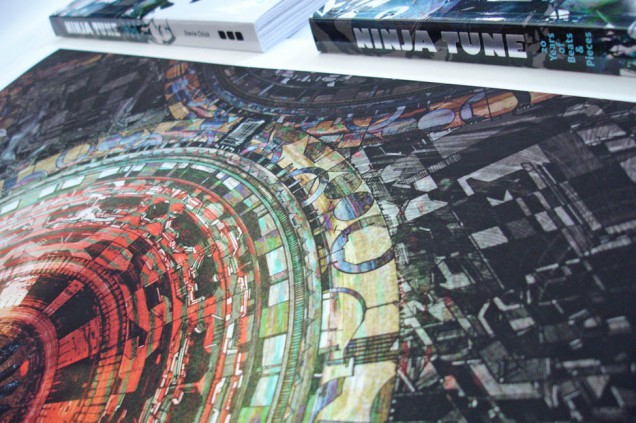
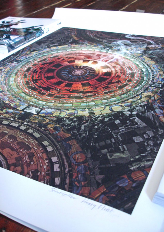
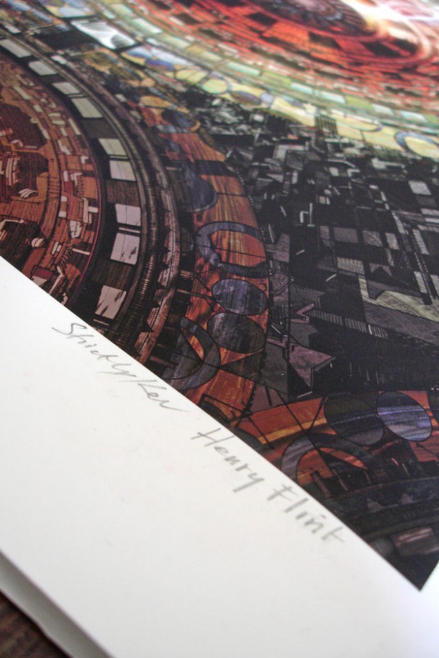
Here we have what I hope to be the first in a series of limited edition signed prints of the work by Henry Flint that’s adorned my record sleeves over the last 2 years. The first one is ‘Life Cycle of a Machine’ that featured on my ‘The Shape of Things That Hum’ EP in late 2009 and was originally a B&W line drawing that Henry did which I have digitally coloured.
The giclee print is 64 x 47cm on 300gsm Somerset Photo paper which is 100% cotton and I can attest that the print is very high quality indeed. All will be signed by Henry and myself and will be available from Scraffer.com, sent rolled in a study cardboard tube. If these sell well there are plans for a further three prints featuring artwork from the album and EPs in the same format.
[youtube width=”640″ height=”480″]http://www.youtube.com/watch?v=Q5AINIO4eFc&feature=player_embedded#at=200[/youtube]
A new Facebook group popped up this week reminiscing over the club at the centre of the mash up / bootleg / bastard pop craze of the early 2000’s. This short piece by a Swiss film crew was posted that I make a brief cameo in. The King Of The Boots/Bastard nights at the Asylum are some of my fondest clubbing memories (as a punter and a DJ), genuinely insane, hilarious as well, as each new mash was greeted with a roar of approval. There was a real shock of the new in some ways, you could hear the scene unfolding month after month, incredibly exciting as well as being some of the silliest, dance-on-the-table-shit-faced nights out.
I found this in the Music & Video Exchange last summer, the packaging was intriguing enough for me to part with £1 for it. On closer inspection I noticed it was designed by Pete Fowler, I like the way he’s used the title as a springboard for the way it unfolds.


Having a hard drive clear out / clean up, things might get a little random this week…

Loved Skylab‘s output, some truly wonderful records made by Mat Ducasse with some help from Major Force West and Howie B along the way.
