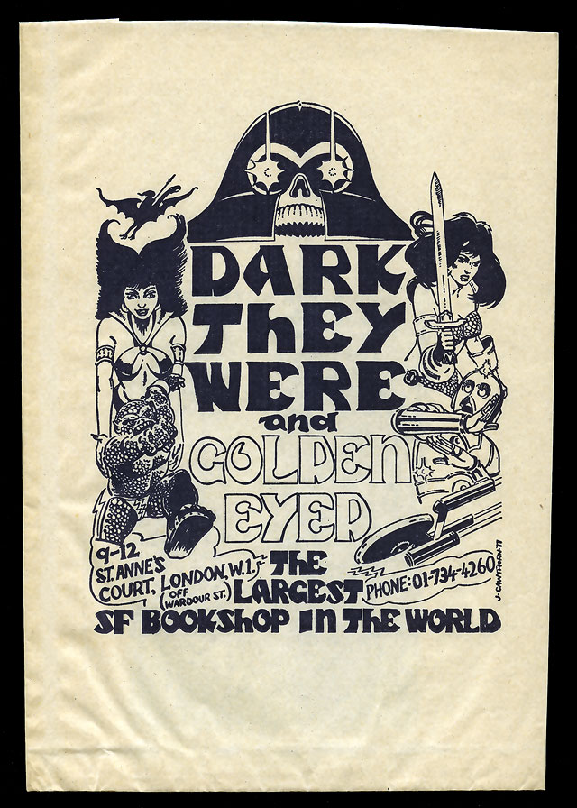
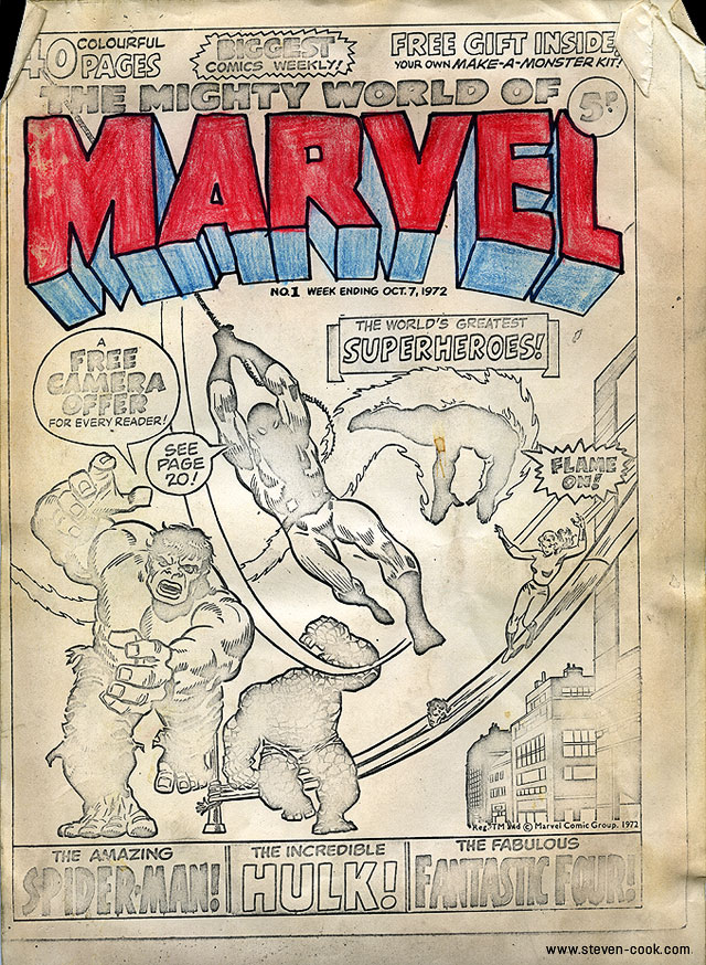
My good friend Steve Cook has been going through his drawers and cupboards (and believe me he has a lot) and finding loads of ephemera from his days working as a designer for 2000ad, Dr Who, Starburst and many more. I know for a fact that he’s got tons of other interesting bits and bobs in his collection so take a look if the miscellania of comic history is your bag. The Secret Oranges title is a play on the Secret Origins series’ so beloved by comics publishers.


Design
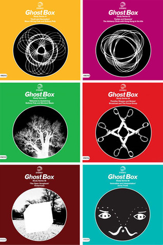
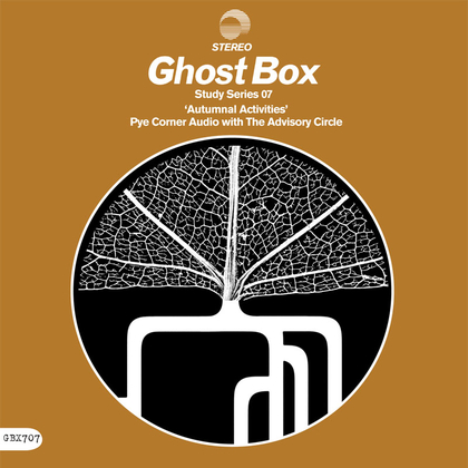 The gorgeous Ghost Box 7″ Study Series continues with a double header from Pye Corner Audio with The Advisory Circle – out in two weeks, pre-order it here.
 Love this cover of JRocc‘s new single, artwork by Gustavo Eandi.
[vimeo width=”640″ height=”480″]http://vimeo.com/30727793[/vimeo]
I’ll have one of those please, now they just need to reissue his children’s book ‘Henri’s Walk To Paris’ and I’ll be happy.
Postscript – apparently ‘Henri’s..’ is due for reissue in Feb 2012! Also this beautiful compilation of Bass film titles was put together by Ian Albinson of the Art of the Title website recently, in honor of the book being published.
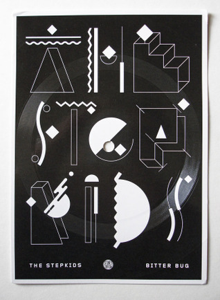
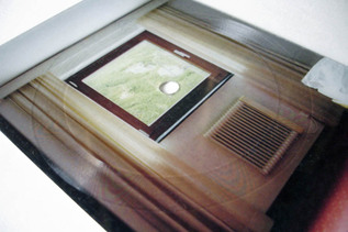 I recently came across a couple of new postcard records, people are suddenly reviving old vinyl pressing techniques the likes of which I never thought I’d see again. The first one was by The Stepkids, a massive favourite of mine after only one album, on the excellent Stones Throw label, and came free with online orders of the new record. It’s a short exclusive track called ‘Bitter Bug’ and the grooves are cut right into the cardboard so the sound quality is not far short of dirt (but that’s not the point, it looks great).
The second one I chanced upon on Facebook and is the creation of Markus Oberndorfer as part of an art project called Lenscape#02 for which he created 33 copies. I was lucky enough to secure the last copy and the difference between this and the Stepkids one is that the grooves are cut into a transparent slice of plastic and the postcard is fixed to this.
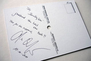
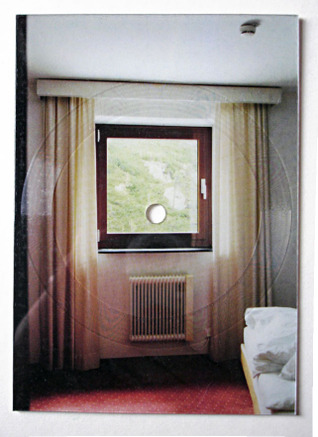 I have several records like these and most get filed along with the flexi discs I collect as they are usually 5 or 7 inches in size and square. These postcards are, well, postcard sized and have the space to write a name and address on the back.
[singlepic id=3352 w=360 h=360 float=left] [singlepic id=3354 w=245 h=347 float=right]
[singlepic id=3358 w=640 h=480 float=left] [singlepic id=3348 w=640 h=480 float=left] [singlepic id=3361 w=640 h=480 float=left]
Equinox Records out of Berlin have been around for a while and they currently have a sale on in their shop so I recently hoovered up some bits I fancied. The packaging and design aesthetic of the label is very strong, being overseen by the label head Gunter Stoppel aka DJ Scientist. There is a look of unbleached card, circular designs, B&W inner sleeve photography and a multitude of formats including colour and clear vinyl, 5″ and postcard records, cassettes and other oddities. It’s a varied roster, mainly concentrating on instrumental beats and electronica with a heavy leaning toward Hip Hop and sampling. Of course I would be first to recommend 2econd Class Citizen but the new David Vangel album is excellent as are releases by Davinci and Deckard amongst others.


There’s so much to like in Alex Varanese‘s images and design. The restricted colour palette, abstract architecture, retro grain and lens effects, robots, analogue era technology and on and on. There is such a thing as too much talent, this is the biggest gallery I’ve done by a mile, see much more at his site.


Some nicely psychedelic ads from an old issue of Design magazine I picked up recently, check out the children’s play sacks near the end, completely impractical but I love the thought of them.
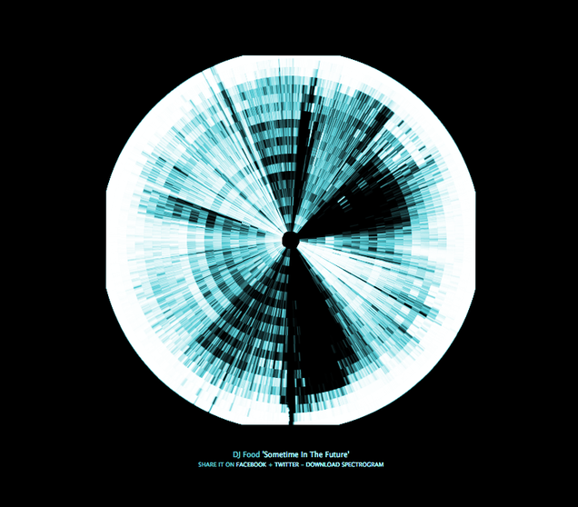
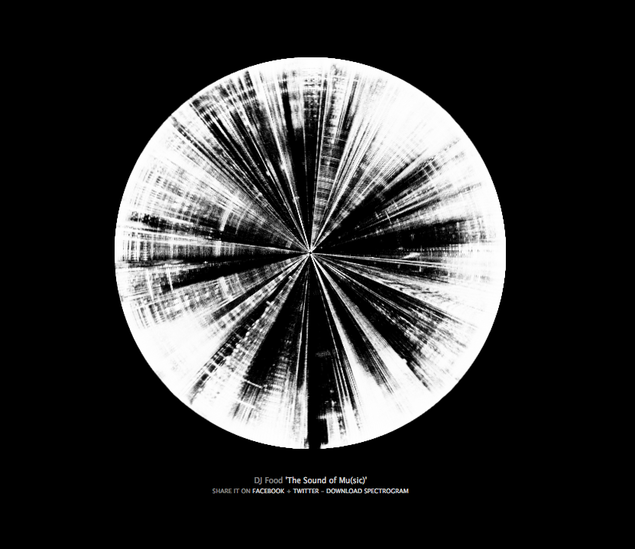 This is my KLF mix ‘The Sound of Mu(sic)’ as visualised with the new Soundcloud plug in Spectrogr.am. It doesn’t seem to like Firefox at the moment (maybe I should update) but it works in Safari fine.
My Boards of Canada mix came out a little weird round the edges, I added the colour as I couldn’t get the colour on Spectrogr.am to work for love nor money.
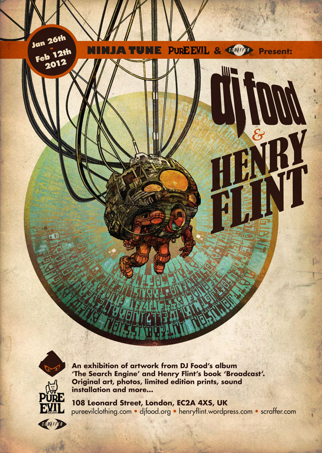 Ninja Tune, Henry and myself are very pleased to be partnering with the Pure Evil Gallery in Shoreditch and Scraffer.com early next year to present artwork from my album and Henry’s forthcoming book ‘Broadcast’.
 Ninja Tune, Henry and myself are very pleased to be partnering with the Pure Evil Gallery in Shoreditch and Scraffer.com early next year to present artwork from my album and Henry’s forthcoming book ‘Broadcast’.
 I can’t say enough good things about the bags and DJ equipment that German company Magma makes. DK and I have been using them for a while now and they have the suss to tailor some of their kit to exactly fit the airline baggage size restrictions which mean we can take these onboard when we fly because they fit in overhead lockers. Check out their new catalogue, they pretty much have a bag for every need and they are all customisable with pull out compartments. They also make laptop stands, covers and sleeves, headphone and needle bags and more.
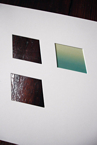
Some very beautiful CD packaging was recently sent to me from the RX:TX label in Ljubijana, Slovenia. It’s a tri-panel CD pack with die-cut windows that show through various layers of card to reveal parts of the CD disc inside as the only colour.

 The CD disc is designed so that it can be viewed either regular or upside down and the titles still readable. Depending on which way up you have the disc it changes the colours viewed through the windows on the other panels.
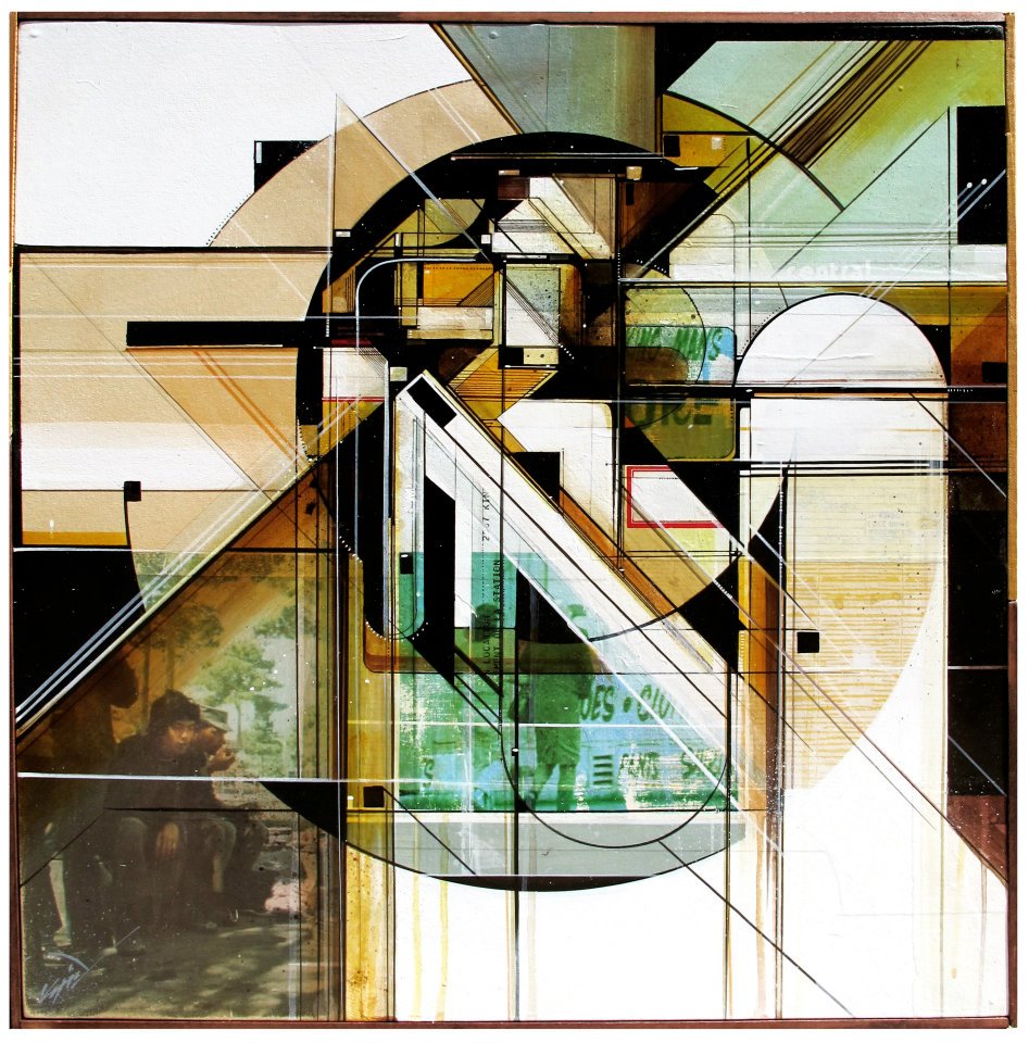 The amazing Augustine Kofie returns to the White Walls gallery in San Francisco next month for a new solo exhibition called ‘Circulatory System’.
I was lucky enough to see his previous exhibition there last year and he has posted two pieces from the forthcoming show here.
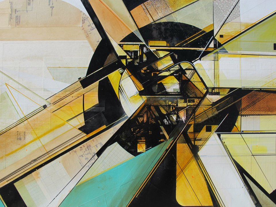 Also Kofie makes music as 4×4 Tracktor and he posted a soundtrack to the show
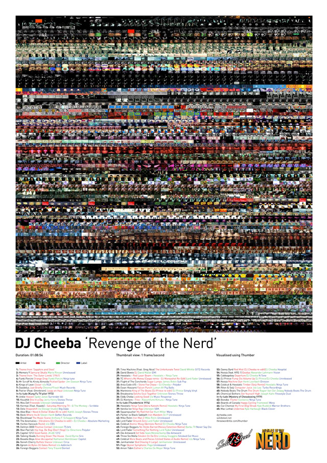
Lovely poster for the forthcoming Videocrash AV gig at the Rhythm Factory in London on Nov 11th, featuring DJ Cheeba plus Tom Central & Cosmo Lopez. Tom also designed this poster and there might be copies for sale on the night.
 More gorgeous work from Simon Bent at Volume2a. “Science Vs Delerium is a series of illustrations celebrating some of the greatest scientists in history. The series was created to re-popularise these iconic figures.”
Lovely book on the design of Sainsbury’s Own Label packaging from the 60s and 70s, curated by Jonny Trunk and designed & published by Fuel. Available now through the Fuel shop and coming to a bookstore near you soon.
[youtube width=”640″ height=”480″]http://www.youtube.com/watch?v=yU4KnzY7Db4&feature=share[/youtube]
