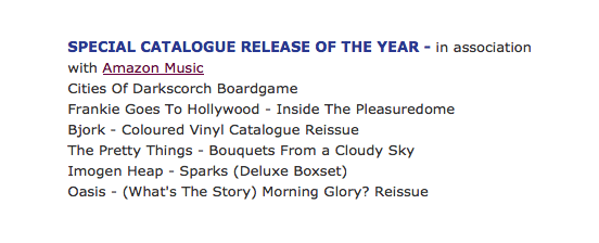
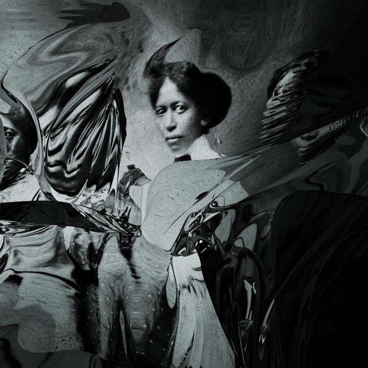
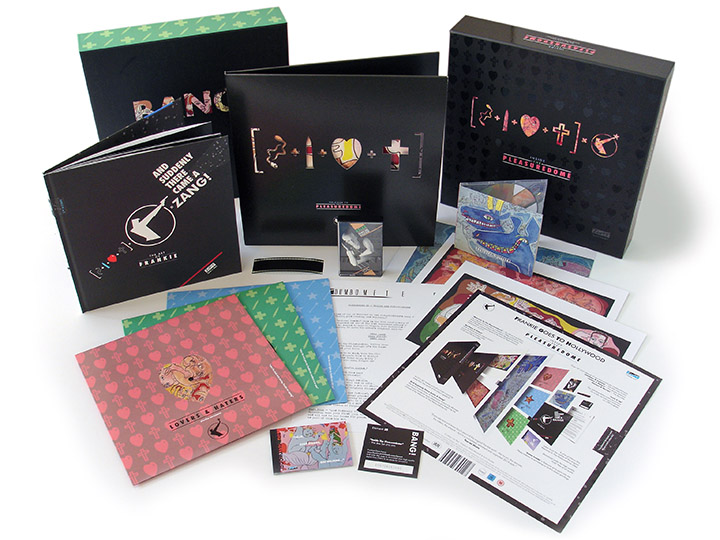
Annabel (lee) ‘By the sea… and other solitary places’

AnnabelLPcover
This is pretty special, passed me by when it was released in April as a co-production between If Music and Ninja Tune. Annabel (lee) qualifies for a raft of clichés to be employed – haunting, fragile, beautiful, widescreen, string-laden – it sounds like a lot of things but still manages to sound unique. I’m not sure if the orchestration is sampled or has been played and put through processing to sound like it but there’s a vintage quality to it, not dissimilar to The Caretaker’s crackly 78’s drenched in reverb, although way cleaner.

Think of Nina Simone‘s darker moments with Lou Rhodes‘ folkier ones but backed by an orchestra ripped from a 60s Bernard Herrmann score. I know nothing about her or the record’s origin but her voice is exquisite and I love it. I’ll never make a decent music reviewer, have a listen and make your own mind up. The sleeve is beautiful as well, some sort of distortion process added to old black and white photographs that perfectly match the audio they cover. No credit for the artist or photographer at all unfortunately but with my Ninja contacts I can reveal it was done by my old mate Doug Bowden aka Pandayohurt. Listen and buy it here.
AnnabelLeeLPback

Jaga Jazzist ‘Starfire’ / ‘Oban’

JagaLPfront
This is the stunning new album from Jaga Jazzist, not only contender for cover design of 2015 by a very long margin but also heading for top 10 album of the year status too. It’s taken a while for me to fully appreciate Jaga but with each album they’ve crept further into my orbit so that now each release has to be checked out. ‘Starfire’, after only a few listens, I can quite confidently say, is my favourite so far and it sees a slightly more electronic mission statement than before whilst still retaining the uber-tight Zappa-like syncopation of previous work.

JagaLPslipJagaLPback
The design on the sleeve is magnificent here as well and really compliments the futuristic feel of the music perfectly. Browsing the new releases in Fopp the other day I was struck by how little of the current crop of album designs stood out, possessed any kind of classic iconography or would make me want to look at them twice. So much of the ‘style’ of the last few years of the kind of music that racks up kudos from the critics seems to be about minimal, safe, almost nonchalant anti-design, designers afraid to go all out and make a statement or content to reference past styles.
The Jaga sleeve, besides being striking yet minimal, has a clever trick up its sleeve – or should that be on it?. It comes in a screen printed transparent outer cover of evenly spaced vertical lines that animate keys graphics underneath on both front and back as you slowly pull the inner cover out. This effect is being billed as ‘anamorphic’ in the press releases but that’s more about stretching an image, this process is closer to the ‘moire effect’ that tricks the eye into believing that objects are moving as the black and white lines move past each other, much like a TV screen flicker.

JagaLPInner
Aside from the outer cover gimmick, the typography on it is stunning, look at those titles above, that must be a custom made face that works with just the right dose of sci-fi and heavy metal styling to make it unique. The labels and second inner sleeve work beautifully to counterpoint the blackness of the outer as well, as does the companion single, ‘Oban’.

JagaLPinner2 Jaga12front Jaga12back
Coming from the Bridget Riley school of Op-Art the single’s sleeve is right in your face, begging you to pick it up. I take my hat off to Martin Kvamme who is credited with the design just for the elegant graphic solution to the 33 rpm speed text on the label, so few designers would bother devising something different these days.
Both releases are out now on Ninja Tune – go and grab them, music that needs to be held as much as heard.

Jaga12label

Ninja Tune 25 Expo, Charleville-Mezieres, France

Ninja_expo257
I keep forgetting to post this – there’s a Ninja Tune 25 Year retrospective currently showing at the Médiathèque Voyelles, 2 Place Jacques Félix, 08000 Charleville-Mézières in France. It’s been curated by Jais Elalouf aka DJ Oof (that’s him below, at the opening night) from his own personal collection and some of my archive. It features many record sleeves, promo posters, proofs and some original artwork and finishes on April 30th so if you’re in the area check it out.

Ninja_expo252 Ninja_expo253 Ninja_expo254 Ninja_expo255 Ninja_expo25 Ninja_expo256 Ninja_expo258

Ninja Cuts: ‘Funkjazztical Tricknology’ 20 years old

zen CD15 cover (72dpi)
Apparently this was released 20 years ago this week – how time flies. Above is my computer file for the Black print that went to the printer before the silver was applied. Below is what it came back looking like if you can imagine the grey as being silver. It didn’t come back with exactly the look I was hoping for in terms of a silver-toned image but back then I was learning the print side of things as I went along.

zen15
Below is an alternate version of the turntables featured on the cover in colour at last. These were my decks and mixer and the photos weren’t actually Polaroids, just normal photos made to look like it by adding a white border. To the left you can see the back of the Jungle Brothers‘ first album with NWA‘s second just peeking out and on the left deck is a Steroid Maximus LP – already subliminally flaunting my love of Foetus‘ music back in 1995.

On the wall are a collection of flyers from the day, the Brain, Passion, Talkin’ Loud and the edge of an Archaos poster on the right. This was only my second ever sleeve design for Ninja, not a design classic by any means but an album that many people hold dear it seems. You can still buy it in digital form online from the Ninja shop too.

Fuckjazztical_decks_alt_web

Freehand Food compatibility issues

Recipe_LP_layout_screengrabI’ve been wrestling with old laptops and copies of Freehand all day to try and open the original artwork for the ‘A Recipe For Disaster’ album. I managed to extract the original files from the first ever disc I burned back in 1997 which houses the first work I did for Ninja Tune on it. To think that the first designs were made in 1994 but I didn’t think to archive them until 1997 says a lot about how small the file sizes were back then. The first LP I ever designed for Ninja was 9 Lazy 9‘s ‘Electric Lazyland’ and it all fitted on a 1.4MB floppy disc!

So, ‘Recipe…’ came out in the Autumn of 1995 and I was using Aldus Freehand 3.1 to lay out my designs and deal with type. At the time there were four main programs: the ubiquitous Photoshop, the fiddly Quark Express (good for laying out books and magazines), Illustrator and Freehand. The last two weren’t that dissimilar and were both good at drawing in vectors but you could do decent layouts with them as long as you didn’t want to use reams of text across multiple pages. For some reason I learned Freehand at college instead of Illustrator so that’s what I stuck to, along with Photoshop to manipulate the images, and most Ninja sleeves were done using this in the 90’s and 00’s.

FH9_10Along the way Freehand got bought by Macromedia and made some big jumps between versions which rewrote a lot of the internals apparently whilst still being backwards compatible with older versions. As with any applications, they’re at the mercy of the Operating Systems they’re made to run on and, through the years, Freehand had to make some big changes. It was finally bought by Adobe and then unceremoniously dumped with everything after Mavericks refusing to run the app. But even before this, getting older versions to open on newer Macs was a task and the files I recovered from 1995 just came up with ‘unsupported format’ messages when I tried to open them in Freehand 10, Illustrator and more.

Even on an old laptop running the OS 9 ‘Classic’ environment I had no joy until I remembered that Freehand 5.5 was a big upgrade and should be able to read the older FH3 files. But I couldn’t find a copy anywhere, not on archive discs or the web, the oldest version I had was Freehand 7. As a last resort I booted that up on the old laptop (all 24 MBs of app) and lo and behold, it worked! Here’s the lesson; don’t throw away those old applications that aren’t compatible with current operating systems, you never know when you might need them. What you see at the top is the low res preview of the DJ Food LP cover as it appeared this afternoon. I know it looks crappy but that’s all I need to work with and I’d rather have that than have to remake the whole thing from scratch.

Byte Digging – exhuming the Openmind archive

I’ve just been combing old discs for archived artwork for various Beat Delete reissues, forget vinyl, this is the new digging – byte digging. The first Herbaliser LP sleeve (‘Remedies’, 1995) and labels takes up just 5.4 MB of space, madness.

Above and to the right are unused designs for the first Cinematic Orchestra album and singles. Neither are for anything in particular, more playing around with the typeface I had created for the band and exploring different textures.

The top version was done by colour copying the logo at different sizes onto sheets of tracing paper which were then ripped, crumpled and overlaid under a scanner. The bright light of the scanner shone through the layers and the resulting scan had various filters applied to bring out the colours in the paper. No Photoshop layers there though, real layers of paper in one scan.

To the right is more playing with letter forms than anything else. The image behind the type is one of the photos from the Colourscape that later got used on my ‘Kaleidoscope’ LP. Below is a typeface I designed in college – check me out with my Fuse fonts, must have thought I was Neville Brody or something…

Machine Drum ‘Vapor City’ artwork

The whole design and packaging of Machine Drum‘s ‘Vapor City’ LP and satellite singles is really building into a nice collection. Designed by Dominic Flannigan & Eclair Fifi for LuckyMe Arts it’s nice to see such meticulous detail in a time of thumbnail images that need to be easily identifiable. I hope this makes end of year lists on the artwork alone as the combination of minimal colours, copper and splatter vinyl really give it a unique feel.

ColdKrushCuts 3xLP repress now in stock

Out now via Ninja Tune‘s Beat Delete repress label – the mix PC and I did in 1997 for a face-off between Coldcut and DJ Krush. It’s a triple disc with the mixes on opposite sides of each disc, if you have two decks you can even mix the beginning and end parts together to form the full thing.

I remember recording this in a professional studio somewhere in London’s West end, I think it took us less than a week after some initial ideas had been gone over in our own studios and a selection made.

The brief was for only Ninja and Ntone releases as this would be easy and quick to license. We did add a lot of spoken word from other sources though. We also made a conscious decision to include some of the more esoteric sides of the label as we second-guessed the kind of material Krush would go for. We were thrilled to have him as a part of it as MoWax was (and still is) one of our favourite labels.

This is the mix with the infamous ‘Bug’s Eye View’ spoken piece that I detailed the source of earlier in the year. We had an engineer recording and editing what we did the whole time, tracks would be mixed live and then sections edited together and overlaid if need be.

It was nice to give the artwork a good brush up and sort out the myriad of spelling mistakes that were on the original. I never liked what I did first time round and, whilst this isn’t a million miles from it, it’s a hell of a lot tidier and easier to read. The idea was that the cover could be placed either way up and that East met West from either direction, being that Krush hails from Japan.

‘Nightrous’ by Peezee was an exclusive track that only features here, PC pulled it out of the bag when we needed something to fit into a troublesome section. Listening back to the mix recently for the first time in 15 years I really enjoyed it as a time capsule of the label at a point where the Trip Hop thing was coming to an end and the label was set to branch out with the ‘Funkungfusion’ compilation the next year.

You can buy it now direct from Ninja Tune.

Jason and Jim at Tribal Gathering

Steve Cook put these photos up last week on his Secret Oranges blog. Above is Jim Murray and below, Jason Brashill, taken at Tribal Gathering in ’97. Both were then working for 2000ad on various projects, with Jim eventually finishing off vol.2 of the Batman/Judge Dredd team-up ‘Die Laughing’ after Glenn Fabry couldn’t commit to it. He then went off to work in the computer games industry but has just put out a gorgeous book with Robbie Morrison called ‘Drowntown’ which is the first of several apparently. Jason followed a similar path but not before he’d painted one of my favourite sleeves for The Herbaliser in the shape of ‘Wall Crawling Giant Insect Breaks’, which I commissioned from him after seeing his work with graffiti artists She One and Req 1 as part of their Brighton crew, The Dusty Knights.

Ninja Tune label exhibiton in Pau, France

A new retrospective exhibition about Ninja Tune just opened in Pau in the Pyrénées, France at the André Labarrere Mediatheque. Curated by Fred Elalouf of the Ping Pong promotional agency in Paris, it also ties in with Ping Pong’s 15th year of existence. They have represented the label in France throughout their past decade and a half through thick and thin.

Earlier this year Fred visited the Ninja offices and my studio on a mission to gather as much original material as he could find for this event. Original art, promotional posters, sleeves, videos, slides and other ephemera are all present, some of it never exhibited outside the UK before. I have to say, he’s done an amazing job as you can see by some of these photos.

The exhibition just opened and is on for the next two months, closing on August 24th. It’s free (I think) so, if you’re in that part of the world, go and take a look as there are a lot of items that will go back into private collections when it’s over. Original Kid Acne, Mr Scruff and Kid Koala artwork hangs with cover proofs and promotional toys. The model robot that was projected on for the front cover of the ‘Funkungfusion’ compilation is on display as well as some of the original drawings for the now famous Ninja logos.

ColdKrushCuts up for repress at Beat Delete

Reissued Beat Delete 3xLP version

Those lovely people at Beat Delete have put the mix PC and I did alongside DJ Krush in ’97 – ‘ColdKrushCuts’ – up for a 3LP repress. Originally only available on CD, (aside from an ultra limited 2xLP version in Japan) they have set a 200 copy limit to be reached before the pressing is closed of which a third have been filled as of writing. Weirdly I only posted about the origin of the ‘The Bug in The Rug‘ sample from the same mix two weeks back.

Beat Delete have steadily been adding other labels to their repress roster too, you can now find selections from Tru Thoughts, KPM (The Big Beat!), Fat City, Mr Bongo, Brownswood, Leaf, Catskills, Ghostly International and Celluloid amongst others. I’m also in the process of curating a compilation of special oddities, offcuts and overlooked tracks for a possible future pressing with them.

The story of the Bug In The Rug

Many times I’ve been asked what the origin of the story of ‘The Bug In The Rug’ was, a spoken word piece that was overlaid in the ColdKrushCuts mix that PC and I did in 1997. Until recently even I didn’t know where it came from because the original source was one of PC’s inclusions, possibly sourced from Jon More‘s record collection.

Patrick took a monologue from this record, ‘Four Dreams of Man’ by Dr. John Furbay, heavily edited it and laid it over Hex‘s track, ‘Harmonic’. The record is a kind of lecture and motivational speech about man’s place in the world released on Lecture Recordings in, I guess, the early 60’s.

This is my copy, it’s actually signed by Furbay, who was an international traveler and speaker at many schools, institutions and companies. He believed the world was getting better and could foresee greater integration of different races and cultures in the future. You can hear the original section of the mix below, the speech starts about 2.10 mins in.

Bonobo ‘Cirrus’ zoetrope 12″

Finally, after a couple of teases by Ninja Tune, I can show this beauty off, something that’s been in the pipeline for a while now. Today is Bonobo‘s big gig at the Roundhouse, a full day of music curated by Simon Green and rounded off with a performance by him and his band. With the likes of Gilles Peterson, Machine Drum, The Invisible, Adam Buxton’s Bug, a Boiler Room-hosted space and Solid Steel broadcasting snippets of the event on the web, it should be epic. To make it even more epic 500 lucky golden ticket winners will each receive one of these 12″ zoetrope picture discs of his already classic track, ‘Cirrus’.

I took the original archive loops from Cyriak‘s incredible video for the track and broke them down into circular visuals to make a spinning animated version. Dating back to the first primitive animation techniques of our time, the zoetrope relies on a viewer to see the action happen. This is included with the disc along with assembly instructions so that people can watch while the disc plays. See the above film for an approximation of what the disc does when spinning.

This is all rounded off by a beautiful Leif Podhajsky design on the reverse side. Lovely.