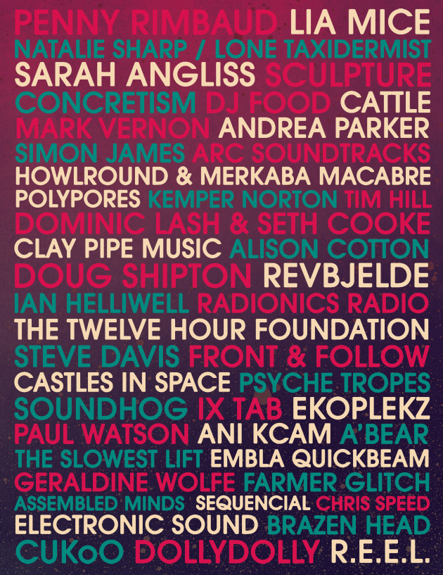
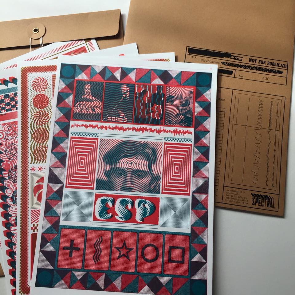
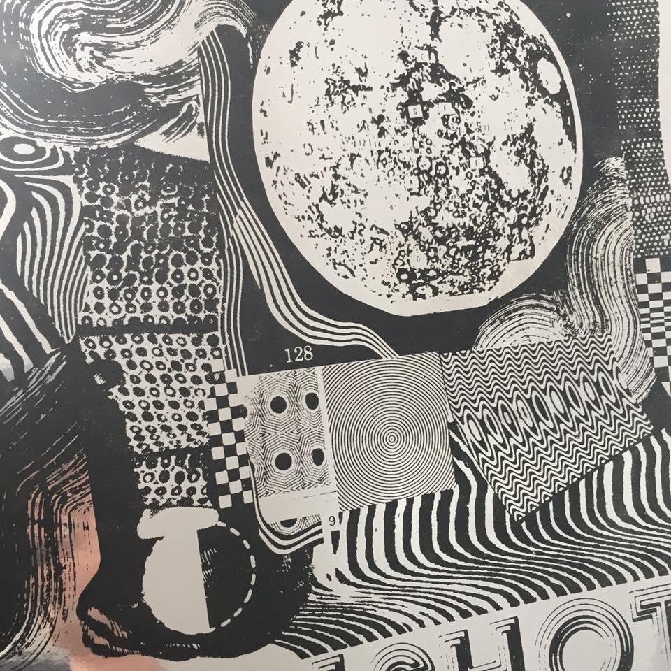
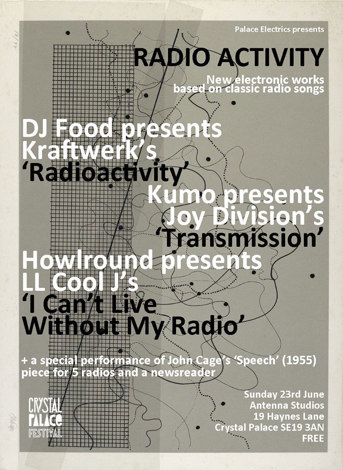
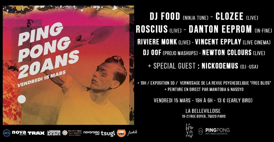
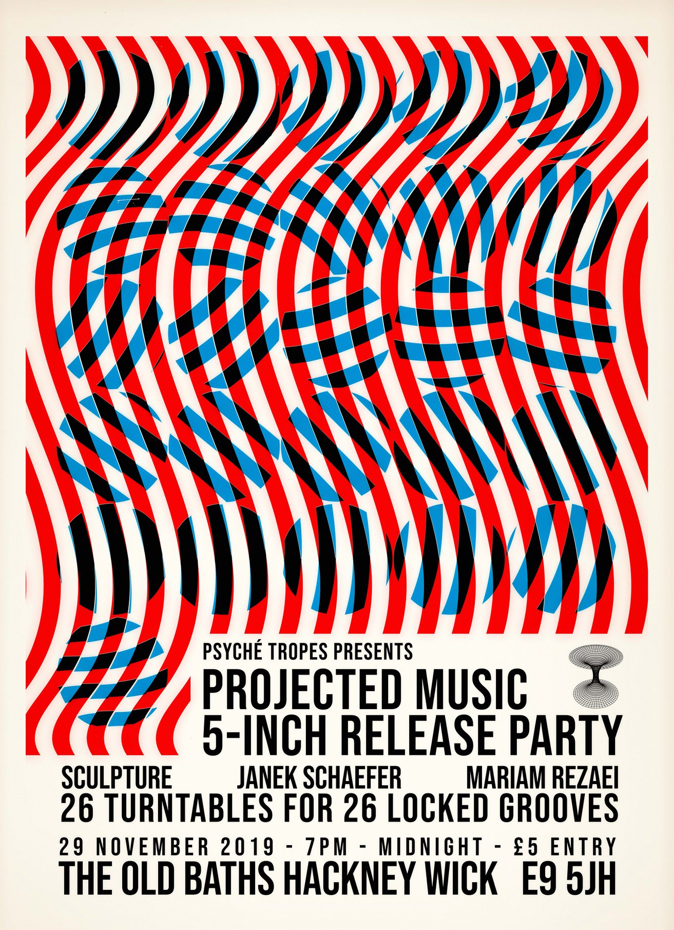
Frank Zappa advert + poster collages Pt.1

1967-09-xx Hit Parader Abs Free ad

Lately I’ve been studying the collage art of Frank Zappa and Cal Schenkel from the Mothers of Invention albums. On reading up on this material, including a long interview with Schenkel, I realised that Zappa himself seems to have done a lot of the artwork for the first two Mothers albums, ‘Freak Out’ and ‘Absolutely Free’, with Cal coming in at the end of the latter and doing some of the adverts. What you see below is – as far as I can tell – is mostly the work of Zappa who was a pretty decent visual artist in his own right is seems.

* Also see part 2 of this post for more!

Absolutely Free ad Frank Zappa flyer-2

Freak Out News 1
An ‘official New of the Mothers’ would occasionally get printed in the LA Free Press, below is the first one, a four page digest that includes a poster for a forthcoming gig.

Freak Out News 2

"</p

Freak Out newspaper poster Freak Out Off news Oct Freak Out Off news Oct2

Some variations on gig posters
Freak Out poster blue Freak Out poster red

Collage made to illustrate an interview in a music magazine

freak out usa 3a large_Mother_s_and_Tim_Buckley_Dec_9_1967_Pasadena_Civic_Aud

The original paste up for an advert / flyer
Original collage flyer 1966-12-08_ThePaper_1

Cuphead Posters

db8
I’m still loving the design of Cuphead, the recent release from Studio MDHR based on the look of the old Fleischer Brothers animation studios. There seem to be lots of great posters for it online, possibly official, it’s hard to tell these days. Many follow the multi-coloured, multi-character model but some keep in line with the look of the game. There’s also merchandise starting to appear, from enamel pin badges to the inevitable Funko toys but the best object so far has to be the 4xLP original soundtrack.

IMG-8640CH_1320x660_02IMG-8633

Housed in a 30’s book-style sleeve with gold leaf cover graphics, separate leaves for each disc and yellowed ‘pages’, it looks like it could have come straight from your grandparents’ vinyl collection. There’s also a lovely 7″ with selections from the near 3 hr LP set. At an eye-watering £71 + postage it’s a bit out of my league at the moment but it looks worth every penny from the photos.

dance_with_the_devil___cuphead_poster_by_edwardjmoran-dbhdl99 image1_1_1024x1024 Screen+Shot+2017-09-29+at+11.52.30+AM 0a47de588c96b1cf2189fe2d3f8e3230

* Beware of pre-orders of figures from PopInABox – my Cuphead and Mugman figures are now 2 months overdue, one has been dispatched from overseas without a tracking number and the other remains in limbo while they wait for stock, meanwhile I’ve seen them in shops in the UK.

Elzo Durt

couv-livre-elzoThrough an odd set of web links I chanced upon the work of Elzo Durt today, his modern take on collage and psychedelia catching my eye and making me investigate further. This Brussels-based artist works with the Recyclart people (I’ve played for them a couple of times and maybe, unknowingly, seen his work) and runs a record label too. Find out and see more of his work at www.elzodurt.com

born-bad-psyche-night cursor-miner_poster-copie dillens_juillet2015_2 el-bla-recto EXPLODING-EYES_oct-2015 hosmoz_fading-mechanism_5 illu_badseed_08_2010 junkyard poster_rockerill_fest poster-killekill-9-years pub_citysounds_mai_2013 red-mass_7inch_recto rockerill_fest_2016 seri_aidswolf_2007 the-sore-losers

DJ Food AV series #2: O Is For Orange

Archspace DJFood flyer crop
Here we go, after last year’s ‘Selected Aphex Works’ shows, the next installment in my live AV Series premiere’s on April 6th at Archspace, London with a new version of my ‘O Is For Orange’ mix – chock full of Boards of Canada and their influences with psychedelic video accompaniment. Tickets available here

Andy Votel exhibition – STOP MAKING SÉANCE

JWArchitectPromodetails One day last Autumn a mystery package arrived containing various Finders Keepers records and one very special, handmade 12″ of Jane Weaver‘s ‘The Architect’ single. One of an edition of 10, it’s a thing to behold; a test pressing hand-labelled with a paste up cover containing one of my favourite designs of last year (see this post).

JWArchitectPromocover
JWArchitectPromoAngle
JWArchitectPromoLabels
Being one of the people urging the designer to make prints of one of his posters for Jane’s Manchester gig I was gutted when my copy got lost in the post over the Xmas period. Luckily a replacement is soon to be on its way. The ‘architect’ of these creations is one of my favourite contemporary designers, Andy Votel, who will be exhibiting some previously unseen self-initiated full size paintings / collages in Manchester from the 25th at Electrik in Manchester.

VOTEL SEANCE INVITE invite

From the press release: “Writer, DJ, designer, broadcaster, label boss and anti-musician Andy “Votel” Shallcross displays a series of original personal works created, at home, in October / November 2017.  
Based around contemporary “fakelore”, reducing influences of European science-fiction art, scholastic illustration, post-pop-art, Plakatstil and mid-century graphic design Andy uses simple methods of painting, collage, deletion and recontextualisation for these one-off, large format placards.
Adopting a recurring patchwork method found in all of Andy’s multi-discipline “magpaic” activities, the running narrative and aesthetic format used in STOP MAKING SÉANCE can be described as pictorial-anagrams, which Votel playfully refers to as Andygrams. Having designed over 200 record sleeves in over 20 years of his graphic design day-job these singular quick-fire situation-abstractions are not intended for large-scale reproduction or as communicative graphic-design thus retaining a freedom previously unexplored in Andy’s visual work and will be on display for short residency in Manchester, Gothenburg and Barcelona in early 2018.”

Check out this interview with Oi Polloi for more info and images

Seance detail 1 Seance detail 2 Seance detail 3

7Up – the UnCola posters

7UPWetUnWild

Browsing eBay over the Xmas holiday, a friend came across a psychedelic Submarine poster not a million miles away from Heinz Edlemann’s classic Yellow variant, created for The Beatles‘ film of the same name. In the same brightly-coloured, cartoonish style of the late 60s and early 70s – much popularised by artists like Edelmann, Milton Glaser, Nicole Claveloux and Peter Max – this sub was in fact green and advertising the drink, 7Up – billing itself as ‘The UnCola’. What was remarkable about this eBay listing though was that it was for an original 60″x36″ poster, not the sort of thing that turns up every day.

7UPtext

Indeed, further investigation revealed that the seller, Dallas resident, Robert Trent, is the foremost collector of this era of 7Up advertising and was selling off duplicates from his collection. Even crazier was that he was also selling huge billboard versions of some of the designs, some as an un-pasted set of 12 panels over 12 meters in length. Over the course of many entries he had compiled a huge resource of information, links and imagery, all expertly checked and presented without fuss and in meticulous detail. These kind of posters don’t come up every day and he has the whole history up there to give context to the images. After seeking his permission I hereby reproduce some of the imagery and details before it’s lost.

From Robert’s listing: “‘Wet Un Wild (green submarine, aka yellow submarine) 60” x 36” horizontal poster by Ed George

Note:  This is made of thick quality poster paper, not dimpled yellow plastic tablecloth material (modern-day Tyvek construction wrap vapor barrier or “paper dress” nylon material) like the other “Wet Un Wild” posters occasionally offered on eBay. 

This one is in excellent, but not perfect condition. This illustration is highly sought after and may be the holy grail of all 7Up UnCola poster images. Ed George illustrated this in 1969, (he) held multiple posts in-house at the J. Walter Thompson [advertising] Co. in Chicago (JWT) over many years.”

Below: 28 of the billboards in Robert’s collection as of writing…7Up UnCola Virtual Billboard Museum (28) 3x10_011518_2

7UP 4xposters7UPButterfly

From Robert’s listing: “Most of these images actually graced highway billboards and dorm rooms. They were so popular that the Seven Up Company offered them for sale – few survived. The first batch of billboard sized images were up nationwide when colorful VW vans full of hippies drove to the Woodstock Festival in August of 1969. A “Fallpaper Poster Offer” on the bottom of page 8 of the October 5, 1969 Chicago Tribune Sunday Comics offered a set of (4) 34″x21″ reproductions of their famous billboards seen earlier in the year for, read it and weep – ONE DOLLAR TOTAL (plus 6 bottle cap liners). That offer expired on 12/31/69. The sizes also ranged from small Size “D” posters to giant Size “A” 21’x10′ billboards. These are all ORIGINAL vintage posters – NOT modern giclee photo reproductions.”

7UPGirl7UPguitarists 7UPLightShining

From Robert’s listing: ‘The Light Shining Over The Dark’  This is a vintage 33″ x 20″ horizontal poster that is in excellent condition and VERY RARE.  I’m only aware of 2 or 3 other copies, some of which have passed through my hands. The artist’s signature can be seen at the right center in the bottom of the girl’s white dress. 

The artist was Pat Dypold who illustrated this by 1973 as a free-lance artist.  She did the bulk of the other outdoor ads (billboards) for the J. Walter Thompson [advertising] Company of Chicago (JWT) that orchestrated the famous UnCola ad campaign from about 1968 through 1975.”


7UPSeeTheLight

From Robert’s listing: “‘See The Light’ (psychedelic bicycle) 60″ x 36″ horizontal poster by the late Tom Kamifuji (1922-2015) (original concept by Bill Bosworth)

“Hiroyuki “Tom” Kamifuji ran a design studio in San Francisco. He was an illustrator, poster designer, typographer, art director and designer. Yet, for all his legacy of brightly-colored works, there is very little biographical information available. Perhaps his most universal success was the inspiration for the rainbow swath of color within the Apple Computers apple. The concept for this image came from Bill Bosworth who worked in-house at the J. Walter Thompson [advertising] Co. in Chicago (JWT) over many years.  However, the actual finished artwork was done by California artist Tom Kamifuji. There is no signature on this “Size B” poster, but the larger “Size A” 21’x10′ “See The light” billboard in my possession has Tom Kamifui’s signature.”

7UPUncanny

From Robert’s listing:‘UnCannny In Cans’ This is a vintage 33 3/4″ x 20 3/4″ poster that is in excellent, near mint condition. This is an authentic, traceable representation of late ’60s, early 1970’s pop art advertising. The artist was John Alcorn who illustrated this in 1969 as a free-lance artist. His signature is in the bottom middle brown band. At the age of 24 Alcorn was the 4th person to join Push Pin Studios which was the place to be in the graphics community at the time.

The Seven Up Co. sold 4 different sizes of most images to the general public. BTW – My collection also includes one of the “UnCanny In Cans” Size “A” billboards plus a 60″ x 36″ Size B” version. The poster for sale here is a 34″x21″ Size “C”.

John did a number of well known illustration advertisements in the prior years for Pepsi and Campbell’s Soup and his career flourished for many more years. These outdoor ads (billboards) were commissioned by the J. Walter Thompson [advertising] Company of Chicago (JWT) that orchestrated the famous UnCola ad campaign from about 1968 through 1975. Most of the 53+ extremely colorful billboard & poster images were illustrated by invited outside freelance artists who were allowed to sign their names on the originals if desired – not all did. Only a few images were produced in-house, and never with the artist’s name on them. JWT wisely chose to invite only up and coming artists and not well known graphic stars so as not to let the notoriety overshadow the product itself.

Many of the artists have gone on to great fame in the graphics community Milton Glaser (I [heart] NY logo) (Mad Men final Season 7 poster; co-founder of Push Pin Studios), Seymour Chwast (co-founder of Push Pin Studios) with Isadore Seltzer, John Alcorn (Push Pin Studios), Kim Whitesides, Barry Zaid, Jacqui Morgan, Simms Taback (1st Happy Meal Box in Smithsonian & Caldecott Honor for children’s books), Skip Williamson, Robert Abel (Tron movie), Charlie White III (permanent collection at MOMA), John Craig, Ray Lyle, Heather Cooper, Nancy Martell, Roger Chouinard, Pat Dypold, Bob Taylor, Tom Kamifuj, Bill Bosworth, Ed George, Joanne _ and probably several others.

The Seven Up Company executives chose rough “comps” without the artist’s names attached to the submissions. If 1 or more sketches were chosen, the artist would eventually earn up to $2,000 per completed piece. I’ve spoken with some of the retired ad execs from JWT and they reported that this was a fantastic assignment with a dream client that encouraged bold moves. These Midwest Mad Men boosted sales by anywhere from 30-60% under their highly creative reign from 1968 until the mid-seventies.”

7UP The YouthFare 7UPAirship

From Robert’s listing: Bob Taylor was an art director at the famed J Walter Thompson [advertising] Company based in Chicago – the Midwest Mad Men.  An American Contemporary Graphics Exhibit booklet from about 1972 featured Bob and a different “cartoony” billboard image of his on pages 9-10.  Bob was one of the driving forces behind “The UnCola” ad campaign from the beginning in 1968 until the end in the middle 1970’s. Bob also illustrated “The Youth Fare” in a similar “cartoony” style depicting a green bottle of 7Up as a bi-plane.

This is the 21’x10′ Size “A” billboard version of this blimp image by Bob Taylor available as Design #10 for $7.00 in the billboard and poster offer that expired on 5/31/72.  A small 21″x11″ poster was available for FREE if you responded to the poster offer that expired on 12/31/70.  Another folding billboard and poster offer that expired on 5/31/72 offered this billboard as Design #12 for $8.50.

As of today, I only know of one other copy besides the 2 billboards in my possession. This piece of advertising history is in NEAR MINT condition and ready for display. To get a sense of scale, a standard sized vehicle would not cover up the blimp itself if laid out flat on a driveway.”

7UP free poster offer

The American Contemporary Graphics Exhibit book laid out profiles of some of the artists along with their contributions and the aim of the campaign.
7UP3xposters7UP2xposters 7UPbookBobTaylor 7UPbookCharlesWhiteIII 7UPbookJohnAlcorn 7UPbookKimWhitesides 7UPbookMiltonGlaser

From Robert’s listing: Milton Glaser (b. 6/26/29) This image was created during his Push Pin Studios era which is the firm he co-founded with Seymour Chwast.  It would be another 6 years before he created the most copied “I [heart] NY” logo on the planet in 1977. Scans from 2 different booklets from about 1971 independently attribute this work to Milton Glaser.  Here are his own words about the concept for the image: 

“Well, basically the idea of being ‘turned on’ by 7Up was buried somewhere in my consciousness, and I transferred that feeling into a visual pun.  The word ‘can’ was my focal point.  To make something extraordinary happen out of this particular can seemed like the right attitude to have at the time.  Graphically, it’s an interphasing of two phenomena – electricity and 7Up”. 

My extensive collection includes the ONLY 2 KNOWN COPIES IN ANY SIZE of this particular image. The originals are 21’x10′ Size “A” billboards acquired from someone in the Out Of Home (OOH) [billboard] business that set these aside in the early 1970’s thinking that they might be something special.  They are.  Even world famous graphics guru Milton Glaser doesn’t have any copies in his vast collection per his archivist.  I’ve never seen ANY other copies in ANY other size.  I also collect 7Up UnCola “poster offers” but I’ve also never found any offering this image to the general public.  Most of my other billboards were offered to the general public for prices between $3.50 and $8.50.  For some reason, this one and a few others were not made available although a few like this one were squirreled away. “


7UPbookPatDypold

Pat Dypold seems to be the unsung heroine of the piece, contributing many illustrations in various styles but she’s not a name I’m familiar with. Robert had a class reunion and hung several of the billboards from the balcony at the venue they held it at, you get a sense of scale with these photos plus some close up details.

7UPUncanny actual size7UPGuitarists actual size

From Robert’s listing: “Giant 21′ x 10′ 7Up UnCola original unused vintage paper billboard illustrated in 1971 by Kim Whitesides. An American Contemporary Graphics Exhibit booklet from about 1972 featured Kim Whitesides and this image on pages 11-12.  He did at least 3 other billboard images for The UnCola ad campaign, 2 of which were issued in billboard and/or poster formats.

The billboard itself consists of 12 thick paper panels, each 43″ wide x 59″ tall.  There’s about a 1″ white margin on the top and right edges of each panel so it can be installed in an overlapping “rainlap” pattern designed to shed water like shingles on a roof (see last image). These were only meant to last outdoors for 30-60 days, and then the next billboard would be pasted over the top – destroying the paper underneath.  The only way any of these survived for nearly 5 decades was for them to be set aside and not used as intended.  This is one of the rare examples of that being done.  Although rare, I have 3 copies of this billboard image in my collection.  All 210 square feet of my copy has been painstakingly reinforced with acid-free scrapbooking tape on the rear side, but only as needed to stabilize small rips, week fold lines and other minor imperfections.  Any small holes have been patched with matching paper from donor panels from the same era and are barely noticeable up close.  In places, colored pencils or markers have been used to refresh missing ink.”

7UPGuitarists section37UPGuitarists section7UPGuitarists section2 7UPHotDog 7UPSeeTheLightactualsize 7UPSeeTheLightdetail7UPLikeNolaidout

There are examples of many order forms including this fold up mail out, such great thinking going into something so ordinary.
7UPOffer47UPorder form27UPButterflypasteupinstructions 7UPfallpaper7UPorder form7UPposter selection
There are two very good articles / interviews with Robert on the web: one with Collector’s Weekly
and one with the ever-reliable Dangerous Minds so head there if you want more info. You can follow Robert on Instagram, view his whole collection on Flickr or peruse his eBay entries for yourself. Masny thanks to Robert for letting me repost these pictures and info.

Posted in Art, Design, Poster / flyer. | 5 Comments |

Further at the Portico Gallery – Nov 18th

Further Portico 2.5 Poster A3 portraitThe next Further at The Portico Gallery is on Sat Nov 18th. Pete Williams and I are very excited to be joined by Sculpture for one of their incredible live AV sets and Simon James (Simonsound / Black Channels /Akiha Den Den) will be performing a live set from his Buchla easel system. Early bird tickets on sale now

We’ll also have the Book & Record Bar stall with releases from both acts and a hand-picked selection to compliment plus delicious food and plenty of seating. See below for what to expect on the night.
Sculpture

Simon James

The last Further at the Portico Gallery

British Underground Press of the Sixties at the A22 Gallery

BUP_posters3

Just opened at the A22 Gallery in Clerkenwell is an exhibition supporting the British Underground Press of the Sixties book by Barry Miles and James Birch that collects the covers to all (big claim I know) the major magazines of the late 60s and 70s together. The exhibition features much more than just the magazines though with archive posters, badges, promo material and memorabilia collected together in a mass of psychedelic colour and badly registered print.

BUP_posters1
BUP_Posters2
BUP_Dylan

Oz, International Times, Frendz, Gandalf’s Garden, Black Dwarf, Ink, cOzmic Comics and more all feature and it’s a wonder to behold. Some of the covers verge on pornographic and serve to remind of more anarchic and sometimes unsavoury times. The book is spectacular, highly recommended at £35 from Rocket 88 and is also available at the gallery with a deluxe edition containing vintage copies of original undergrounds for a silly money price too.

BUP_HendrixBUP_cOzmicComics BUP_FrendzBUP_Oz BUP_Oz2 BUP_Oz3 BUP_Oz4 BUP_Oztrials BUP_OzTshirt

Pink Floyd at the V&A Museum

PinkFloyd_poster

It’s taken me an age to post these because life is currently getting in the way in the form of moving and renovating a new home. The Pink Floyd exhibition, ‘Their Mortal Remains’ at the V&A Museum, is very much worth seeing even if, like me, Pink Floyd don’t mean much to you. I swore off them for a long while due to ‘Another Brick In The Wall Pt.2’ being no.1 for so many weeks as a child and finding myself utterly sick of it.

But the fickleness of youth only lasts so long and I found myself gradually checking back through their back catalogue, picking up the odd cheap LP here and there and finally realising why everyone raves about ‘Dark Side Of The Moon’. This exhibition highlights exactly what a forward-thinking, visually aware band they were, adapting as their fame and venue sizes increased, their sleeve concepts becoming ever more outlandish as budgets made pre-photoshop surrealist montage possible. The amount of artwork and props present attest to a group with a very strong concept behind each album, courtesy of the Hipgnosis team of course.

Starting at the beginning and travelling chronologically through their career we enter a time tunnel and emerge inside a version of the UFO club circa ’67 complete with pulsating liquid light ceiling, psychedelic poster gallery and films. Rooms concentrating of Syd Barratt, Wish You Were Here, Dark Side of the Moon and more eventually give way to a stunning display of Animals and The Wall-era stage props and art. The 80s side of things were less my bag but the concepts were now reaching gigantic proportion and are impressive as last bastions of the sort of excess that just doesn’t happen any more now that we can do all these things digitally. The final room with a surround performance of their reunion at Live8 was very moving and a perfect way to end this retrospective. Go and see if before it ends on October 15th!

PinkFloyd_UFOPinkFloyd_SydPinkFloyd_Tour PinkFloyd_Infinity PinkFloyd_Pig PinkFloyd_AnimalsPinkFloyd_DSOTM PinkFloyd_Wall1PinkFloyd_Teacher PinkFloyd_Wall2PinkFloyd_HammersPinkFloyd_beds PinkFloyd_Bulbs PinkFloyd_Heads1 PinkFloyd_Heads2PinkFloyd_Eyes

Welcome To The Dark Ages Pt.1 – Tuesday: 2023 book stamping

DPMRules

Ok, I’ll attempt to get this down while it’s still reasonably fresh, there will be gaps, there will be questions raised that are never answered, there will be confusion, joy, hilarity and sadness plus everything in between. The reasons why are pointless to debate and the amount of pre-planning, effort, co-ordination and just plain luck that went into the events I just took part in may never be known. The truth is also irrelevant as everyone will have their own version and perspective on it, you’ll have to take my word for it and if you were there you may understand it better than those who weren’t. That’s not meant to sound elitist but you’re ultimately reading an account and looking at highlights of what went down from one perspective out of 400. I’m betting that if all the participants told their stories, each would differ quite radically in places, such were the multitude of experiences, tasks, responses and reactions to what unfolded over the last five days in Liverpool.

I’m going to have to post this in parts as there’s just too much to tell and here’s a quick recap for those who don’t have a clue what this is all about. The JAMsBill Drummond and Jimmy Cauty – aka The Justified Ancients of Mu Mu, The KLF, The Timelords, The K Foundation, K2 Plant Hire and more have reached the end of their self-imposed 23 year hiatus following the burning of £1 million of their own money back in 1994. To mark the occasion they are staging a series of events in Liverpool where 400 tickets have been sold at £100 a head and each ticket holder is a volunteer who will take part in the events that unfold over the days 23rd-25th August 2017. I was one of the 400 but I was also taking part in the event at the request of the JAMs, but more of that later. Just one more thing before we begin, even though I was asked to perform, I had no idea what was going to happen at all, I probably had two or three scraps of info that others didn’t but had no idea how these fitted into the jigsaw puzzle that was constructed over the following days.

BadgerKullposter

Tuesday 22nd: I departed for Liverpool, arriving to my hotel close to the Static Gallery, now rechristened The Dead Perch Lounge – the base of operations for the week. On my way up the street I passed a fly poster for the Graduation Ball, happening that Friday night, featuring myself and Greg Wilson on the decks and the unknown band Badger Kull performing their one and only gig. Inside was a bar and a wristband collection point where we signed in and gave names and telephone numbers, receiving a menu for the week with times, places and info on what would lie ahead. Each person was presented with a list of eight different tasks that they had to pick one of whereby their names were written next to the number and then put into a bucket for later. These tasks ranged from ‘Are you a strong swimmer?’ to ‘Can you tell people “no”?’ to ‘Are you strong and exactly 5’5″?’. I chose number seven, ‘Can you draw?’.

wristbandsDPM1-8list

By the bar was the merchandise area – run by the L-13 Light Industrial Workshop: T-shirts, mugs, posters and more – all priced at £20.23 each regardless of their size – with a couple of mystery items to be revealed at the end of the week on the price list. Most of these items are now available from L-13 at these prices – just go here.

DPMMenu K2Hi-Viz K2kagool K2mug K2mugbottom K2mugpyrmid K2poster K2priceK2box K2cup

At 23 seconds past midnight (technically Wednesday) the JAMs were to drive their Ice Kream Van down Bold St to the News From Nowhere bookshop to stamp hardback copies of their new book, ‘2023′. In the window was the infamous ‘T-speaker’ from ‘The White Room’ LP cover – now with the addition of a small TV with single roving eyeball video on top, giving it a more religious, crucifix-like shape – and a list of rules for the event that forbade the signing or memorabilia, the taking of selfies or jovial conversation with the band.

DPM BookRulesBoldStTspeakerBoldStTVEyebooksBold St queue pano web BoldStFordBoldStCardoor

The queue had formed hours before and by midnight half the street was full with the 400, onlookers, press and organisers with the odd taxi struggling to get through the mass. Super-fan Phil Blake was one of the 400, arriving in his customised Ford Timelord police car, complete with siren. At the appointed time the JAMs arrived in their van, blaring out the ‘Just One Cornetto’ theme alternated with their own ‘What Time Is Love’ in classic ice cream van distorted bell form. The media scrum around the van was unlike anything I’d ever seen, fans and paparazzi alike rushed the van as it made its way down the street and chaos reigned for 10 minutes while they tried not to run anyone down and were quickly ushered into the bookshop.

BoldSt-busy BoldStscrum BoldStVanBoldStJAMsBoldStJAMsentryBoldStcrowd BookstampingKev

Each book was stamped with a variety of different insignia ranging from ‘Built By The JAMs’ to the pyramid blaster to the new ‘Toxteth Day of the Dead’ skull that I’d spotted earlier stuck to the back of the speaker and was now plastered over the van outside with another mysterious 99 Mu Mu brick sticker. Channel 4 News were doing pieces inside and outside of the shop and you can just see me above getting my book stamped with the Moody BoyzTony Thorpe to the right. People hung out until 2am at least, catching up with friends, new arrivals and speculating what we would be in for during the week. Rumour was rife, faces were spotted and names bandied about, this very much seemed to be a coming together of the original crew again save for the few who had since passed on like Ricardo da Force and plugger Scott Piering. It was an exciting start to the three days we would be taking part in, the JAMs were back, there were more questions than answers but we’d soon be finding out what the FUUK was going on… part 2 here

BoldStVanfrontBoldStGimpoSkull1Skull2Skull3Skull4Skull5Skull699BricksJAMssticker2023book2023 stamps

Liverpool 2017, the JAMs and the Dark Ages

Instagram Mu notesMy Instagram page at the moment – follow me there for images from Liverpool later this week, I will put some sort of report together once I’m back but I won’t be posting properly until next week once I’m in Liverpool. I’ve been posting KLF-related bits that I’ve done in the past all week and here’s a selected recap of The Sound of Mu(sic) mix and poster series jape that I made with Mr Trick back in 2003. For the full story download the pdf here

KLF S of M cover

FILM POSTER 1 web

FILM POSTER 5

FILM POSTER 11

FILM POSTER 13

FILM POSTER 14

FILM POSTER 17

DJ Food in Liverpool: Graduation Ball & Emotion Wave

poster 6
The cat’s out of the bag – I’ll be playing at the Graduation Ball on August 25th after the three day event The Justified Ancients of Mu Mu are holding in Liverpool commencing August 23rd. Greg Wilson will also be playing and, topping the bill (for 3 minutes) will be the mysterious Badger Kull. This is free for the existing 400 ticket holders for the Welcome To The Dark Ages events but additional tickets just for this gig can be bought here. Be there for the birth of FUUK.

The day after, I’m playing at Emotion Wave, a night not a million miles away from my own Further nights in concept. I did a quick Q&A with organiser Neil Grant, aka Lo Five with a recent release on the Patterned Air label. All on the bill is Mark from Loka with a DJ set, Melodien and Neil himself.

Foodatvideocrash
EmoWaveflyer5-front

Posted in DJ Food, Event, Gigs, Poster / flyer. | No Comments | Tags: , ,

Franco Grignani at the Estorick Collection of Italian Art

Grignani2.1
There’s not much to say about this post really, I’ve posted about Franco Grignani before, quite recently. The Italian designer has been featured in a couple of exhibitions in London this year, the second of which has just opened. Just look at these images and then go and see this wonderful artist’s work, it’s on display at the Estorick Collection of Italian Art on Canonbury Sq. in London. The simplicity and precision of execution is simply breathtaking.

Grignani2.2 Grignani2.3 Grignani2.4 Grignani2.5 Grignani2.6 Grignani2.7 Grignani2.8 Grignani2.9 Grignani2.10 Grignani2.11 Grignani2.12 Grignani2.13 Grignani2.14 Grignani2.15 Grignani2.16 Grignani2.17 Grignani2.18 Grignani2.19 Grignani2.20 Grignani2.21 Grignani2.22 Grignani2.23 Grignani2.24 Grignani2.25 Grignani2.26 Grignani2.27 Grignani2.28