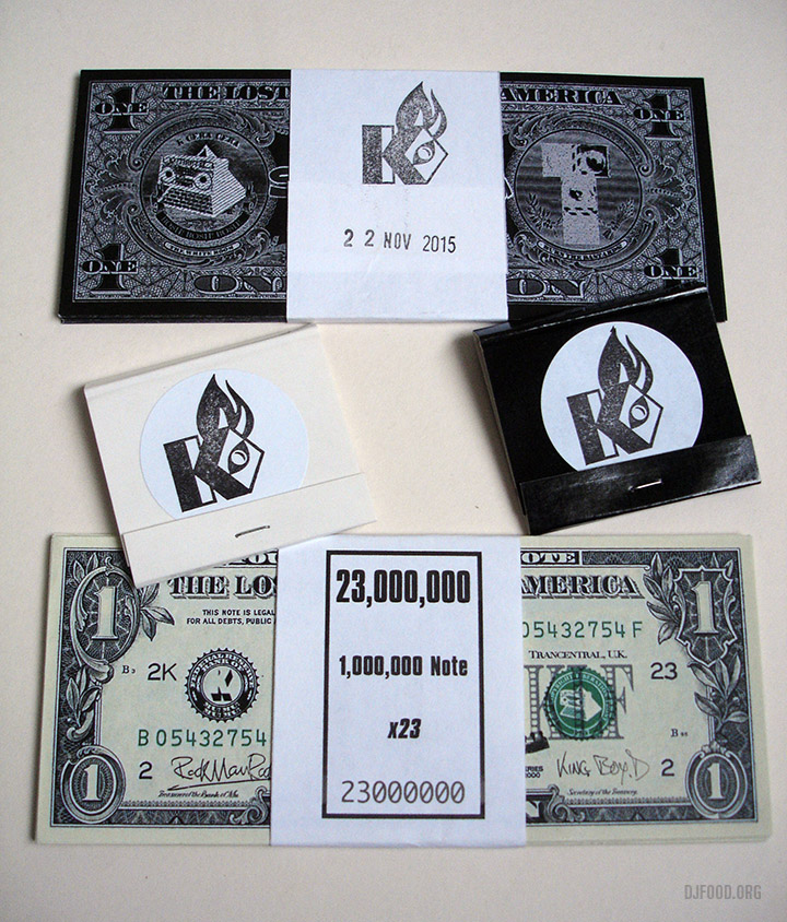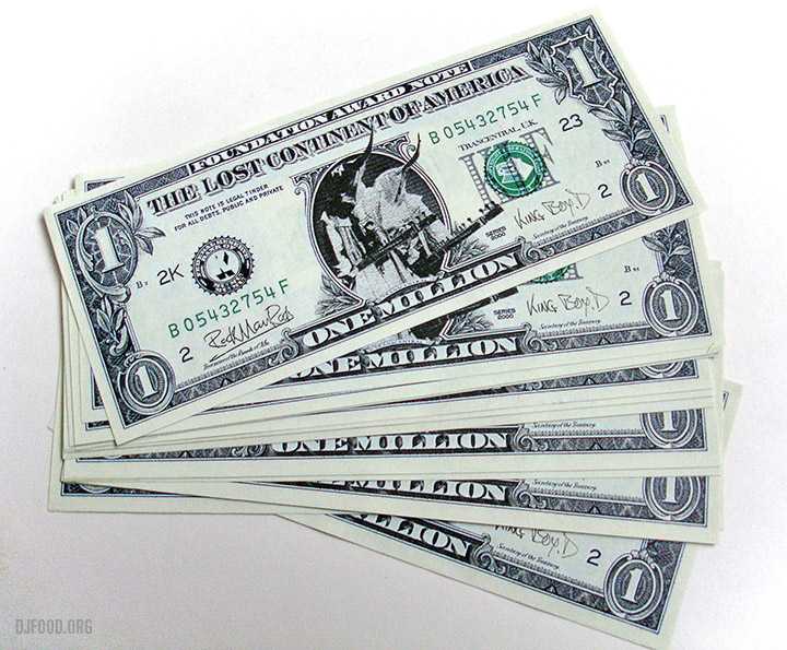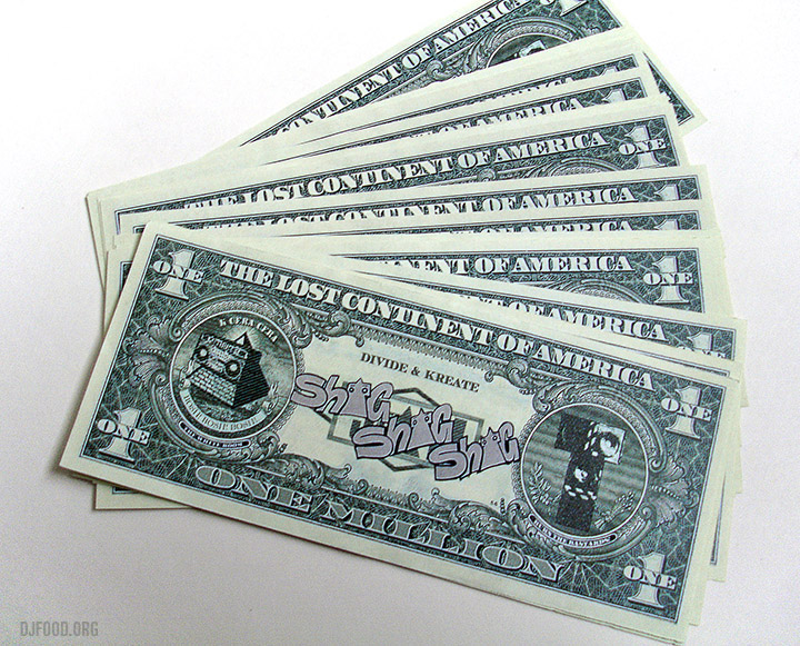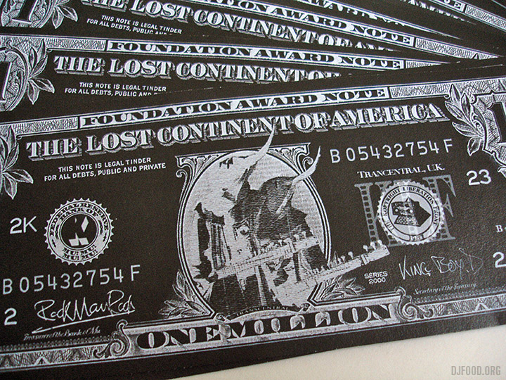
Been a bit quiet on here of late, sorry for the lack of activity but there’s a lot going on behind the scenes, making some big changes this year. Just finished a fantastic graphic design project that I can show in full soon. Also I’ve been more active on Instagram this year than last so you can find quite a few things cropping up there daily.
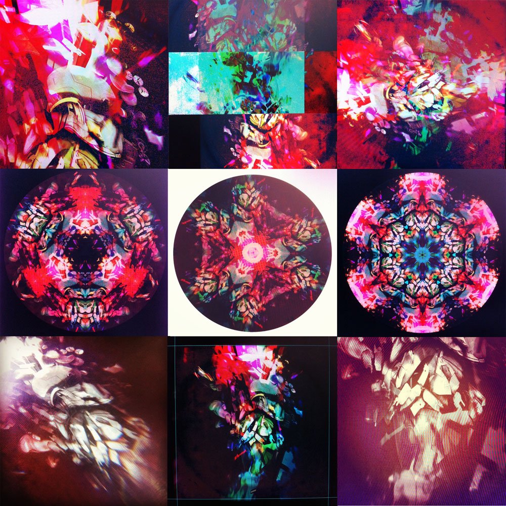
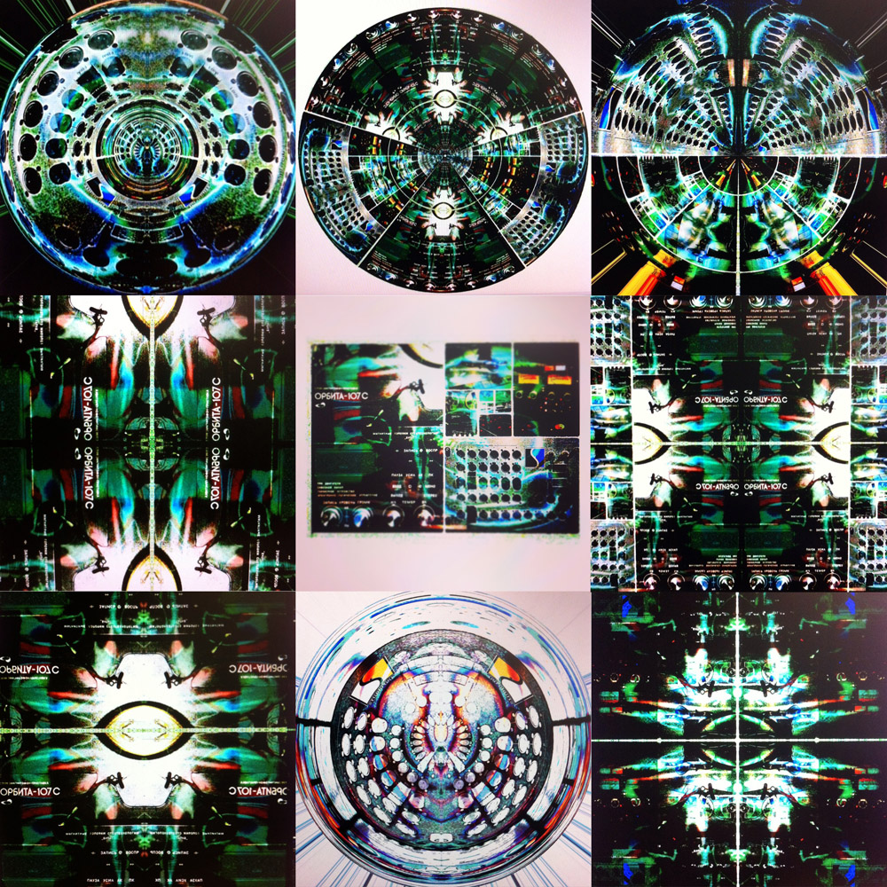
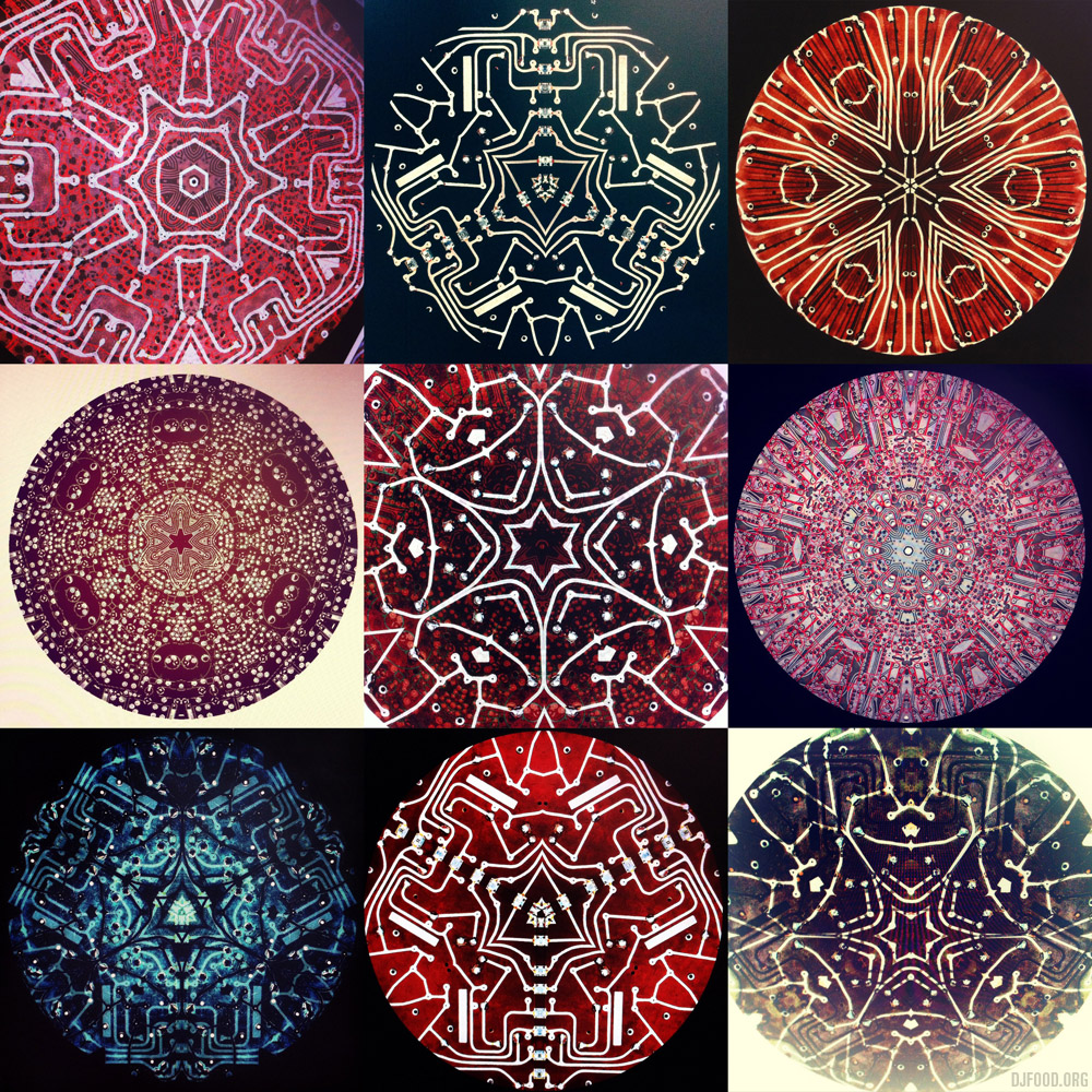
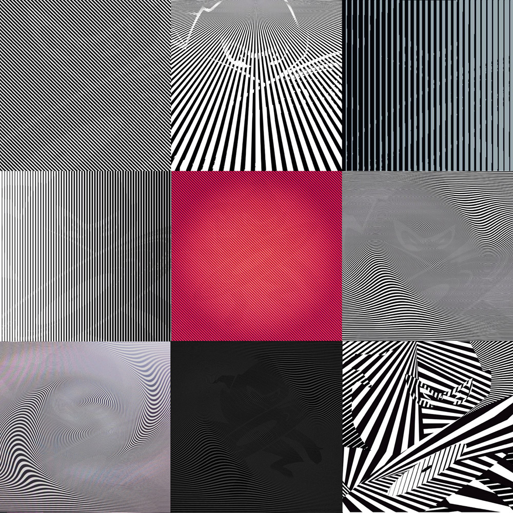
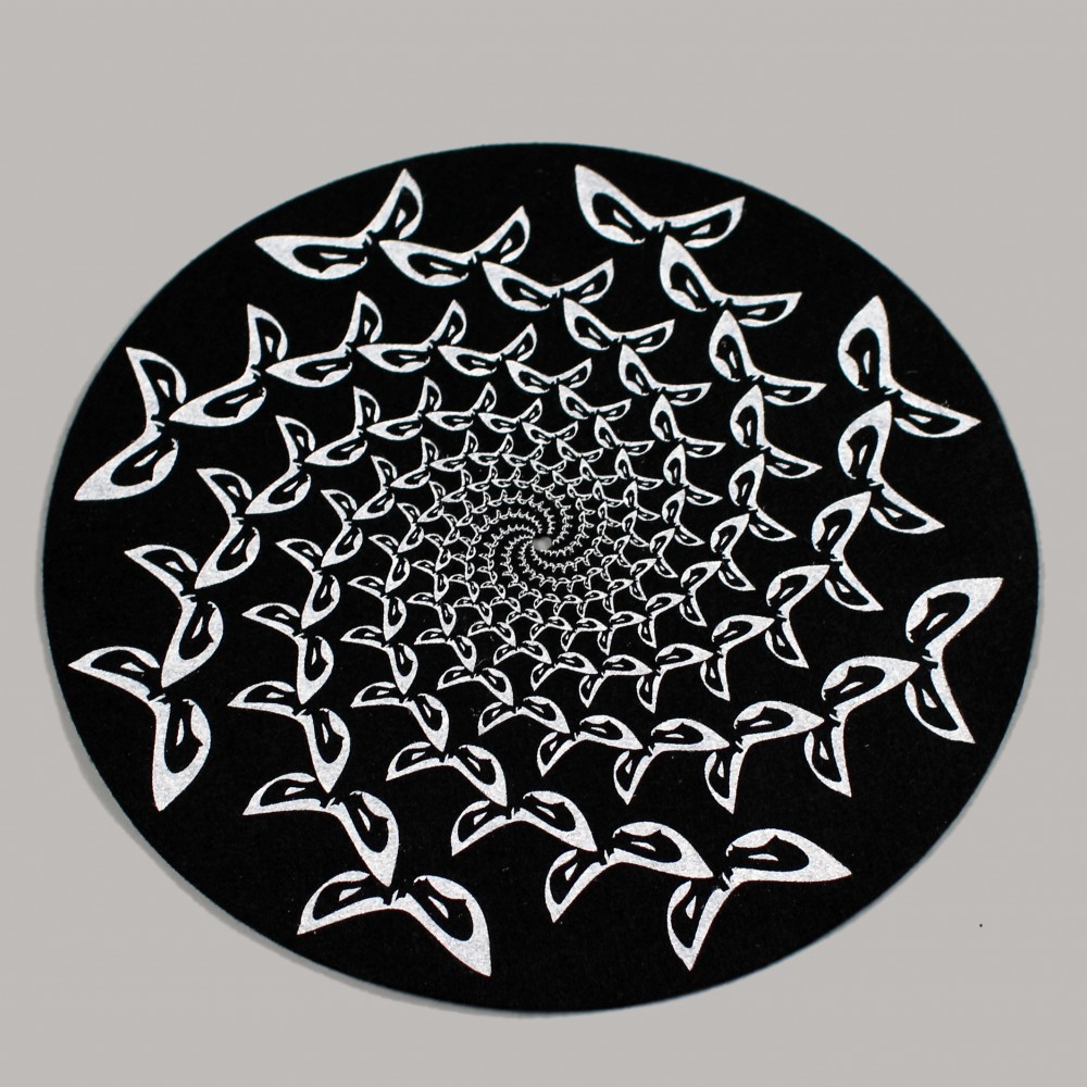
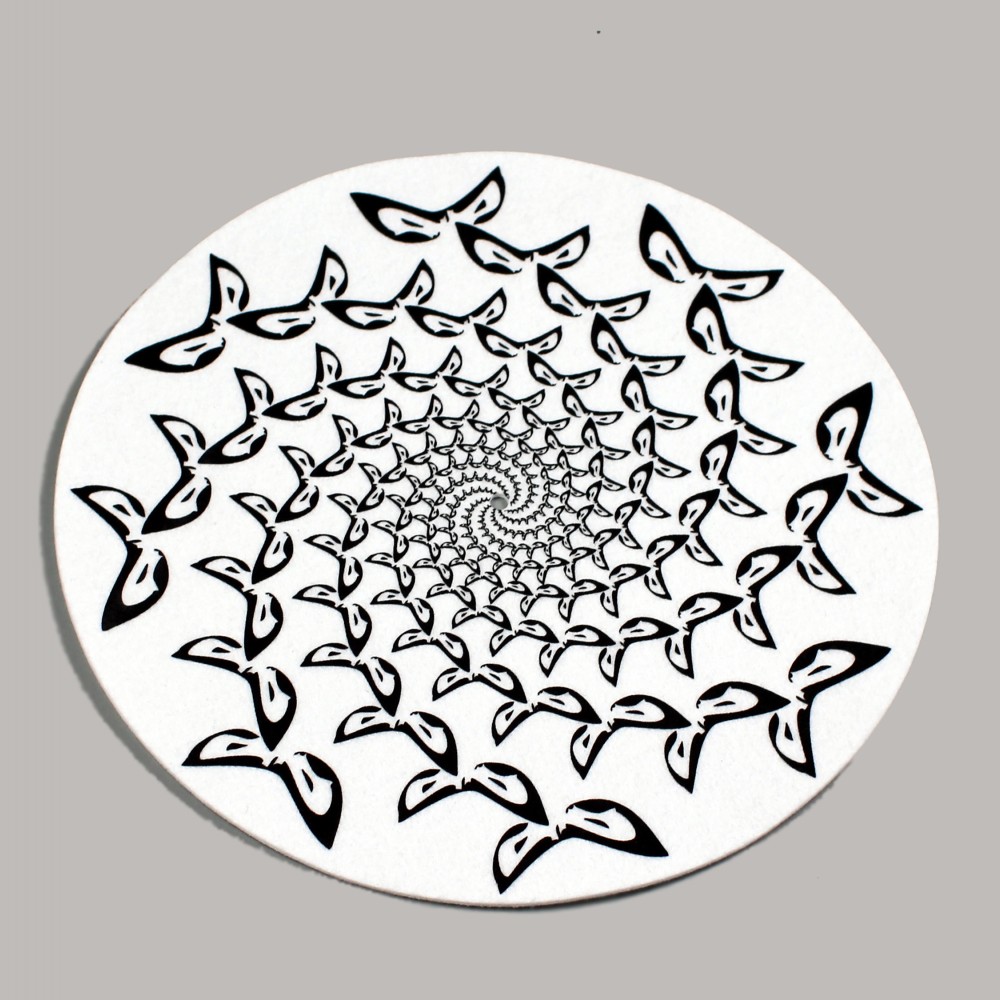
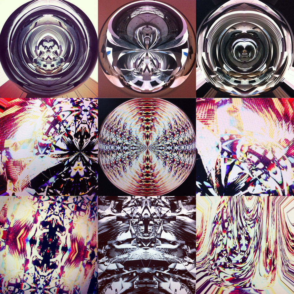
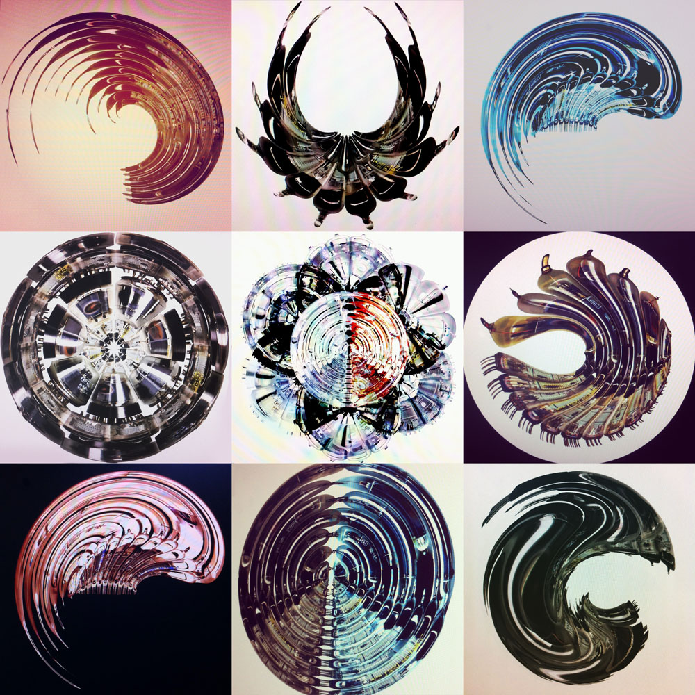
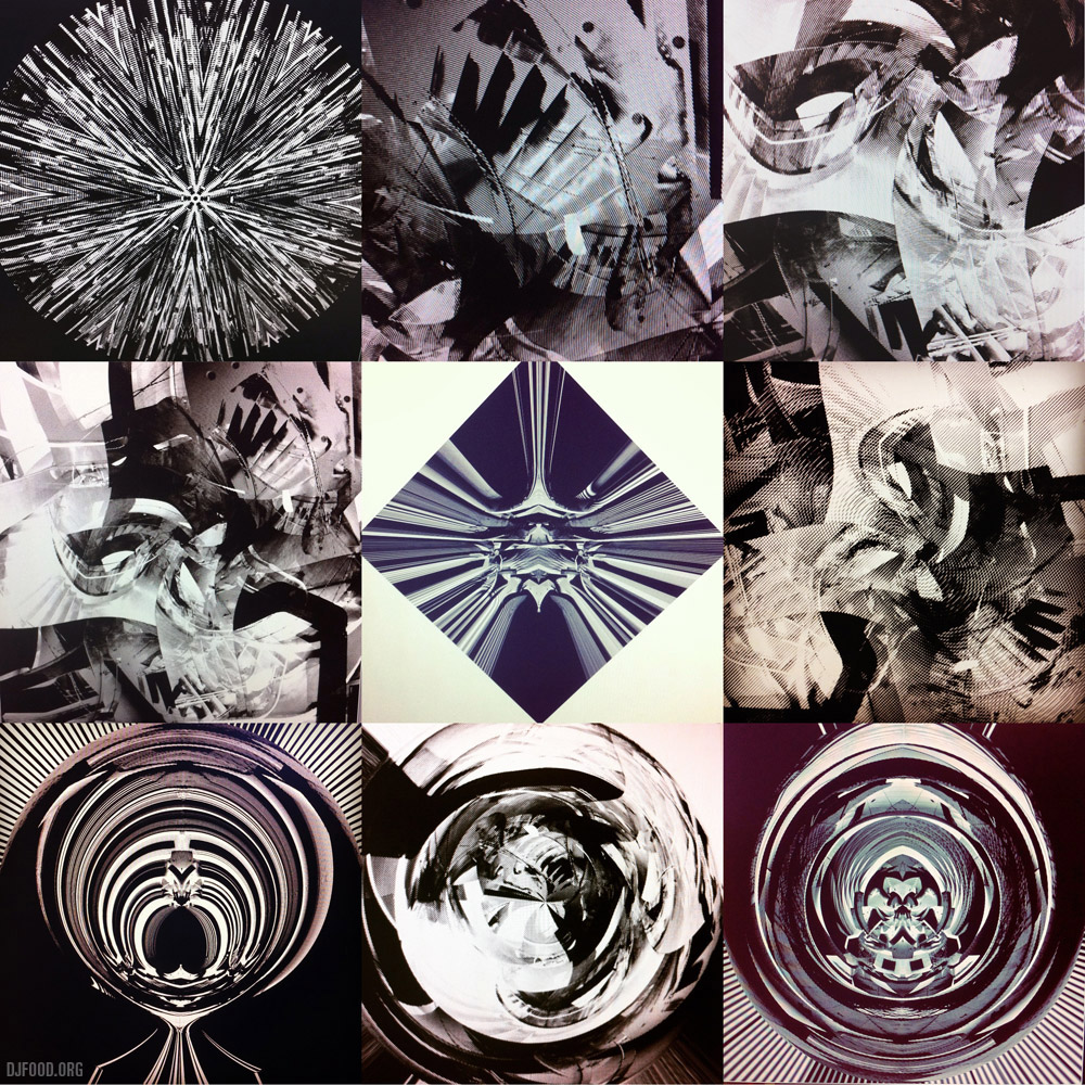
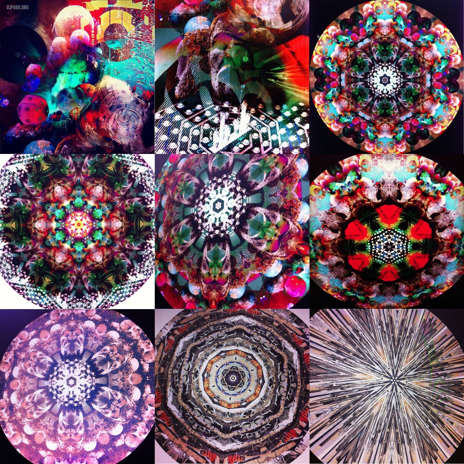
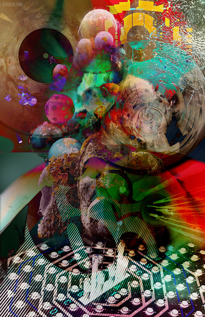
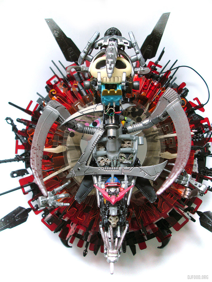
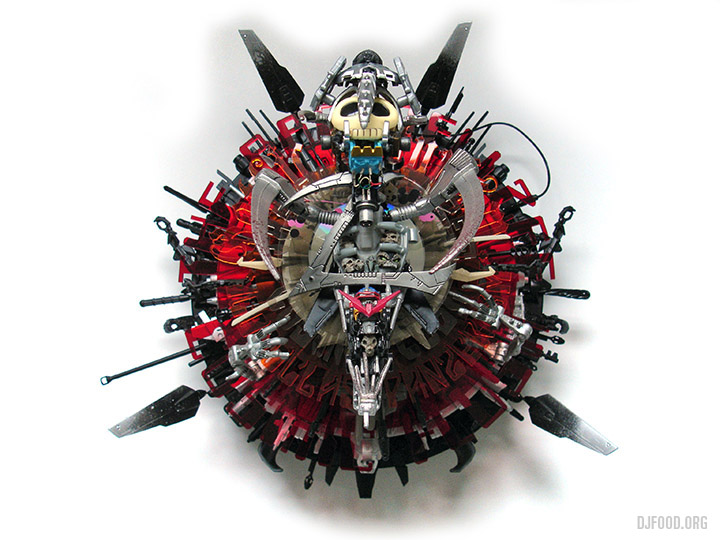
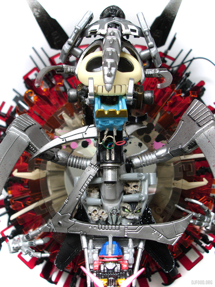
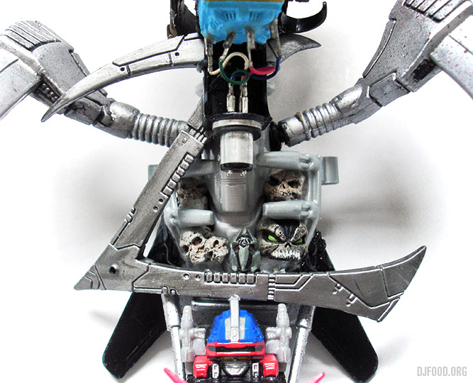
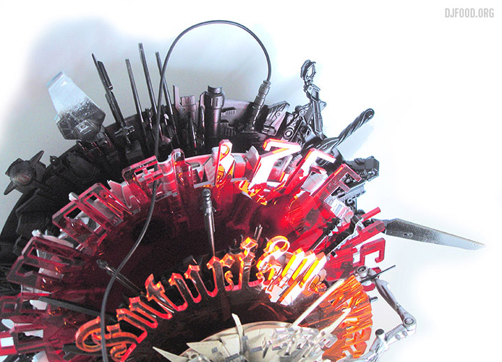
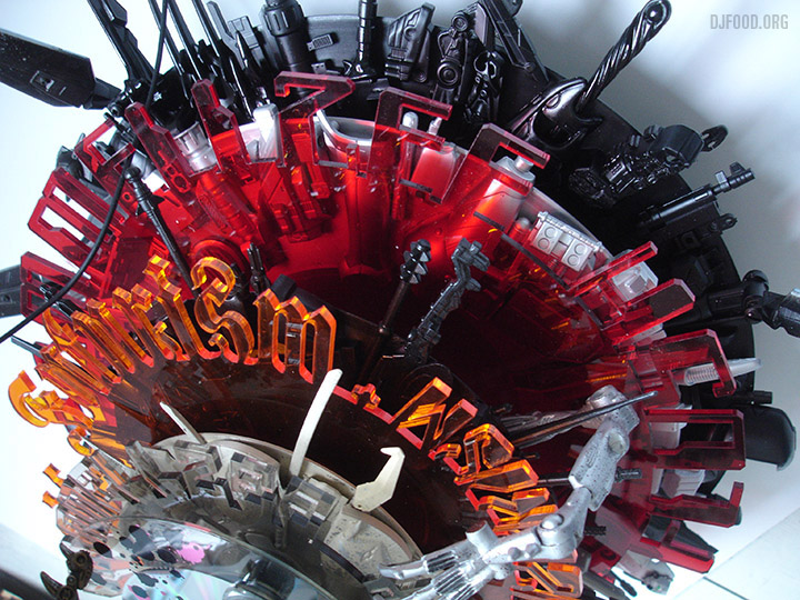
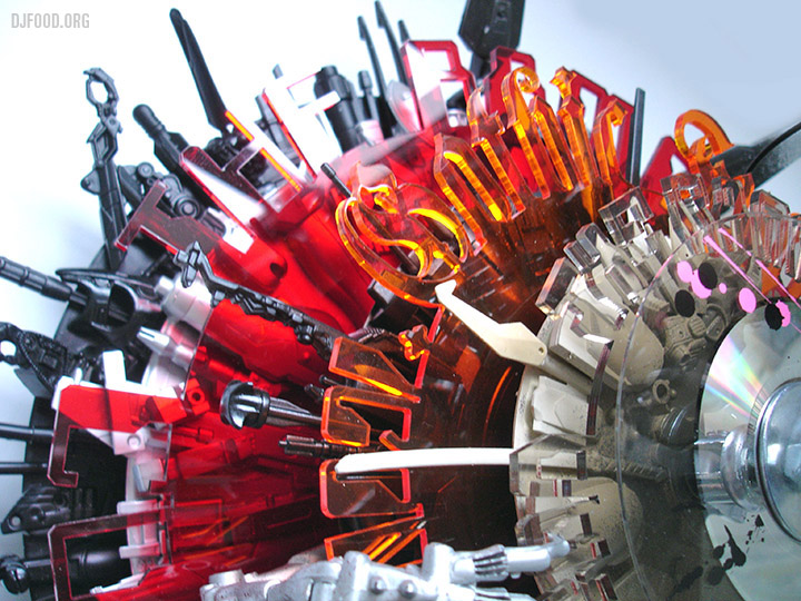
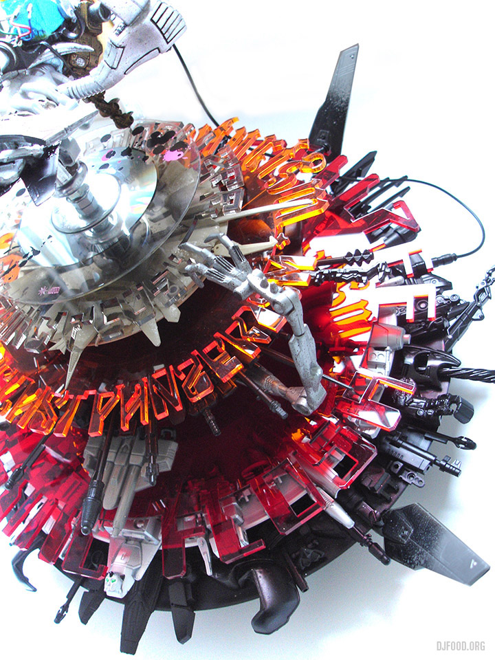
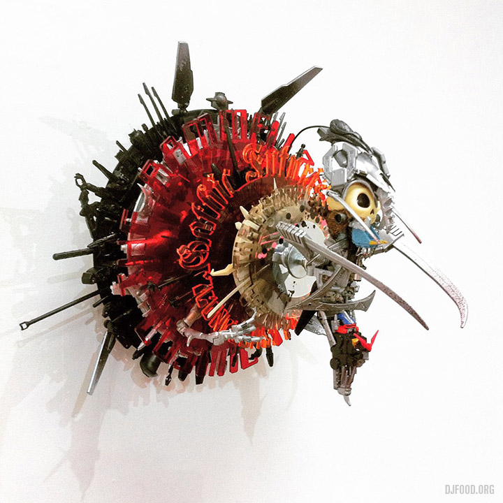
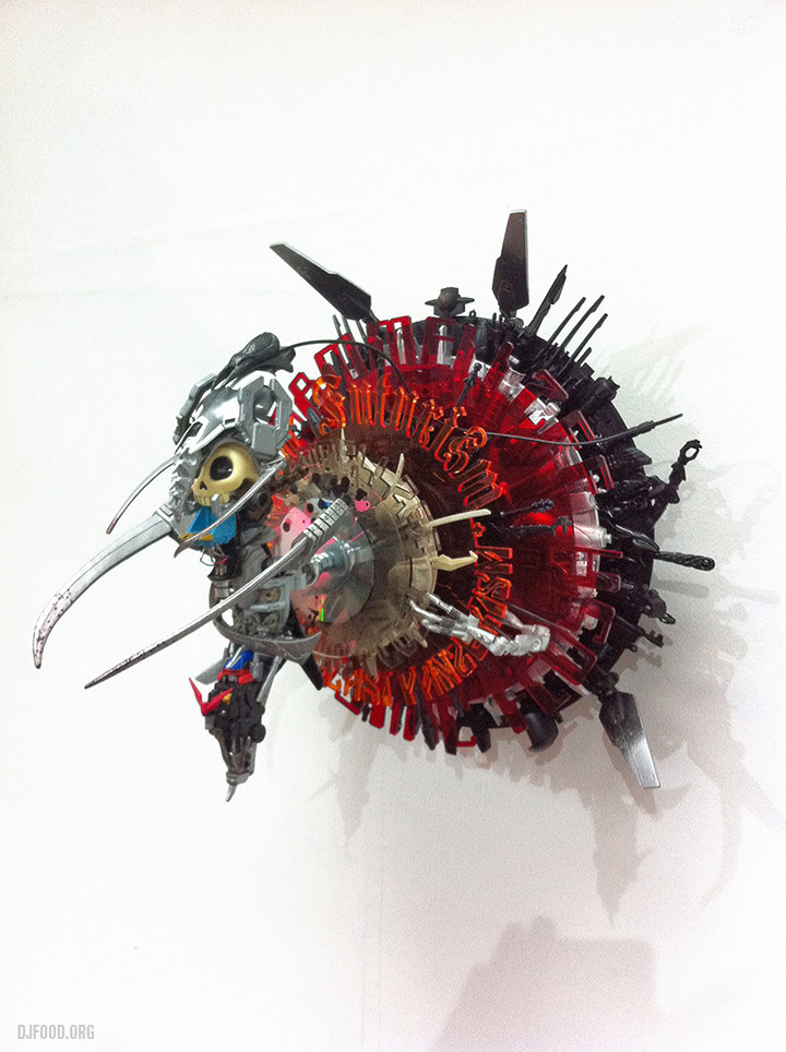
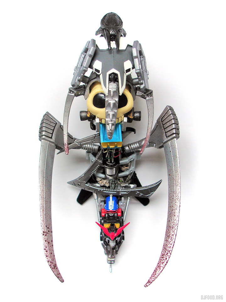
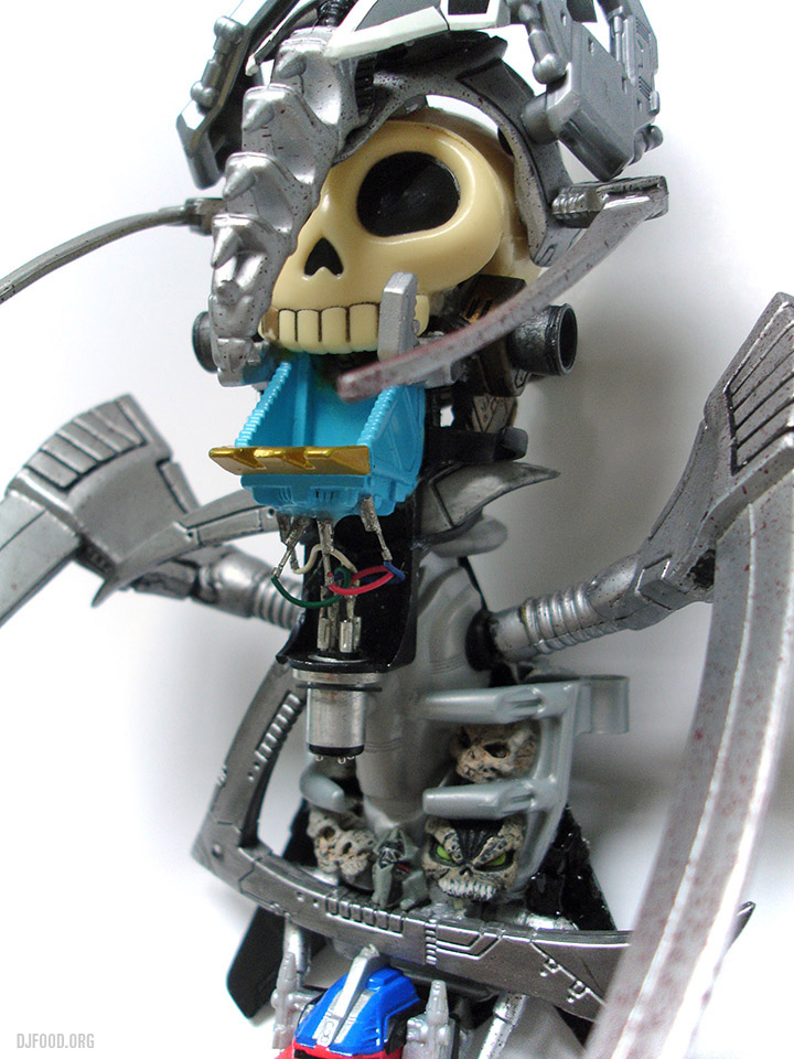
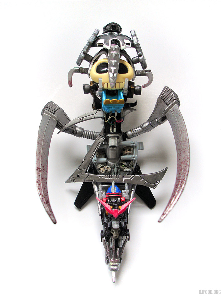
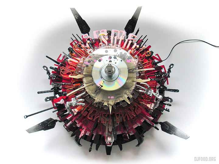
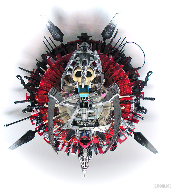
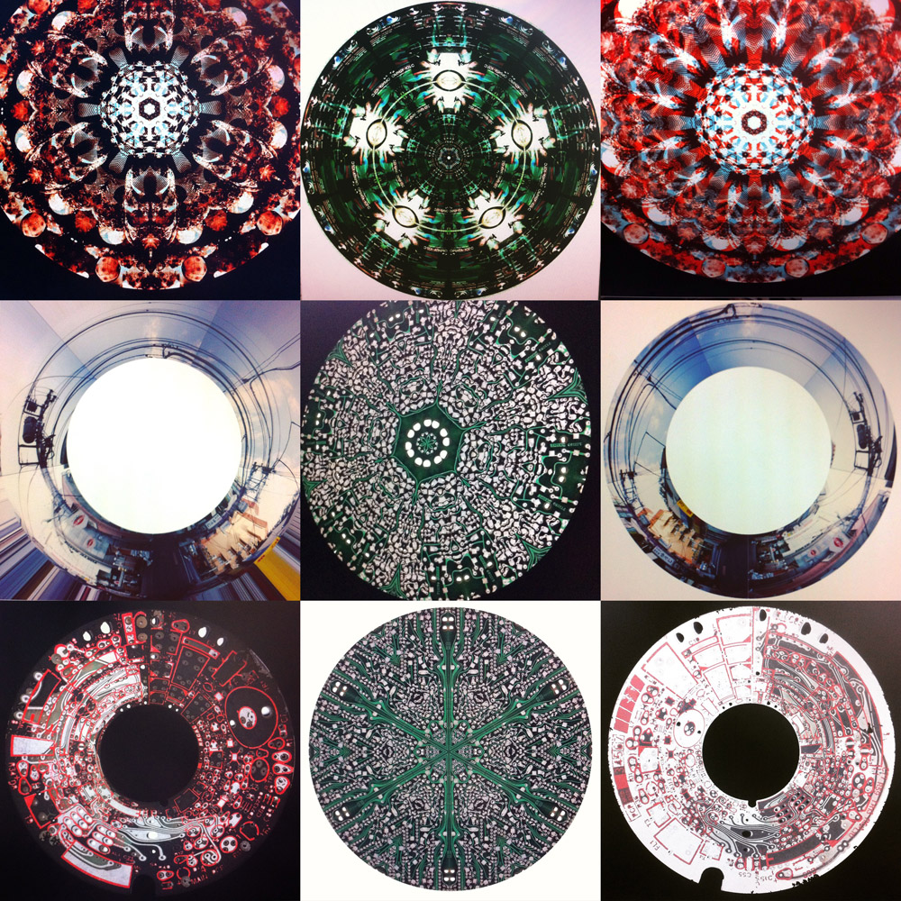
The pieces above are some circular experiments with circuit boards (Circuit Mandalas), colour shift try-outs with recent collages and some digital trickery with an old photo collage I made in the late 90s of a 180 degree shot of a Tokyo street. In April I’m going to do a month’s worth of B&W Op Art designs I made one afternoon recently before launching into something a little different…