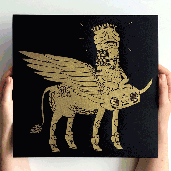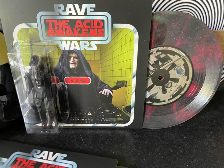
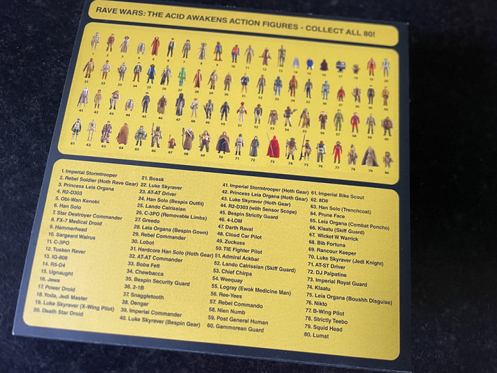
The new Rave Wars 7″ suddenly appeared today, I wasn’t prepared for it, nor for my track to be revealed but then nothing is normal about this release.
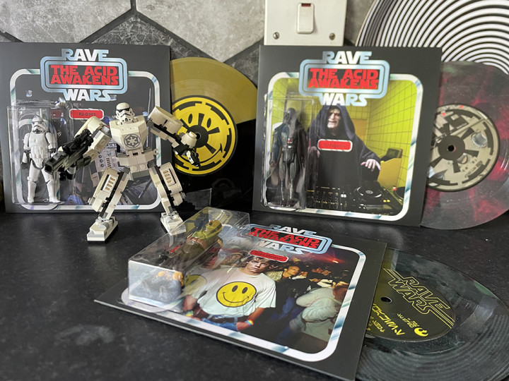
3 different covers (maybe 4?)
3 different tracks, pot luck as to which 2 you get
8 different labels
Multiple different vinyl colourways
1 of 80 different random original SW figures
Vinyl package of the year?
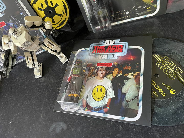
This must have been in the works for over 2 years now, glad to be a part of it and have it out in the world. To top it all I found a nice little Lego Stormtrooper mech in the charity, must have been a sign. Order a copy from HERE
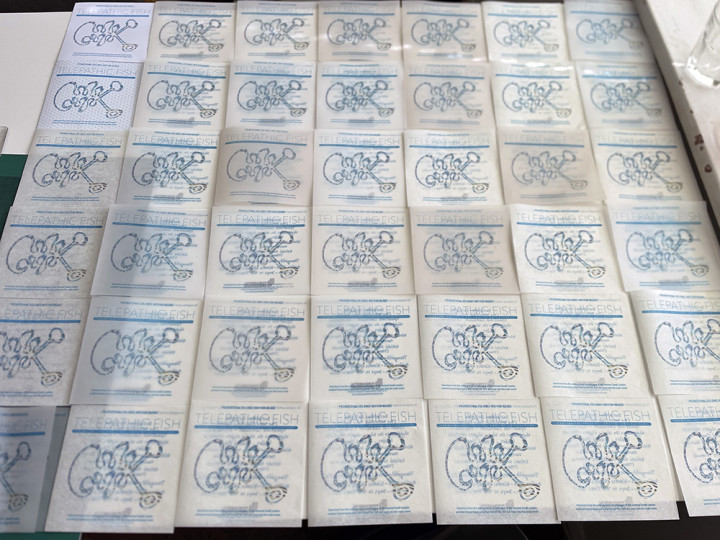
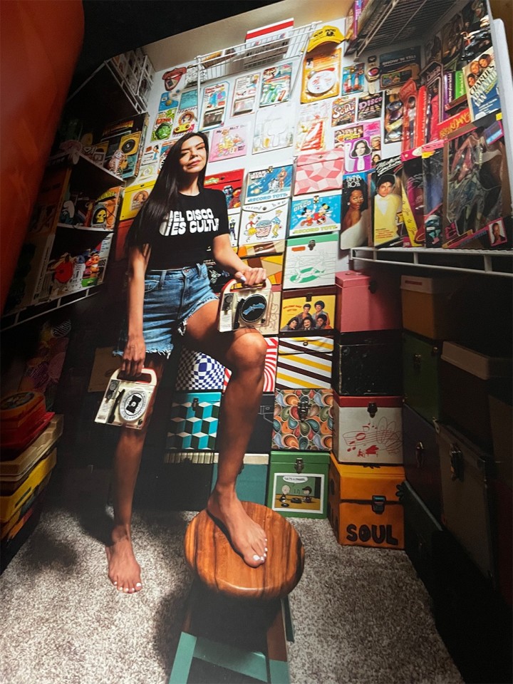
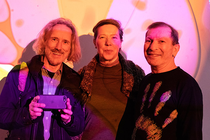
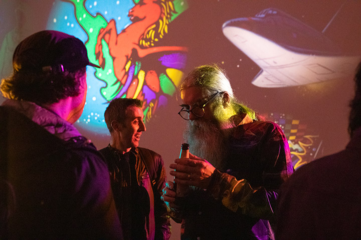
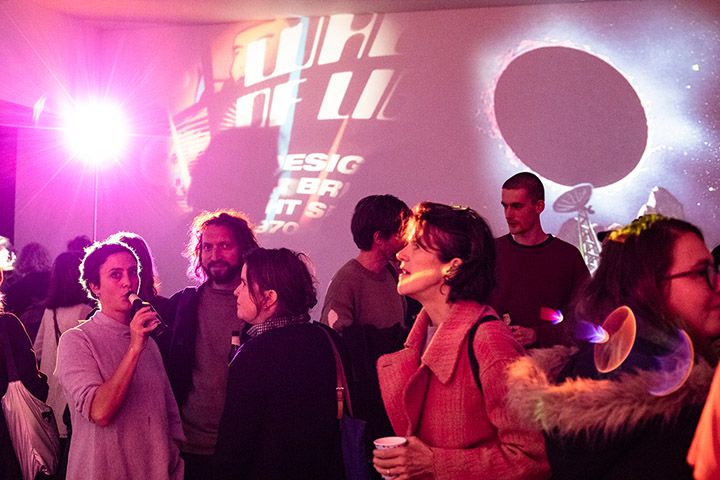
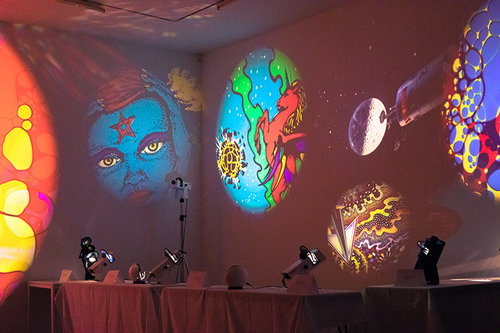
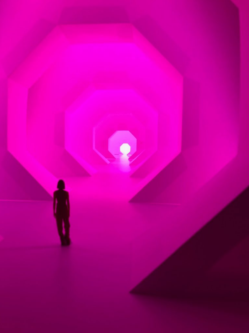
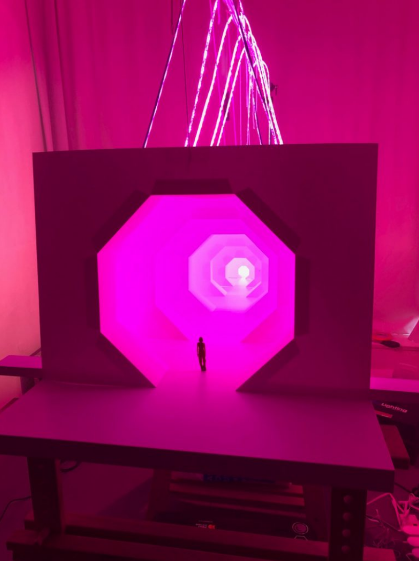
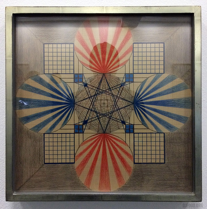
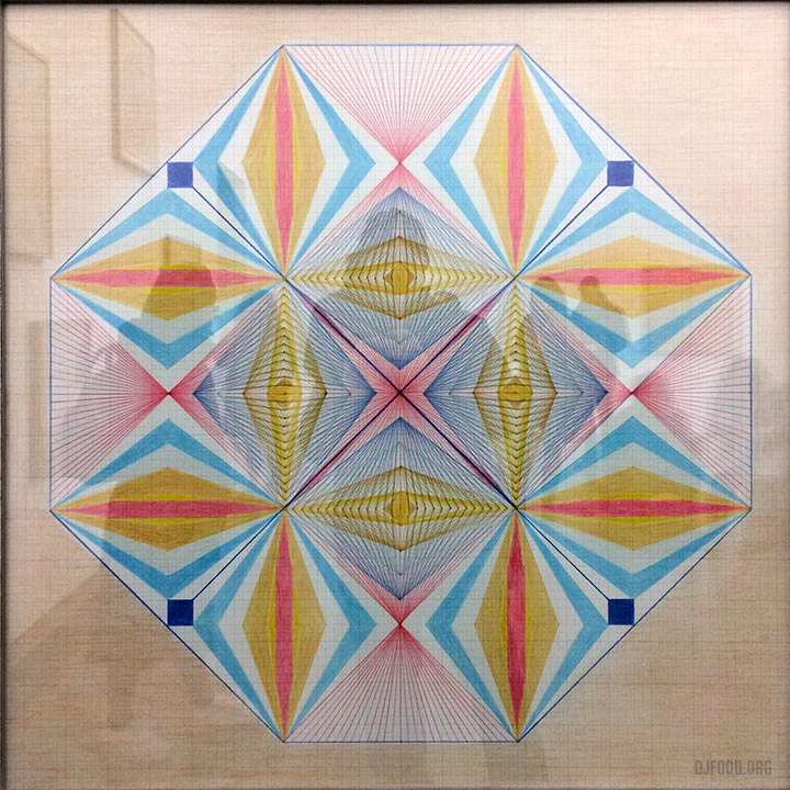
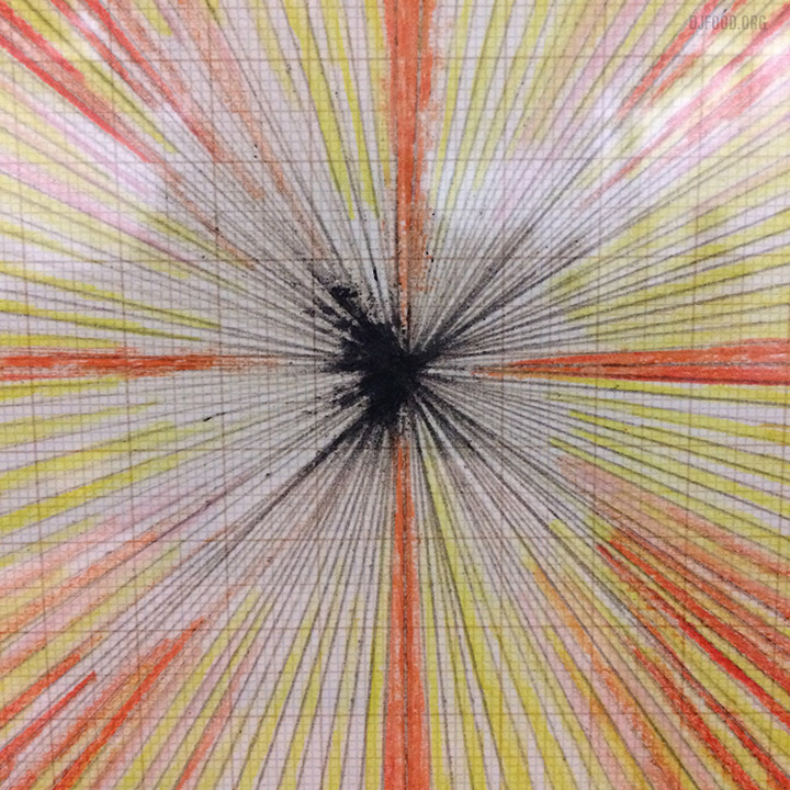
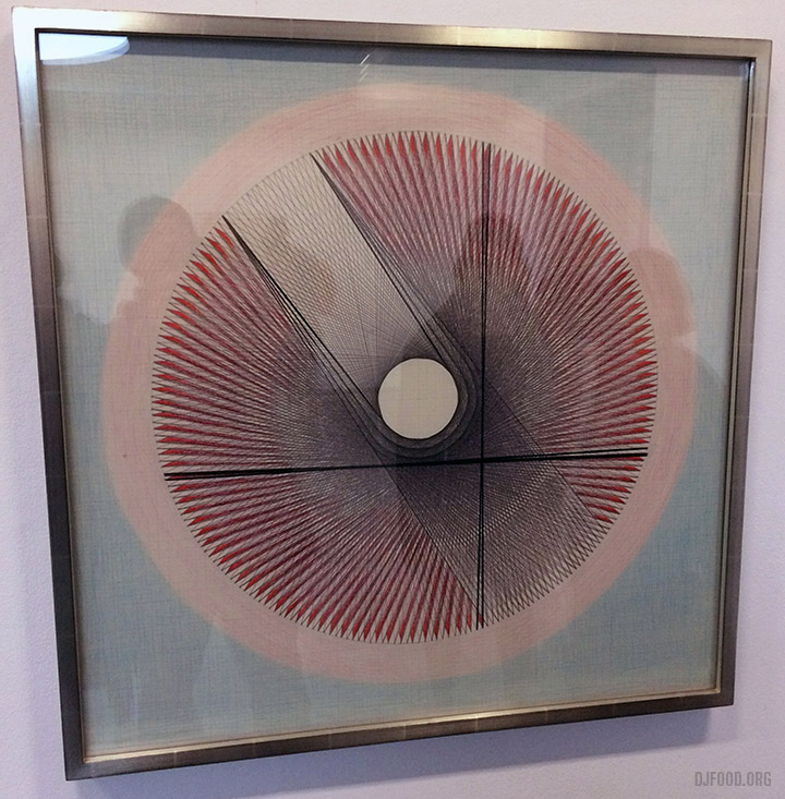
It’s been very quiet on here because I’ve been doing so much I’ve not had the time but I’ll spare you the carboot sale trips, Tate Modern gig with Doug Shipton and Mixmaster Morris and venue location scouting. Press for the Telepathic Fish release has started and I spent a few days hand-making some promo CDs with tracing paper covers for a lucky few. The Openmind exhibition in Folkestone came and went and will be arriving somewhere new soon hopefully.
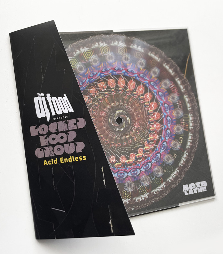
I lent Warp some bits and pieces for their show at the Barbican this past weekend too and I’ve been co-ordinating getting the first wave of Acid Endless lathe cuts out to people in the UK.
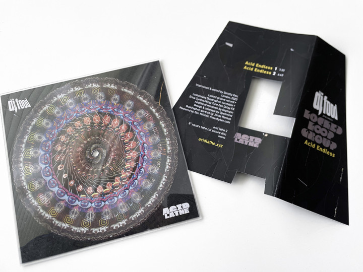
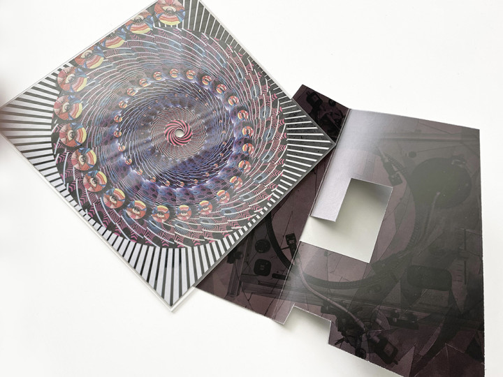
The pre-order for the second run of those ends at the end of the month and they will be cut to order so contact me if you want one and you’re in the UK.
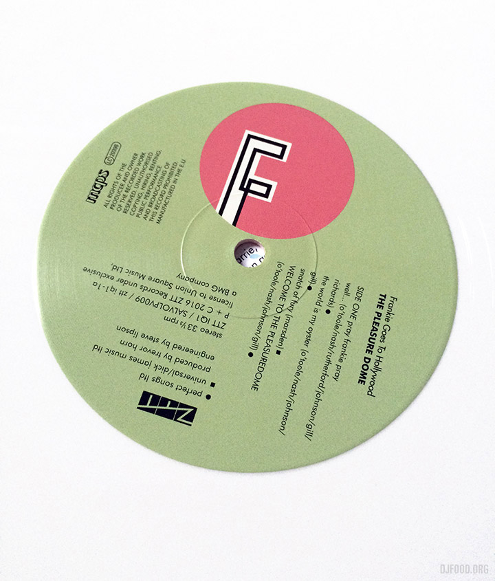
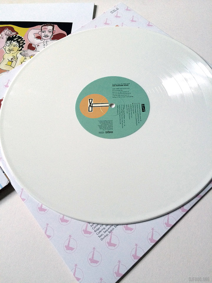
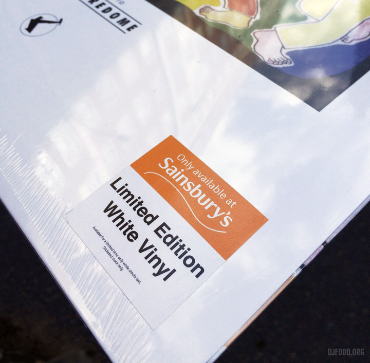
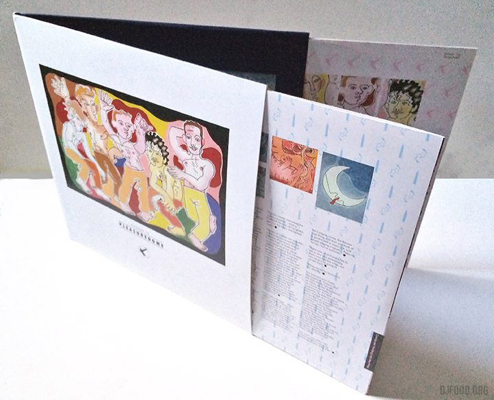
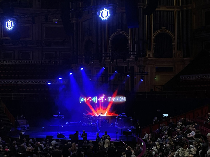
Last week saw a visit to the Royal Albert Hall to see Holly Johnson (ex-Frankie Goes To Hollywood) in concert, expect a huge announcement connected with that soon…
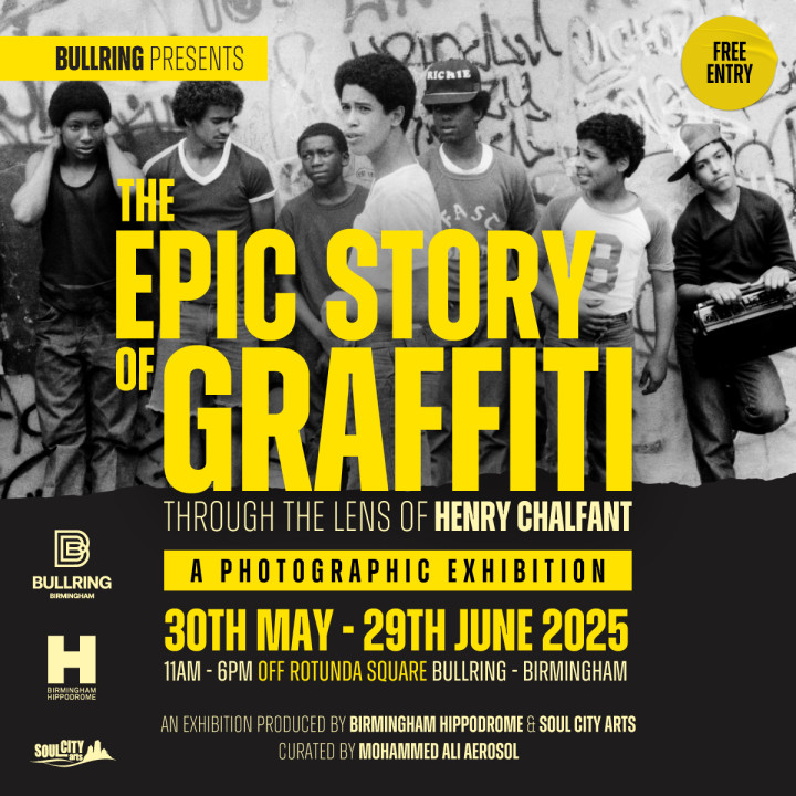
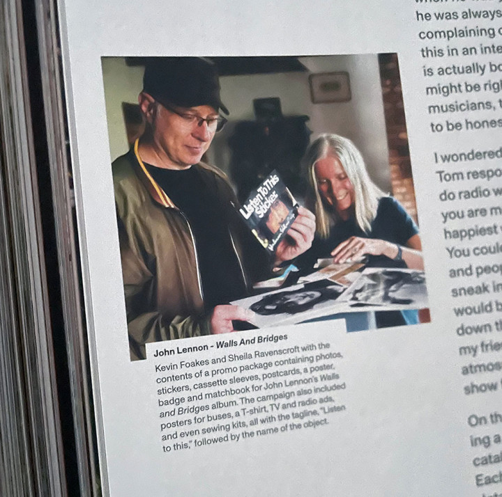
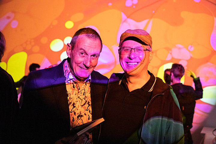
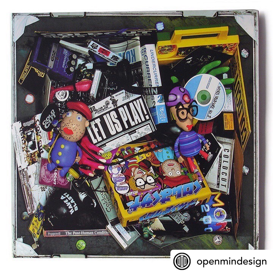
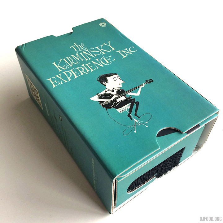
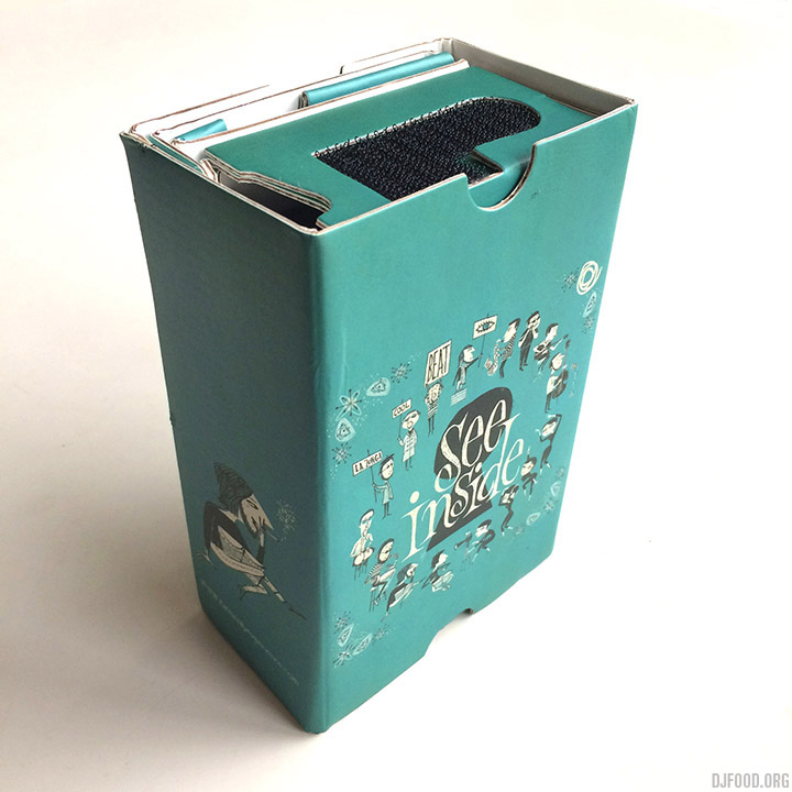
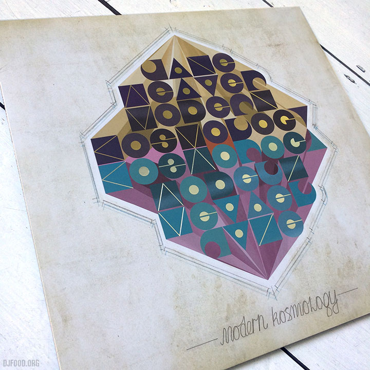
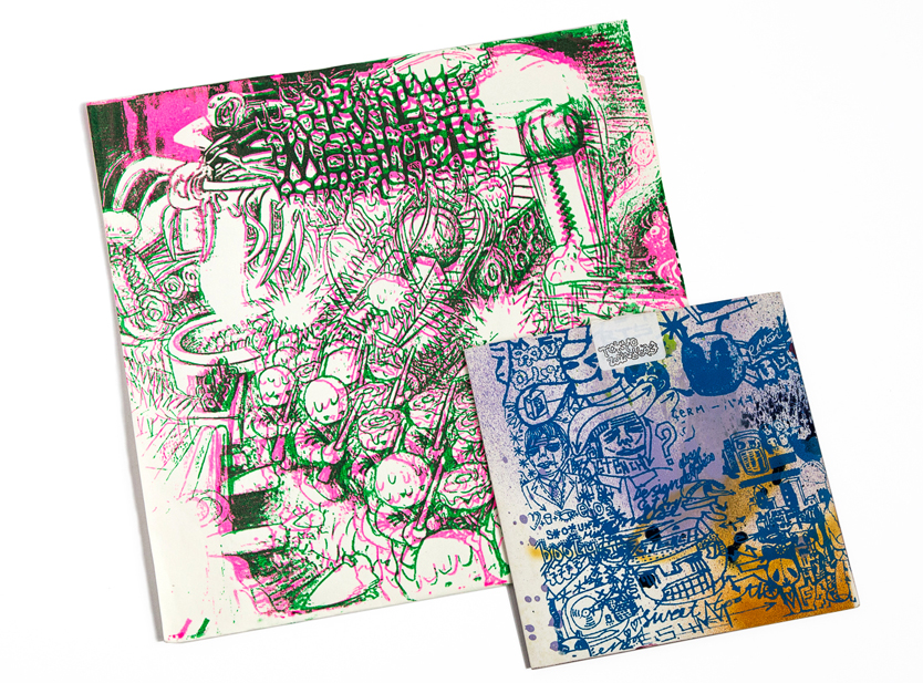
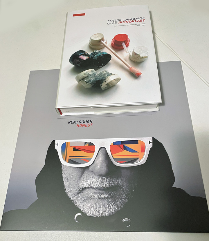
Also last week was the soft launch of a new book from long time friend Remi Rough and Velocity Press – Future Language of the Ikonoklast – an amazing collection of work from the graffiti crew of the same name that operated from the late 80s in the UK and rewrote the rulebook on what could be classed as writing. Seen here with Remi’s latest album, you can pre-order the book and there should be a proper London launch around September with one in Birmingham at the end of the month with special guest Henry Chalfont!.
Speaking of Birmingham and Henry, one of the reasons he’s there is because there’s an exhibition of his photographs from Subway Art and beyond on RIGHT NOW and it ends at the end of June! Get up there, and while you’re there the High-Vis graffiti/comic festival is on this weekend 21st June in Kingsheath too – all roads lead to Brum.